


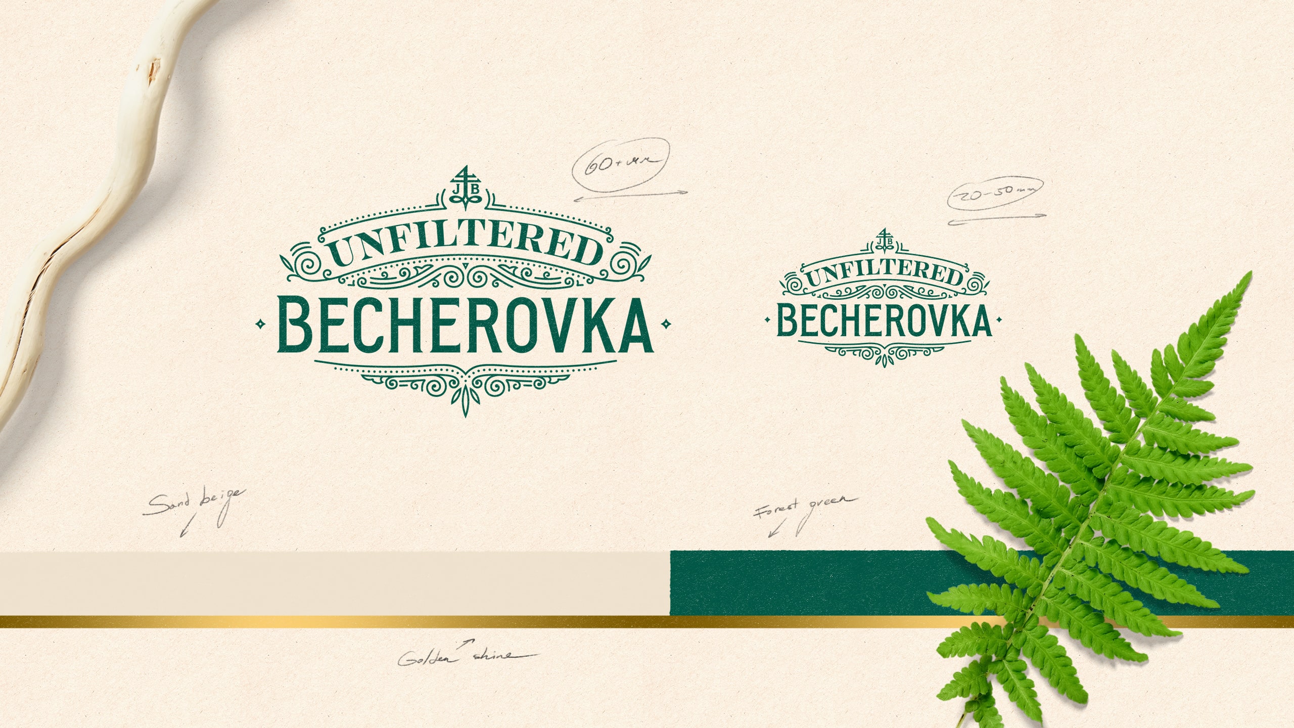
The nature-oriented expression of the Becherovka Unfiltered bottle designed by Cocoon also inspired a richly herbal and crafty identity. It starts from a line-illustrated brand block, created also in the secondary version, embracing the golden Jan Becher cryptogram in the heart of it. The colour palette is simple and compliments the amber brown bottle: deep forest green best describes the genuine herbal taste and is elegant yet modern. Used in a combination with soft beige and a touch of gold, it creates a significant colour coding that links the look and feel throughout all the media mix.
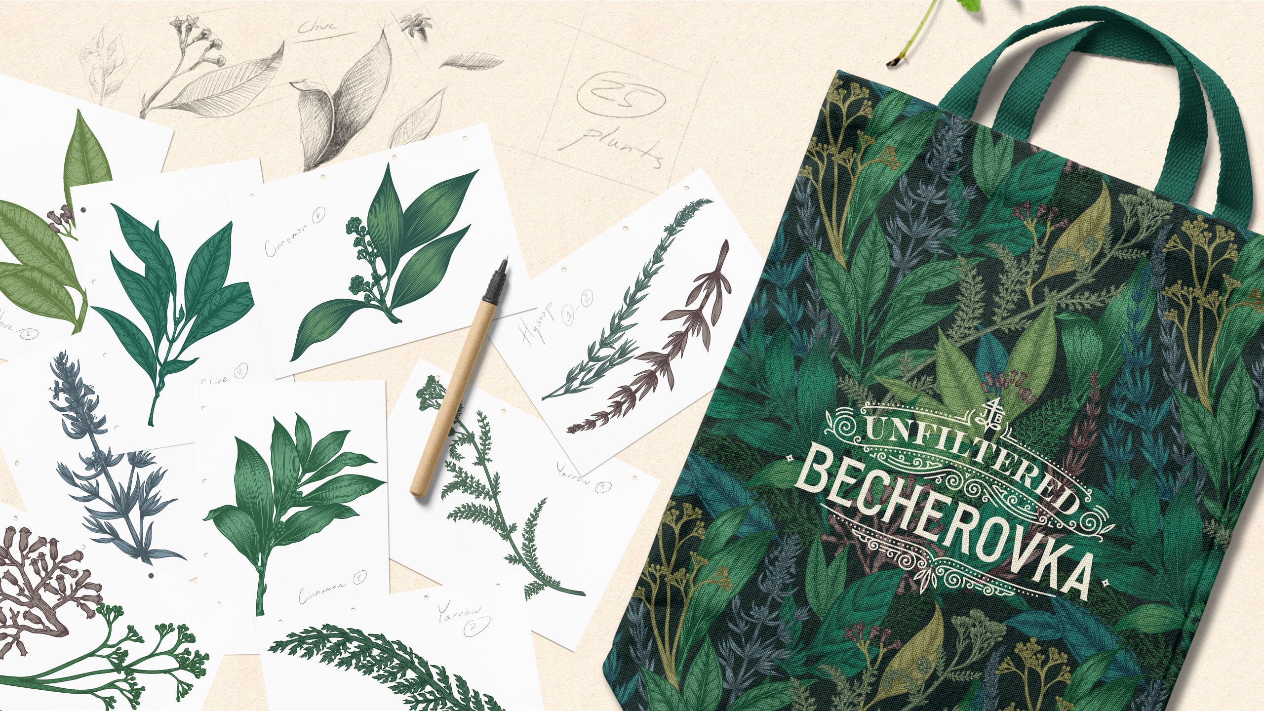
The mix of herbs that are true to the original ingredients inspired a completely custom-made patterned wallpaper design. Hand-drawn, digitalised, crafted, and colourised to match the visual identity, this herbal jungle as well as the individual leaves became its key assets.
Applications
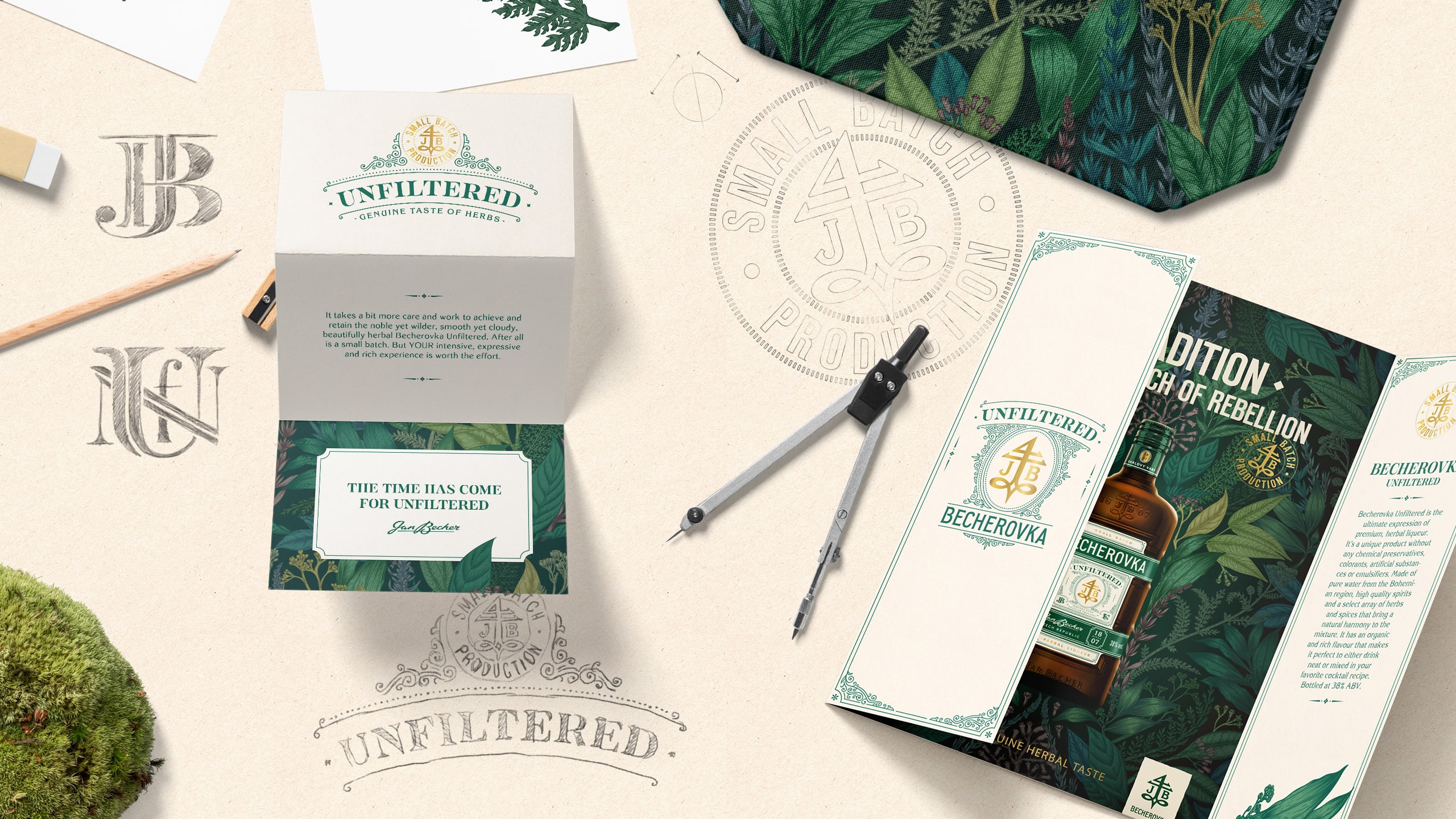
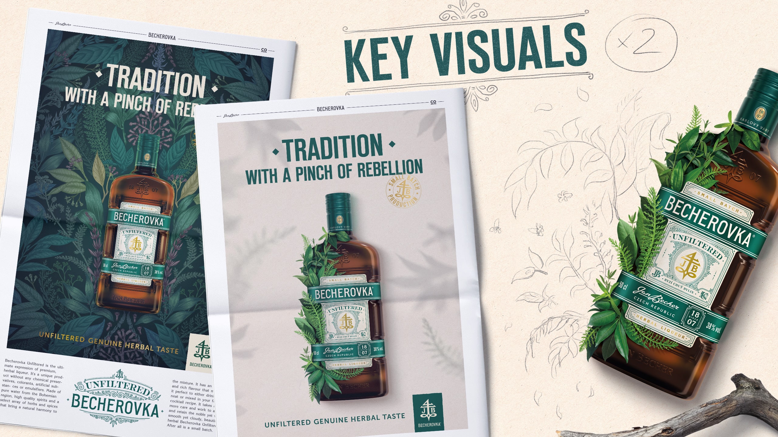
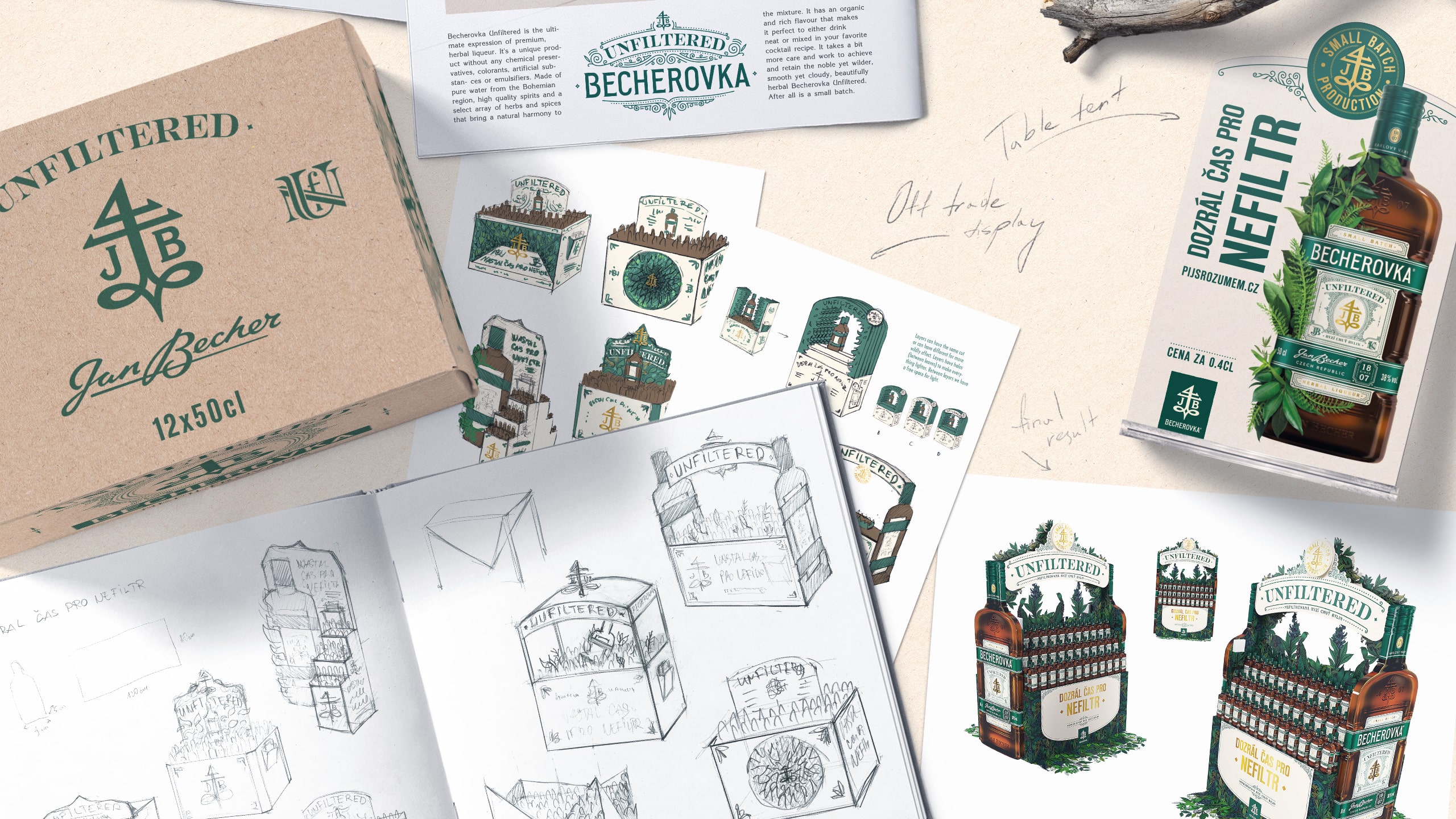
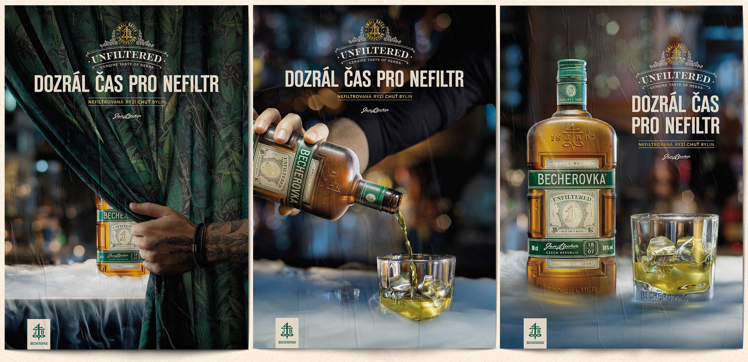
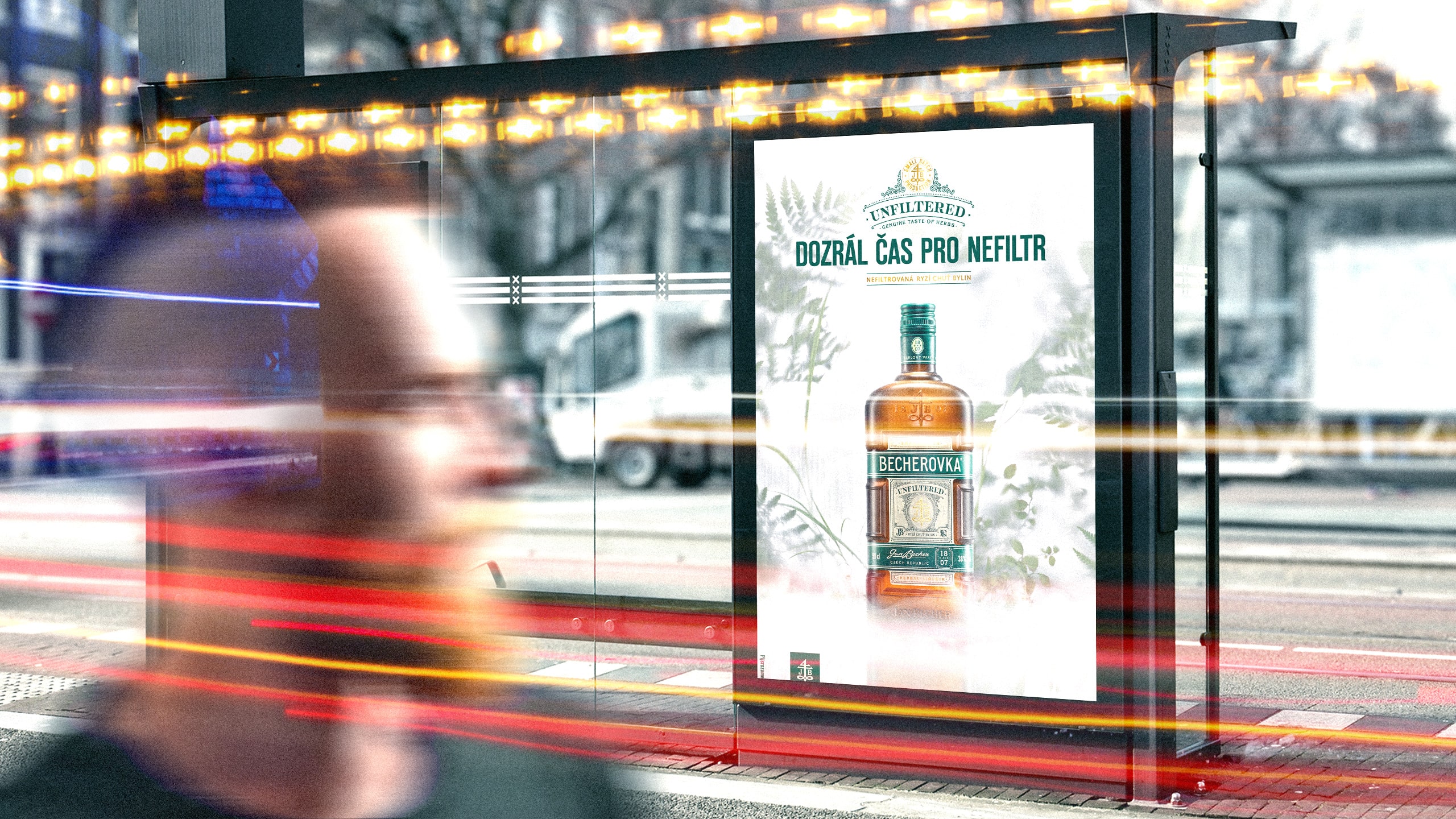
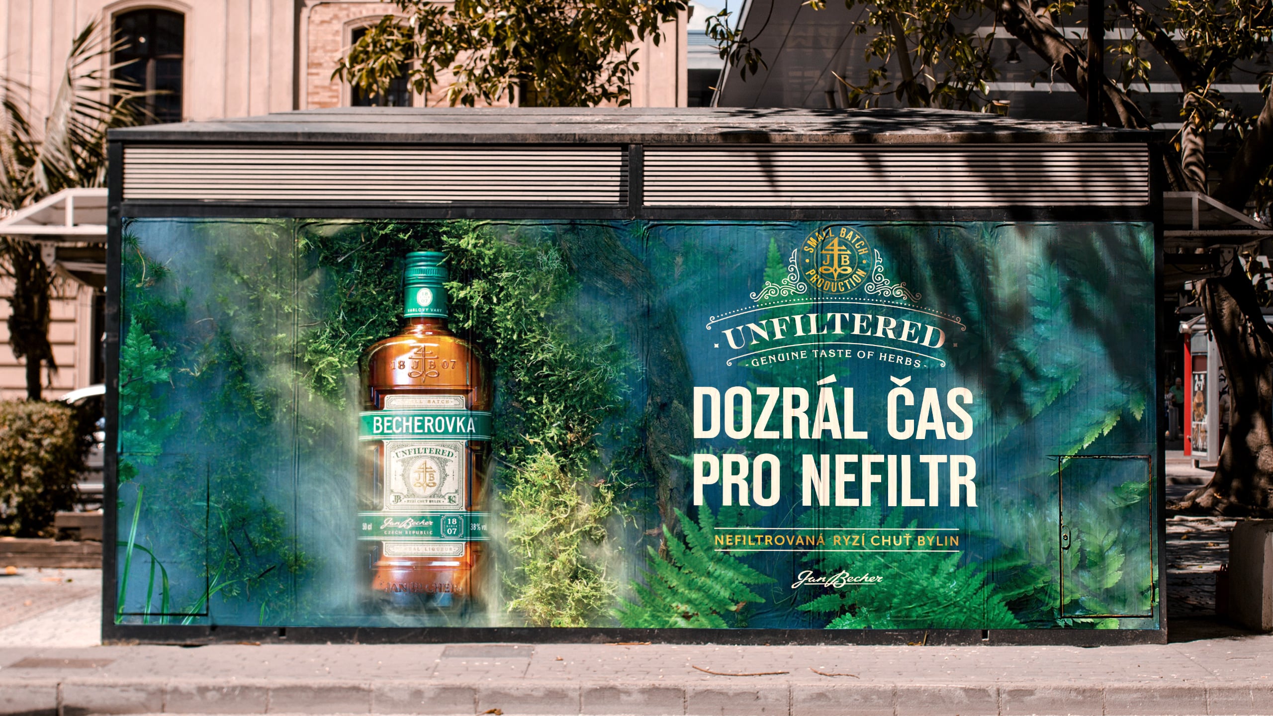
Becherovka is all about the right mix, and we had the right mix of elements to apply on various roll-outs. POS materials have been designed and produced. Simultaneously, we had the pleasure to develop two key visuals ready to be applied to different formats expressing the proposition of Becherovka Unfiltered. Once more, the herbs, the cloudiness, and the intensity of the liquid inspired our visual thinking for the KVs. We also created two claims expressing the uniqueness of this new premium drink: Tradition with a pinch of rebellion and The Time has come for Unfiltered. They can be used interchangeably, based on the occasion.
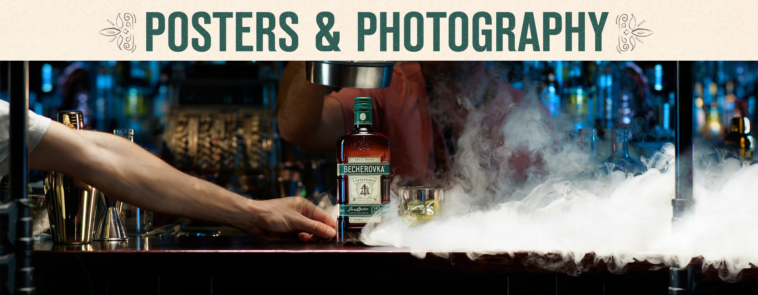
The Big Photoshoot
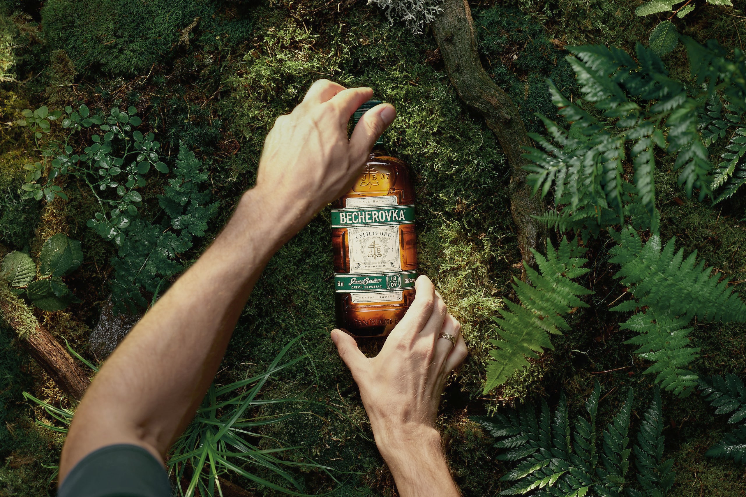
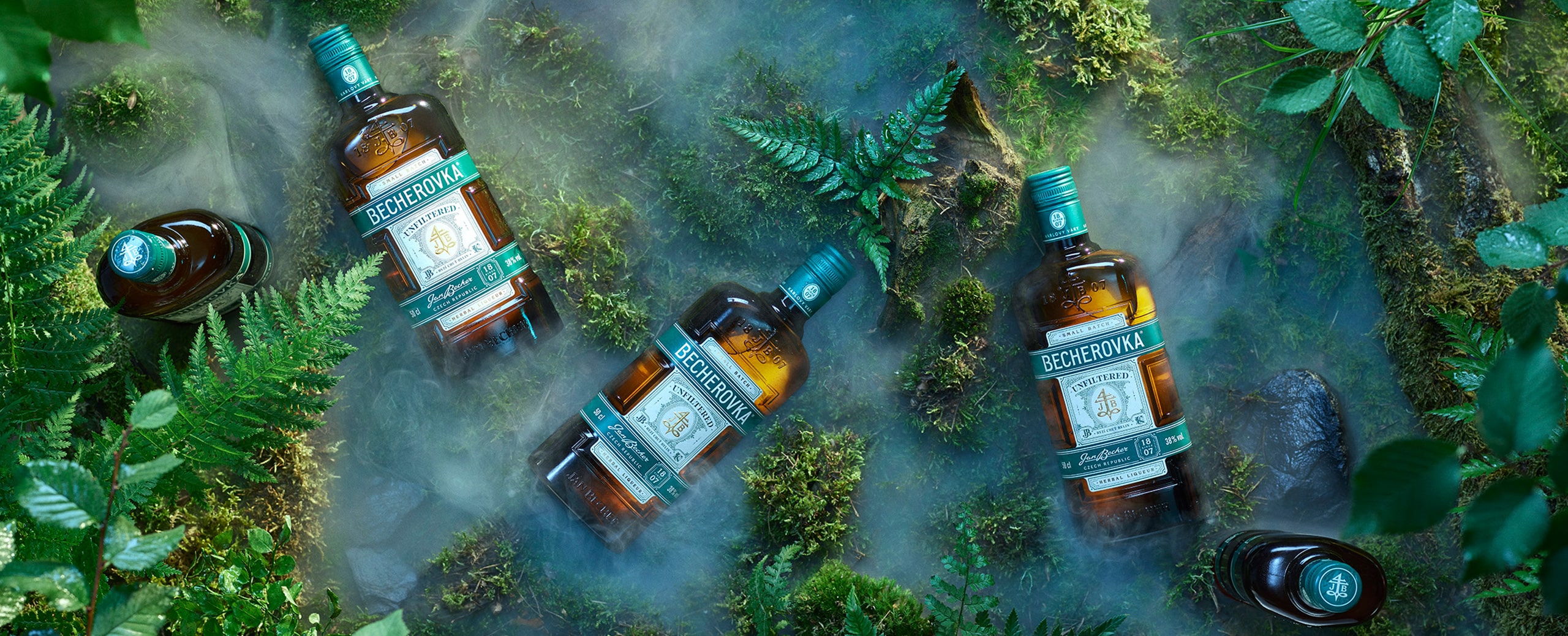
… And the fun part came. See the video at the end of this case study to get a flavour of it. Kilos of dry ice, plants, moss, special effects and several pairs of skilful hands got involved. In the professional cooperation with 4D Photo and the talented photographer Petr Krejčí, we shot both on set (The Hemingway’s Bar in Prague) and in the studio. Six original images were made, enwrapping Becherovka Unfiltered in a world of its own – natural, herbal, mystical, and intensively tasteful. The photographs also introduced the drinking ritual “on the rocks”, which makes Unfiltered taste the best. On social media and in communication the consumers can now be invited into this world.
The Results
After only 5 months from the beginning of the launch, The Unfiltered grew from zero to hero, achieving a 7% share in the whole Becherovka portfolio in selected channels, which exceeded the plan by 4%! The journey of this unique product has just started. Beautifully, we dare to believe.
CREDIT
- Agency/Creative: Cocoon Prague
- Article Title: Visual Identity of Becherovka Unfiltered in the Spotlight
- Organisation/Entity: Agency, Published Commercial Design
- Project Type: Packaging
- Agency/Creative Country: Czech Republic
- Market Region: Europe
- Project Deliverables: Brand Identity, Brand Strategy, Brand World, Branding, Graphic Design, Identity System, Illustration, Packaging Design, Photography
- Format: Bottle
- Substrate: Glass Bottle


