


Unica is a learning environment for Adventist Education with a focus on professional development, supporting continuing education for teachers in the educational network.
It was instituted to improve the quality of teaching, considering the analysis of the Adventist Basic Education Evaluation Program (PAAEB), as well as surveys carried out with the teaching staff and school managers.
It is common in educational institutions to have a Corporate University in order to deepen the knowledge of employees. The brand was going through a moment of transition and needed a new brand in line with its positioning and, thus, to talk better with its public that is from different states and regions of Brazil aged between 25 and 45 years old, but all with the goal of learning something new, in order to improve and evolve professionally.
One of the main challenges of the project was to develop a project that did not connect with the old brand, the purpose was to carry out a complete renovation. That is why we define brand positioning, trace your personality, emotional benefits and brand manifest. The pillars of the brand were: educator, elegant, professional.
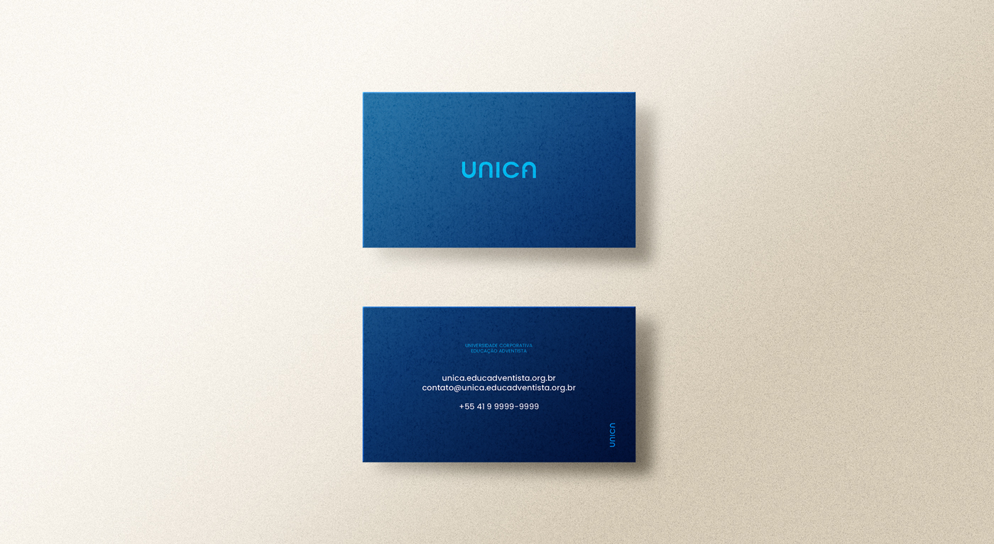
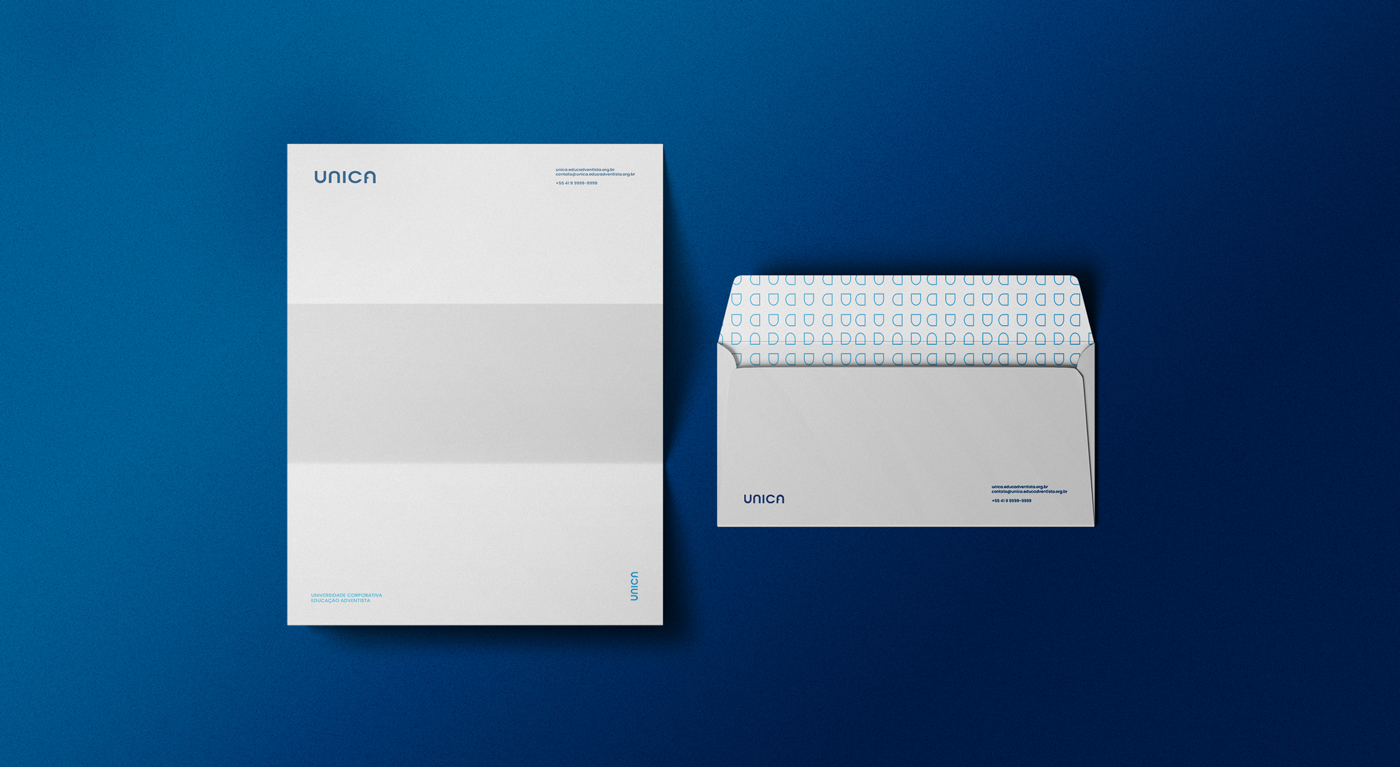
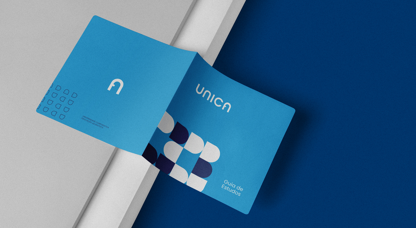
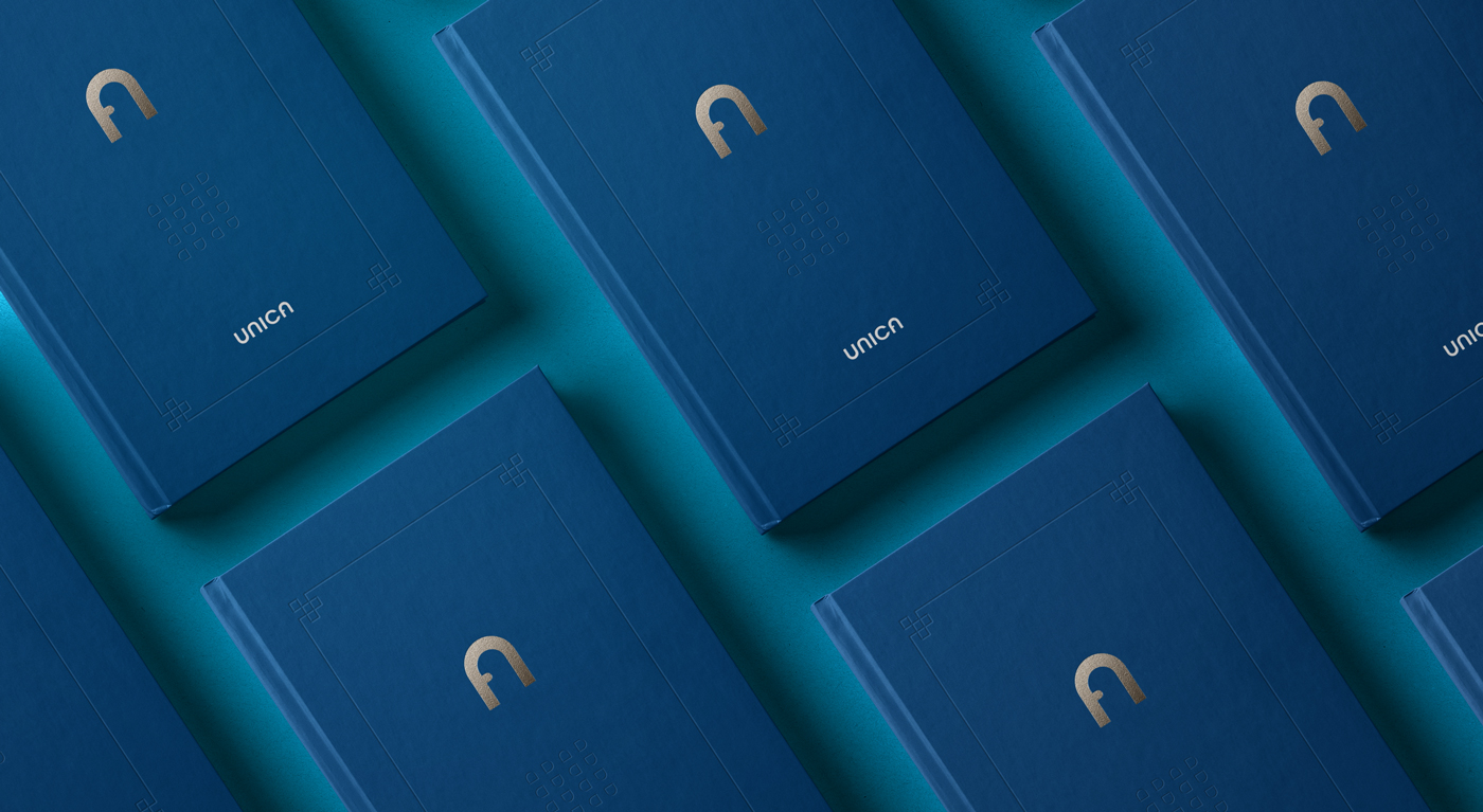
Based on the studies and diagnosis made, I developed a new visual identity with blue as the main color of the brand, for demonstrating all the solidity and reliability of the institution. Because it is a typographic brand, clean and simple, the letter “A” was the main inspiration for the construction of the symbol in order to synthesize and facilitate applications in the universe of the brand. Then the Single symbol is born, which is a door, representing the opening for a new learning, the evolution of knowledge.
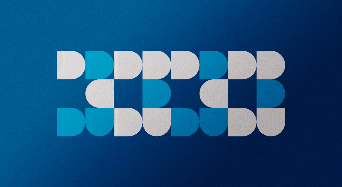
The Unica brand has dynamic elements, whose purpose is to support the materials of the grids. The icons were inspired by the shapes of the symbol, thus maintaining consistency in language and further reinforcing Unica’s identity.
With that, we were able to make the brand tangible, creating patterns and dynamic elements that strengthened the contact points.


CREDIT
- Agency/Creative: Samuel Santos Design
- Article Title: Visual Identity for Unica Education by Samuel Santos Design
- Organisation/Entity: Freelance, Published Commercial Design
- Project Type: Identity
- Agency/Creative Country: Brazil
- Market Region: South America
- Project Deliverables: Brand Creation, Brand Design, Brand Identity, Brand Naming, Brand Redesign, Brand Strategy, Branding, Graphic Design, Identity System, Rebranding, Research
- Industry: Education
- Keywords: brand, logo, brand, identity, rebranding, visual identity, education, university, corporate.


