


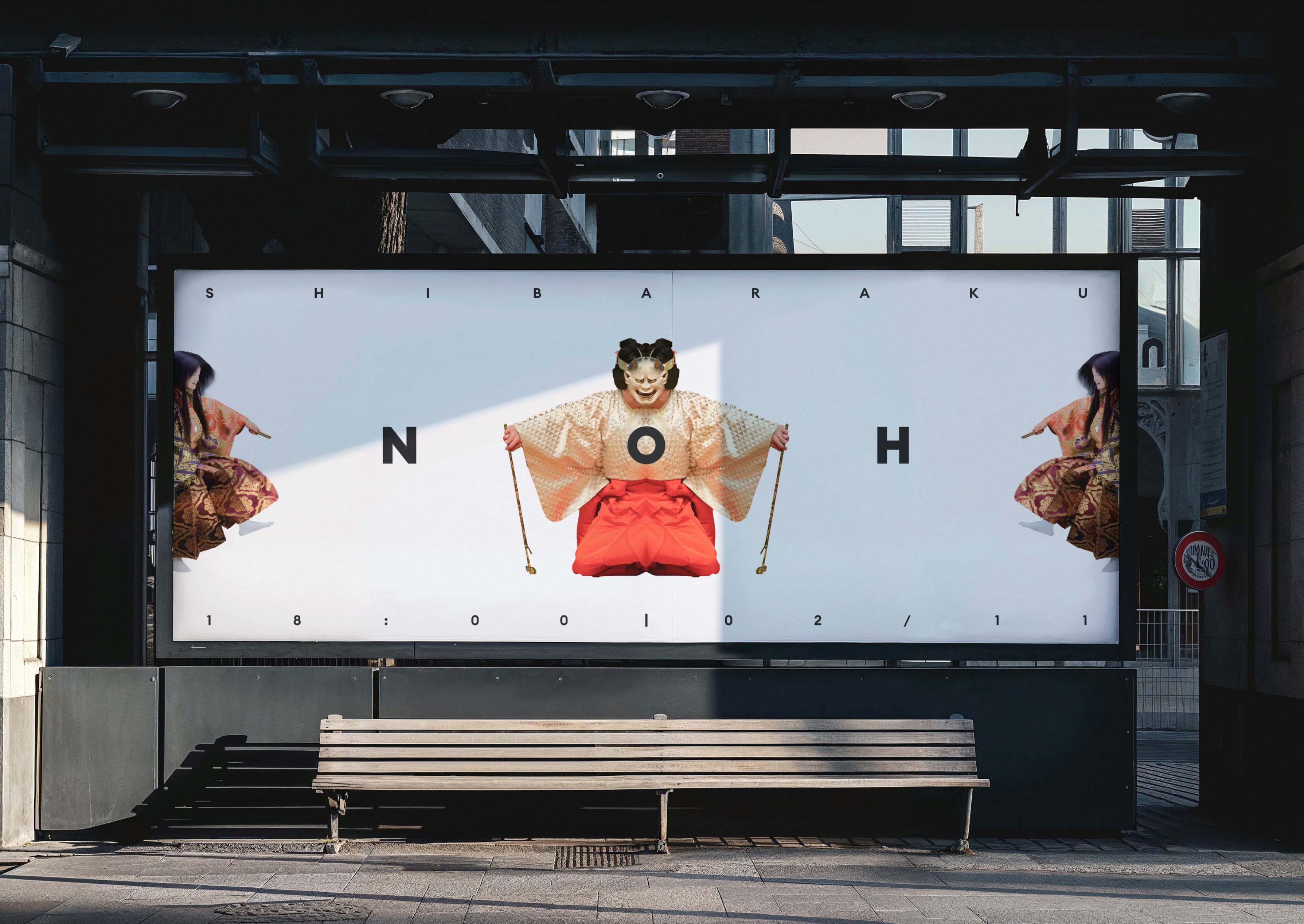
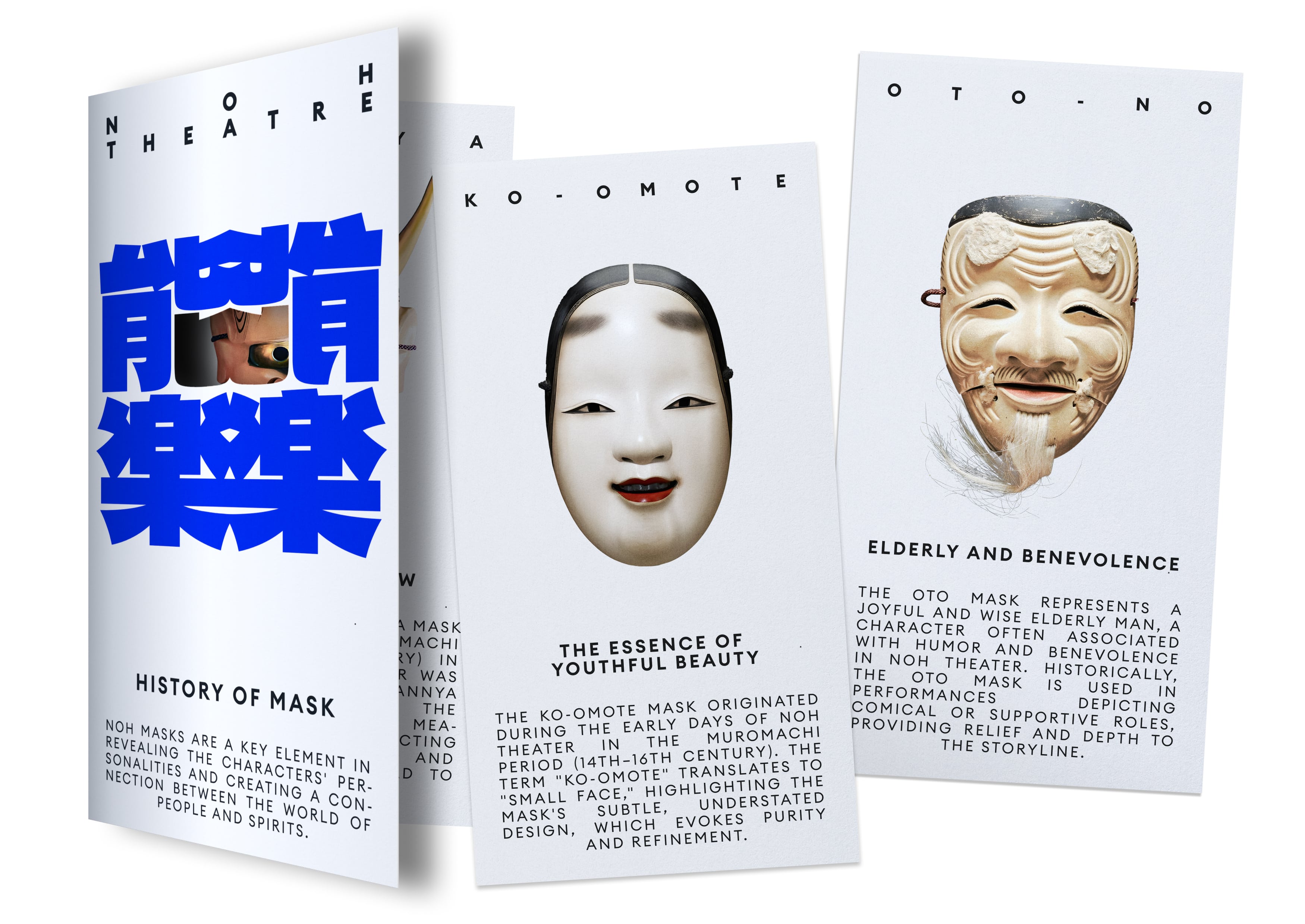
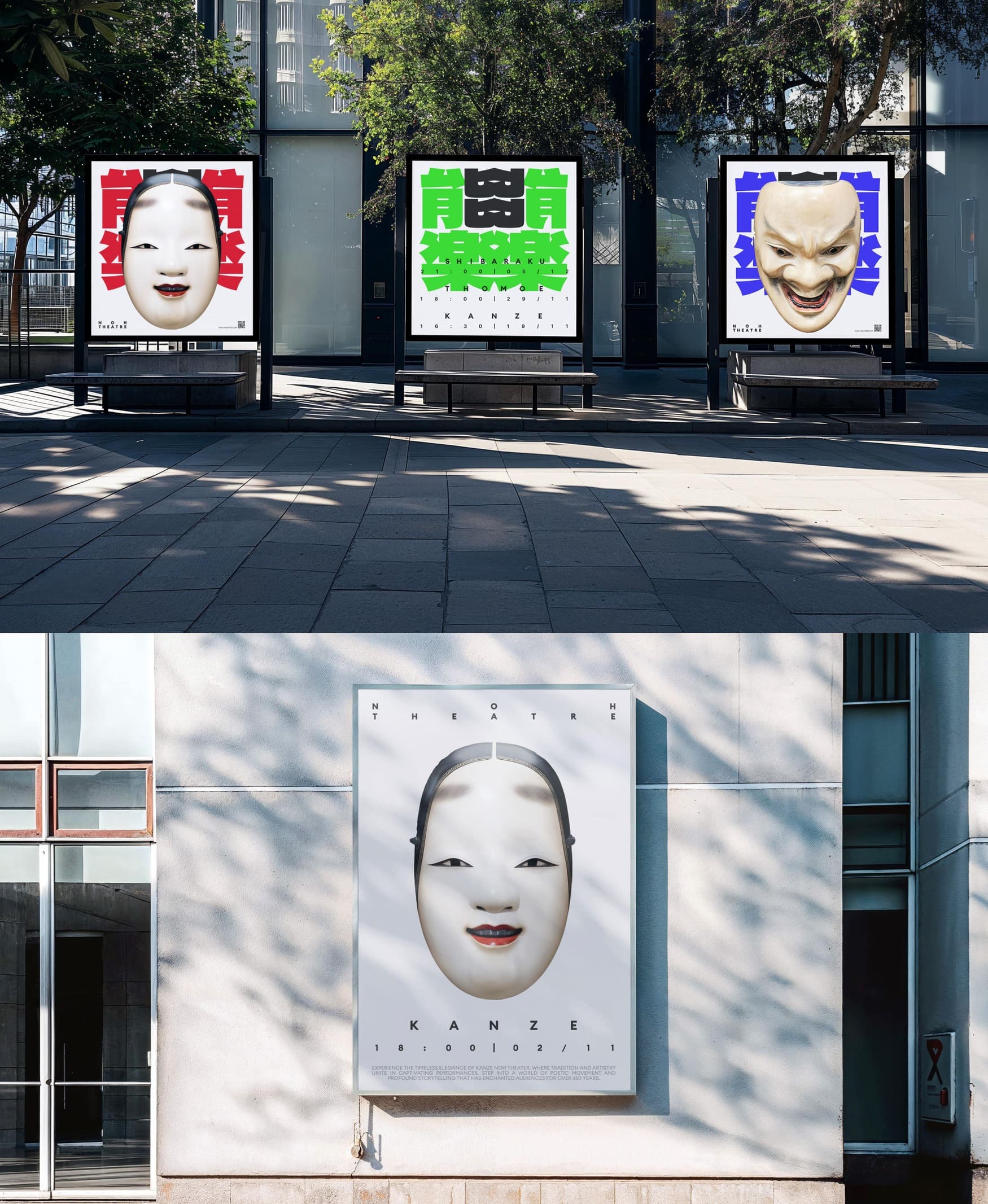
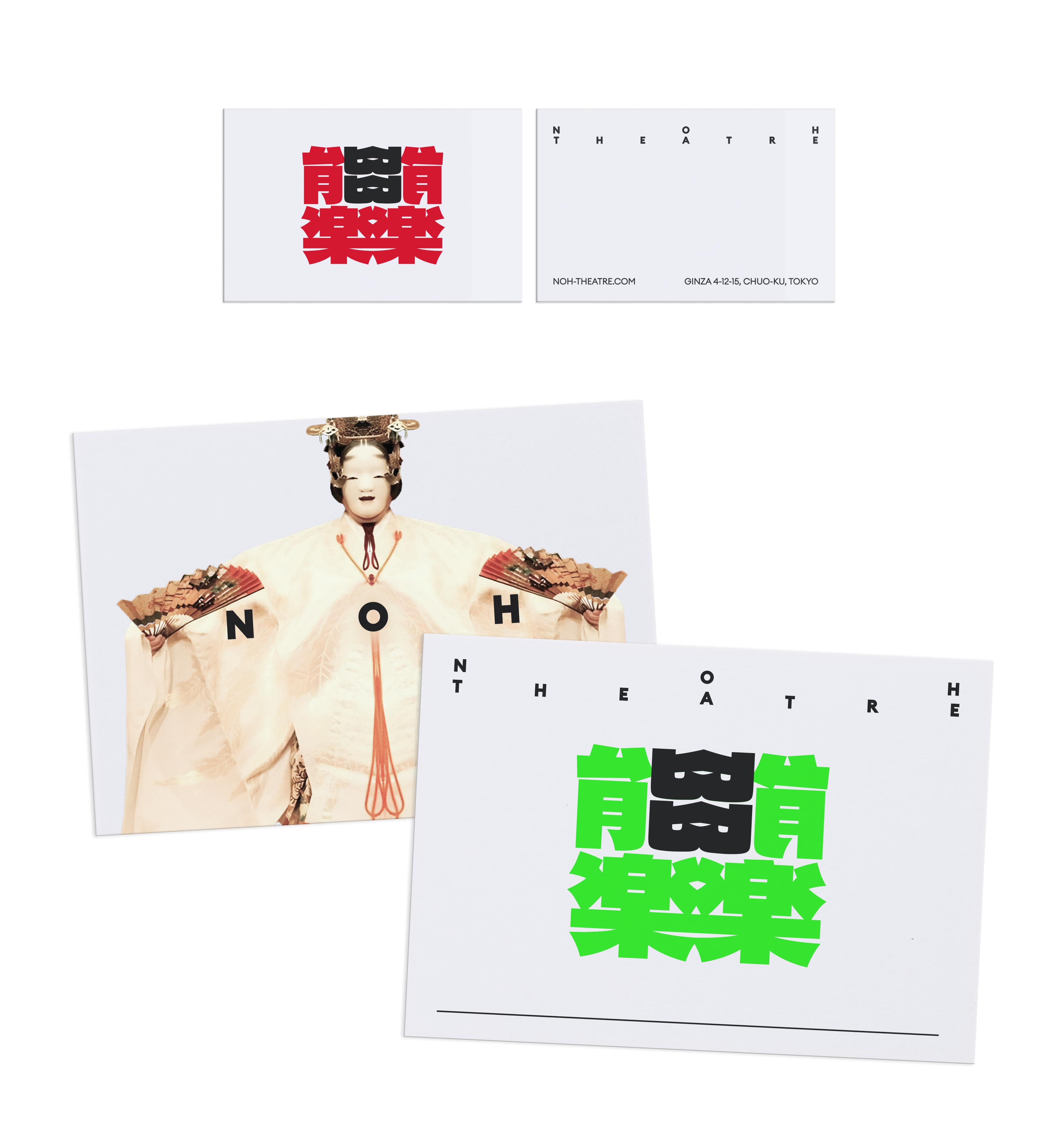
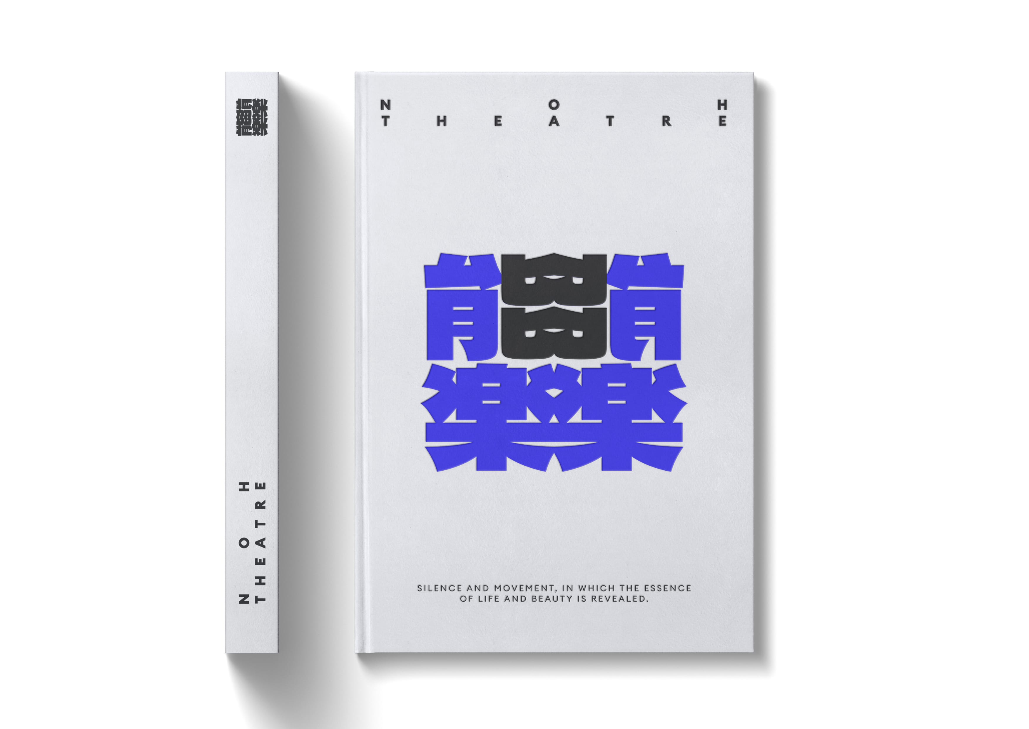
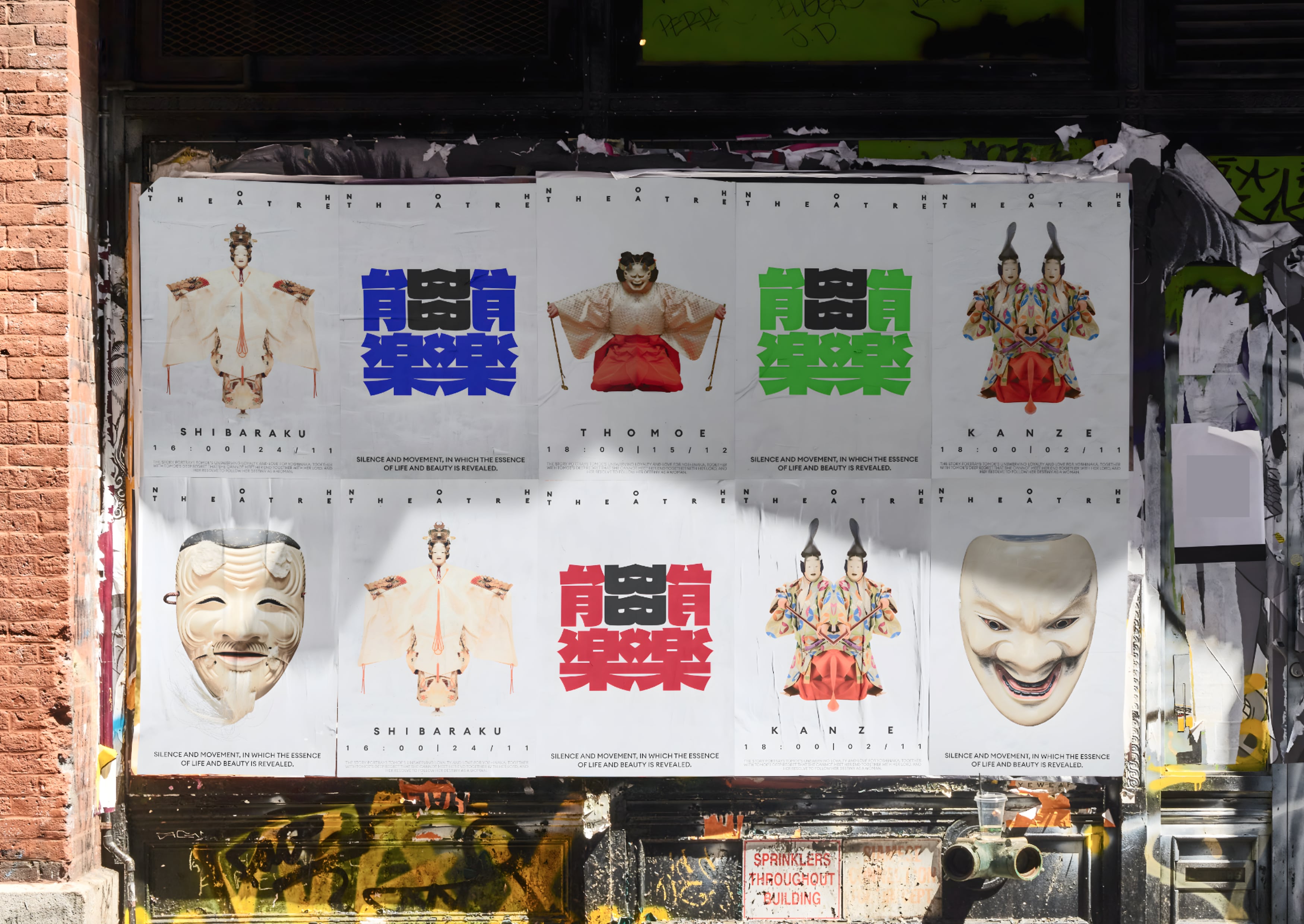
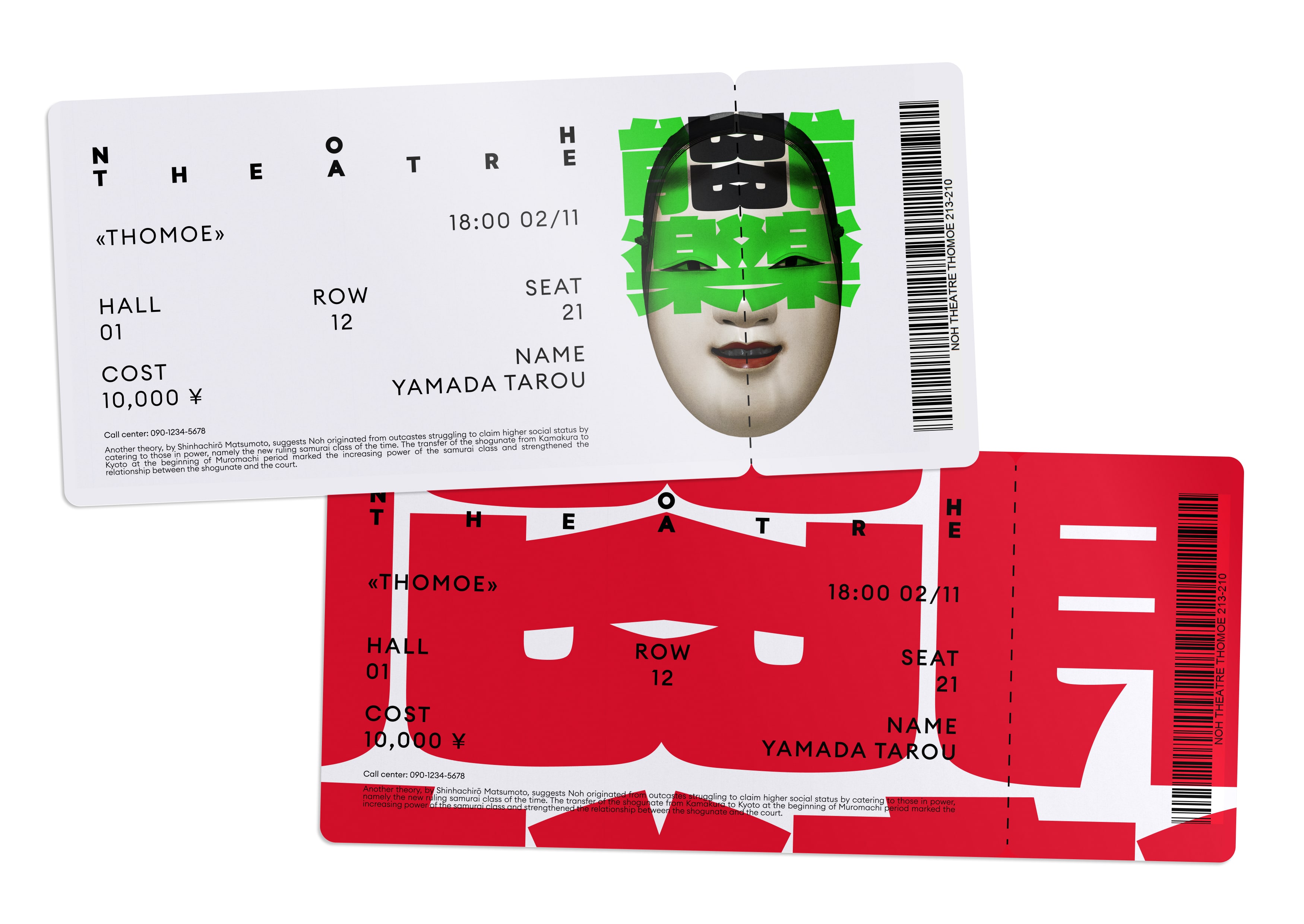
The visual identity for Noh theatre, developed as part of the HSE Art and Design School, is a harmonious combination of traditional elements of Japanese theatre and modern design solutions. The foundation of the composition and the logo is the principle of central symmetry, which reflects the key aspects of Noh theatre. Most of the masks used in the theatre, as well as the stage itself, are symmetrical about the central axis, emphasizing the balance and harmony inherent in this art form.
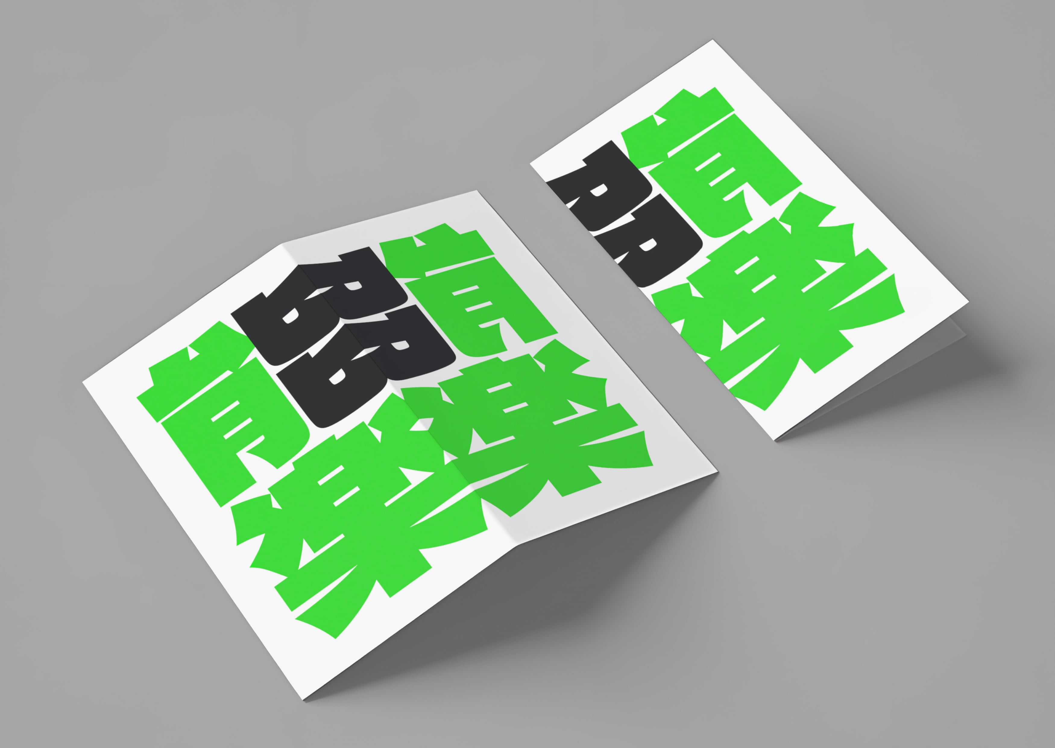
The logo was created by mirroring the Japanese characters for the word “Noh,” giving it a unique and contemporary look while maintaining a strong connection to tradition. This approach results in a central design that resembles two masks, a characteristic feature of Noh theatre.
The composition of the identity is also symmetrical about the central axis and incorporates rhythm, reflecting the musical accompaniment that is an integral part of Noh performances. The rhythm and movement expressed in the design echo the dance elements often present in the productions.
The color palette includes red, blue, and green, which are used to visually differentiate between various plays and to create a vibrant, memorable image for the theatre. These colors add dynamism and variety, making the identity more expressive and modern while still honoring traditional Japanese motifs.
Thus, the visual identity of Noh theatre combines the rigor, dynamism, and emotional depth characteristic of this art form with contemporary design approaches, resulting in a unique and recognizable image that captures the essence and spirit of Noh theatre.

CREDIT
- Agency/Creative: Aleksey Prokhorov
- Article Title: Visual identity for the Noh Theatre by Student Aleksey Prokhorov
- Organisation/Entity: Student
- Project Type: Identity
- Project Status: Non Published
- Agency/Creative Country: Russia
- Agency/Creative City: HSE ART AND DESIGN SCHOOL
- Market Region: Asia
- Project Deliverables: 2D Design
- Industry: Entertainment
- Keywords: theatre, identity
-
Credits:
Curator: Pavel Borisovsky


