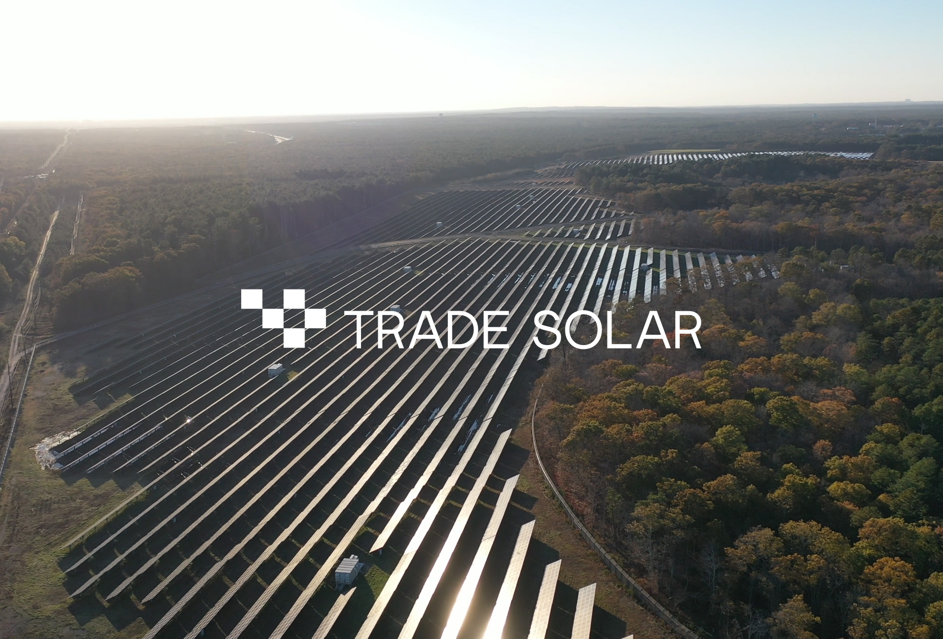
Due to centuries of unbridled and unconscious use of natural resources, the planet alerts us with the urgent need for the use of renewable energy. Thinking about this new world and new demands, Trade Solar arises – a company specialized in the installation and maintenance of photovoltaic panels.
The brand sought a traditional target audience with high financial power and needed a didactic, elegant and self expressive visual identity. This was the main challenge in creating the identity.
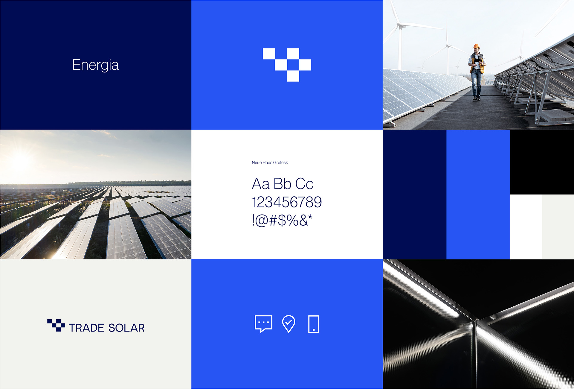
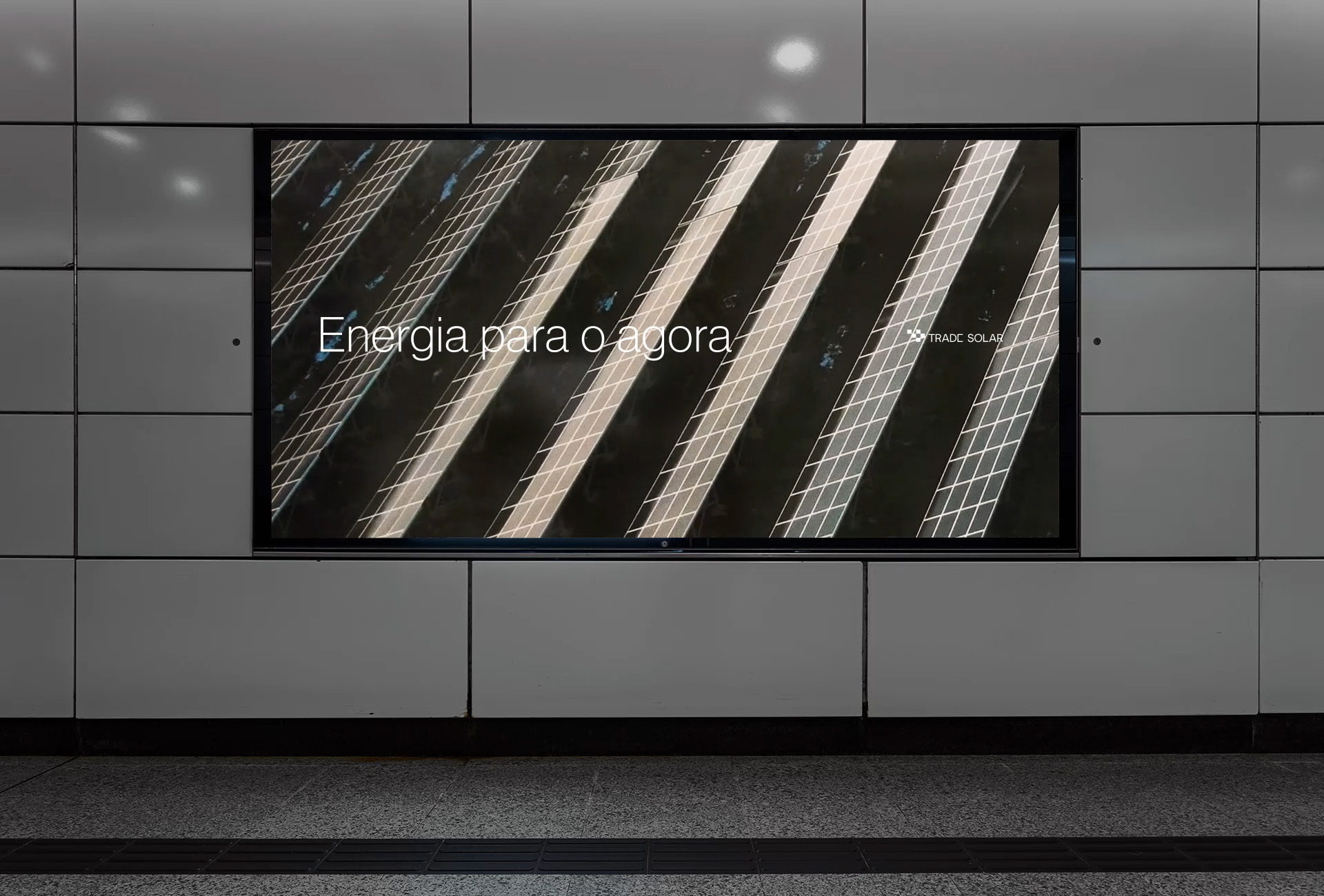
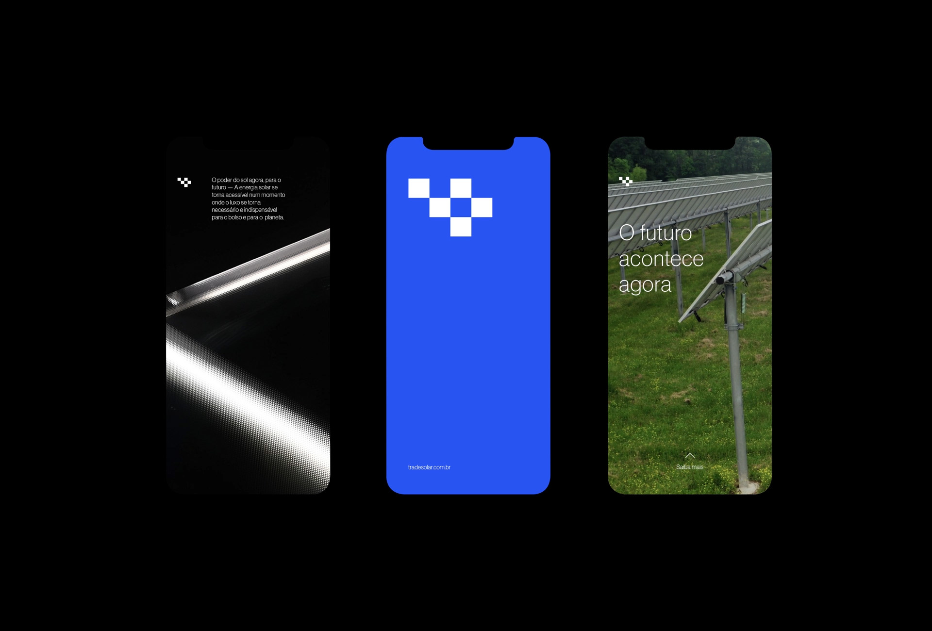
The symbol makes reference to the solar panel mesh, while the typography chosen for the logo is an elegant sans serif, creating a minimalist and functional language.
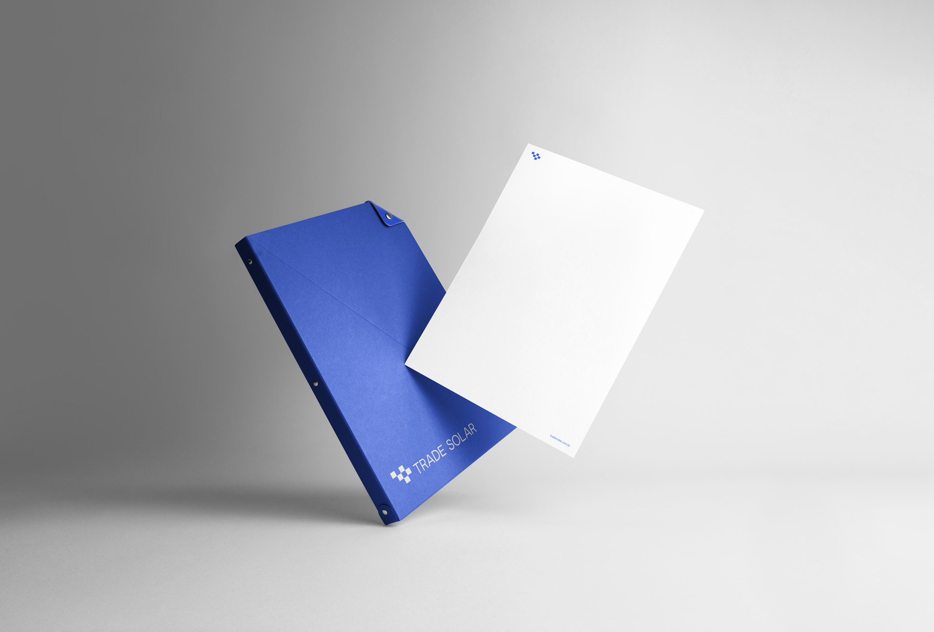
The universe also needed to be minimalist and elegant, so in some pieces the color palette together with the typography are enough to generate the necessary recognition. In the printed materials, white dominates the palette, also avoiding the use of inks, showing consistency between what the brand believes and what it puts into practice.
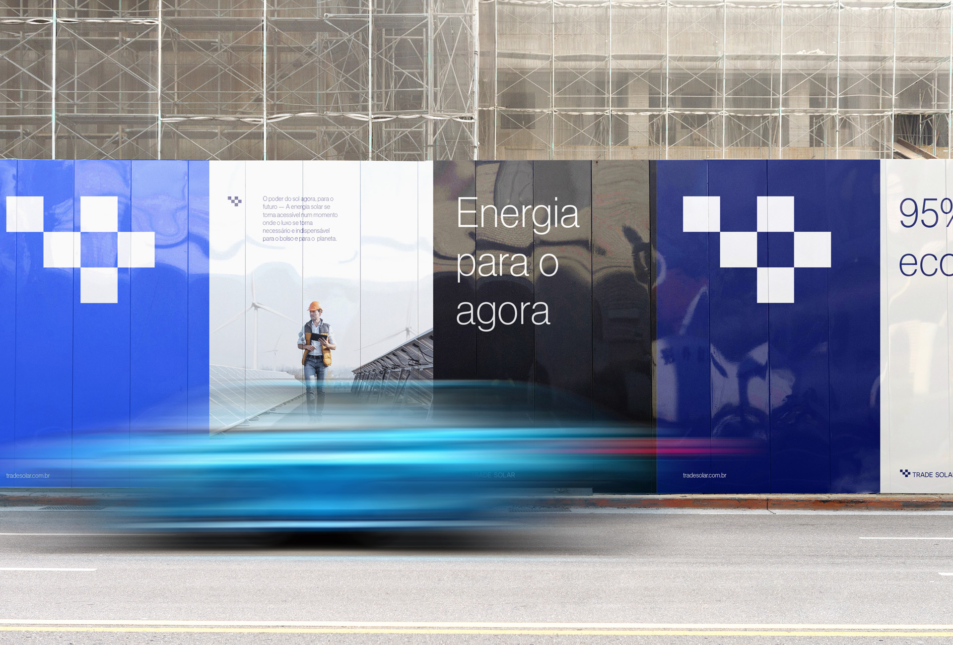
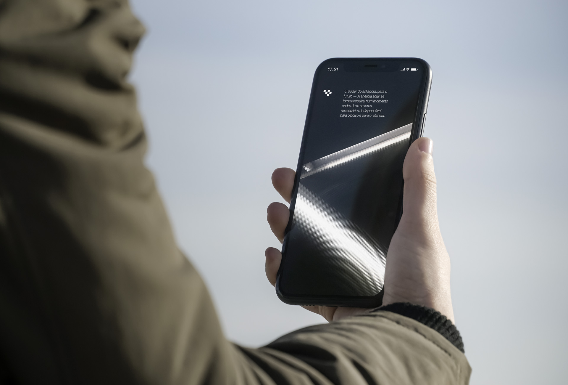
In the digital universe the blue predominates, the ease of working with blue tones helps the identity come to life.
After doing a survey, it became evident that most brands in the segment appropriate the sun to derive icons, palettes, and even the brand. Considering having more highlight and differentiation from competitors, the best option was to choose the sky as reference for the color palette, which is composed of two shades of blue, while shades of white, derived from clouds, finish the palette.


CREDIT
- Agency/Creative: Yago Ferreira Design
- Article Title: Visual Identity for Solar Energy Company by Yago Ferreira Design
- Organisation/Entity: Freelance
- Project Type: Graphic
- Project Status: Published
- Agency/Creative Country: Brazil
- Agency/Creative City: Nova Iguaçu
- Market Region: South America
- Project Deliverables: Brand Design
- Industry: Energy
- Keywords: Solar Energy, Visual Identy, Logo, blue palette
-
Credits:
Graphic Designer: Yago Ferreira de Lima


