


The Japanese word Shokunin is defined by both Japanese and Japanese-English dictionaries as ‘craftsman’, but such a literal description does not fully express the deeper meaning. ‘Shokunin’ means not only to have technical skills but also implies an attitude and social consciousness. It stands for continuous improvement, highest quality standards to strive for mastery on all levels.
This philosophy was the starting point for the visual identity of this recruitment agency, together with a few characteristics about Japan and Japanese culture:
Simplicity: Japanese style emphasises the principle of “less is more. The overall feel of Japanese design is clean, simple and structured. It all comes down to the essentials, the elements that are really needed in the design.
Subtlety: Japanese design is all about subtle elegance. The style is striking for all the right reasons – and is never about excess. Even though the concept is chaotic, there is an understated but striking aspect within the chaos.
Calm: Everywhere you go in Japan, there is a sense of calm, peace and quiet. Even on the busy streets of Tokyo, locals respect each other’s personal space. This calmness is also very evident in Japanese design and art.
The use of natural elements such as wood, bamboo and stone creates a relaxed atmosphere.
Bright colours: Japanese style is injected with life through vibrant colours. A quick search for colors for modern Japanese graphic design leads to a full spectrum of palettes.
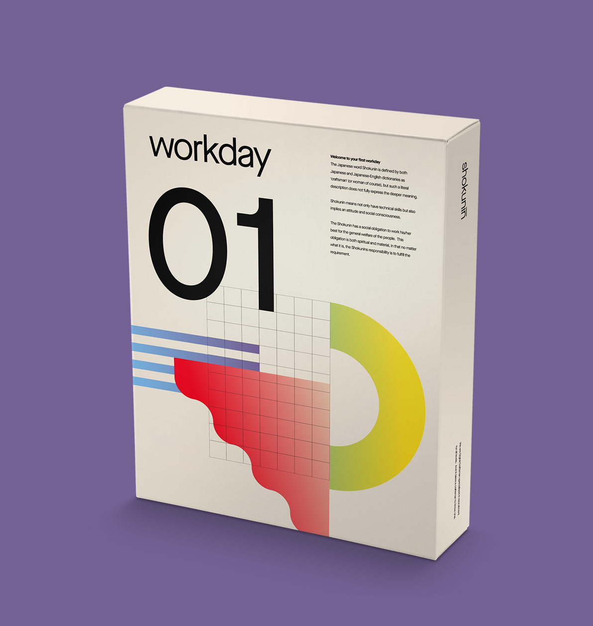
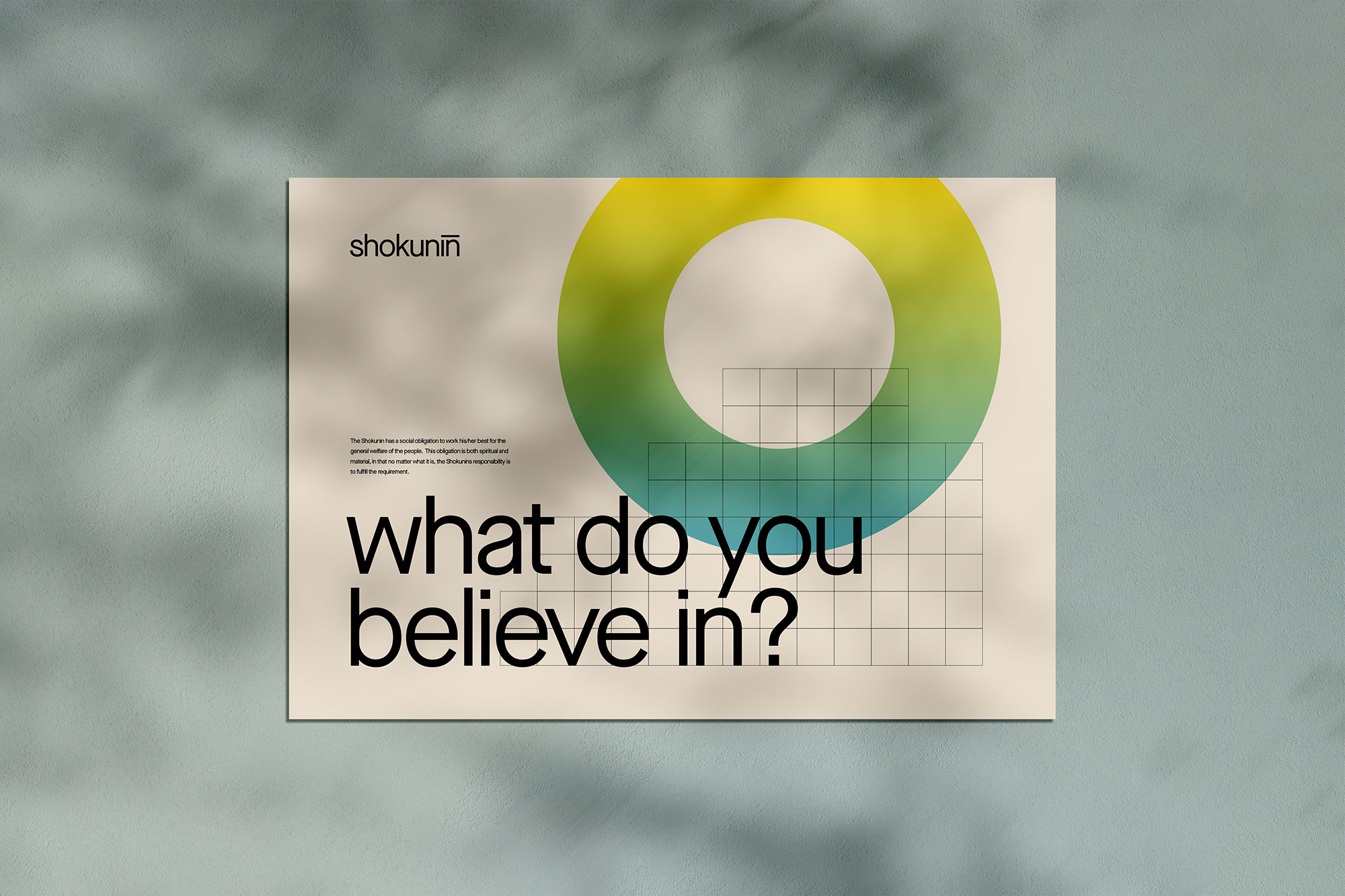
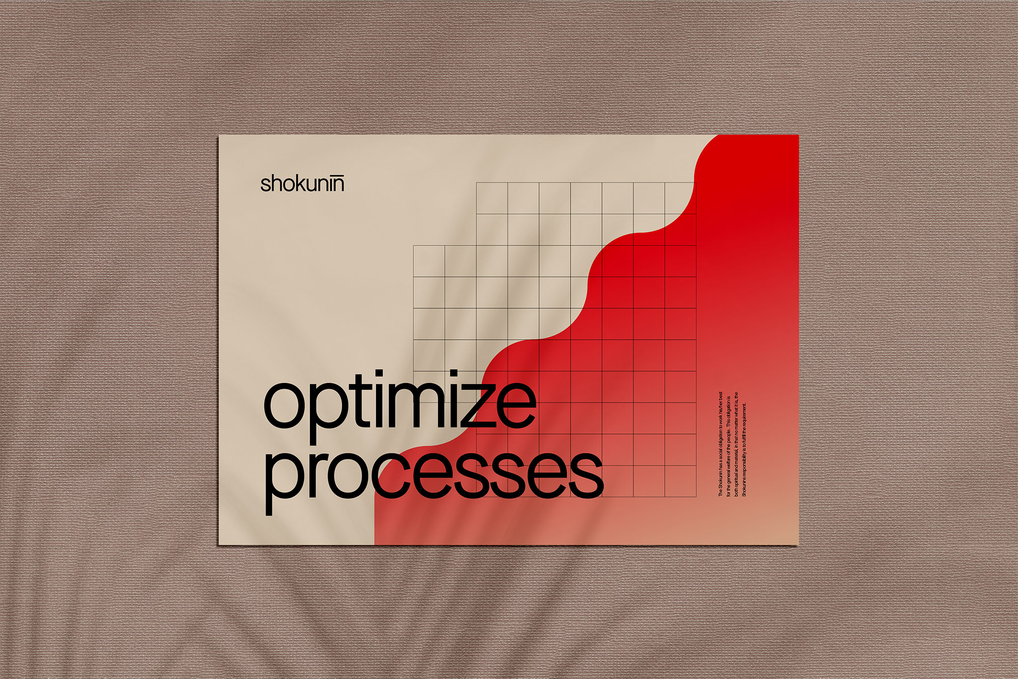
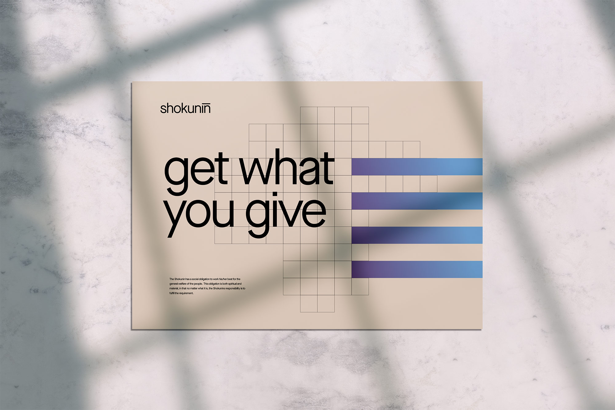
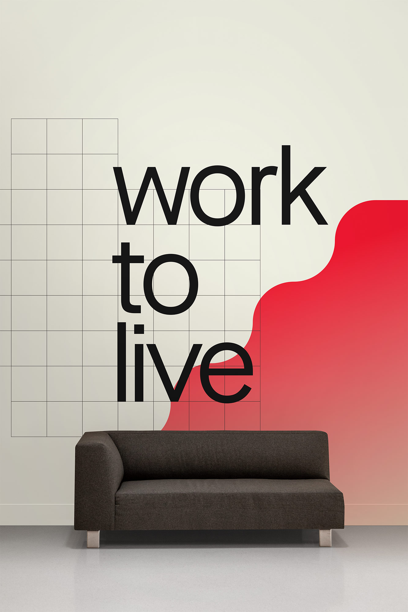
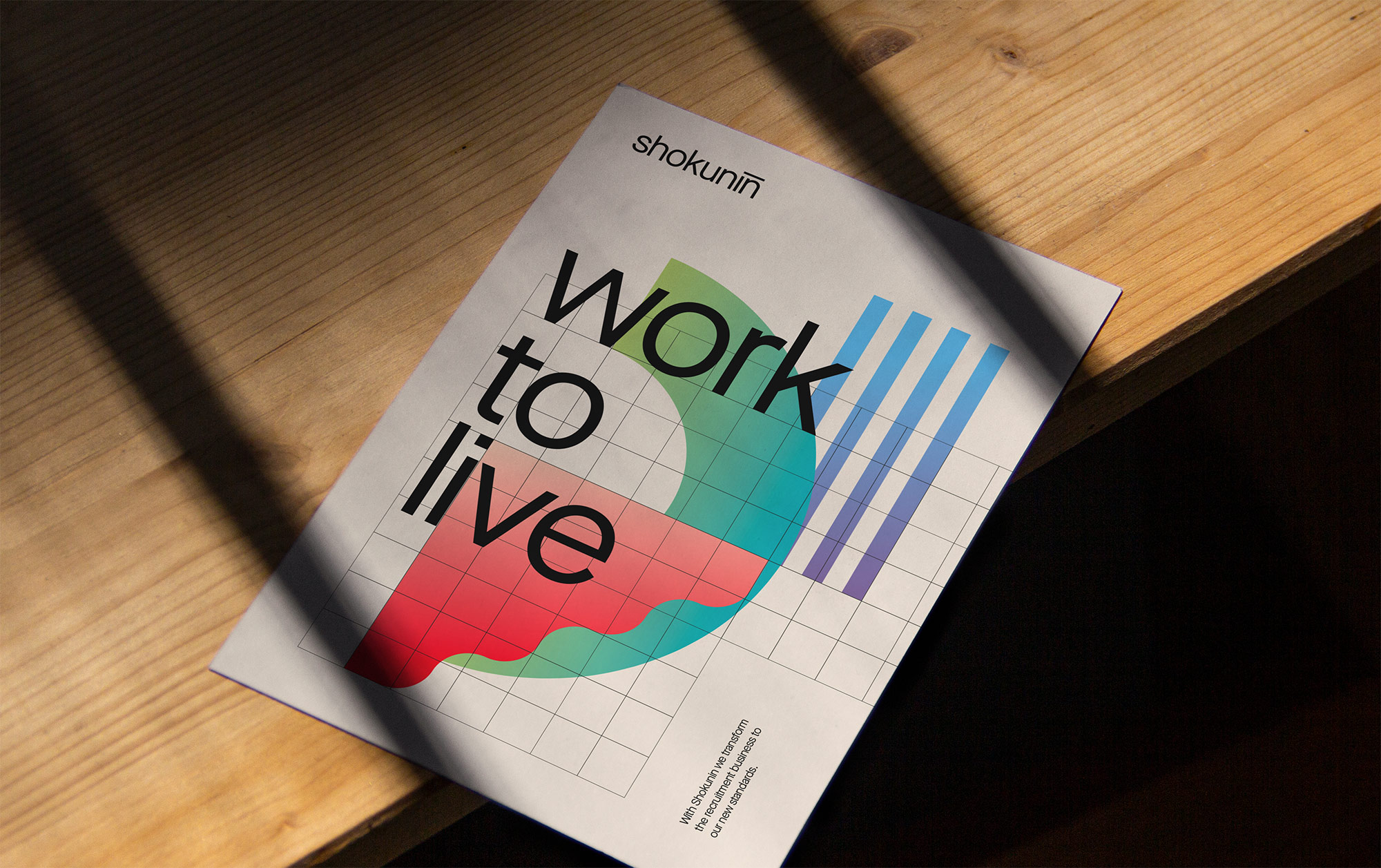
With these characteristics is mind, we translated the three core values of the brand into a set of abstract illustrations, that form the design system of the identity: Purpose – Finding a meaningful goal both personally and socially. Process – Clear and transparent steps for client and candidate and Price – An honest price. Balanced by value for money
The illustrations can be combined, but also be used separately, while ensuring a recognizable look and feel on all touchpoints. The illustrations are always placed on a visible grid, visualizing the companies’ structured processes.
The result is a striking and distinct visual identity that sets Shokunin Recruitment apart from the competition.

CREDIT
- Agency/Creative: Lowres Creative Studio
- Article Title: Visual Identity for Shokunin Recruitment
- Organisation/Entity: Agency, Published Commercial Design
- Project Type: Identity
- Agency/Creative Country: Netherlands
- Market Region: Europe
- Project Deliverables: Brand Creation, Brand Identity, Brand Strategy, Branding, Identity System
- Industry: Technology
- Keywords: Recruitment, Japanese graphic design, design system, graphic design


