


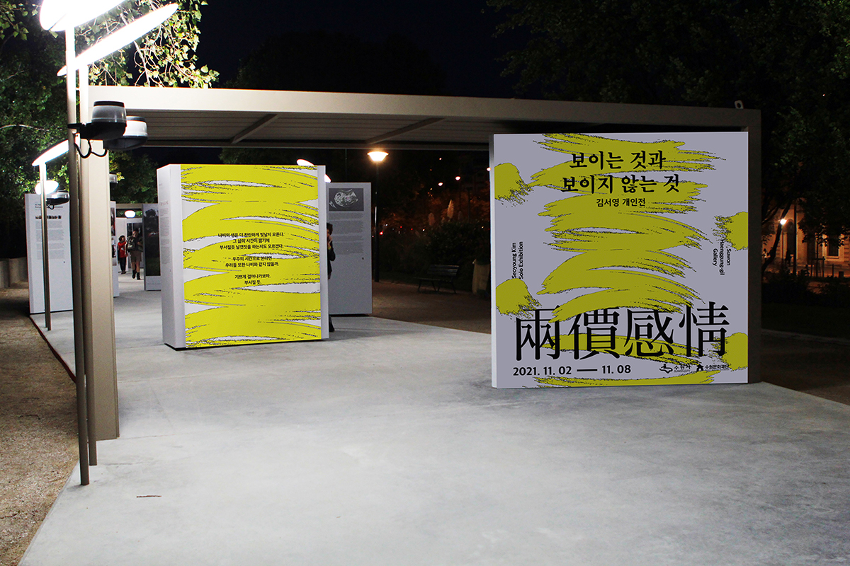
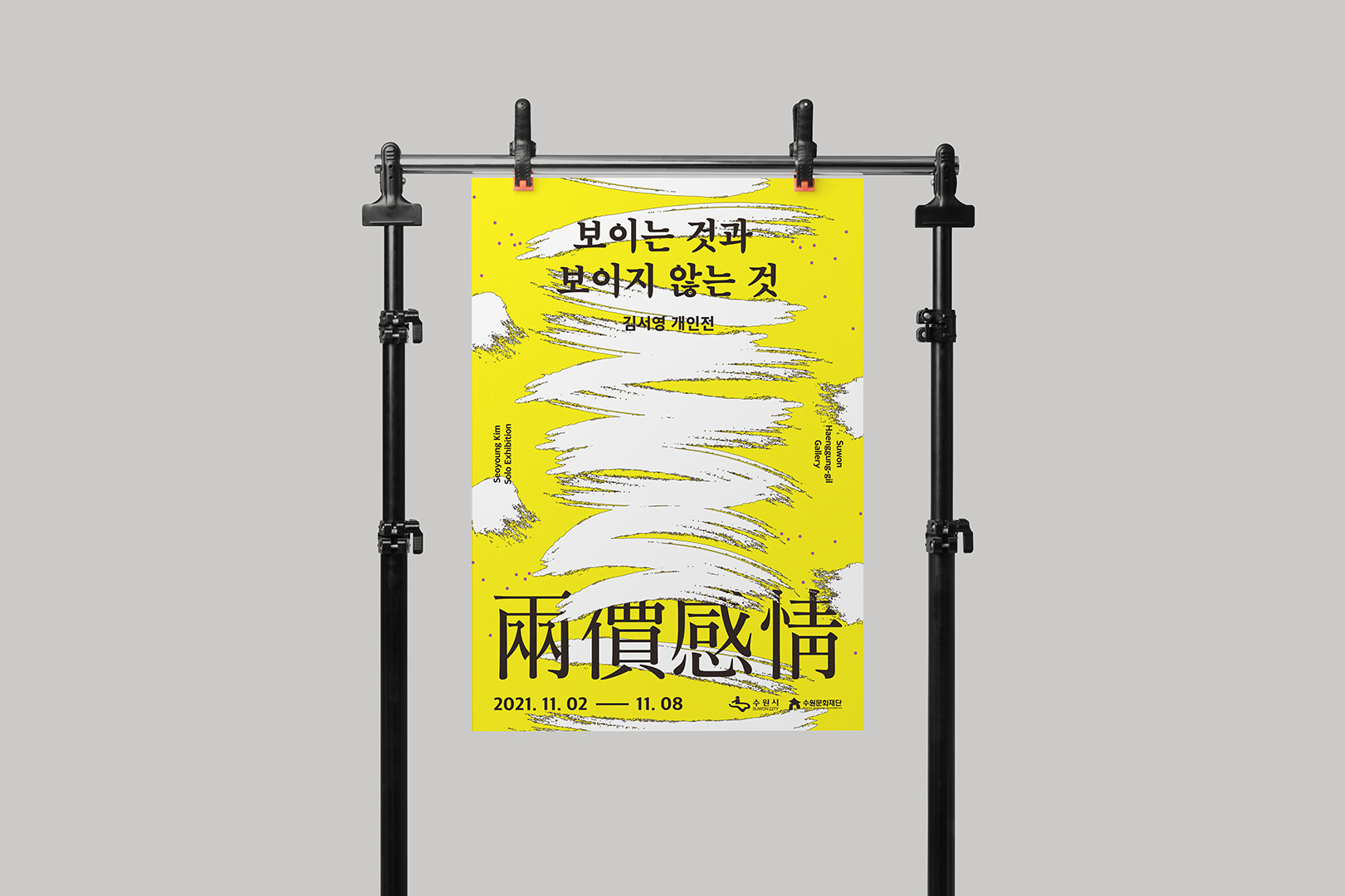
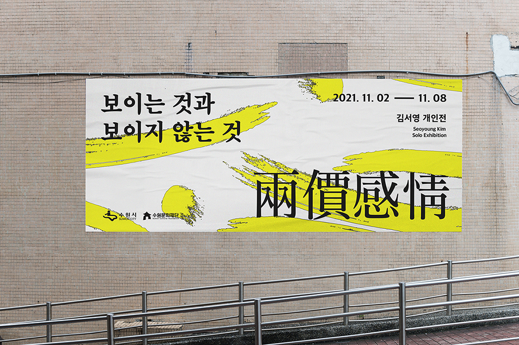
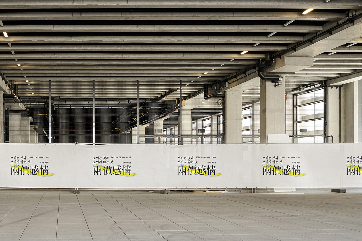
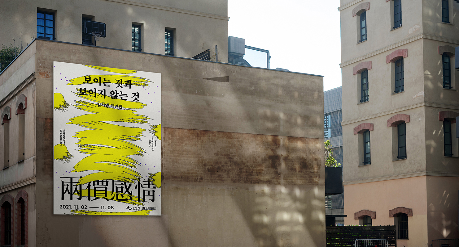
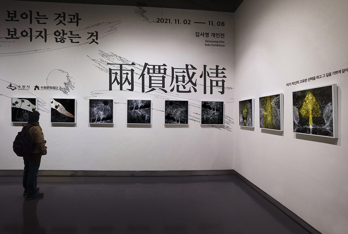
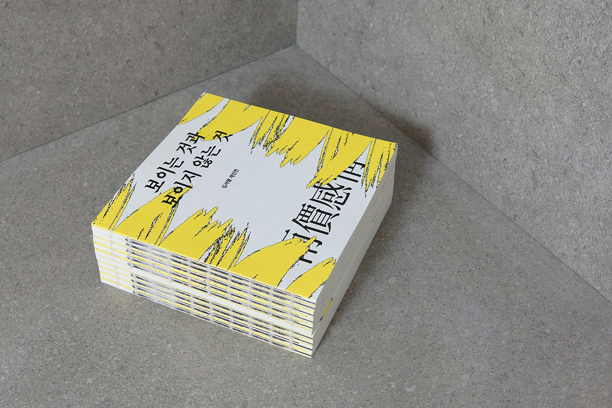
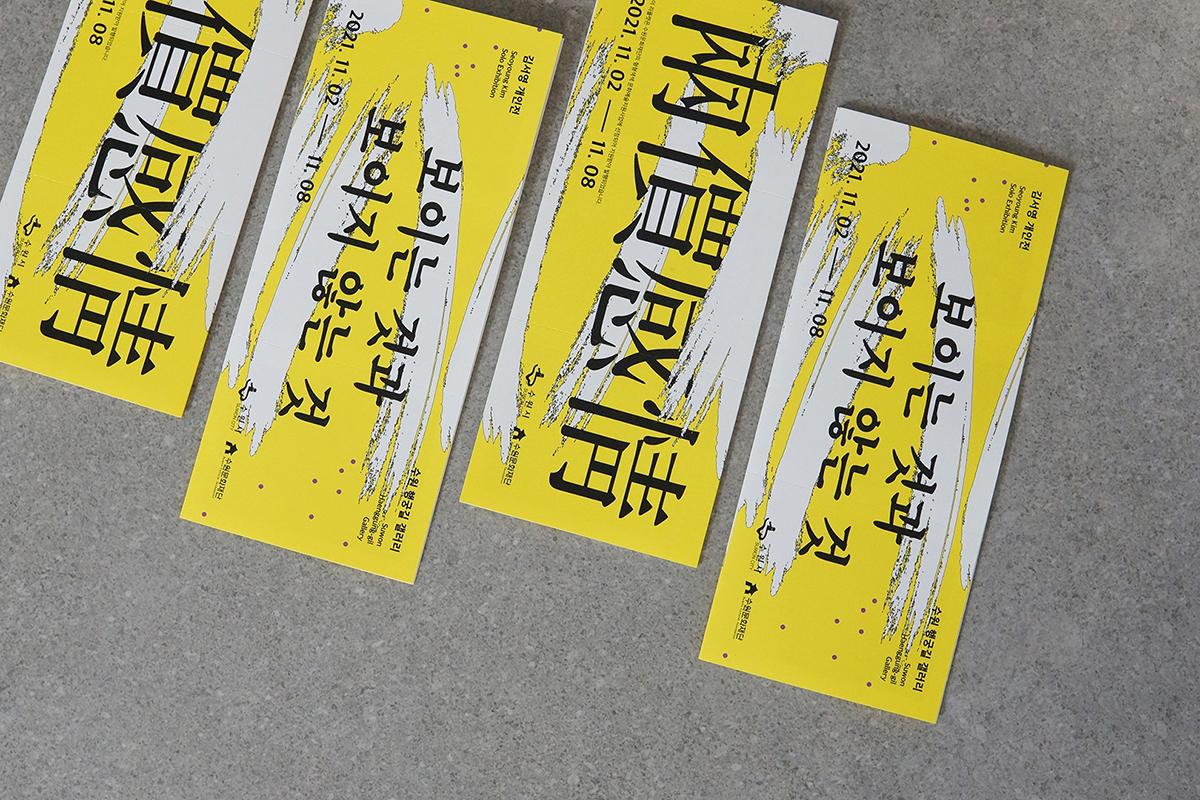
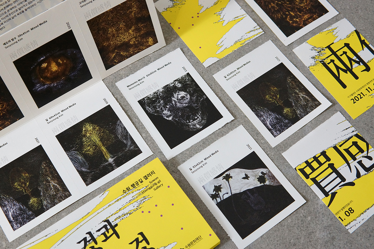
Seen and Unseen is the first solo exhibition of Korean Artist Seoyoung Kim. We conducted interviews to capture the visual identity of the exhibition and tried to understand her work in detail through a lot of conversation time. The most important keywords in the exhibition were light, two emotions, dots and lines, and I tried to solve these with visibility. Therefore, the derived visuals were applied to various media such as posters, books, leaflets, and web & mobile. Below is the preface to the exhibition.
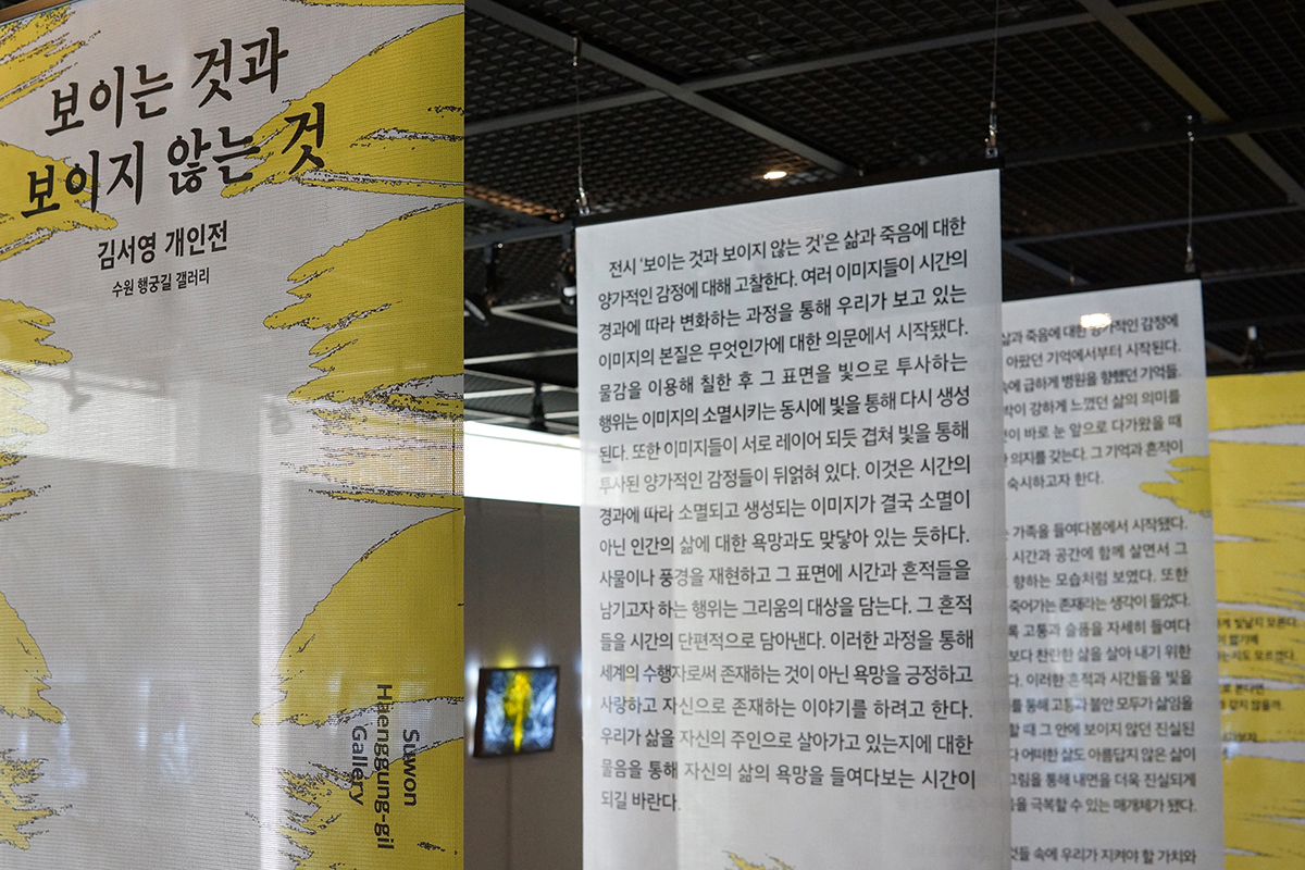
The exhibition “Seen and Unseen” examines the ambivalent feelings for life and death. It began with the question of what the nature of the image we are seeing through the process of changing images over time. The act of painting using paint and projecting the surface into the light is generated again through the light while extinguishing the image. In addition, the images overlap as if they were layered
with each other, intertwining ambivalent emotions projected through light. This seems to be in contact with the desire for human life, not the image that disappears and is created over time. The act of recreating an object or landscape and leaving time and traces on its surface contains the object of longing. The traces are captured in pieces of time. Through this process, we try to affirm, love and tell stories that exist as ourselves, not as a practitioner of the world. I hope it will be a time to look into the desires of our lives through the question of whether we are living our lives as our own owners.
CREDIT
- Agency/Creative: Long & Short
- Article Title: Visual Identity for Seen and Unseen Exhibition Design
- Organisation/Entity: Agency
- Project Type: Graphic
- Project Status: Published
- Agency/Creative Country: South Korea
- Agency/Creative City: Soeul
- Market Region: Asia
- Project Deliverables: Editorial Design, Exhibition Design
- Industry: Non-Profit
- Keywords: Emotion, Light, Dot&Line
-
Credits:
Creative Director: Joohyung Yun
Designer: Sohyeeon Kim


