Description
The Percepções Paralelas project aims to enable a reflection on the relativity of human vision and on our perceptive capacity, sometimes forgotten, through other senses and our imagination. Through a photographic experiment carried out by both visually impaired and seer photographers intentionally deprived of sight, we sought to exercise the perceptive capacity of each one, sharpening the sensory system and imagination.
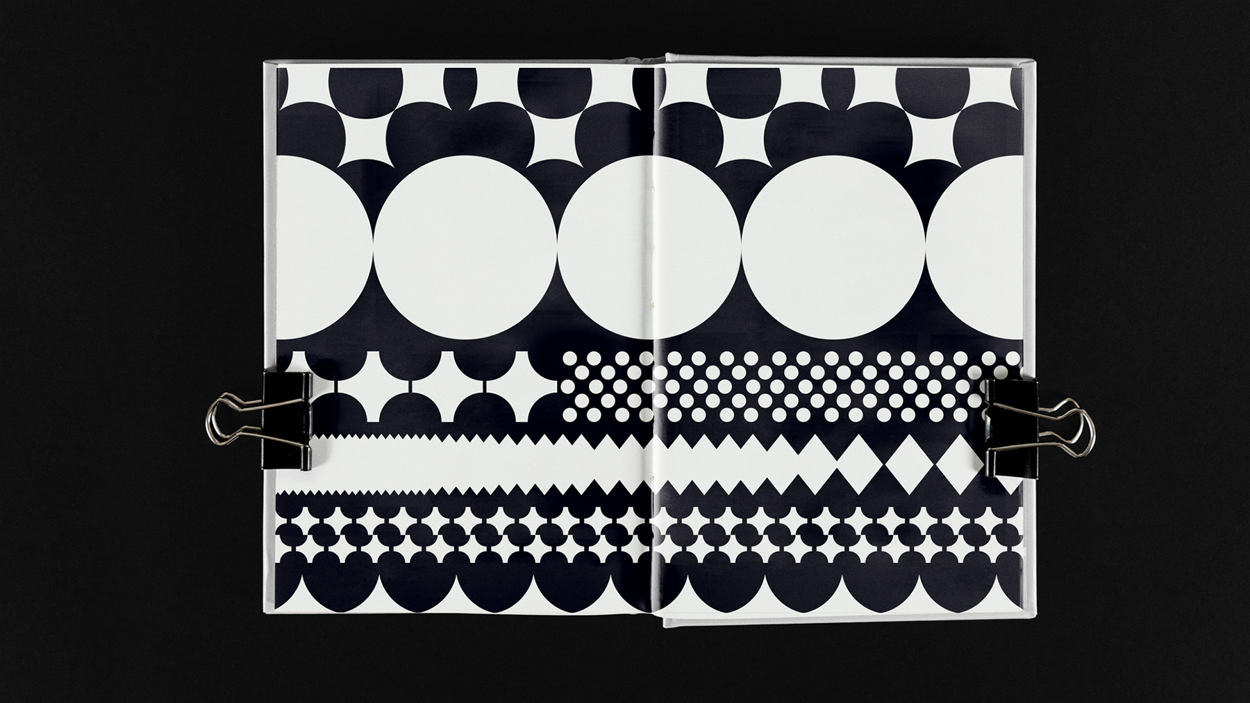
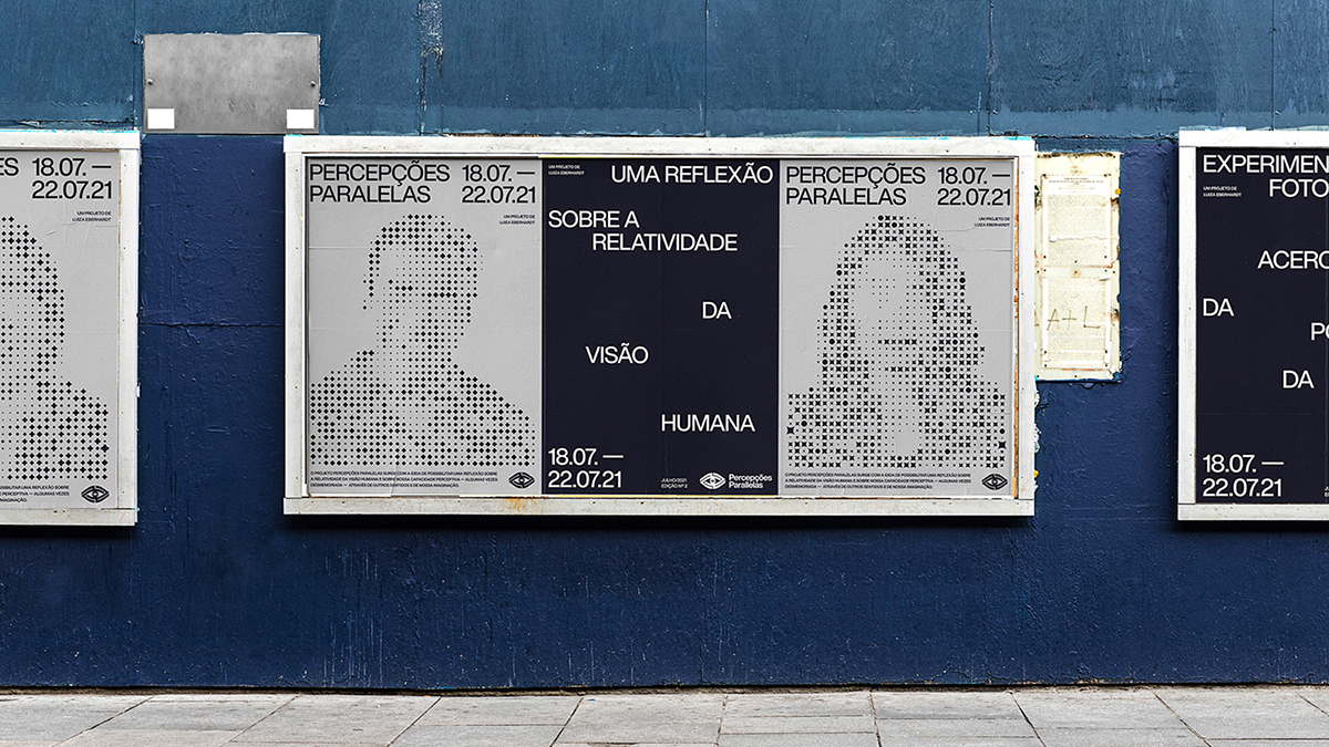
The graphic elements were inspired by research on visual phenomena and mental processing, such as:
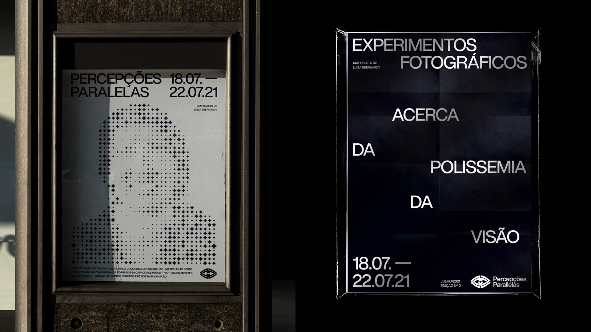
– Phosphene is an optical phenomenon characterized by the perception of spots of light when we close or rub our eyes. These patches of light are formed by cells inside the eyes that emit biophotons.
– Perception is created by mental processing of external stimuli that we receive every second
– The cortex is responsible for mapping the world we see inside our brain
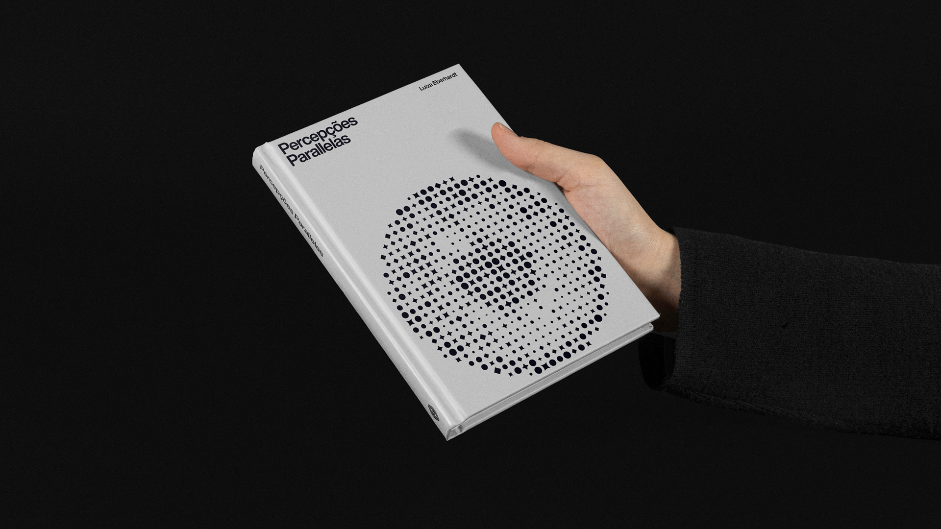
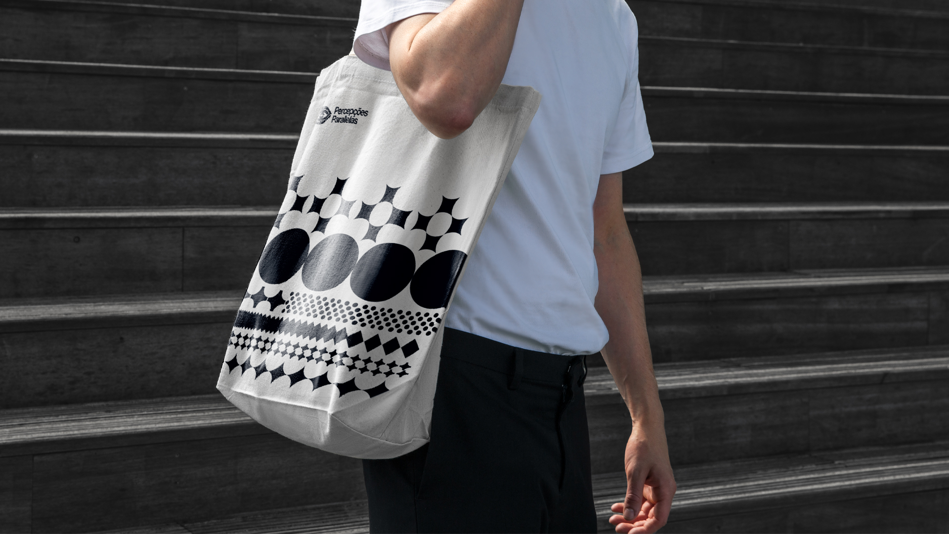
Based on the research, we selected photos of the project participants and created a representation of their projection in small particles of light. Each person was designed with a different symbol because each human being has a unique perception that is created within themselves.
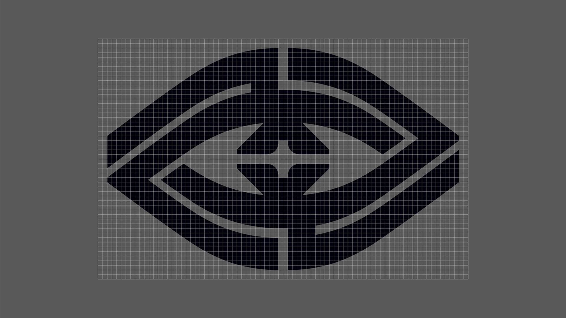
The logo was created based on the idea of the labyrinth, which simultaneously embodies confusion and clarity, chaos and order. The labyrinth represents the path that needs to be taken to find the solution, the light, in the face of the challenge that the project offers its participants.
In addition to the visual identity of the project, a book was also created documenting the experiment.
Solution
The project needed a strong visual identity that reflected its complex and abstract idea. With the creation of the brand, it was possible to arouse attention and generate interest in the project..
Cultural Context
The project and its visual identity seek to reflect on human vision and perceptions, reinforcing the inclusion of the visually impaired in the social and photographic world. It also directly addresses issues relevant to society, such as the social inclusion of minorities, the concept of blindness and prejudice towards the visually impaired, in addition to relating these issues to the photographic medium, presenting and valuing photographers who are visually impaired.
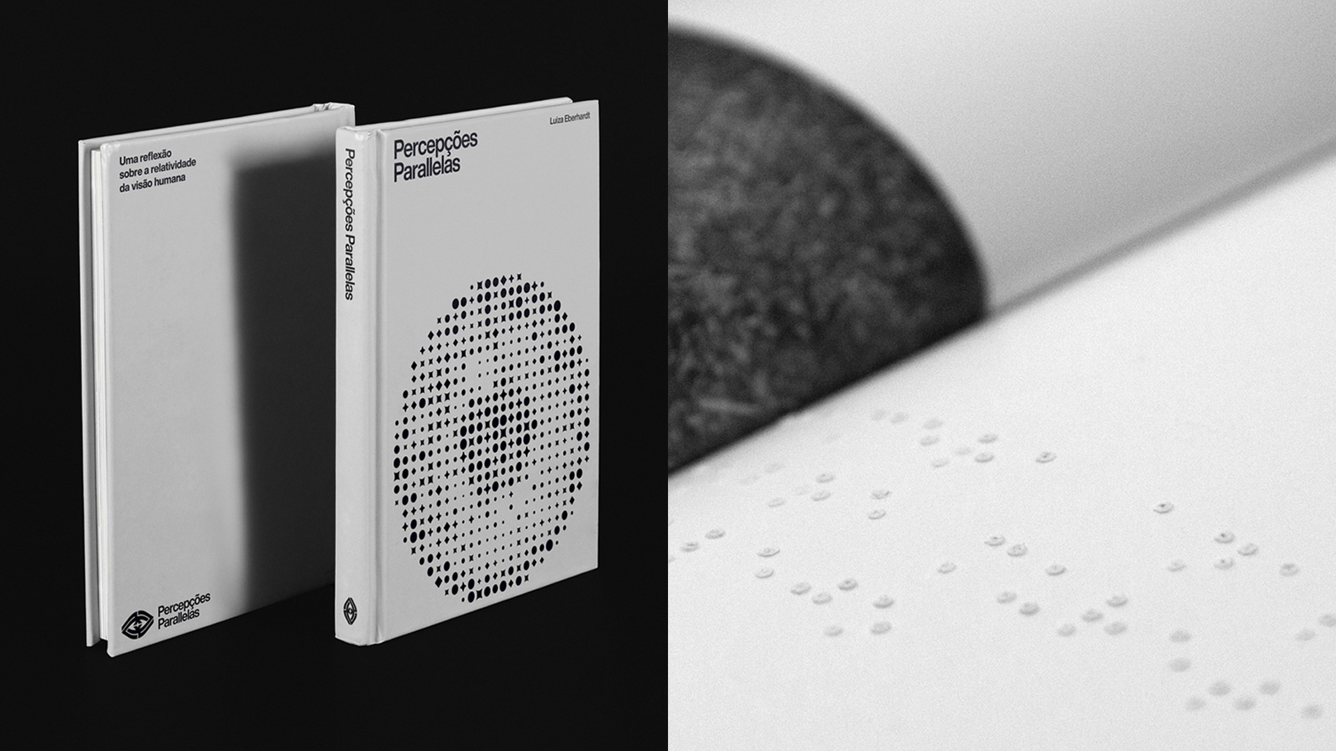
The book was designed so that both sighted and blind people could enjoy it. For this, a brief description in Braille of each photograph was printed.
CREDIT
- Agency/Creative: Bruno Moreni
- Article Title: Visual Identity for Percepções Paralelas Project
- Organisation/Entity: Freelance
- Project Type: Identity
- Project Status: Published
- Agency/Creative Country: Spain
- Agency/Creative City: Barcelona
- Market Region: Europe
- Project Deliverables: Animation, Art Direction, Brand Design, Brand Identity, Editorial Design, GIF Animation, Poster Design, Research
- Industry: Non-Profit
- Keywords: blind, perception, light, maze, labyrinth, eye, sight, photography, book, braille, design,
-
Credits:
Project Idea and Photography: Luiza Eberhardt


