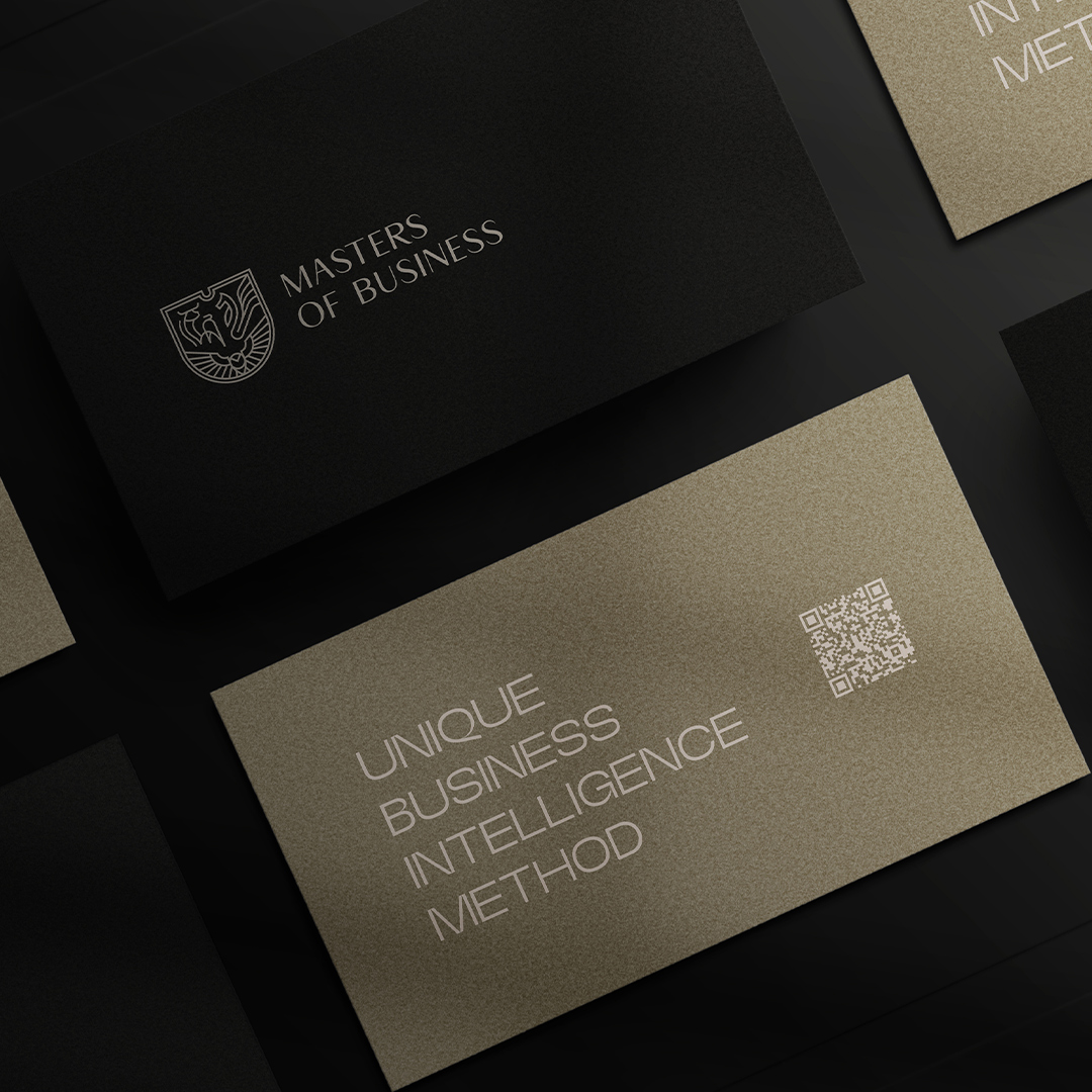
Briefly introducing the brand, Masters of Business is a company offering high-ticket courses for executives, 100% online and immediately applicable. The central challenge of this project was to recreate its visual system, focusing on the reconstruction of its coat of arms into a more contemporary language, which included three symbols: owl, bull and dragon.
Despite seeking a feeling of historical tradition, the old logo did not correctly convey all the brand’s values. Its symbols lacked authority and its shapes and fonts were aged, in addition to its layout being difficult to apply.
Business , Knowledge, Elite , Tradition, Contemporary
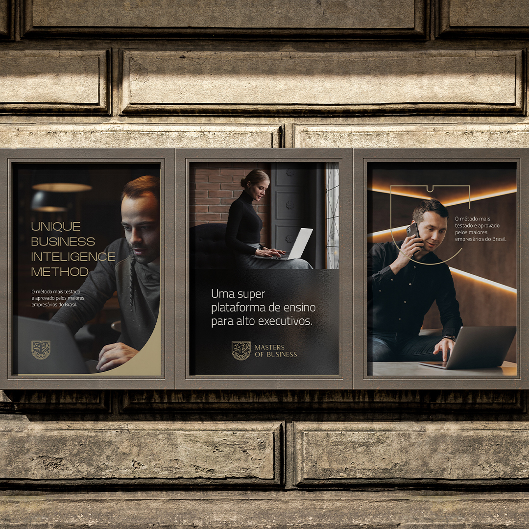
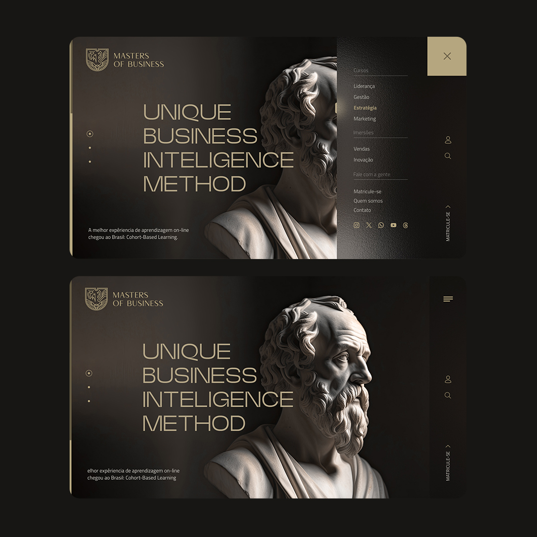
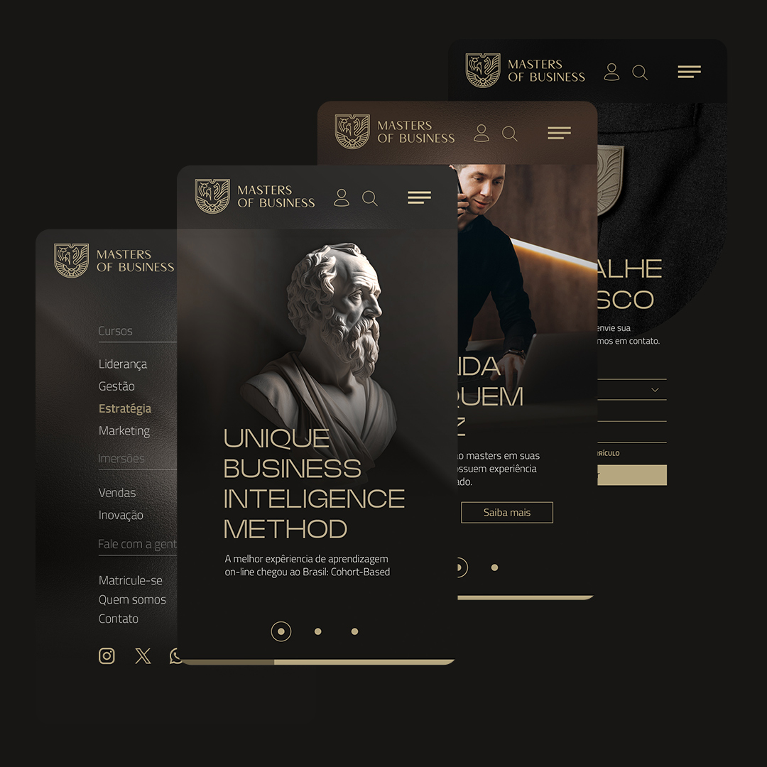
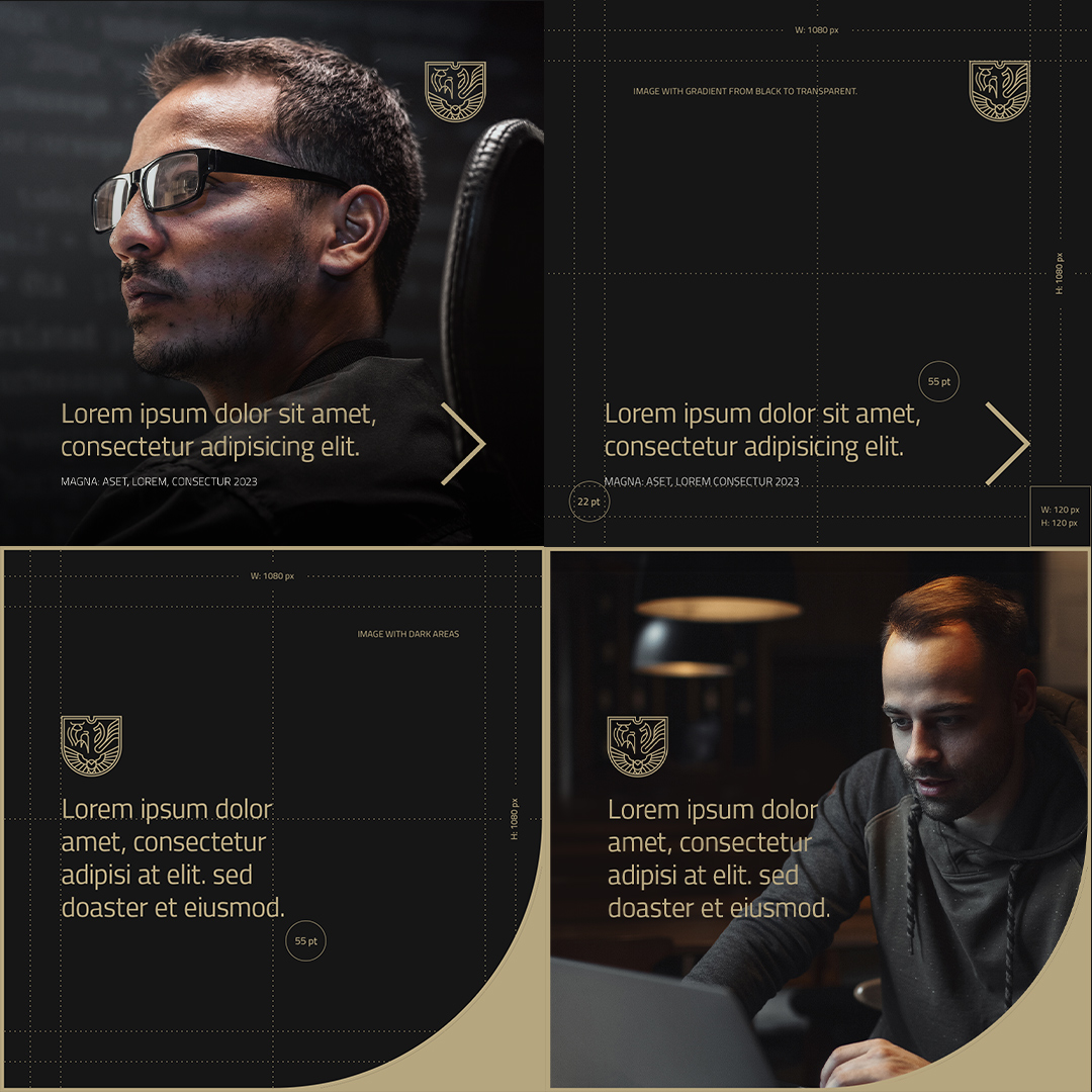
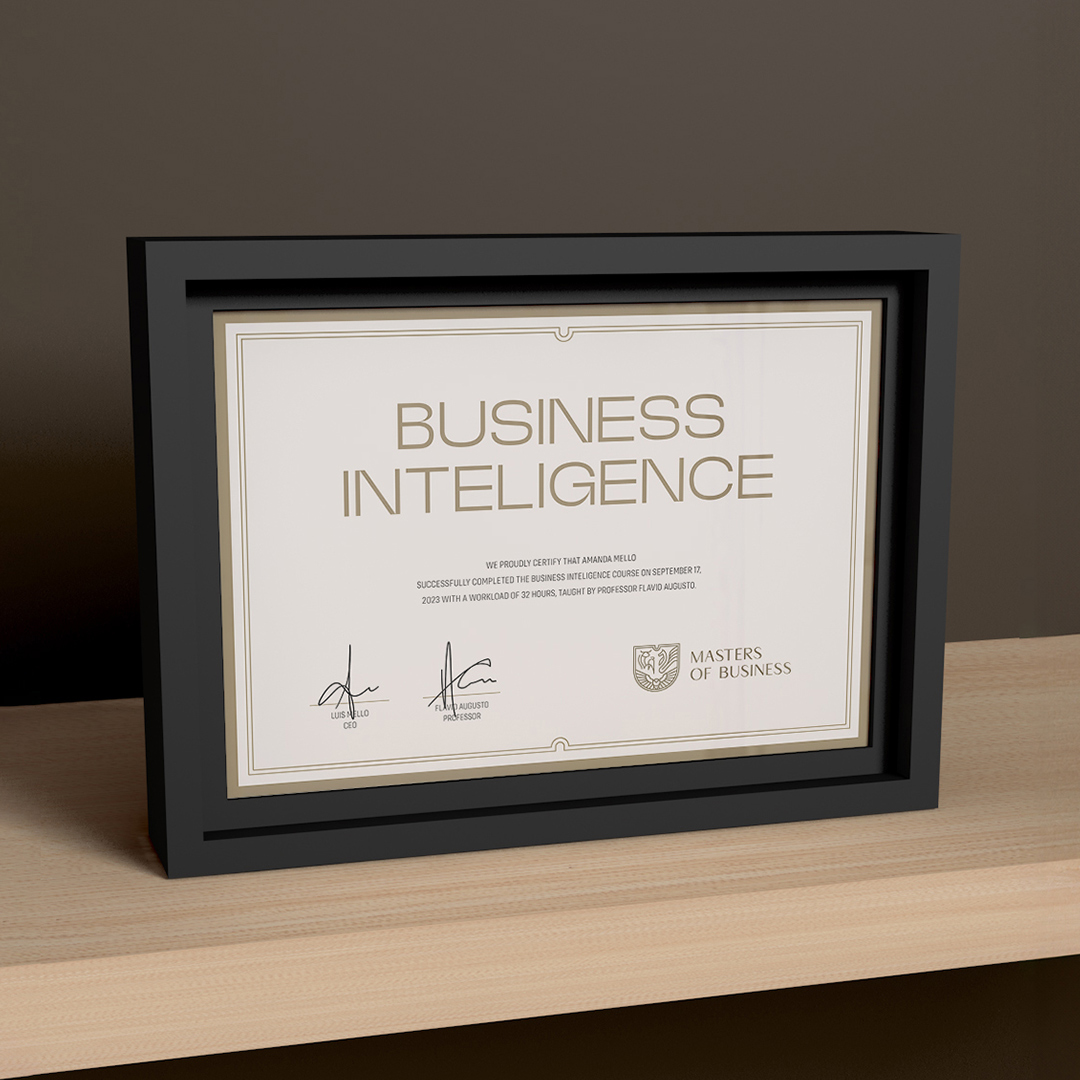
To dialogue with a modern and high-end market, we use fonts and graphics that produce contrasts with each other, in order to balance the perceptions of tradition and modernity. When defining colors, we opt for tones and proportions that highlight their values. In addition to defining the visual elements, their union is harmonic and their layout favors both physical and digital environments, thus solving the problem with the old visual system.
In its reconstruction, we created a new symbol using lines of fixed width to have a more geometric symbol, where the animals themselves form its structure and help to assemble it. This made both its perception and its applicability more modern. The entire typography of the project was designed to convey the exclusivity and high standard that the courses have, without losing sight of the connection with the brand. Its colors were selected to be used preferably in the proportion 60%-30%-10%, which, together with generous negative spaces, provides a strong and premium language.



CREDIT
- Agency/Creative: CEXM
- Article Title: Visual Identity for Masters of Business
- Organisation/Entity: Freelance
- Project Type: Identity
- Project Status: Published
- Agency/Creative Country: Brazil
- Agency/Creative City: Campinas
- Market Region: South America
- Project Deliverables: Brand Identity, Brand Redesign, Graphic Design, Identity System, Logo Design
- Industry: Education
- Keywords: logo design, redesign, visual identity, brand, online course, school, business, premium, luxury
-
Credits:
Senior Art Director: Carlos Mello


