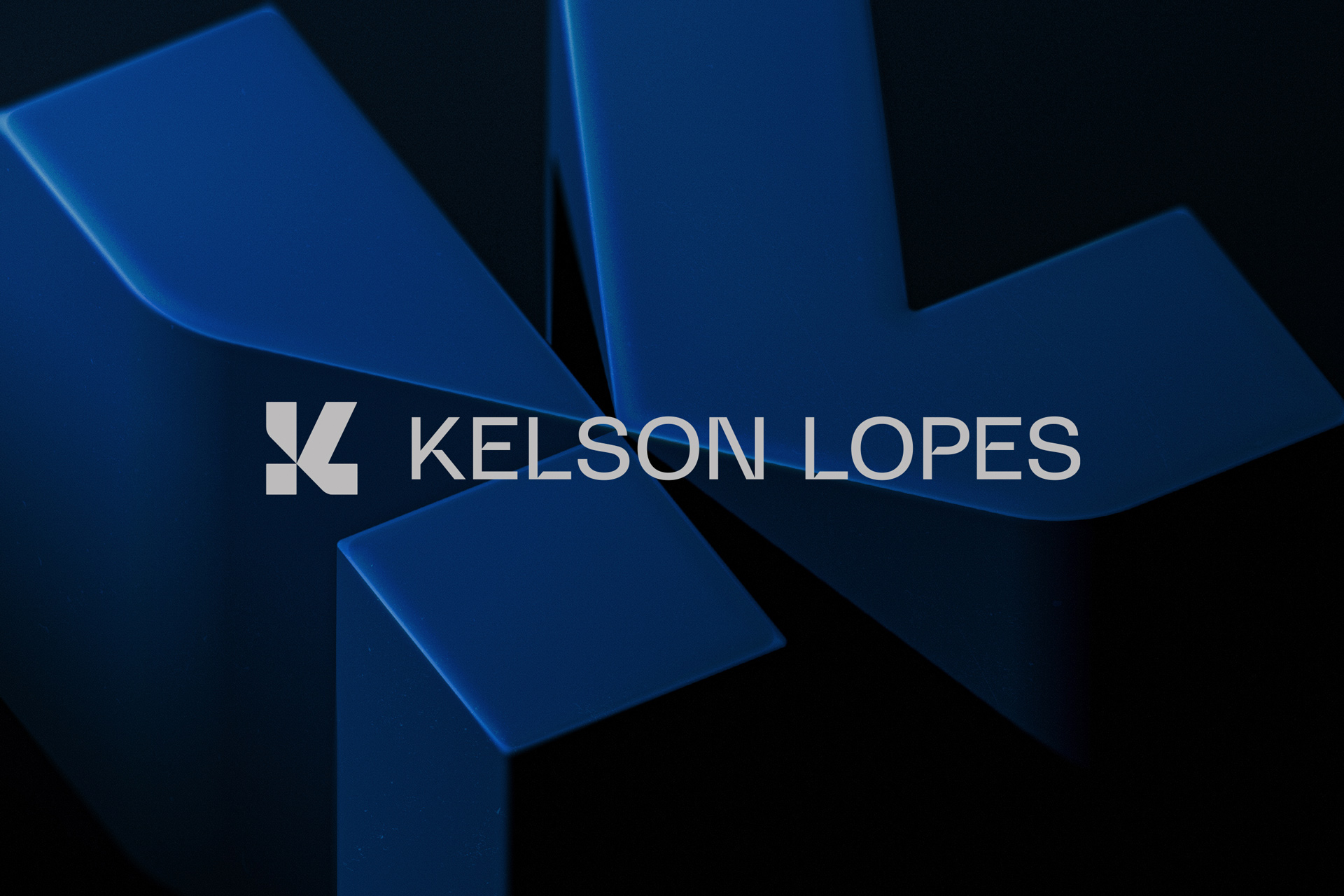
Kelson Lopes Advogados is a law office located in the interior of São Paulo, Brazil. The company’s main focus is corporate law focused on risk management (advice, consulting, legal auditing, lectures and training) but it also operates as a full-time law office offering services in other areas of law: social security, labor, consumer, civil property, intellectual property, succession, etc. In 2023, the company reaches a moment of consolidation in the regional market and, in addition to opening a new headquarters, they realize the need to have a new visual identity for the office, that represents this new phase.
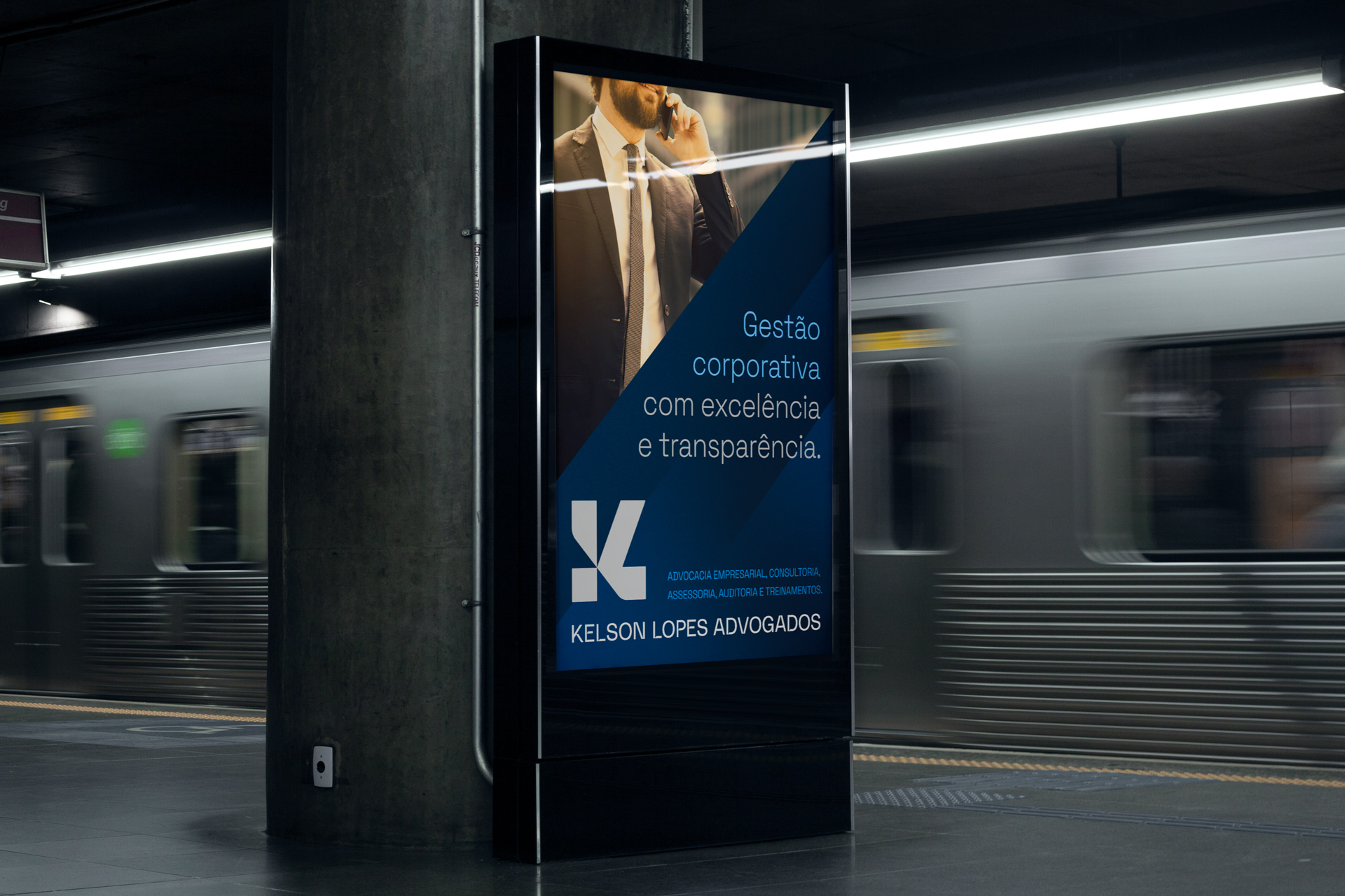
The proposed challenge was to create a timeless, solid and minimalist brand that had the versatility to be used in any situation: from the corporate and internal space to the virtual and public space. Besides, the brand should not be complex in its design and could not present any common icon of the segment, such as the scales of justice, the hammer, the Greek column, among others. So, they understand the need to think of an element with high synthesis power to represent the company, since the office has a long name with the combination of 3 words: Kelson Lopes and Advogados.
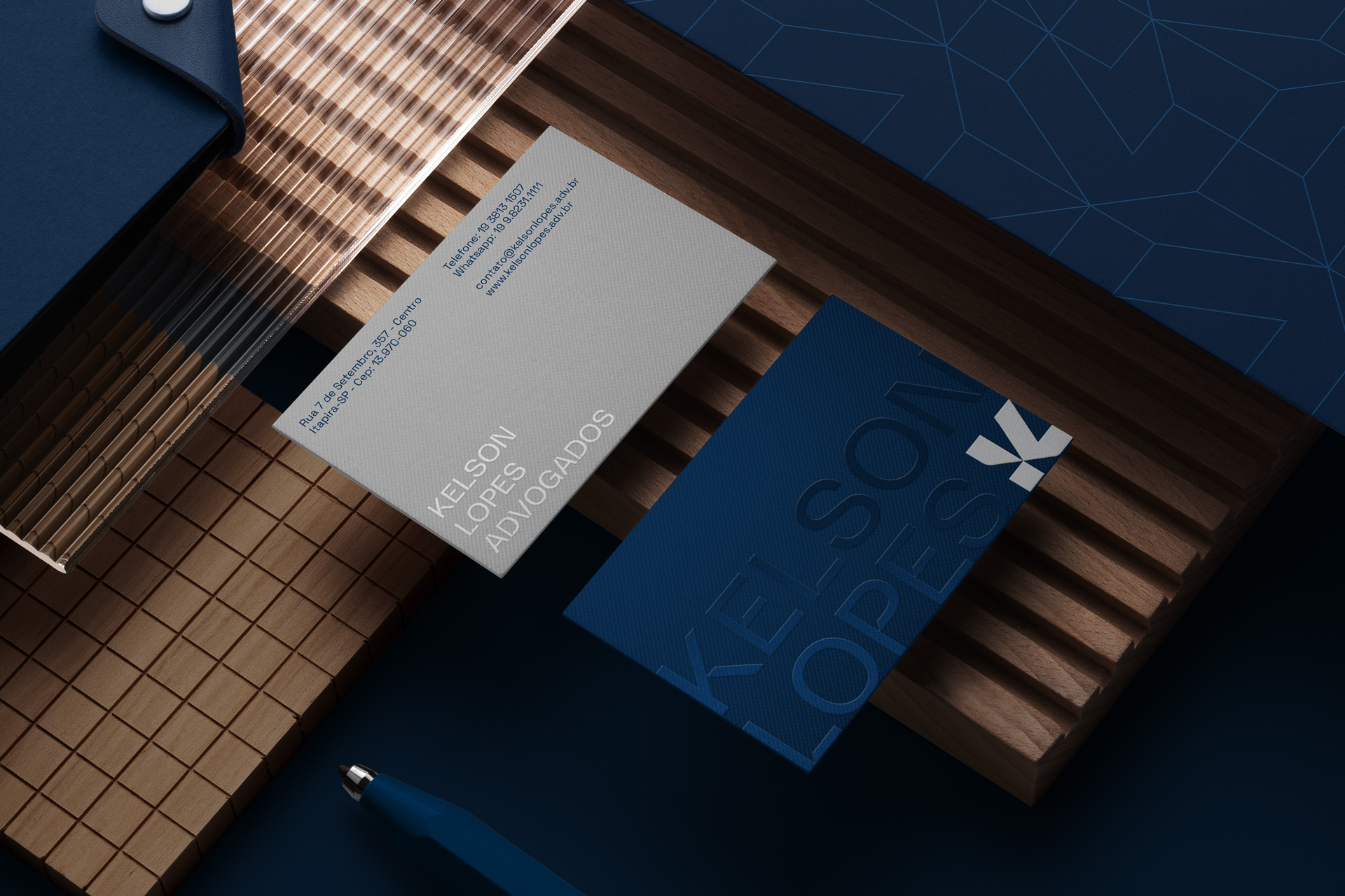
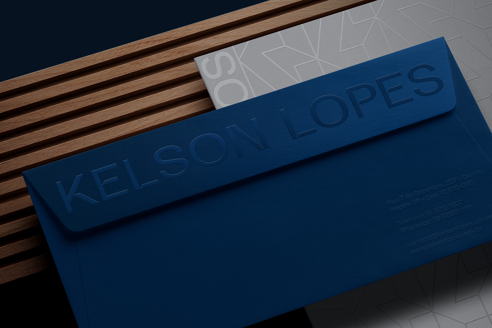
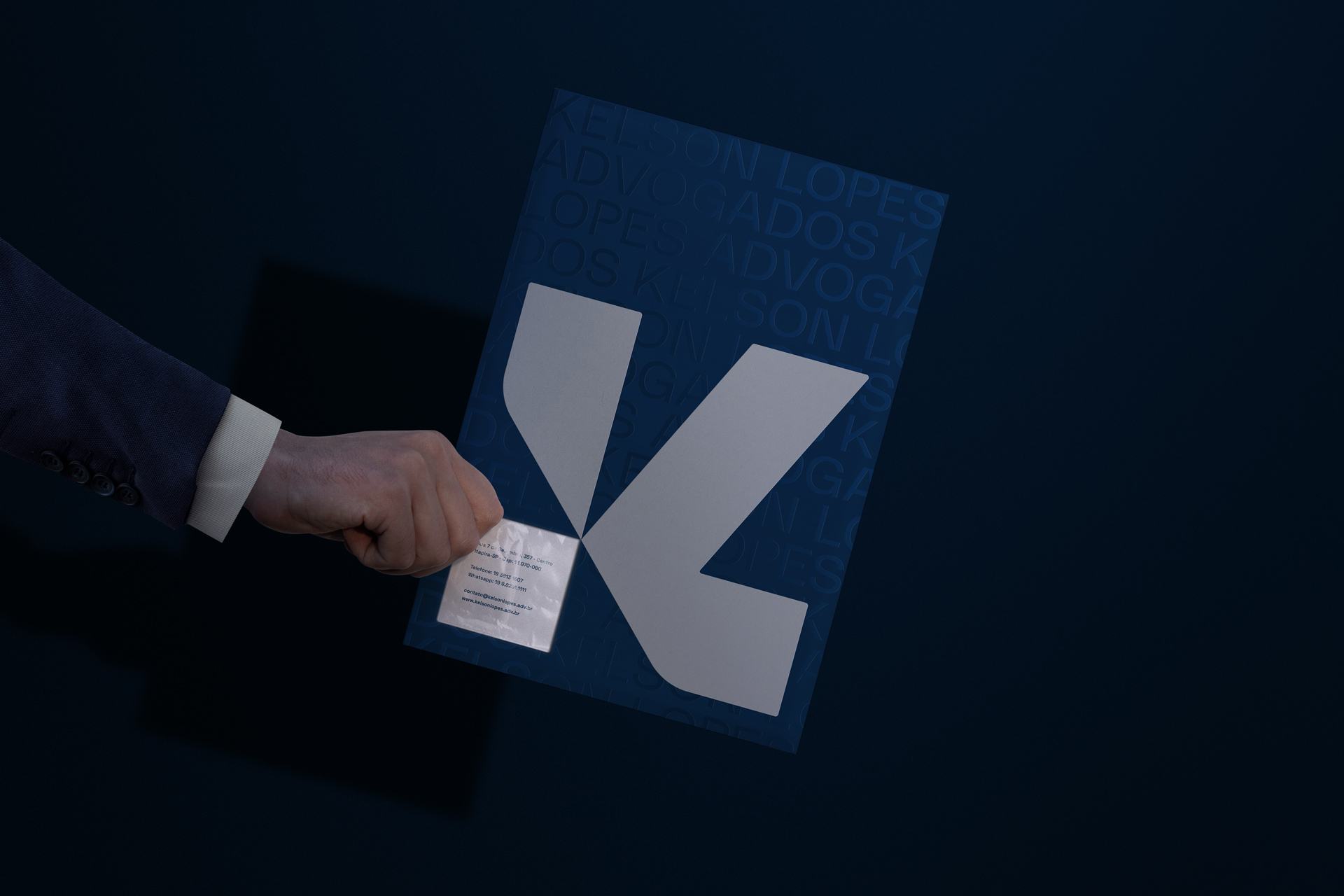
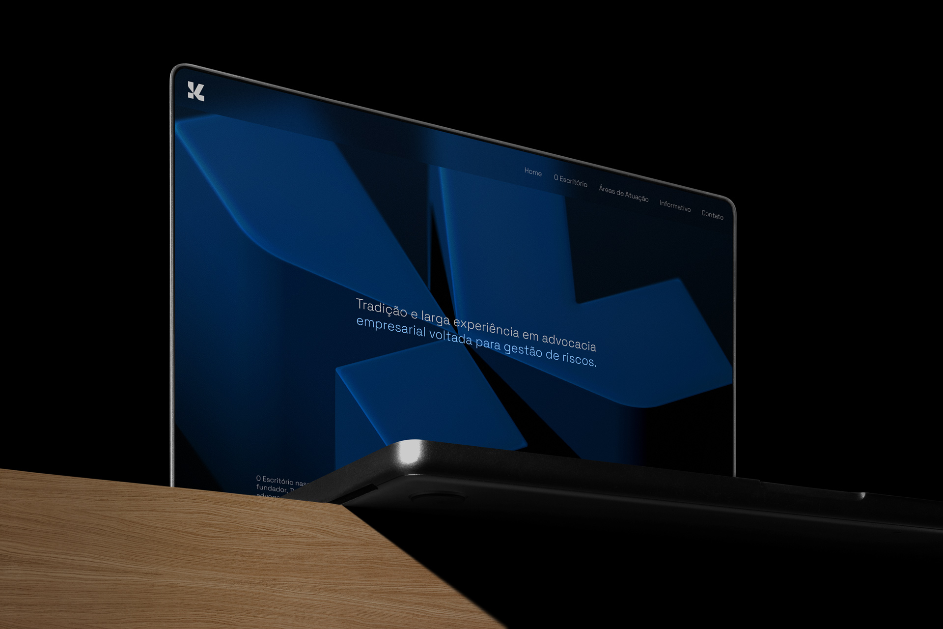
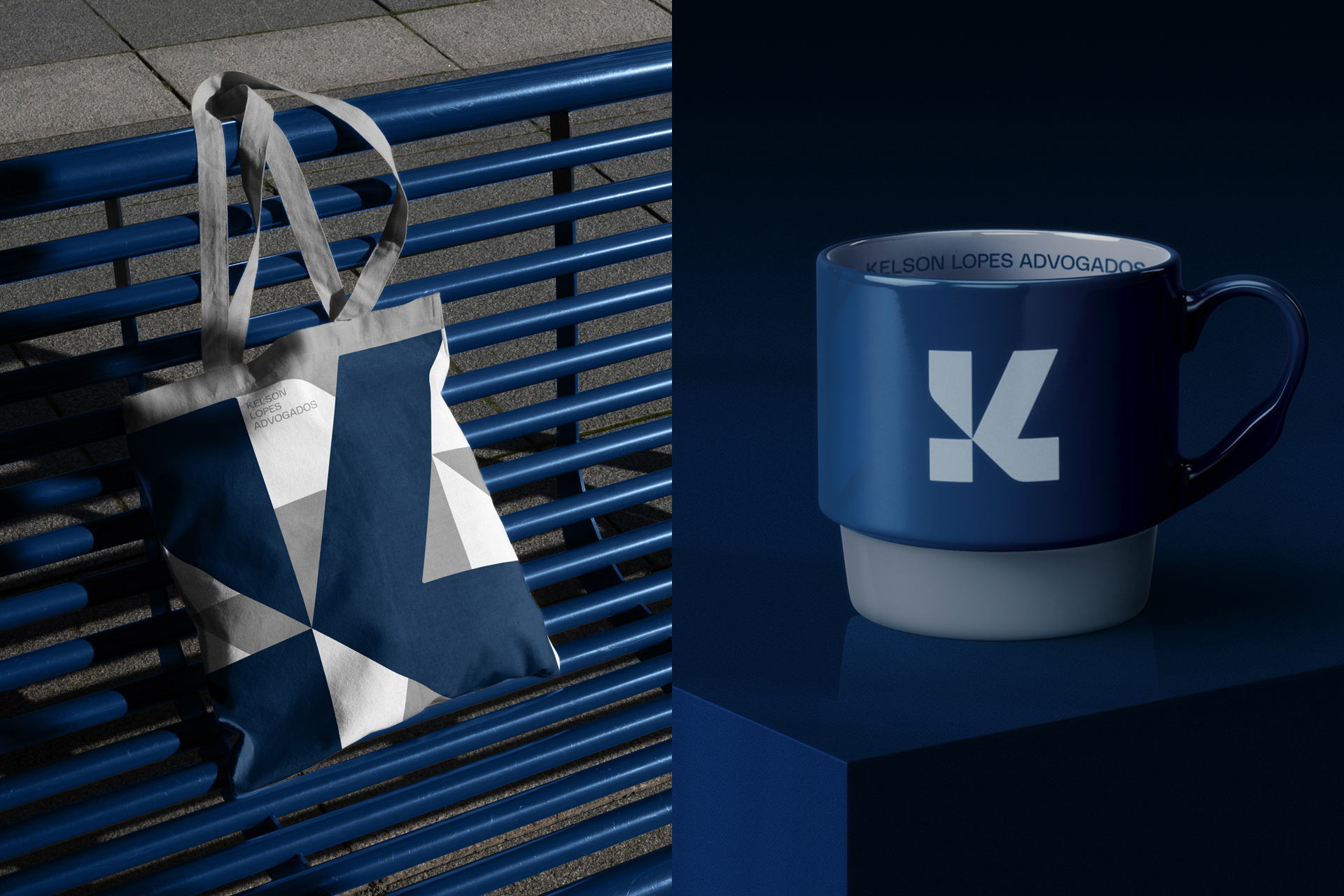
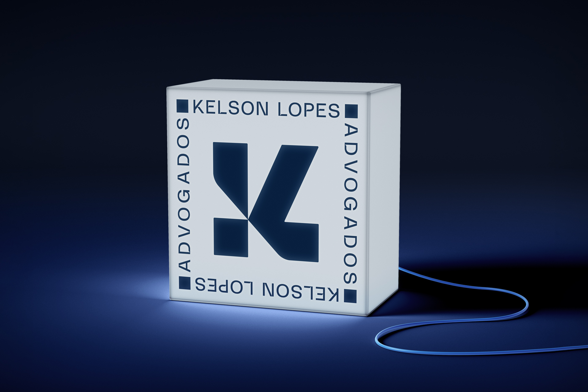
The solution was to design a symbol made from a square shape (solidity and stability), which has the letter K (Kelson) in its full form and the letter L (Lopes) in its half form. To gather this minimalist aesthetic, a typography was created for the brand, in sans serif / grotesk style, but with 45-degree cuts in some areas that refer to the design of the symbol. Finally, navy blue and gray are used as the main colors, designed to serve the public indicated in the briefing.
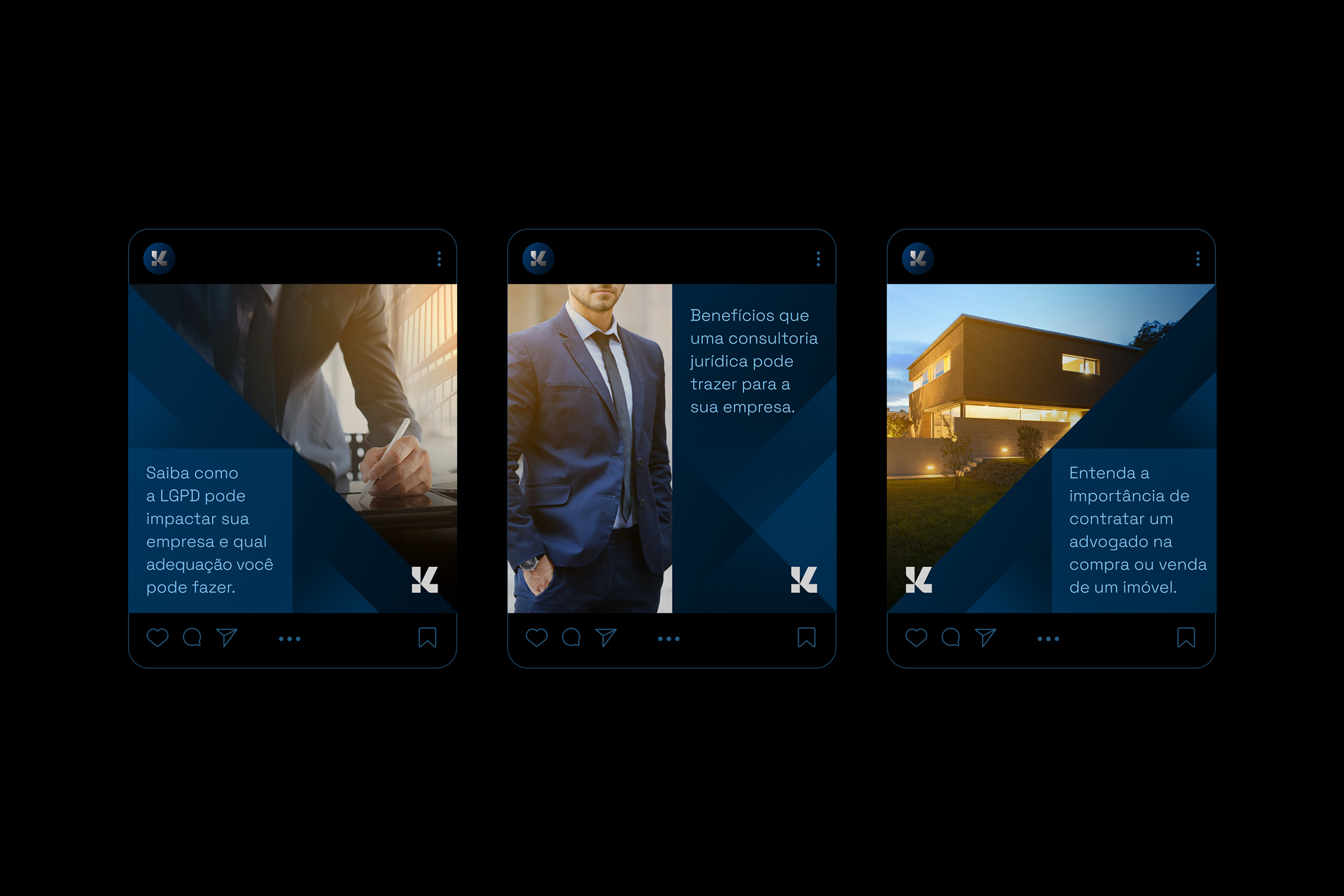
Several assets were created to beused with the brand, such as several patterns and supporting graphic elements. The support typography and the photographic style that can be used by the company were also defined.
The project is currently being implemented, initially with the application of the facade and internal visual communication of the office, followed by the production of printed and digital materials.
With this redesign, we managed to deliver what the office must have: a minimalist, strong and modern brand, with flexibility of use for any application needed.

CREDIT
- Agency/Creative: Lucas Coradi
- Article Title: Visual Identity for Kelson Lopes by Lucas Coradi
- Organisation/Entity: Freelance
- Project Type: Identity
- Project Status: Published
- Agency/Creative Country: Brazil
- Agency/Creative City: Campinas
- Market Region: Global
- Project Deliverables: Brand Creation, Brand Design, Brand Guidelines, Brand Identity, Brand Mark, Brand Redesign, Brand Tone of Voice, Creative Direction, Design, Graphic Design, Icon Design, Identity System, Logo Design, Pattern Design, Poster Design, Rebranding, Type Design, Typography
- Industry: Defence
- Keywords: logo, branding, symbol, law, law firm, lawyer, blue.
-
Credits:
Creative Director: Lucas Coradi
Designer: Lucas Coradi
Motion Graphics: Gabriel Kazuo


