


It’sWorkTime is a comprehensive productivity service that enables individuals to maximize the efficiency and value of their time. ItsWorkTime believes that time is one of life’s most valuable resources, and its unwavering mission is to help you use it wisely, purposefully, and, most importantly, to your advantage. They understand the daily challenges that people face when attempting to manage their time effectively, and they are here to provide you with a plethora of effective methods and invaluable resources that will facilitate better time management, task prioritization, and unwavering focus on what truly matters in your life. With ItsWorkTime, you can say goodbye to the overwhelming chaos of daily life and usher in a new era of productivity and happiness.
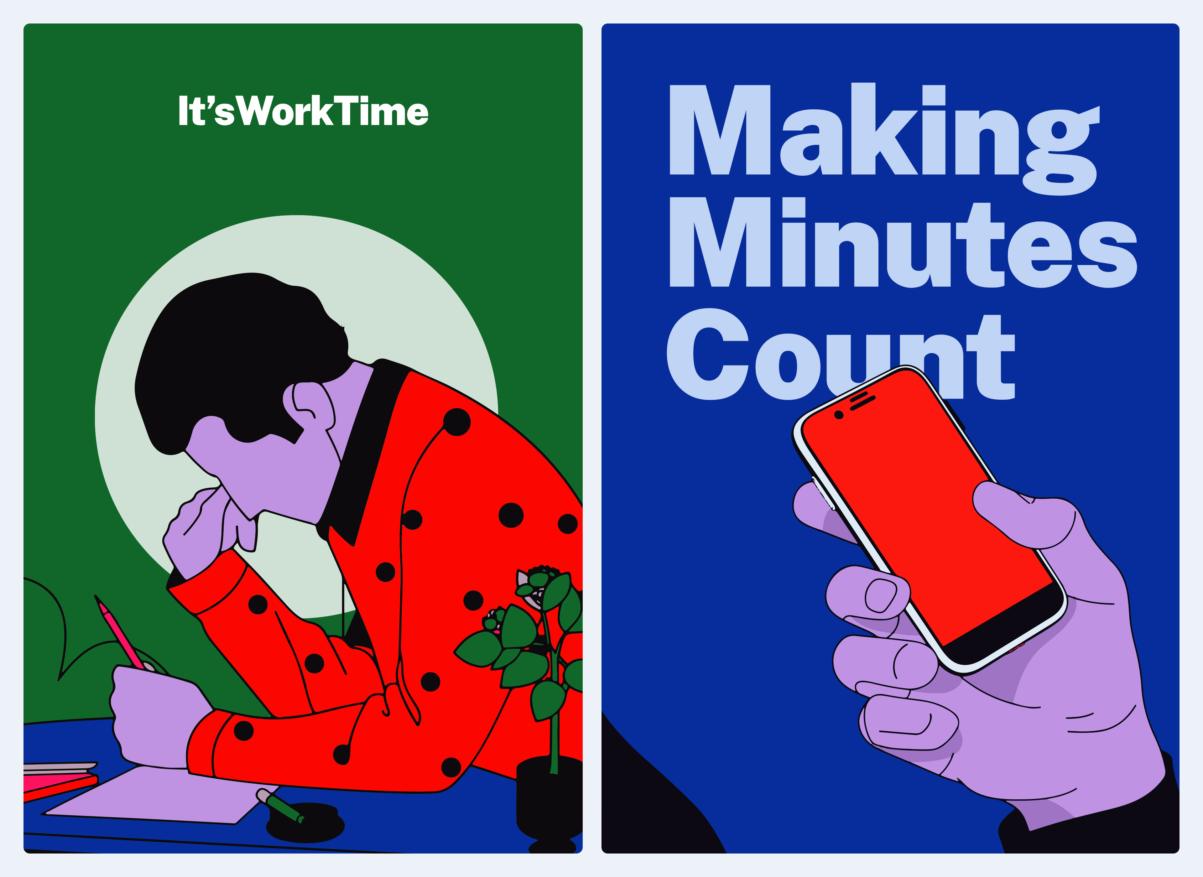
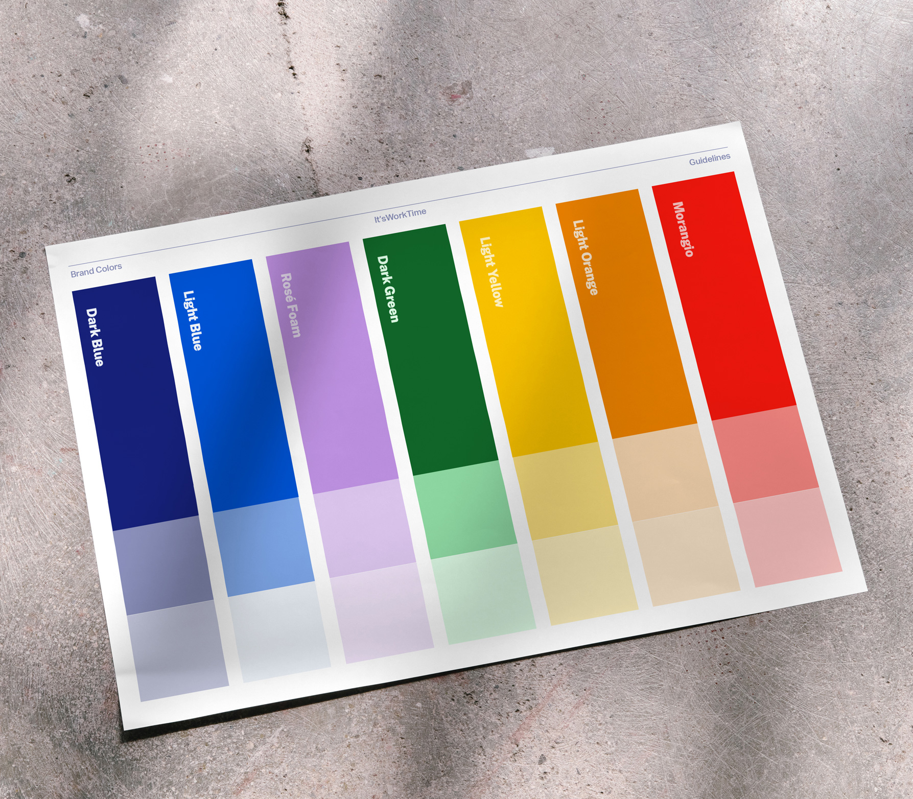
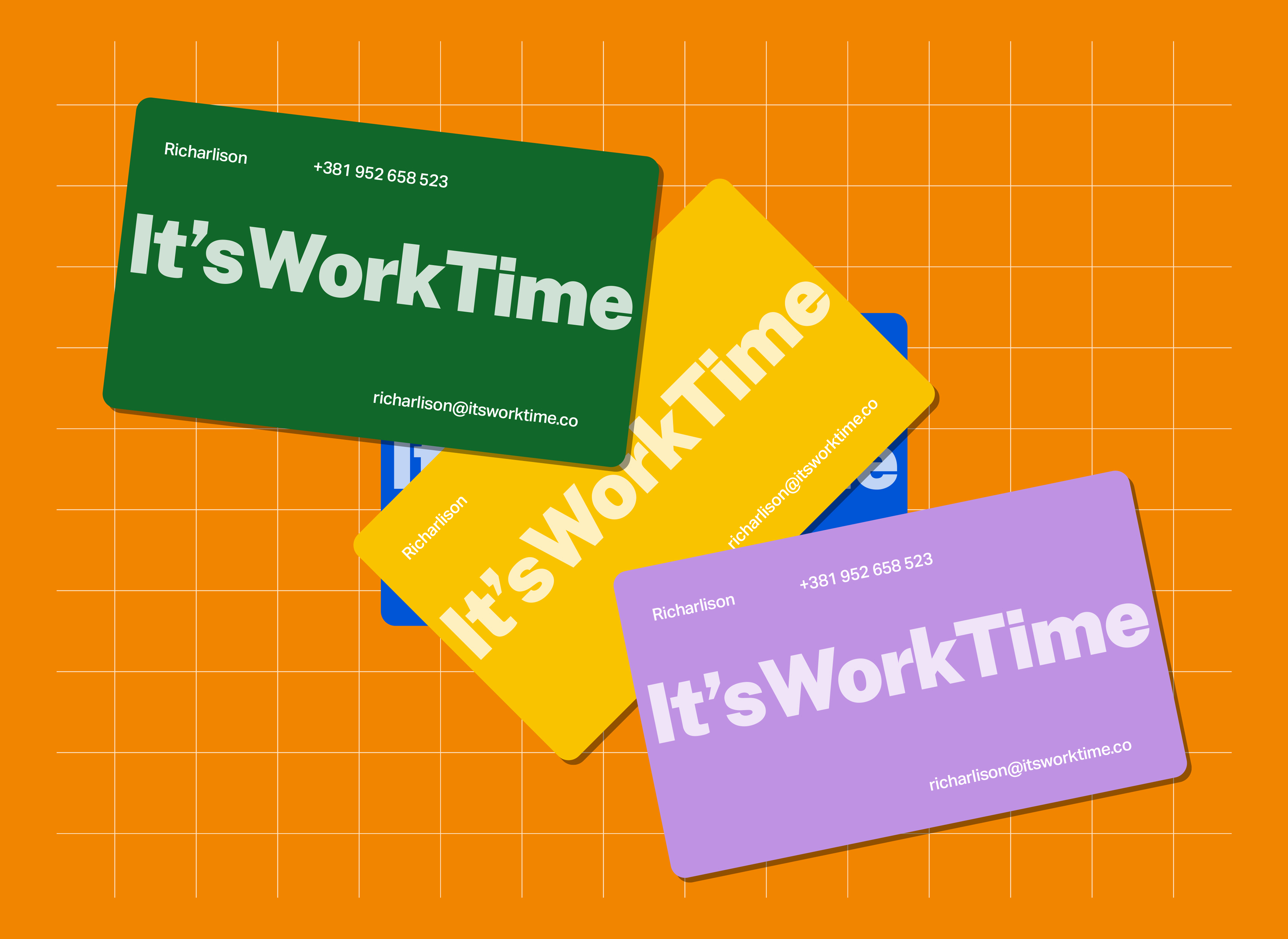
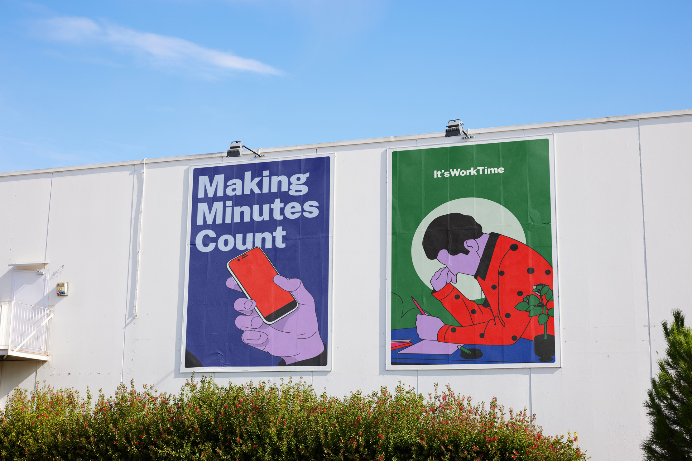
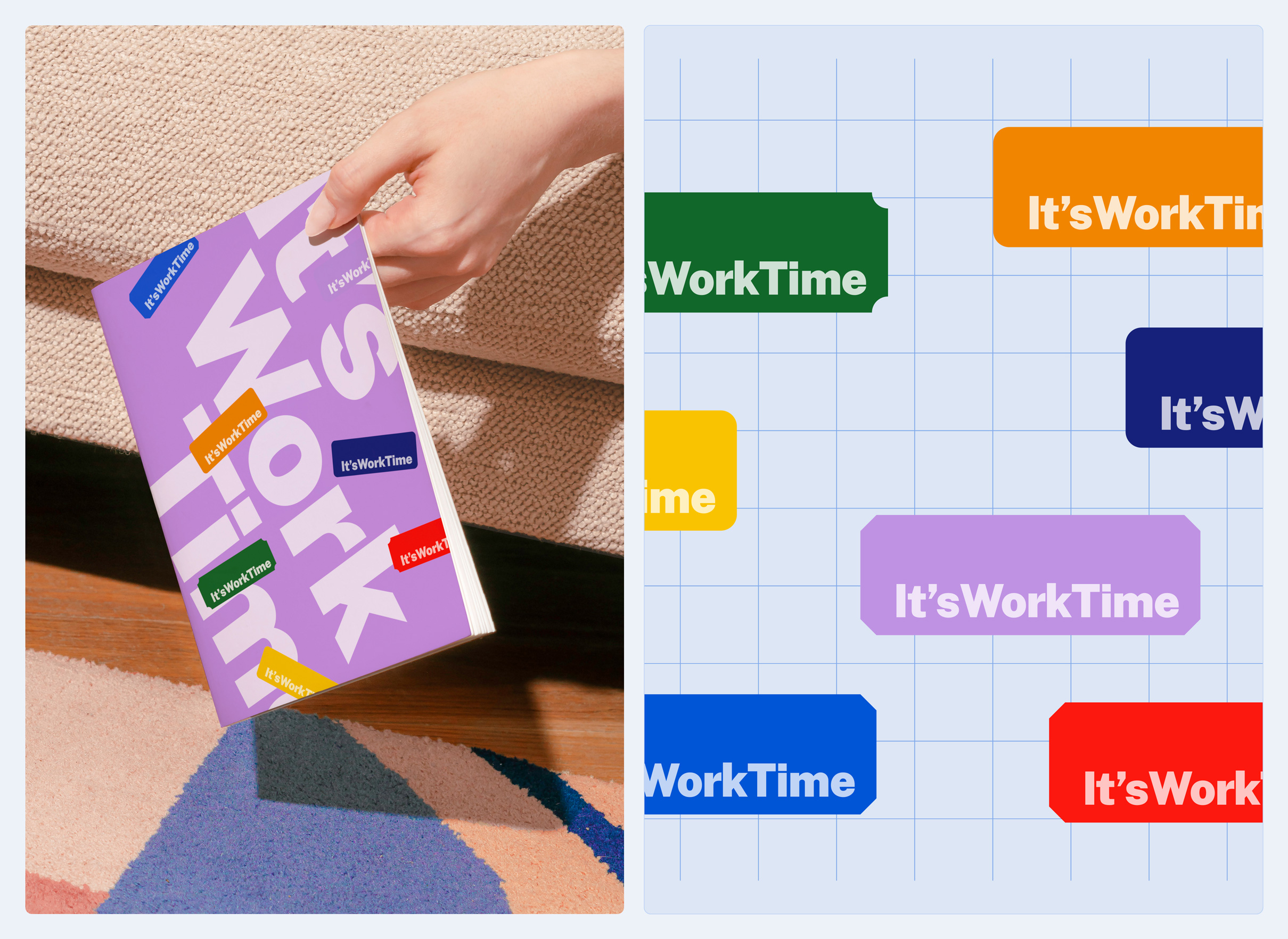
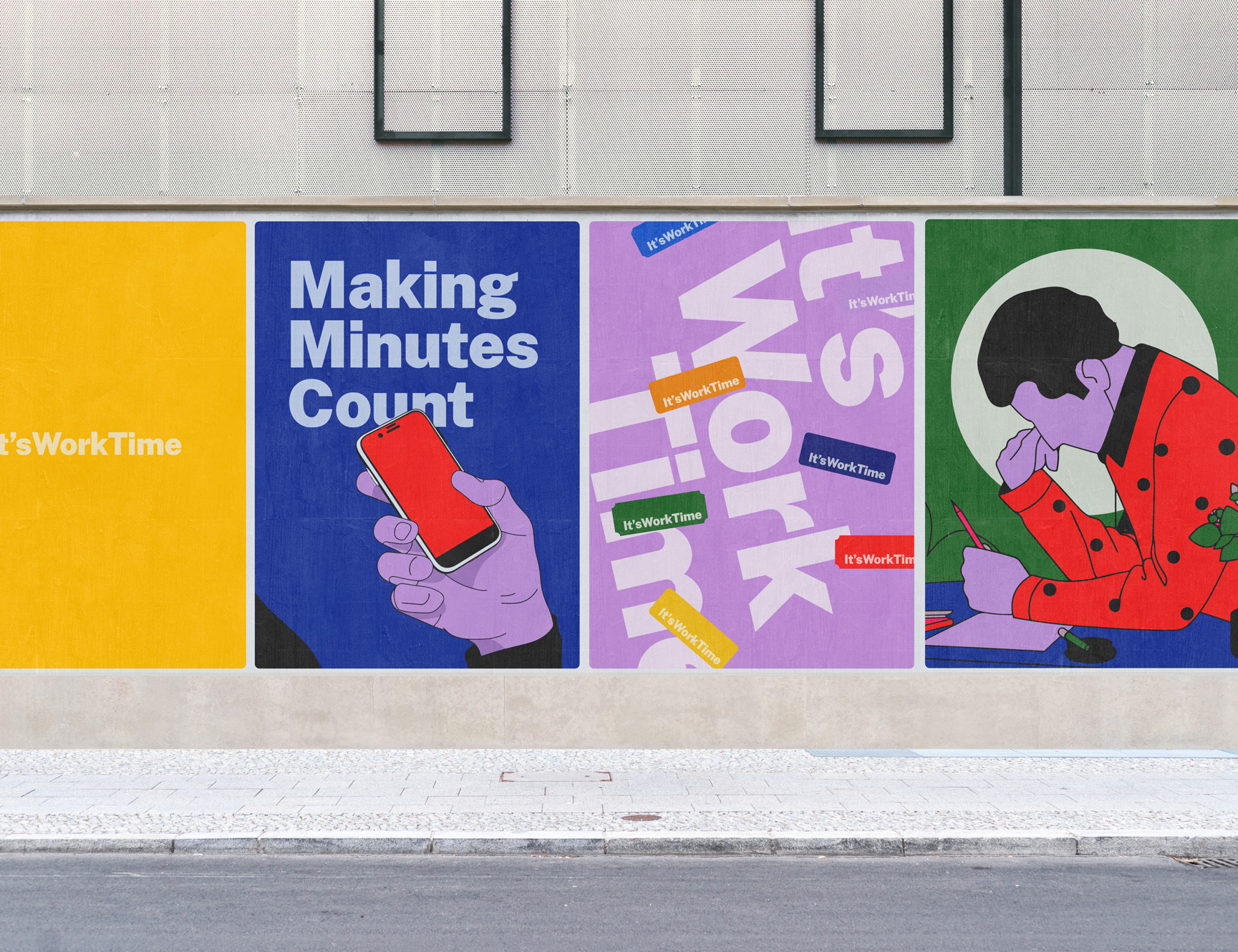
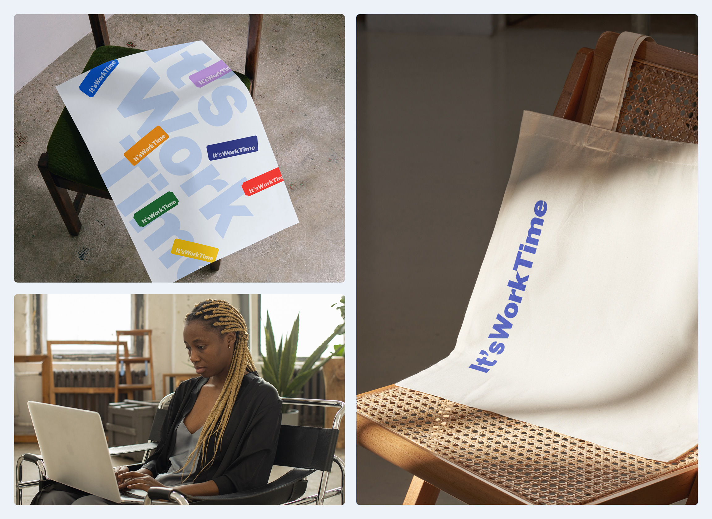
My approach to design and branding is more than just functional; it reflects our dedication to improving your overall ItsWorkTime experience. We achieved a harmonious balance of energy and approachability by using bold colors and semi-tones. While vibrant and dynamic, this visual language remains inviting and engaging, ensuring that your journey with ItsWorkTime is both enjoyable and effective.
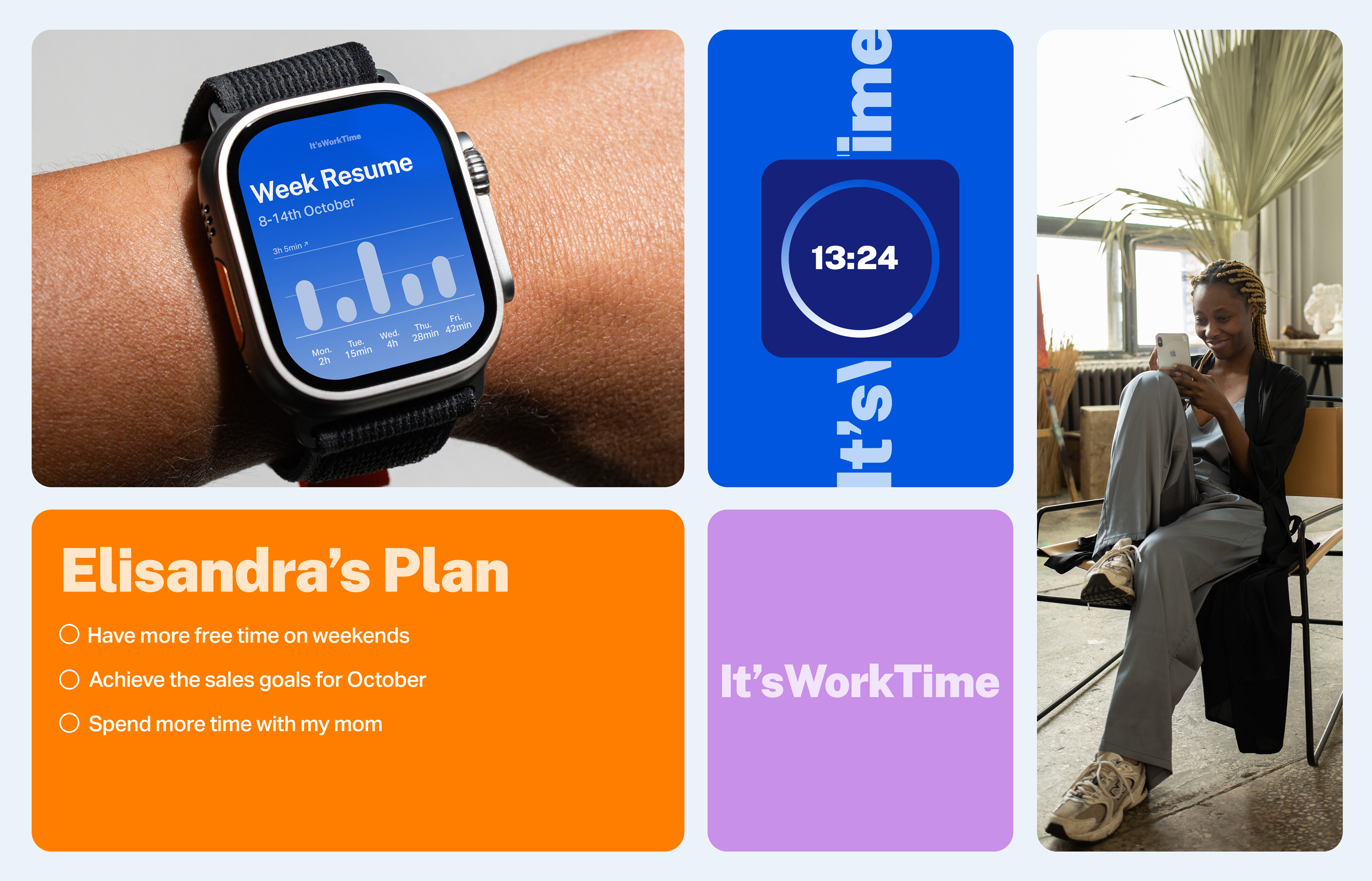
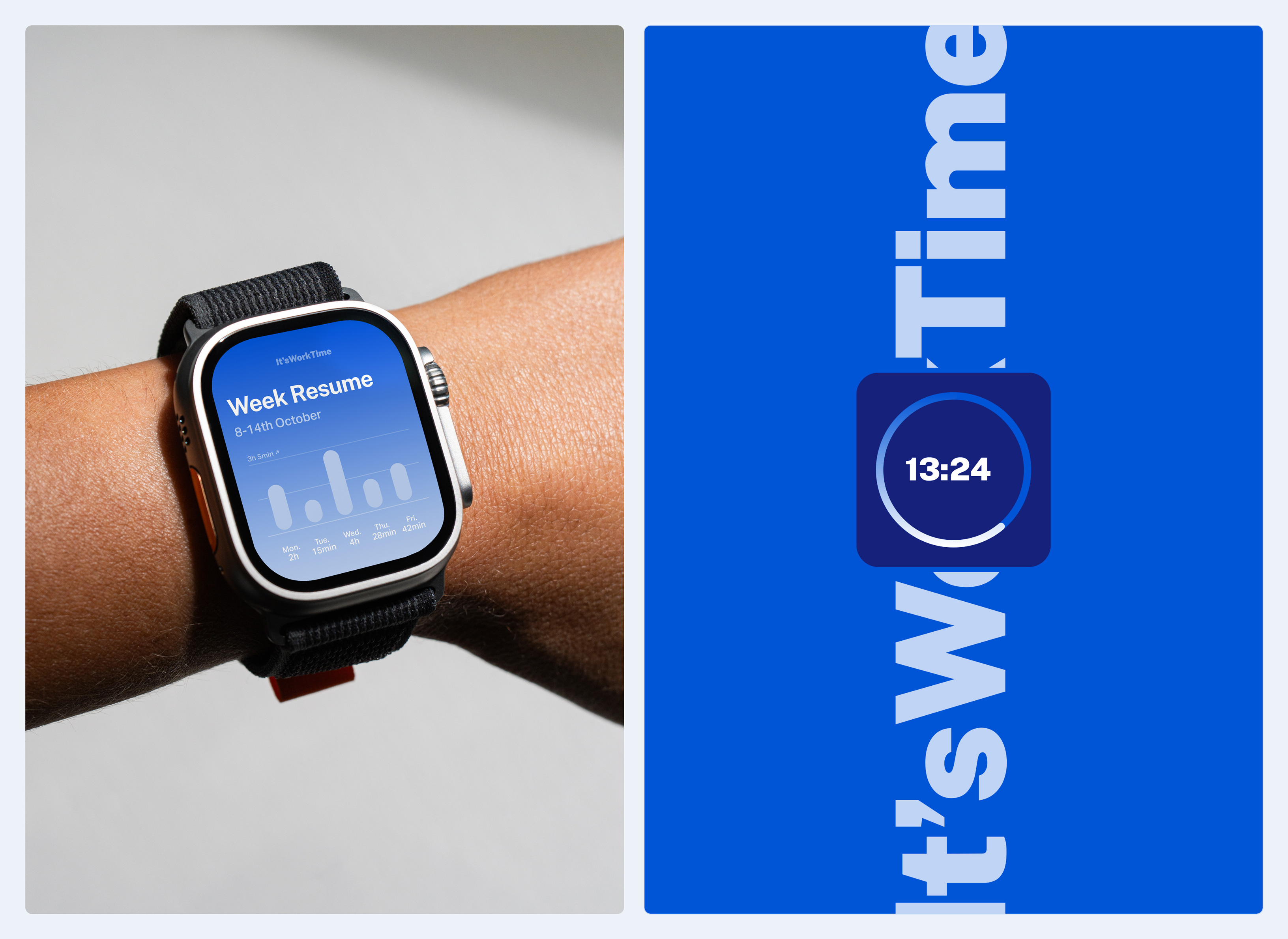
When it comes to user interface design, we put readability and usability first. We understand that the key to providing a successful productivity service is ensuring that you can navigate and use our tools with ease. To that end, our interface design incorporates our brand’s signature blue colors seamlessly, ensuring a consistent and recognizable identity. This approach ensures that you have a comfortable and familiar environment to work in whether you are exploring new features or managing your daily tasks.
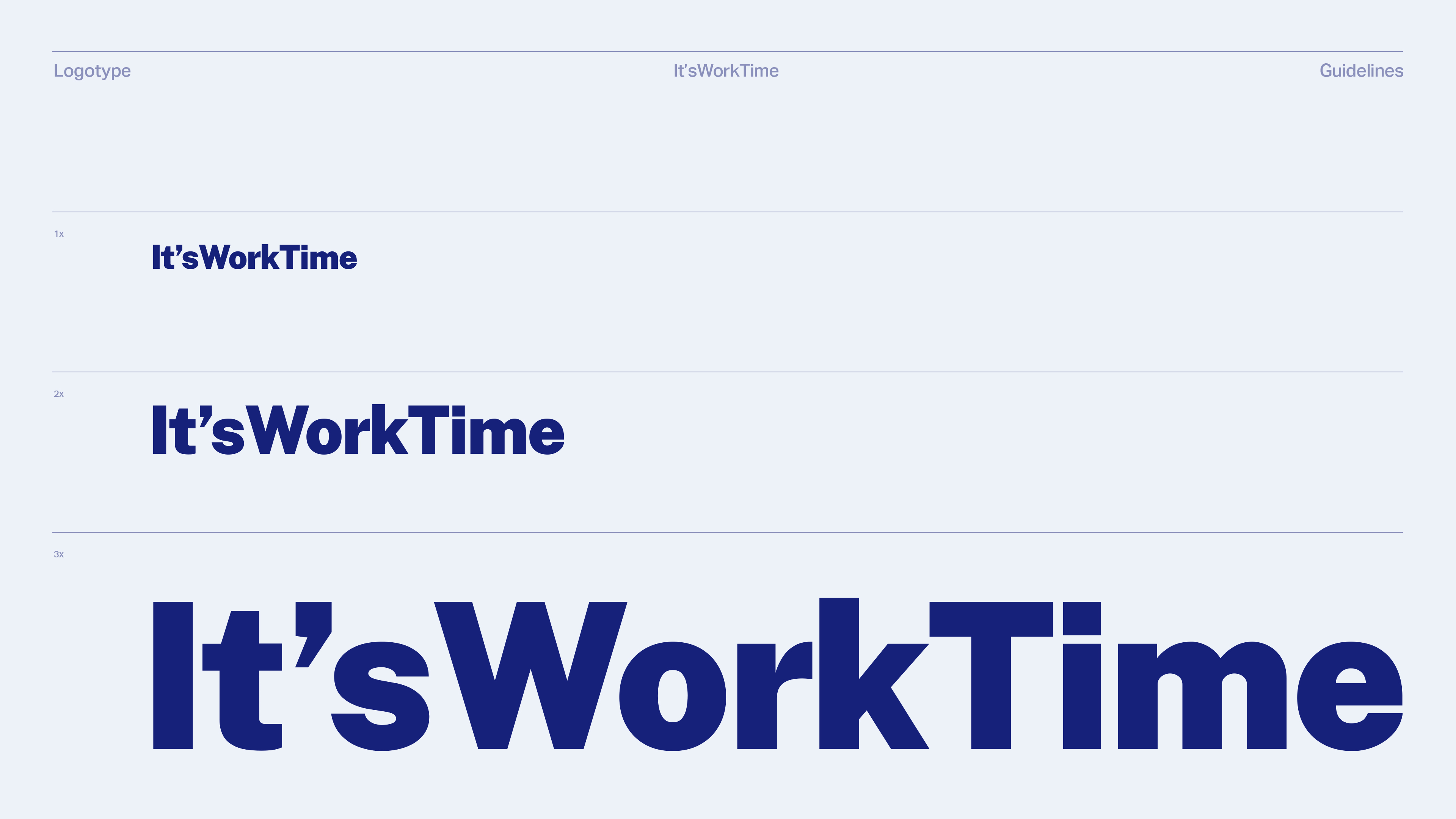
For typography, I have chosen a sans-serif font that exudes clarity and modernity. This decision reflects our forward-thinking approach and aligns with the core principles of efficiency and effectiveness that underpin ItsWorkTime. Furthermore, our design incorporates some illustrations and forms, resulting in a clean and organized layout that reflects the brand’s commitment to streamlining and optimizing your daily routines.
CREDIT
- Agency/Creative: Vinicius Germano Muller
- Article Title: Visual Identity for It’sWorkTime
- Organisation/Entity: Freelance
- Project Type: Identity
- Project Status: Non Published
- Agency/Creative Country: Brazil
- Agency/Creative City: Gramado
- Market Region: Global
- Project Deliverables: Brand Identity, Identity System, Illustration, Motion Graphics
- Industry: Technology
- Keywords: time management, start-up, app, task
-
Credits:
Design Director: Vinicius Germano Muller


