


Icerocks is an international ice skating summer campus that is dedicated to providing high-quality teaching to students of all ages. The campus boasts of internationally renowned coaches and skaters who impart their knowledge and skills to the students. The focus of the Icerocks campus is on learning from a good foundation and continuous improvement. This text will discuss the design of the identity for Icerocks, including the brand archetype, the visual identity, and the message conveyed.
Brand Archetype
The brand archetype for Icerocks is the wise. The wise archetype is characterized by a focus on knowledge, learning, and understanding. The wise archetype is often associated with education and academia. The choice of the wise archetype for Icerocks is a reflection of the campus’s mission to provide quality teaching based on learning from a good foundation and continuous improvement.
Visual Identity
The development of the visual identity for Icerocks is based on the brand archetype of the wise. The objective of the visual identity is to share knowledge and position Icerocks as a reference in its industry. The visual identity aims to convey a clear and direct message to the audience. To achieve this objective, the visual identity is designed to be simple and modern.
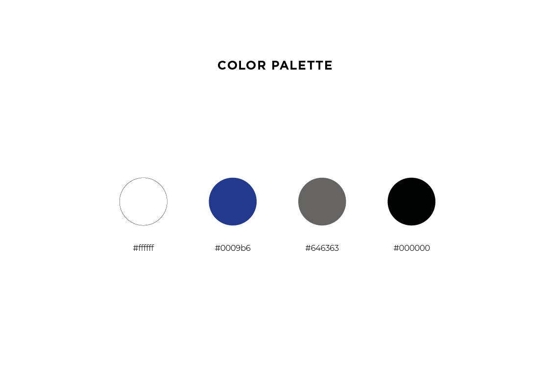
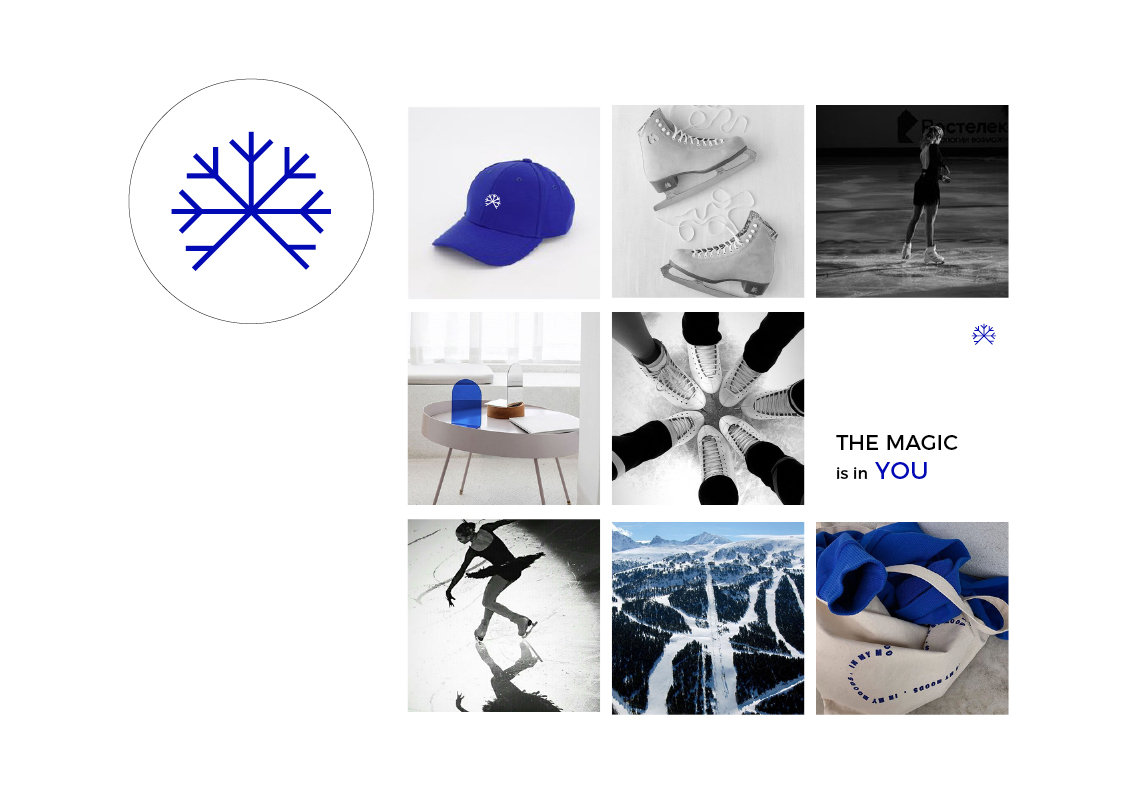
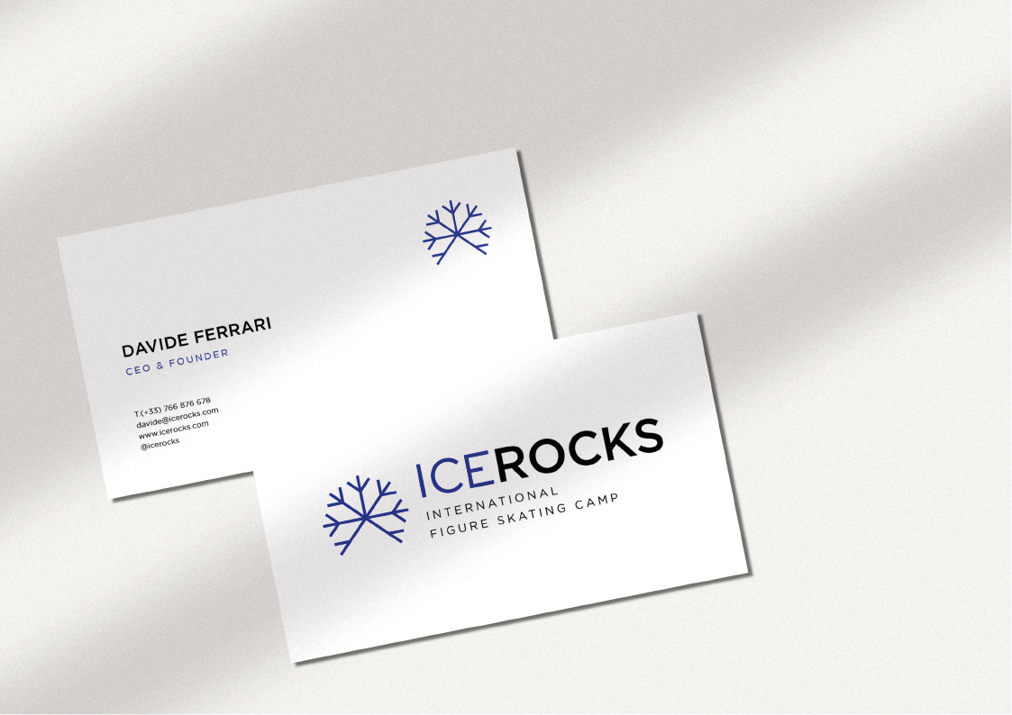
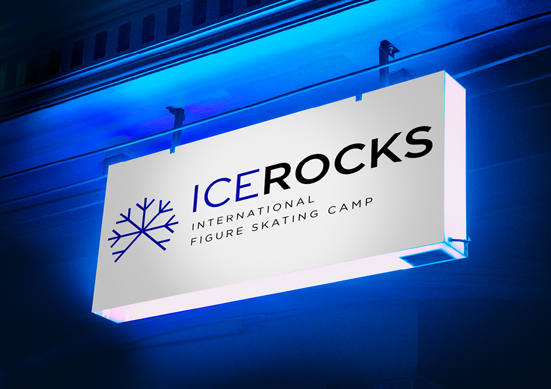
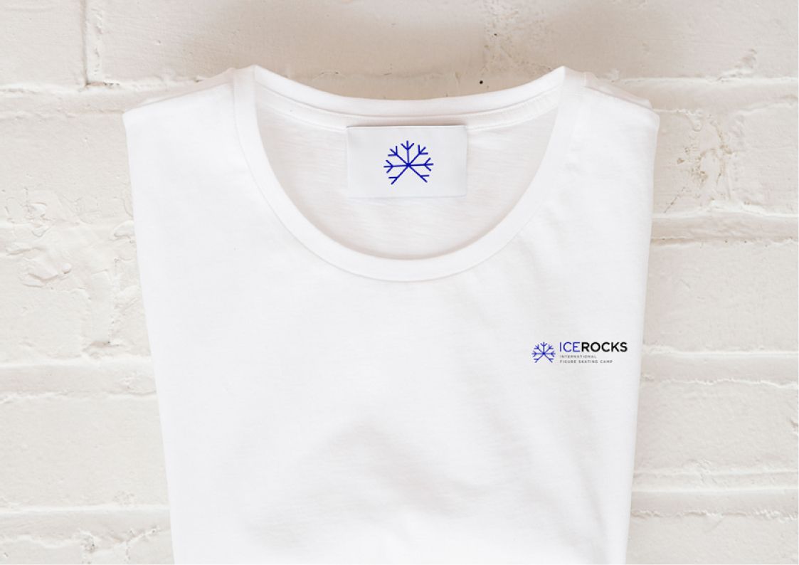
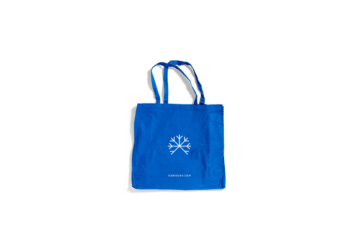
The primary colors used in the Icerocks visual identity are blue and white. Blue is often associated with knowledge and trust, while white is associated with purity and clarity. The use of these colors in the visual identity is intended to convey a message of trust and clarity to the audience.
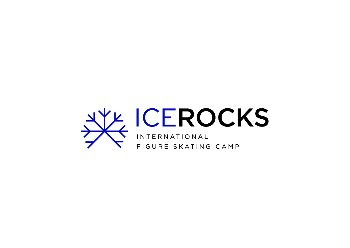
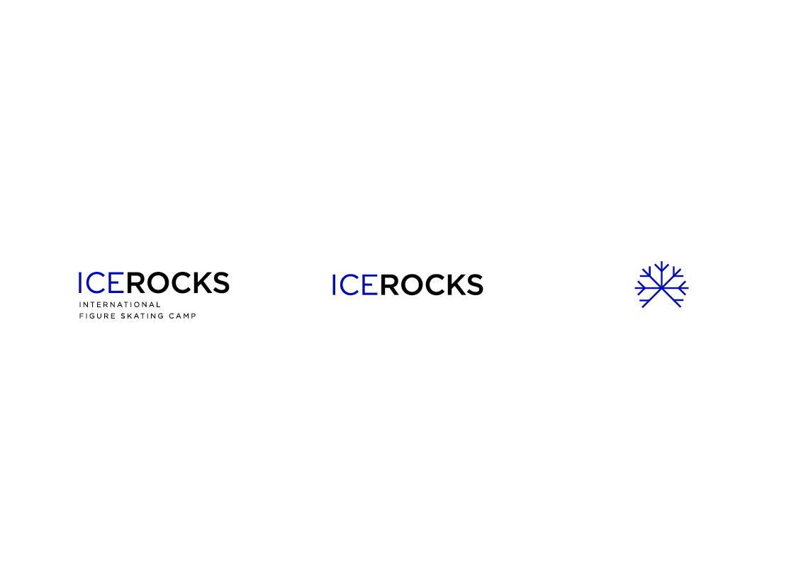
The typography used in the Icerocks visual identity is clean and modern. The font used for the logo and headings is sans-serif, which is often associated with modernity and simplicity. The use of sans-serif fonts is intended to convey a message of clarity and simplicity to the audience.
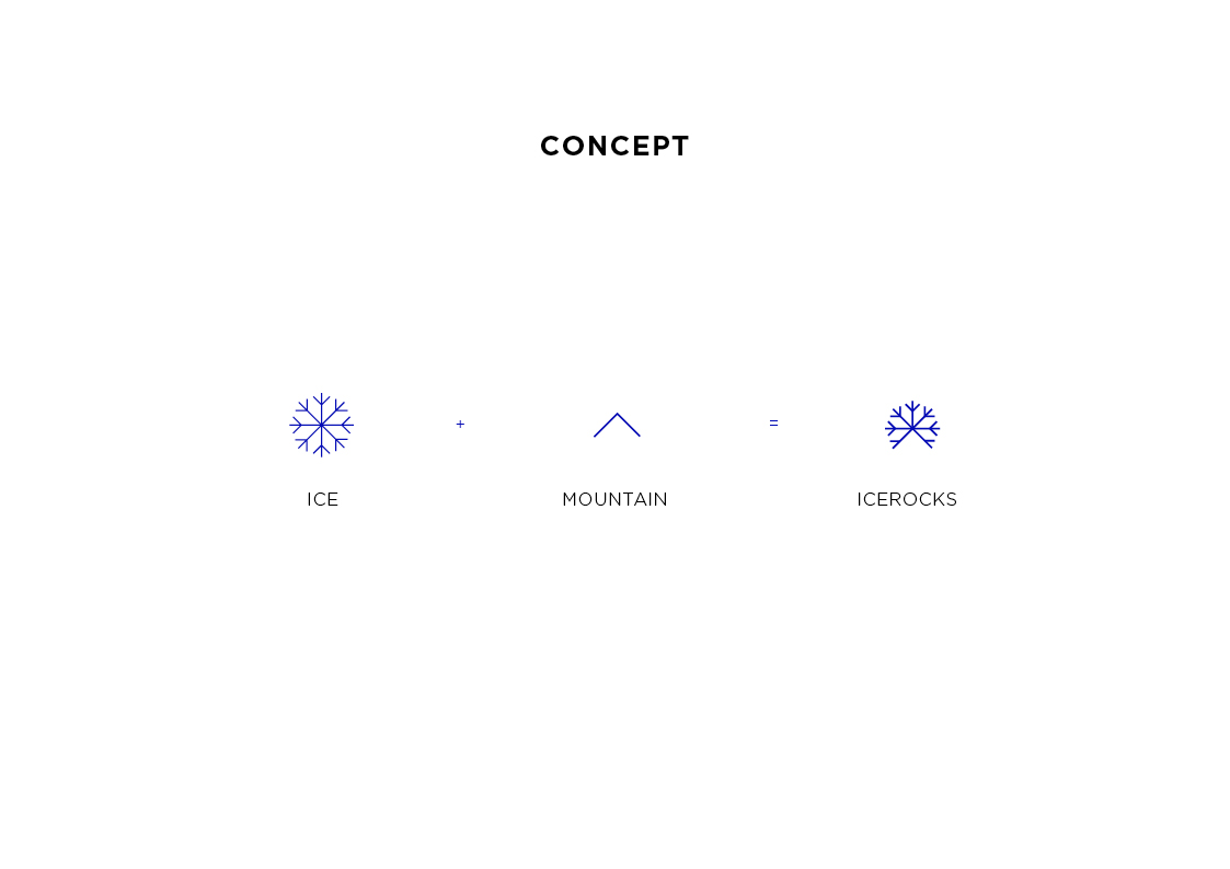
Icerocks is a mountain fused with ice, reflecting the location of the center and its connection to the ice skating rink. This logo design is a unique and effective visual representation that can help differentiate Icerocks from other ice skating and winter sports centers.
The use of mountain and ice in the logo design also reflects the organization’s focus on experiential learning. By merging mountain and ice, a sense of adventure and exploration is created, suggesting that Icerocks is an exciting and challenging place where students can learn and grow. The combination of the mountain and the ice also suggests that the center is a place of holistic learning, where students can develop both physical and mental abilities.
Taken together, the Icerocks visual identity will help to differentiate the center and attract students interested in ice skating and winter sports during summer in a challenging and exciting learning environment.
CREDIT
- Agency/Creative: Estudio del mar
- Article Title: Visual Identity for Icerocks
- Organisation/Entity: Freelance
- Project Type: Identity
- Project Status: Published
- Agency/Creative Country: Spain
- Agency/Creative City: Alicante
- Market Region: Europe
- Project Deliverables: Brand Identity
- Industry: Education
- Keywords: skating, ice skating, training, sport Club, sports training, minimal, professional ice skating
-
Credits:
Graphic designer: Mar Cerdeira


