


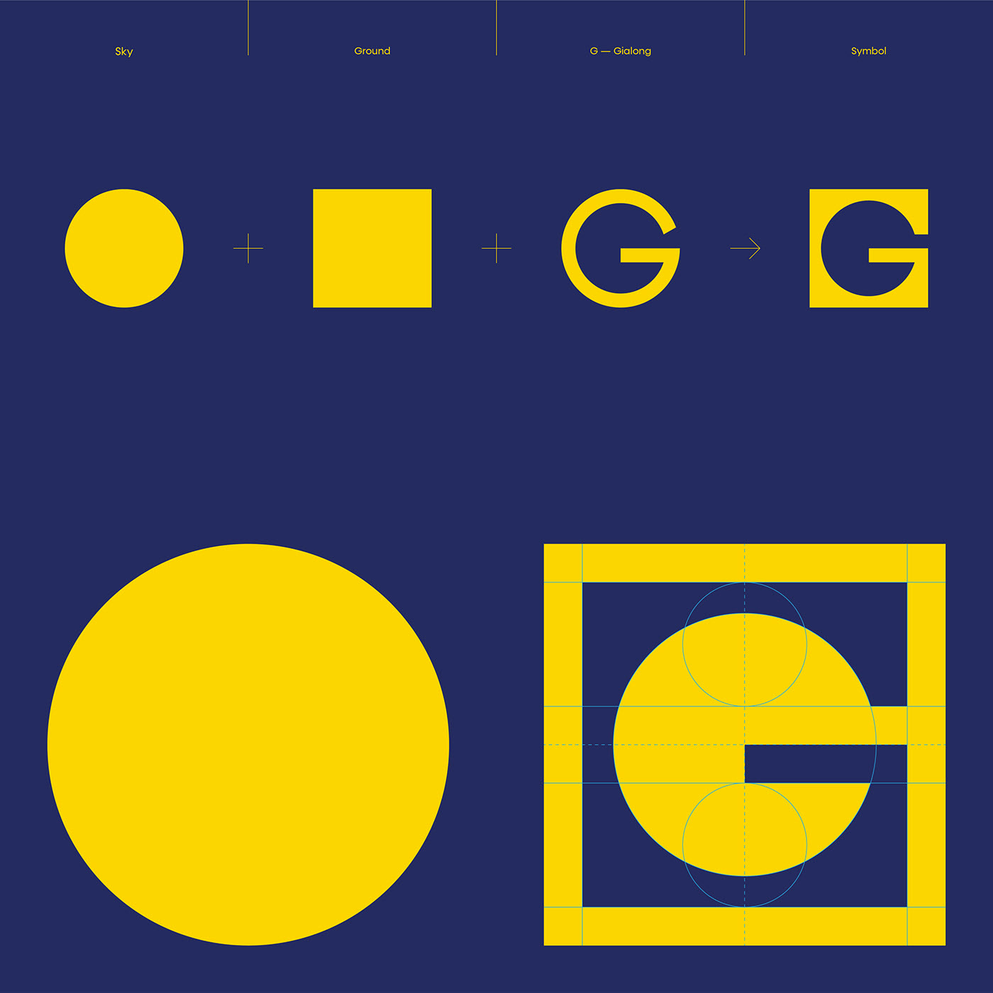
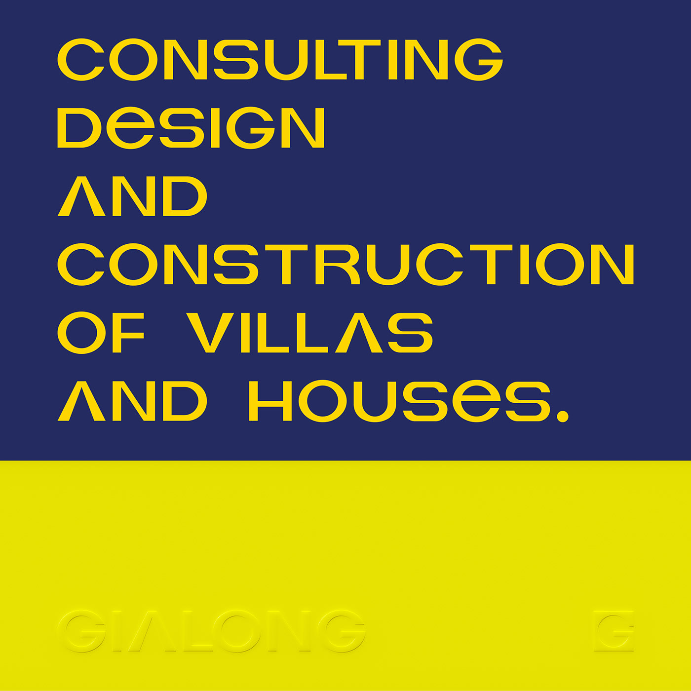
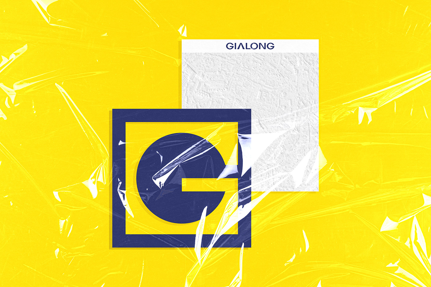
Originating from the concept of sky and ground in Vietnamese folklore with a square representing the ground, a round representing the sky, Fubo created Gia Long’s symbol which contained their philosophy as well as their business field – consulting design and construction of villas and houses.
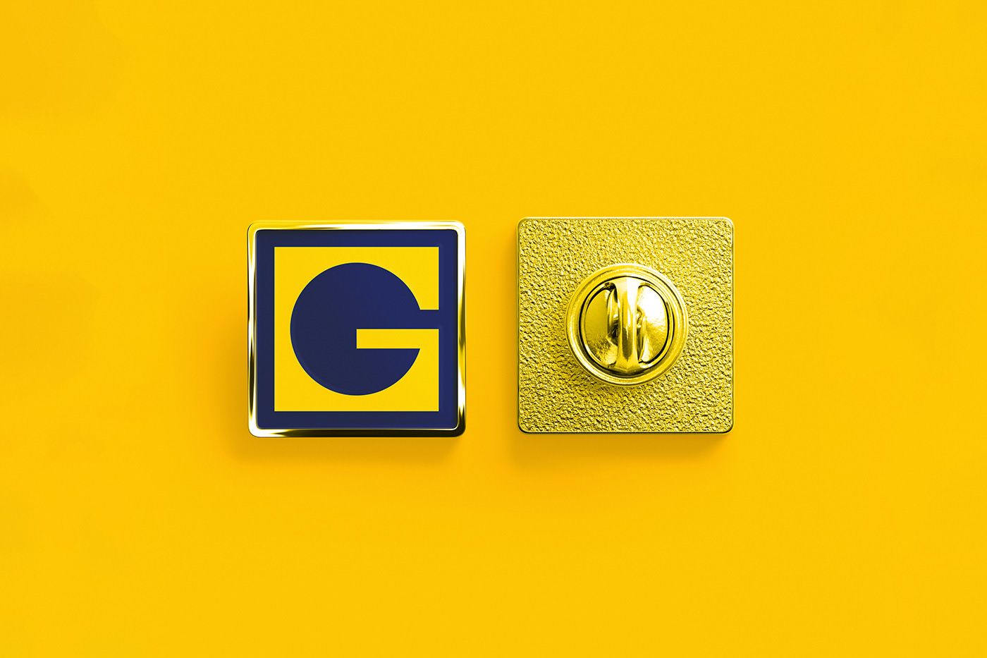
A circular cut inside the square creating the letter G (the first letter in the brand name of Gia Long) was based on applying the well-matched layout to ensure the balance of the symbol, and also express the meaning of stability throughout the development of Gia Long Company.
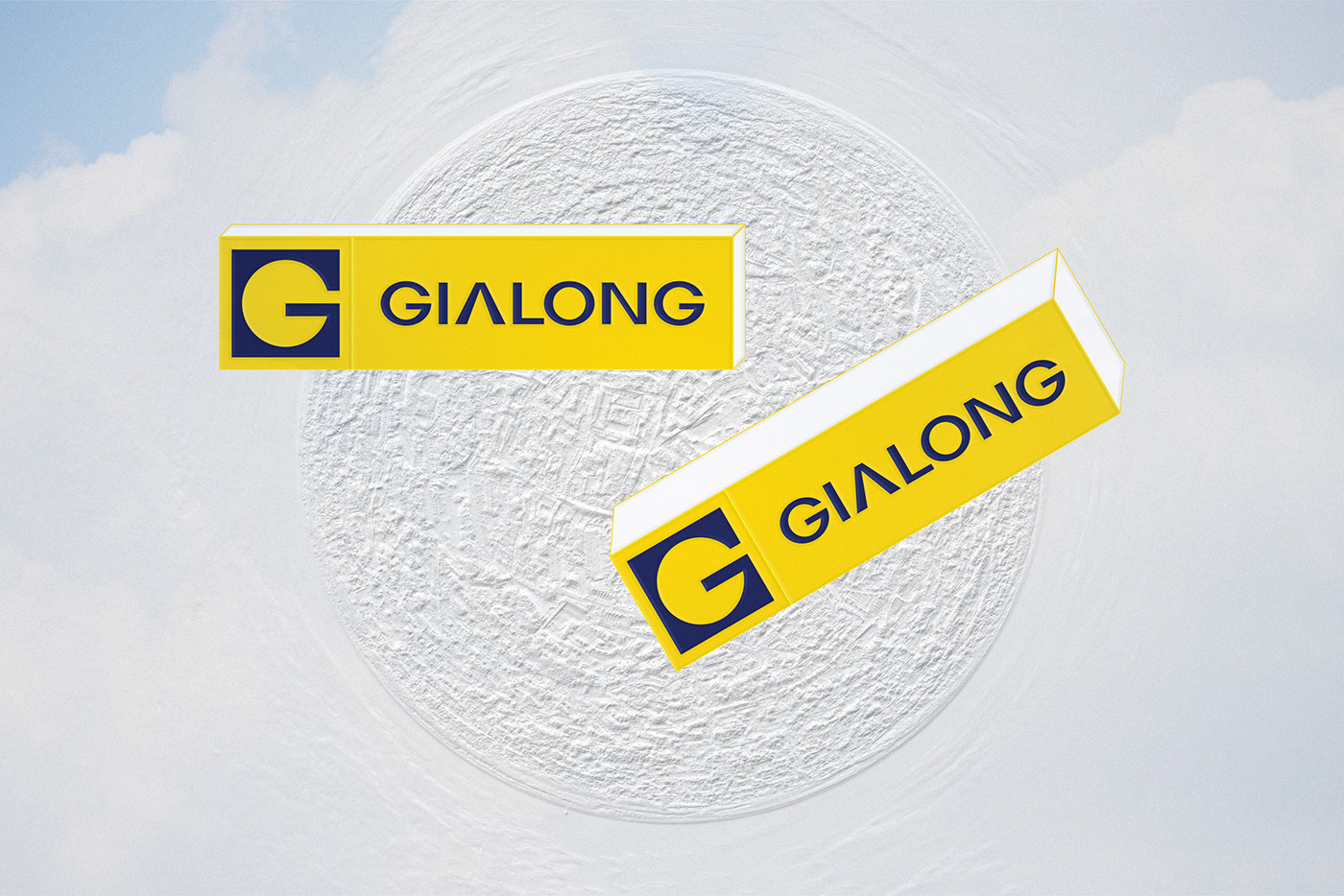
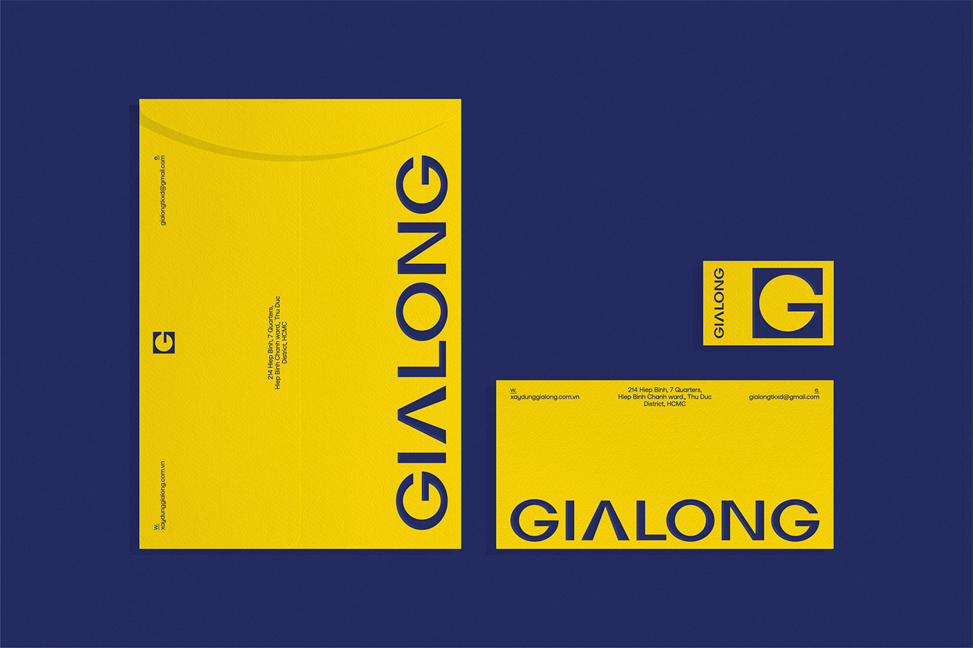
The wordmark was built from the idea of enhancing the letter’s body in width to create stability for the overall logo, which is also a message for the quality of Gia Long’s housing design. Wordmark still made the most of the idea of “square” and “round” to create the geometric cohesion between the symbol and letters.
“Square Round” named for Gia Long’s typeface was developed specifically for it to increase the connection with the logo. The typeface combined thick strokes representing solidity and reliability with thin strokes representing sophistication and aesthetics. These are the values that Gia Long wants to bring to its customers.
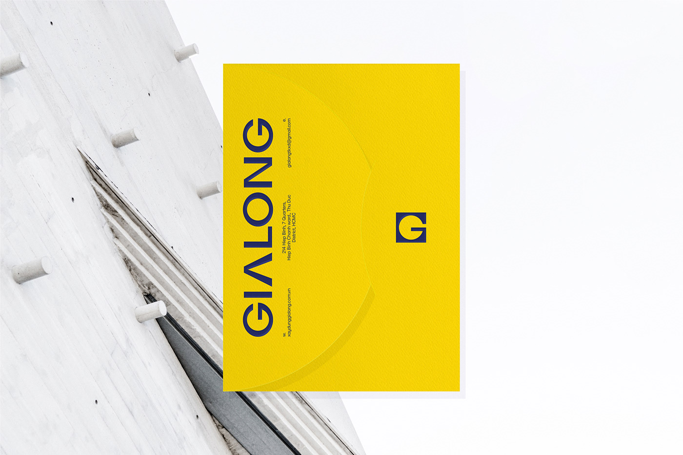
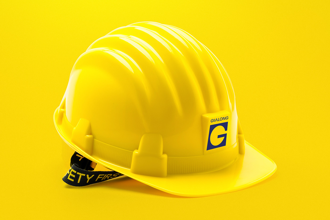
The blue color emphasised Gia Long’s business philosophy: putting the trust first with the slogan “Trust – everyone believes”. The yellow played as a complementary color for this brand identity with the purpose to express the Earth element which had a strong link to Gia Long’s business.
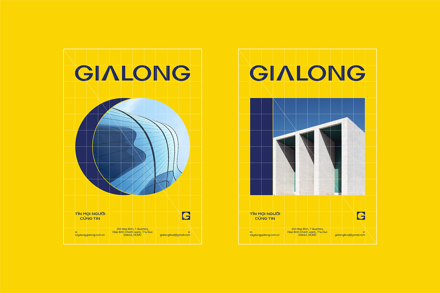
The graphic elements were developed from the cubes that make up the square and round of the identity to increase the uniformity in application designs and support Gia Long’s brand identity.
CREDIT
- Agency/Creative: The Fubo
- Article Title: Visual Identity for Gialong by The Fubo
- Organisation/Entity: Agency
- Project Type: Identity
- Project Status: Published
- Agency/Creative Country: Vietnam
- Agency/Creative City: Ho Chi Minh
- Market Region: Asia
- Project Deliverables: Brand Identity, Branding, Illustration, Rebranding, Typography
- Industry: Construction
- Keywords: Branding, identity, visual design, Gialong, Fubo, creative
-
Credits:
Art Director: Hoa Pham
Designer: Phuong Thao Pham
Project Assistant: Hong Cam Ngo


