


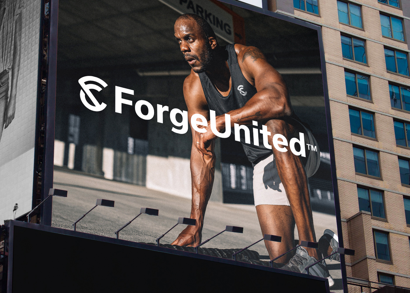
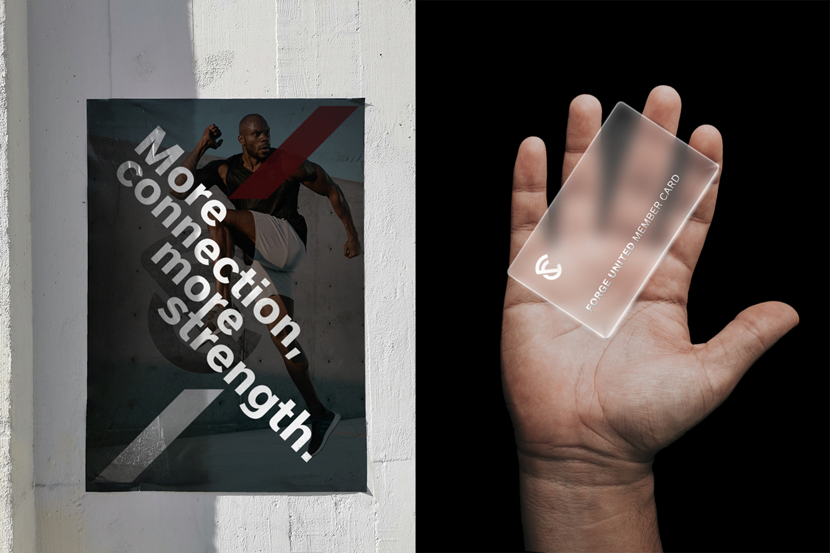
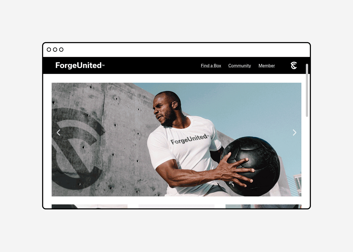
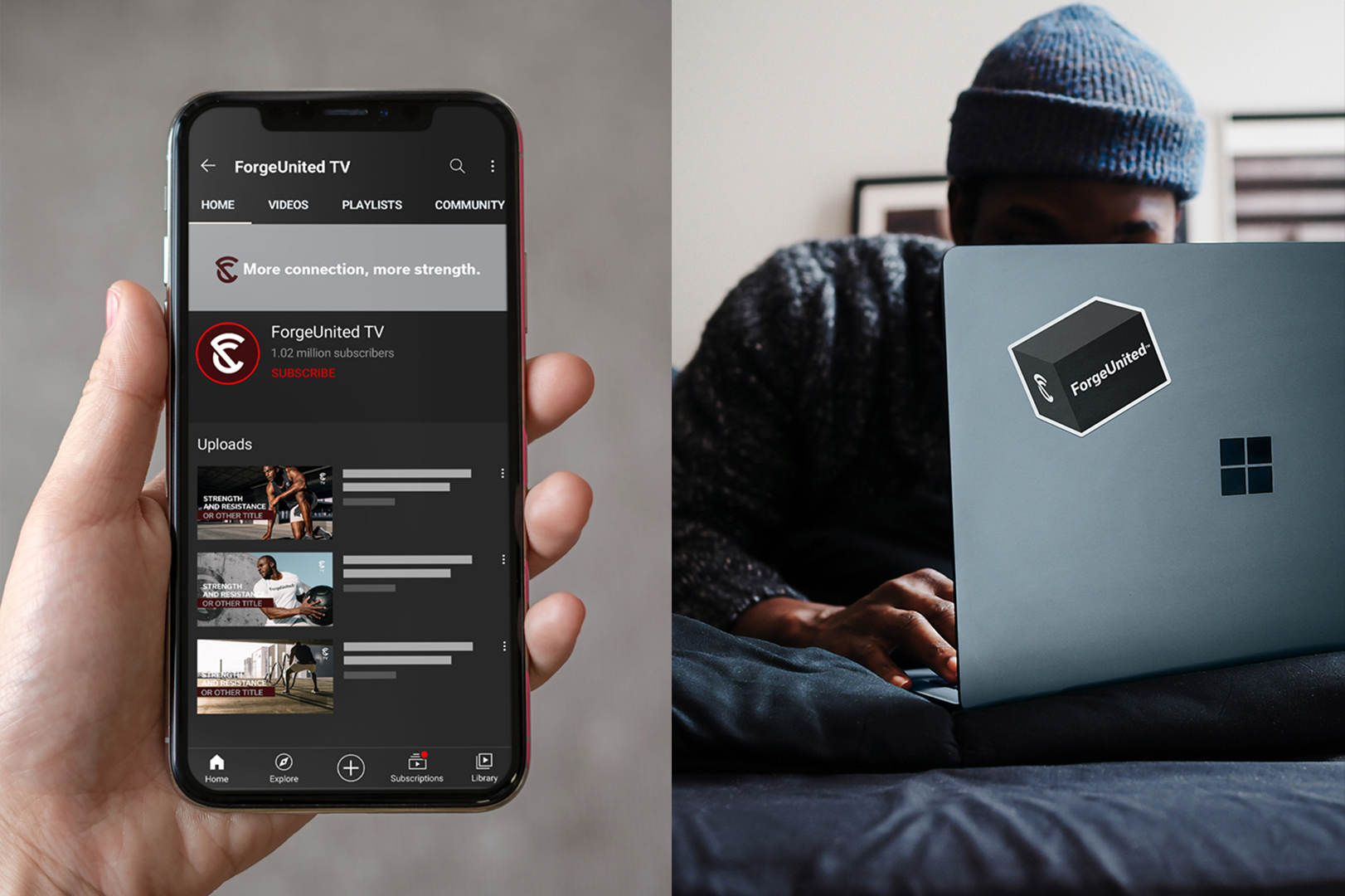
More connection, more strength. ForgeUnited is a community that aims to unite the most passionate Crossfit and functional training athletes in the world. It offers search experiences through its website so that athletes find the nearest Box and can connect to the collective.
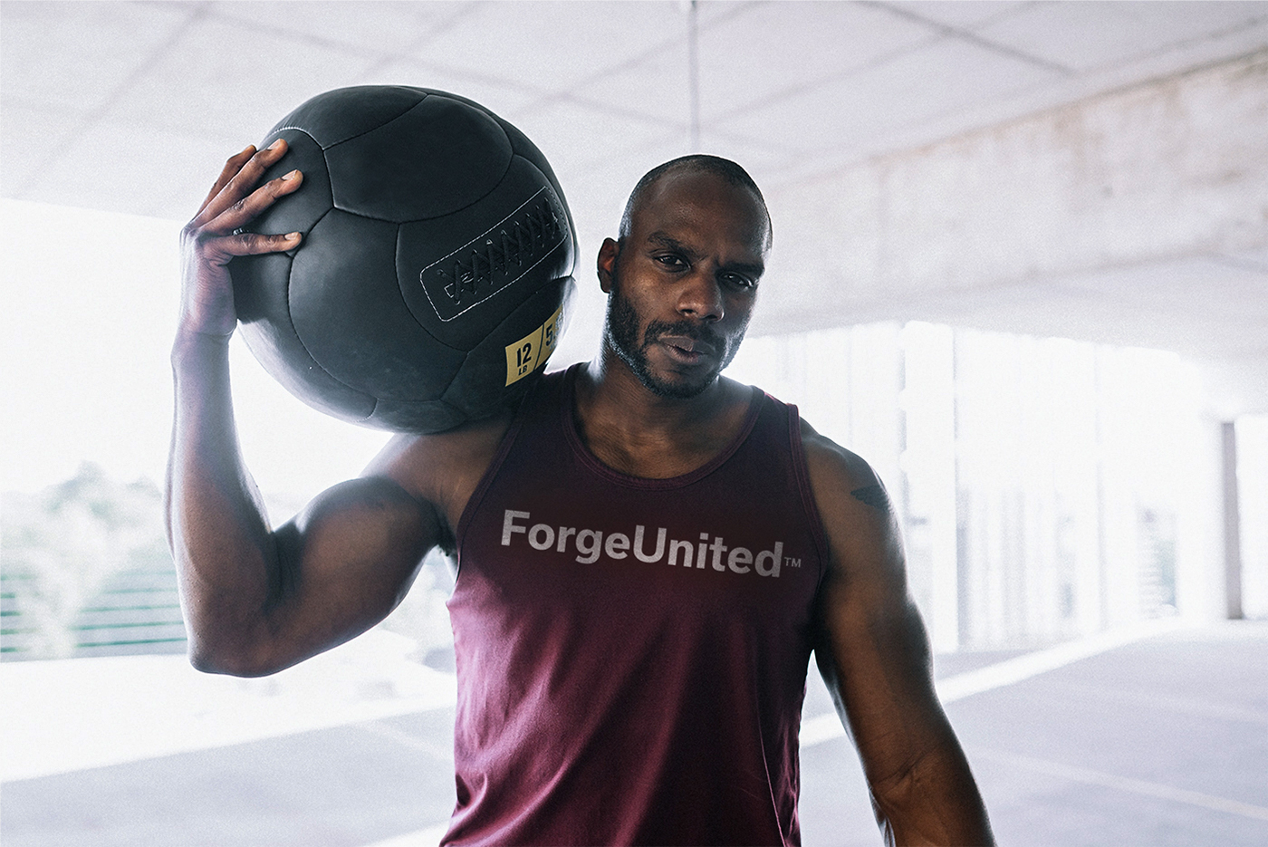
I was invited by ForgeUnited to develop their visual identity, the purpose of the collaboration was to develop the perception of strength and organization, creating an intense feeling for the brand.
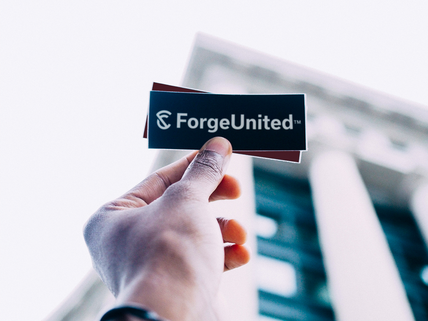
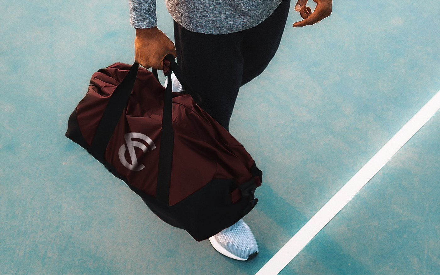
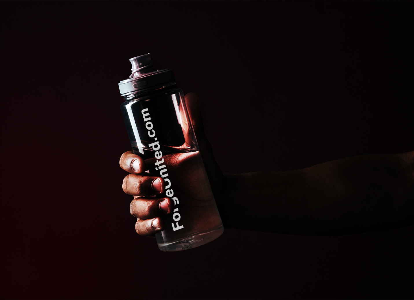
The solution features a minimal and carefully crafted system that adapts to a wide range of brand touch points.
Believing in the strength of people united with the same purpose, the company was born to prove that the result of this connection makes the sport even stronger and works to build the most comprehensive community directory of functional fitness, high intensity interval training (HIIT), strength and conditioning and cross training academies.
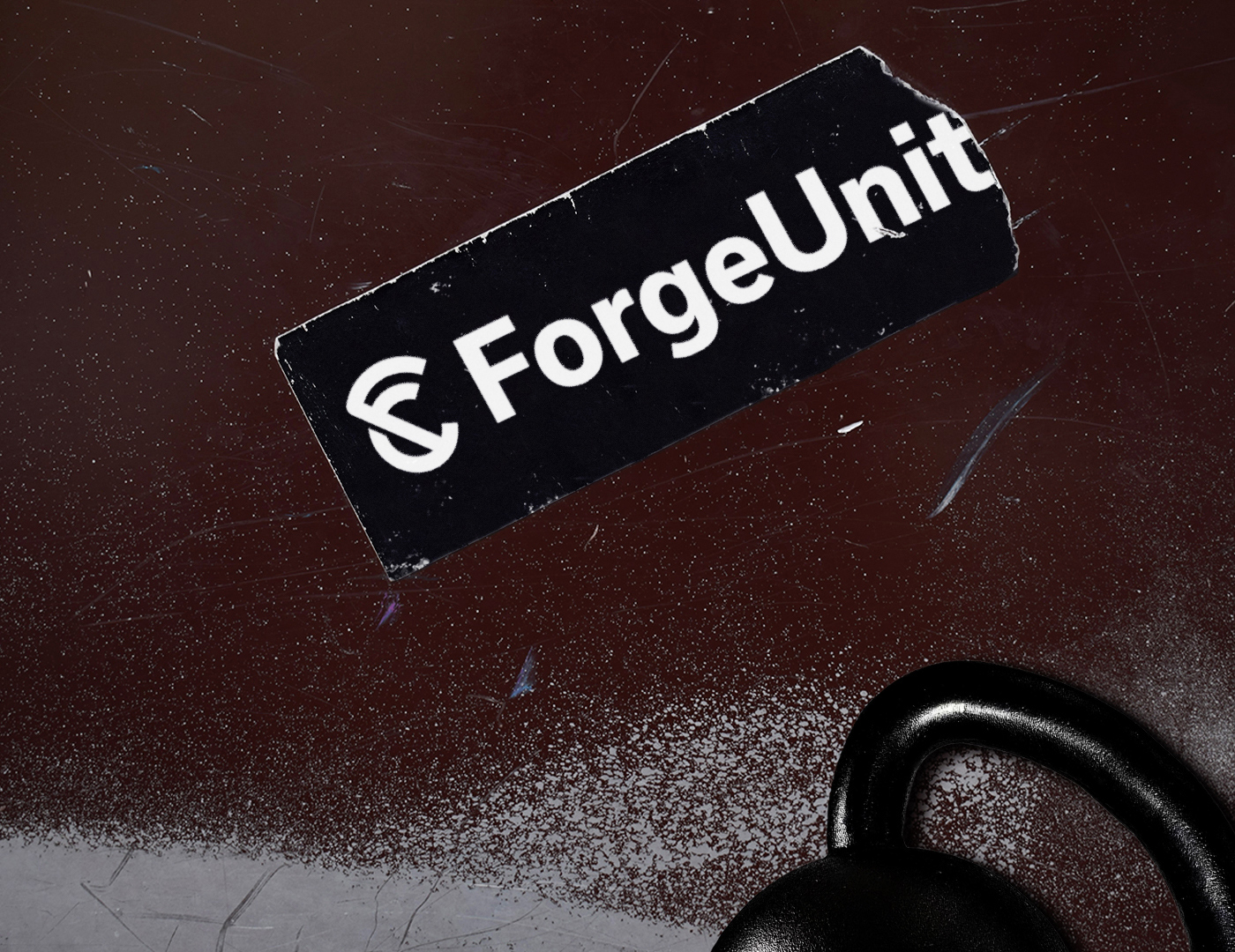
Logo: The symbol was built from three elements, the letters F and U forming a Kettlebell, one of the main instruments for the practice of cross training. We decided to choose the bold version of the symbol and rotated the letter U slightly so as not to ignore the appearance of the kettlebell and avoid the appearance of the Letter C.
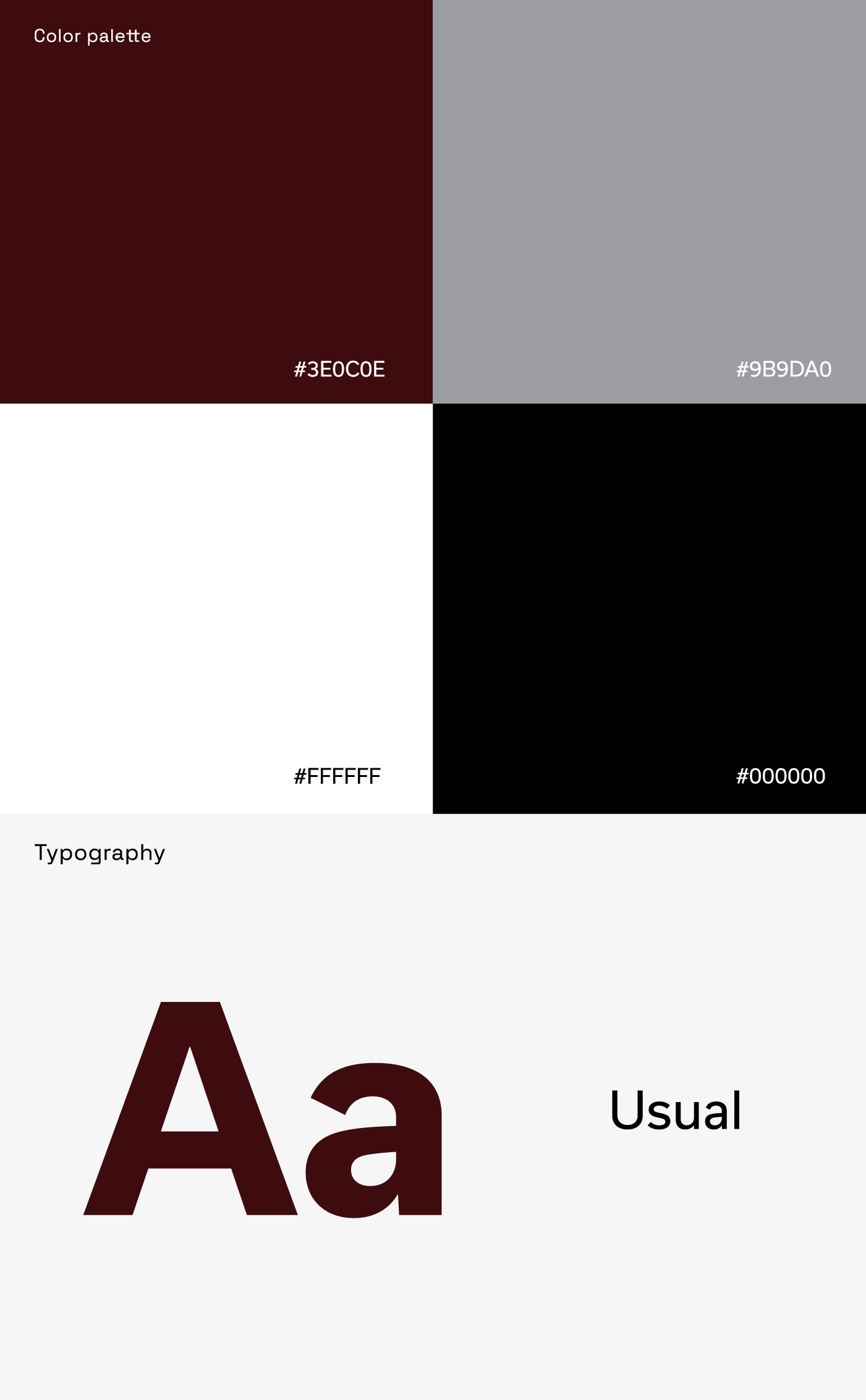
Colors: In addition to the white and black colors, two more colors were chosen to differentiate and give identity to the brand. The wine color was chosen to bring the blood spectrum (thus bringing energy) in a darker tone to bring out more sophistication. The gray color was chosen to bring modernity, timelessness and versatility to the company.
Typography: The letter used in the brand is the Usual font with bold thickness. With straight and sans serif shapes, it was chosen for bringing strength, credibility and modernity.
Strategy: The forgeunited.com brand’s strategy is primarily online, feeding its website with cross training academies from the most diverse countries in the world, in this way your website works as a gym search engine, reaching thousands of people faster.
CREDIT
- Agency/Creative: Thalles Borba
- Article Title: Visual Identity For ForgeUnited By Thalles Borba
- Organisation/Entity: Freelance
- Project Type: Identity
- Project Status: Published
- Agency/Creative Country: Brazil
- Agency/Creative City: João Pessoa
- Market Region: South America
- Project Deliverables: Brand Creation, Branding, Creative Direction
- Industry: Health Care
- Keywords: sport, fitness, crossfit, gym, athlete, force, workout, community, collective, digita, branding, health, athletic, training, muscle, functional fitness, connection
-
Credits:
Brand Designer, Art Director: Thalles Borba


