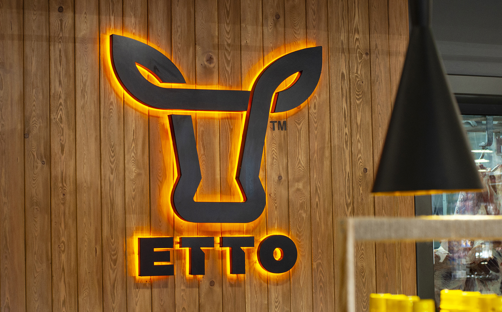
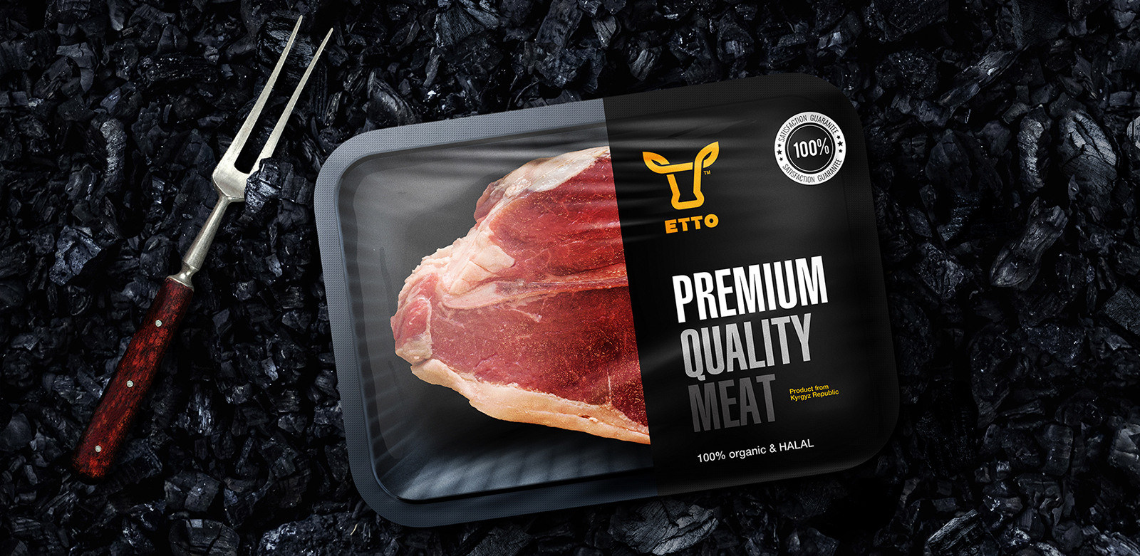
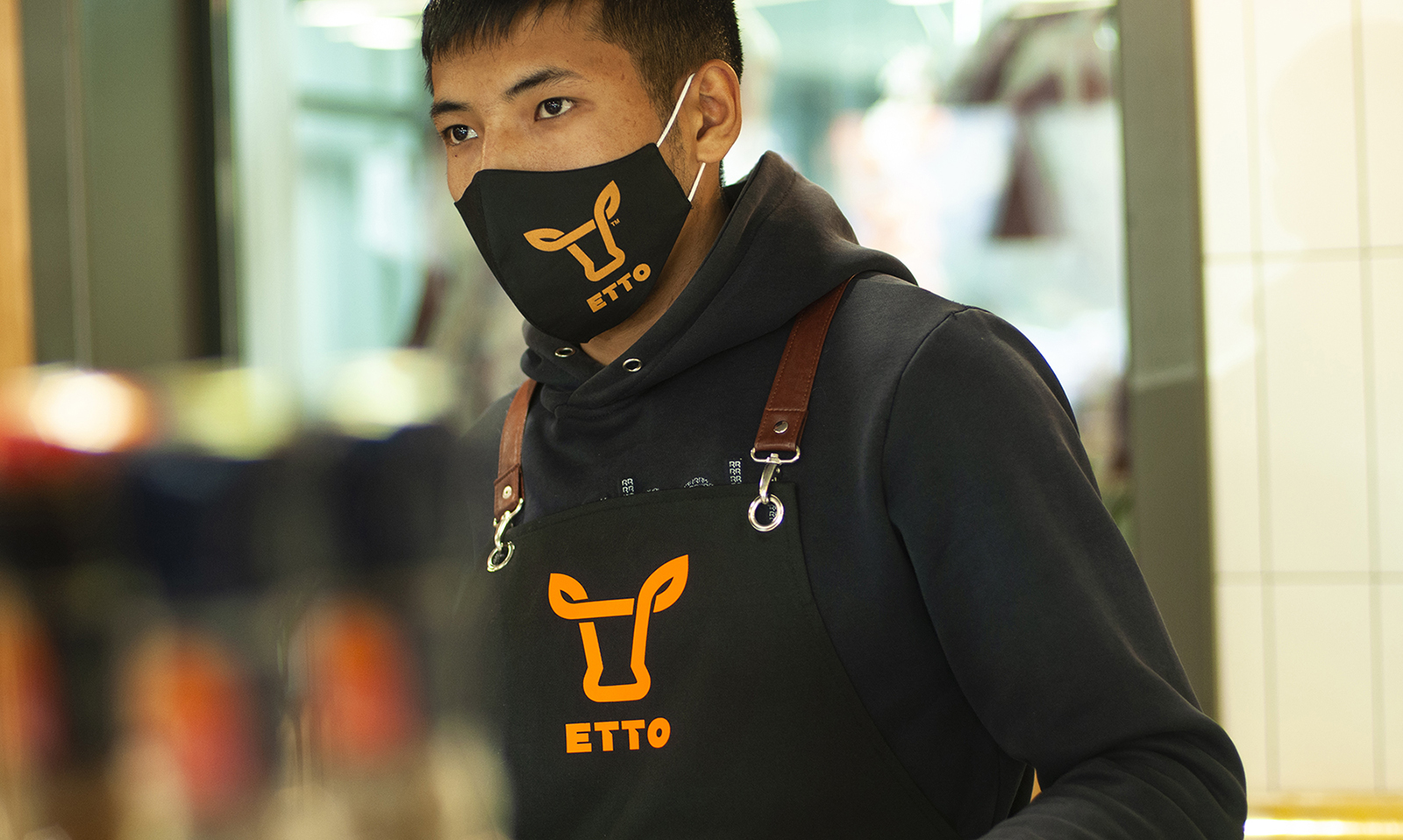
Logo and visual identity for the ETTO butcher shops located in Kyrgyzstan, Central Asia. Naming: equally readable in Kyrgyz, Russian and English. From the Kyrgyz language “ET” means “The Meat”.
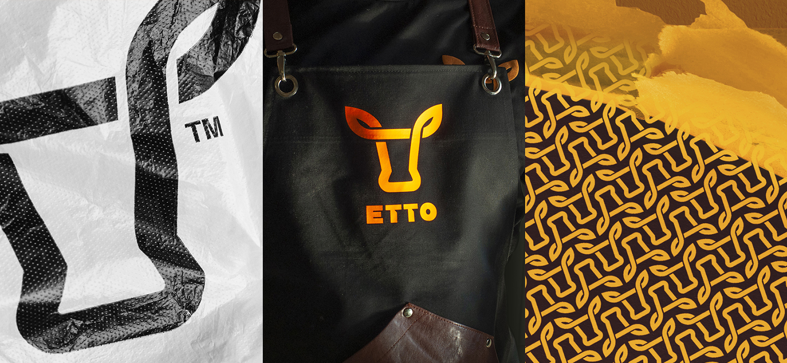
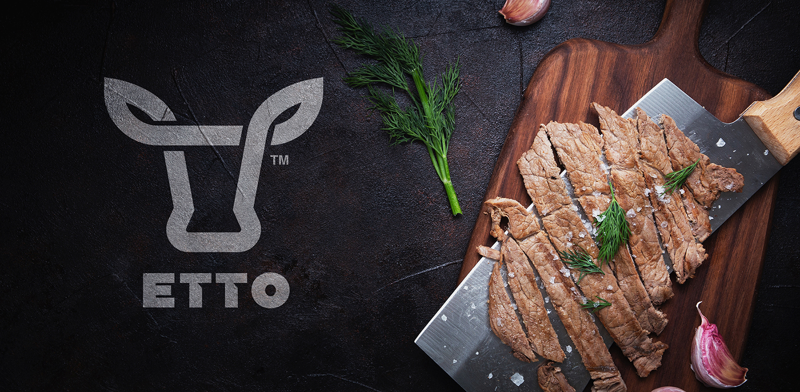
Uniformity of execution: uniform thickness lines, clearly visible symmetry in construction, and clean white spaces inside the symbol, pictures of the association of confidence in, strictness in her control, neatness and cleanliness brand. The line is a link with the branded shops of Trade Mark, and this is a uniform quality service and assortment. The various graphic shapes formed by the line pattern create the image of a variety of meat products, different cuts of meat.
The image is based on a line having a symmetrical and a geometric construction scheme. Circles around the edges of the modular mesh, create rounded outlines at the bottom of the symbol and sharp outlines (horns) at the top of the logo. Internal line breaks imitate a three-dimensional image, and have the same graphic distance.


CREDIT
- Agency/Creative: Alexey Lysogorov Design
- Article Title: Visual Identity for ETTO Meat Brand by Alexey Lysogorov
- Organisation/Entity: Freelance, Published Commercial Design
- Project Type: Identity
- Agency/Creative Country: Kyrgyzstan
- Market Region: Asia
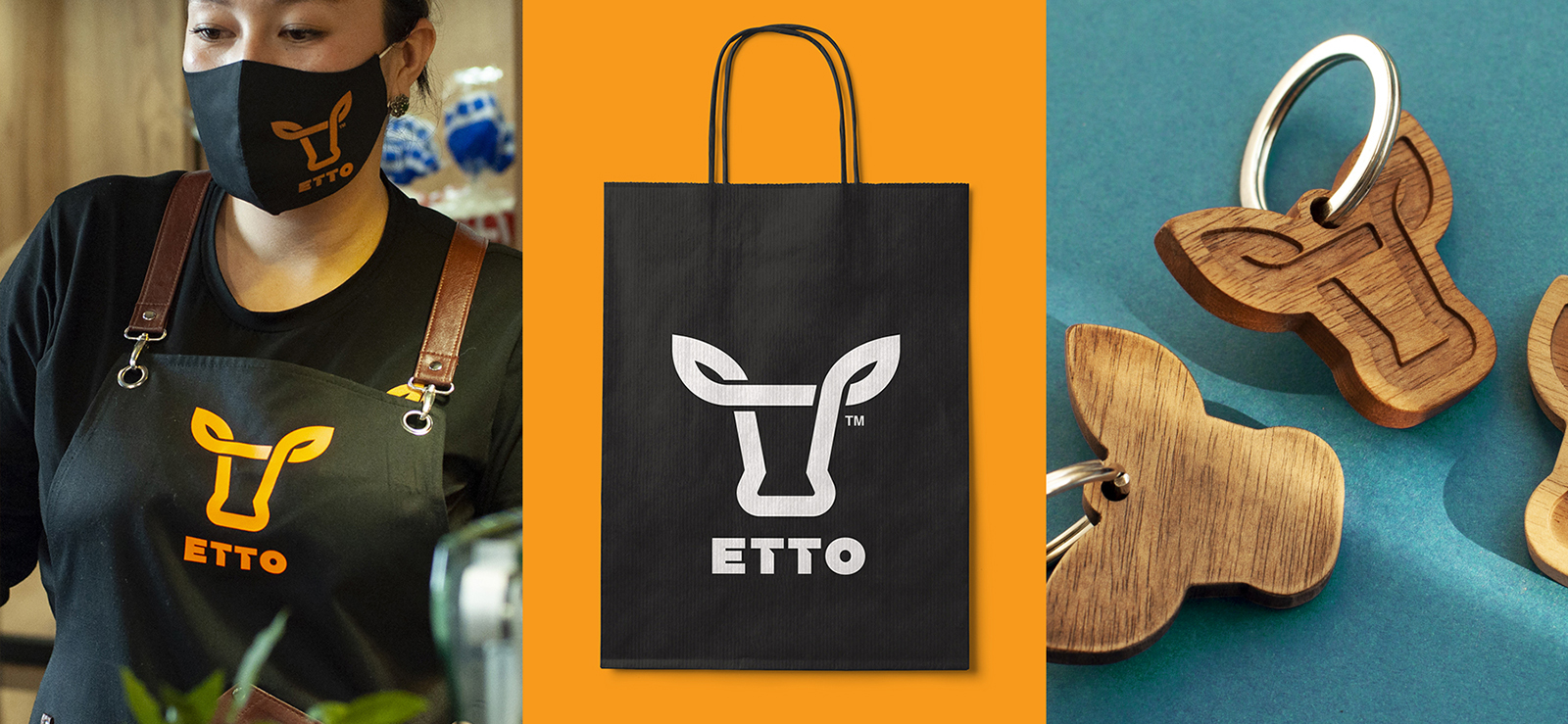
- Project Deliverables: Brand Guidelines, Brand Identity, Brand Naming, Graphic Design, Identity System, Packaging Design, Photography, Research
- Industry: Food/Beverage
- Keywords: meat brand, Kyrgyzstan, Central Asia, ETTO, Lysogorov


