


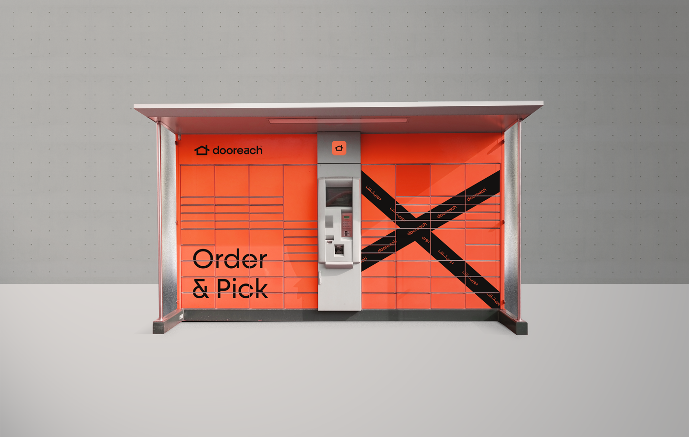
Doorech is a Saudi-based logistics company, Riyadh and its services are expanding to reach the rest of the Gulf countries. It is mainly involved in providing logistical services related to shipping, transportation, supply, etc. In addition to its own logistics services, it also provides warehouse storage services, as it has a lot of expertise and capabilities, in addition to the Locker service (as Amazon Locker), which is a new service to them.
The naming dooreach is a word consisting of two words (door, reach) Which expresses the ease of delivery of products to the home and it is a very effective designation for a project in this industry as it is easy to memorize
Designing a logo in this industry is always a challenge, and what is required is to design a symbolic logo that expresses more of the preservation and storage away from the common and repetitive shapes, but simply and expressively that is characterized by the strength of application in all respects. Whether printed or digital
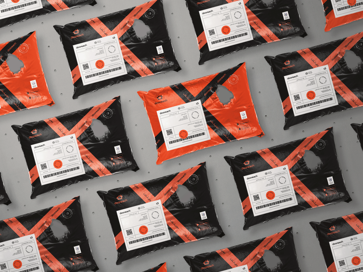
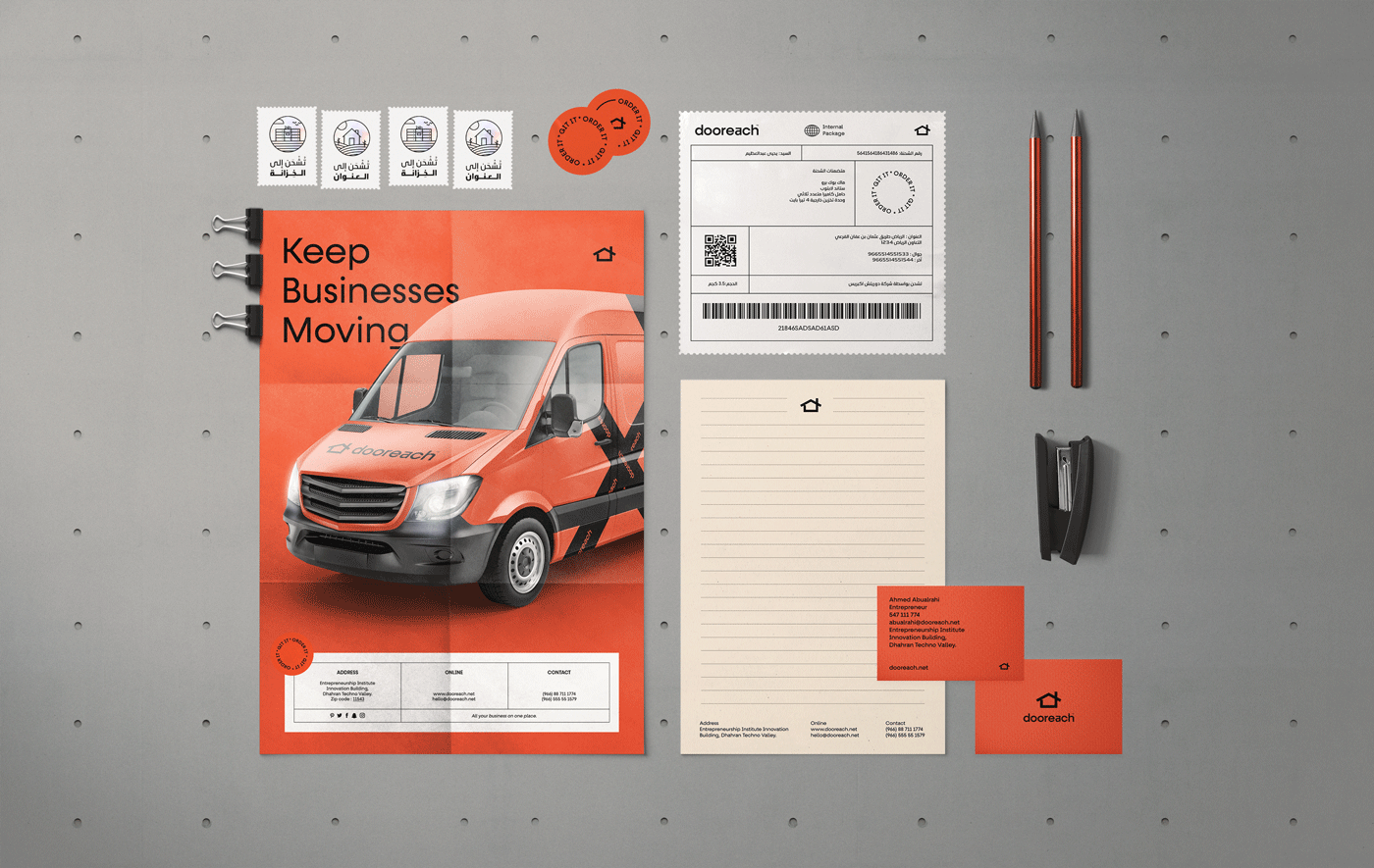
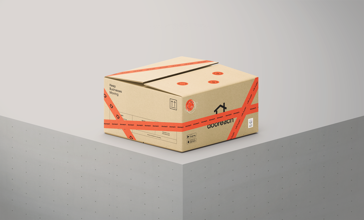
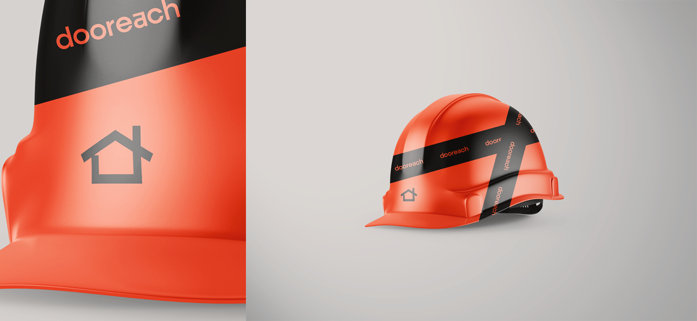
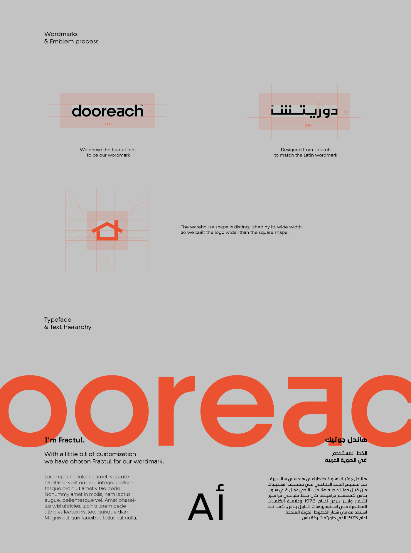
The logo combines the letter (d), an arrow, and the shape of a storage warehouse. The colour was chosen based on the colours of its competitors, and the orange colour had a distinct ability to express and force. And on the pattern of the geometric logo comes to us the special mark of the logo
With the balanced san serif lines that express the movement and dynamism. The Arab identity came to complement that. The Arabic logo was designed from scratch to match the Latin logo. Identity colours serve an abstraction, simplicity, and simple shapes even in icon illustration, this is the main message of this minimalistic design. Yes, doorech is simple, modern, but strong, with sharp graphics, fonts, and spatial compositions that underline this brand message. It was an honour for us to work on a project like this. It is not easy to create a local identity that is compatible like this.


CREDIT
- Agency/Creative: Babyl Branding
- Article Title: Visual Identity for Dooreach Logistic by Yahia Abdulazem
- Organisation/Entity: Freelance, Published Commercial Design
- Project Type: Identity
- Agency/Creative Country: Egypt
- Market Region: Asia
- Project Deliverables: Brand Advertising, Brand Experience, Brand Identity, Brand Naming, Branding, Identity System, Packaging Design
- Industry: Transport
- Keywords: BOX CARGO DELIVERY IDENTITY LOGISTICS LOGO LOGOTYPE MARK PACKAGING SERVICE


