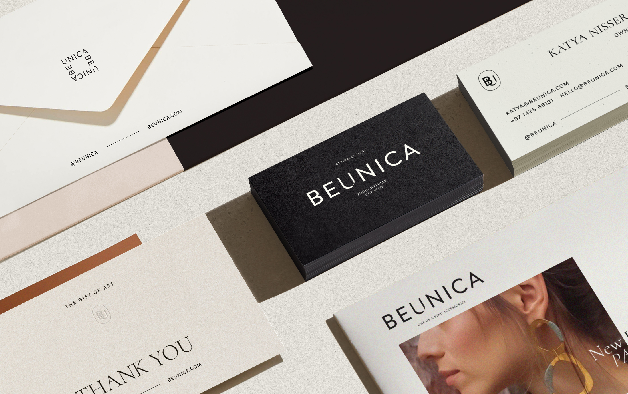
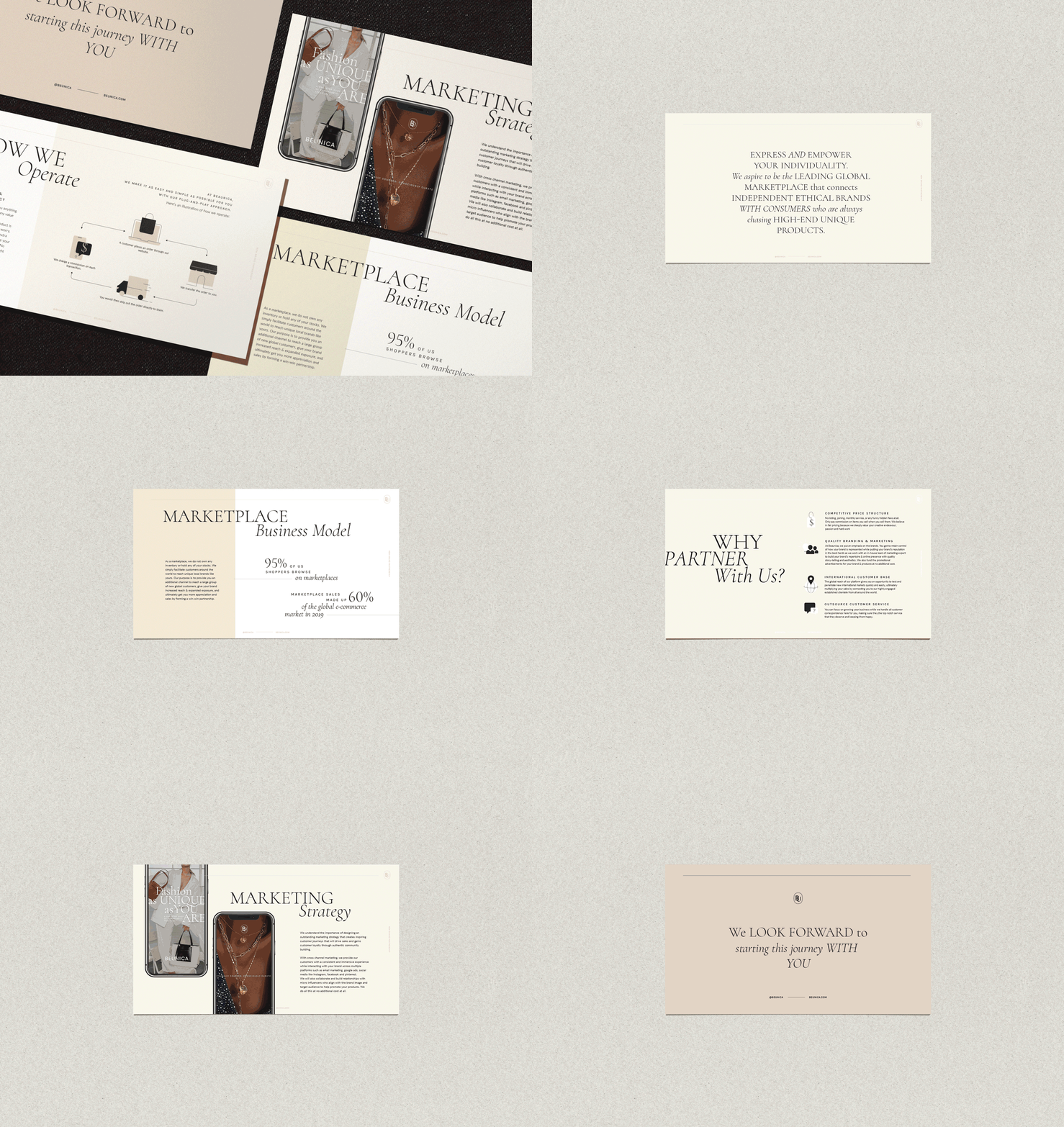
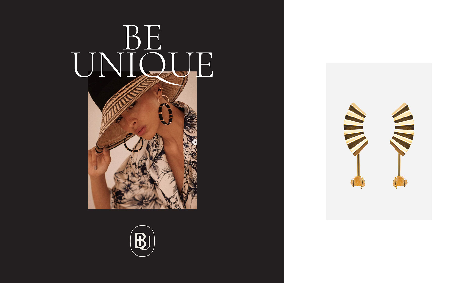
Beaunica is a fashion marketplace that connects independent ethical brands with consumers who are always chasing high-end unique products from fashion accessories to home décor.
They exclusively pick one-of-a-kind pieces with world class quality & craftsmanship and a focus on sustainability. Their mission is to provide shoppers a captivating experience through unique contents in an aesthetically pleasing website and inspirations. As we developed the branding, our goal was to establish a framework that could help Beaunica redefine their positioning in the marketplace e-commerce world. As an emerging brand in a highly competitive category, our differentiation strategy was to focus on an immersive and inspiring customer experience through meaningful aesthetics.
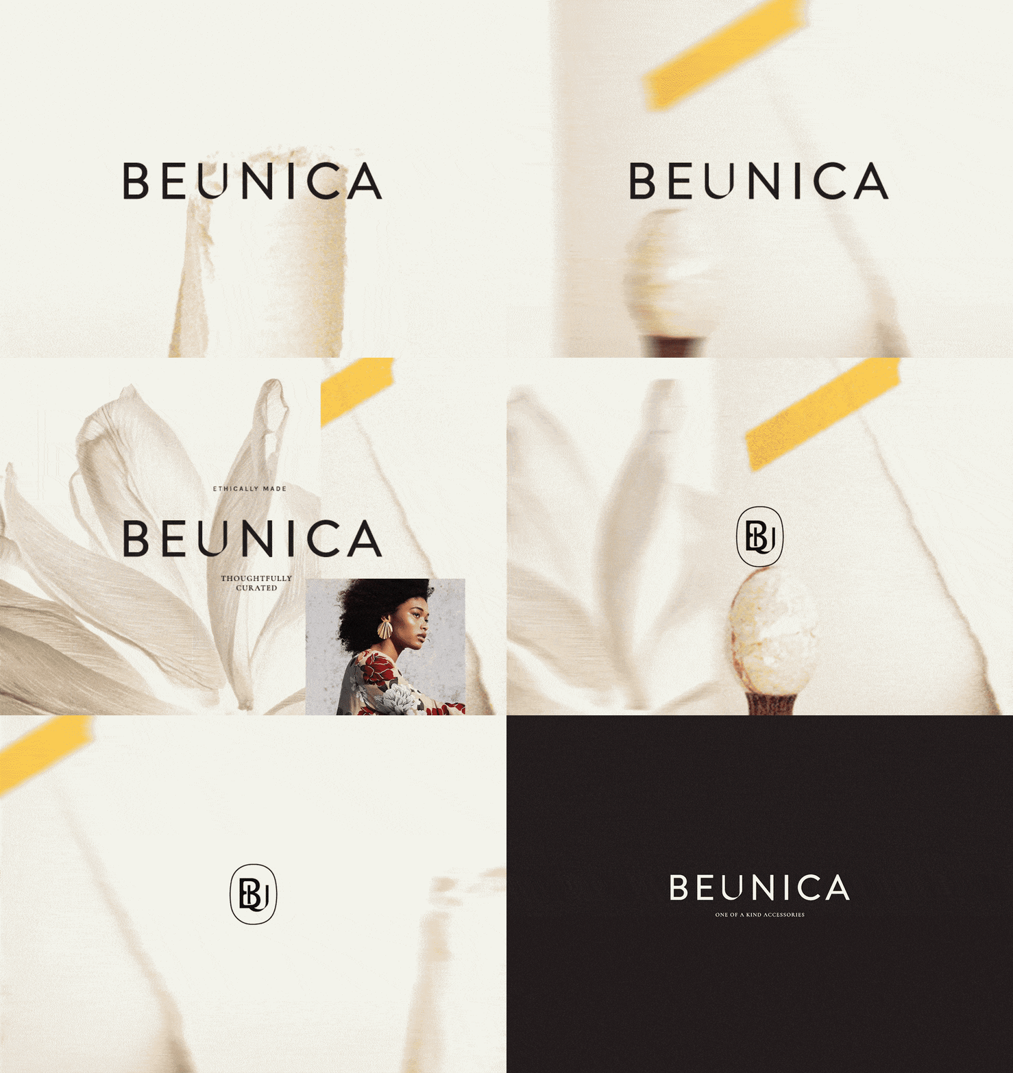
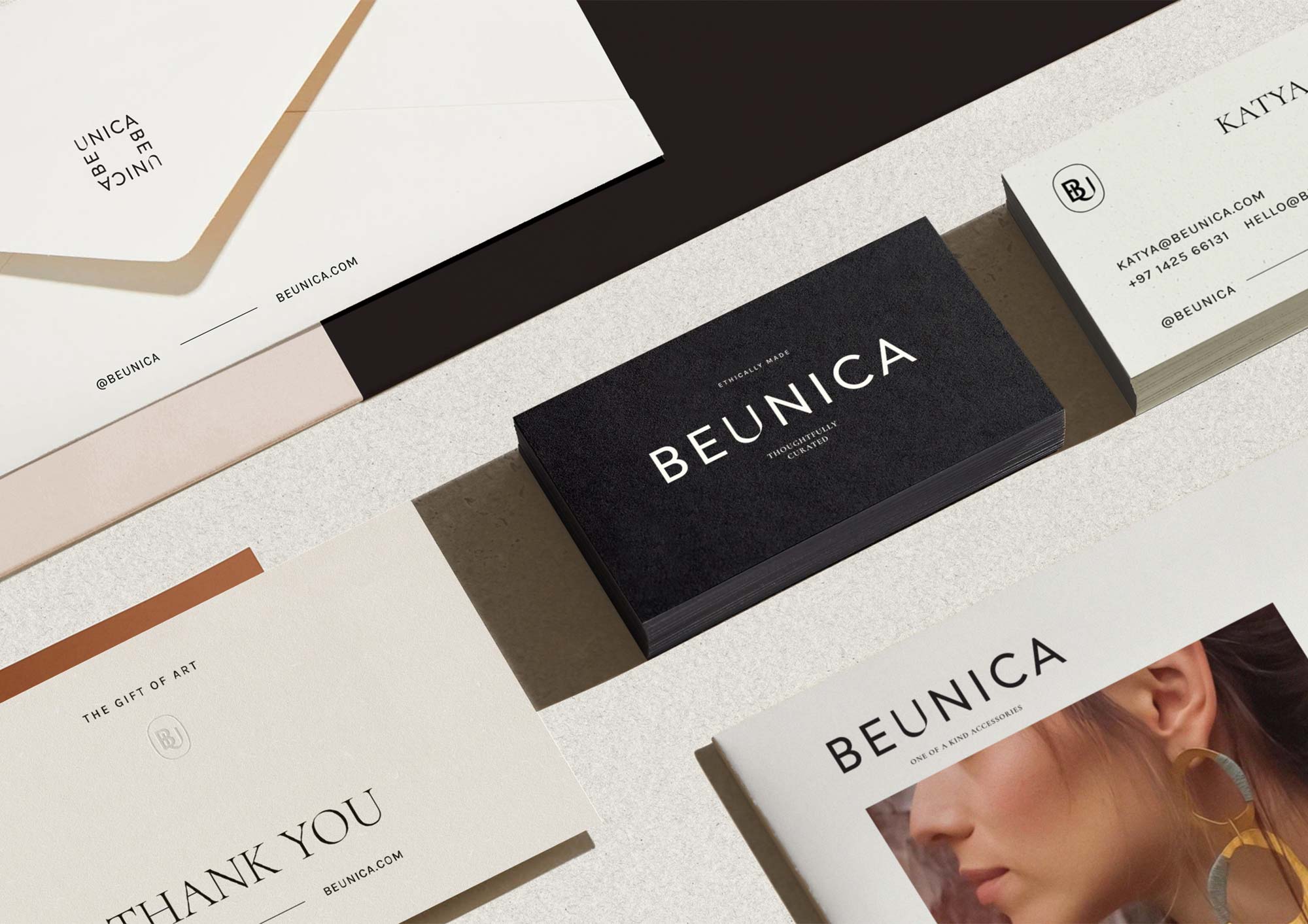
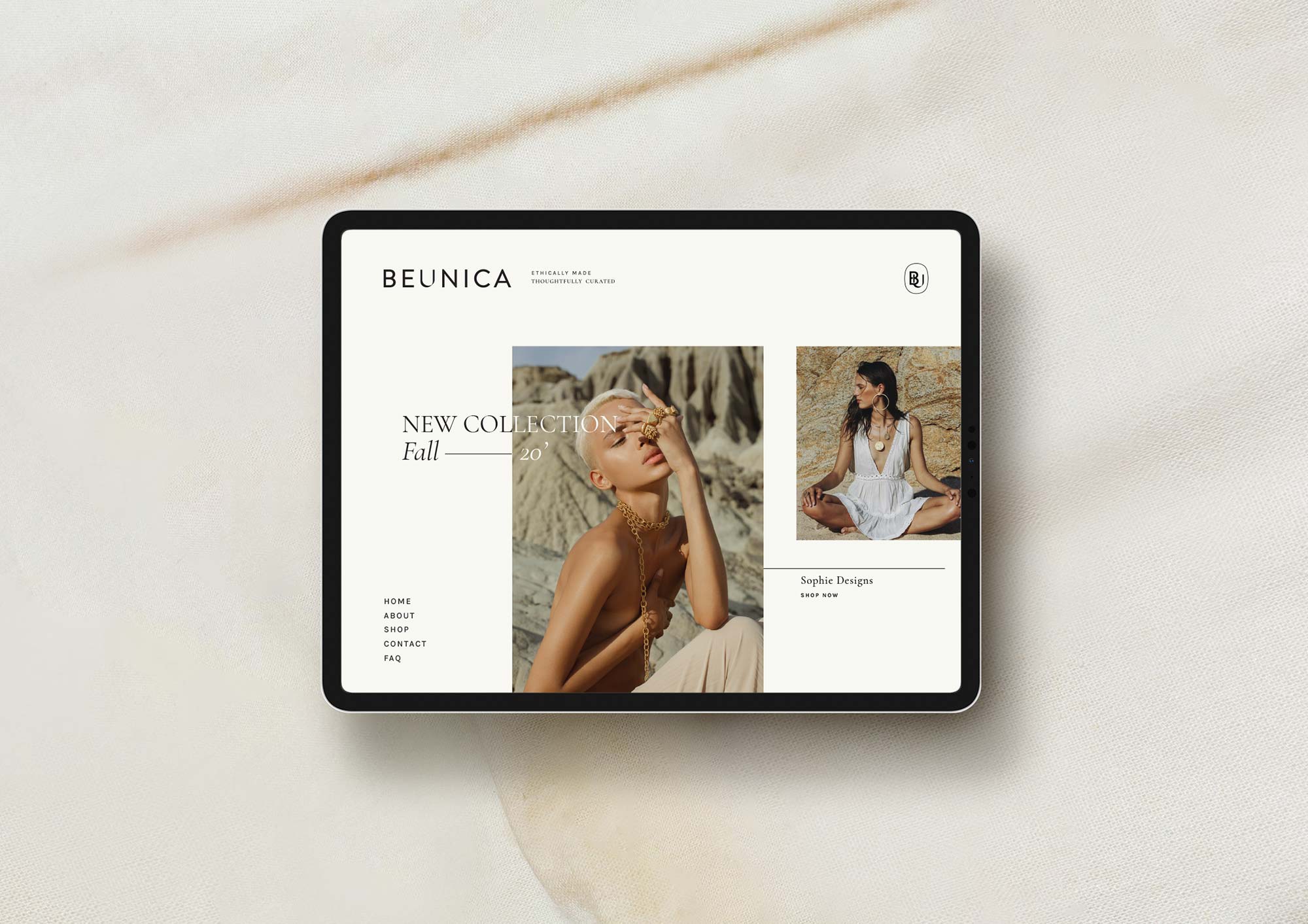
We crafted a unique and elegant visual identity that’s simple, subtle, and sophisticated to help them stand out from the rest and differentiate themselves as a high-end yet affordable brand that speaks to their niche target market. We created a logotype that is elegant yet has an eclectic character, using a bold san serif typeface with an accent on the “U” that is made to be different from the rest to accentuate the uniqueness and individuality of U – referring to Beaunica’s customers. Combining it with a thinner typeface for that sweet balance, both serif & san-serif to convey a sense of sustainability and exclusivity.
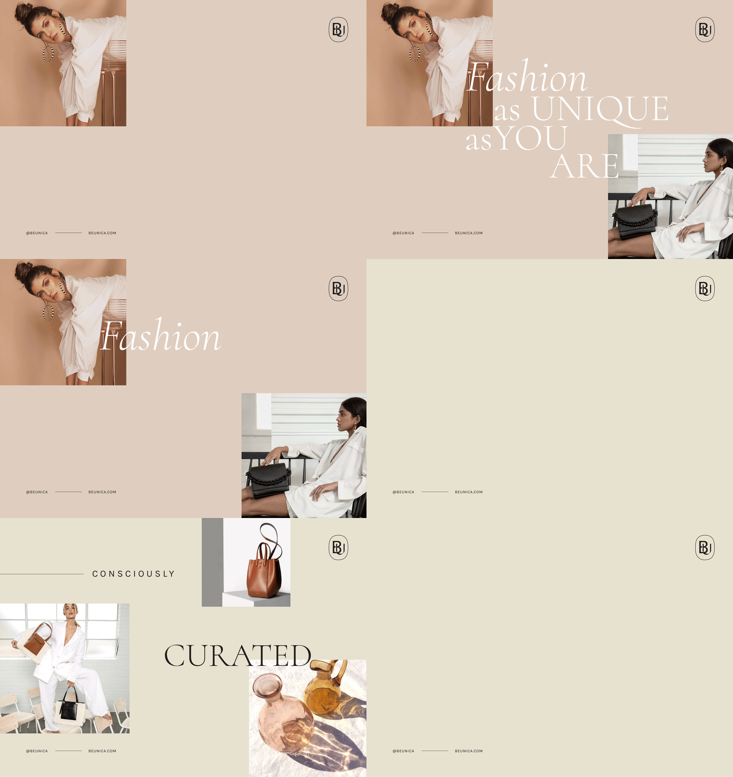
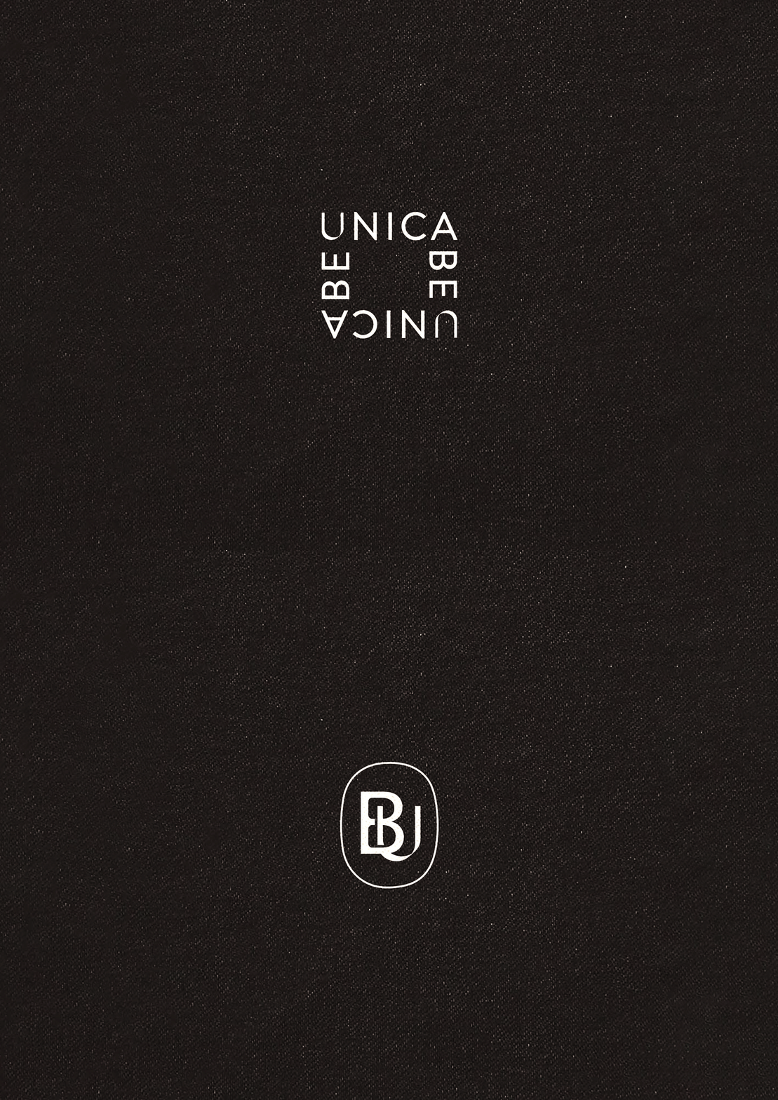
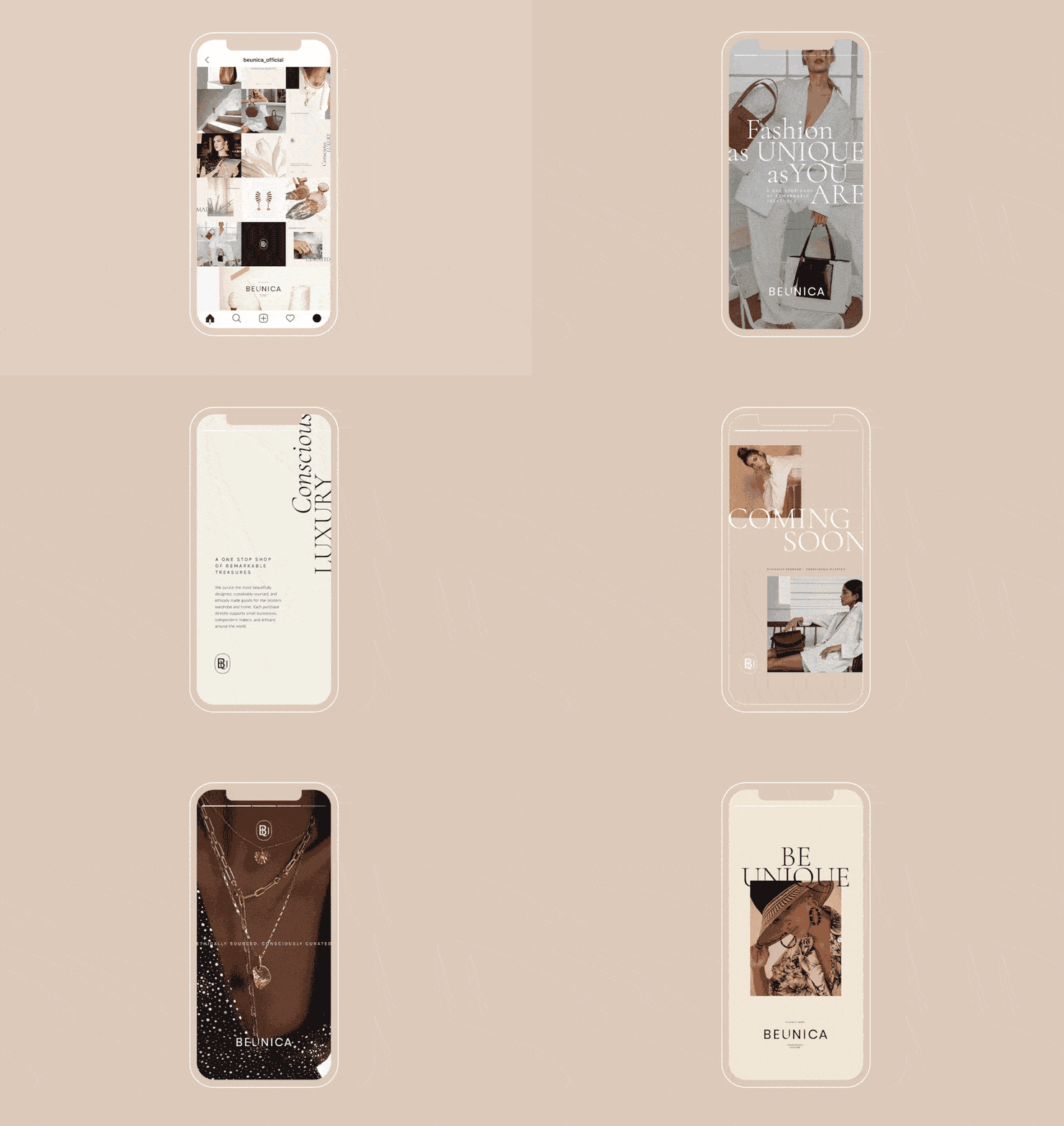
The logotype is paired with a main icon that is both a monogram of BU and a play of words of “Be You”. The second icon is square shaped that reads Beaunica but with a smart separation from be and unica to deliver the message “Be You. Be Unique. Be Unica”. Both icons embody the simplicity, modernity and luxury side of the brand and can be used diversely across medias. Beaunica puts an emphasis on the designers and the stories behind the products and their uniqueness. To support this, we use clean and simple yet unique layouts mainly using monochrome thin line arts and elements that compliment the typography and colors. The color palette consist of neutral tones that is basic, timelessly fashionable and highly functional as a calm backdrop to let the products and content be the stars of the show.
CREDIT
- Agency/Creative: Merillangie Studio
- Article Title: Visual Identity for Beaunica A Fashion Marketplace by Merillangie
- Organisation/Entity: Freelance, Published Commercial Design
- Project Type: Identity
- Agency/Creative Country: Indonesia
- Market Region: Global
- Project Deliverables: Brand Guidelines, Brand Identity, Brand World, Branding, Graphic Design
- Industry: Fashion
- Keywords: brand identity, graphic design, fashion, marketplace, unique product, ethical brands


