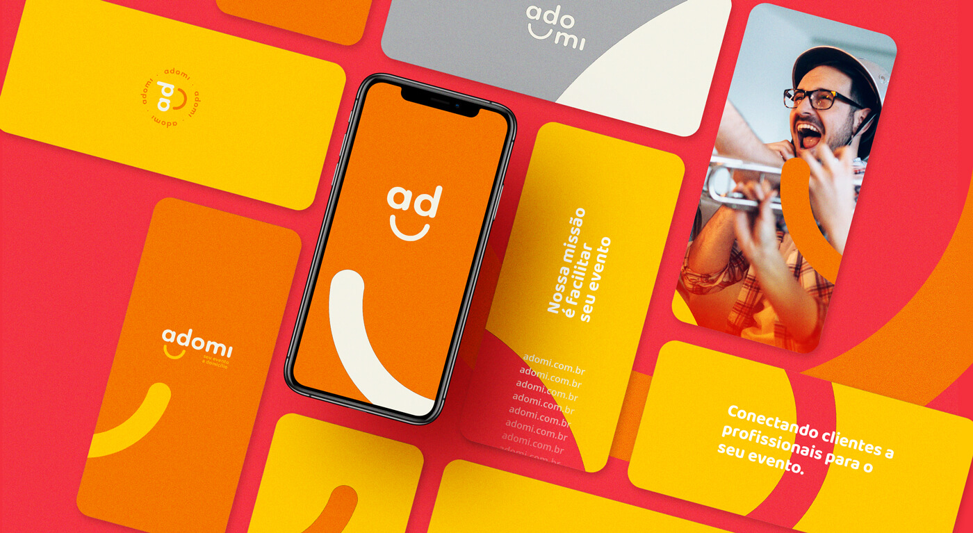
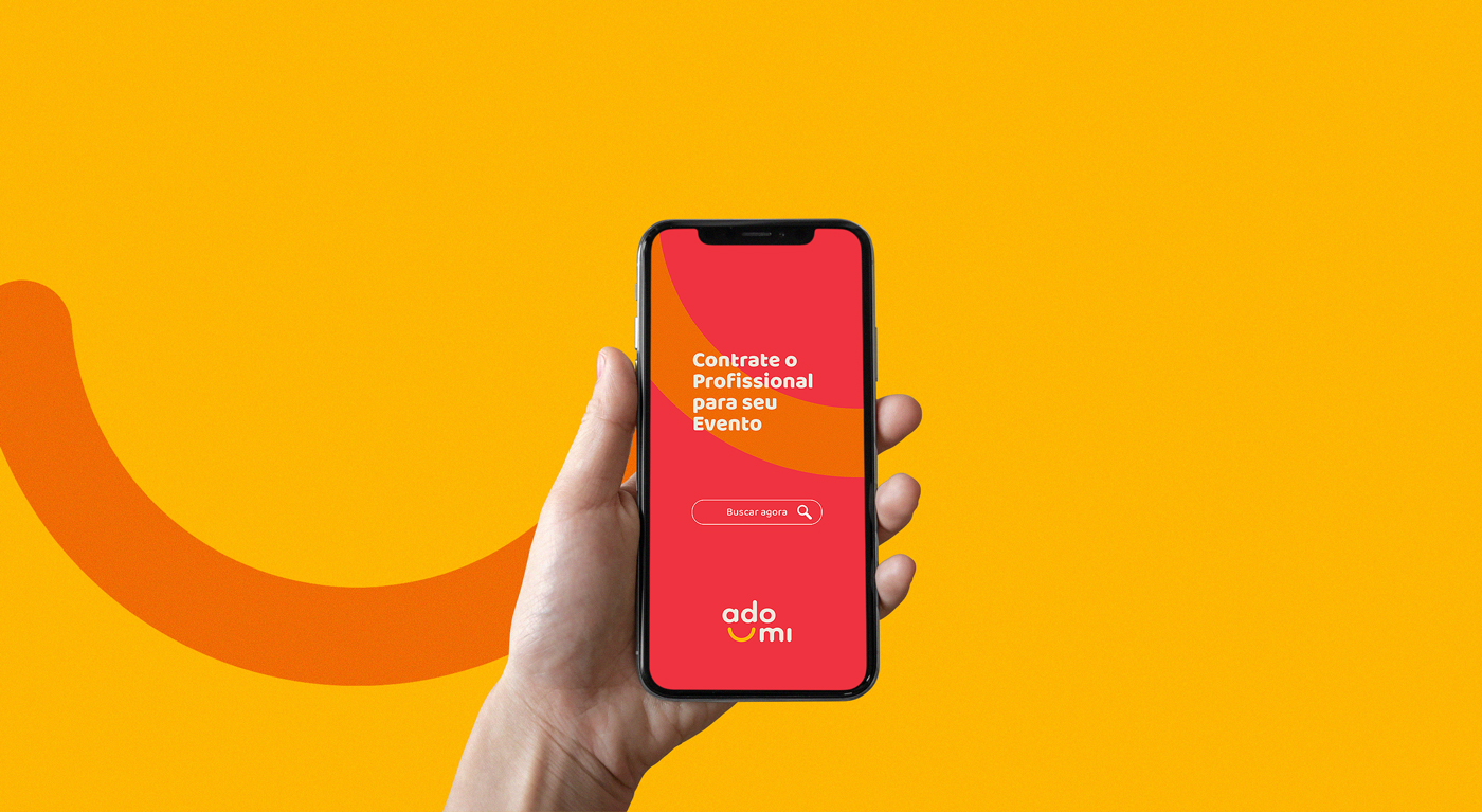
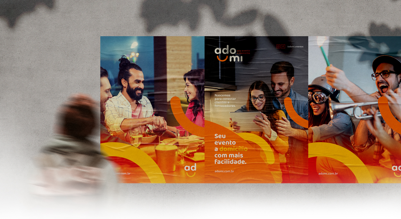
Adomi is a marketplace to facilitate the organization of home and / or small events, connecting potential contractors with service providers. Its objective is to transform the home events sector in Brazil, revolutionizing the way people organize their parties, allowing for the professionalization of this sector and adding value in different ways by making the interconnection between the parties (contractors and providers).
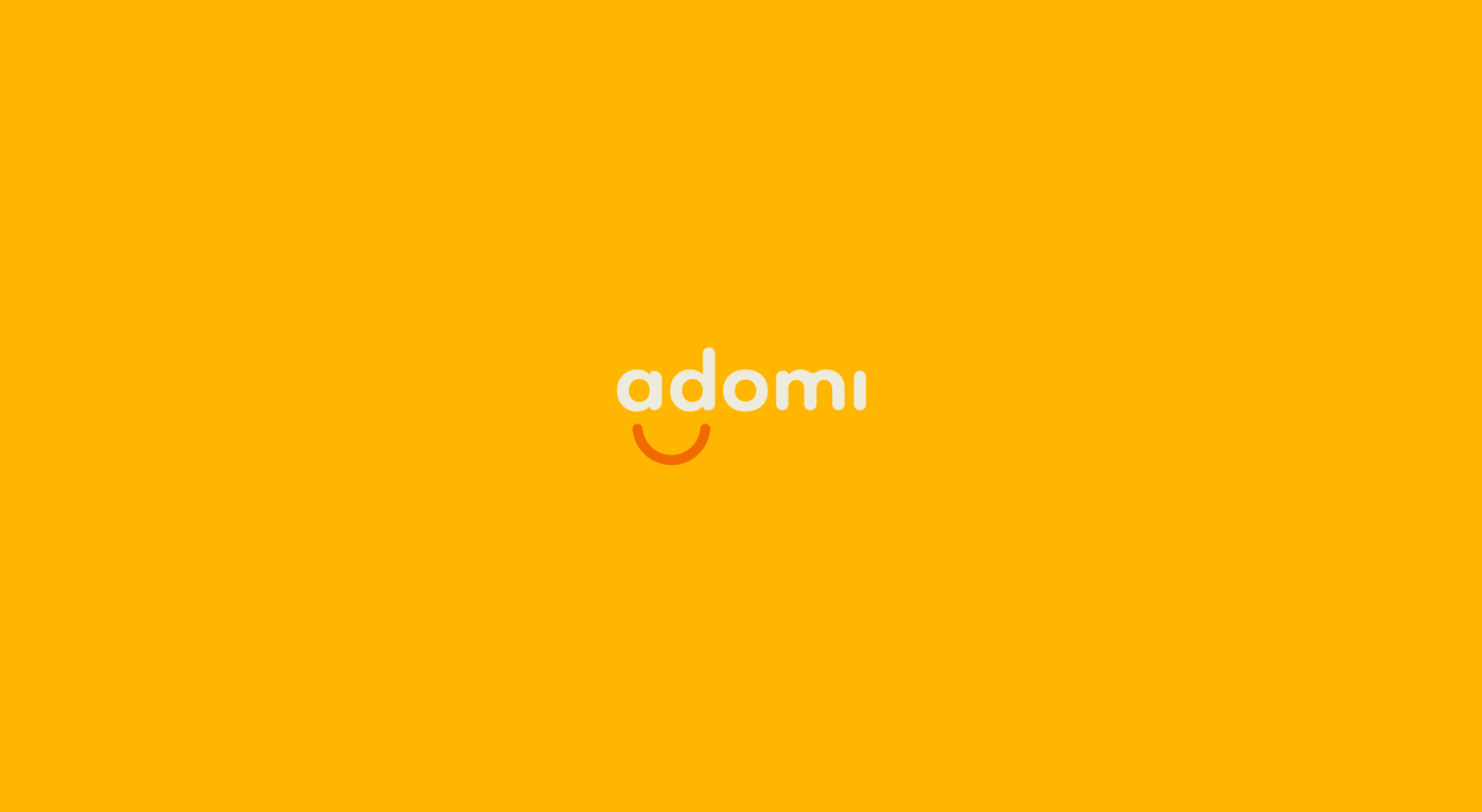
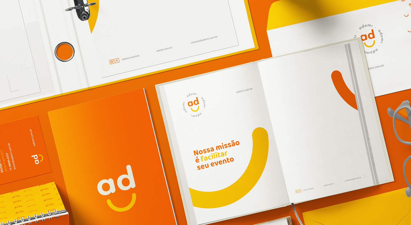
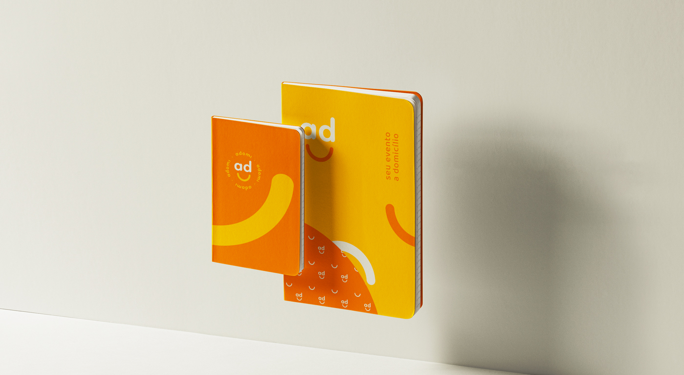
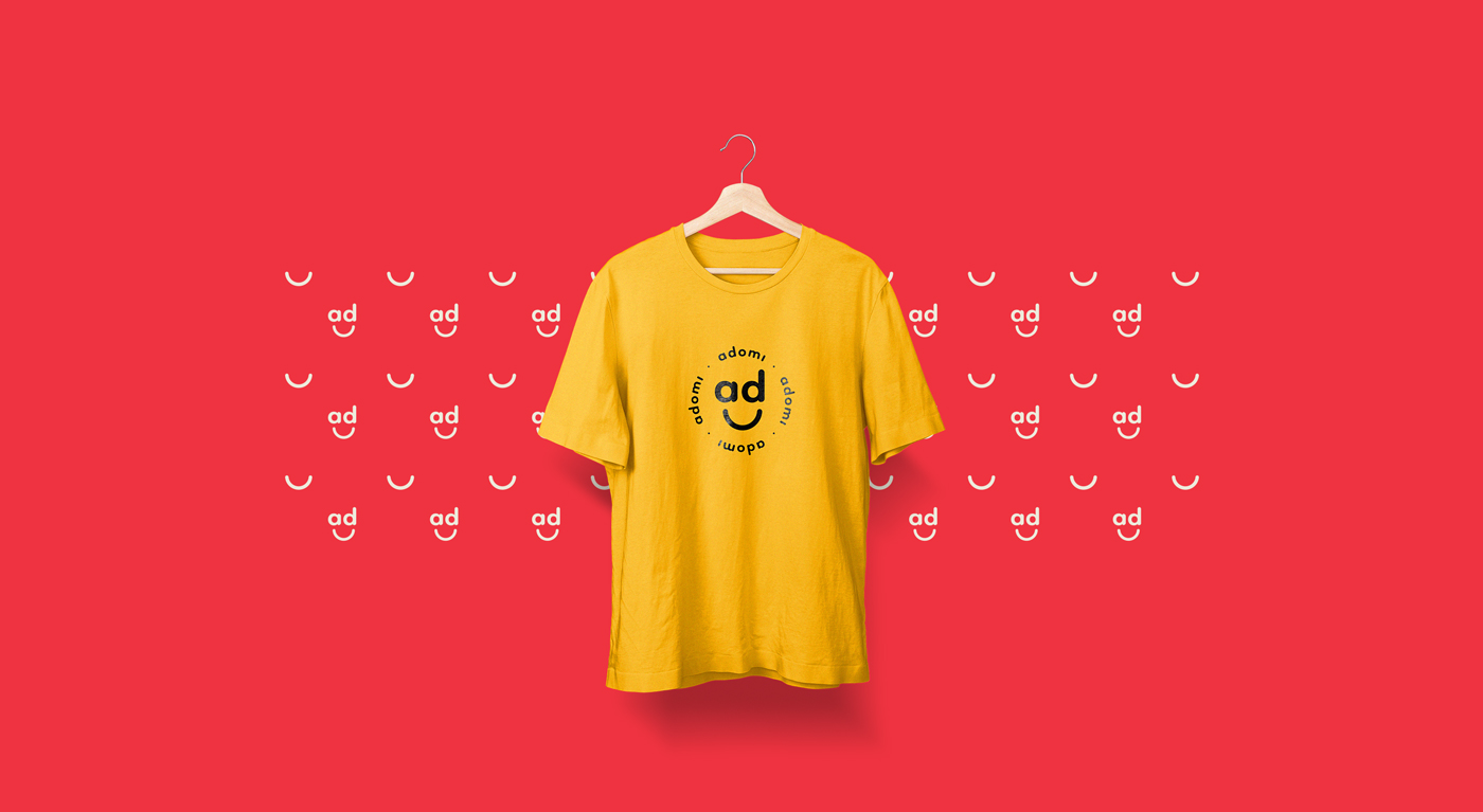
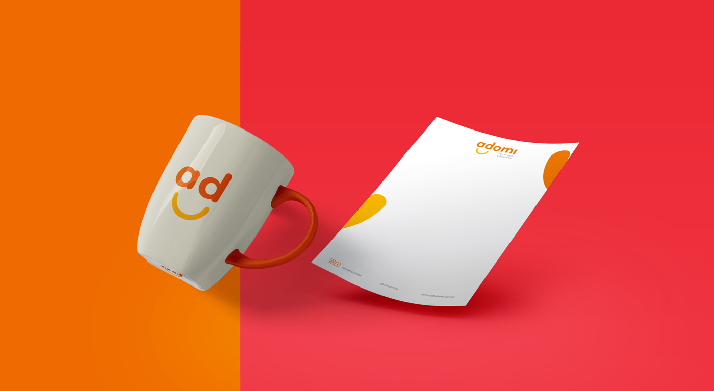
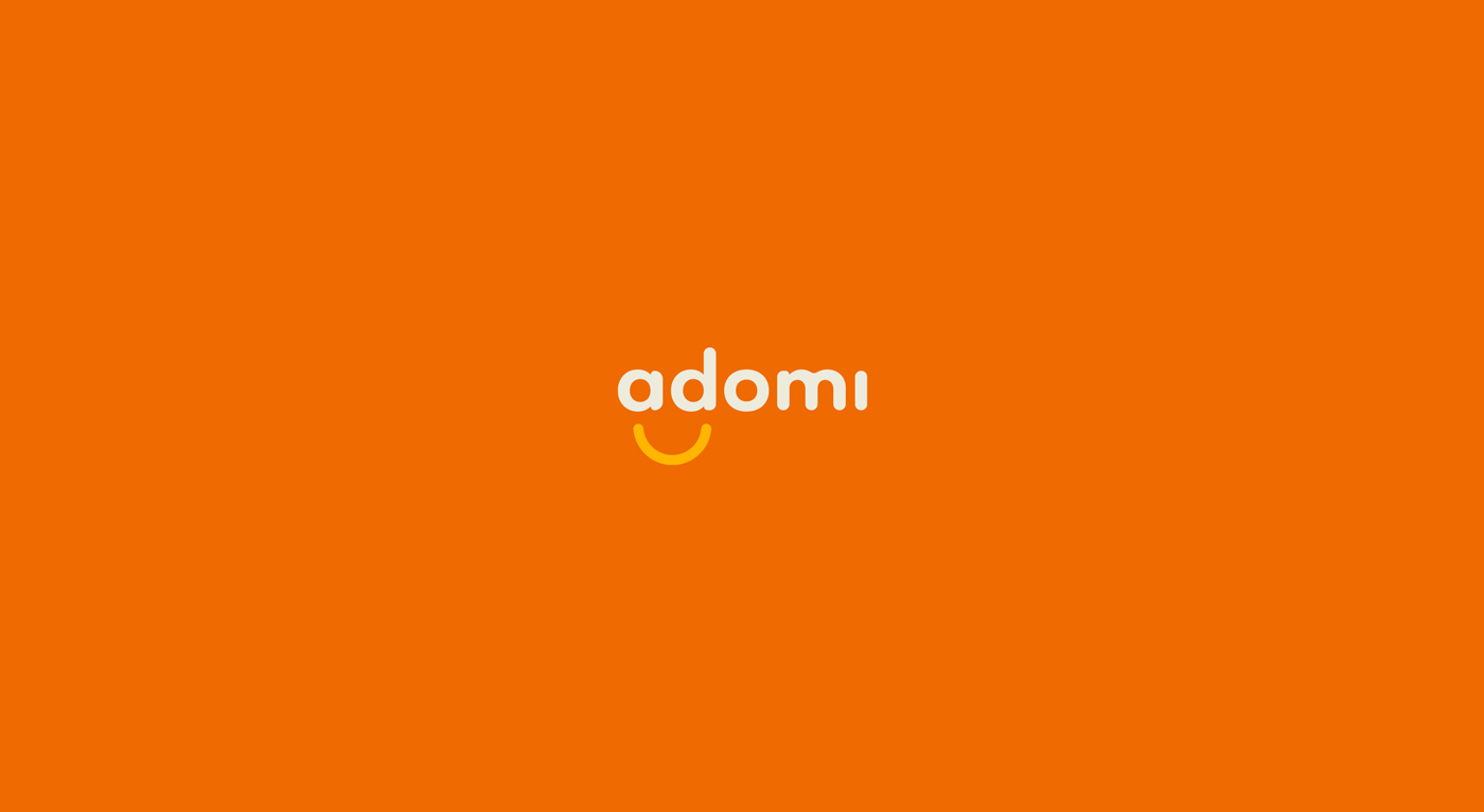
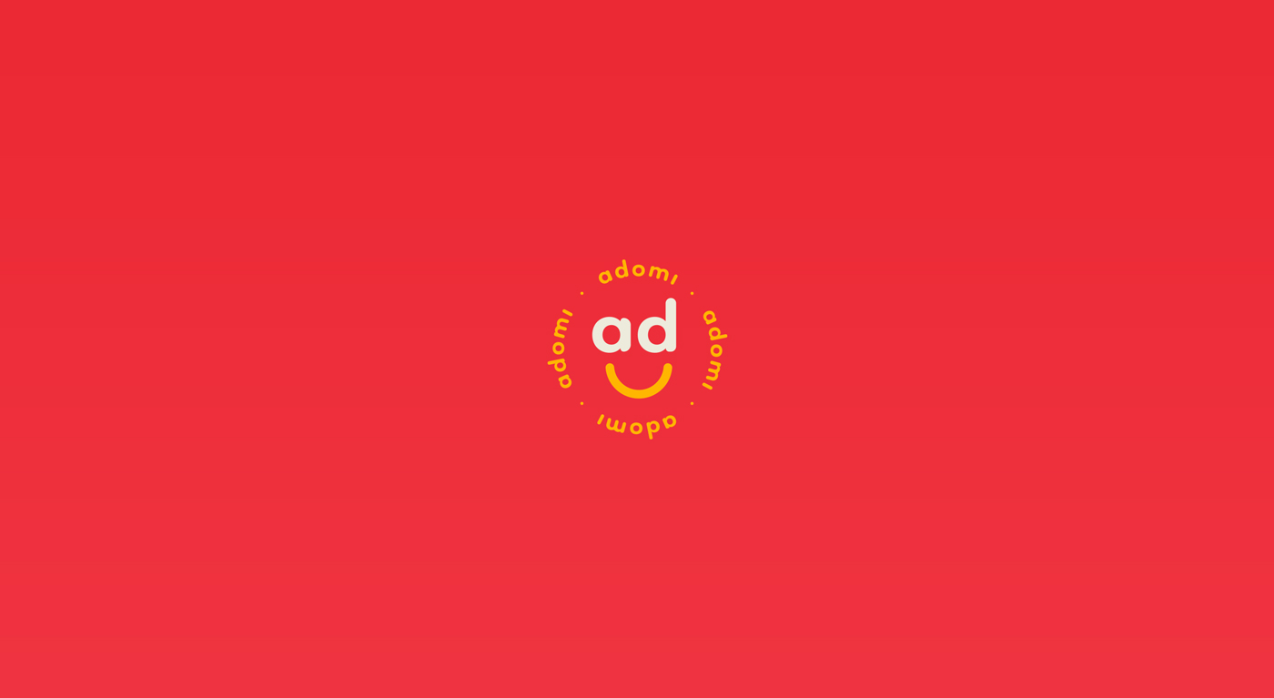
The symbol was constructed with the stylized letters “A + D”, creating a cheerful, simple and friendly shape. Deriving the logo symbol was a choice to synthesize the brand, facilitate applications and make it timeless.
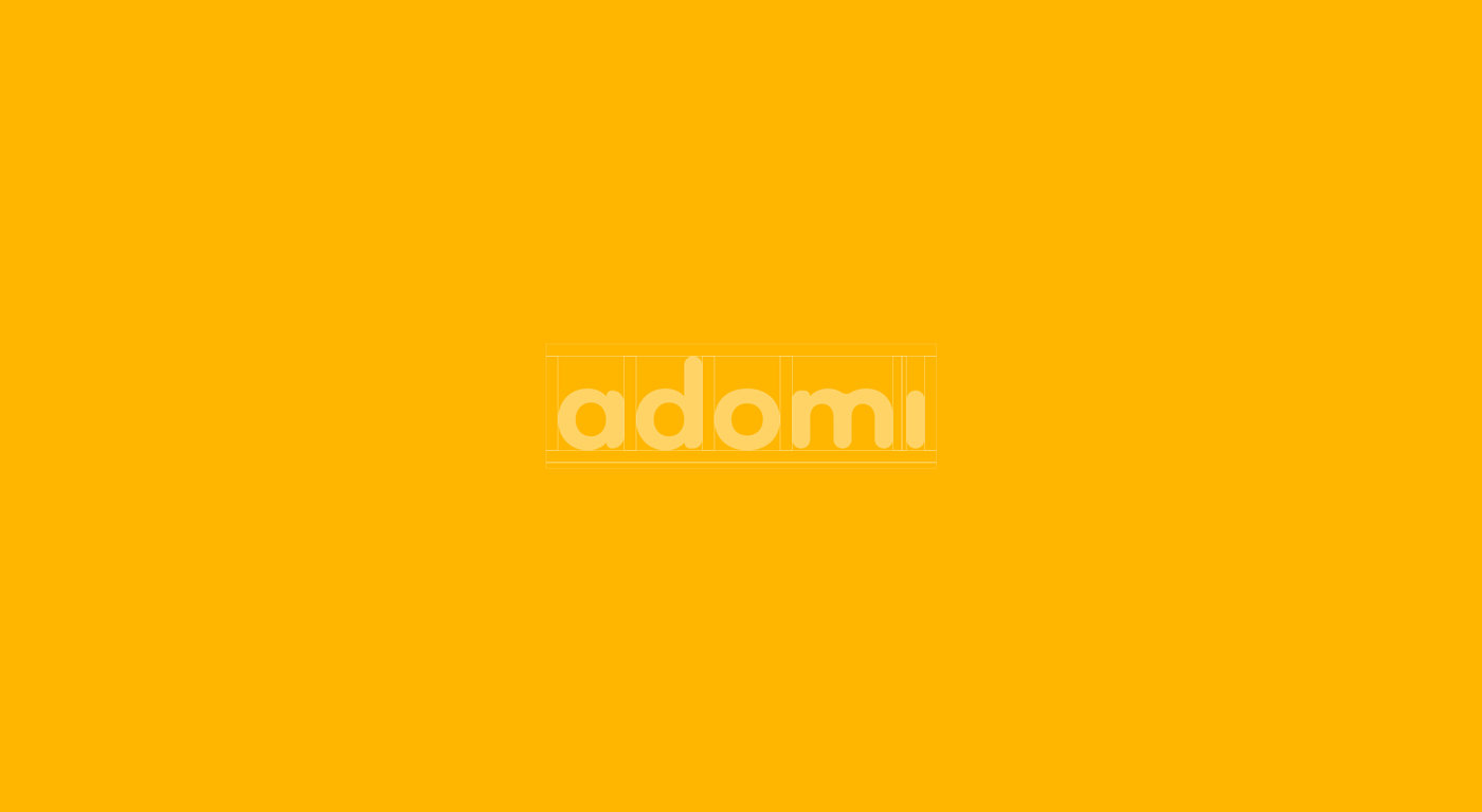
Based on the original typography, it was necessary to make some adjustments to better suit the attributes of the brand, therefore the rounded corners, bringing a smooth and friendly air, while some letters have undergone modifications that allow better legibility.
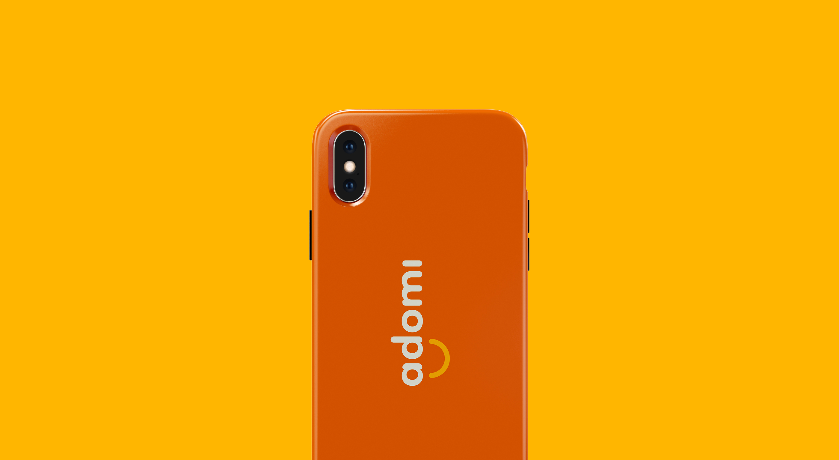
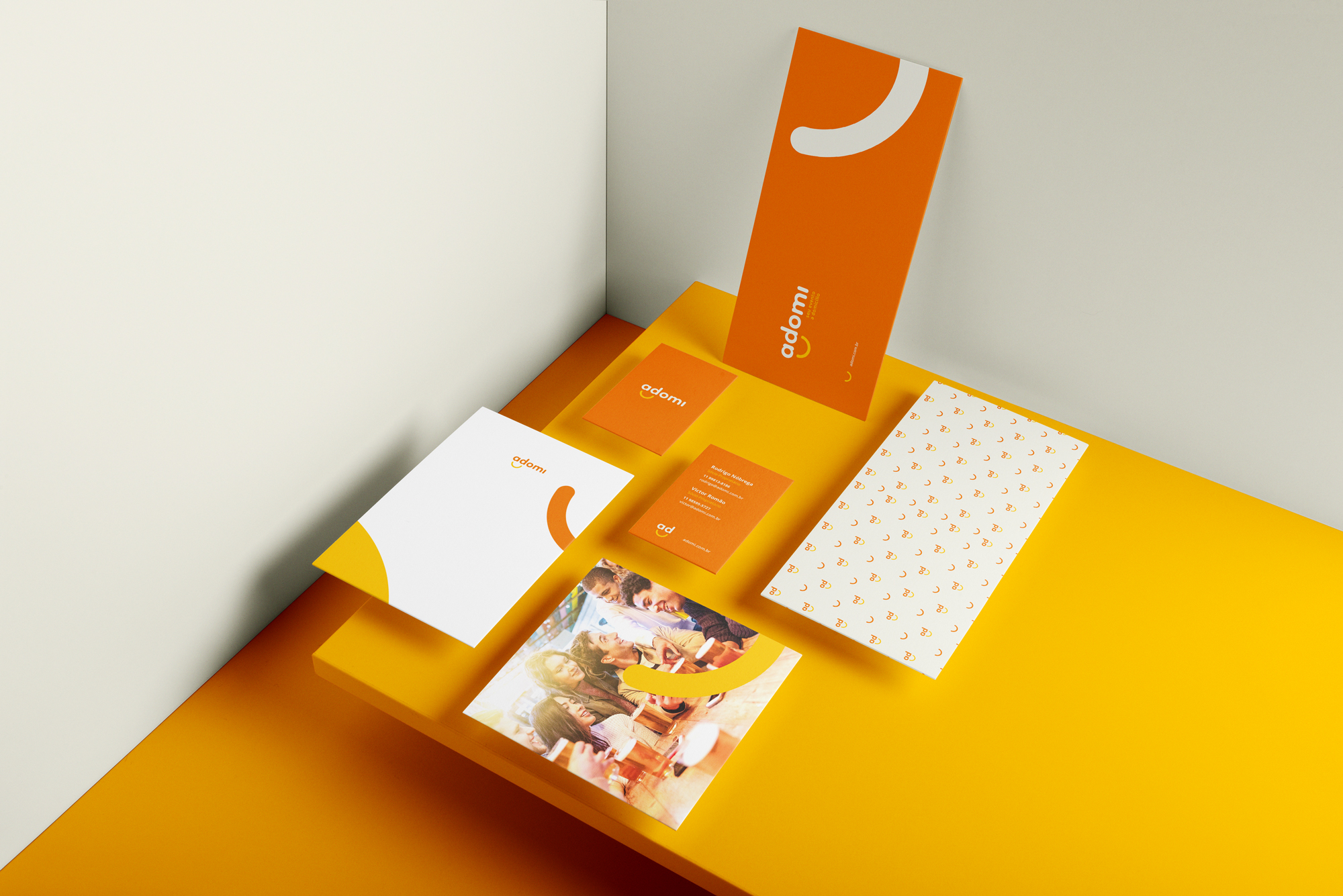
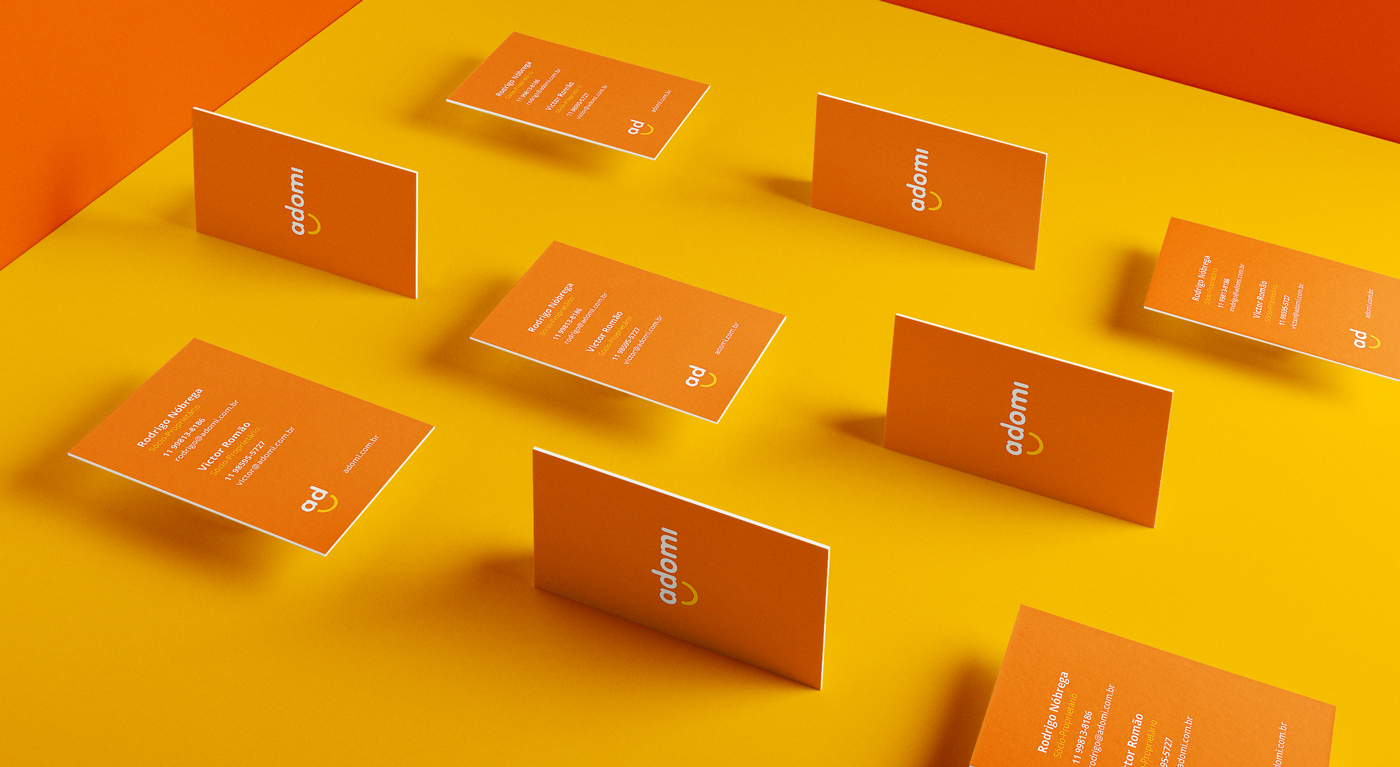
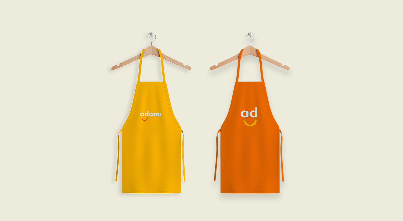
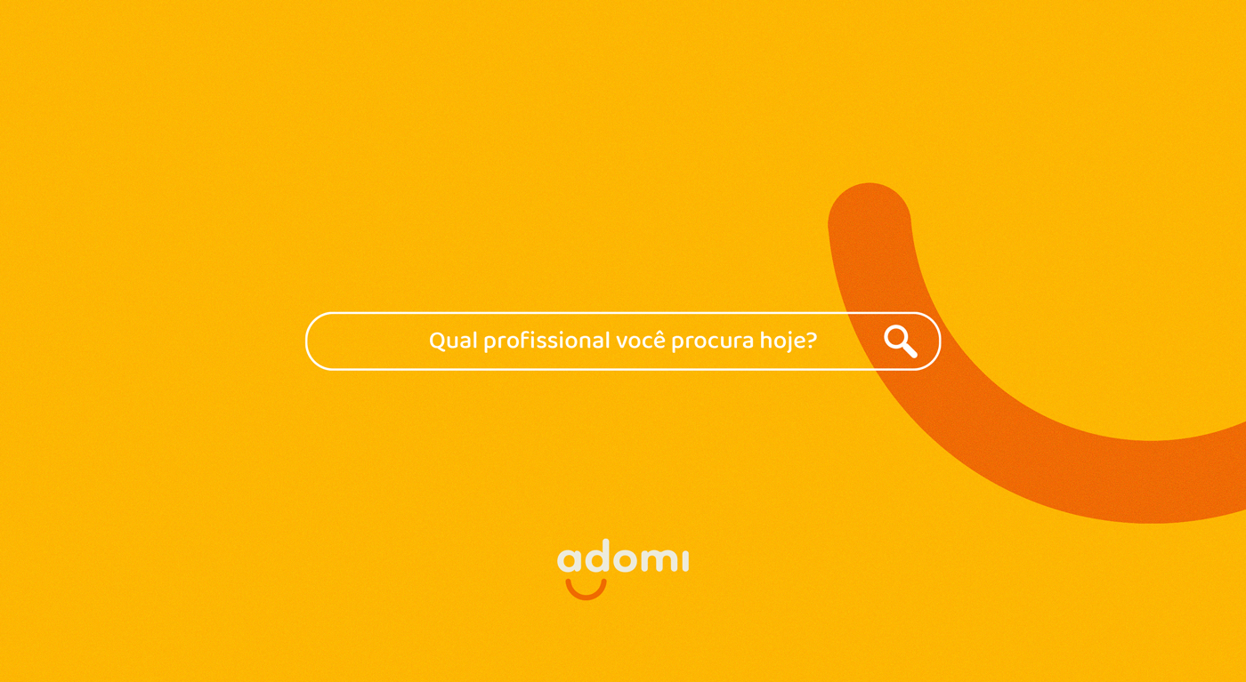
The chosen color palette provides dynamism, and at the same time is light and welcoming, connecting easily with the brand’s audience. To bring many possibilities, the Adomi palette consists of two main colors and three complementary colors.






CREDIT
- Agency/Creative: Samuel Santos Design
- Article Title: Visual Identity for Adomi Marketplace by Samuel Santos Design
- Organisation/Entity: Freelance, Published Commercial Design
- Project Type: Identity
- Agency/Creative Country: Brazil
- Market Region: South America
- Project Deliverables: Brand Architecture, Brand Creation, Brand Identity, Brand Strategy, Graphic Design, Identity System, Research
- Industry: Technology
- Keywords: brand, logo, brand, identity, rebranding, visual identity, delivery, food.


