Adna Oliveira is a lawyer who manages business contracts, looking for loopholes and improving and/or adapting the clauses, understanding the difficulties of the client’s business with attention, care, and honesty. Furthermore, she believes that companies can be immortal if they receive the attention and care they deserve, which is why she helps companies protect themselves from contractual dangers and keep their doors open for longer.
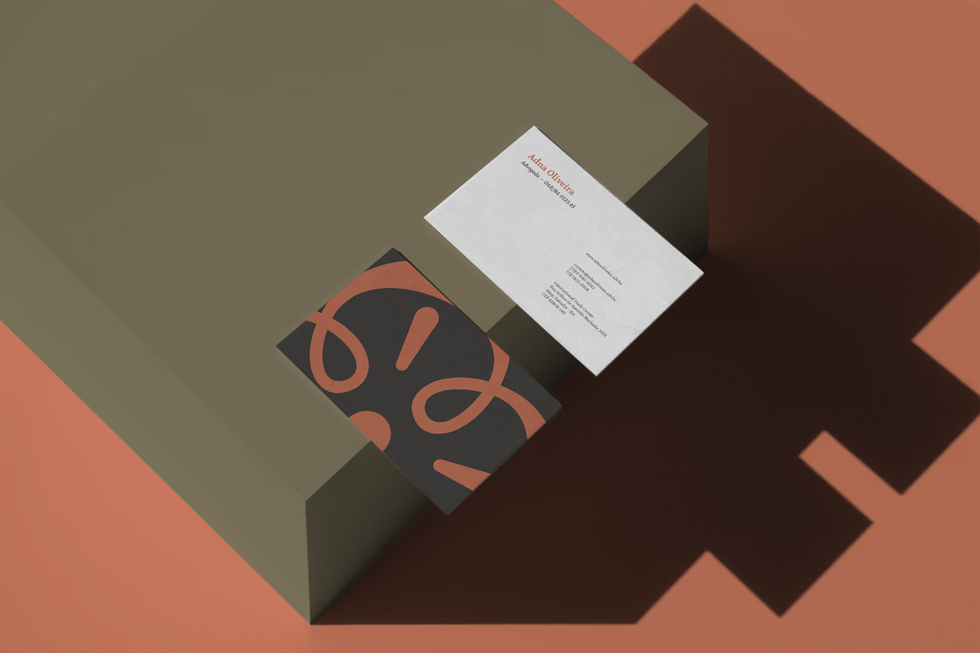
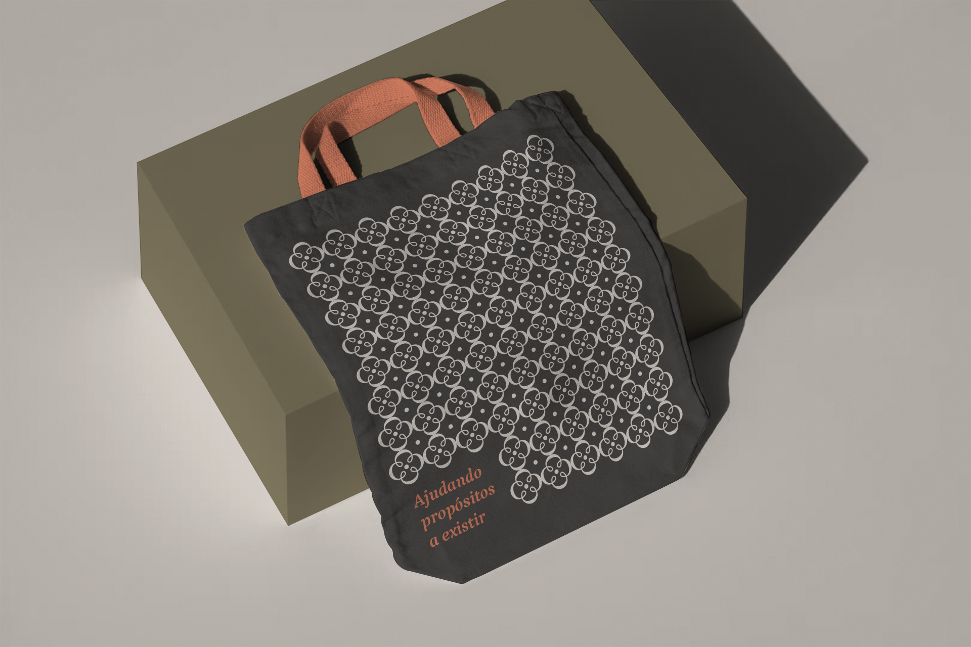
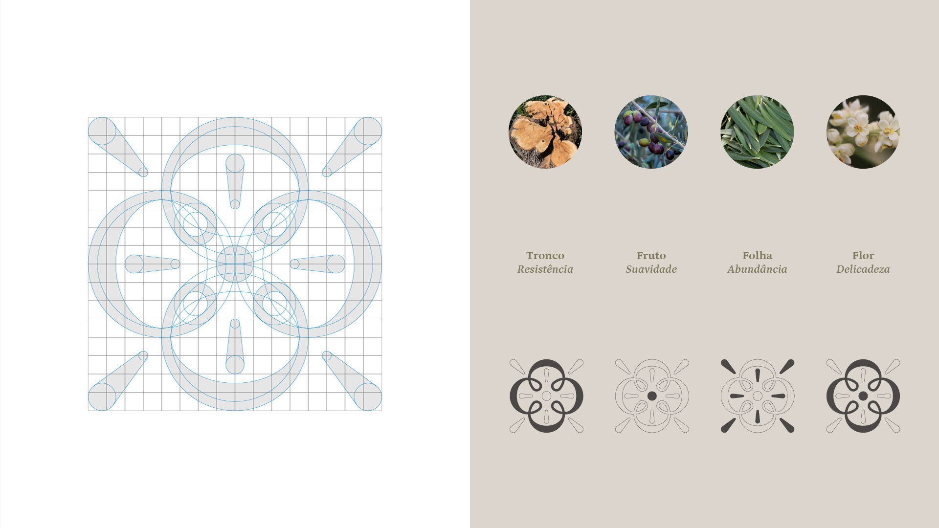
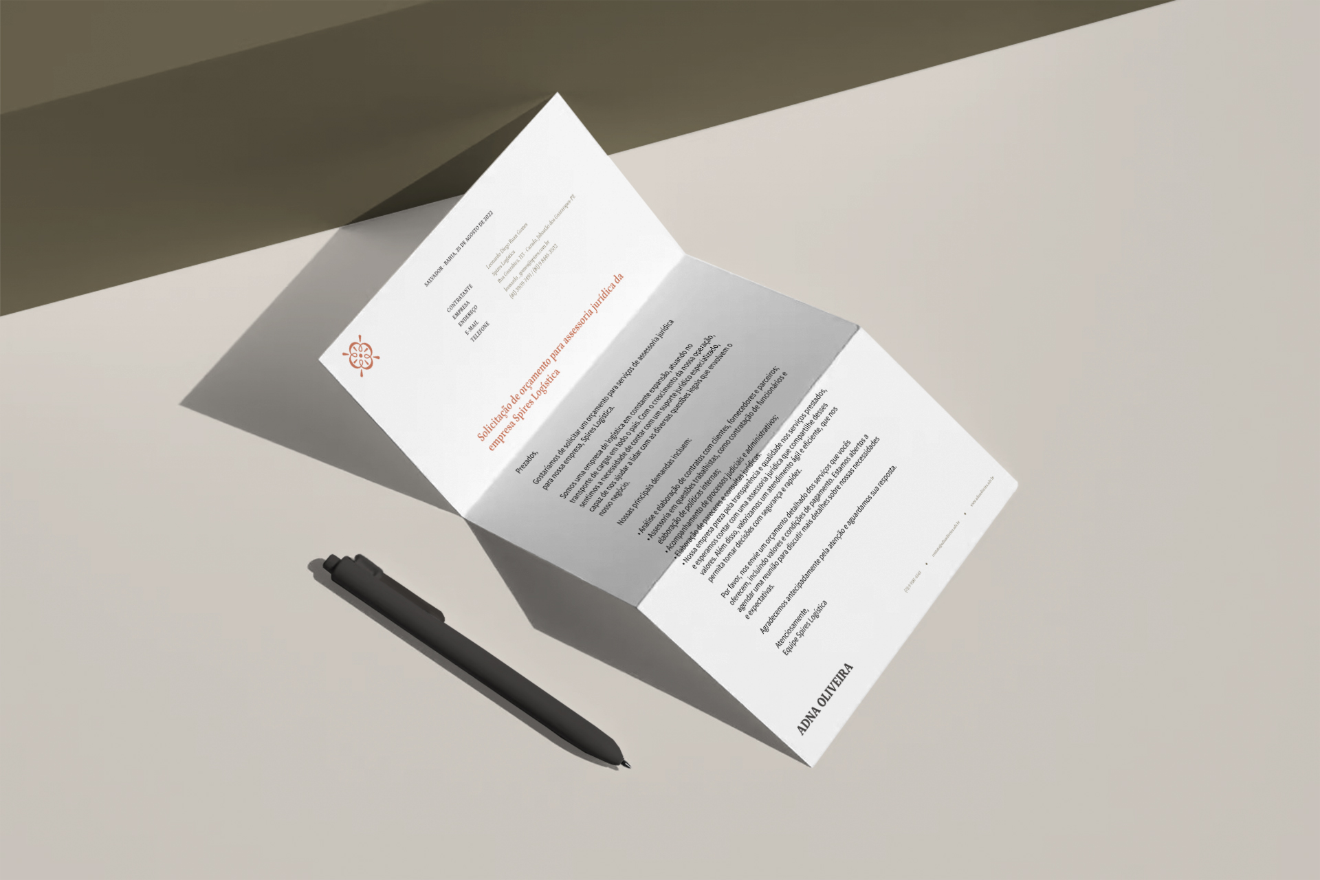
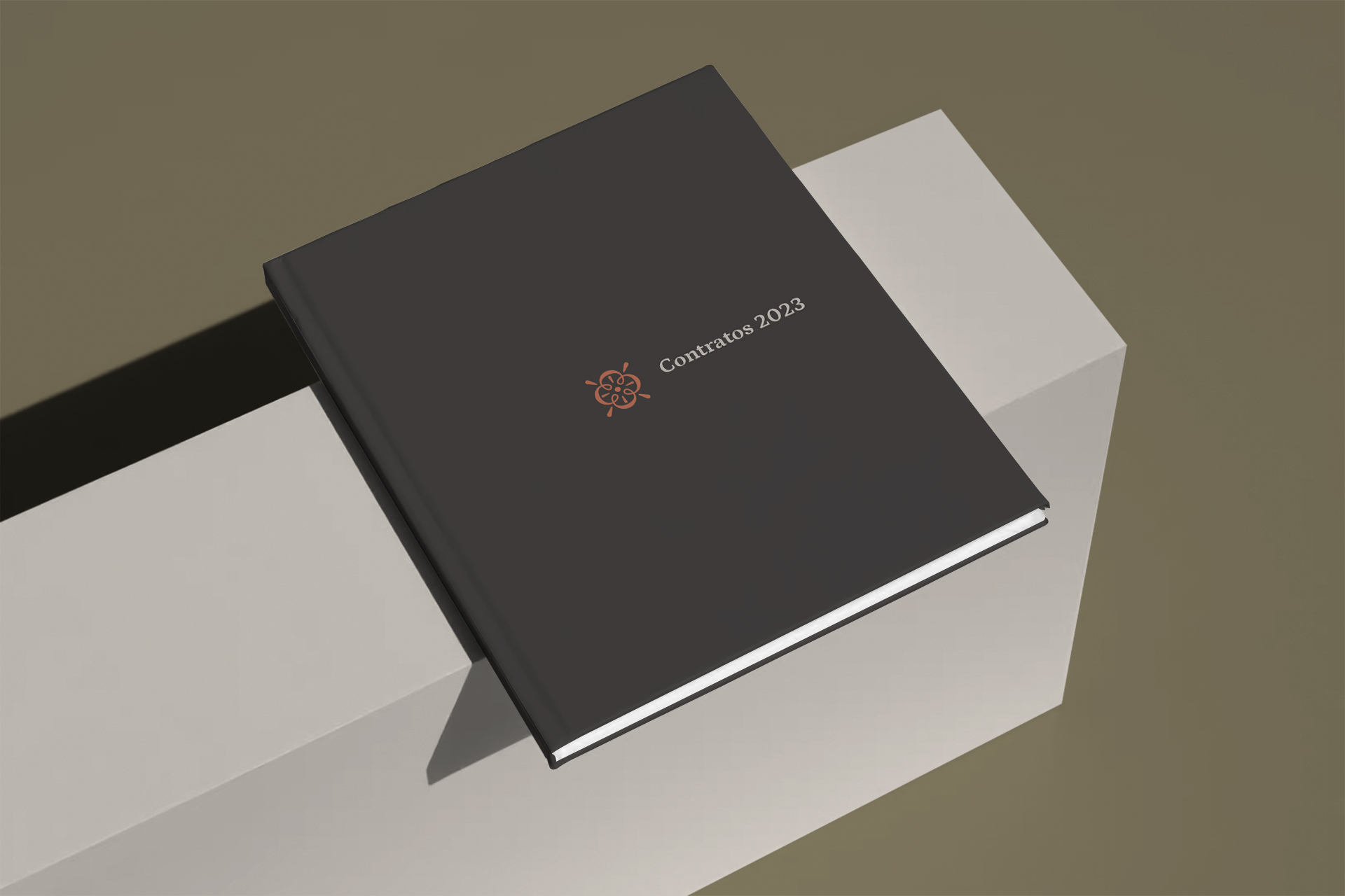
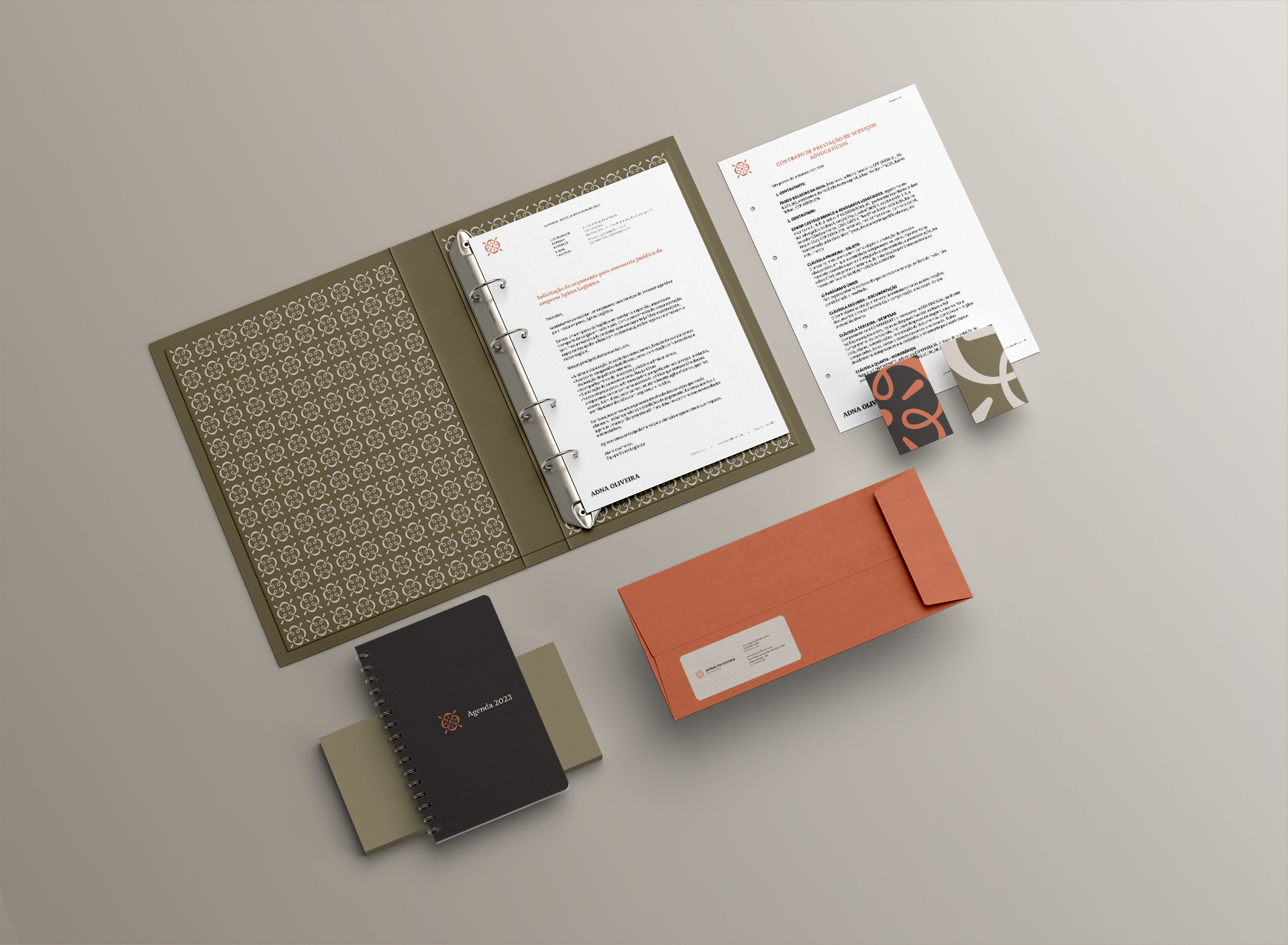
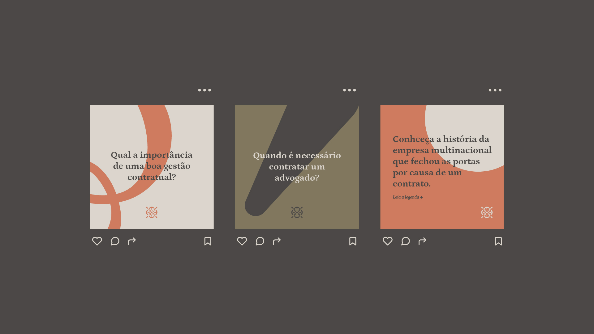
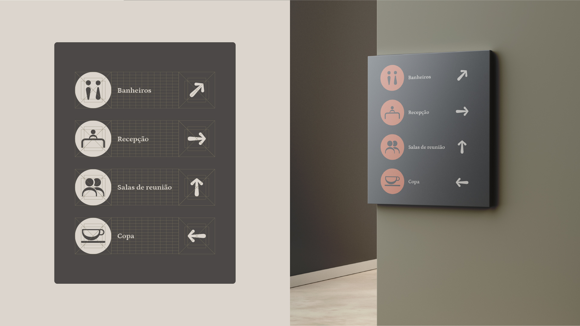
With the objective of creating a unique and memorable visual identity, a project was developed that has its essence in the lawyer’s surname and attributes. The symbol was inspired by olive trees, due to the lawyer’s surname [in Portuguese, “Oliveira”], which has exclusive meanings and has great affinity with the brand. The chosen colors were selected because they convey a serious and feminine tone, which meets the identities found in the market in this segment, as well as the typography, which helps to reinforce the seriousness that the brand seeks to bring. All visual language started from the symbol and its divisions, which gave rise to visual patterns, graphics and icons.
Olive trees are majestic and imposing trees, with a strong and resistant trunk that allows them to withstand adverse climate and soil conditions, and can even develop knots, which are protrusions or protuberances on the surface of the trunk. Fruits are a symbol of the softness, sweetness and delicacy that can be found in nature. Leaves are another treasure of theirs. They are abundantly produced by trees, being a symbol of nature’s abundance and generosity. Flowers are an example of the delicacy and beauty that nature can offer. They are small and simple, but their beauty is undeniable.

CREDIT
- Agency/Creative: Estúdio Ponta
- Article Title: Visual Identity for Adna Oliveira Law Firm
- Organisation/Entity: Freelance
- Project Type: Identity
- Project Status: Published
- Agency/Creative Country: Brazil
- Agency/Creative City: Salvador
- Market Region: South America
- Project Deliverables: Brand Design, Icon Design, Identity System, Logo Design
- Industry: Defence
- Keywords: lawyer, business, protect, attention, care
-
Credits:
Graphic Designer: Jeferson de Jesus


