Sintropia is a translation company that works with other companies, translating documents and interpreting meetings, as well as working with private classes.
The owners of Sintropia have already worked for other translation companies, and they realized that the work process of these other companies was disorganized and this ended up affecting employees and customers. Opening this company they intend to deliver a better solution and something better planned and more organized.
According to physics, sintropy is a principle opposite to that of entropy. Entropy, in turn, is a magnitude of thermodynamics that measures chaos. In a simpler explanation: the greater the disorder of a system, the greater its Entropy. Or, still, using the short definition of the dictionary, Entropy is the function that defines the state of disorder of a system.
Syntropy is precisely the opposite concept: it is a measure of the degree of organization of a system, that is, that which contributes to the balance and ordering of a system, seeking to break chaos. And all the interactions in the system are to create a positive energy balance in it.
And the choice of that name represents the idea that the company will bring the solution to the problems related to the linguistic understanding of my potential clients, in a better way.
In addition, we can say that something to be translated, is something that is in “chaos” for those who do not have knowledge in that other language, reinforcing again the same idea, bringing an organization.
Thinking about it, the brand comes with this same concept, the idea of chaos organization, or the response to chaos.
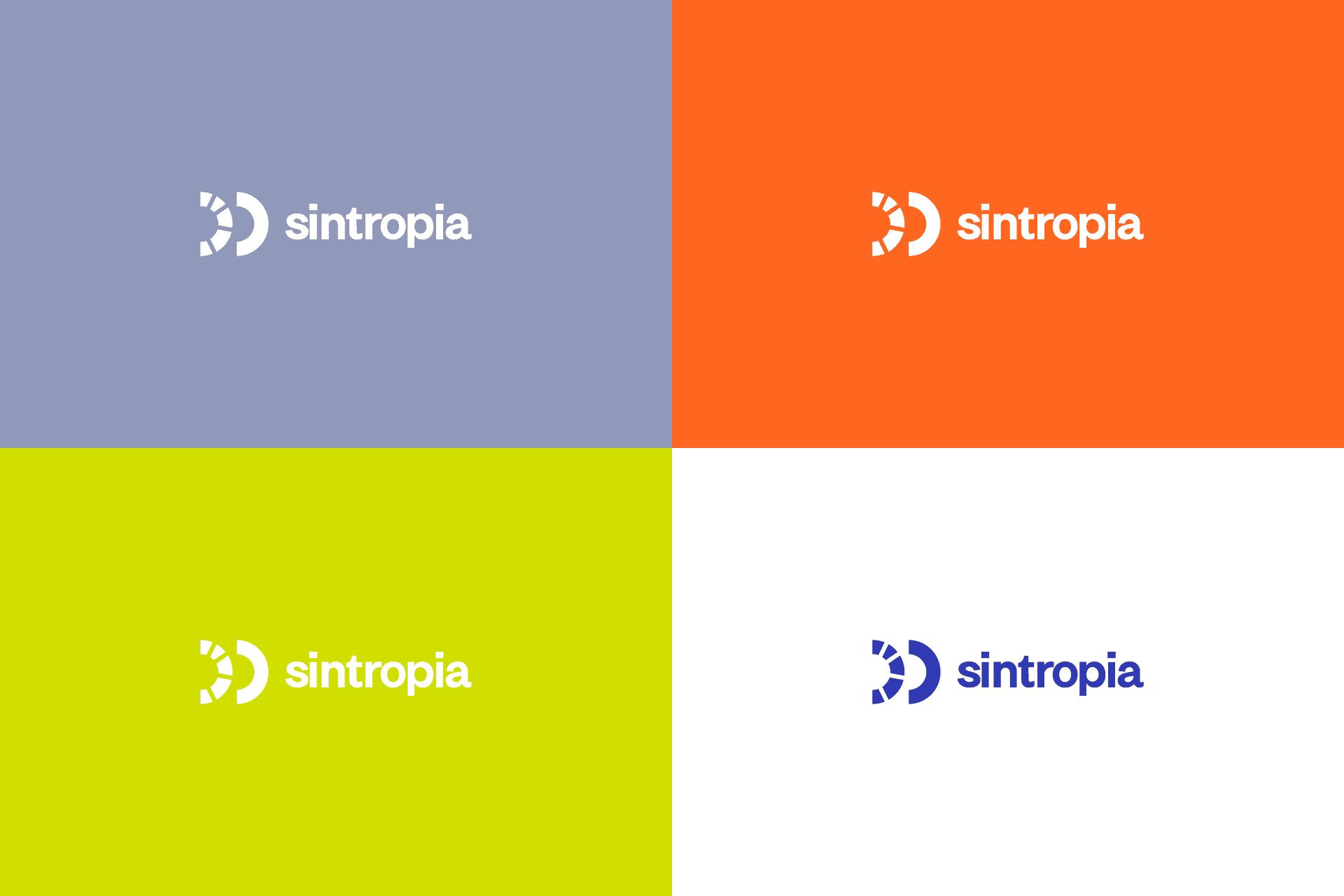
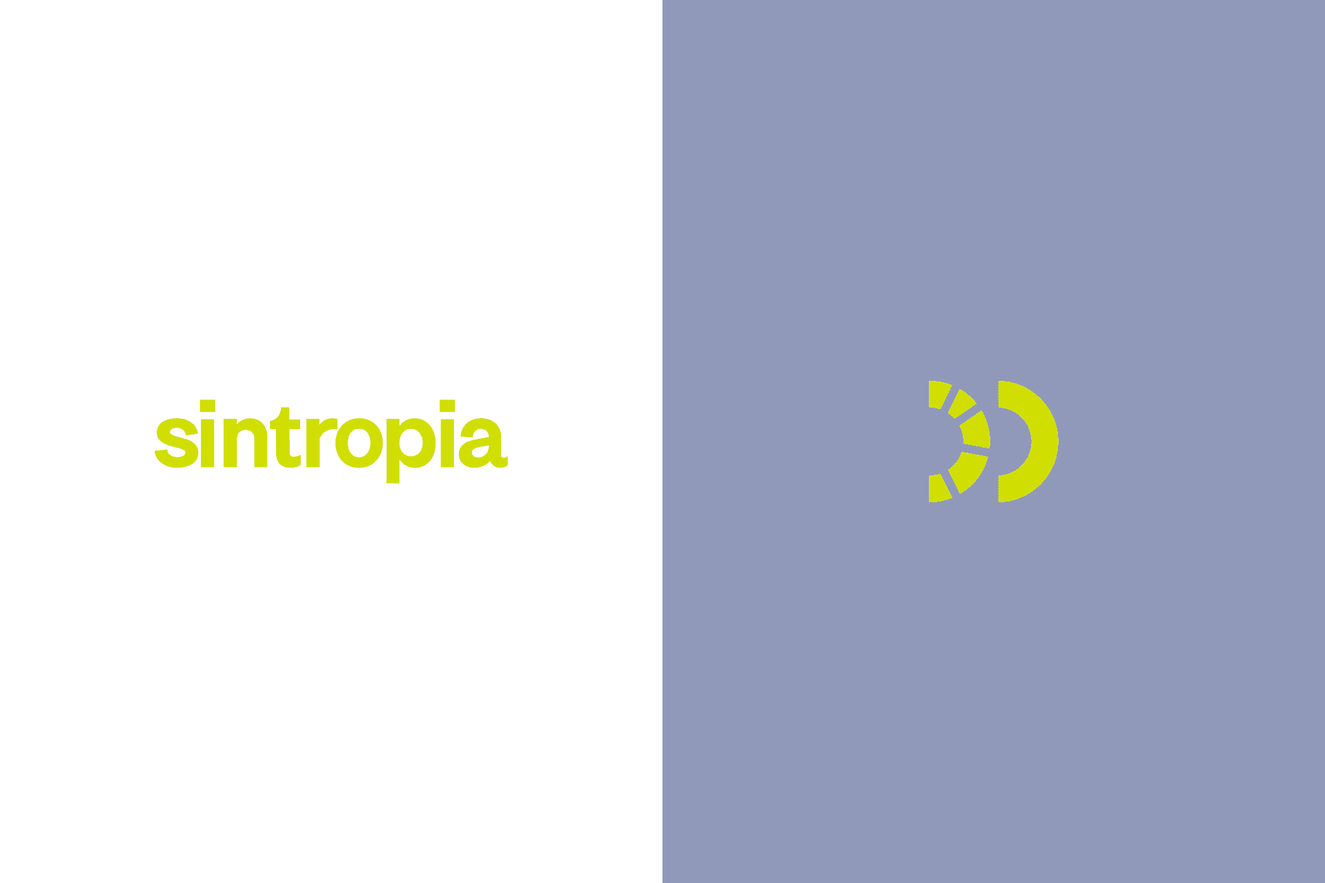
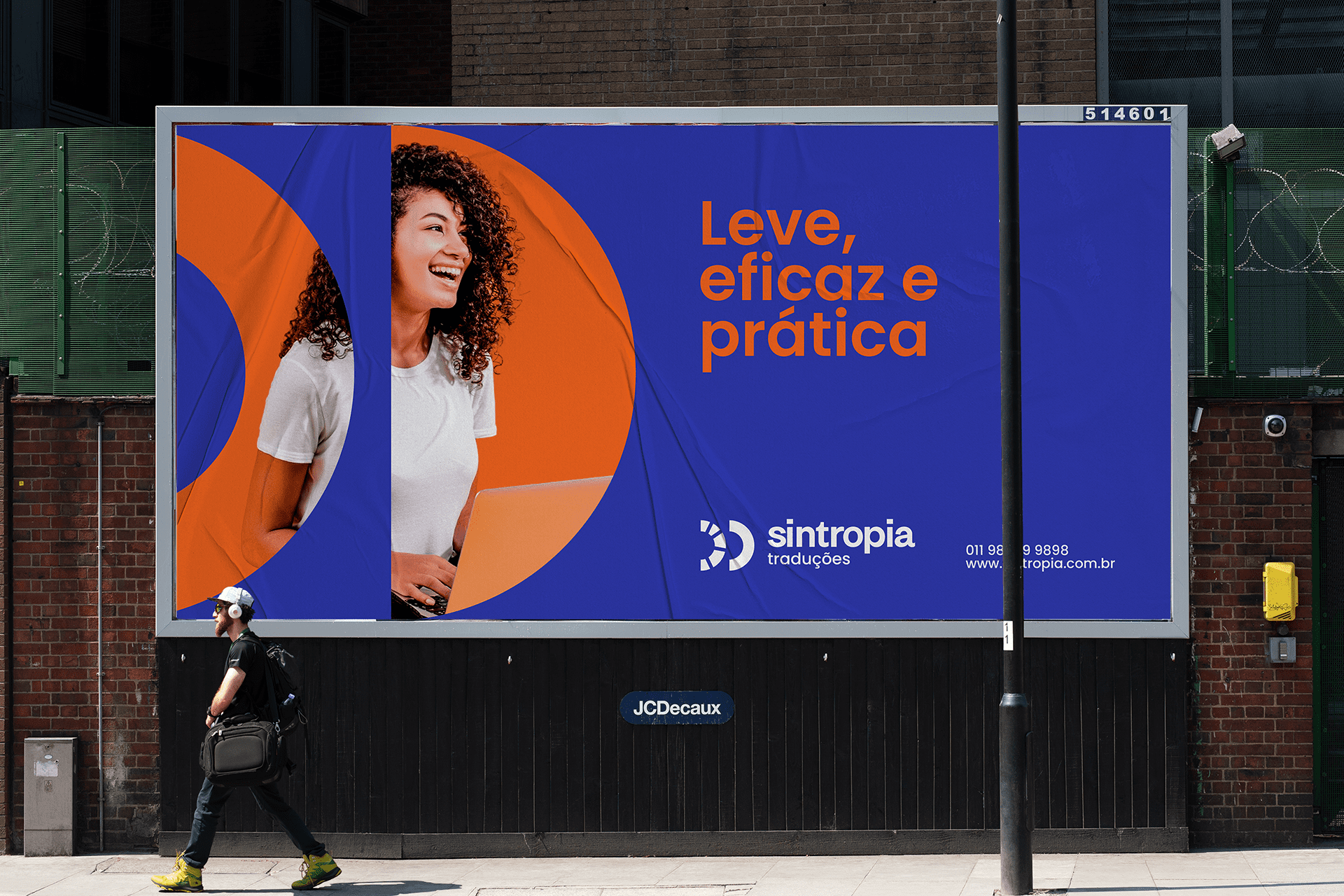
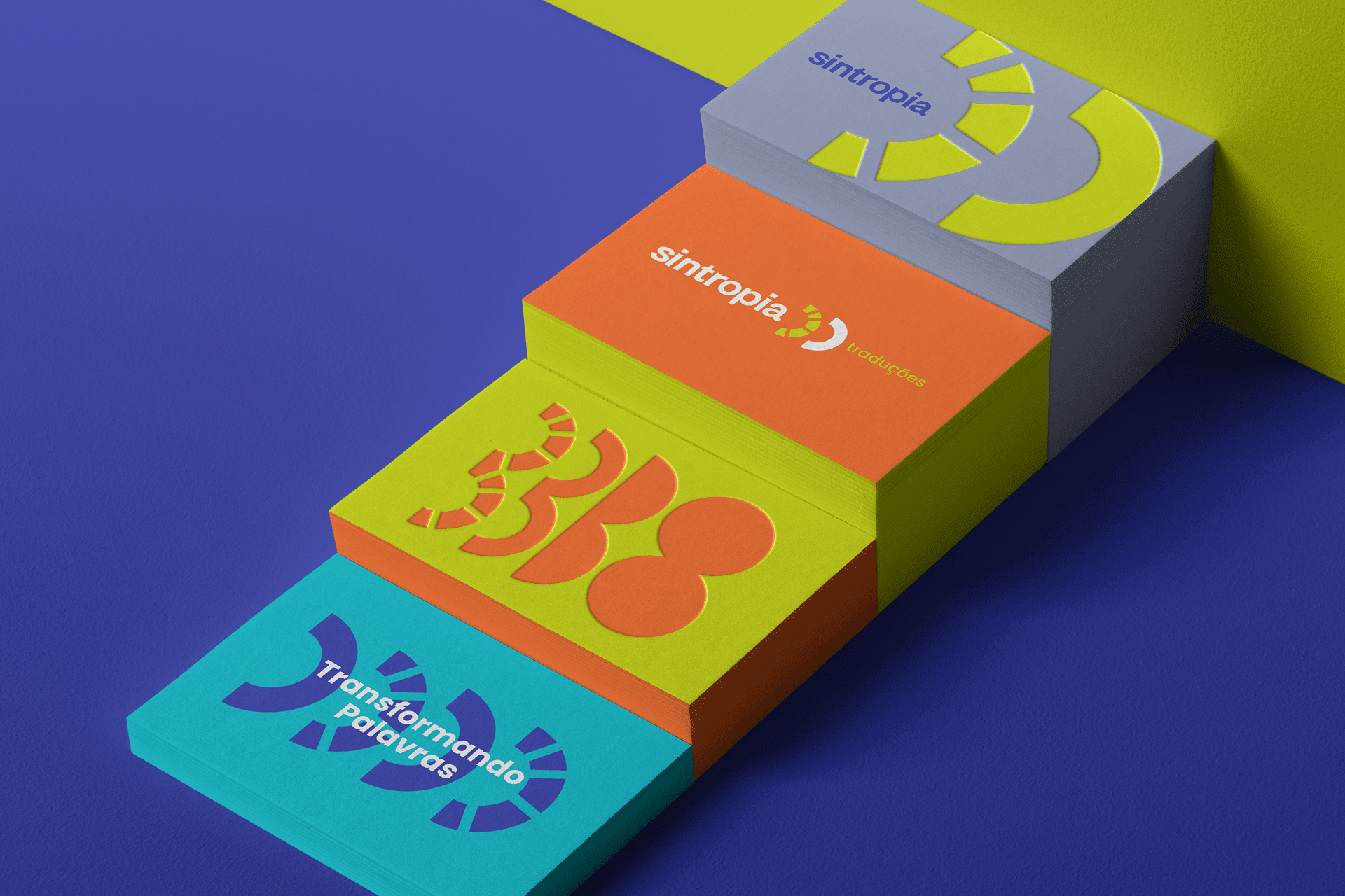
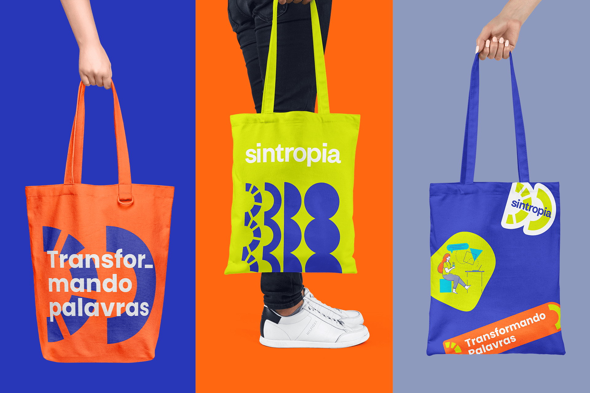
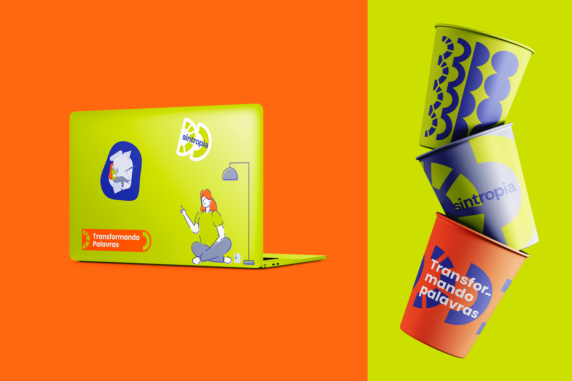
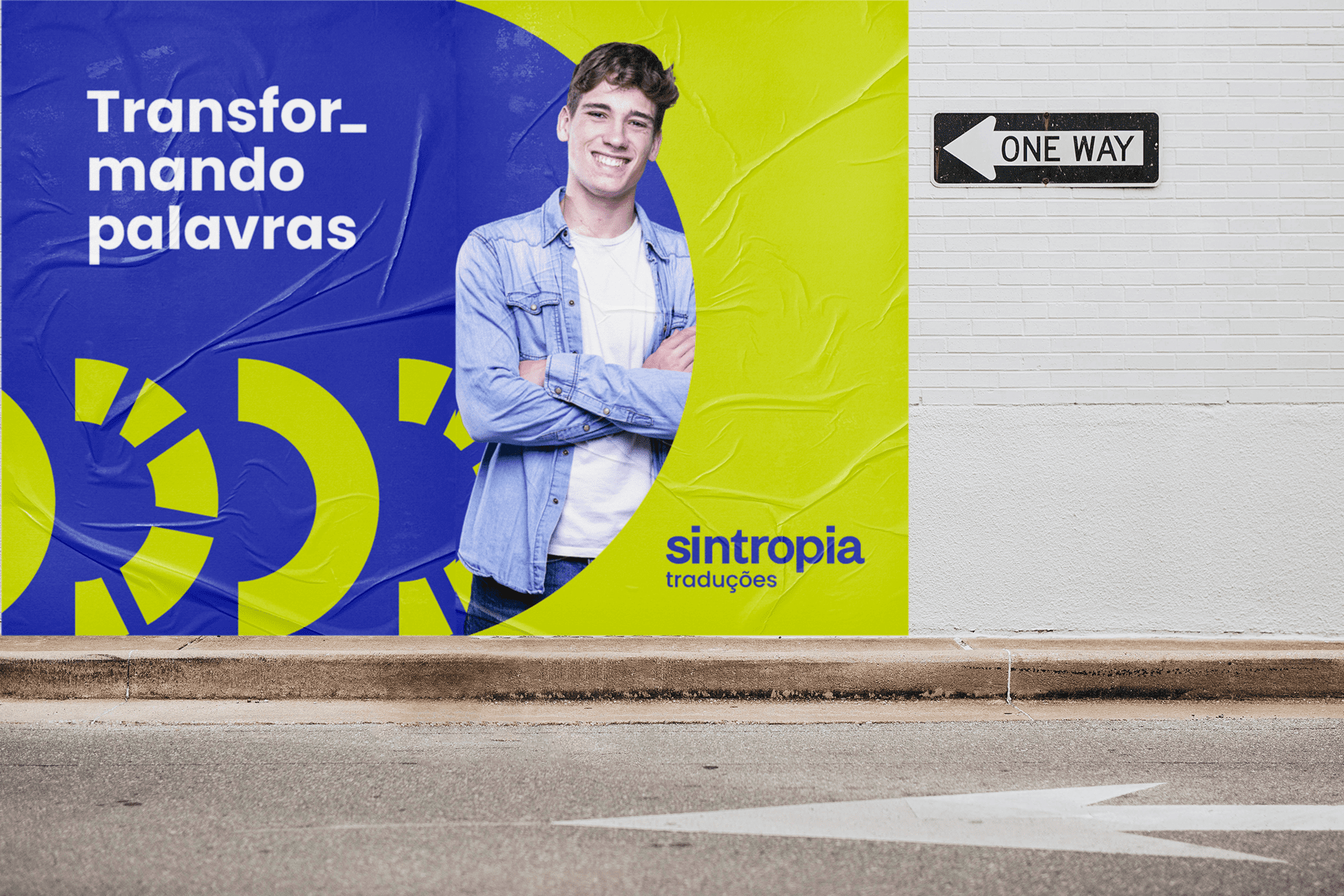
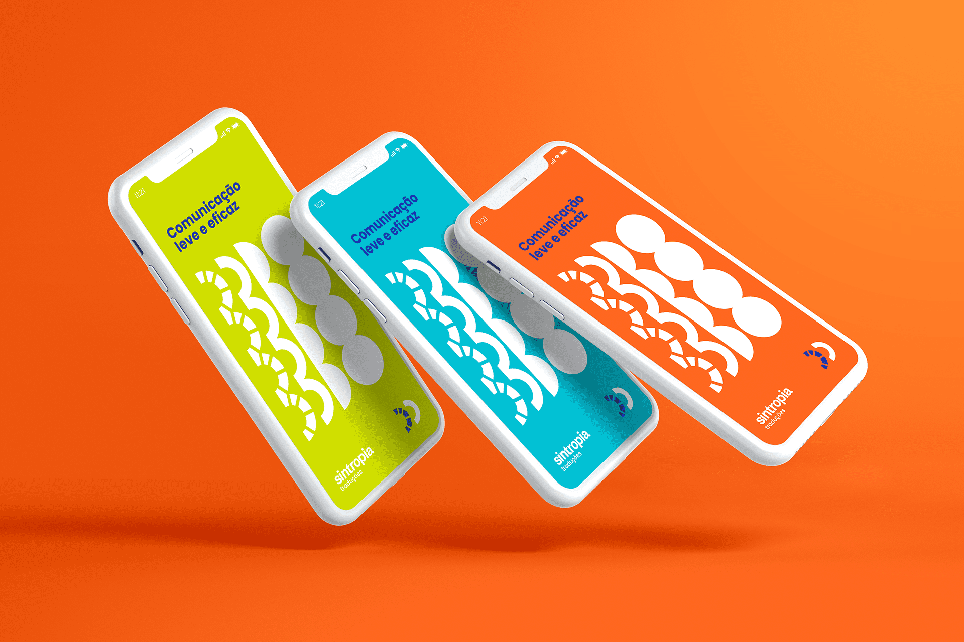
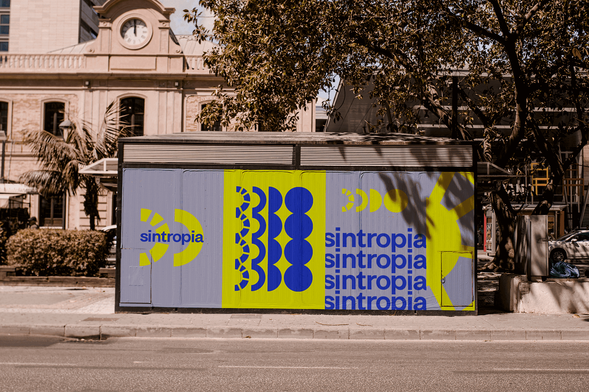
The logo is formed by two elements, the first element of the brand represents chaos, the disorganization of processes and also represents text / speech that needs to be translated, and the second element represents Syntropy, that is, the answer to chaos, the solution , the organization in the processes and thus also the translation.
In this way, we are able to bring a more comprehensive representation of what the company wants to achieve and bring to its customers.
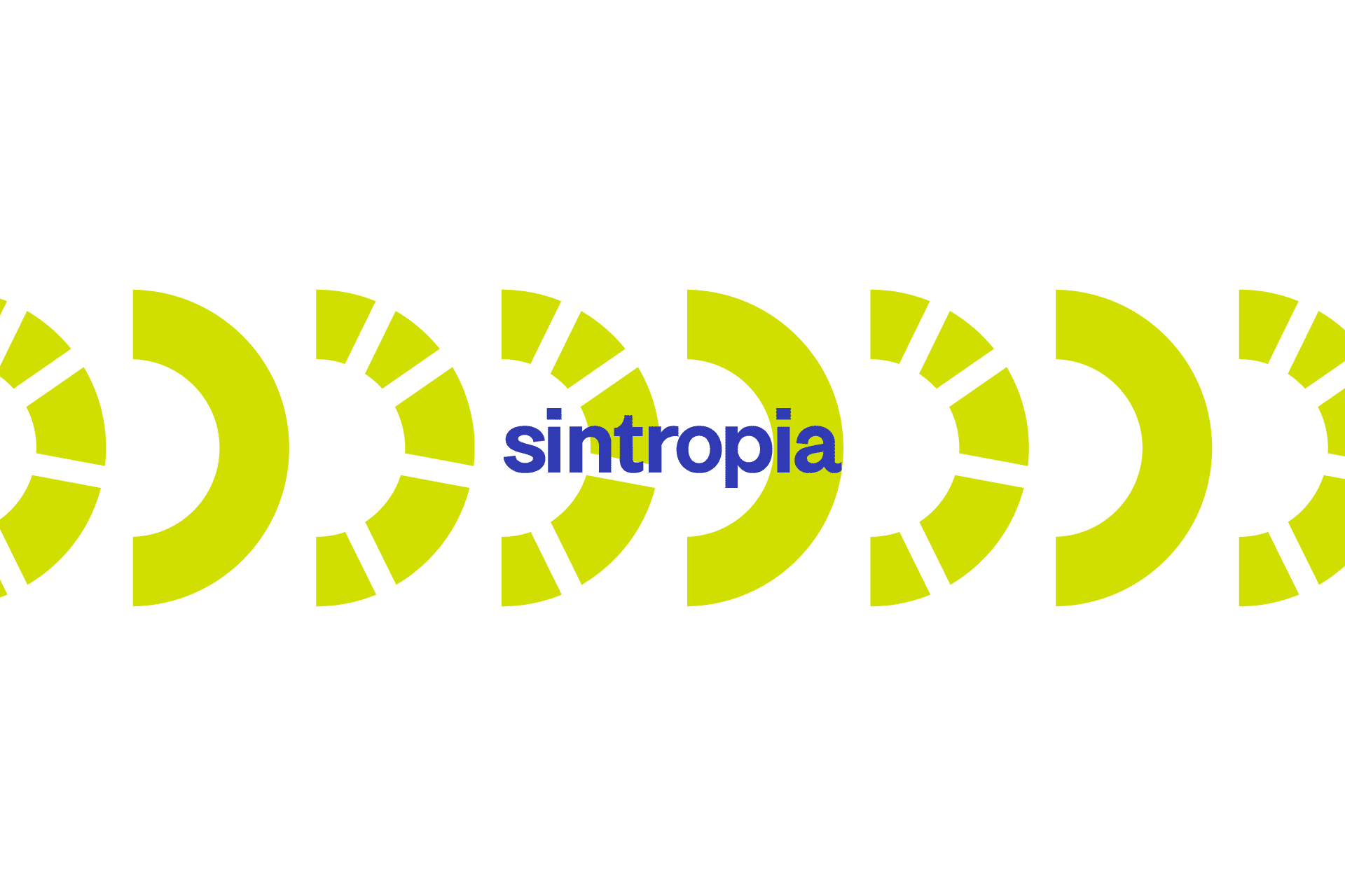
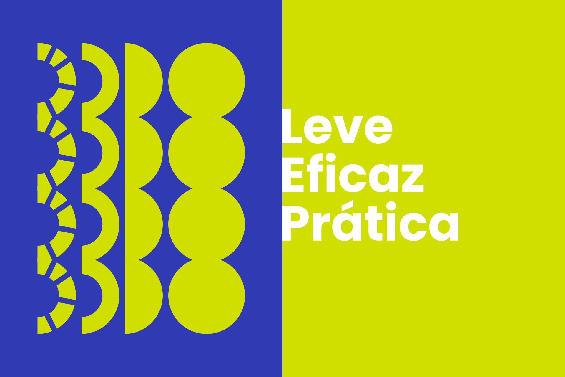
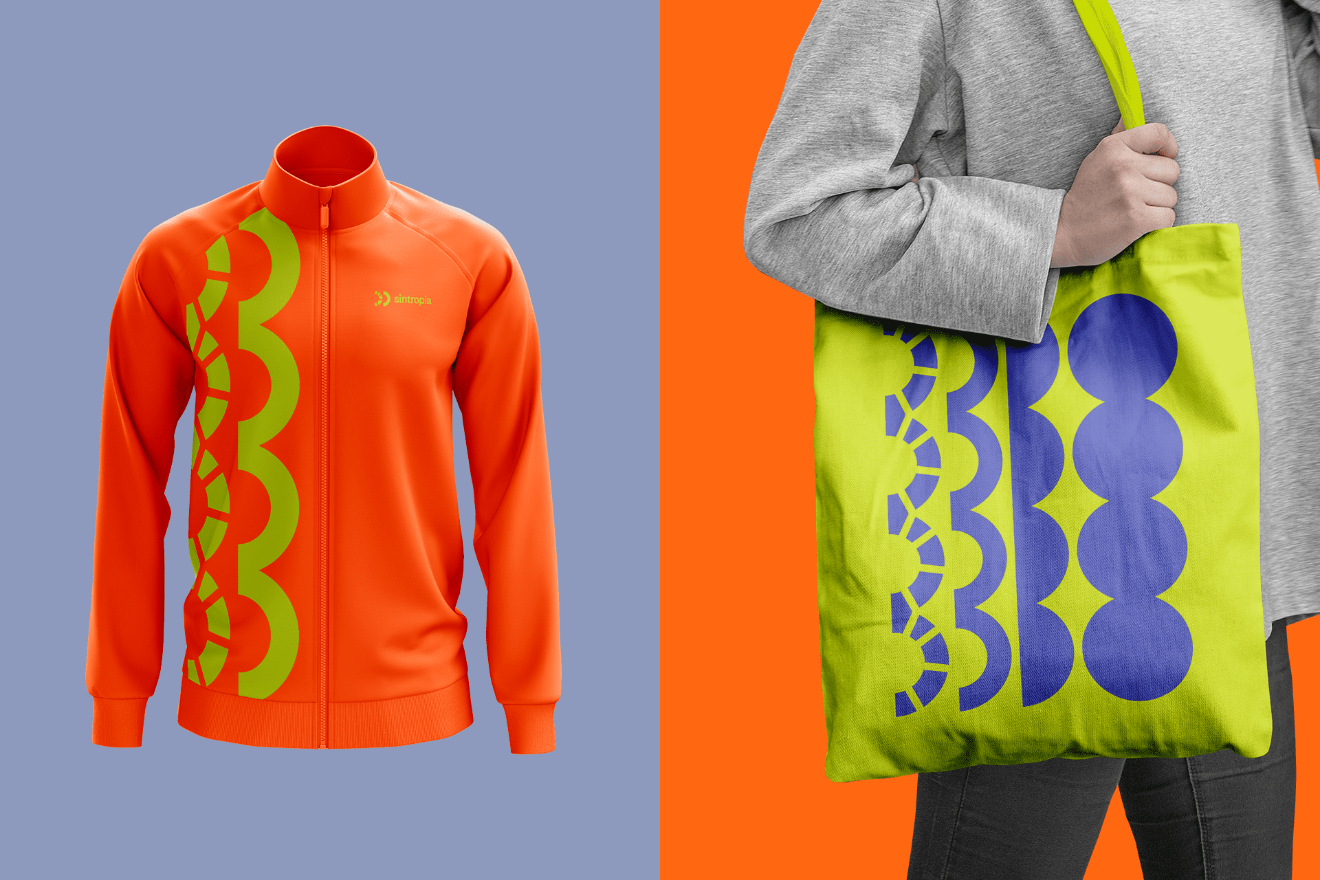
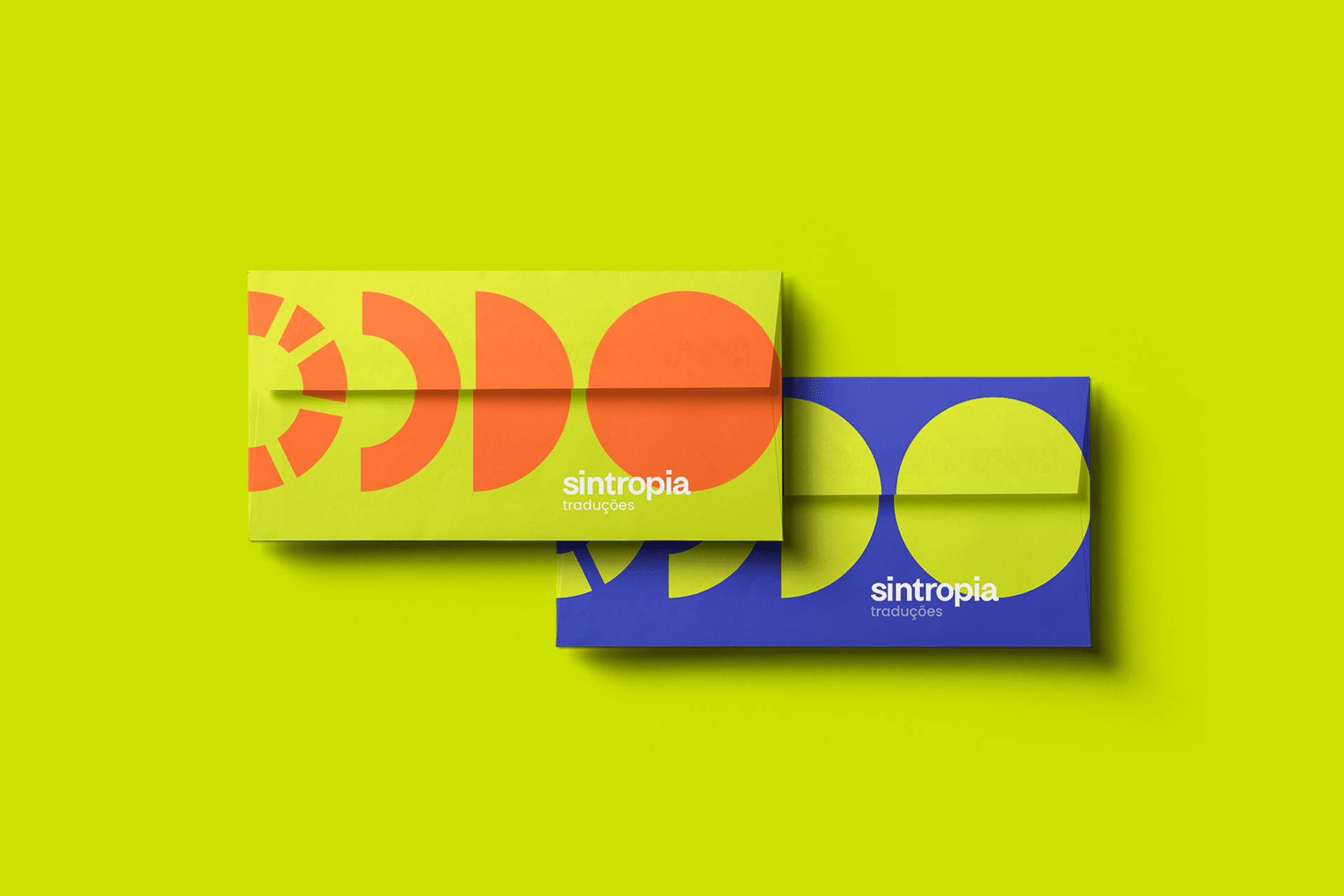
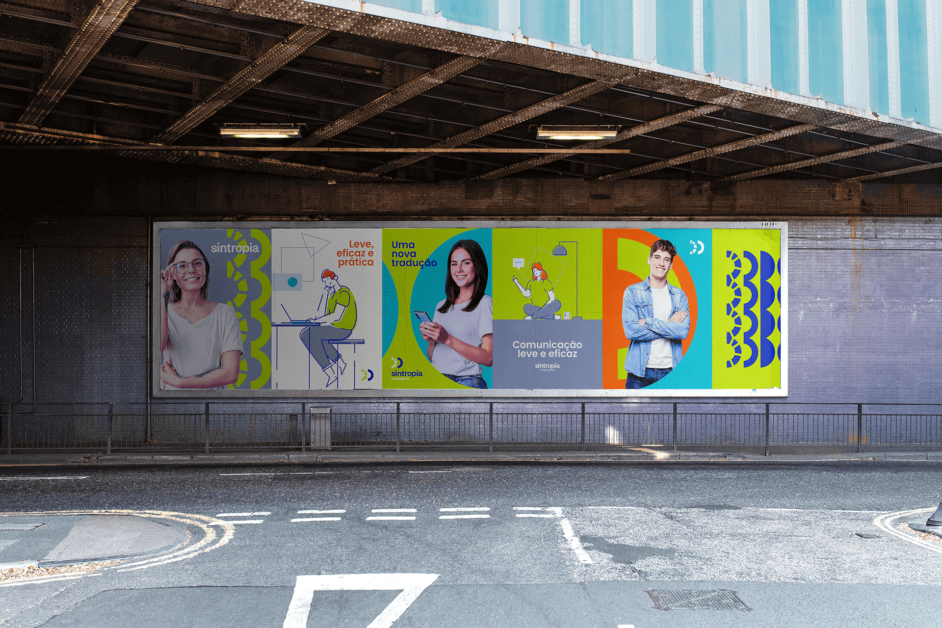
We also work with some illustrations to enrich the universe of the brand and make the identity even more dynamic and more communicative.
In colors, we think of using something with energy, representation of action and dynamism that makes up the entire visual identity.

CREDIT
- Agency/Creative: Nil Brands
- Article Title: Visual Identity for a Translation Company by Nil Brands
- Organisation/Entity: Freelance, Published Commercial Design
- Project Type: Identity
- Agency/Creative Country: Brazil
- Market Region: South America
- Project Deliverables: Brand Architecture, Brand Creation, Brand Guidelines, Brand Identity, Branding, Graphic Design, Identity System
- Industry: Education
- Keywords: logo, brand, visual identity, Branding, Brand Identity, Graphic Design


