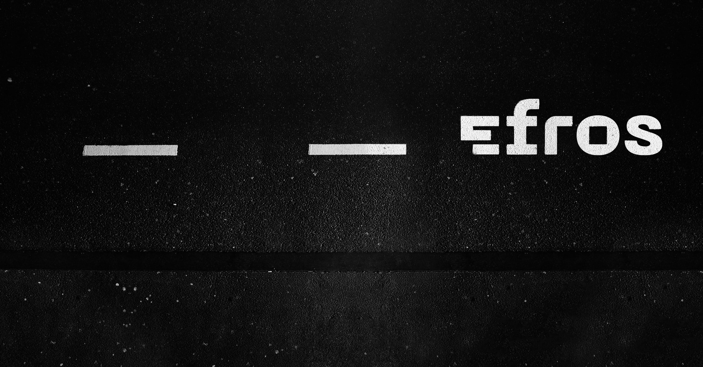
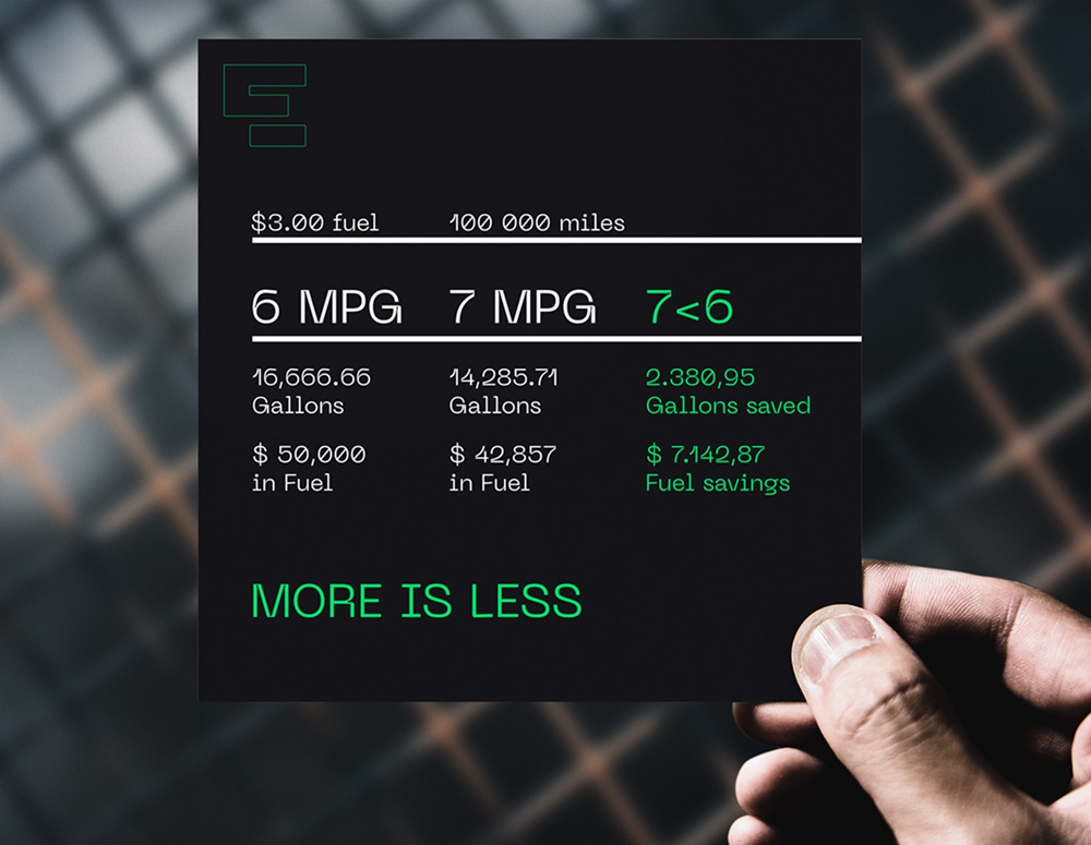
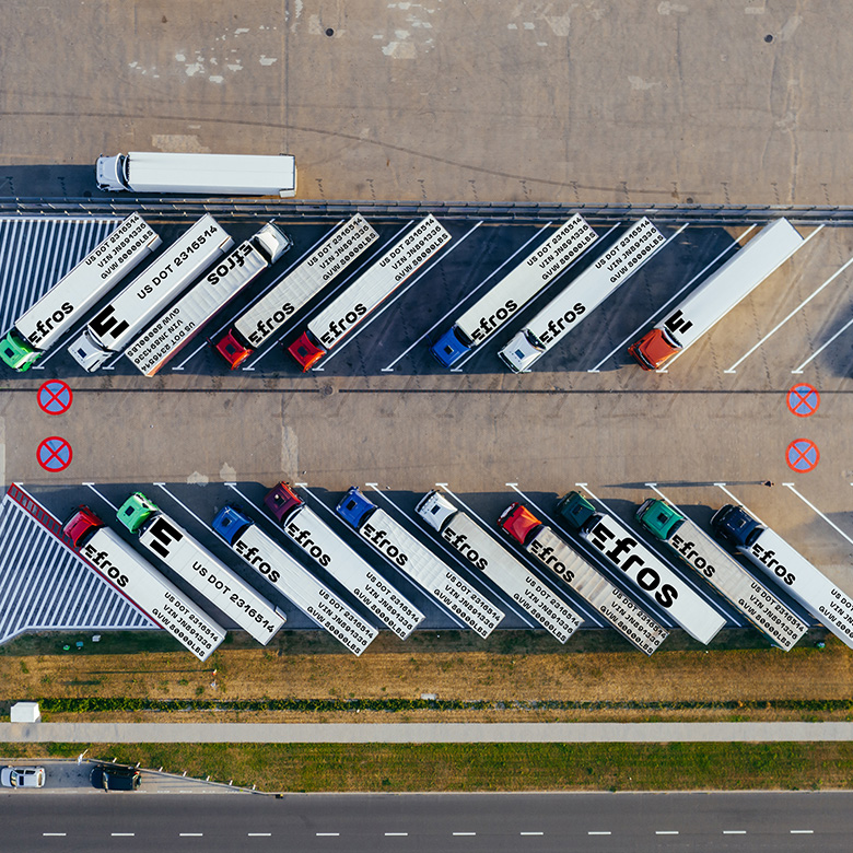
Efros Group is a freight carrier operating in the United States. Their field of activity is heavy and massive, but strive to be as efficient as possible, in order to minimize operating costs and the impact on the environment.
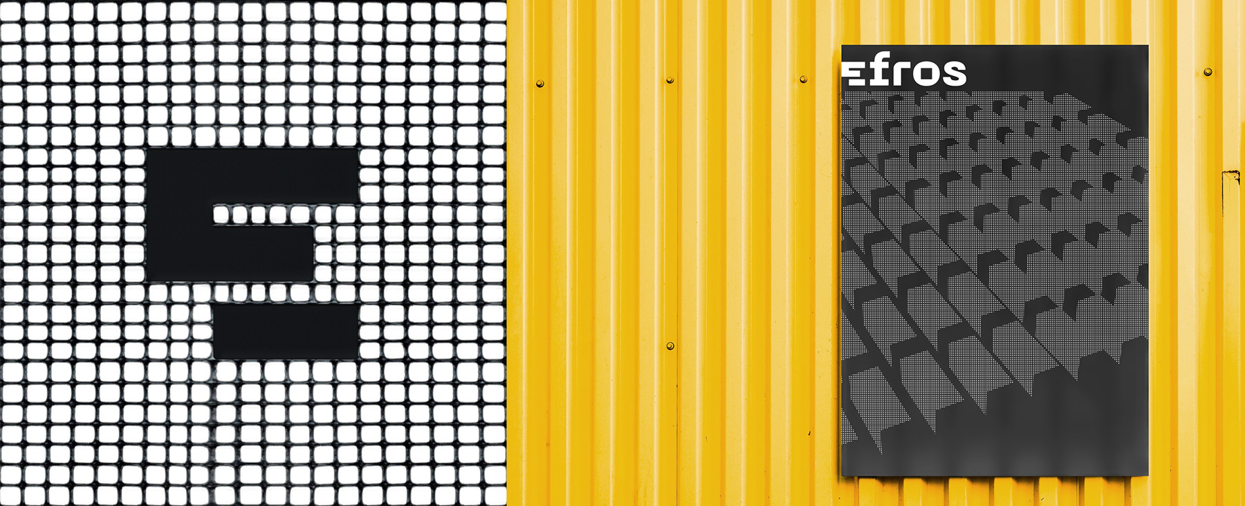
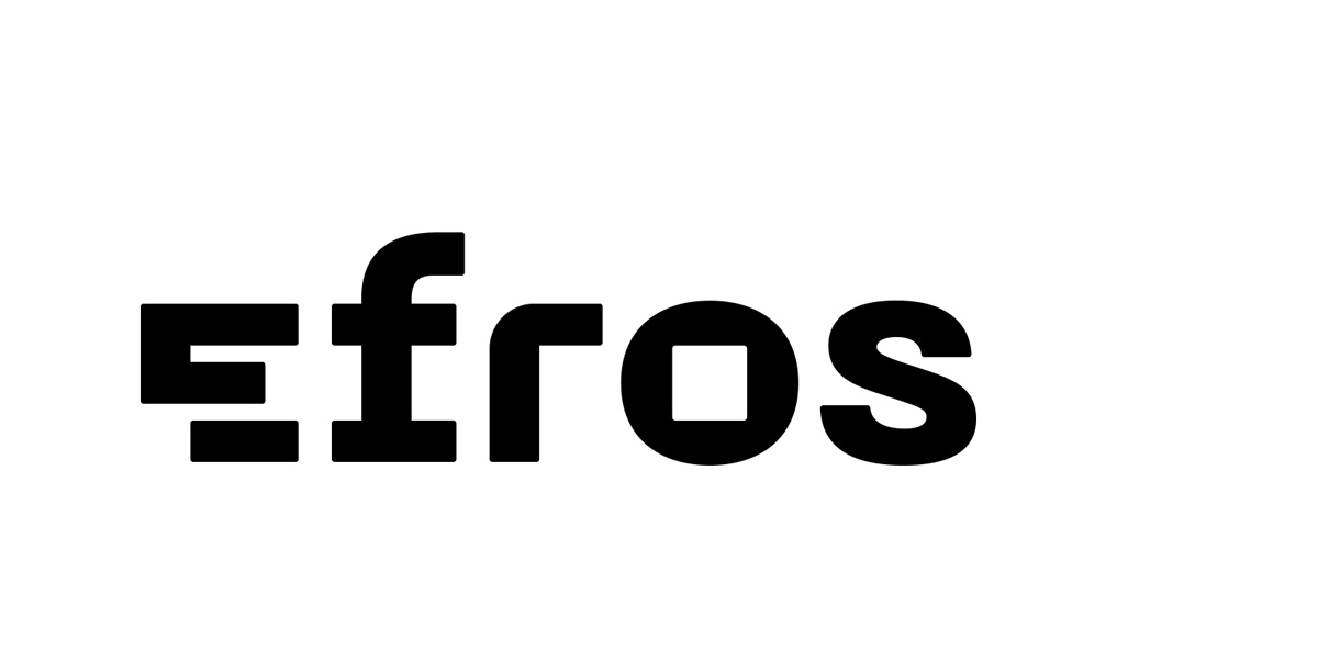
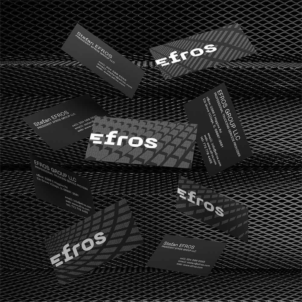
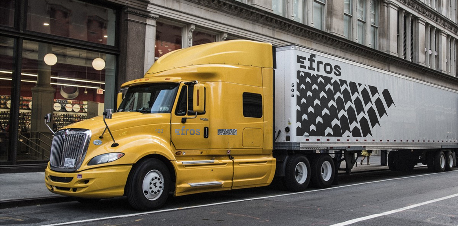
Having as a starting point the mix of power and flexibility, we stopped our sketches upon a graphic formula that combines sharp and round corners, that is both strong and soft. The uppercase E is divided in two parts to hint the field in which the brand operates: road transportation of loads.
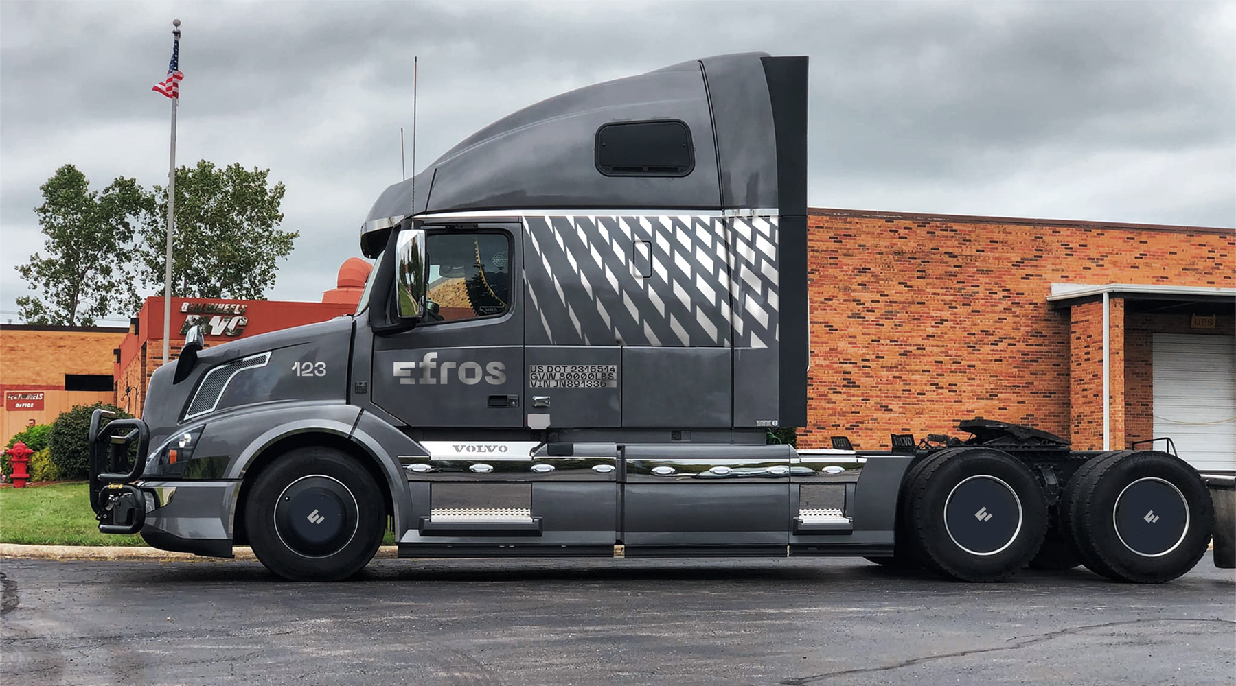
To make up to the diversity of truck colors the company employs, Efros color palette is overall black and white, with an addition of chrome, and occasional color inserts.
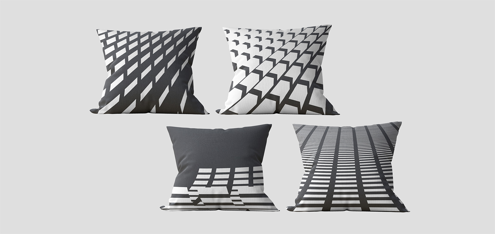
The identity is complemented by a series of patterns that illustrate 3D occurrences in 2D spaces.
These are simple, geometric shapes that suggest common elements, anything from truckloads, containers, road surface marking, to wings and earth grid.
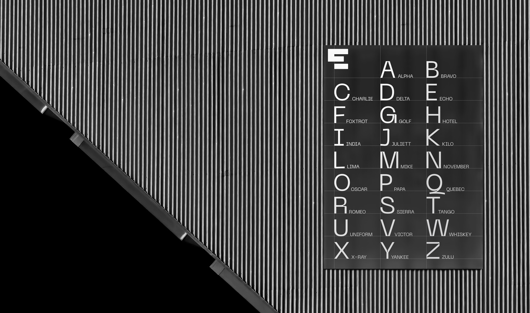
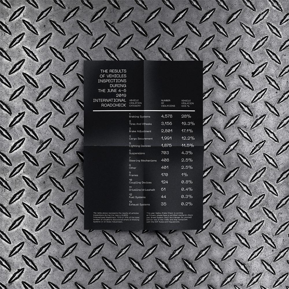
The identity is subtly rounded by the Neue Machina typeface. Which has been painstakingly crafted, and works just as fine for both short titles and massive text paragraphs.
Characters nature is inspired by the aesthetics of robotics and machines. It is all about high technology and future.


CREDIT
- Agency/Creative: casa imago
- Article Title: Visual Identity for a Freight Carrier, Operating in the United States
- Organisation/Entity: Agency, Published Commercial Design
- Project Type: Identity
- Agency/Creative Country: Moldova
- Market Region: North America
- Project Deliverables: Brand Guidelines, Brand Identity, Branding, Graphic Design, Identity System, Research, Tone of Voice
- Industry: Transport
- Keywords: USA, transportation, loads, trucks, branding, identity, blac&white, geometry, 2D, 3D, pattern, shapes, minimal, grid


