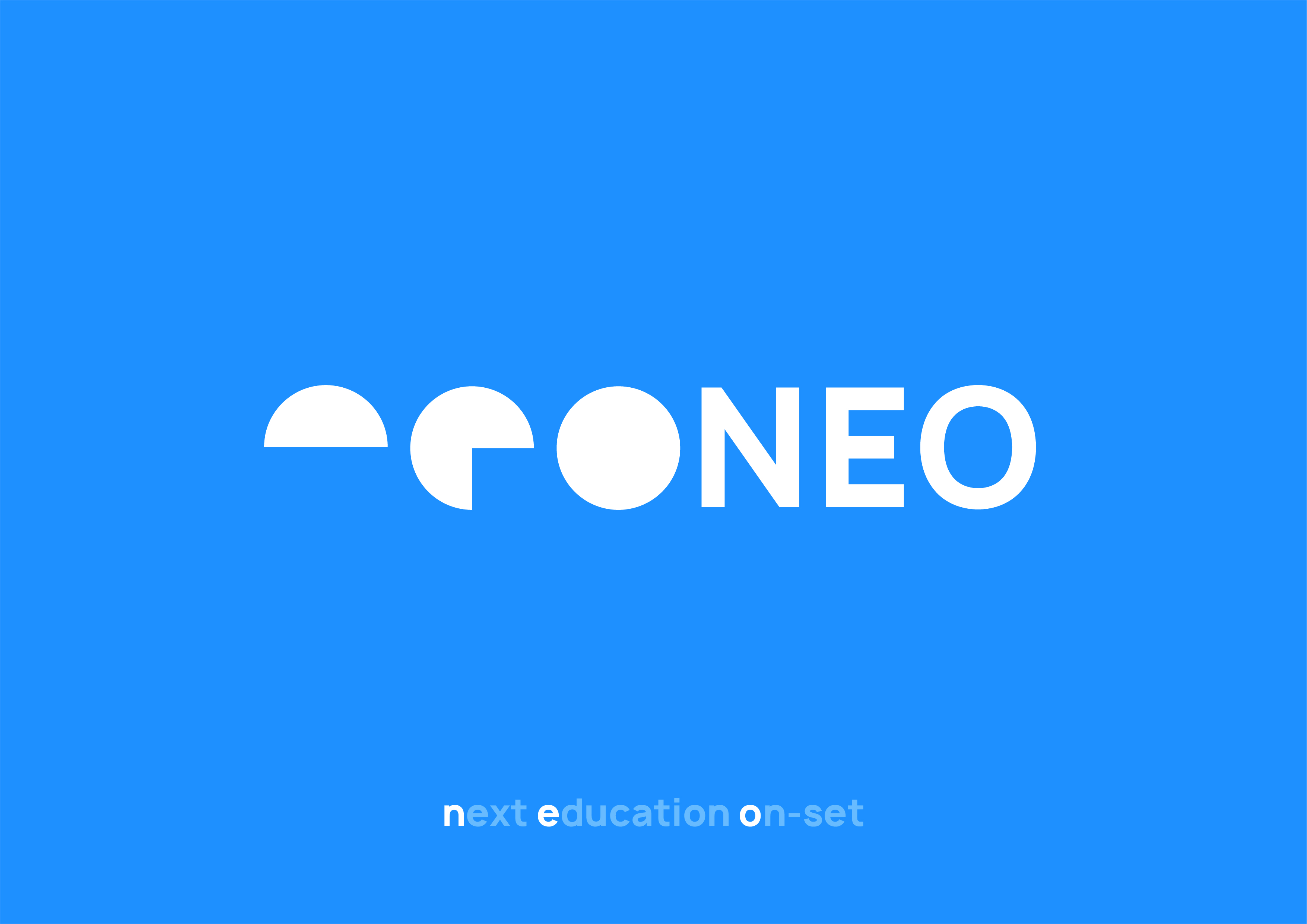
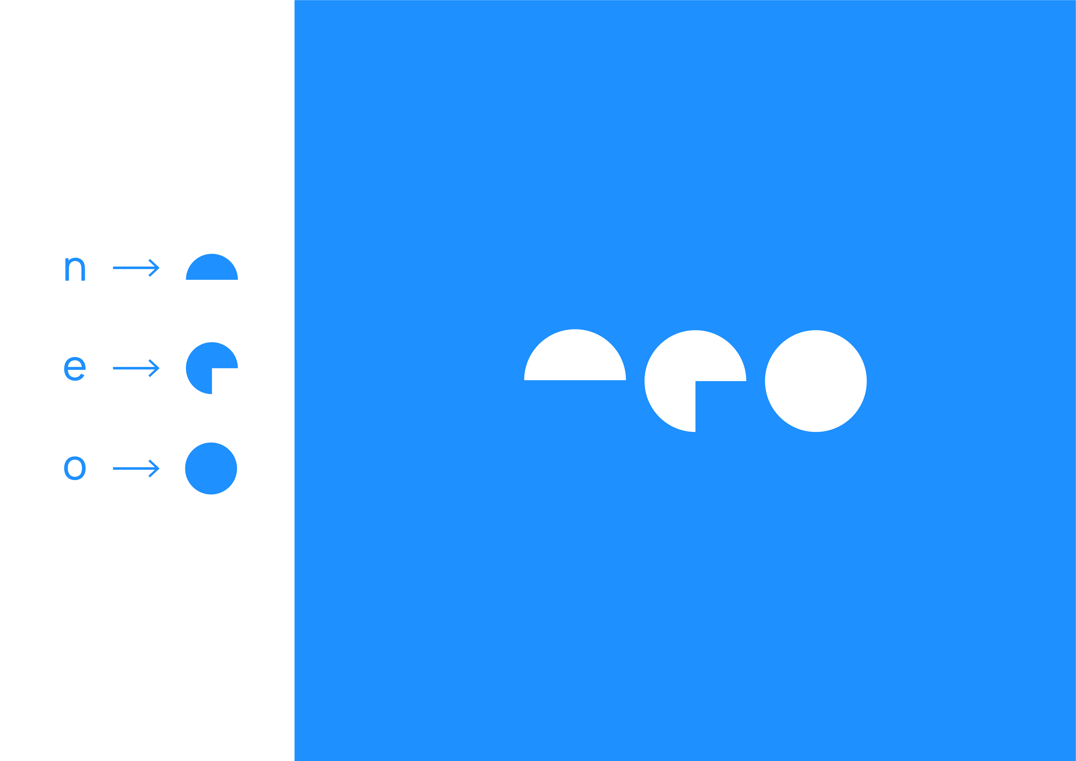
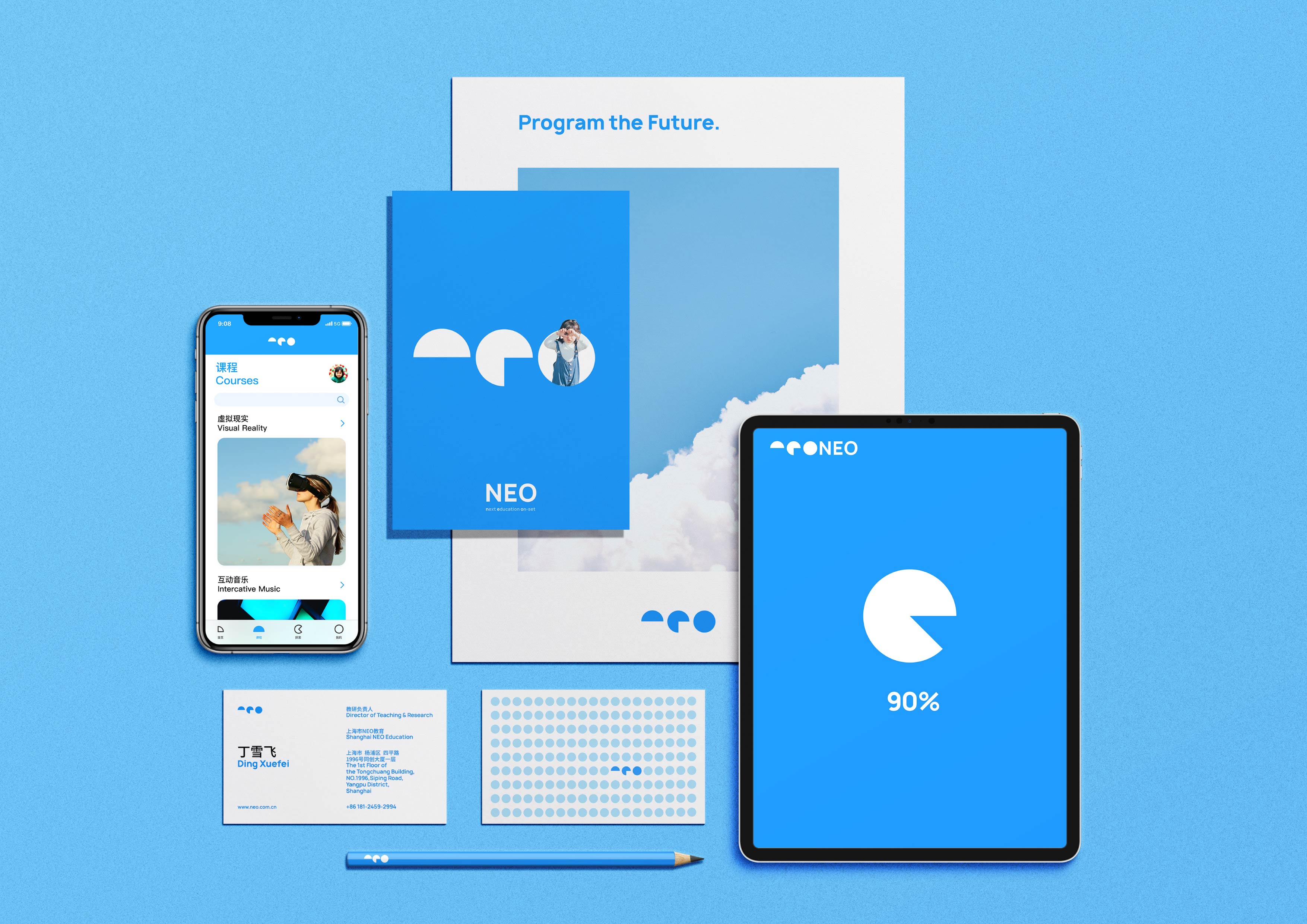
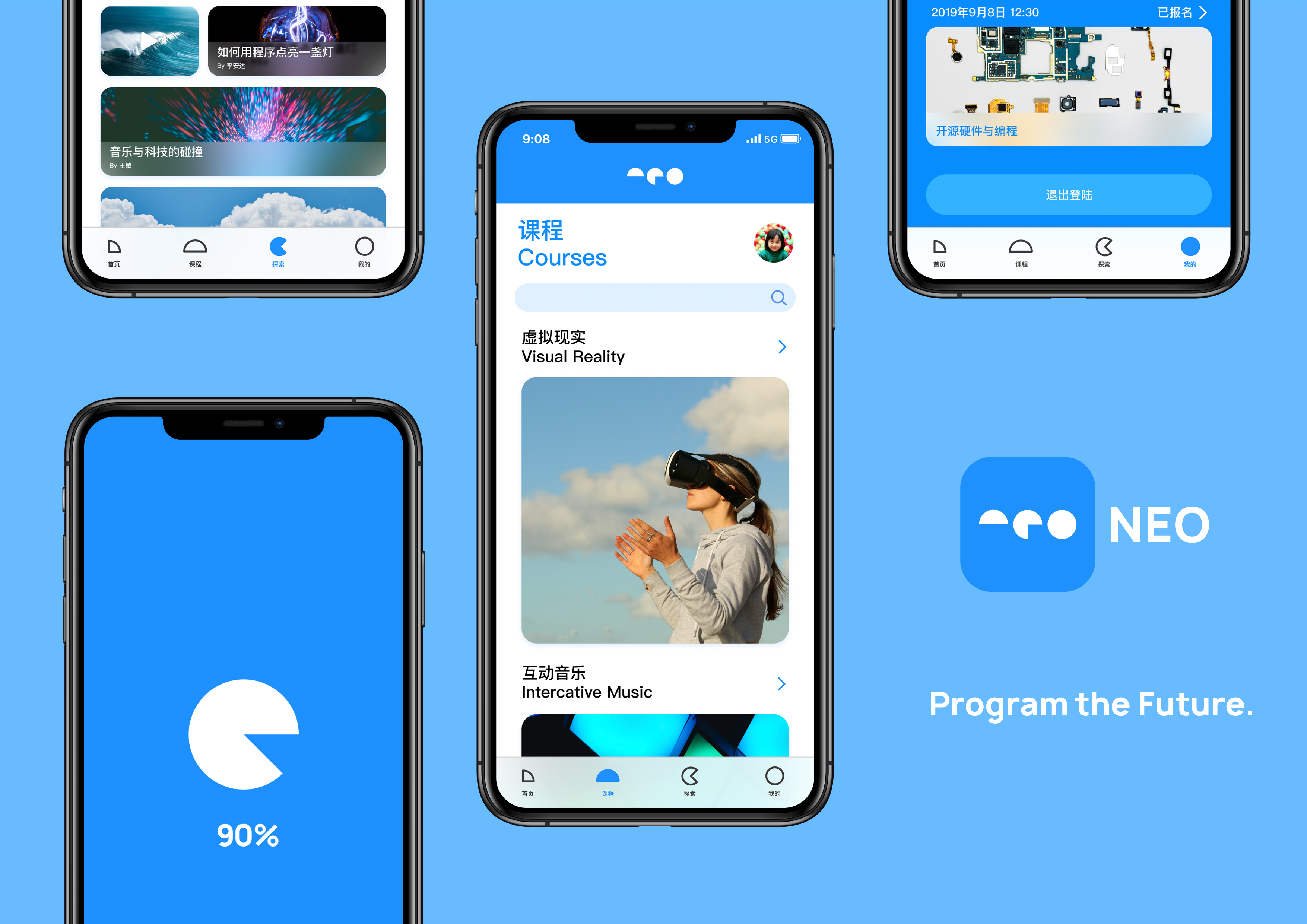
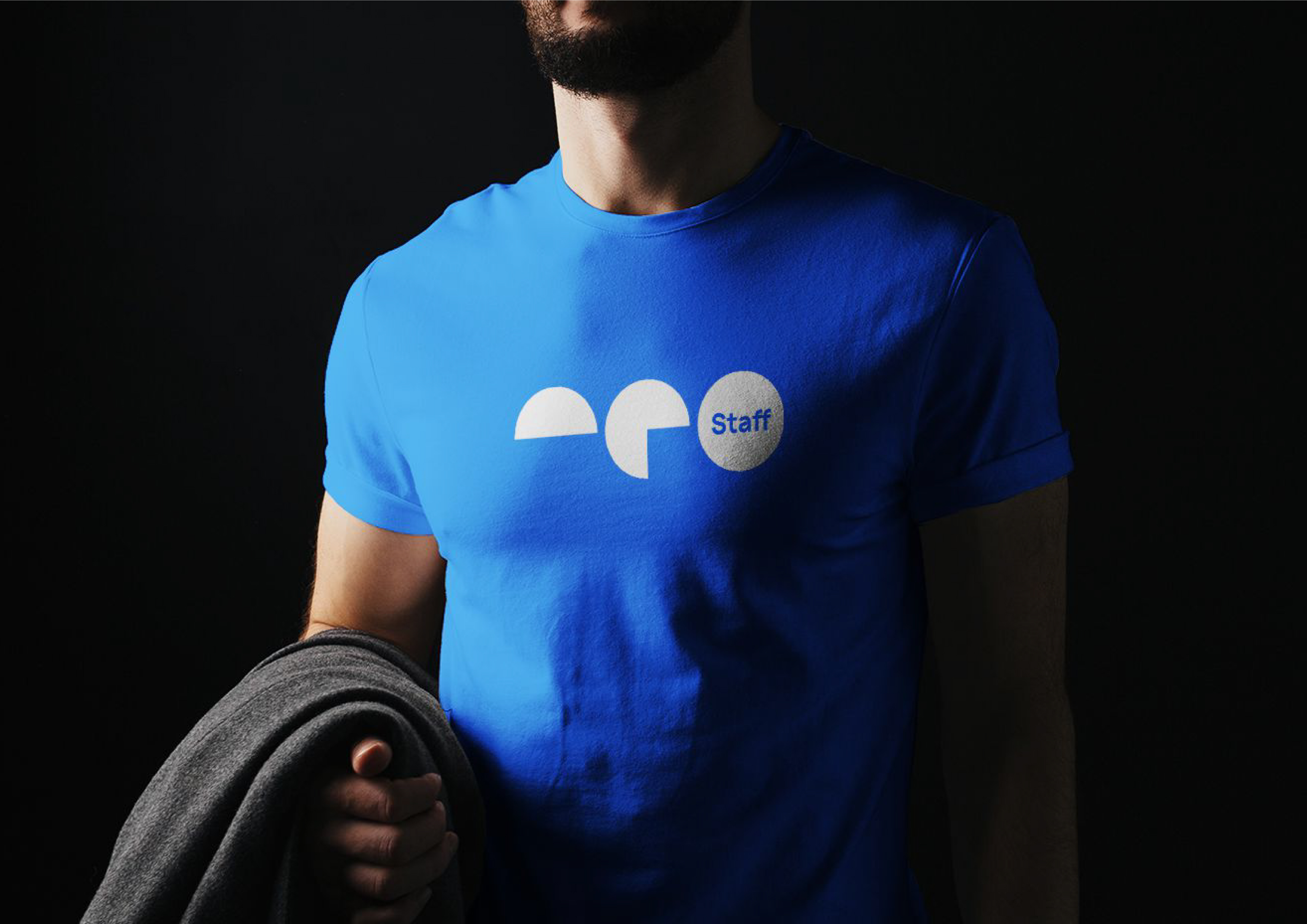
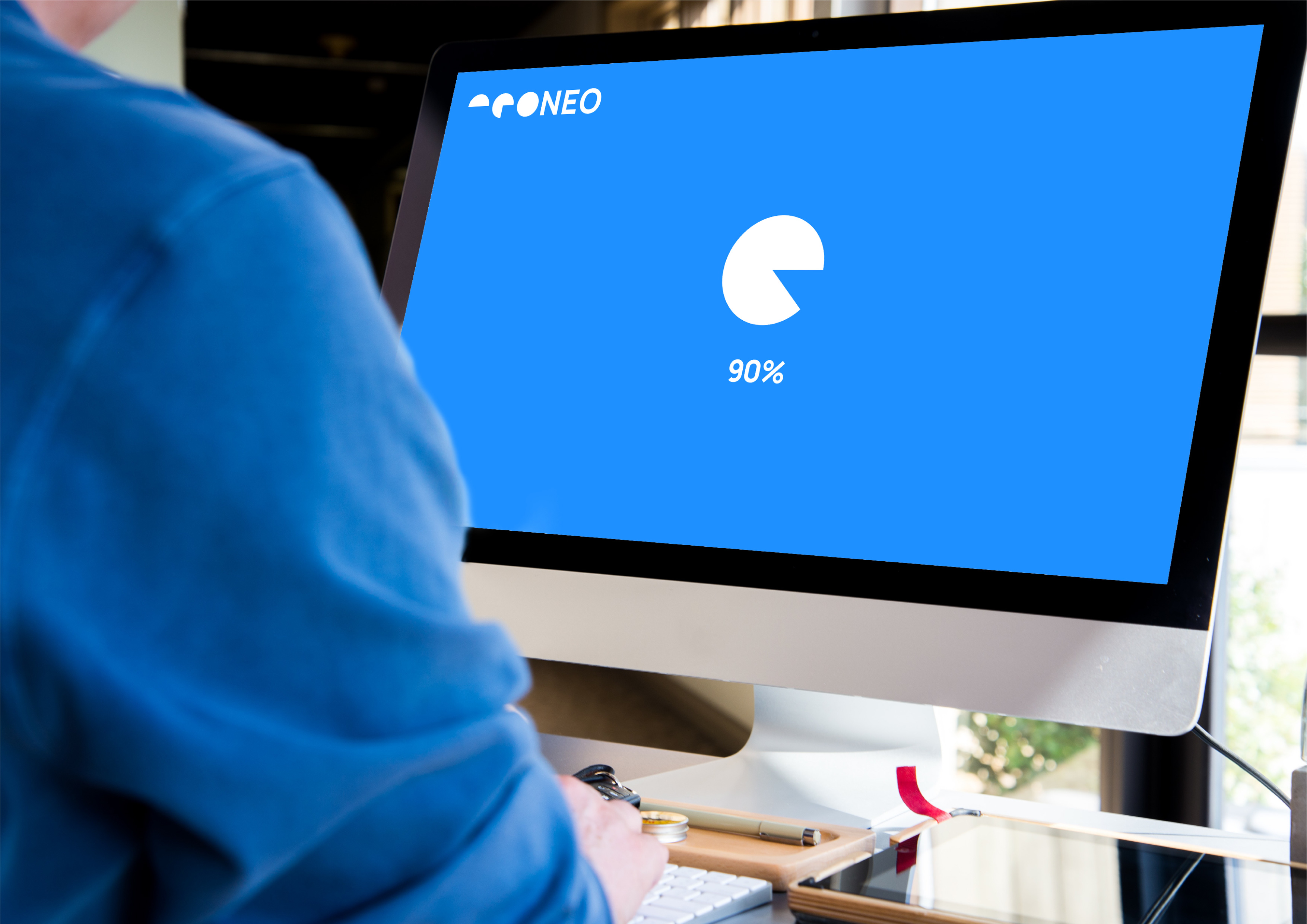
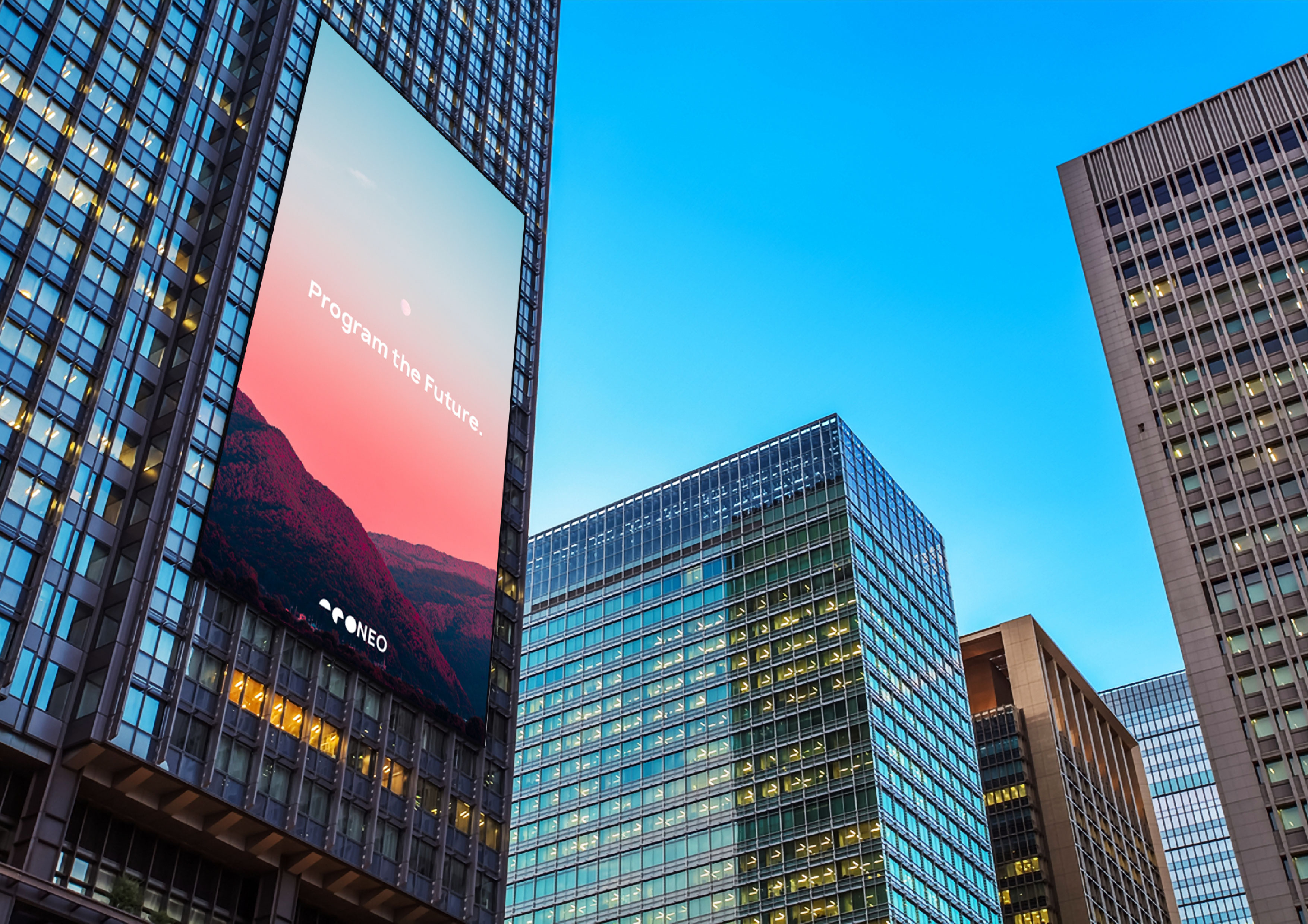
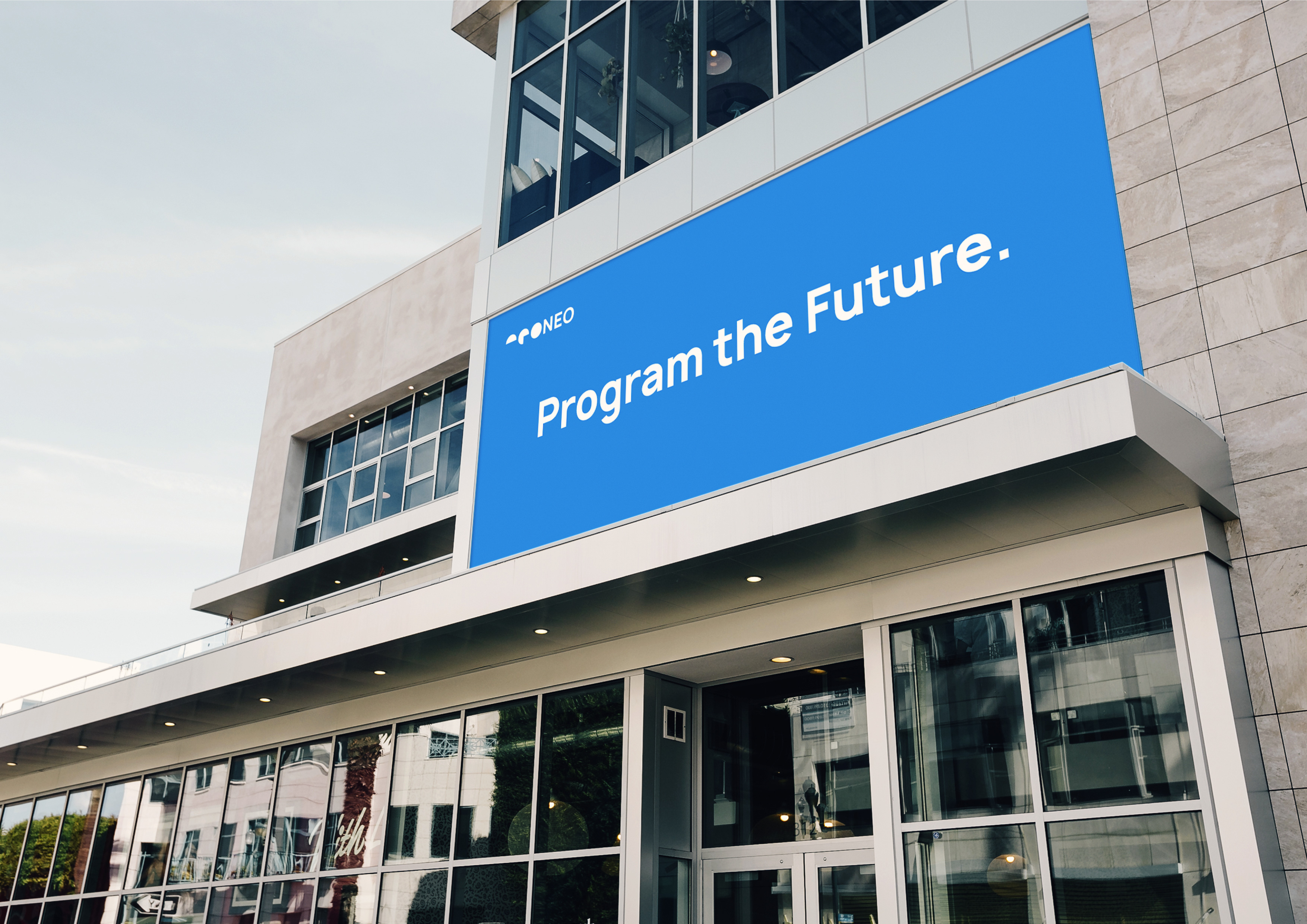
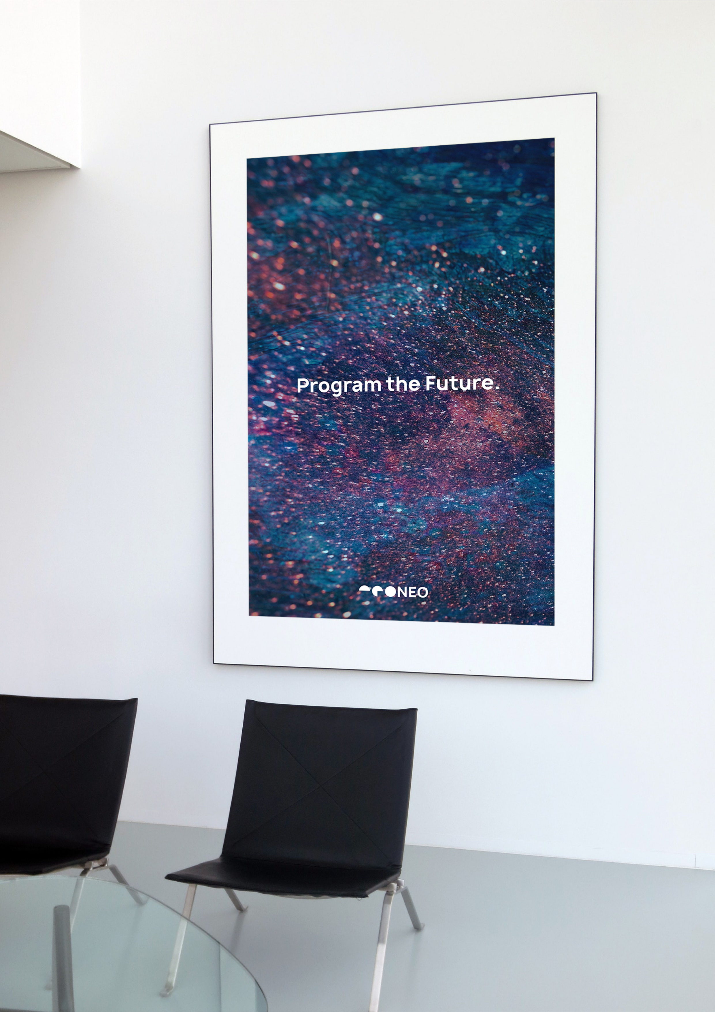
NEO, the abbreviation of Next Education On-set, is a brand of Internet technology education for teenagers in Shanghai. In this brand identity design, a very simple expression is used. The whole logo originates from the progress circle when the network is loading, so as to reflect the idea that the brand pays more attention to the process of education. Specifically, the three letters of NEO have been transformed into a loading circle, which is ingenious to achieve the effect of continuous development, creating a brand impression of technology, youth, relaxing, fun and a sense of future.
CREDIT
- Agency/Creative: CAI Qingyi
- Article Title: Visual Identity Design for NEO
- Organisation/Entity: Freelance, Published Commercial Design
- Project Type: Identity
- Agency/Creative Country: China
- Market Region: Global
- Project Deliverables: Brand Advertising, Brand Architecture, Brand Creation, Brand Design, Brand Experience, Brand Guidelines, Brand Identity, Brand Naming, Brand Strategy, Brand World, Branding, Graphic Design, Identity System, Research, Retail Brand Design
- Industry: Education
- Keywords: Technology, Education, Teenager
FEEDBACK
Relevance: Solution/idea in relation to brand, product or service
Implementation: Attention, detailing and finishing of final solution
Presentation: Text, visualisation and quality of the presentation


