


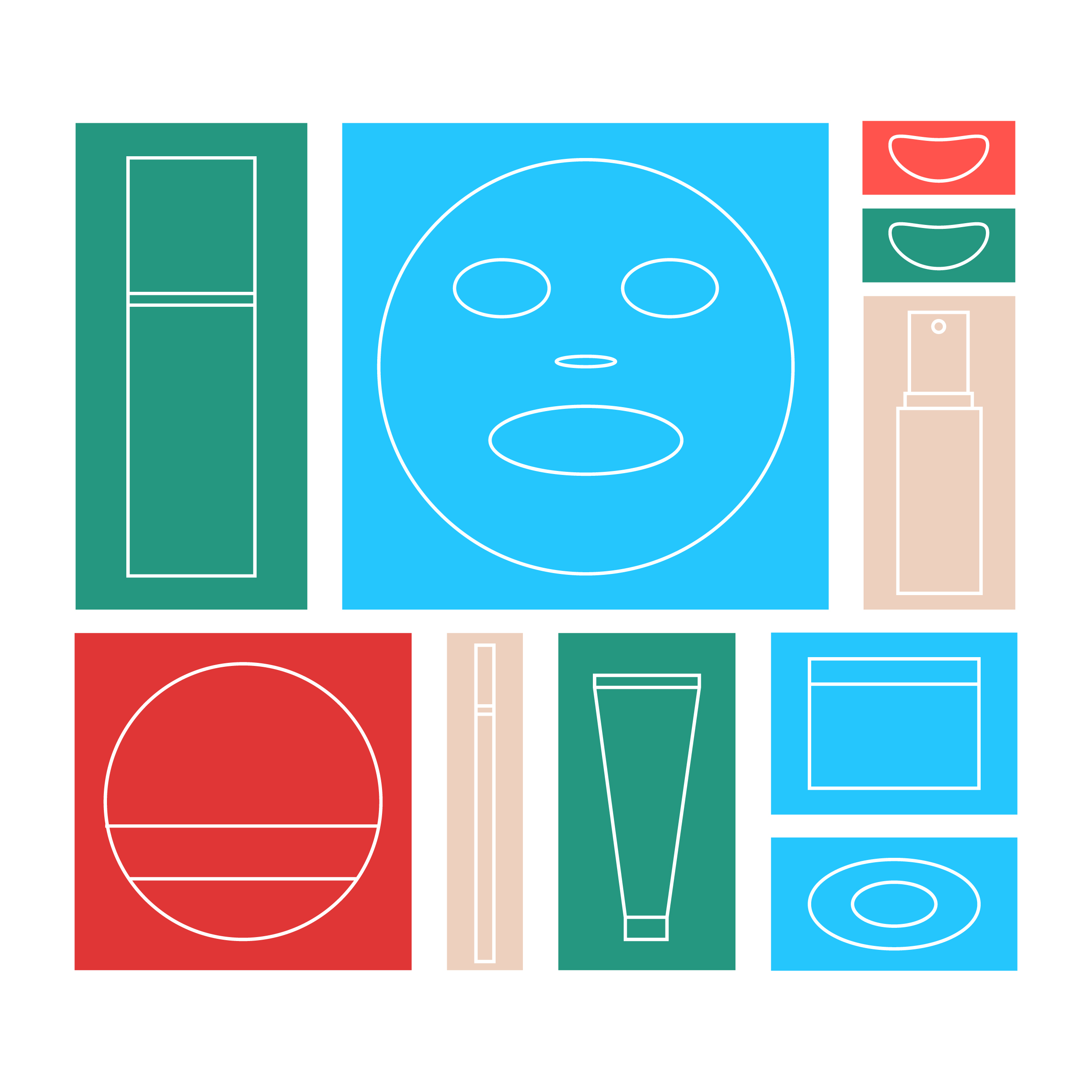
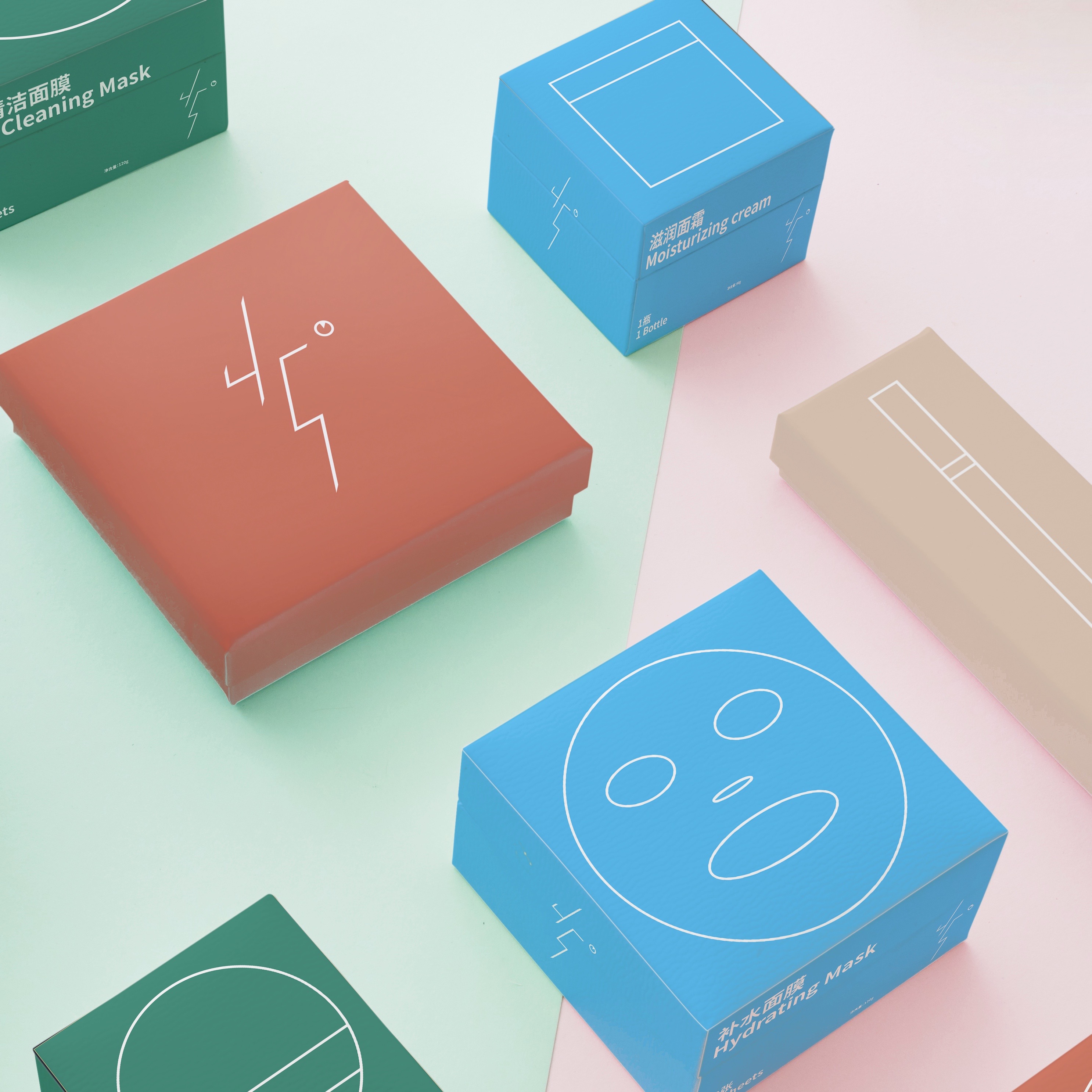
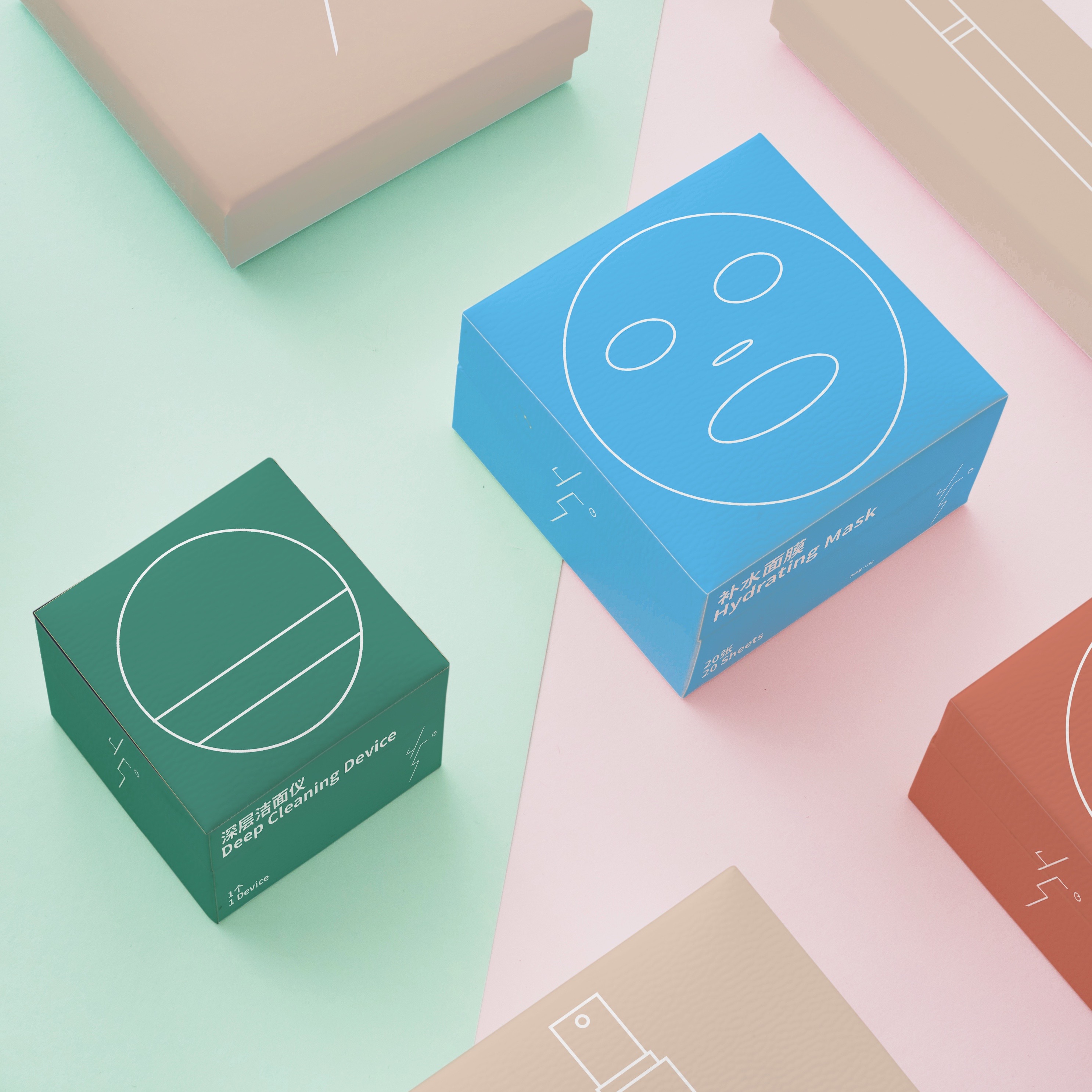
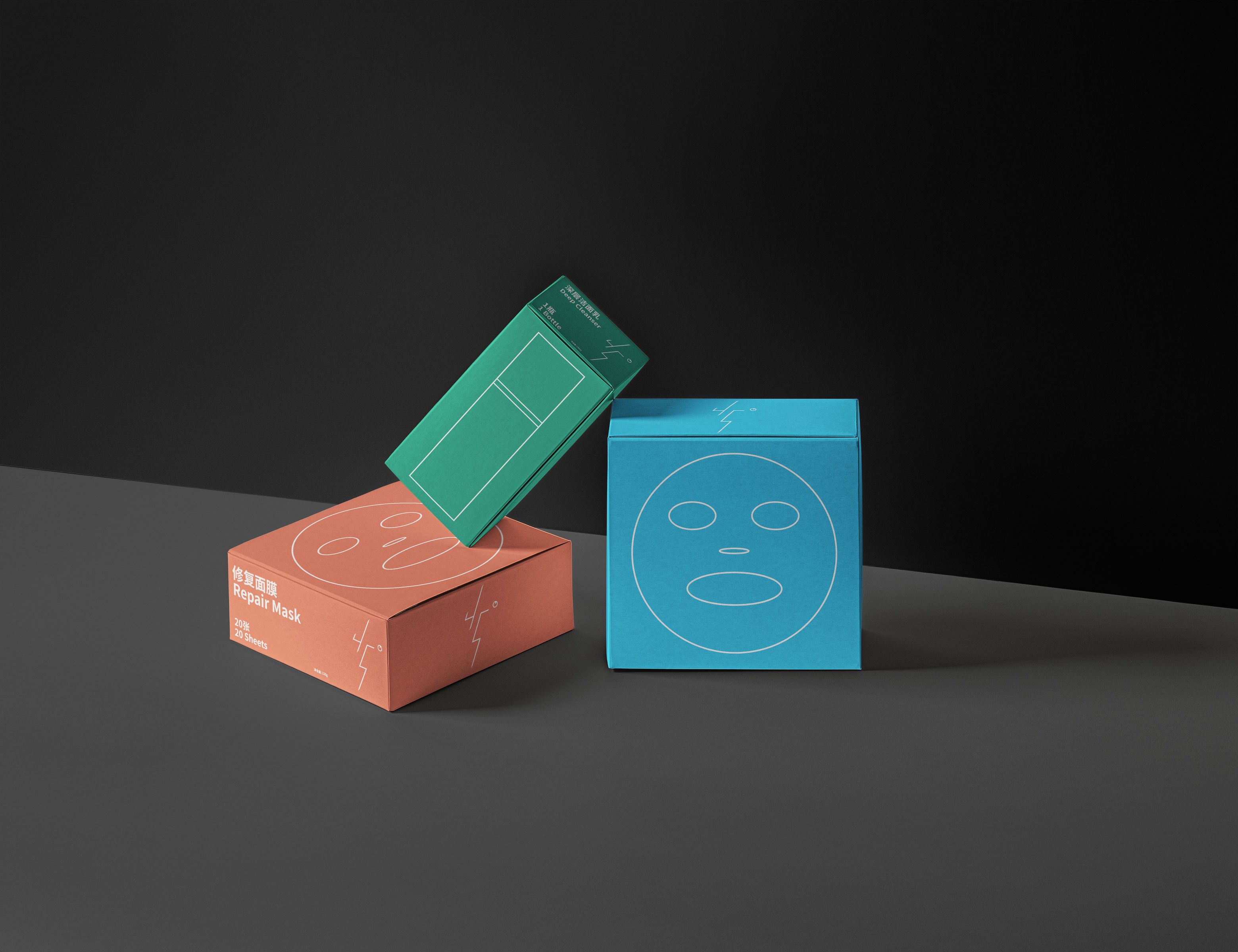
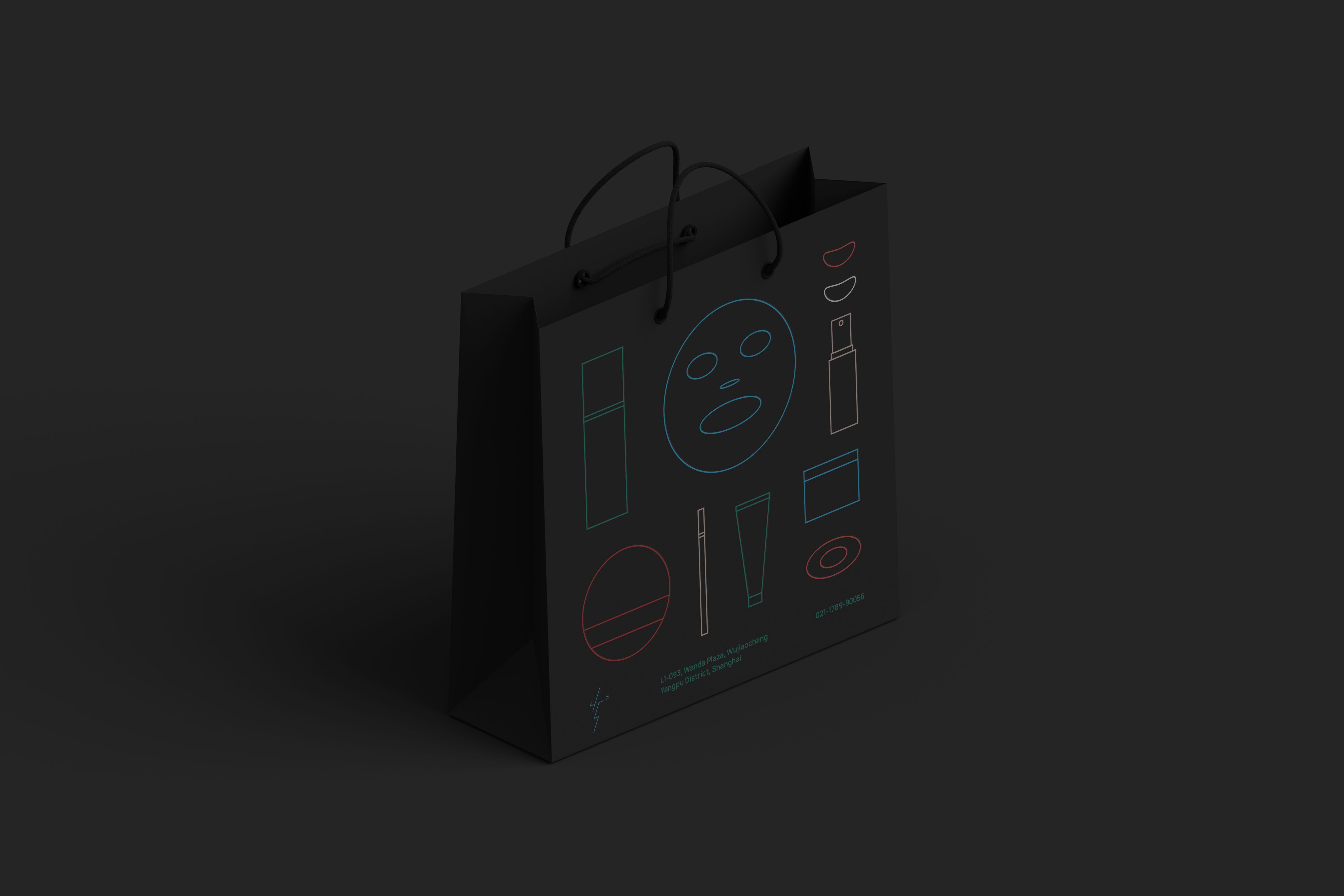
45° is a face care brand for young women.
In order to achieve a fresh, clean and light brand impression, the most simple linear expression is adopted in the overall visual language, and the product content is displayed in the symbolic form, so that 45° is highly recognizable on the dazzling cosmetics shelves in the mall.

CREDIT
- Agency/Creative: CAI Qingyi
- Article Title: Visual Identity Design for 45°
- Organisation/Entity: Freelance, Published Commercial Design
- Project Type: Packaging
- Agency/Creative Country: China
- Market Region: Asia
- Project Deliverables: Brand Architecture, Brand Creation, Brand Design, Brand Experience, Brand Guidelines, Brand Identity, Brand Naming, Brand Strategy, Brand World, Branding, Graphic Design, Identity System, Packaging Design, Product Architecture, Product Naming, Research, Retail Brand Design, Structural Design, Tone of Voice
- Format: Bag, Box
- Substrate: Pulp Board
FEEDBACK
Relevance: Solution/idea in relation to brand, product or service
Implementation: Attention, detailing and finishing of final solution
Presentation: Text, visualisation and quality of the presentation


