Choux is a modern version of a French patisserie, based in São Paulo, Brazil. It offers exclusive products made with quality ingredients, refined techniques and recipes, and an elegant presentation. The brand is refined, delicate and modern.
The brand’s name was inspired by “pâté à choux”, the traditional French éclair pastry. This is a versatile and delicate pastry created in the 19th century, that has a large hollow inside after baked and requires a rigorous precision in preparation.
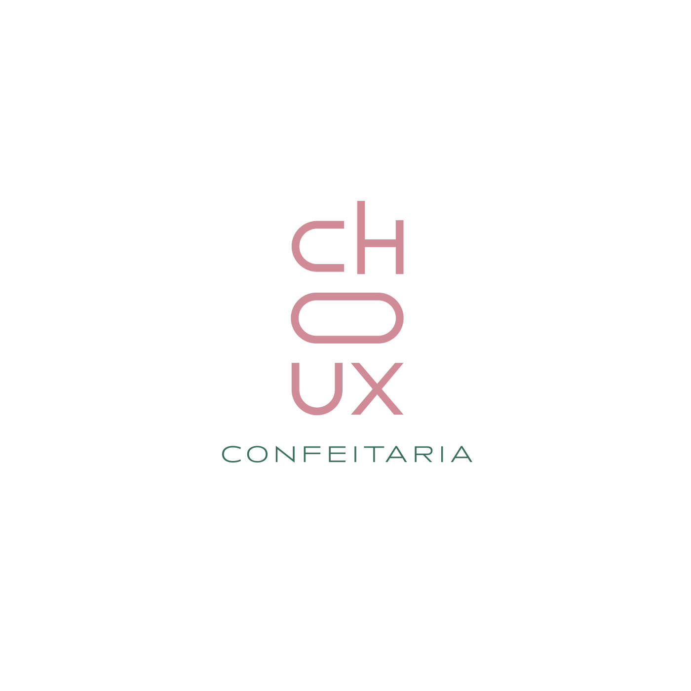
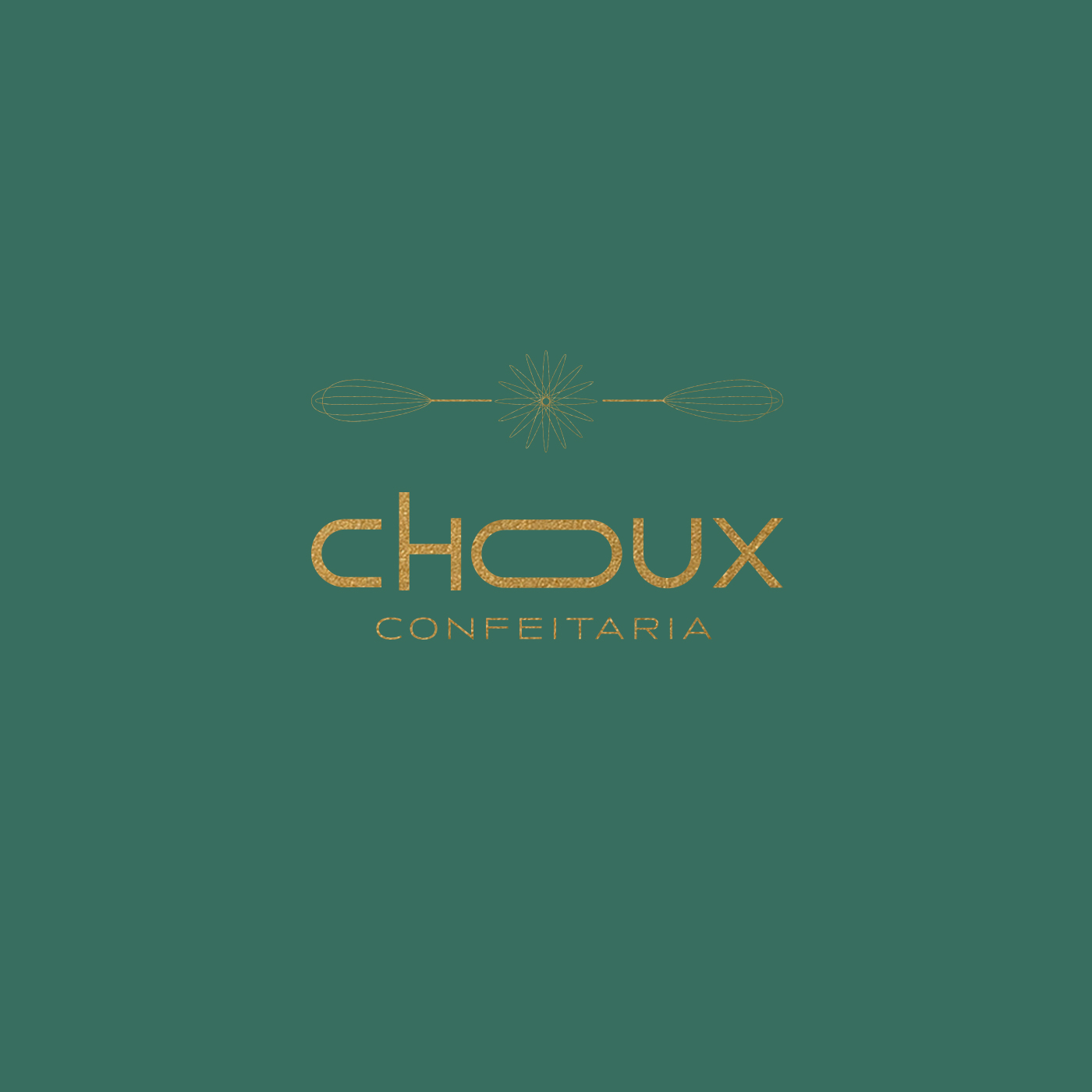
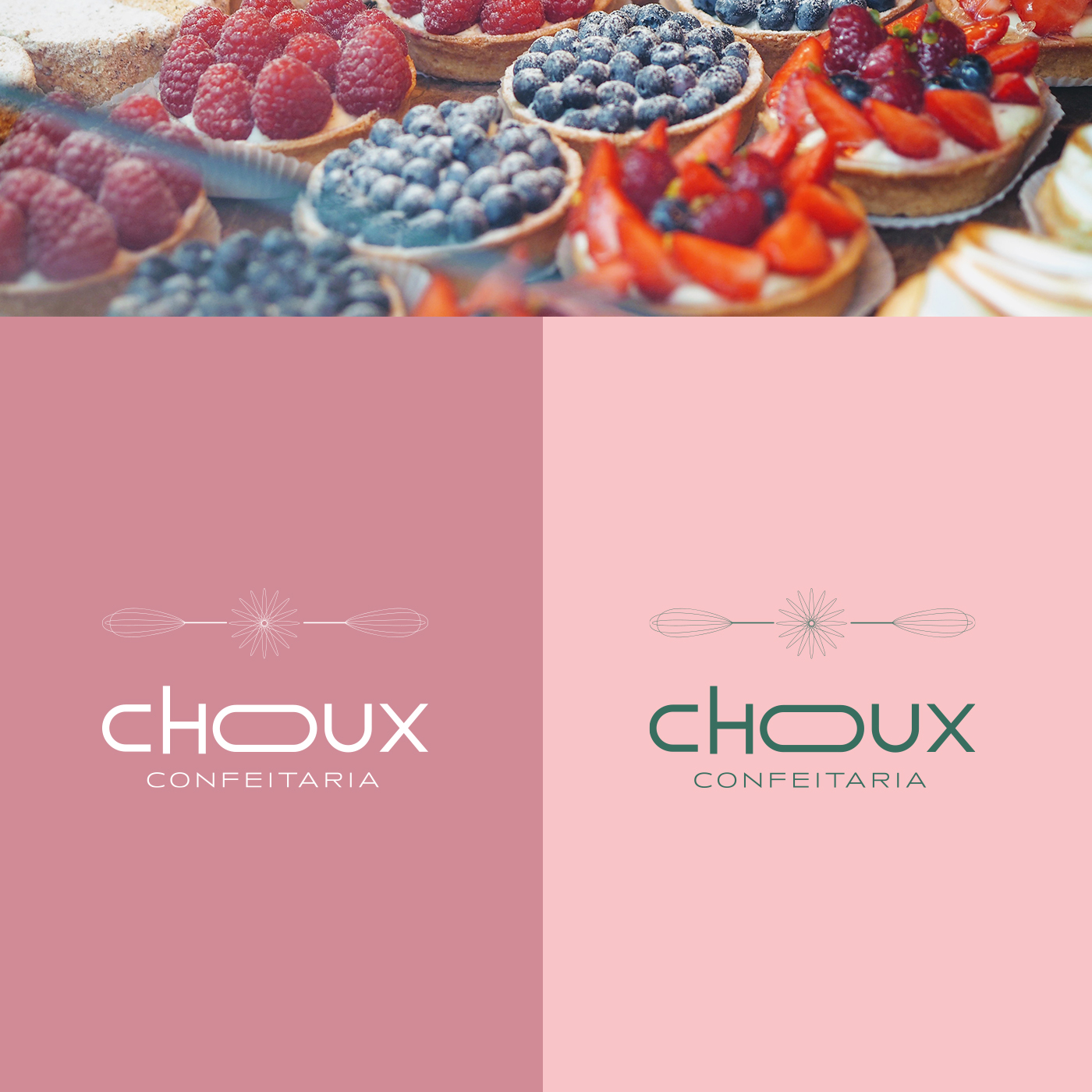
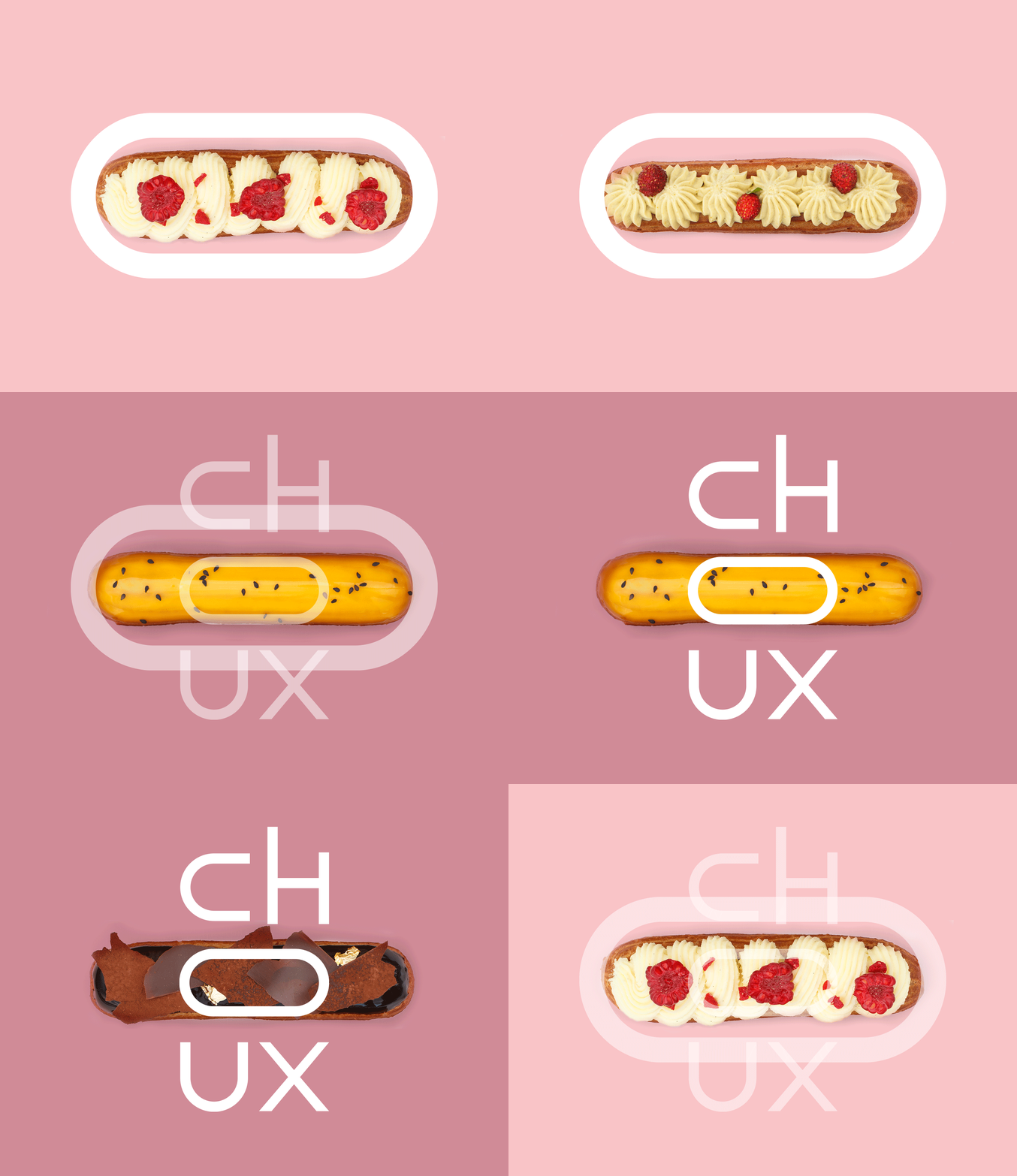
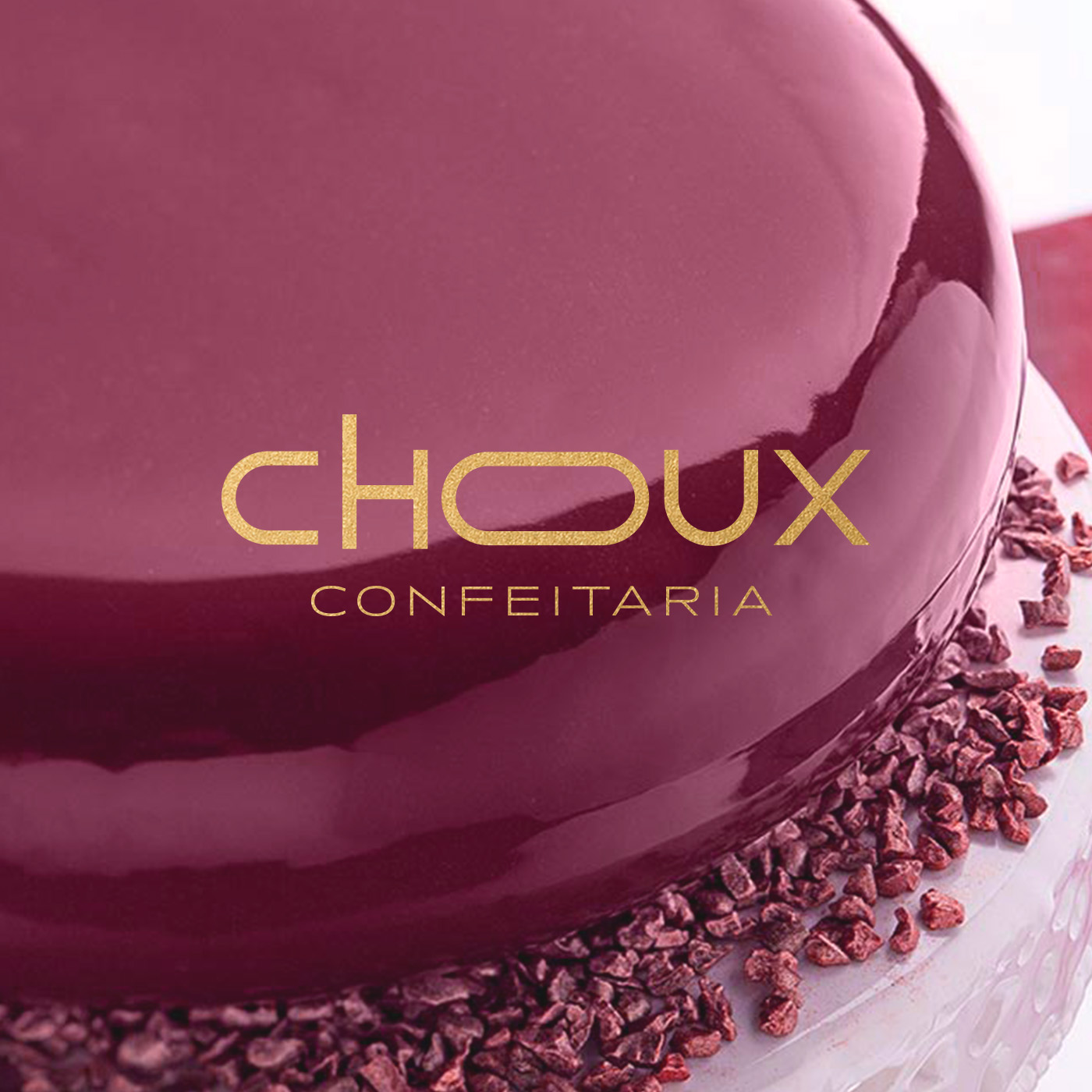
The éclair’s format and the precision of the recipe were the inspirations for the visual identity. As a modern brand, it was necessary to be a different version of this tradicional éclair shape, integrating tradition and modernity. After many tests, was decided to customize the typography to integrate the shape in the O letter, and to keep the brand’s name modular.
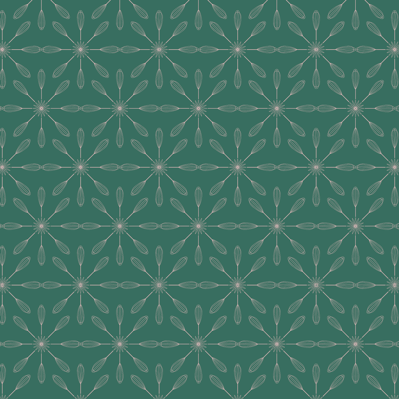
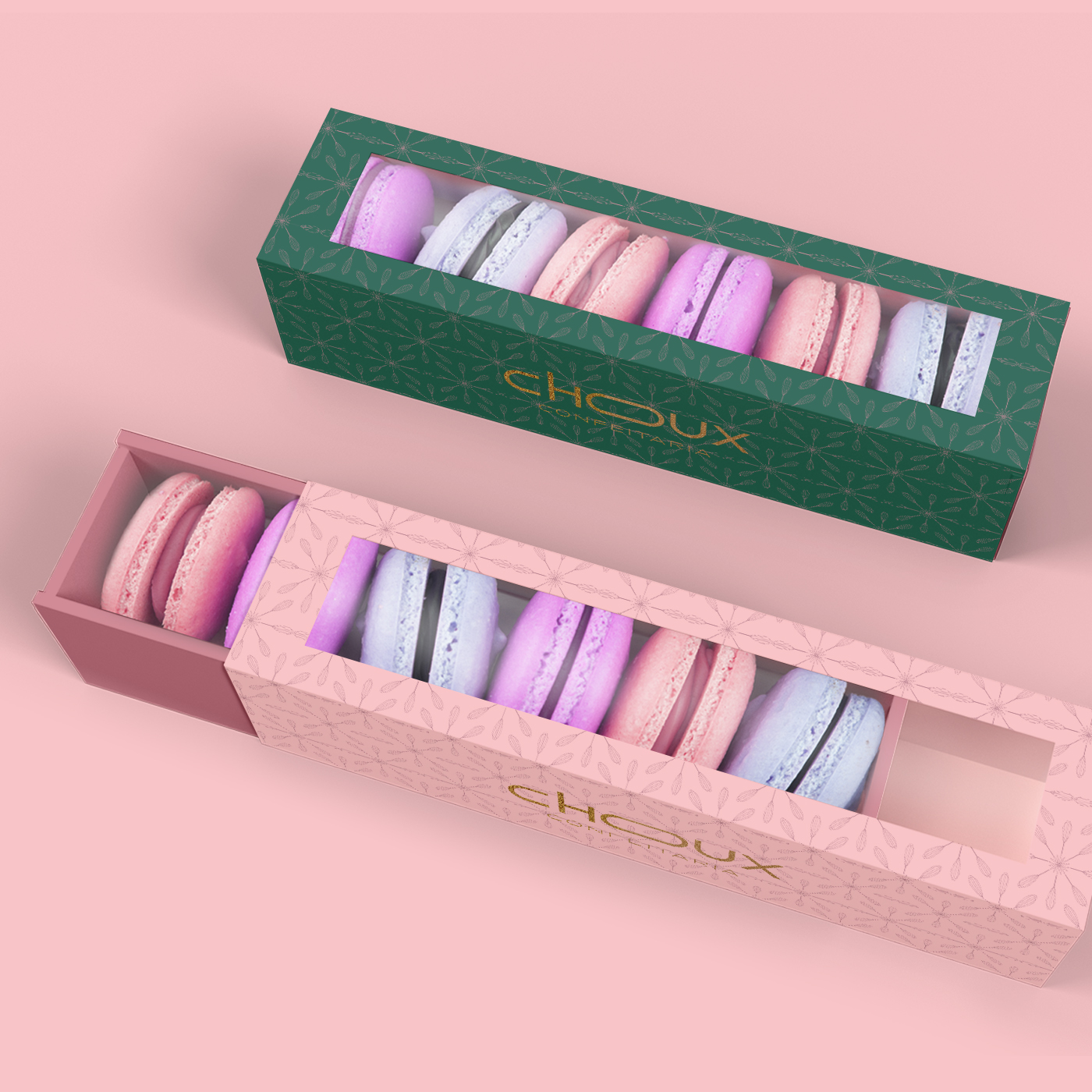
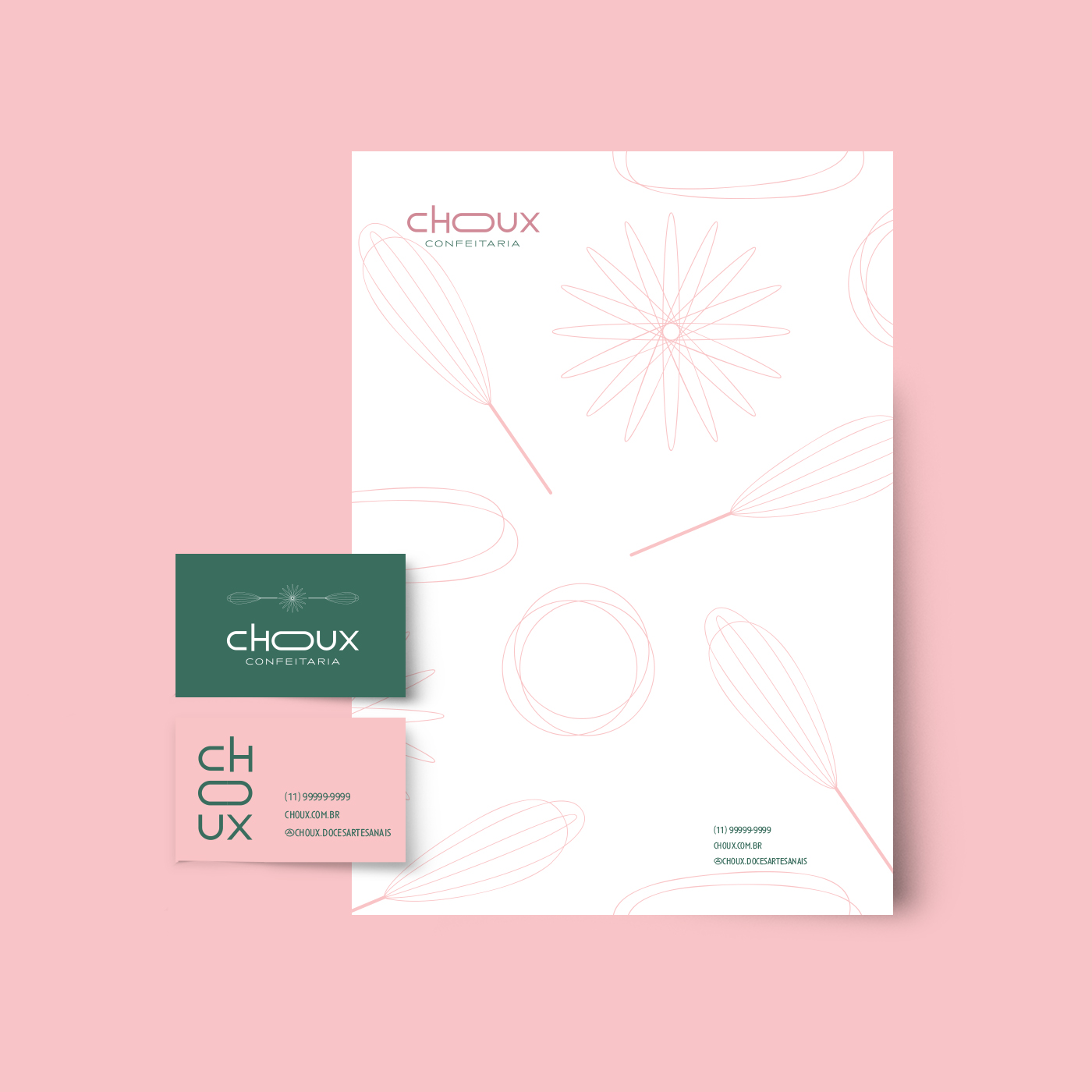
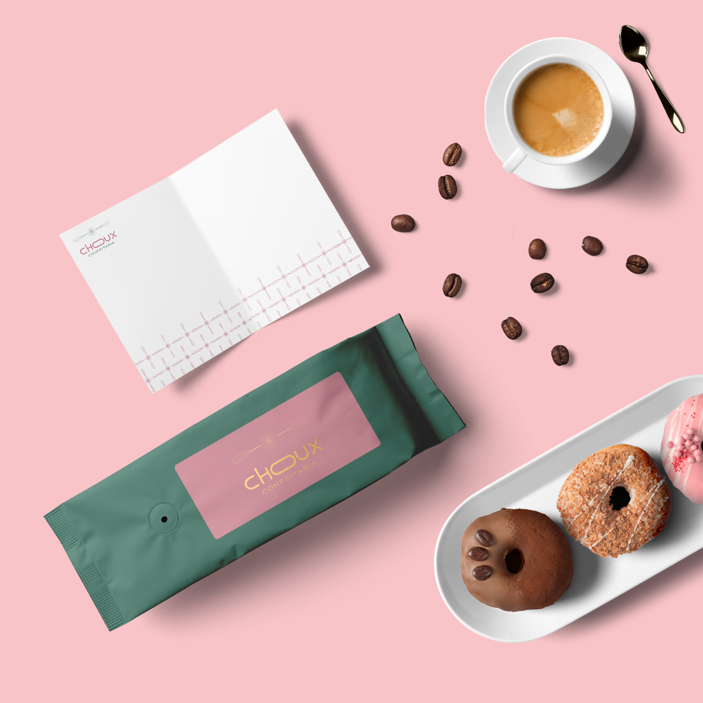
The fouet and its lines gave rise to a set of complementary elements that play in a top view, untraditional that refers to a mandala, and in the composition of prints.



CREDIT
- Agency/Creative: Fernanda Galindo
- Article Title: Visual Identity Choux Patisserie
- Organisation/Entity: Freelance, Published Commercial Design
- Project Type: Identity
- Agency/Creative Country: Brazil
- Market Region: South America
- Project Deliverables: Brand Creation, Brand Guidelines, Brand Identity, Brand Strategy, Brand World, Graphic Design, Research
- Industry: Food/Beverage
- Keywords: Patisserie, Brand Design


