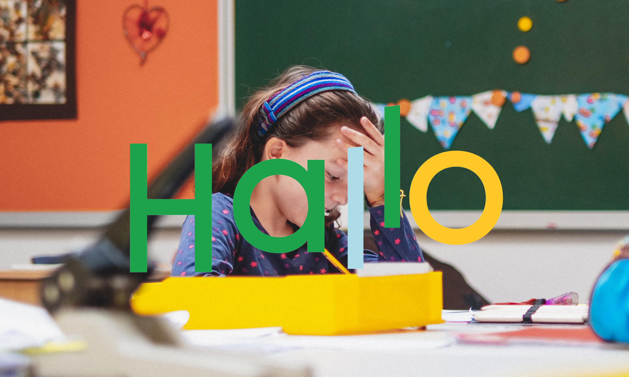
The Backnang primary school describes itself as a “school on the move” which, with its focus on sport and movement education, enables successful learning and a healthy physical, emotional and spiritual development.
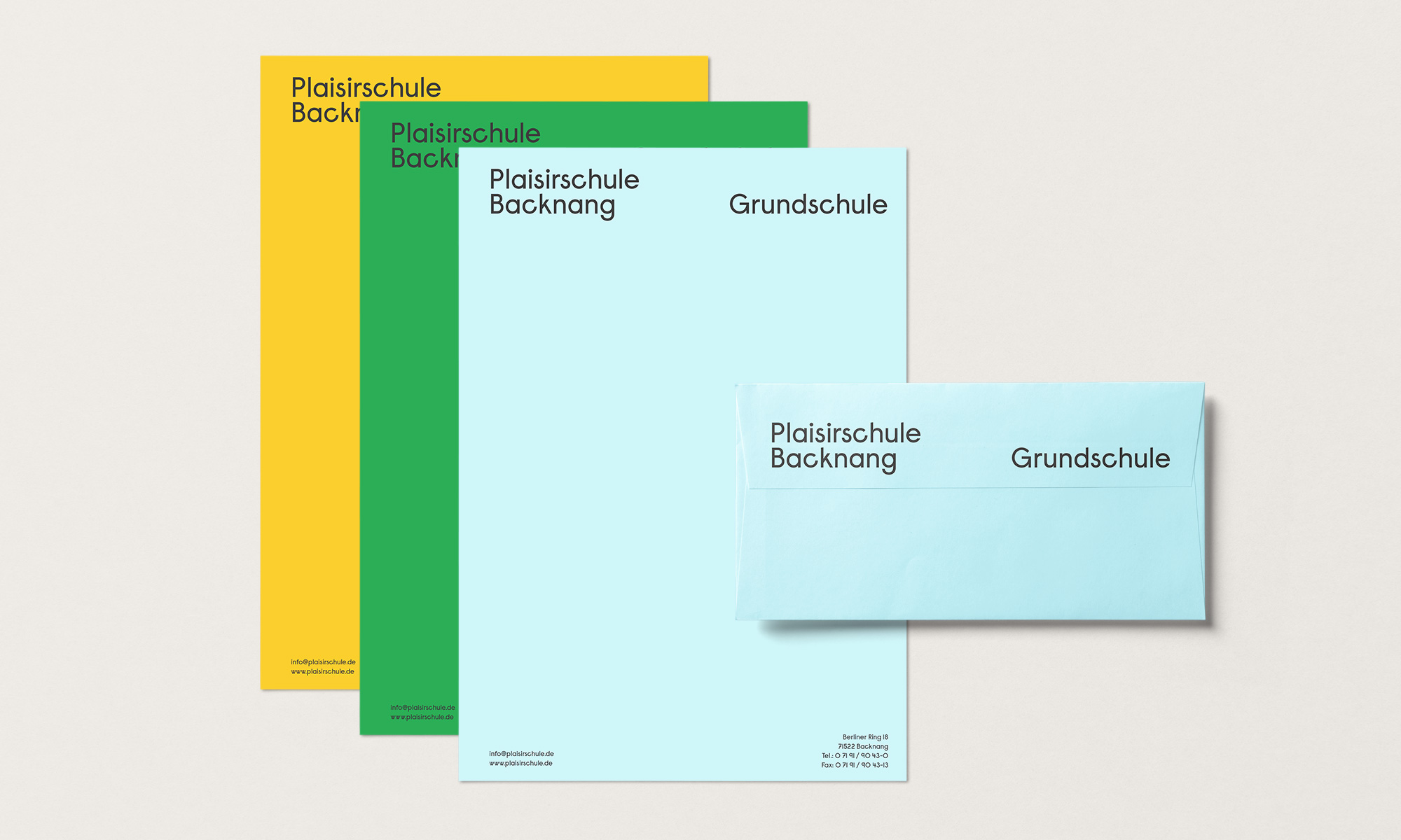
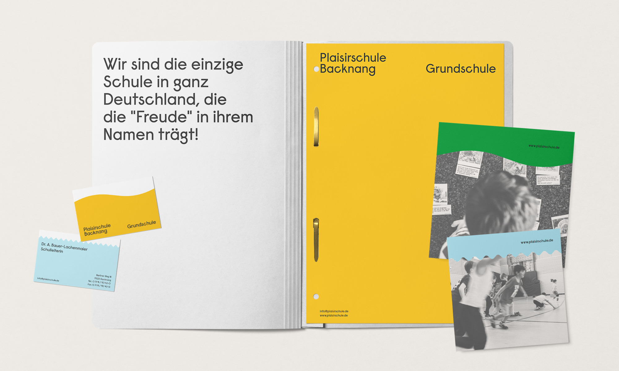
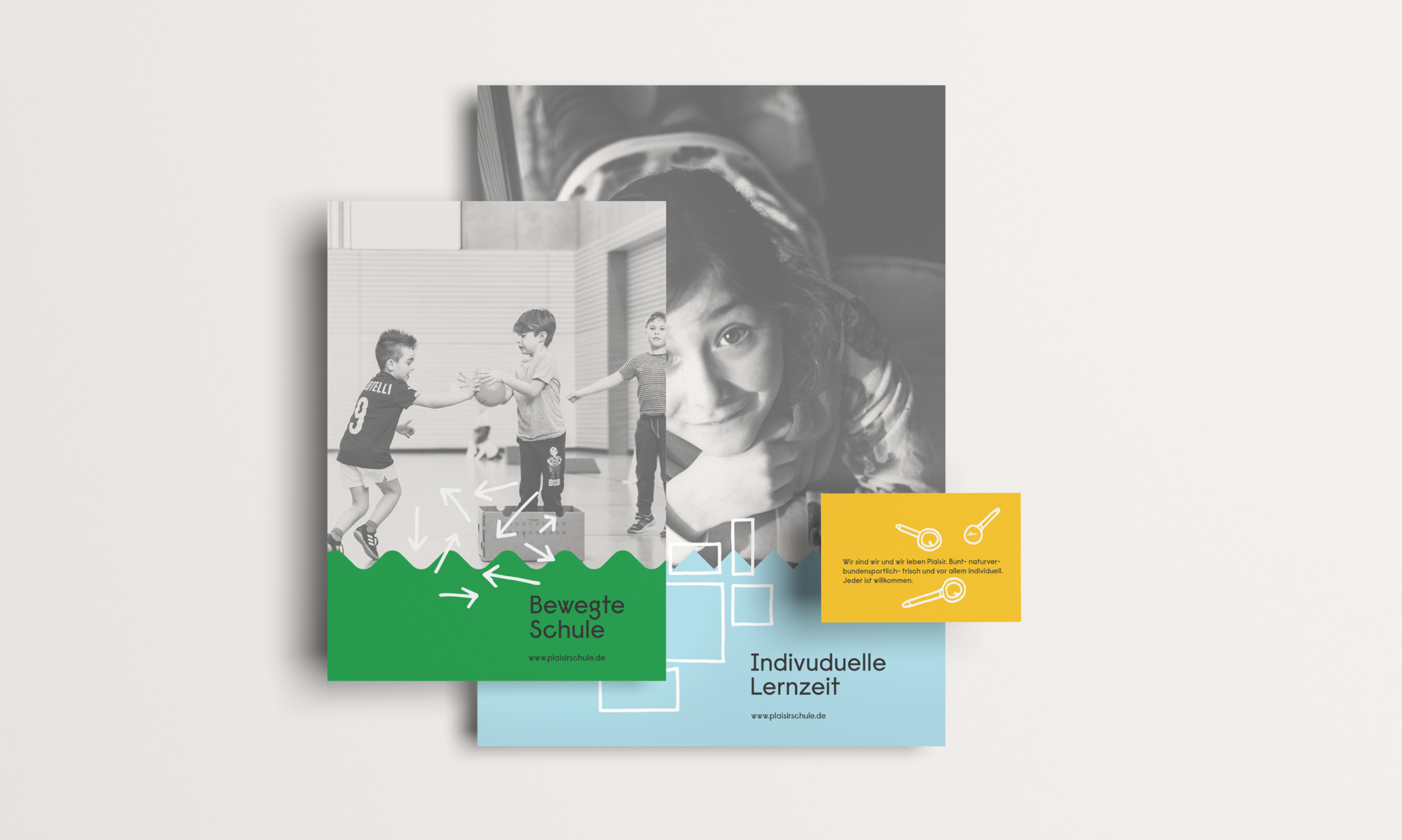
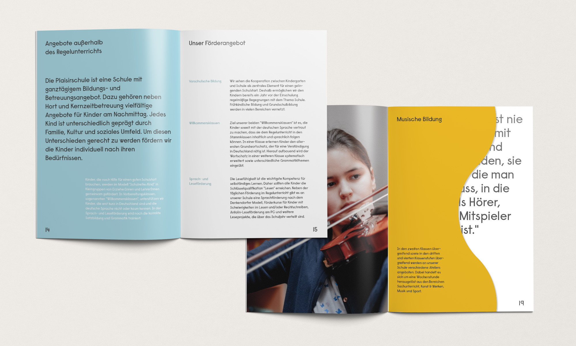
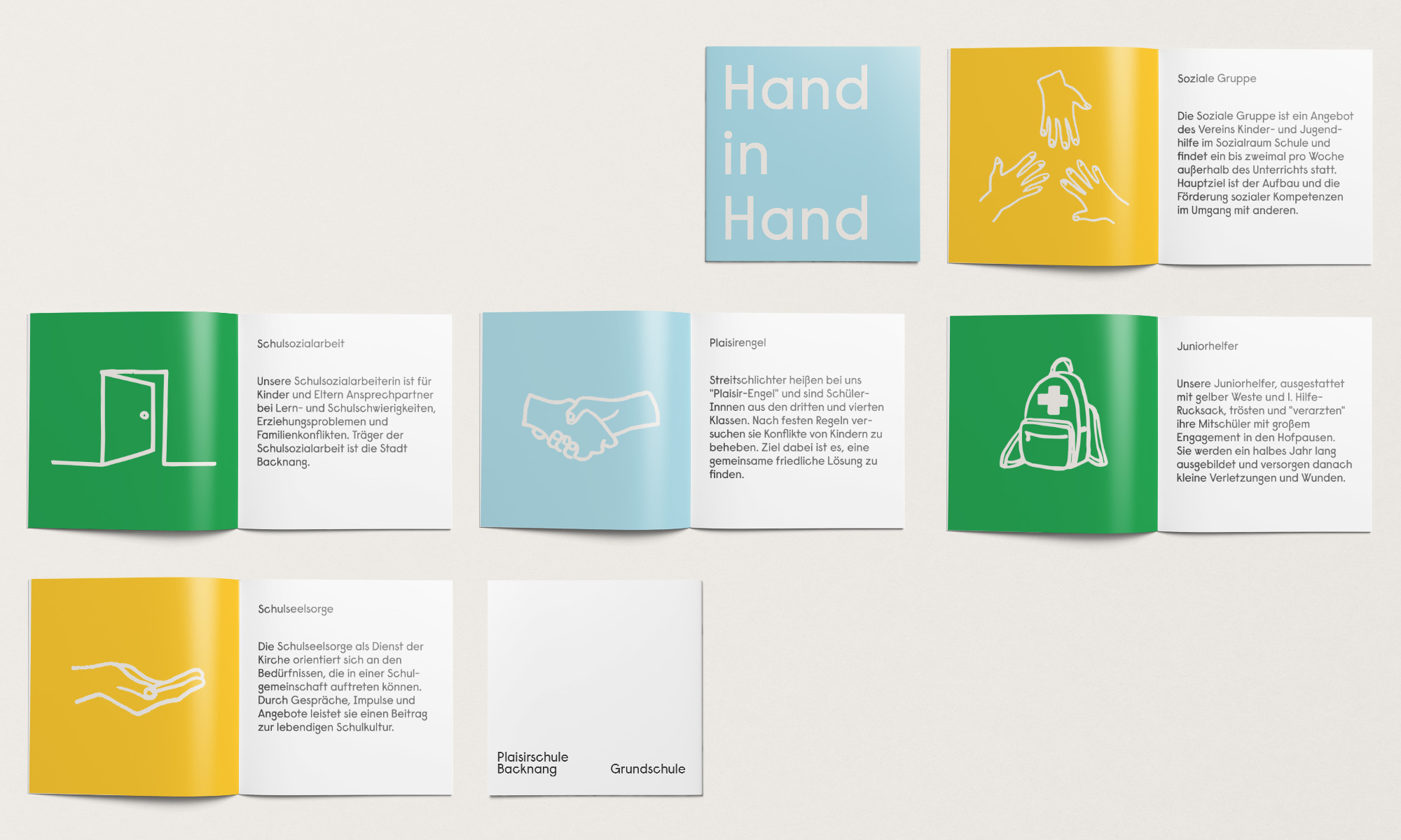
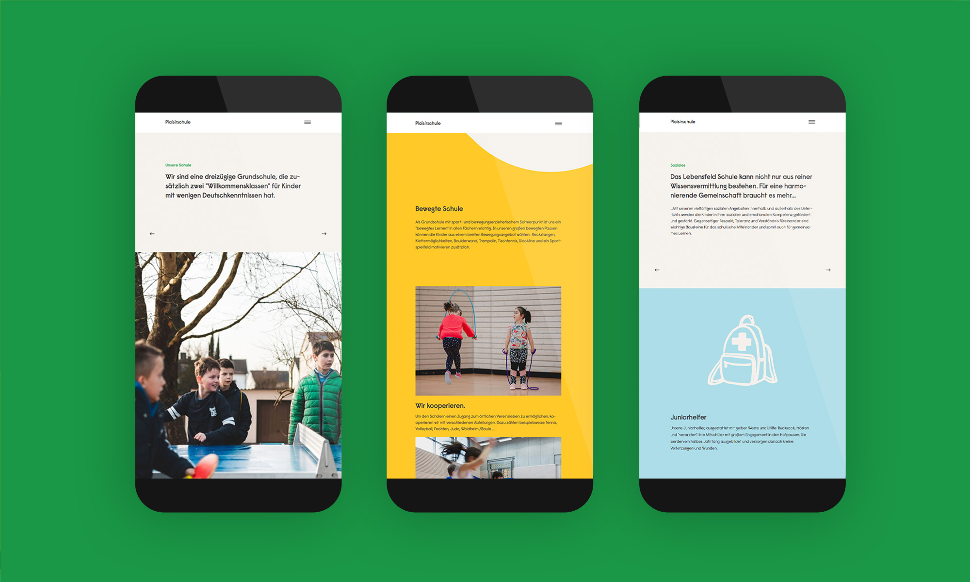
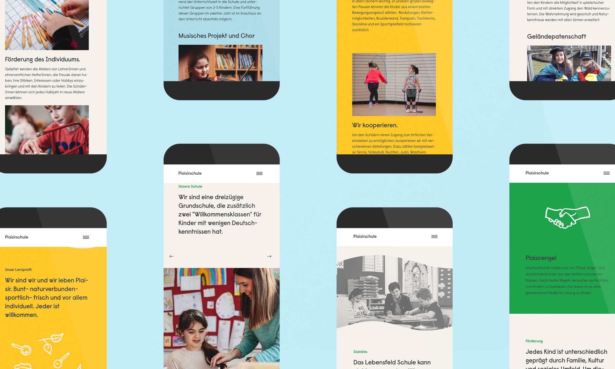
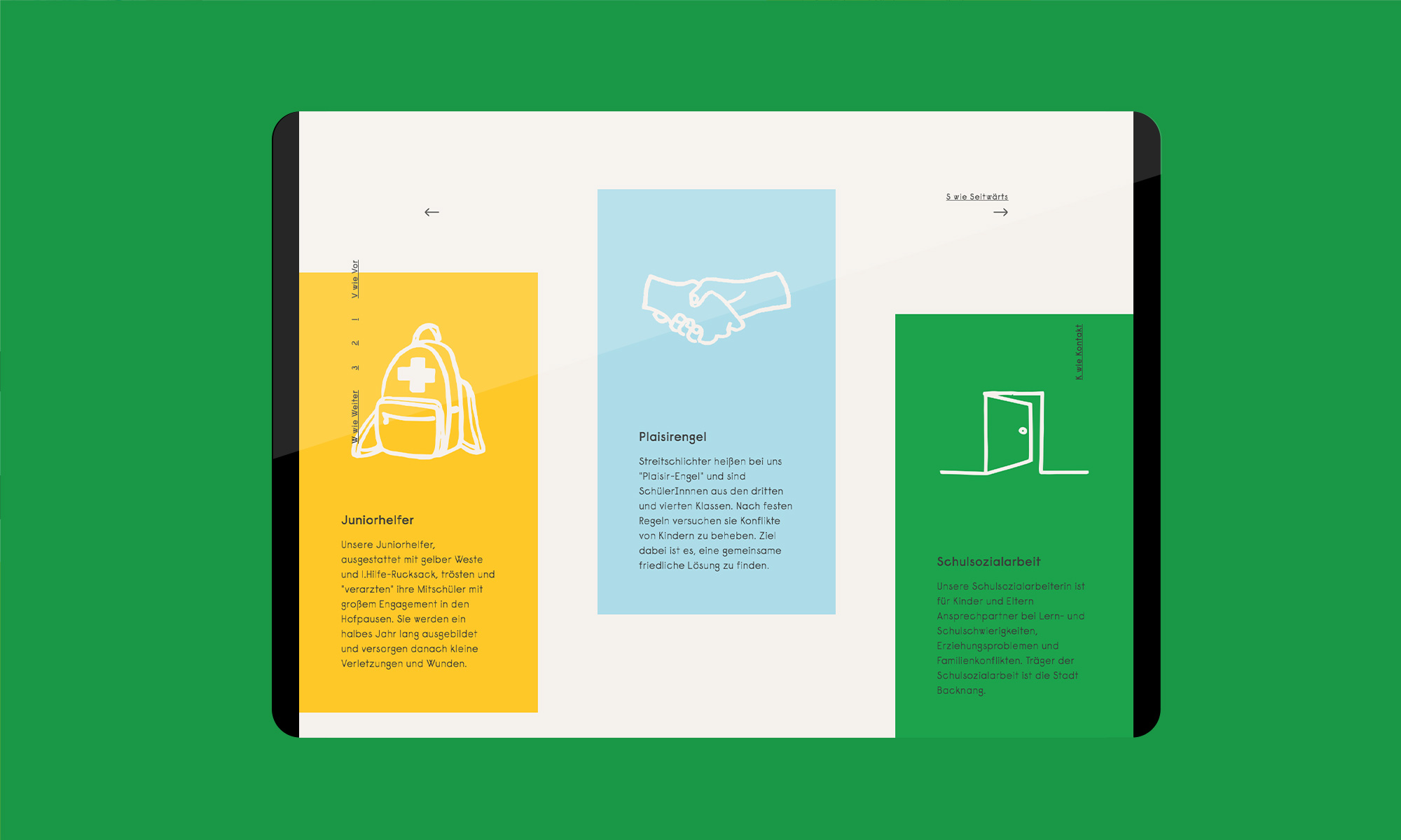
The color, writing, illustration, animation and photography elements that papa tom designed and developed are characterized by nature, movement, individual personality, lightness and joy. Clear, cheerful colors play around shapes that break open rigid boundaries, creating space, just as the school does as a place of learning. The designers made a logical and well-thought-out choice to use the “Raisonné” font which, with its geometric, playful and simple design language, emits a character-strong sense of individuality.

CREDIT
- Agency/Creative: papa tom
- Article Title: Visual Identity and Website for the Plaisir School
- Organisation/Entity: Agency, Published Commercial Design
- Project Type: Identity
- Agency/Creative Country: Germany
- Market Region: Europe
- Project Deliverables: Brand Design, Brand Experience, Brand Identity, Brand World, Branding, Graphic Design, Illustration, Tone of Voice
- Industry: Education
- Keywords: branding, school, school design, stationary, flyer, web design
FEEDBACK
Relevance: Solution/idea in relation to brand, product or service
Implementation: Attention, detailing and finishing of final solution
Presentation: Text, visualisation and quality of the presentation


