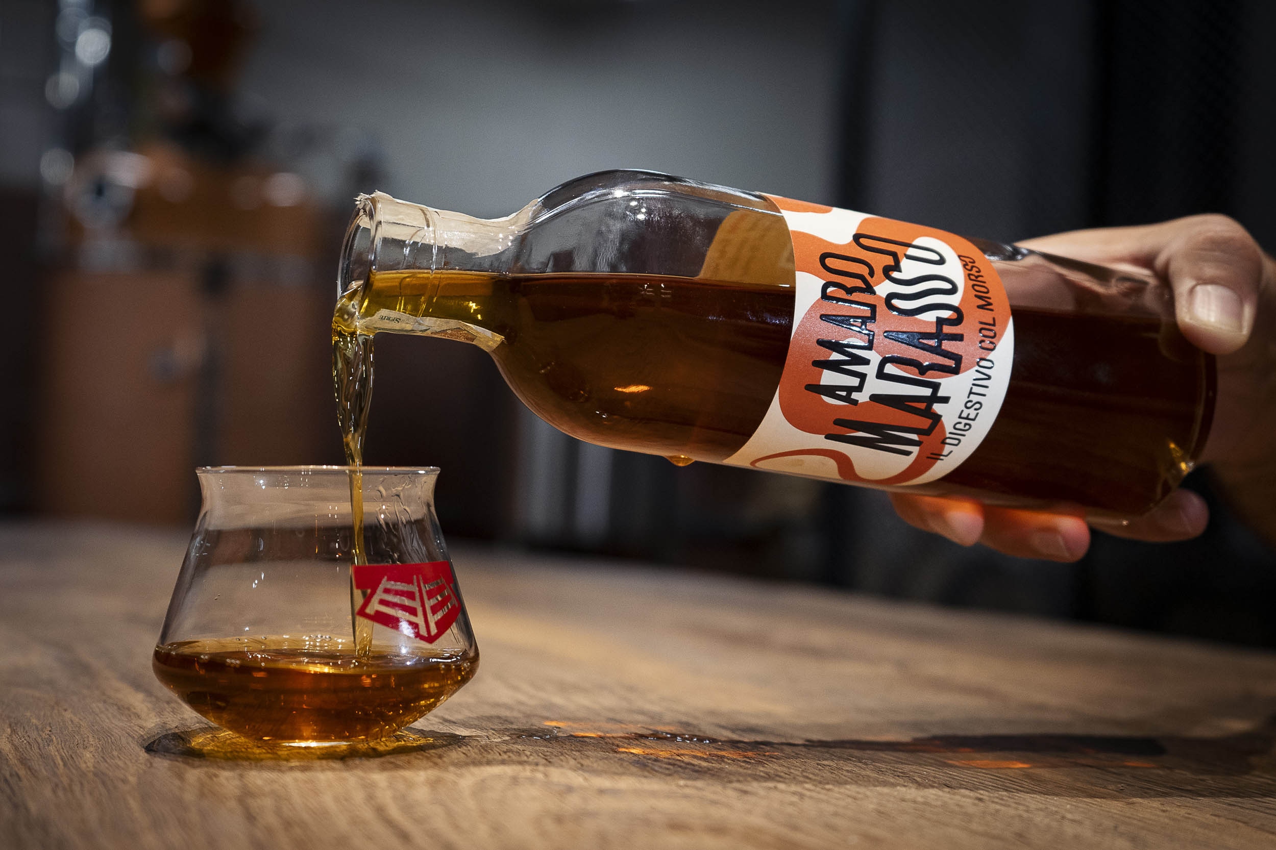
Amaro (Italian for ‘bitter’) is a typical bittersweet liqueur traditionally served after a meal, before or alongside an espresso. They say it helps with digestion, whereas we like to think it’s more of an excuse to get a little bit tipsier. Big and small distilleries all over Italy make their own amaro using local herbs, spices, fruits and occasionally more exotic ingredients; legend has it the family recipes are handed out from one generation to the other and are closely guarded secrets.
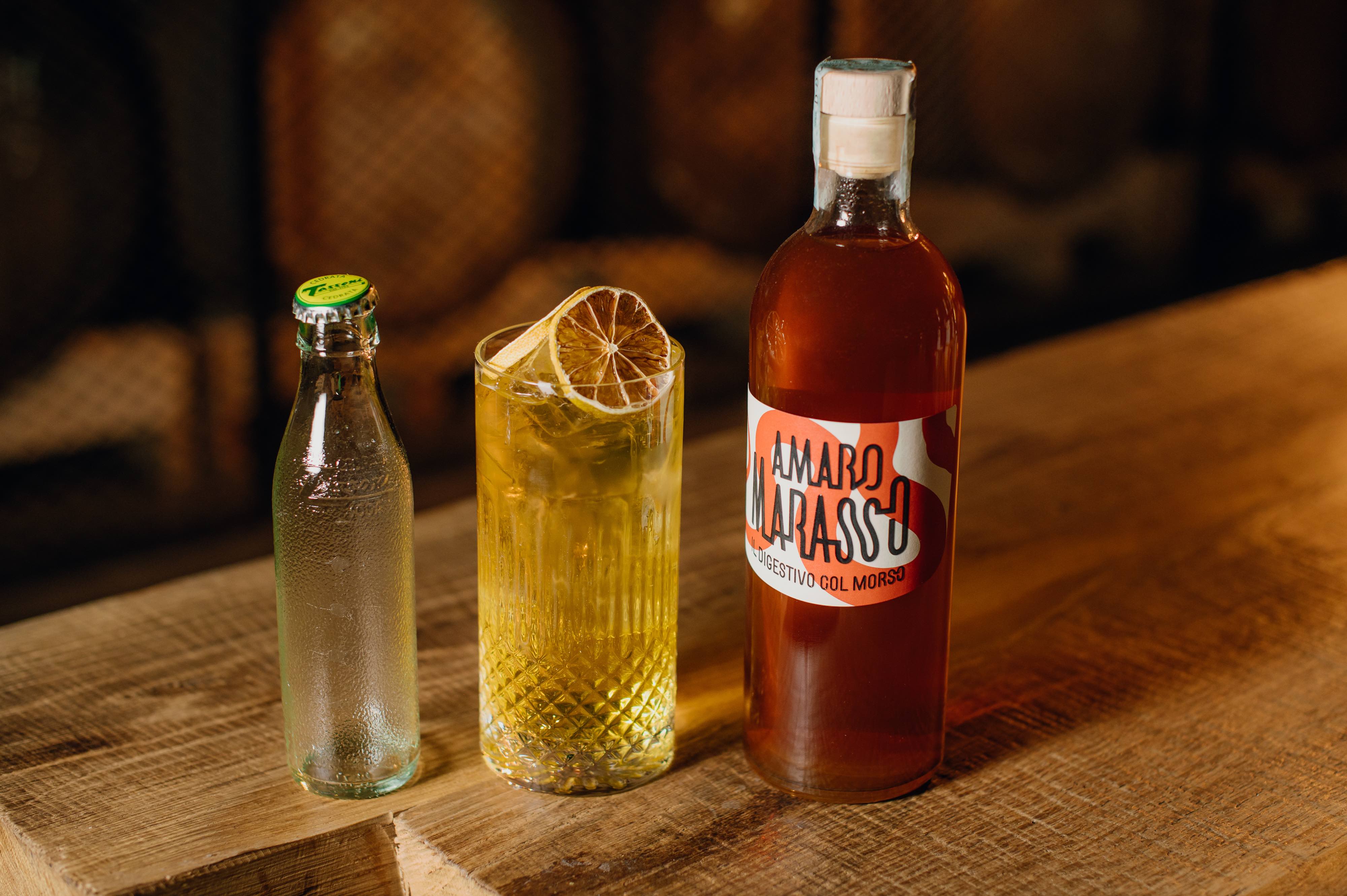
Enter Amaro Marasso, the new kid on the block made not in a remote Alpine village but right in the middle of suburban Milan. ‘Marasso’ is Italian for adder, and its bite makes up for its lack of heritage: 16 carefully selected ingredients are infused in each batch to give it an explosive aroma and a firmly bitter finish. Contrary to one’s habits, you can drink Marasso before or after dinner, neat or mixed, on ice or just as it is.
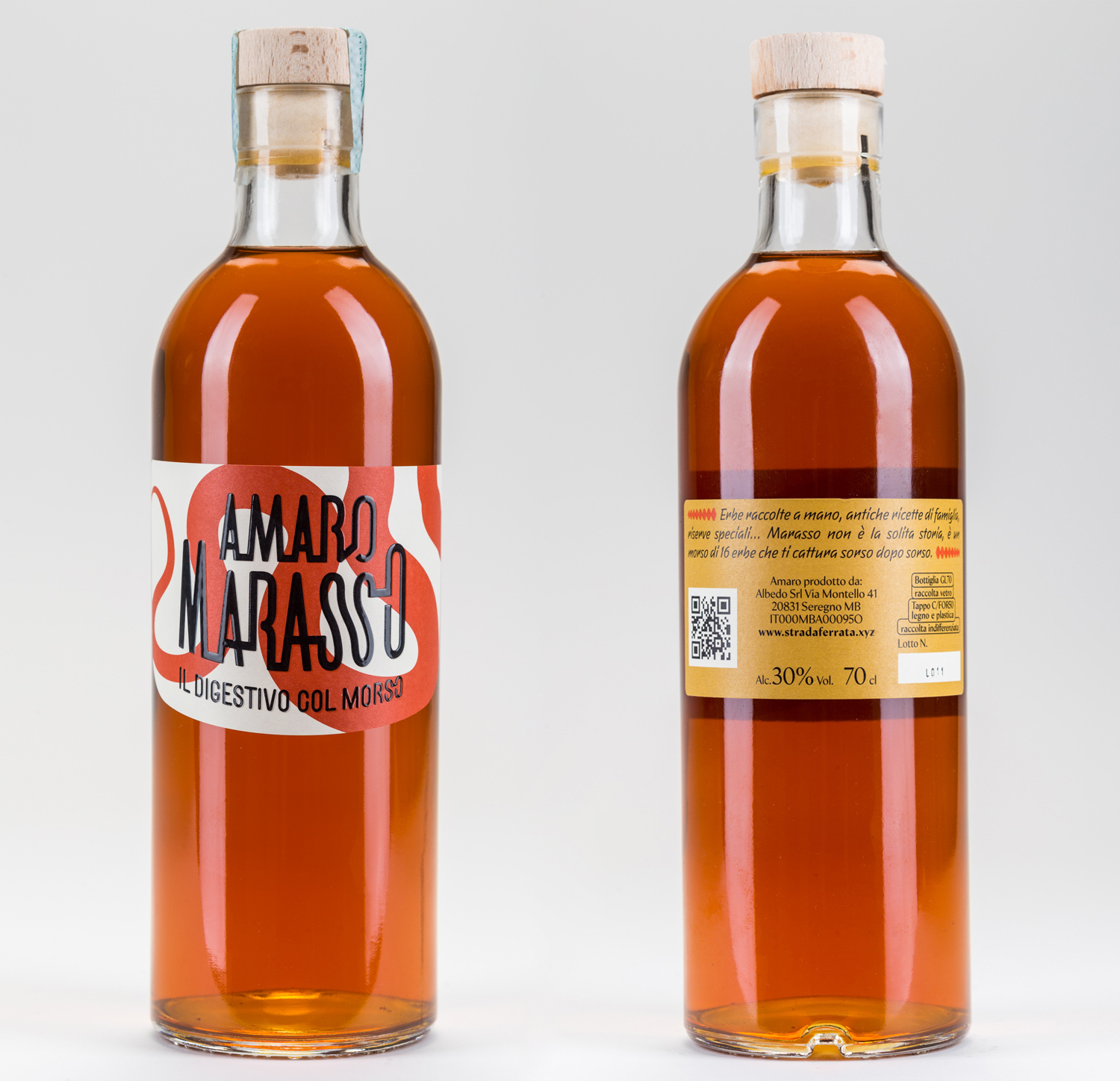
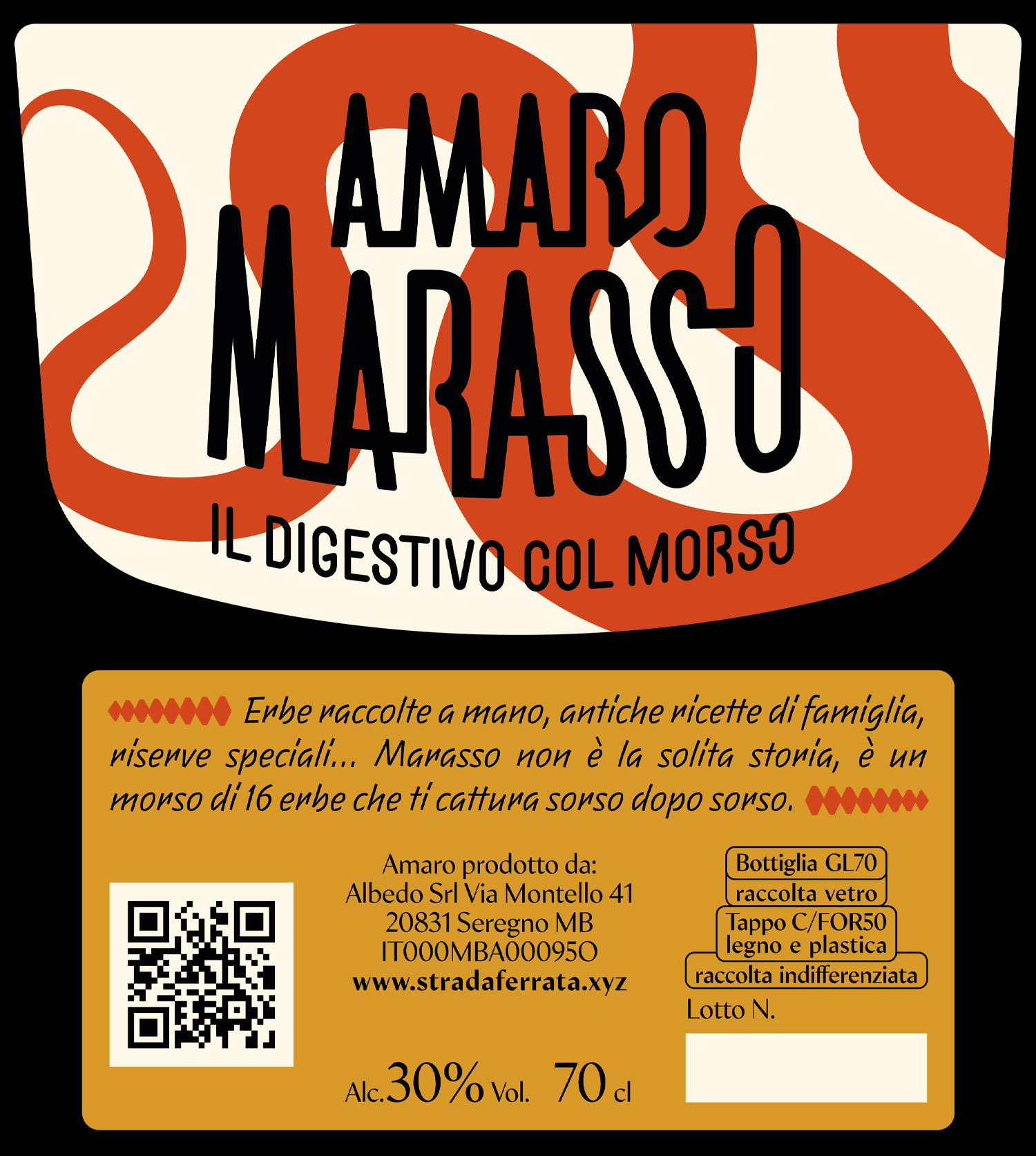
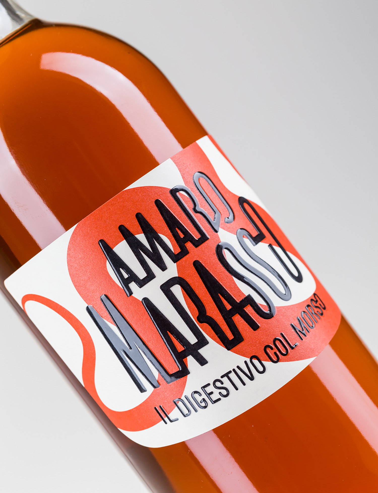
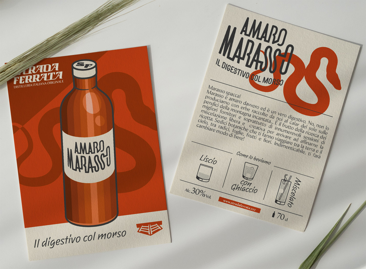
The visual identity of Amaro Marasso takes a stand against the old-fashioned, apothecary-style look of most of these classic liqueurs. A colour blocked orange adder and a stern proprietary black lettering are the only two visual assets. Working closely with printers we selected a heavyweight textured paper label and added a raised spot gloss on the logo for added contrast against the background. Complex but uncomplicated, like the drink itself.


CREDIT
- Agency/Creative: ByVolume
- Article Title: Visual Identity and Label Design for Amaro Marasso
- Organisation/Entity: Agency
- Project Type: Packaging
- Project Status: Published
- Agency/Creative Country: United Kingdom
- Agency/Creative City: Margate
- Market Region: Europe
- Project Deliverables: 2D Design, Brand Architecture, Brand Design, Brand Identity, Illustration, Lettering, Packaging Design
- Format: Bottle
- Substrate: Glass Bottle
- Industry: Food/Beverage
- Keywords: spirits, amaro, digestif, bitter, packaging design
-
Credits:
Creative Director: Alessio Leone


