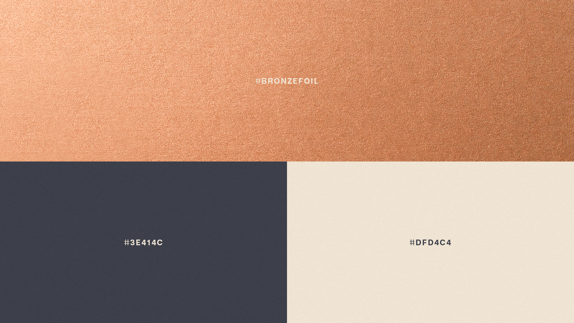
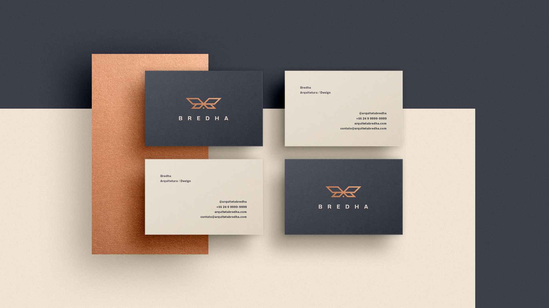
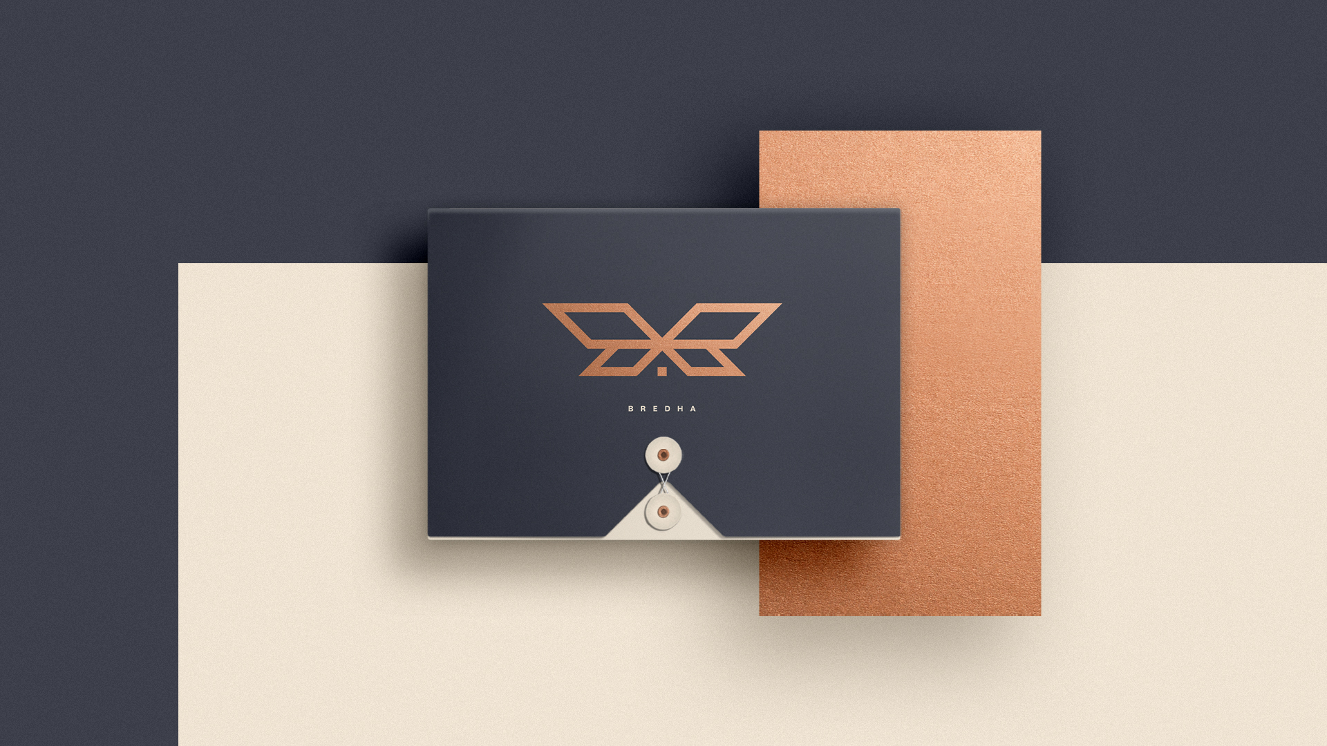
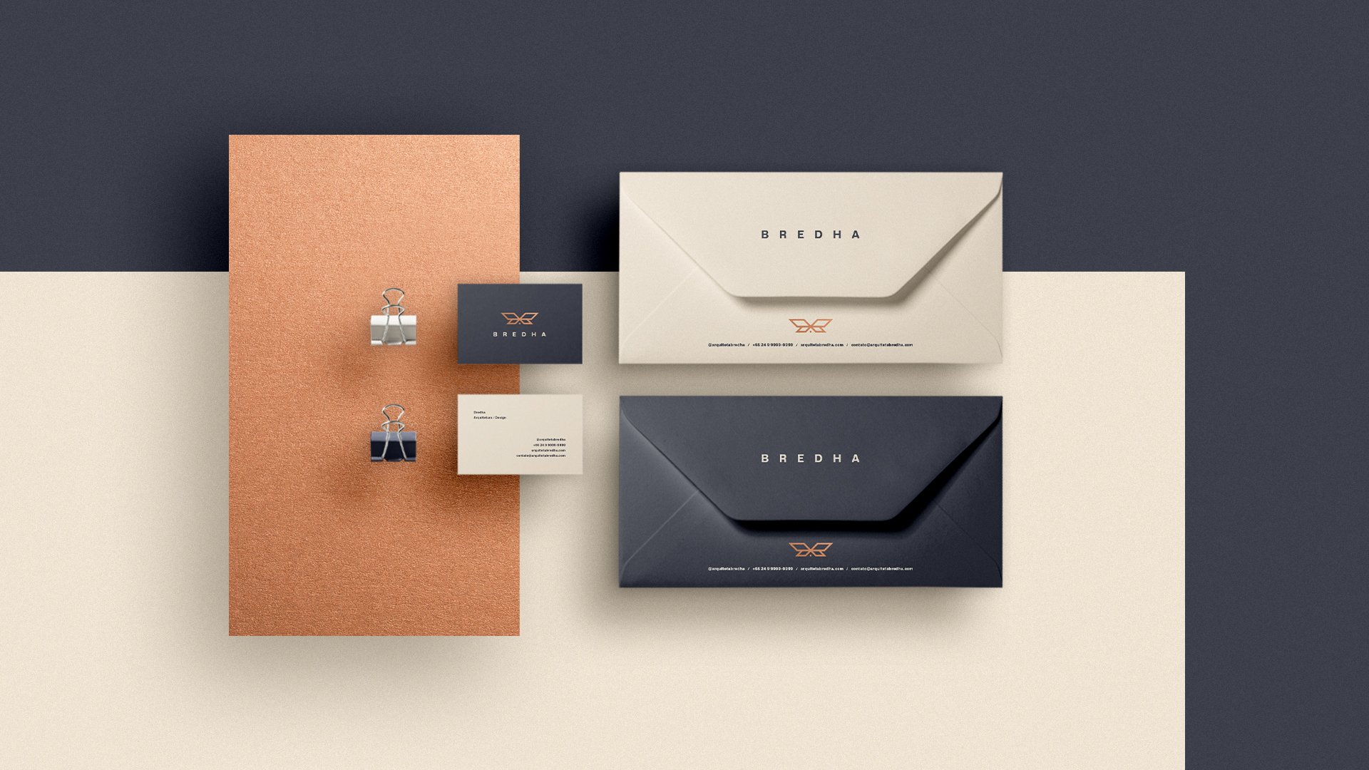
Focused on architecture and interior design, the “Bredha” office came to me for the creation of its brand and Visual Identity. For personal and affinity reasons, the client requested the use of the butterfly for the symbol. After many studies and visual tests, the result became solid, polished and modern. The project was aimed at the best possible application in the local market, standing out from the competition. The colors are professional and safe, creating a contrast with bronze, which brings a creative and innovative air to the final identity. The symbol was built from a geometric and proportional grid, adding to the harmony and positioning of the elements. The addition of a butterfly to the roof of a house forms a light and clean symbol with easy visualization





CREDIT
- Agency/Creative: Vissotto Studio
- Article Title: Vissotto Studio Design Brand and Visual Identity for Bredha Architecture
- Organisation/Entity: Freelance, Published Commercial Design
- Project Type: Identity
- Agency/Creative Country: Brazil
- Market Region: South America
- Project Deliverables: Brand Creation, Brand Identity, Brand Strategy, Branding, Product Architecture, Research
- Industry: Construction


