


Visilant – Restoring Sight Through AI-Driven Technology
Globally, 2.2 billion people live with vision loss or impairment, and for nearly 900 million, it remains untreated.
High costs, limited access to care, and a global shortage of ophthalmologists leave entire communities without the ability to see clearly. In India, only 1 in 5 patients can reach an eye specialist. The burden falls disproportionately on women and low-income families, who often live far from major hospitals.
Visilant’s mission is to change that.
This health tech nonprofit uses AI and smartphone imaging to enable eye screening, diagnosis, and follow-up care in underserved areas. By empowering community health workers with an intuitive mobile platform, Visilant delivers a complete, end-to-end eye screening pathway. From detection to treatment. It’s scalable, accurate, and built to bring high-quality eye care to everyone, everywhere.
Challenge
When Visilant approached us, they had a strong vision but no clear visual identity to match it.
Their early-stage brand didn’t reflect the scale of their mission or the sophistication of their technology. With a small team, no internal marketing support, and a short deadline, they needed a partner who could turn complex health technology into a clear, trustworthy, and human story. The one that resonates with both medical professionals and the public.
Solution
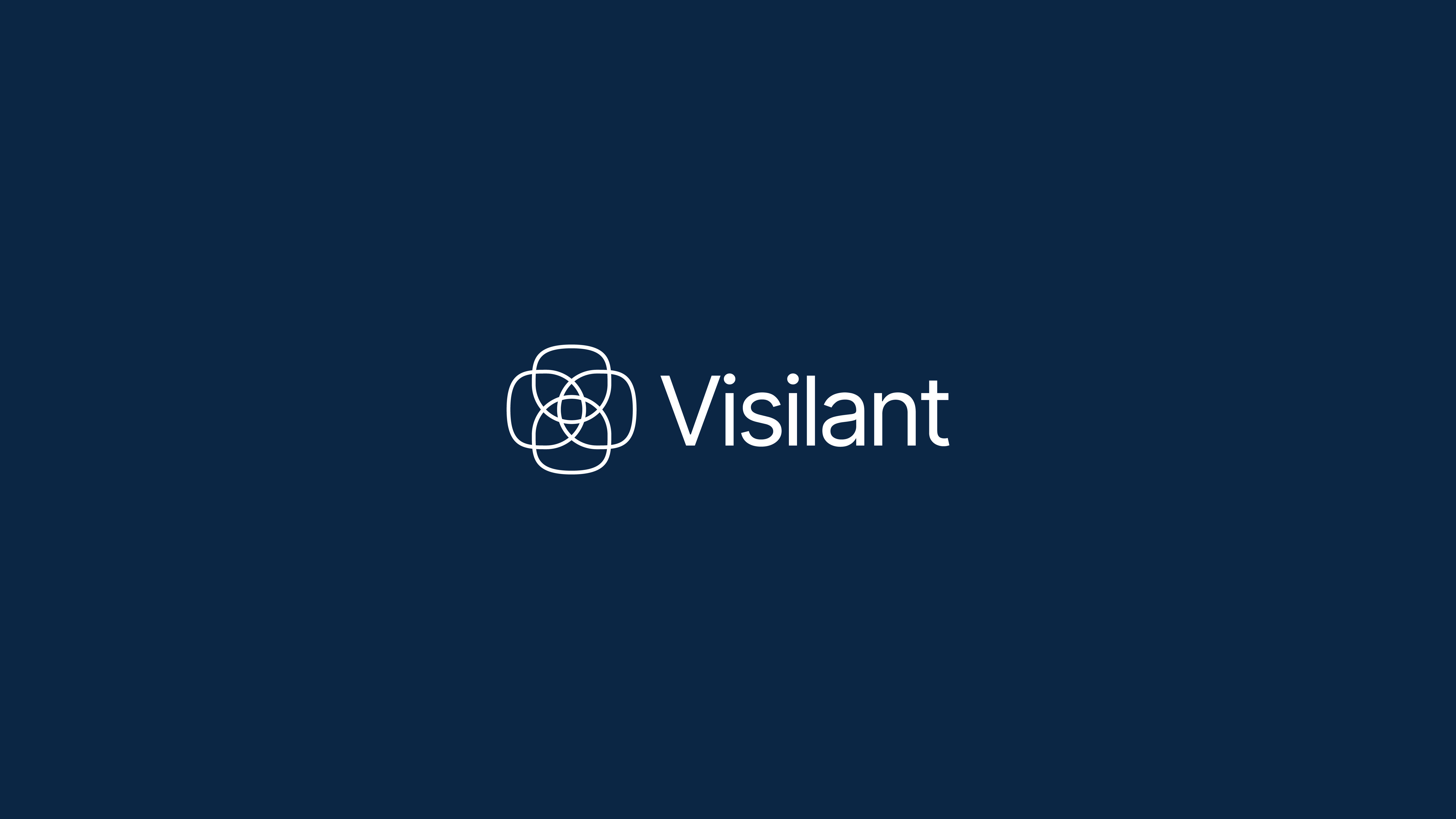
During research, we discovered Louise L. Sloan, a Baltimore-born ophthalmologist and vision scientist. Just like Visilant itself, founded in Baltimore. Sloan revolutionized clinical vision testing by creating the Sloan Letters, optotypes built on a perfectly square 5×5 grid. Precise, consistent, and easy to read. That same grid became the foundation of Visilant’s new visual identity.
Science gave us the structure. Design gave it emotion. Beyond medical precision, we wanted the identity to express the human joy of sight–the ability to see and appreciate the world’s beauty.
This idea inspired the Visilant symbol: a form that merges an eye and a flower, built on the same 5×5 geometric grid as Sloan’s work. It represents the balance between technology and life, innovation and empathy.
Technology restores sight.
Sight restores wonder.
We extended this thinking into a complete identity system: brand, website, infographics, and motion. All crafted to feel clear, credible, and inspiring across all audiences.
Impact
The new brand became a strategic tool for communication and growth.
• Increased credibility with investors and healthcare partners
• Clearer articulation of Visilant’s technological and ethical mission
• Stronger public perception as a purpose-driven innovator
• Daily compliments and higher engagement on the new website
• Scalable design assets for internal and external use
CREDIT
- Agency/Creative: Transatlantico Studio
- Article Title: Visilant Brand Identity by Transatlantico Studio Merges Medical Accuracy With Human Wonder
- Organisation/Entity: Agency
- Project Type: Identity
- Project Status: Published
- Agency/Creative Country: Poland
- Agency/Creative City: Warsaw
- Market Region: North America
- Project Deliverables: Brand Creation, Brand Design, Brand Identity, Brand Strategy, Branding, Design, Graphic Design, Identity System
- Industry: Health Care
- Keywords: HealthTech, AI, Vision, Sight, Eye, Brand Identity, human empathy, helping others, medicine, technology, brand design, art direction, branding, MedicalTech
-
Credits:
Art Director: Sebastian Mojsa


