


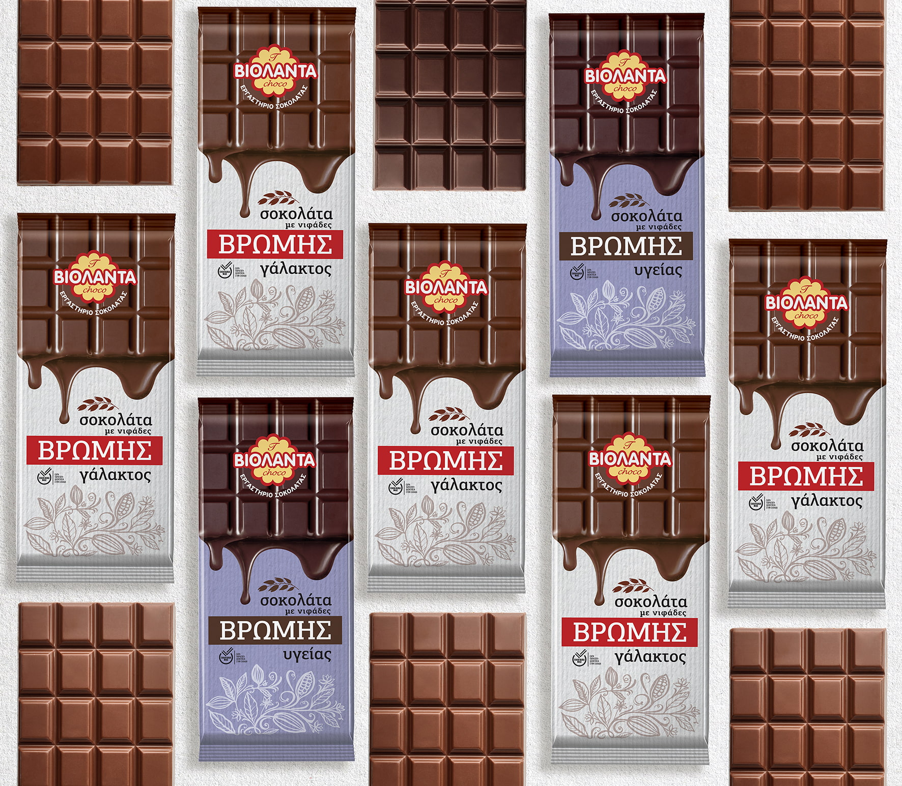
The Violanta company, very well-known for its acclaimed biscuits and cereals, wanting to expand its range of products, made use of their advanced know-how and released a new series of chocolate bars with Oat flakes, coming in two varieties: Milk chocolate with oats and dark chocolate with oats.
Many of the company’s products contain oats and are found in its codes. This was an additional reason to come up with the idea of an oat chocolate that would win over consumers as well as a large market share.
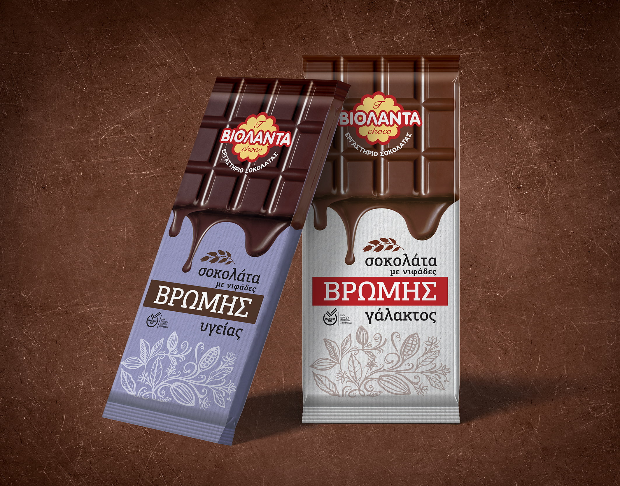
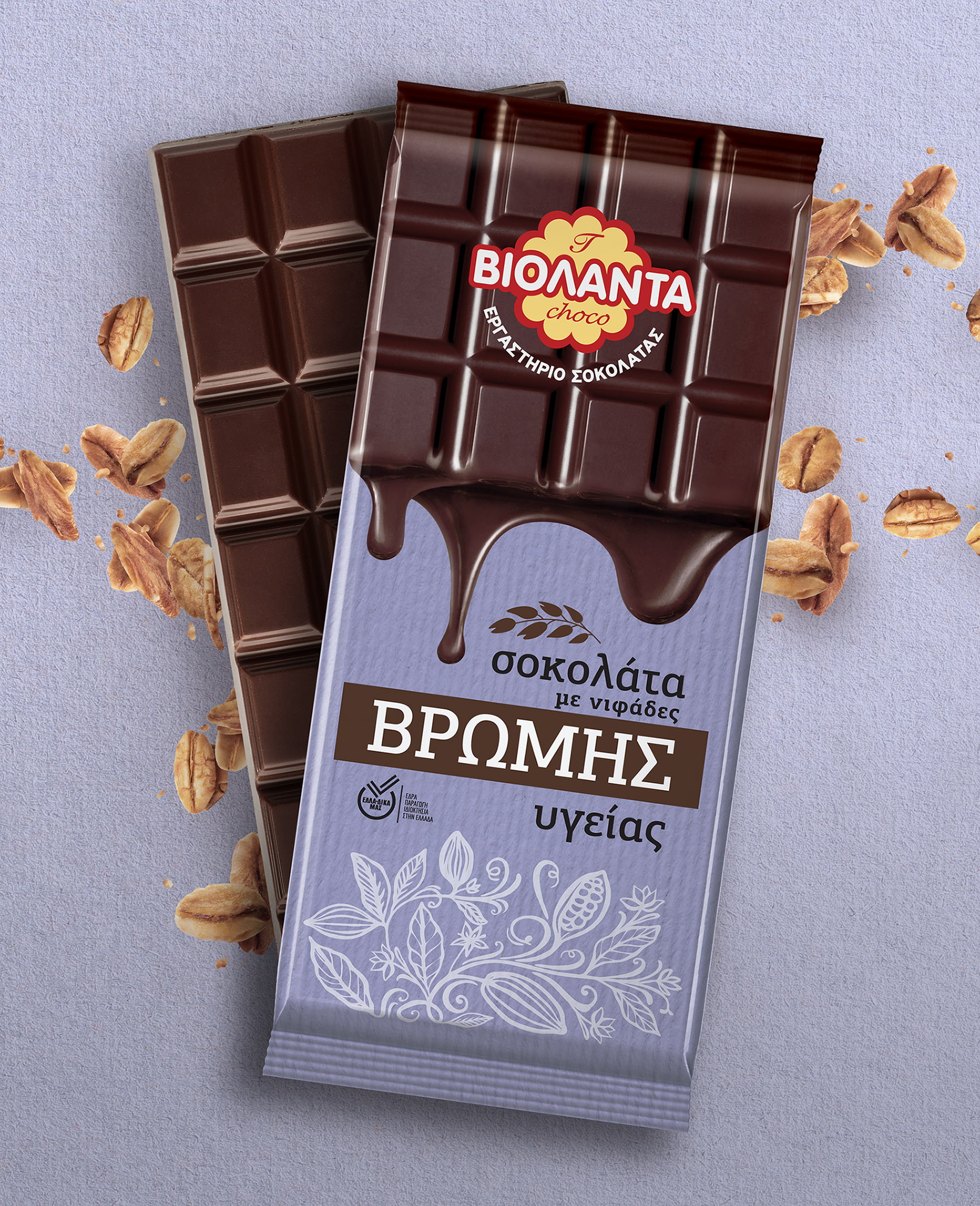
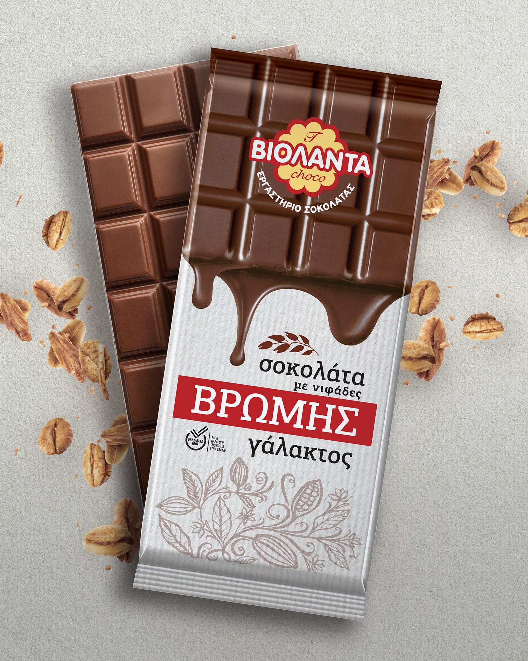
The strategy chosen in order to highlight the distinct position of Violanta against the competition in chocolate products was based on the figure of chocolate bar itself, which stands as the center-piece of the packaging, luring the consumer with scrumptious imagery and establishing Violanta’s position in the chocolate market.
The visual fluidity of the packaging incites desire for immediate satisfaction by the product.
The image of the logo at the top of the packaging makes an impression, consolidates the brand and achieves its recognition by the consumers.
In addition, the fonts selected for the term “Oats” dominate the packaging, radiating the image of a healthy, competitive and recognizable product on the shelf of supermarkets and reinforcing the general impression the product makes on the viewer.
The vertical alignment of the information and the placement of the chocolate itself vertically in the shop windows was chosen to differentiate itself from most competing products in the category which have a horizontal shelf arrangement thus having a smaller volume and a more difficult visual to search for.
The satin texture of the chocolate packaging gives a quality image both to the look and to the touch, offering another plus in choosing this particular product.
The design of the cocoa engravement accompanying the logo as well as the color gamut of the two packages define a new range that will earn consumers both for its aesthetics and for its taste.
CREDIT
- Agency/Creative: ABC Design Communication
- Article Title: Violanta Oat Chocolate Packaging
- Organisation/Entity: Agency
- Project Type: Packaging
- Project Status: Published
- Agency/Creative Country: Greece
- Agency/Creative City: Athens
- Market Region: Europe
- Project Deliverables: Packaging Design
- Format: Box
- Substrate: Pulp Paper
- Industry: Food/Beverage
- Keywords: Packaging Design , Product Creation
-
Credits:
Creative Director: Kostas Lakis


