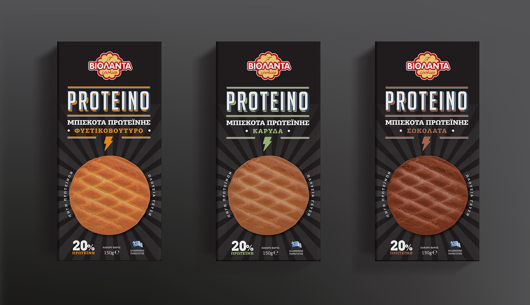
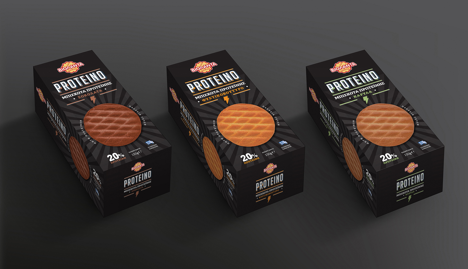
Violanda, a biscuits industry, has responded to the consumers’ need that have included protein products to their every day diet, creating the new biscuits range “PROTEINO” in three different flavours.
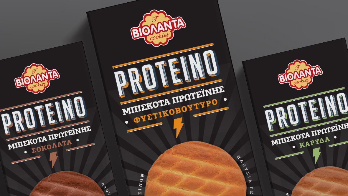
With a black packaging and key art elements the thunder and the sun rays, it visualizes in a clean and simple manner, the power and energy provided by the “PROTEINO” biscuit. For the logo, we used an intense vintage font, and the color code characterizes the range making it attractive and easy to remember for the consumer.


CREDIT
- Agency/Creative: ABC Design Communication
- Article Title: Violanda Protein Biscuits
- Organisation/Entity: Agency, Published Commercial Design
- Project Type: Packaging
- Agency/Creative Country: Greece
- Market Region: Europe
- Project Deliverables: Brand Naming, Branding, Graphic Design, Packaging Design, Research
- Format: Box
- Substrate: Pulp Carton
FEEDBACK
Relevance: Solution/idea in relation to brand, product or service
Implementation: Attention, detailing and finishing of final solution
Presentation: Text, visualisation and quality of the presentation


