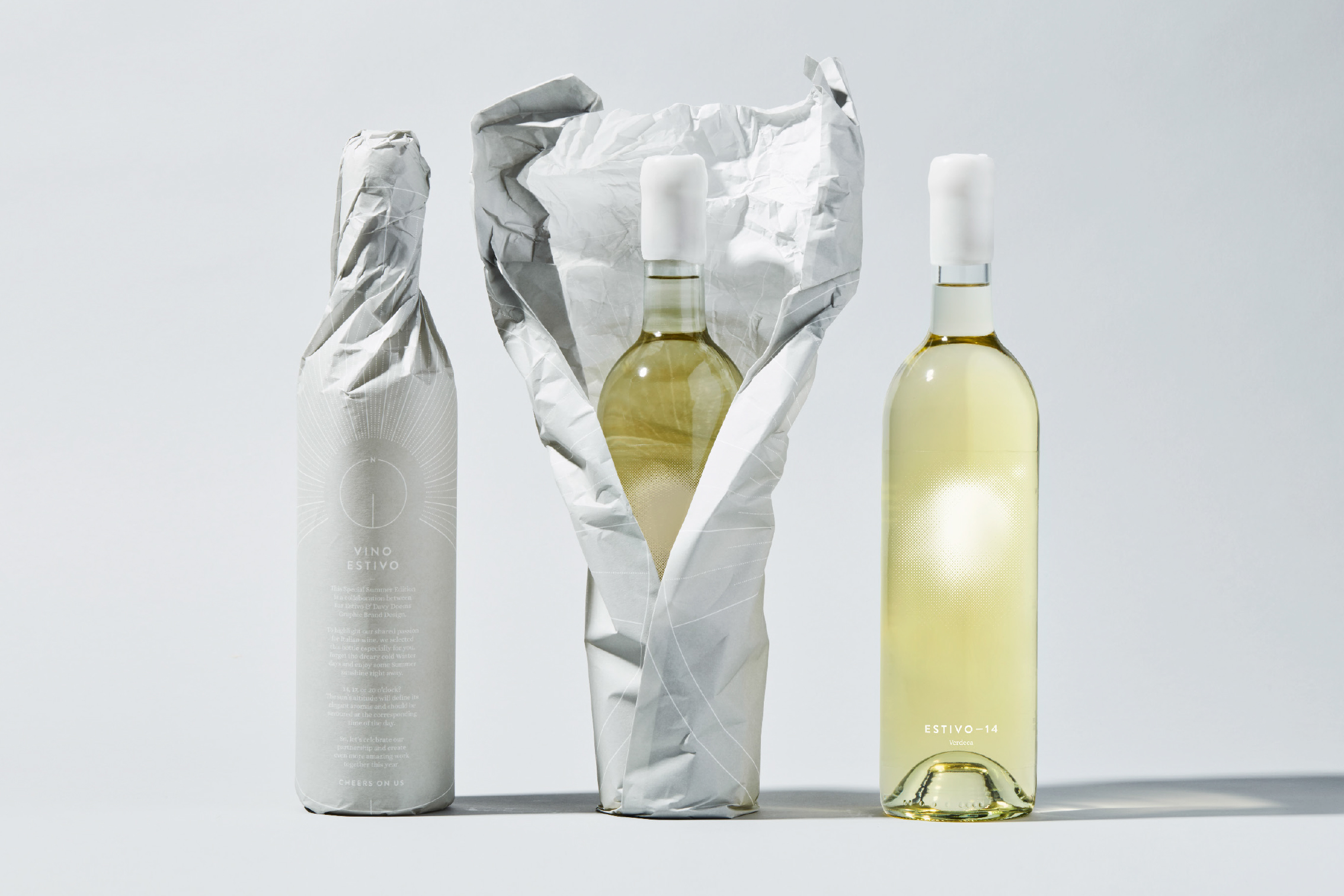
To start the new year 2020 we wanted to surprise our marketing clients with a gift that showcased our enthusiasm for collaboration, but more our engagement to support the local community.
Wine is a classic when it comes to gifts, but with this special edition bottle we teamed up with one of our own clients, Bar Estivo. An Italian wine bar based in Antwerp, Belgium. Oh yes, we both share a passion for wine and graphic design. To highlight this, we made it a double self-promotion.
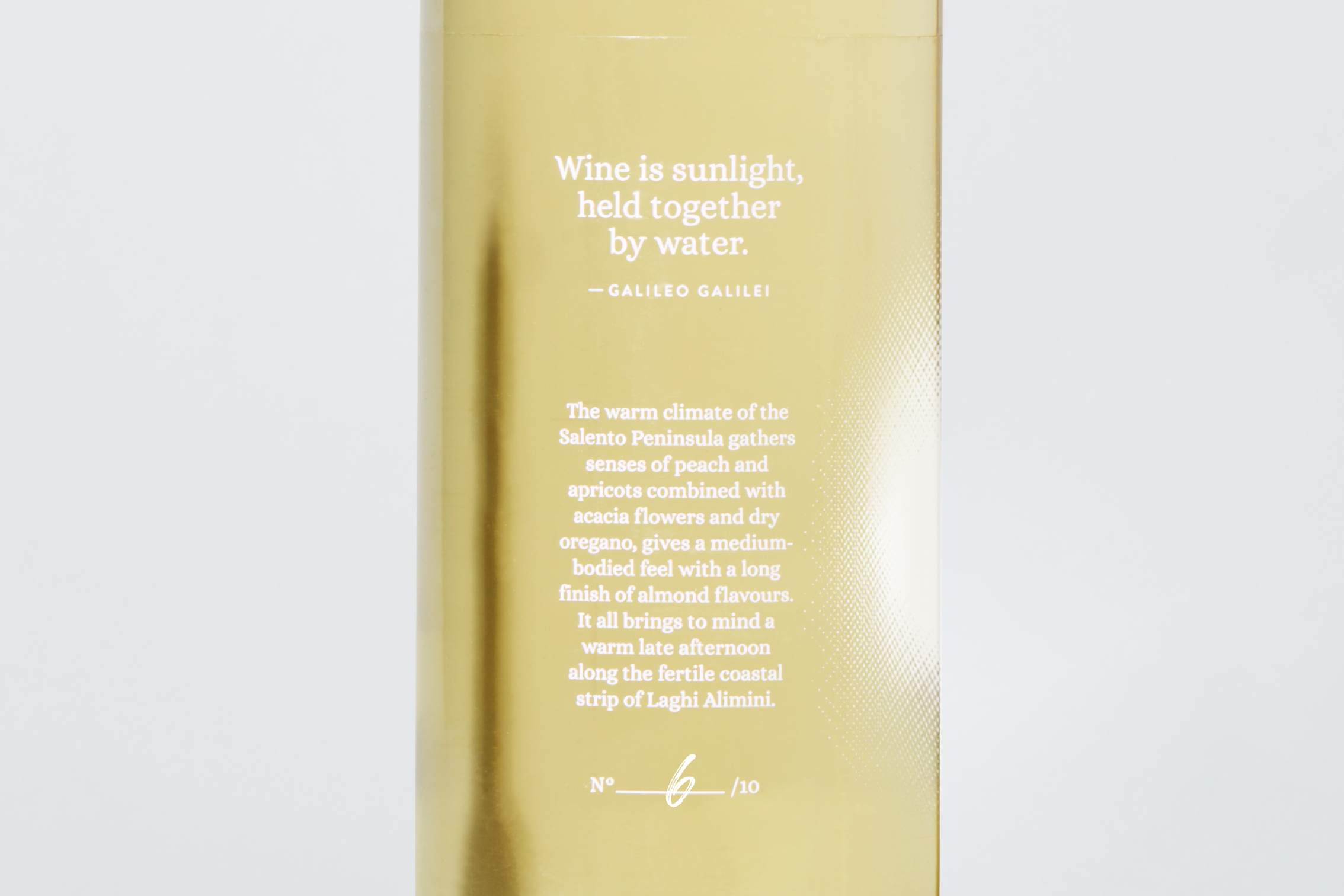
Belgium is generally known for its rainy and miserable Winter days. So nothing better to start the new year with something to look forward to, sunshine. Galileo Galilei, astronomer and Italian himself, once said: ‘Wine is sunlight, held together by water’. This poetic wisdom became the main inspiration for this gift packaging. The bar itself, named ‘Estivo’, also means ‘Summer’ in Italian. So it couldn’t have been a better moment to let people experience three less known Italian grape varieties and enjoy some sunshine right away.
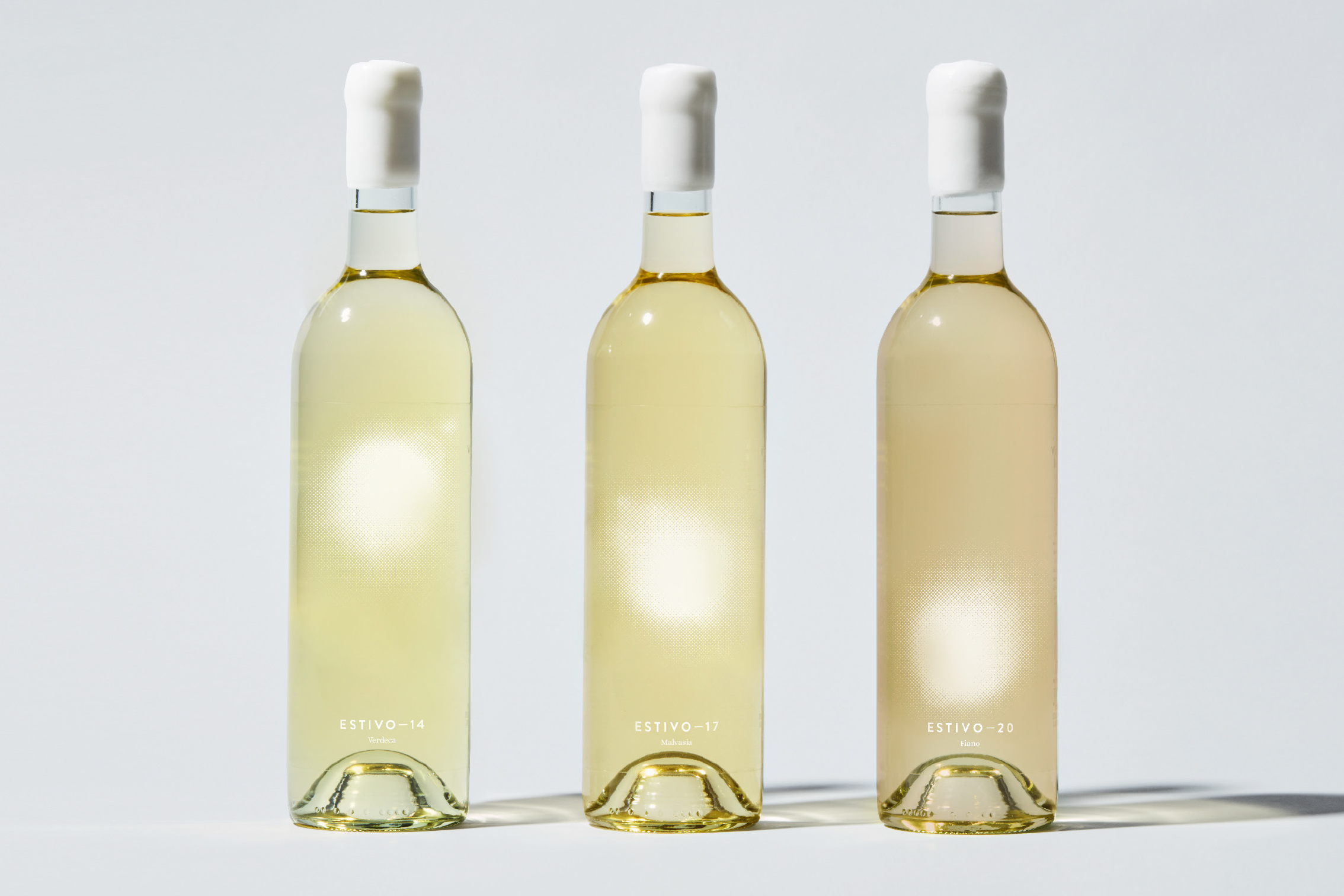
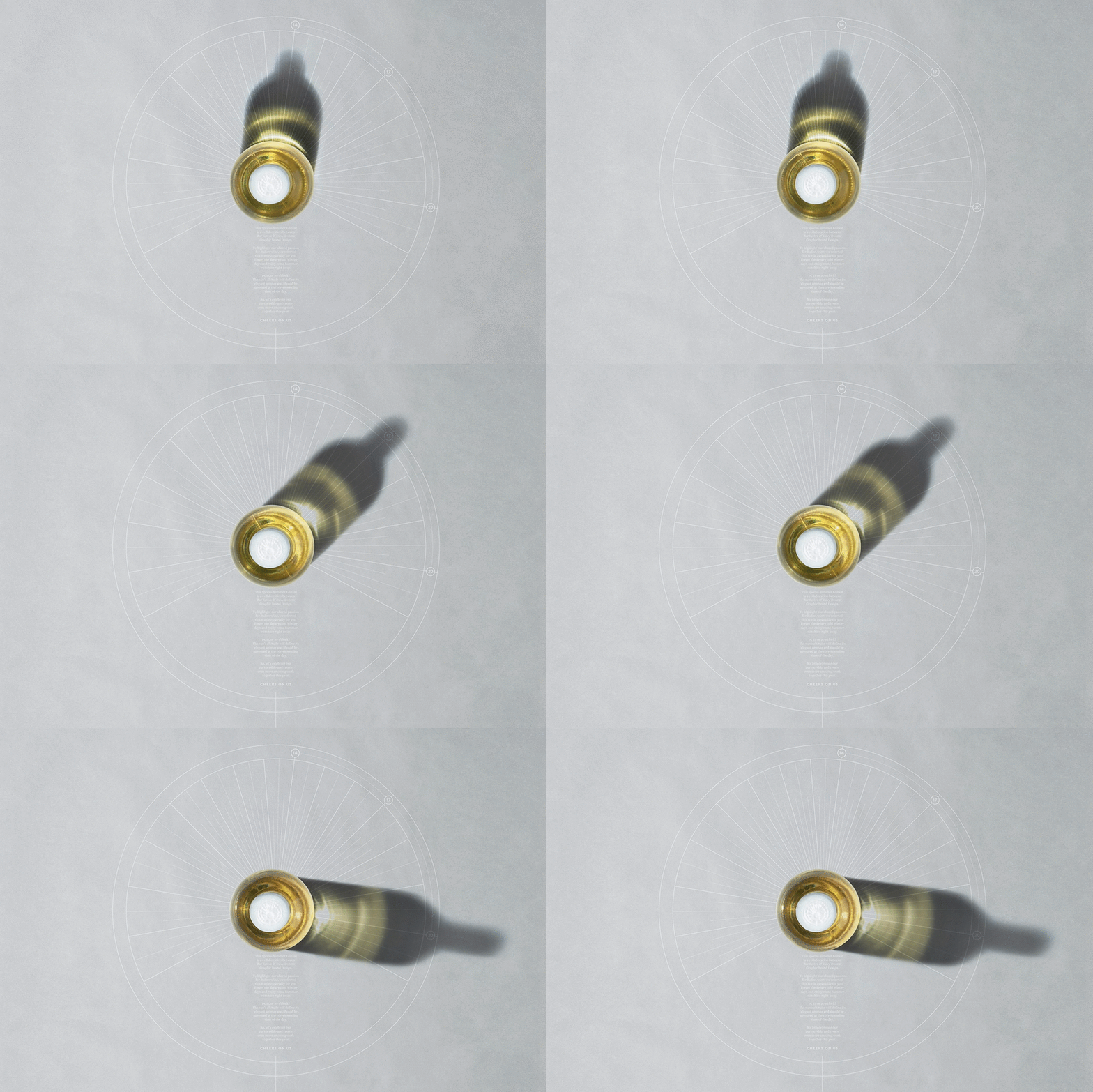
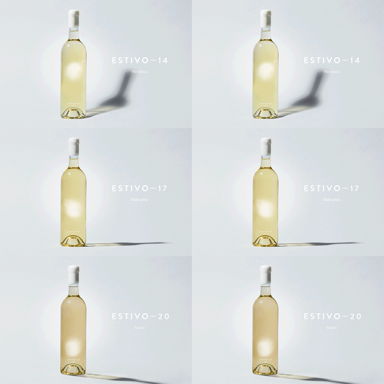
Together we selected three white grapes; Verdeca, Malvasia & Fiano and got them bottled in Estivo—14, Estivo—17 and Estivo—20. Three grape varieties that are best savoured at the corresponding time on the day (14h, 17h, 20h).
We start with a light, mineral Verdeca in the early afternoon and end the day with a full-bodied, yet darker coloured Fiano. From a fresh breeze that gently blows over the Adriatic Sea, to sensations of an evening stroll through the Puglia countryside. The lower the sun goes, the more intense the wine gets.
So as each grape evolves by the sun, so each wine bottle does.
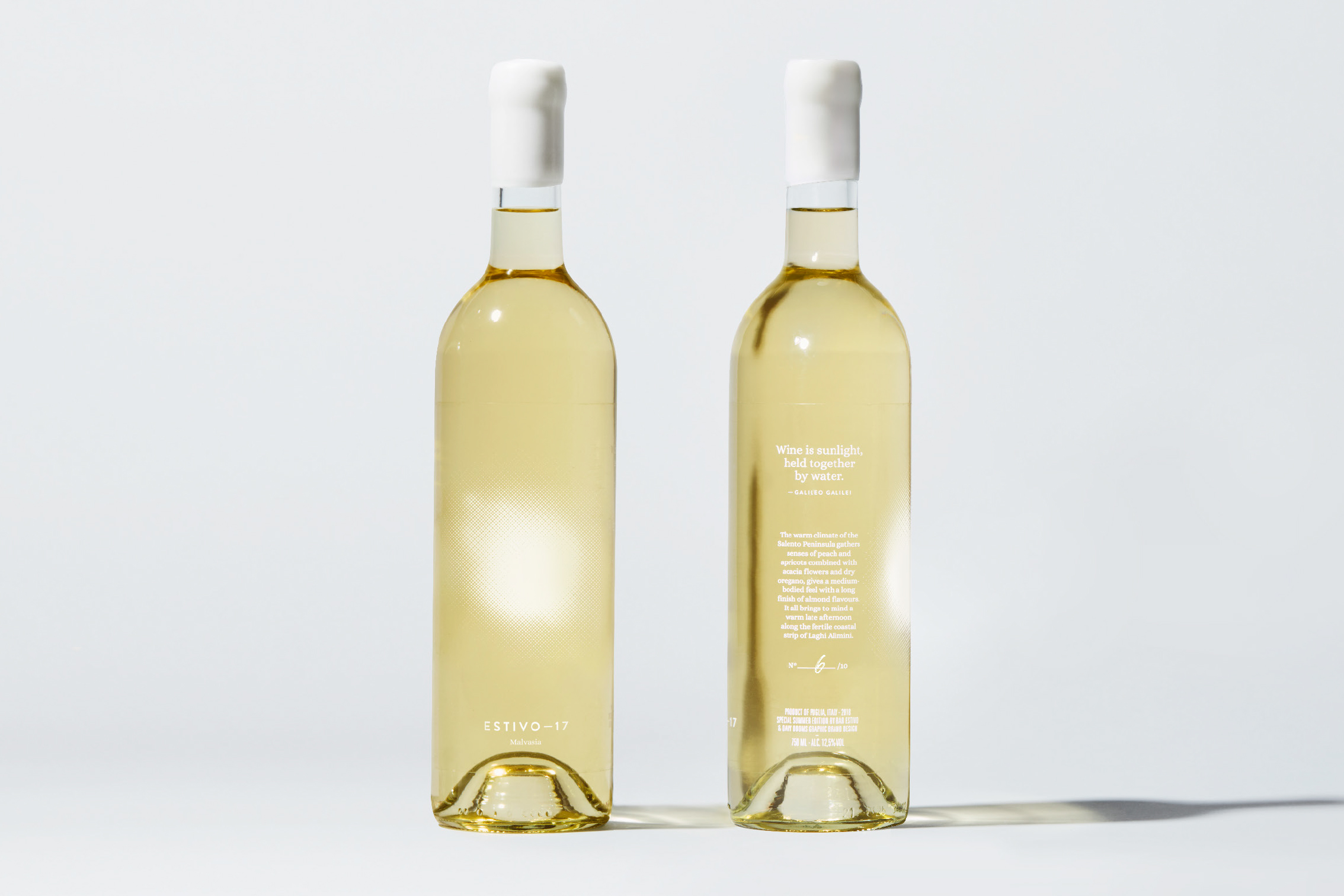
To make it an experience for our clients, the sunset was printed on the back of each bottle so it could be seen through the bottle itself in a unique way. This translated Galileo’s saying literally.
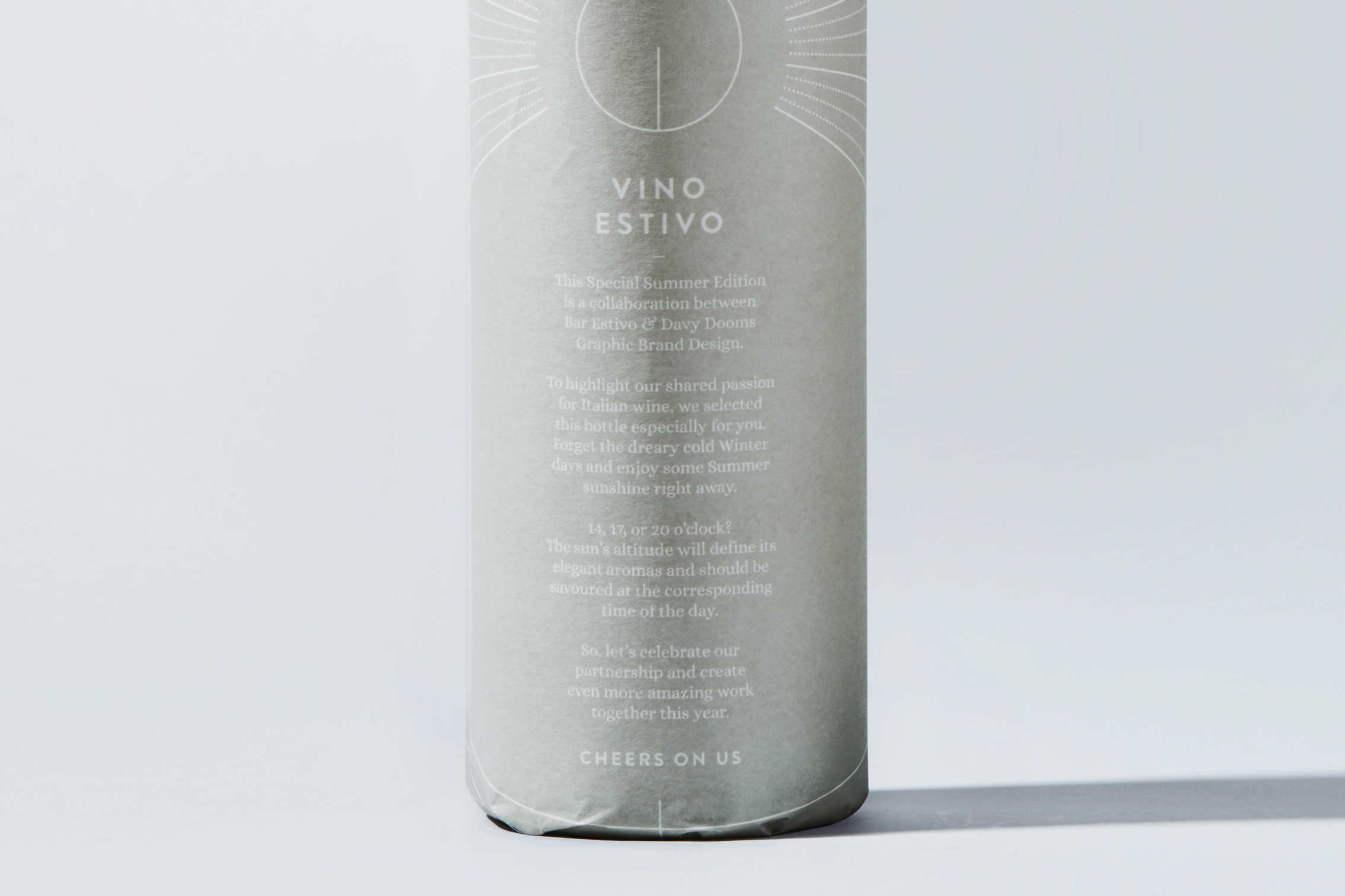
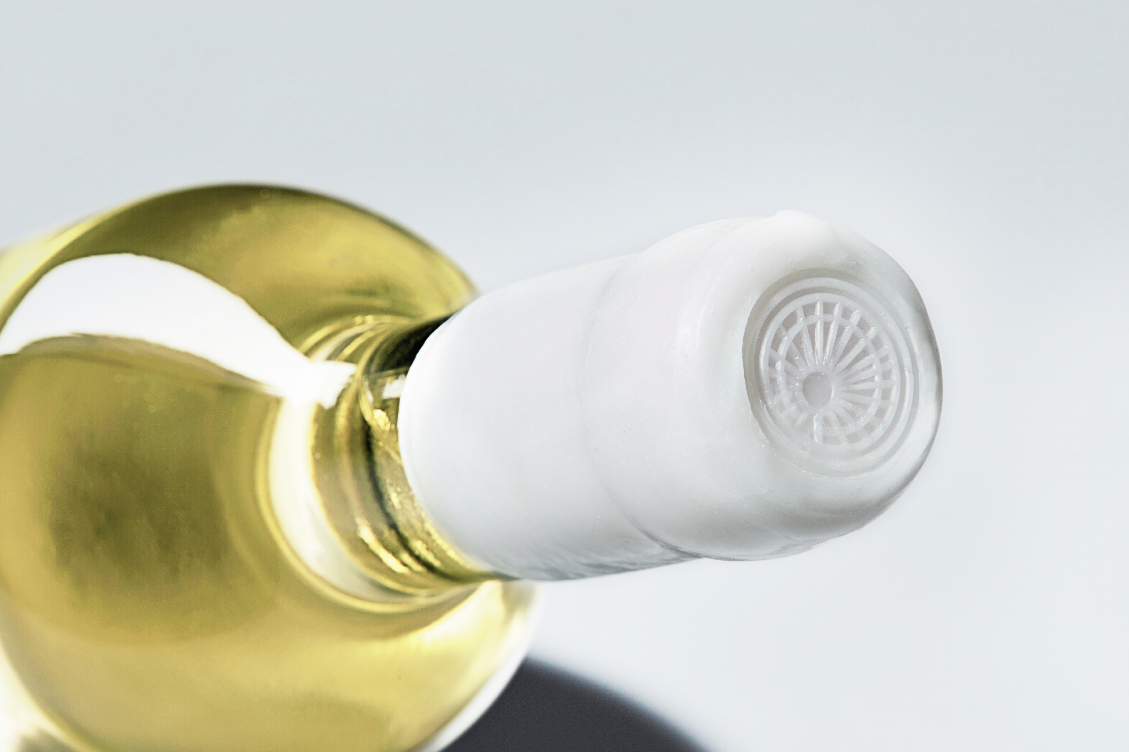
Each limited edition bottle is gift-wrapped with an astronomic sundial based on our exact location, Antwerp. To emphasize the concept, the origin and characteristics of the specific grape is explained on the side of the bottle in an idyllic way, each individually numbered and finished with a wax seal and stamp symbolizing the sun.
A minimal, yet different approach was needed in order to get the idea clear and make it stand out between all the other gifts our clients receive during the Winter holidays. Through an elegant combination of a modern sans and serif typeface we brought purity and authenticity to packaging.
We only used white on the bottle to make it as transparent and bright as possible. This to have all attention to the golden straw colour of the wine, our reference to the best season of the year. Summer, Estivo!
Cheers,
on us and on our collaboration.
CREDIT
- Agency/Creative: Davy Dooms Graphic & Brand Design
- Article Title: Vino Estivo – A Gift of Summer
- Organisation/Entity: Freelance, Published Self Promotional Design
- Project Type: Packaging
- Agency/Creative Country: Belgium
- Market Region: Europe
- Project Deliverables: Brand Naming, Branding, Packaging Design, Product Naming, Research
- Format: Bottle, Wrap
- Substrate: Glass


