


For the last two years, we’ve partnered with Latvijas Nafta in a re-branding project, to make it more modern, globally inclusive and accessible. Latvijas Nafta is the oldest player on a local Latvian market in oil and gas retail with 44 fuel stations around the country. We’ve started by creating a “space grey & yellow” masterbrand. This forms the brand’s DNA, and allows the multitude of content to stand out. The visual language was inspired by the Barbara Kruger’s installations, immersive photography and collage with Futura Bold typography.
Main task: Produce and implement the new modern visual-identity of Latvijas Nafta brand and change the perception of this company on the home market. About the project: Latvijas Nafta is one of the largest player on the oil market of Latvia in retail and wholesale. At the moment this company operates 44 gas stations, 4 oil bases and cooperates with world largest oil refineries. Comprehensive analysis: We have studied the LN’s story – how and when this company was established, first steps and how it is positioned on the market today. We have identified company’s target audience, audience’s tastes and preferences.
Thereby it was possible to lay the foundation of the new brand positioning, not forgetting the Latvijas Nafta’s true identity and history, make this brand modern and memorable.
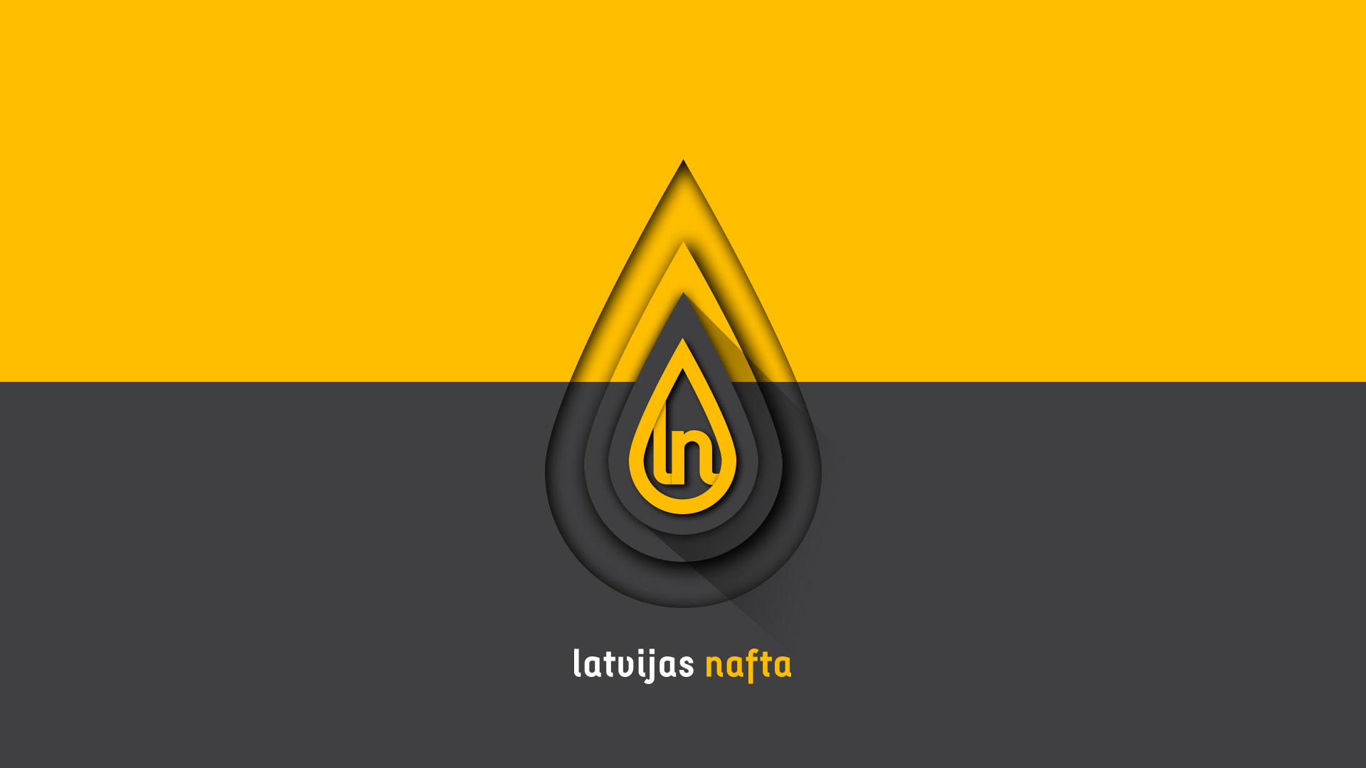
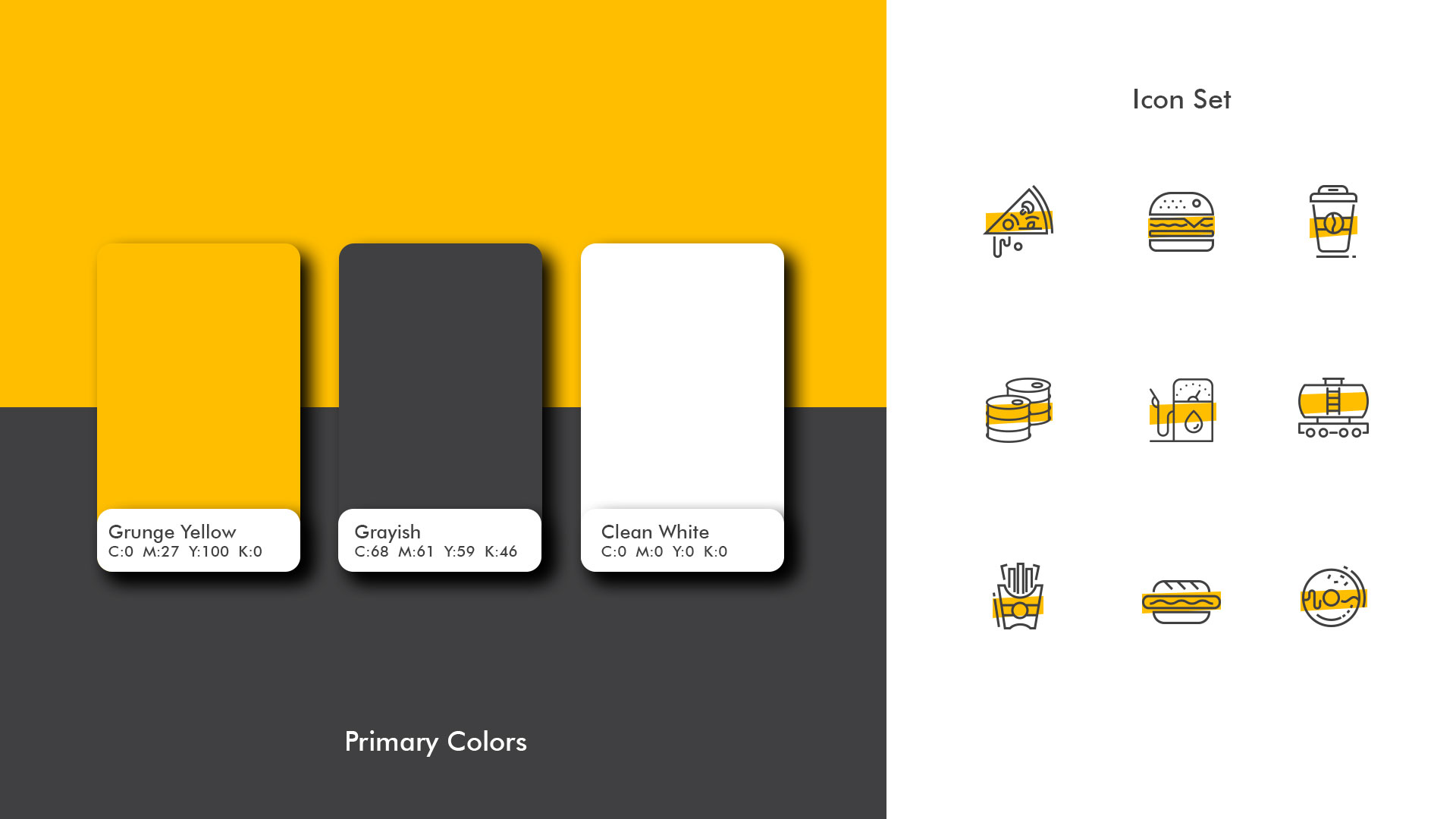
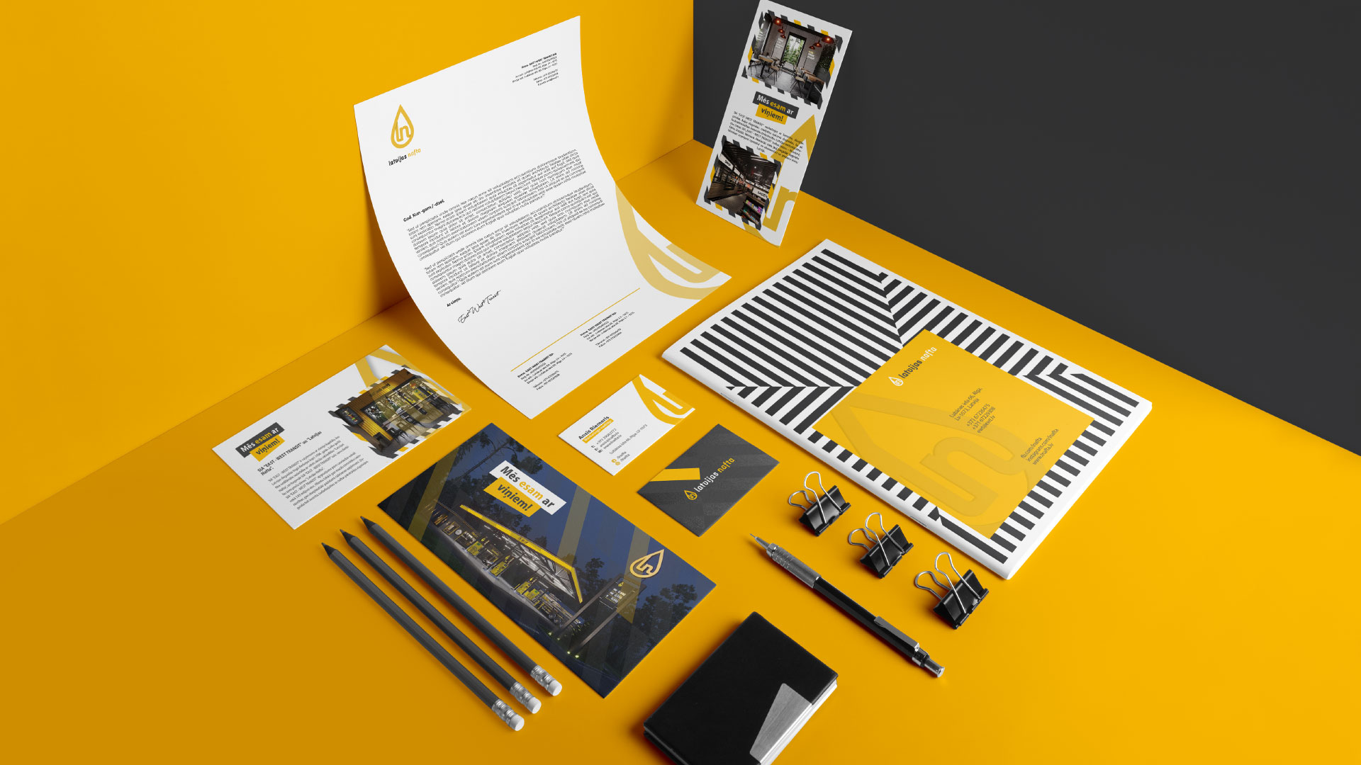
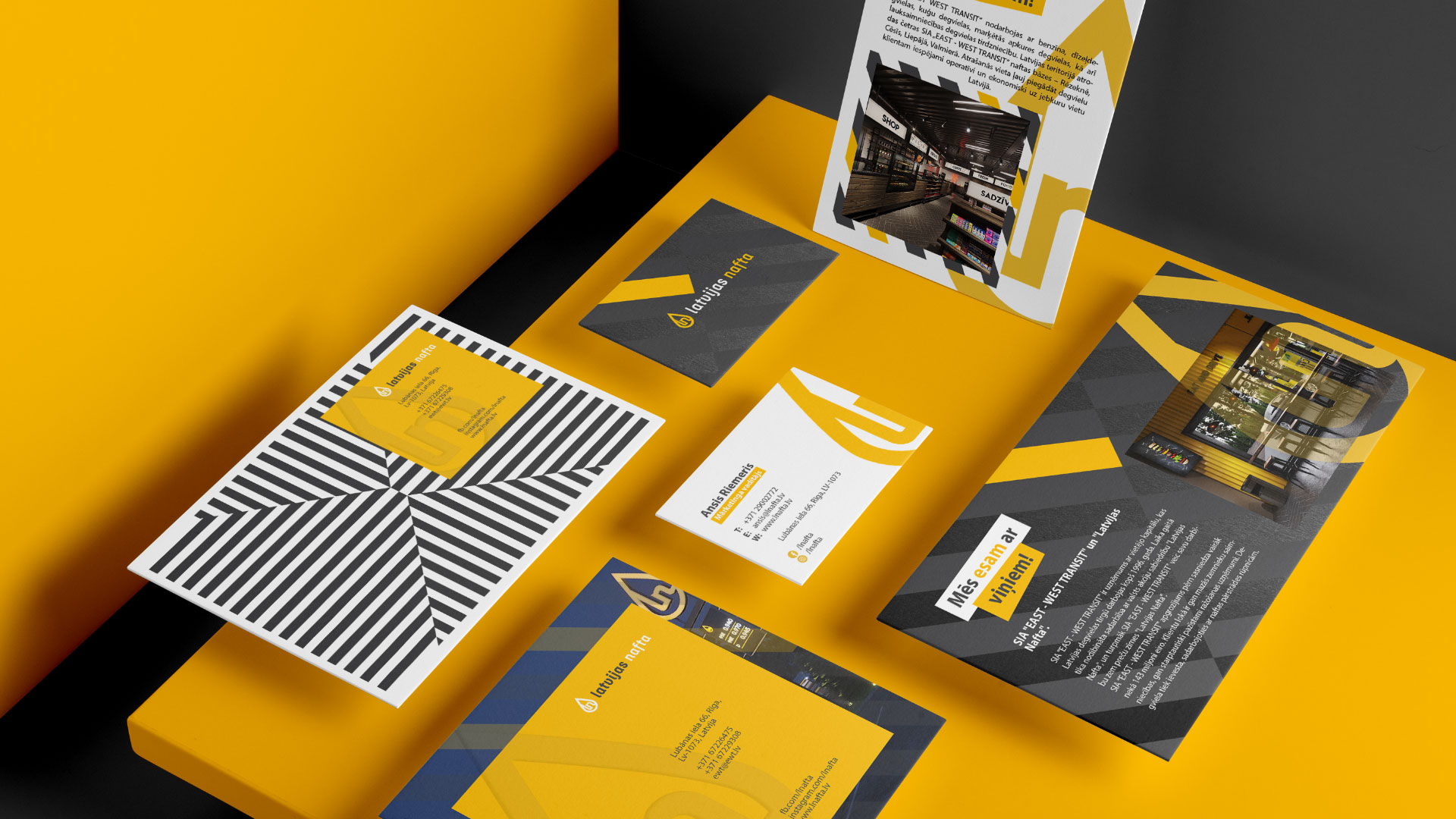
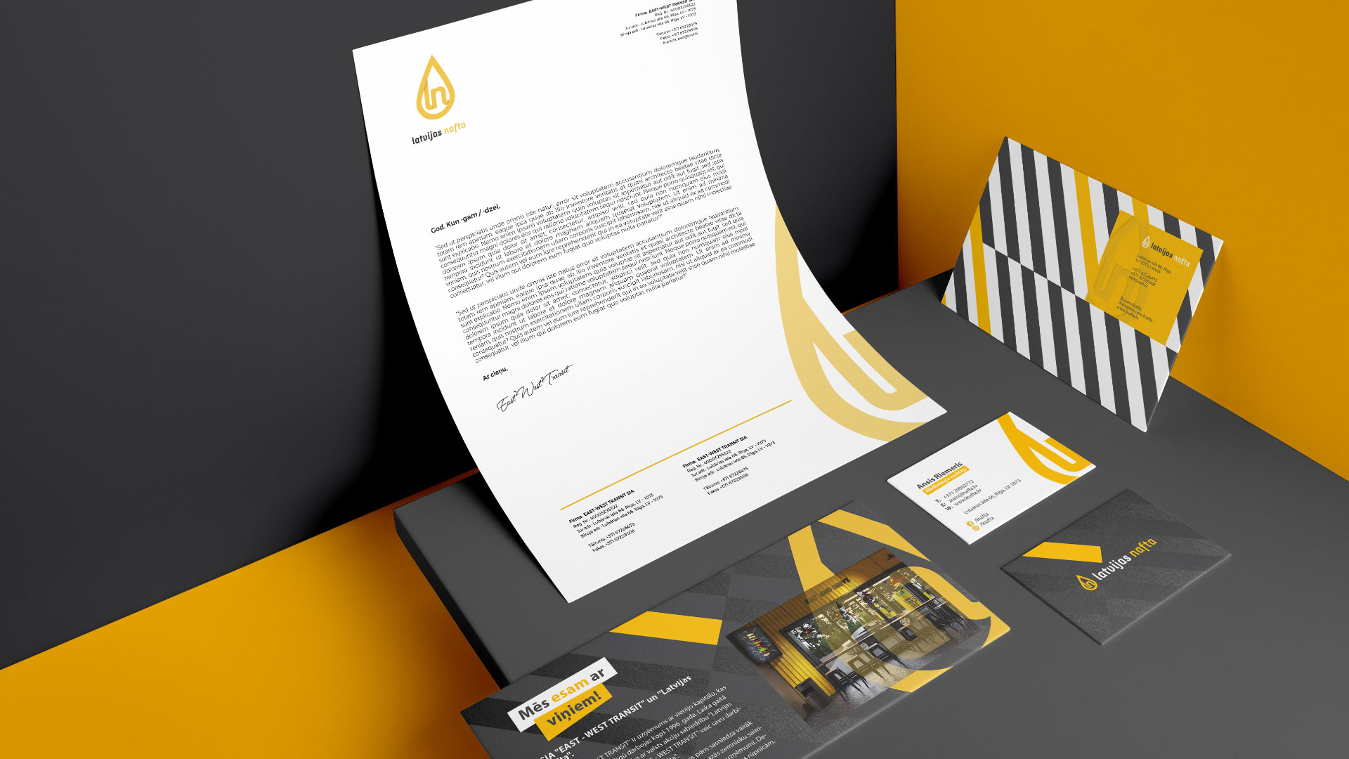
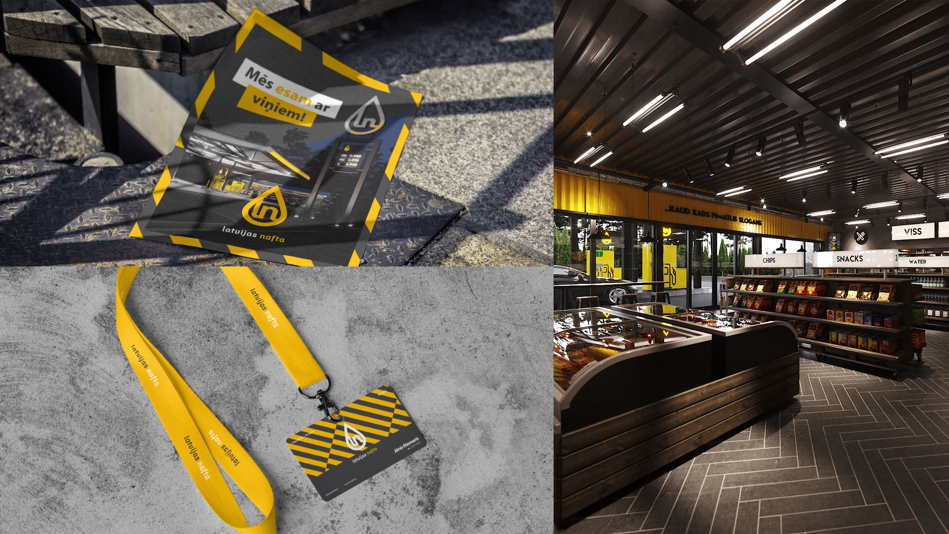
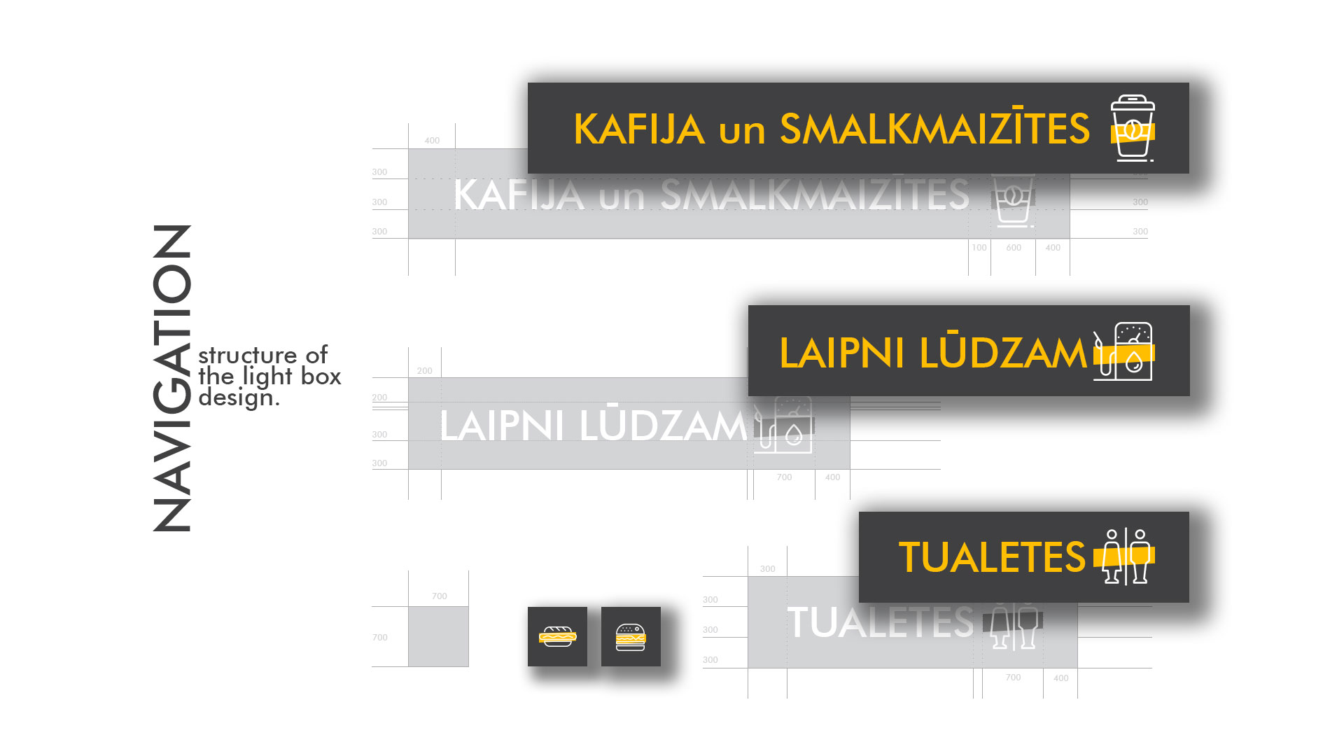
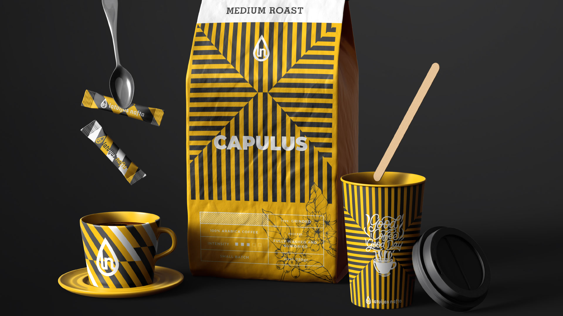
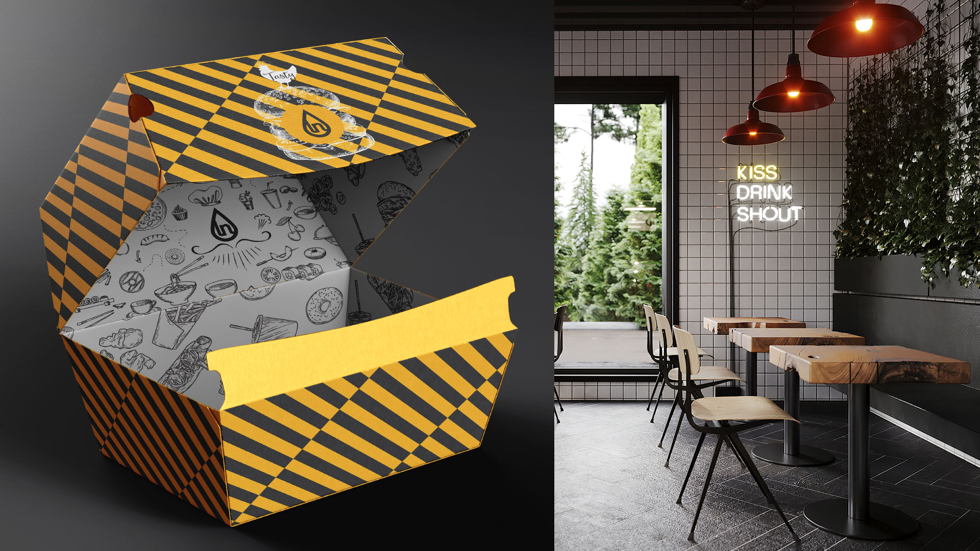
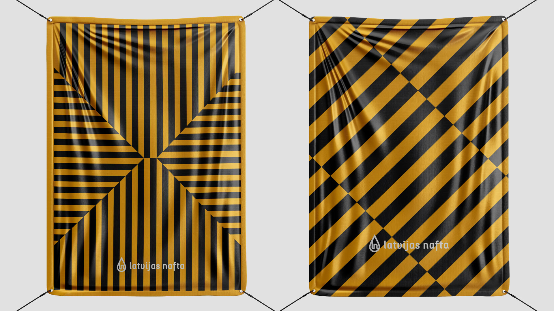
Change of logo: Our team have removed superfluous elements, worked out a colour, gave freedom to letters and added a distinctive element – a drop. Corporate identity: We have abandoned the typical associations on the topic of oil: neutral “earthy” colours, wicker baskets etc., and developed corporate identity using the-well overlooked old – retro industrial style. Brand-book and guideline: Here we have described the brand’s values and rules on the use of corporate identity on a variety of media and materials. Food packaging: The packaging was made using the minimalism to make it fully understandable for the target audience. The brand name has become clear and noticeable, leaving only the necessary information about the product inside. Graphic design: We have decided to completely change the graphic design of the company’s advertising strategy. They helped us with this.
CREDIT
- Agency/Creative: vinille
- Article Title: Vinille Agency Creates Branding for Latvia’s Largest Oil Company Latvijas Nafta
- Organisation/Entity: Agency, Published Commercial Design
- Project Type: Identity
- Agency/Creative Country: Estonia
- Market Region: Europe
- Project Deliverables: Brand Architecture, Brand Creation, Brand Design, Brand Experience, Brand Guidelines, Brand Identity, Brand Redesign, Brand Strategy, Branding, Graphic Design, Packaging Design, Rebranding, Research, Retail Brand Design, Structural Design
- Industry: Energy
- Keywords: fuel, gas station, branding, corporate identity, industrial design


