


On the banks of the Douro River, where centuries of winemaking tradition meet a spirit of innovation, the new visual identity of Menin Douro Estates is born. This project pays tribute to the region’s heritage while reinterpreting it through a visual language that is contemporary, elegant, and intentionally minimalist. It is a design rooted in place, but shaped by a modern sensibility.
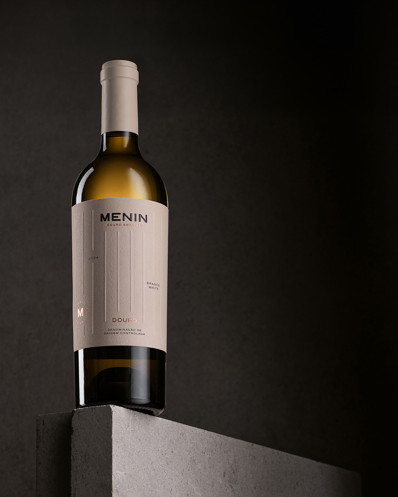
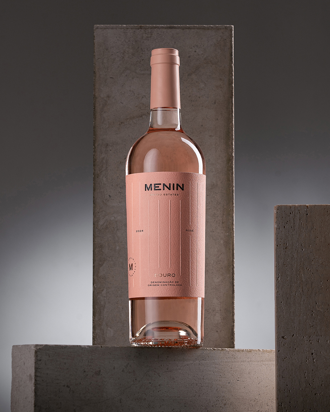
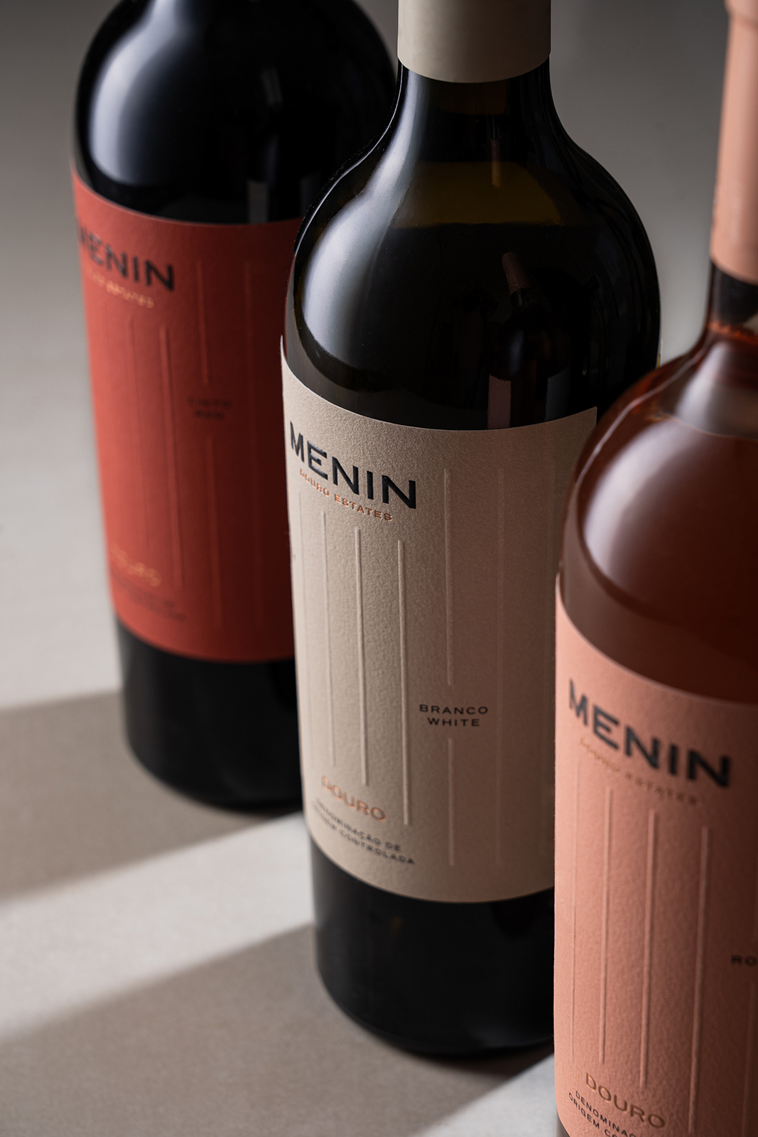
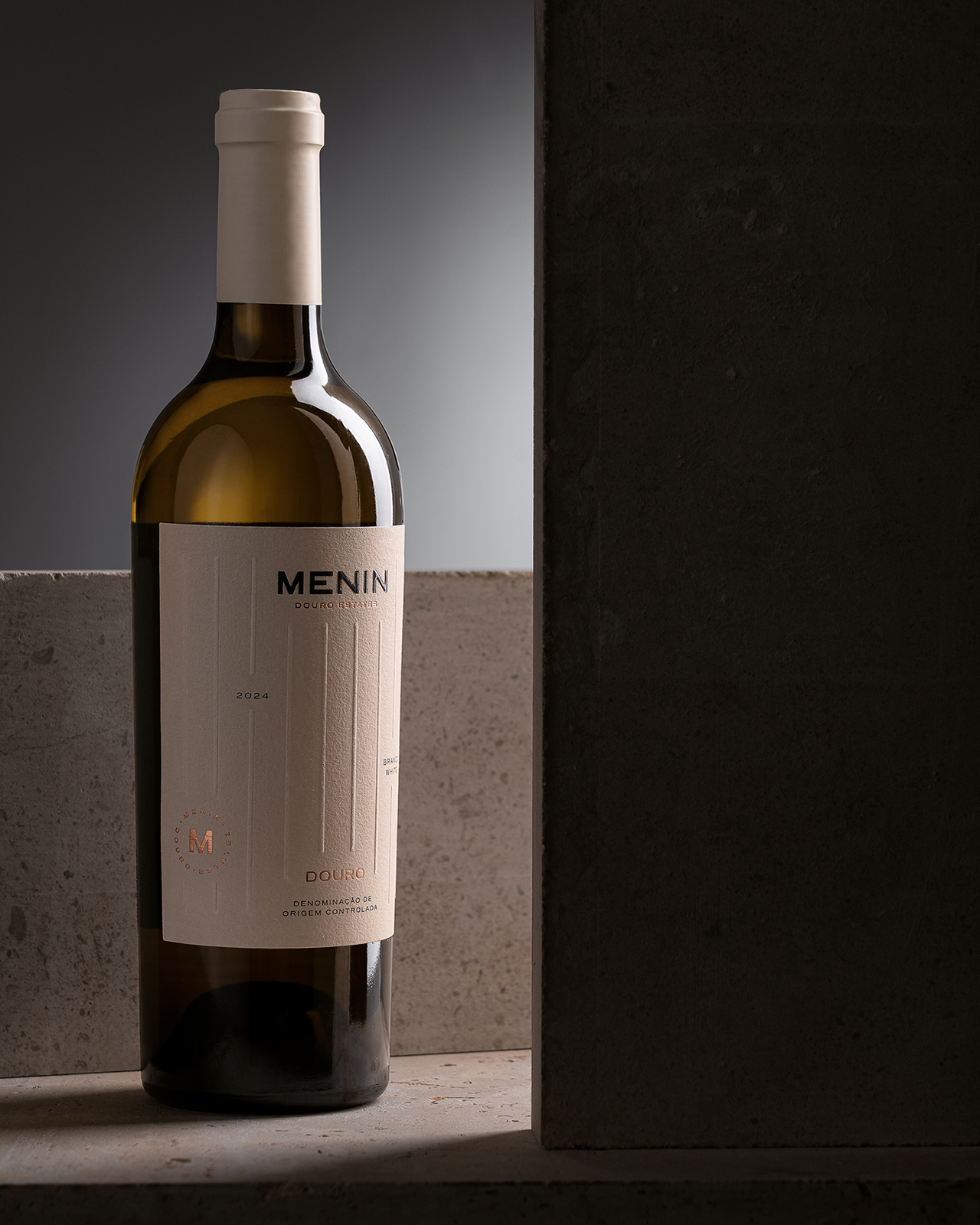
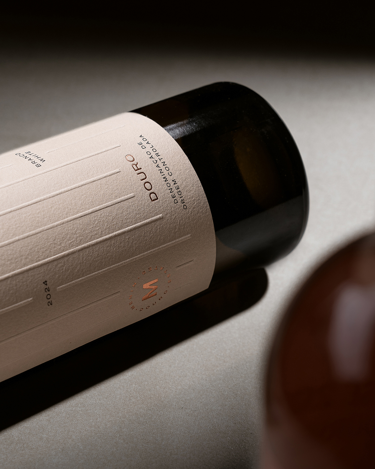
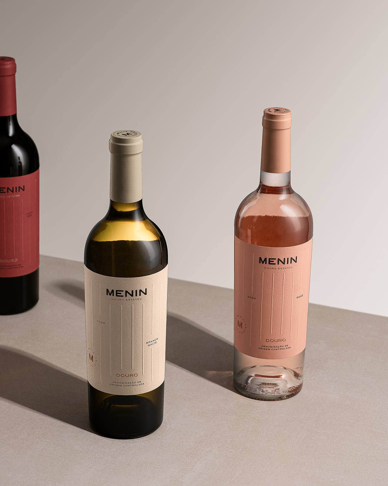
The creative concept began with an aerial view of the Douro vineyards. From above, the terraced landscape reveals a striking, almost architectural geometry. Inspired by this visual rhythm, we departed from the usual curved lines associated with natural topography and embraced vertical, parallel lines as the foundation of the label design. These lines symbolize precision, structure, and human effort — qualities that define both the land and the winemaking process behind every bottle of Menin.
This graphic system brings clarity and balance to the visual identity, creating a refined aesthetic that speaks softly but with intent. Rather than decorating, the design reveals — making space for what truly matters: the wine, the land, and the experience.
Available in Red, White, and Rosé, the Menin range maintains a unified structure, with carefully chosen colour variations that distinguish each variety. High-quality materials such as textured cotton paper, subtle embossing, and hot foil elements enhance the tactile experience and elevate the overall perception, positioning the brand firmly within the premium segment.
More than just a redesign, this is a statement of intent: Menin is about tradition reimagined with boldness and authenticity. It is an invitation to slow down, to share meaningful moments, and to rediscover the timeless beauty of the Douro through a fresh visual perspective.
CREDIT
- Agency/Creative: Vinco Studio
- Article Title: Vinco Studio Redefines Douro Elegance with a Minimalist Identity for Menin Douro Estates
- Organisation/Entity: Agency
- Project Type: Packaging
- Project Status: Published
- Agency/Creative Country: Portugal
- Agency/Creative City: Peso da Regua
- Market Region: Global
- Project Deliverables: Label Design
- Format: Bottle
- Industry: Food/Beverage
- Keywords: Wine Label Design, Packaging, Photography, Illustration, Wine
-
Credits:
Creative Director: Daniel Teixeira


