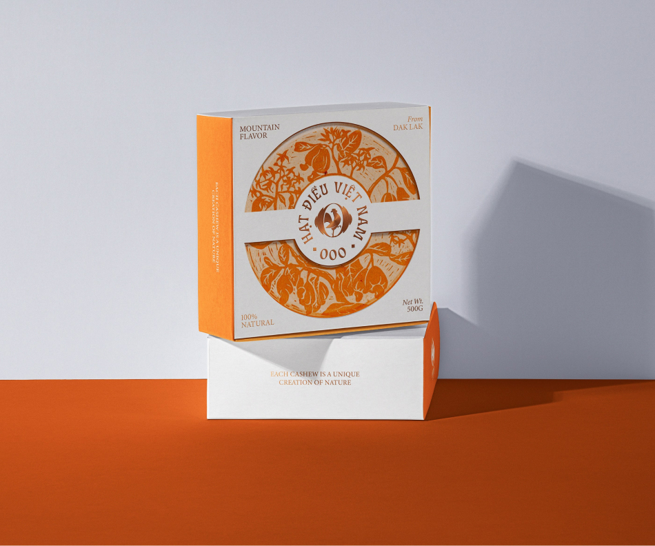
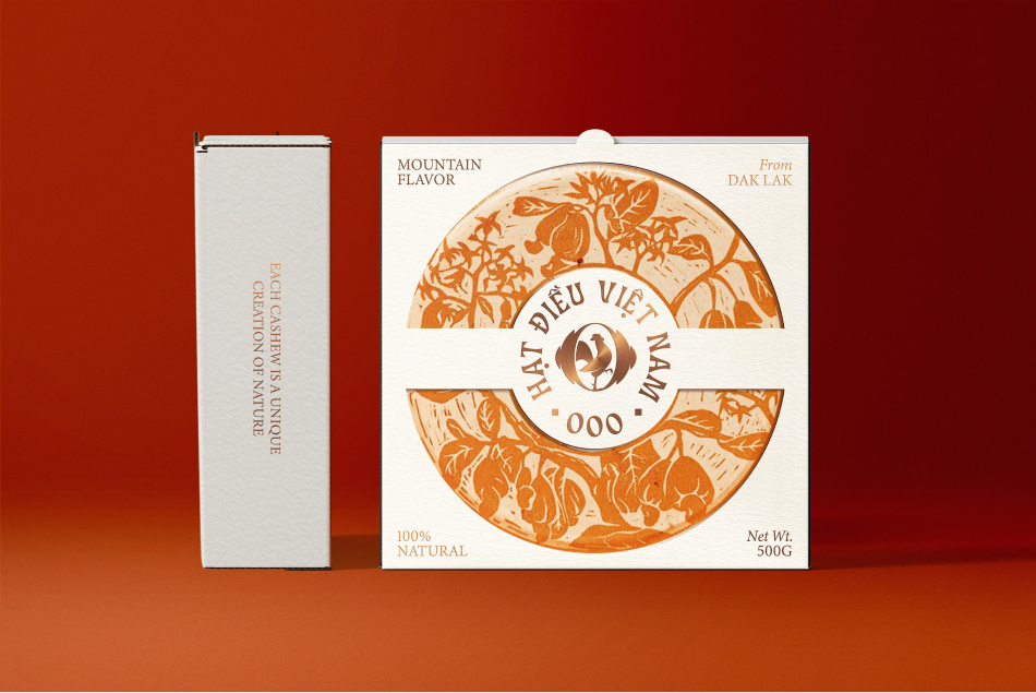
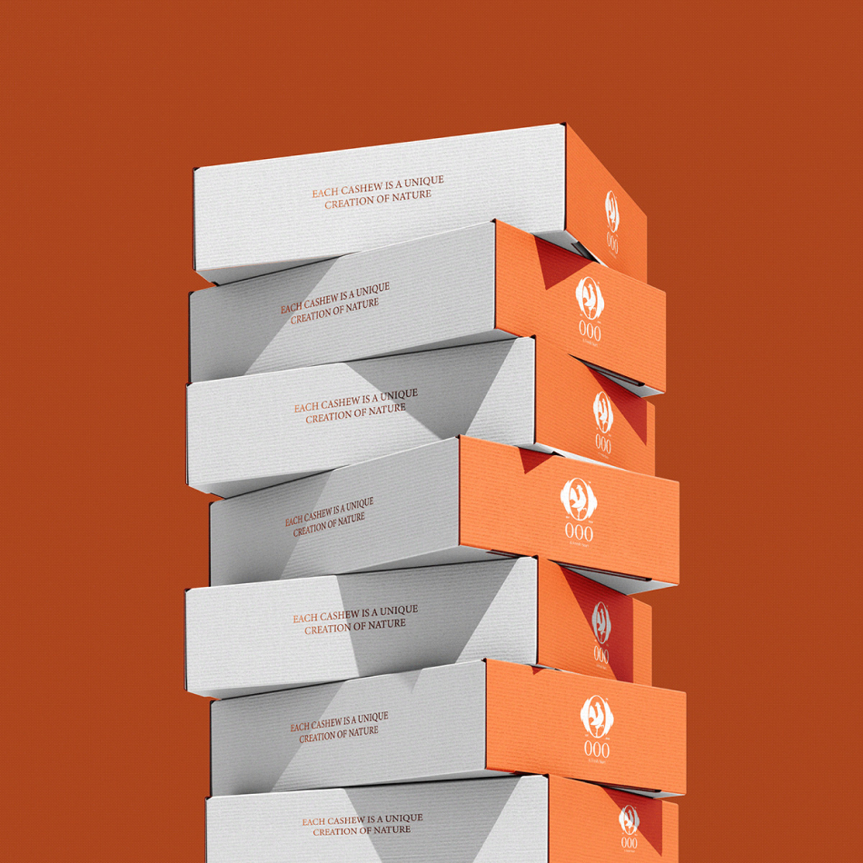
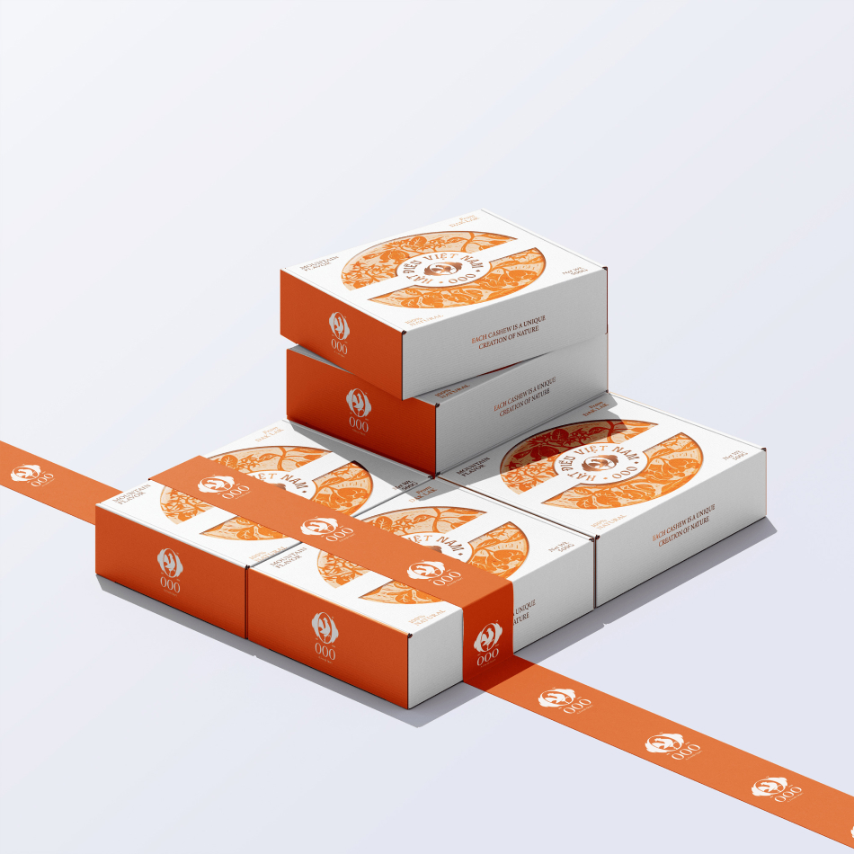
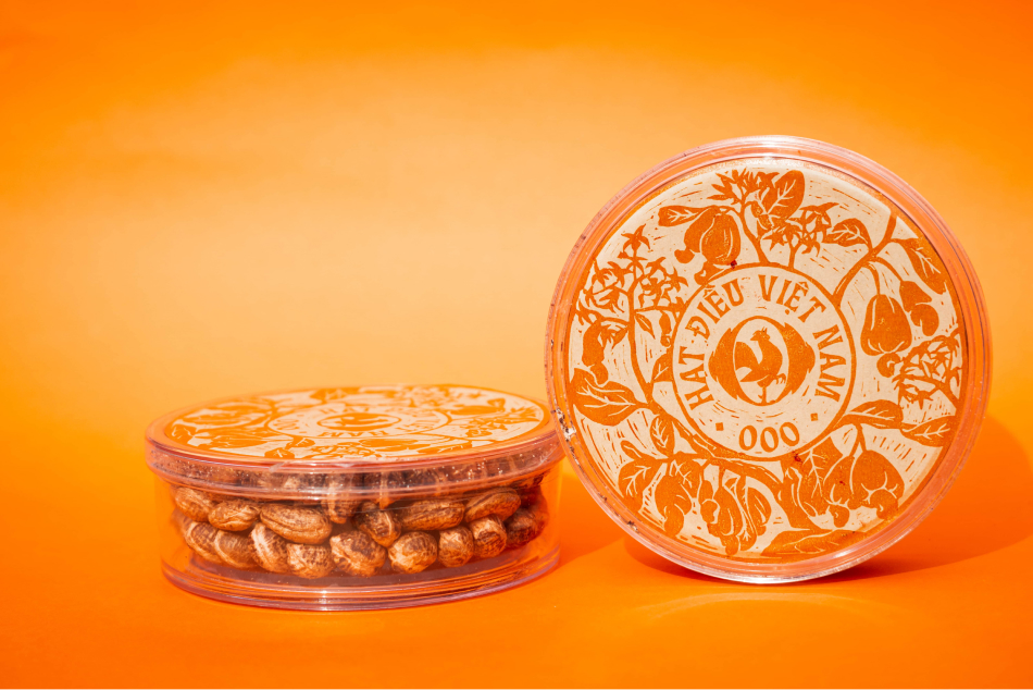
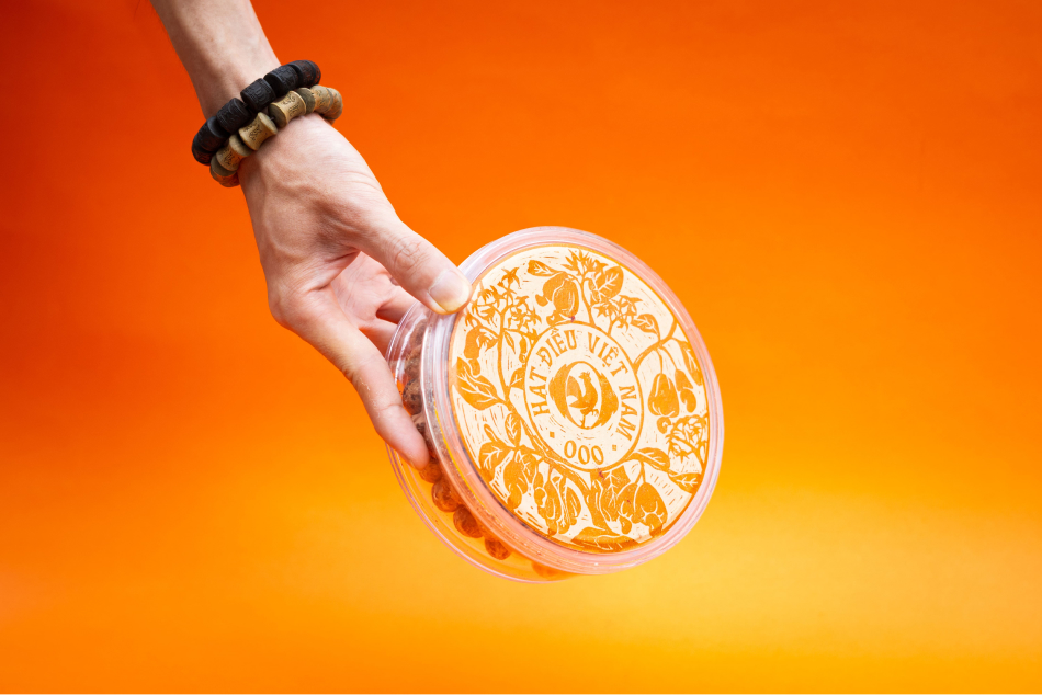
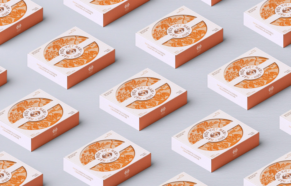
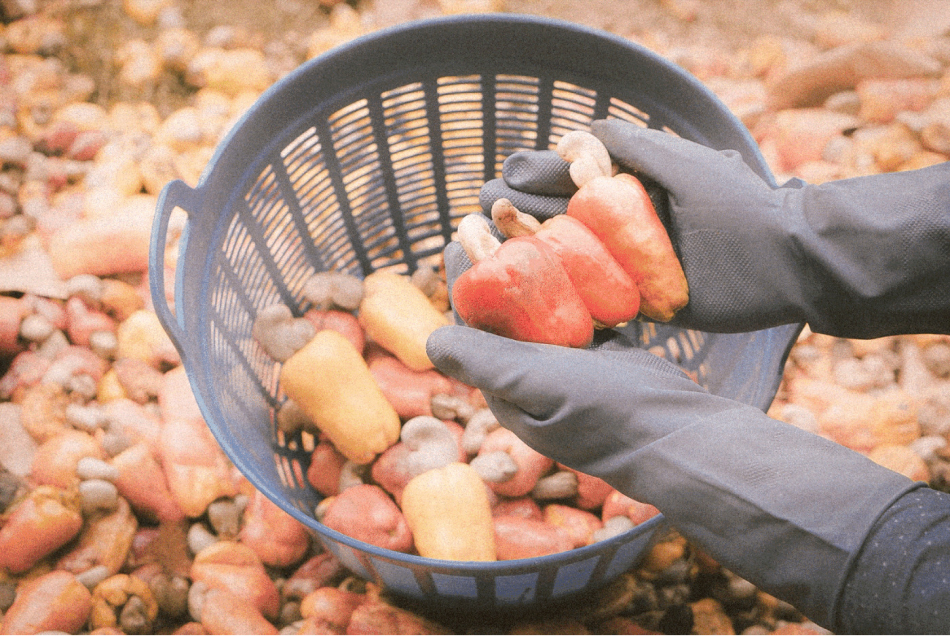
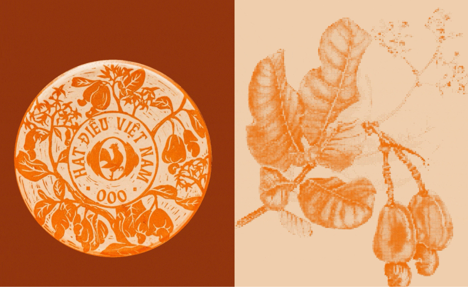
In designing the packaging for Đắk Lắk cashews, I embraced the linocut technique to artistically narrate the journey of the cashew tree, from its earliest blossoms to its fully ripened fruit. This hand-crafted approach captures the raw beauty of each stage in the tree’s lifecycle, creating a visual story that feels both intimate and authentic. The linocut style not only celebrates the untouched splendor of the Tây Nguyên region but also bridges the gap between the product’s origins and its consumers. Through this design, I sought to craft an experience where every package conveys the artisanal care and natural charm synonymous with Đắk Lắk cashews, inspiring customers to connect with the story of the land and the dedication that nurtured the product.
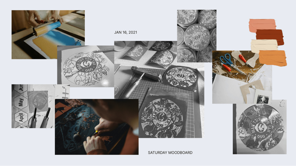
The journey to create this linocut design begins with careful observation and sketching. Each detail of the cashew tree—its leaves, blossoms, and fruit—is meticulously drawn to highlight its transformation over time. These sketches are then transferred onto linoleum blocks, where I hand-carve the intricate patterns that bring the design to life. This stage demands immense precision and a deep respect for the subject, as every groove and contour carved into the linoleum contributes to the final image’s authenticity. The carving process is not merely technical; it is an artistic exploration that seeks to honor the cashew tree’s natural elegance.
Once the carving is complete, the magic of linocut printing unfolds. Ink is carefully applied to the surface of the carved linoleum block, ensuring that every detail is vividly highlighted. The block is then pressed onto the packaging material, transferring the design in a manner that feels rustic yet refined. What makes this process unique is the slight variations that occur with each print—no two packages are exactly alike. This subtle imperfection is not a flaw but a feature, reinforcing the handcrafted essence of the design and adding a personal, human touch to every package.
This packaging design is more than a visual representation; it is a storytelling medium. Each element of the linocut artwork is thoughtfully composed to reflect the lush landscapes and rich cultural heritage of Tây Nguyên, the heartland of Đắk Lắk cashews. The bold, textured lines of the linocut evoke a sense of tradition and artistry, reminding consumers of the dedication and care that go into crafting every cashew. The natural progression of the tree, from its tender beginnings to its fruitful bounty, mirrors the patient effort involved in cultivating and harvesting these premium nuts. Through this design, customers are not just buying a product—they are embracing a piece of Tây Nguyên’s spirit.
The linocut process also speaks to the values that define Đắk Lắk cashews. The tactile quality of the print, the organic flow of the lines, and the one-of-a-kind variations in each package all reflect the authenticity and craftsmanship inherent in the product. The design invites customers to slow down and appreciate the artistry, much like savoring the rich flavor of the cashews themselves. It transforms the act of unwrapping the product into an experience—an interaction with something created with intention, care, and respect for nature.
Moreover, the design connects consumers to the broader story of Đắk Lắk, a land known for its vibrant culture and abundant natural resources. The packaging serves as a tribute to this region, showcasing its beauty and resilience. By incorporating the linocut technique, the design stands out in a market crowded with mass-produced, generic packaging. It tells a story of uniqueness, tradition, and quality, setting Đắk Lắk cashews apart as a premium product with a soul.
Ultimately, my goal with this packaging design was to create something that transcends function and becomes a bridge between the product and its origins. The linocut technique, with its handcrafted aesthetic and narrative depth, perfectly encapsulates the spirit of Đắk Lắk cashews. Each package carries not only the delicious nuts but also a piece of the region’s heritage, inviting consumers to savor the flavors and the stories of Tây Nguyên. This design is a celebration of nature, craftsmanship, and the human connection to the land—a fitting tribute to the exceptional quality of Đắk Lắk cashews.
CREDIT
- Agency/Creative: OOO Brand
- Article Title: Vietnamese Cashew Nut Packaging Design by OOO Brand
- Organisation/Entity: Freelance
- Project Type: Packaging
- Project Status: Published
- Agency/Creative Country: Vietnam
- Agency/Creative City: Ho Chi Minh City
- Market Region: Asia
- Project Deliverables: Brand Design, Brand Mark
- Format: Box
- Industry: Food/Beverage
-
Credits:
Graphic Designer: Phuoc Nguyen
Photographer: Phuoc Nguyen
Creative Director: Y Huynh


