


Saul studio – piña
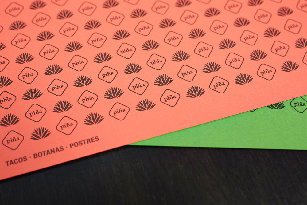
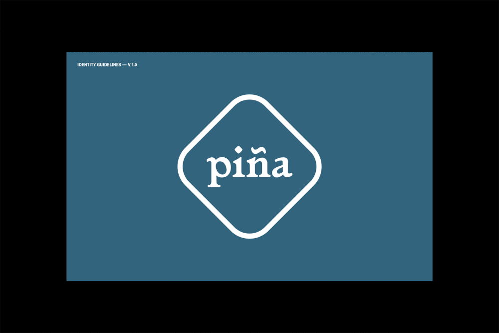
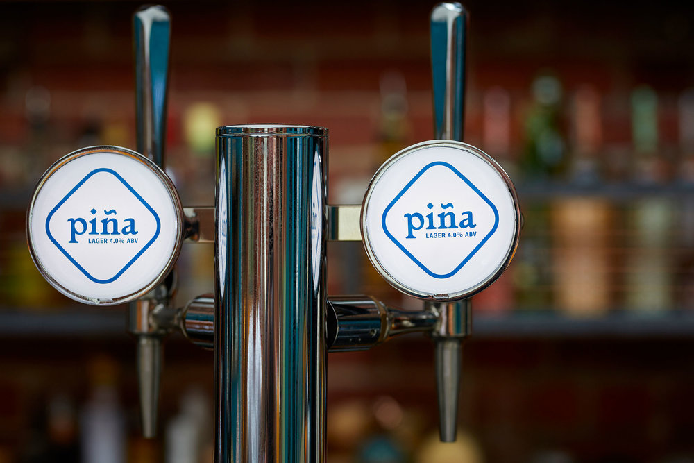
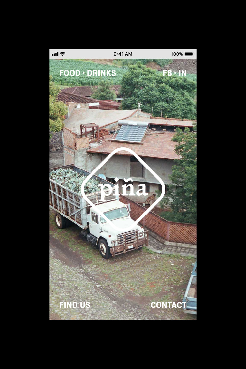
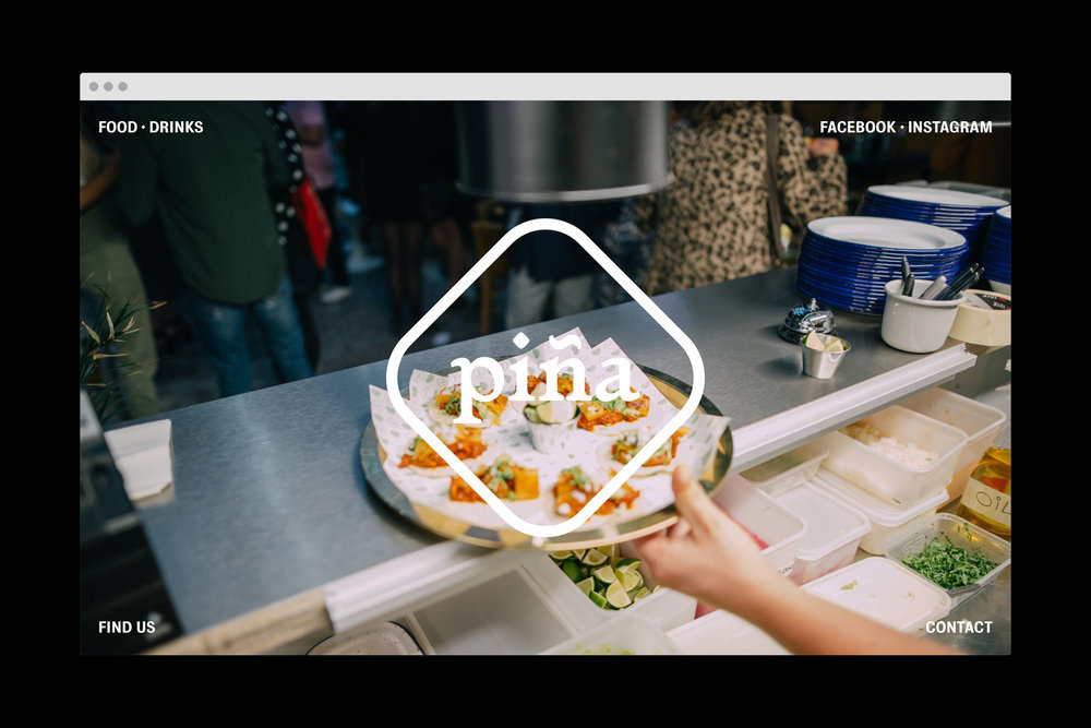
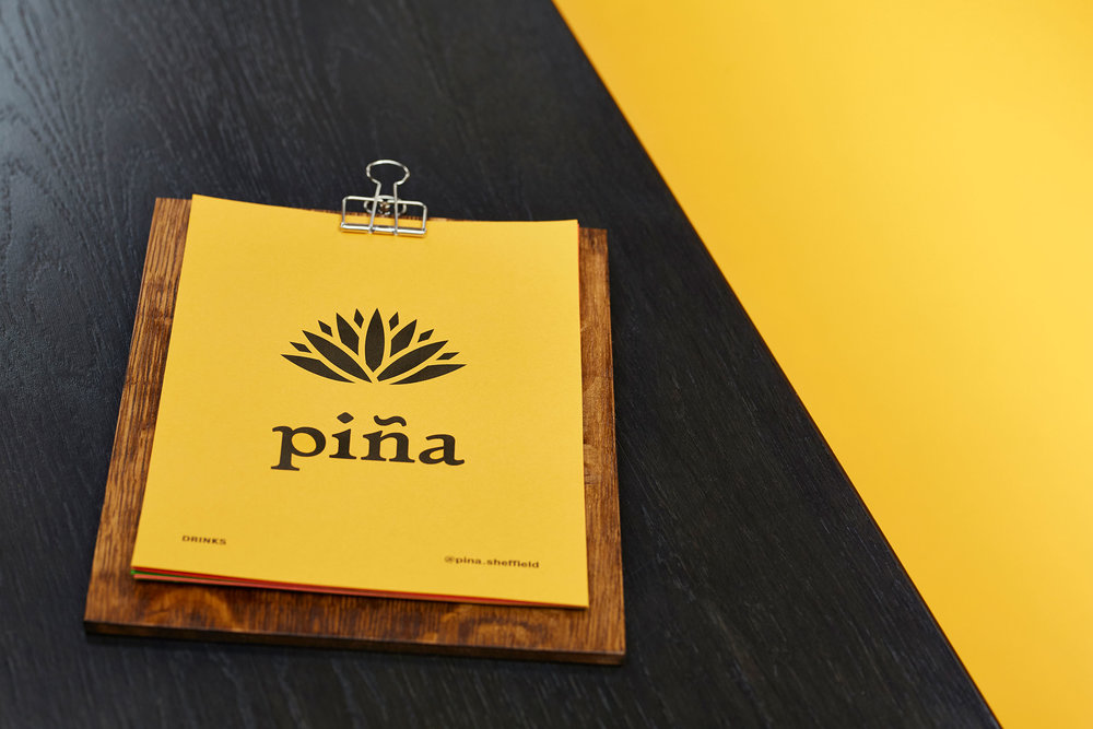
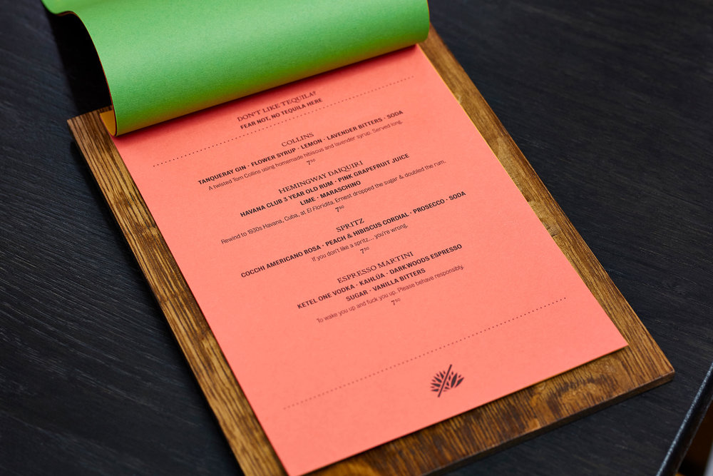
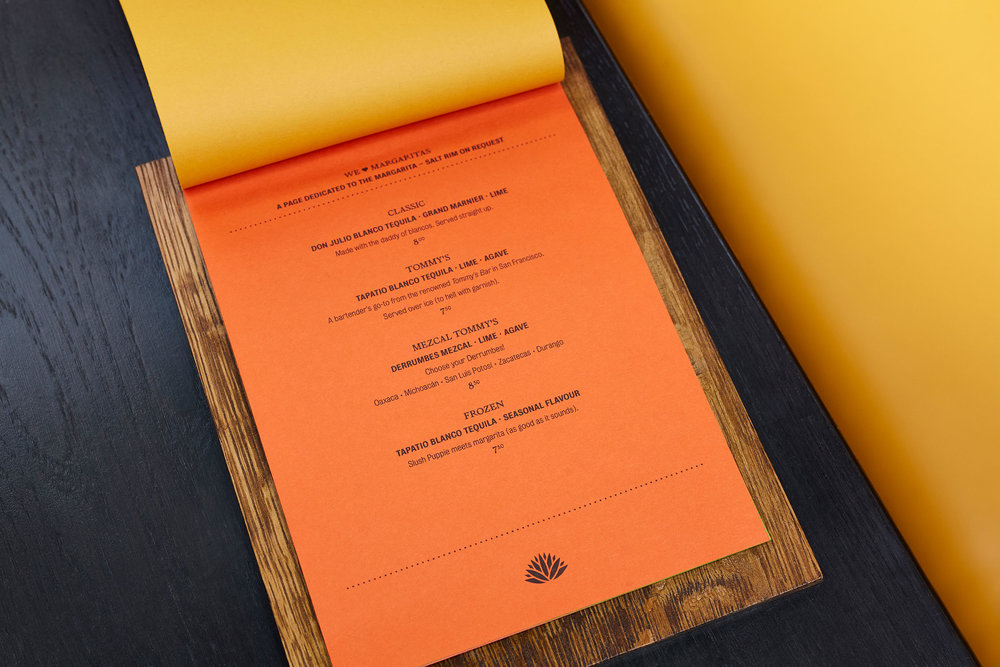
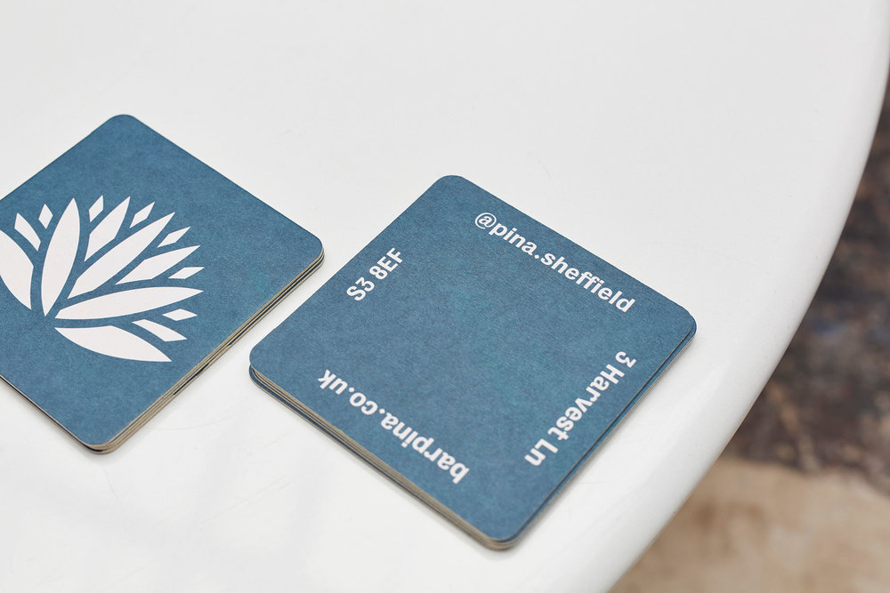
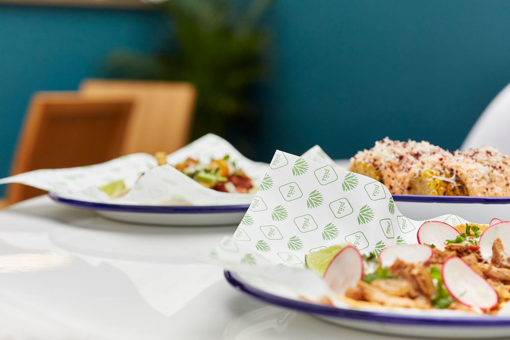
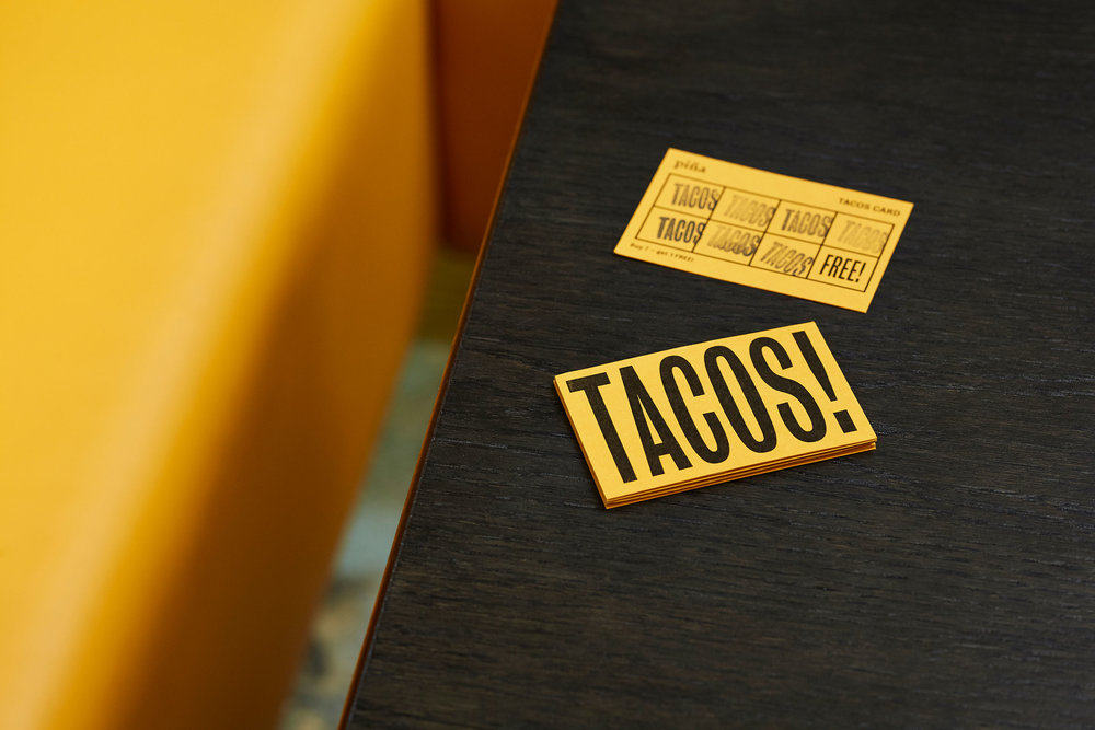
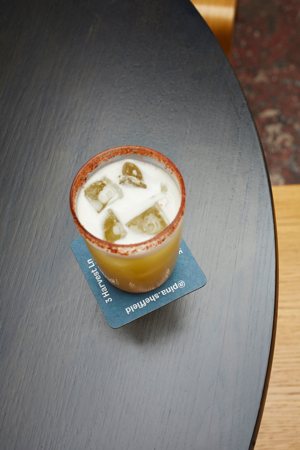
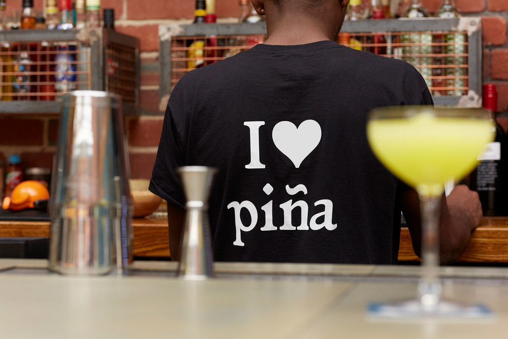
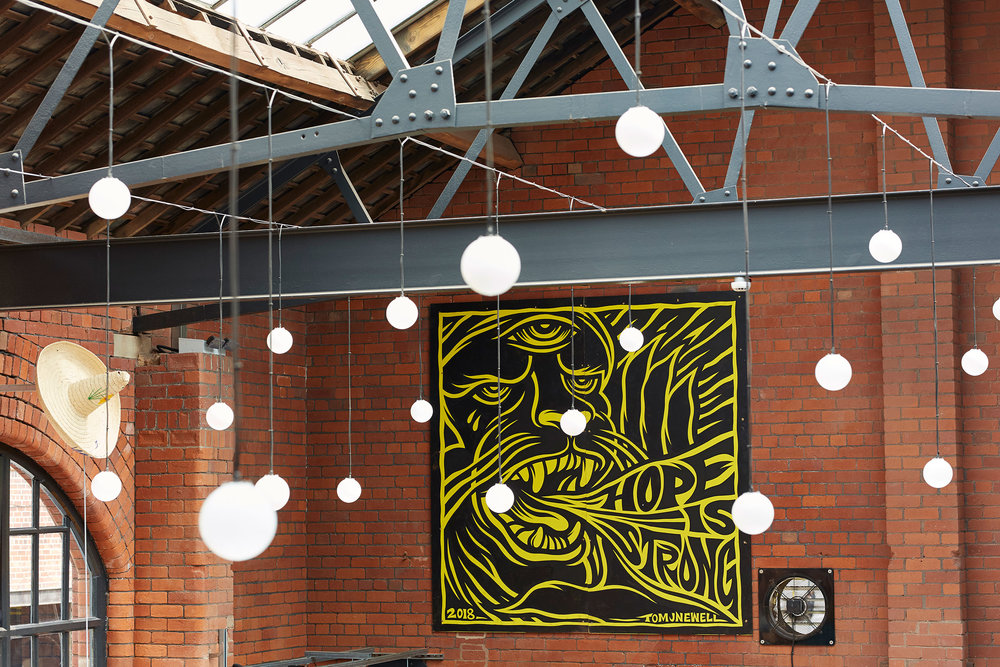
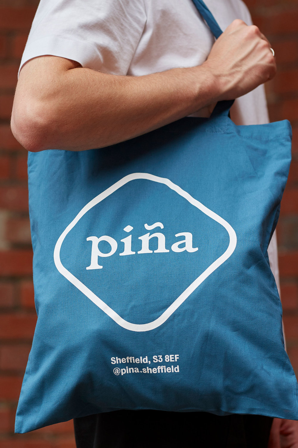
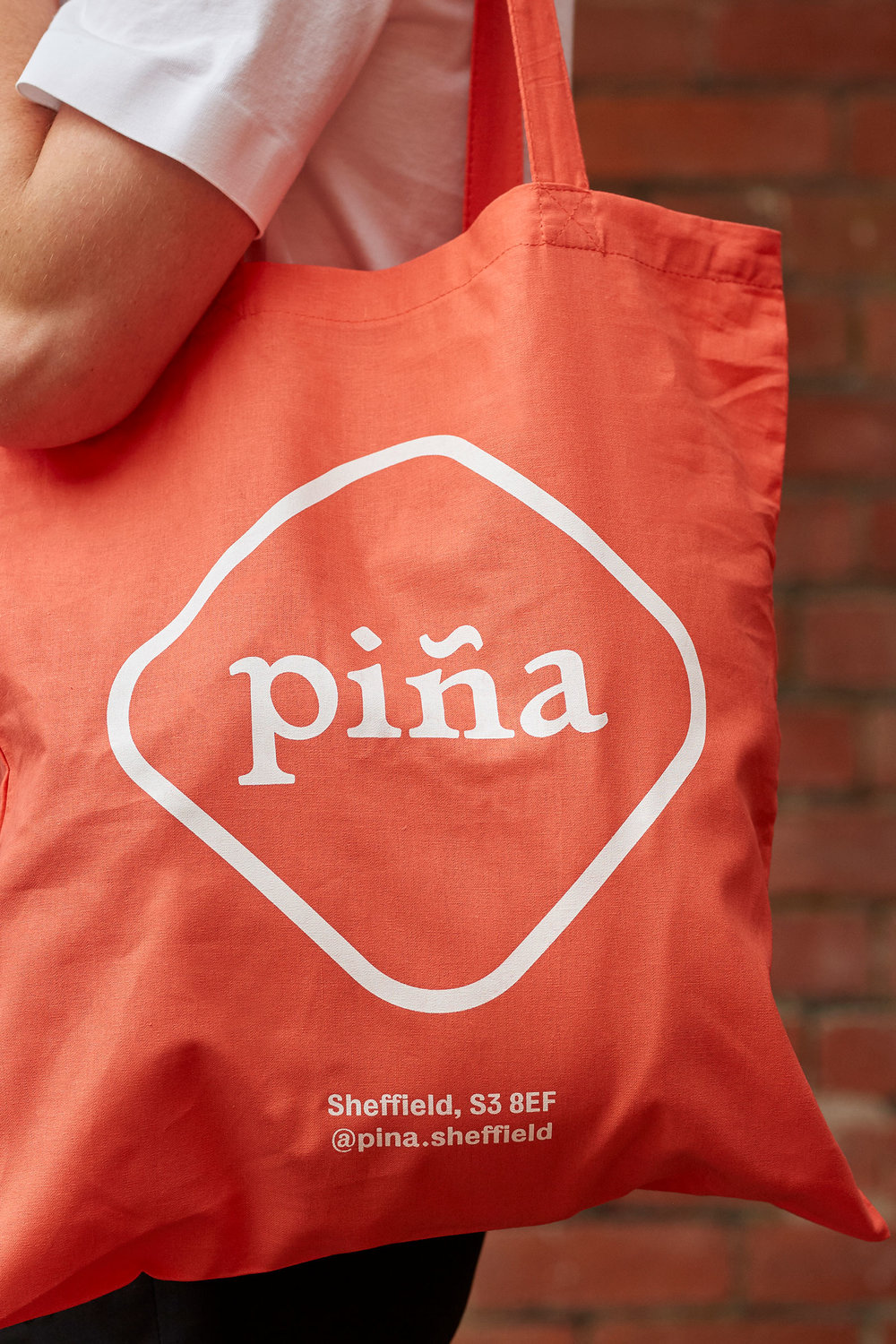
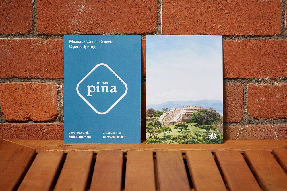
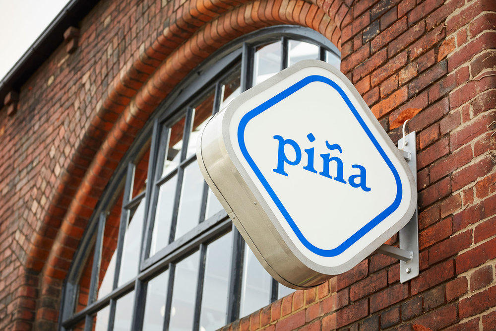
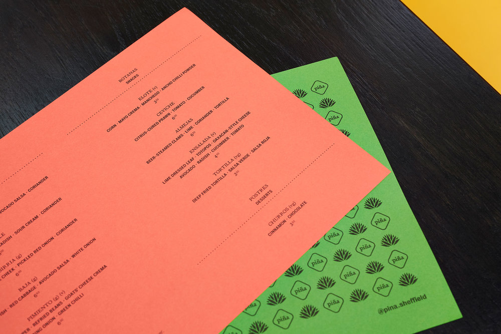
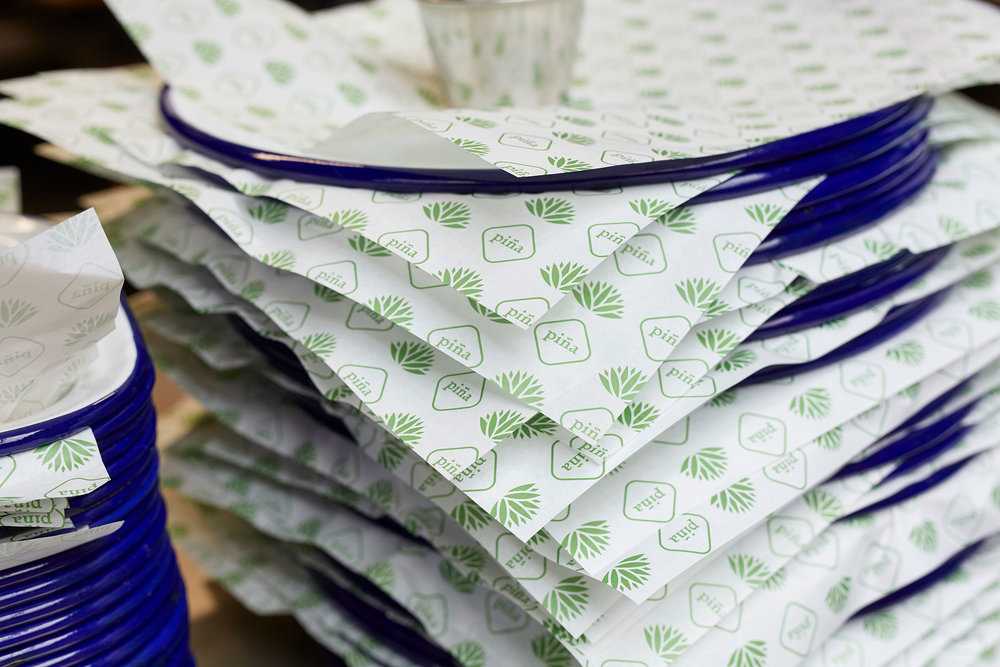
“Piña is a Mexican bar and taqueria based in Sheffield, UK. Its emphases are mezcal, tacos and sports.The visual identity is a hybrid of both Mexican and Sheffield cultures. The primary identity colour ‘steel blue’ eludes to Sheffield’s industrial heritage and the weber azul, a specific cultivar in tequila production (the plant’s heart is also known as the piña).The rest of piña’s energetic colour palette is drawn from Mexican culture, utilising the natural tones of G . F Smith’s recycled Extract range of papers throughout design material such as: beer tap, coasters, flyers, greaseproof, logo and wordmarks, menus, signage, social media, tacos card, tote bag, t-shirts and website. A Sheffield-based type foundry was chosen as a reference point for the identity’s supporting typeface (Bureau Grot). Stephenson Blake was the last active type foundry in Britain, operating until the 1990s and, coincidentally, signage displaying the Stephenson Blake name is present opposite piña.”


CREDIT
- Agency/Creative: saul studio
- Article Title: Vibrant Visual Identity for a Mexican Bar & Taqueria based in Sheffield UK
- Organisation/Entity: Agency Commercial / Published
- Project Type: Identity
- Agency/Creative Country: United Kingdom
- Market Region: United Kingdom
- Industry: Hospitality


