Namuun Valley is a camping resort situated at the end of the road in Terelj, nestled near a serene forest, offering a peaceful retreat away from the crowd.
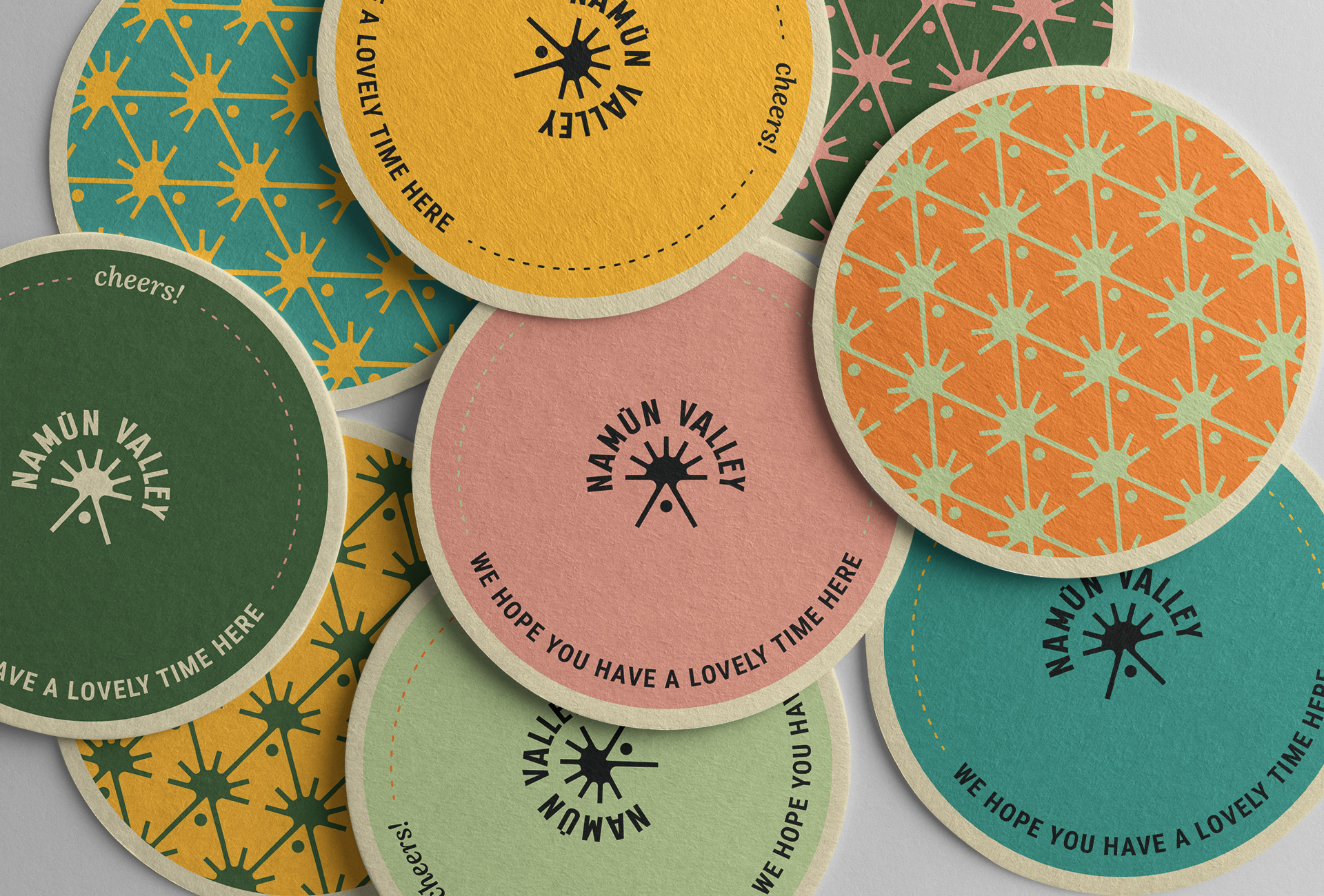
Namuun Valley’s identity design embraces the vibrant and joyful essence of nature. The colorfulness is inspired by Namuun Valley’s range of services, which extend beyond relaxation. It reflects the variety of entertaining and educational workshops and activities, offering a diverse experience for visitors.
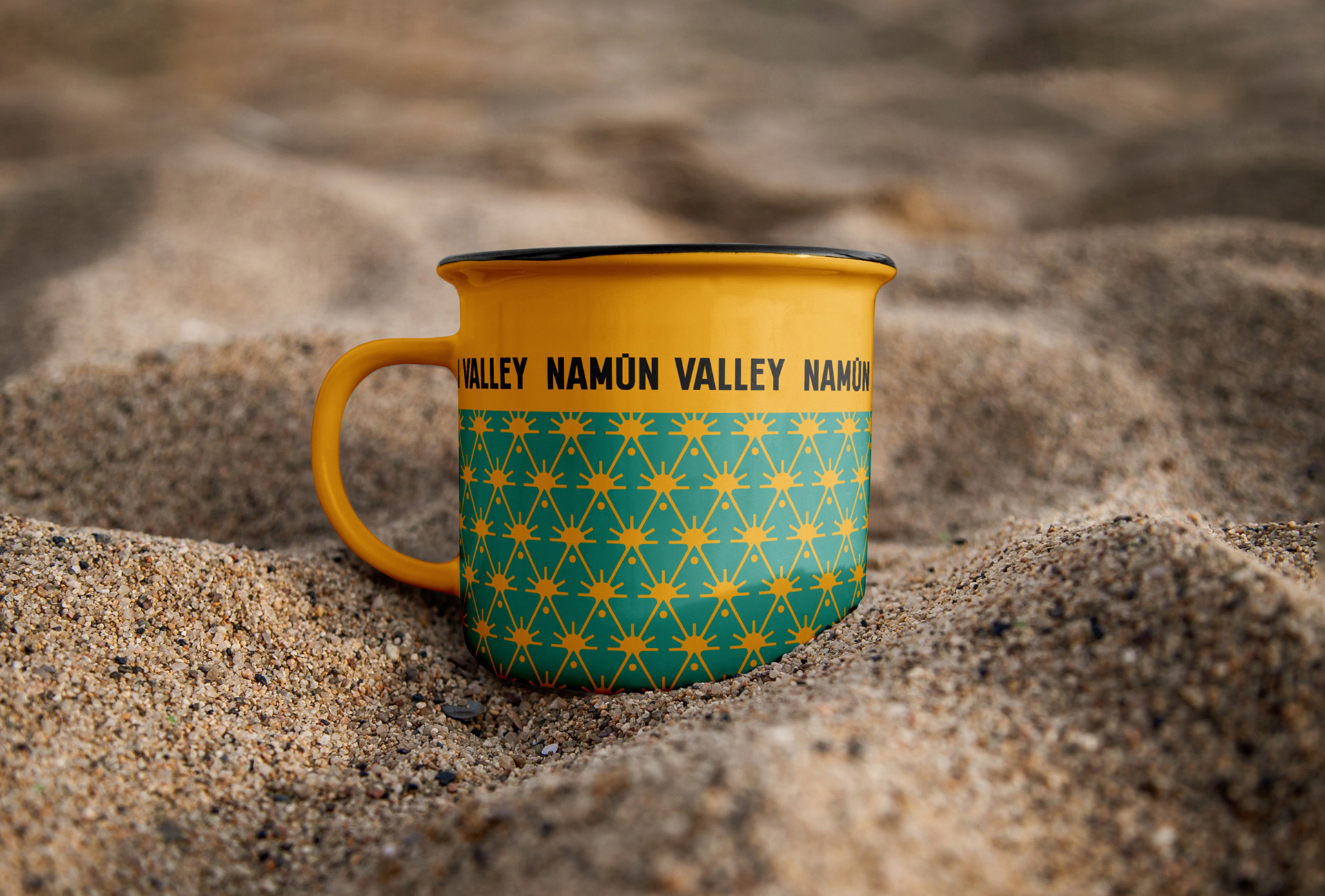
The brandmark: The primary element of the Namuun Valley logo is its wordmark, which prominently features the brand name in a sans-serif condensed font. The condensed writing style succinctly captures the essence of the brand while maintaining visual impact. Notably, one “u” in the wordmark is adorned with a macron, a long line atop the letter, emphasizing its pronunciation and adding a distinctive touch to the typography.
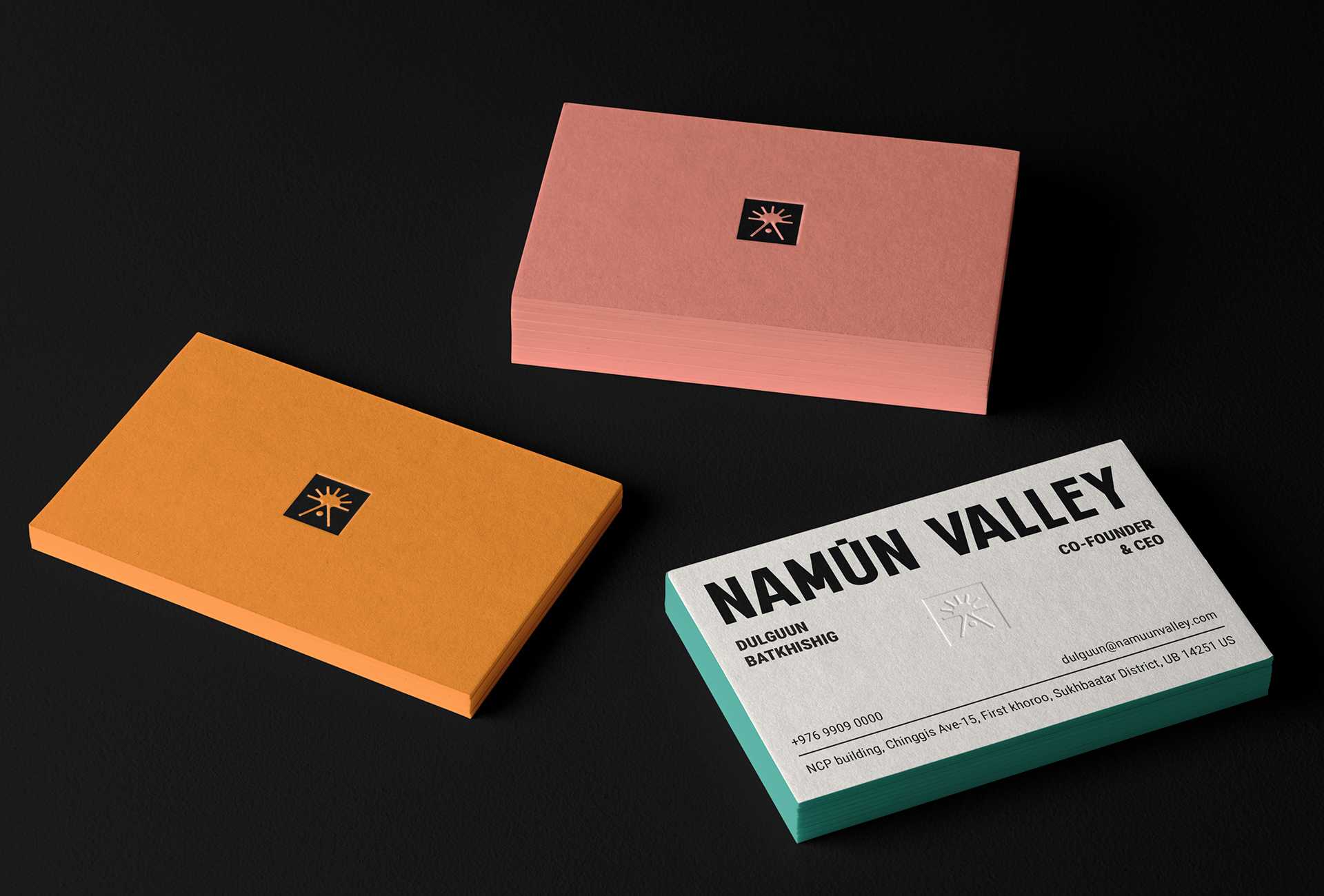
The submark: The submark features a stylised ray of sunlight shining behind the resort’s triangular house, creating a visual connection between the logo and the brand’s natural surroundings.
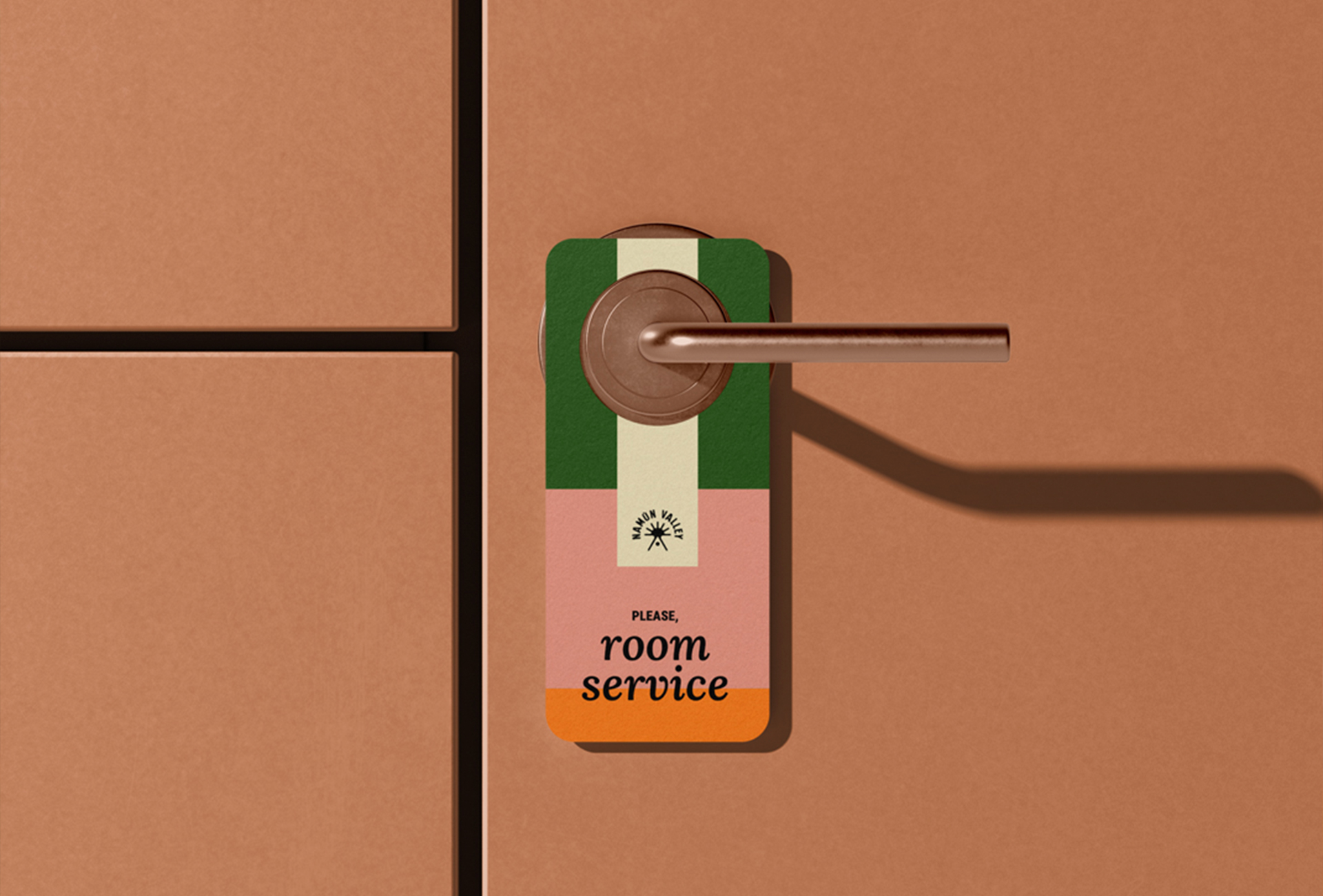
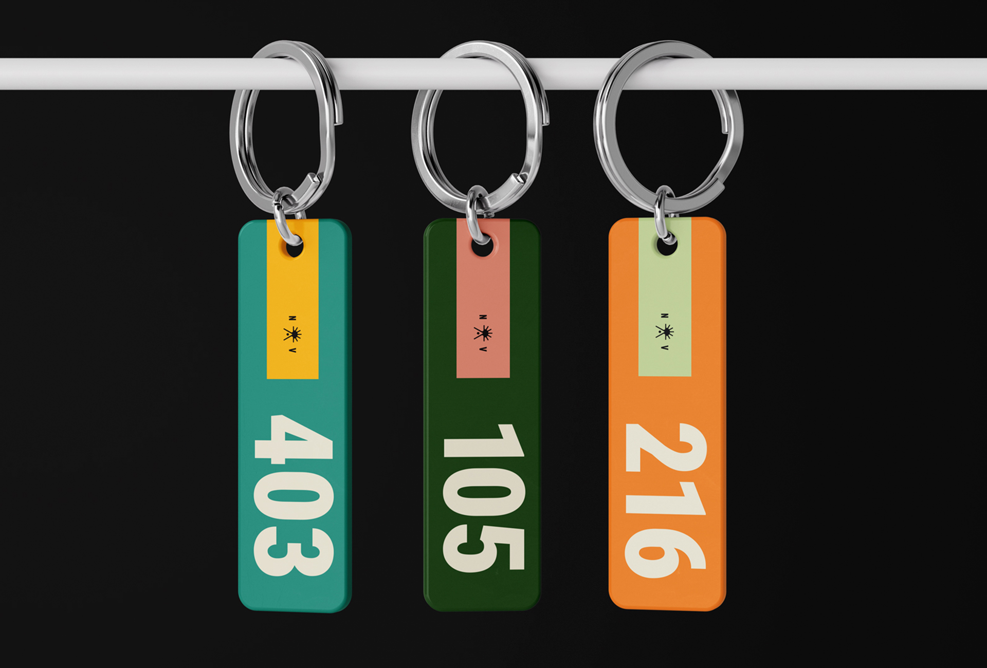
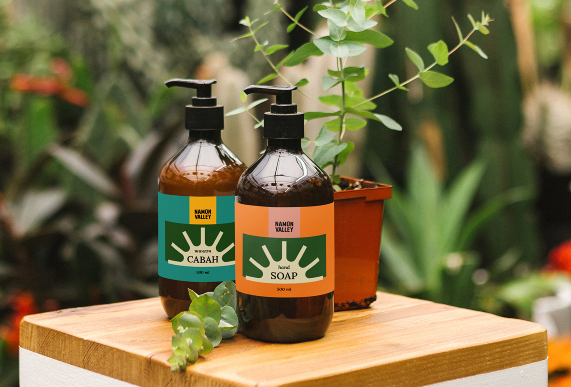
Supporting element: The supporting elements seamlessly integrate with the wordmark through compact rectangular shapes, enhancing the visual structure. These rectangles draw attention to main elements and establish a clear hierarchy, using vibrant colors to maintain simplicity and avoid visual clutter.
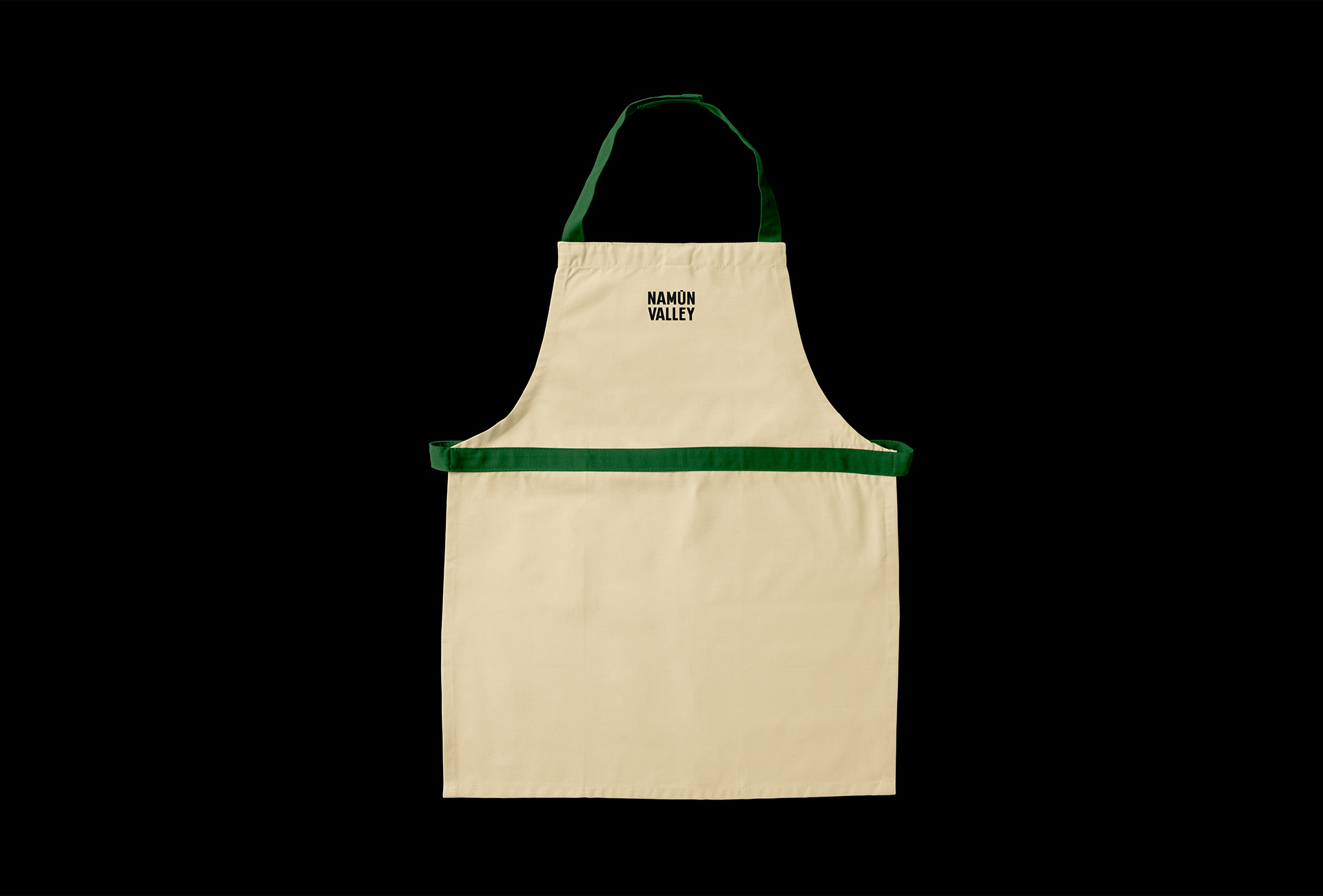
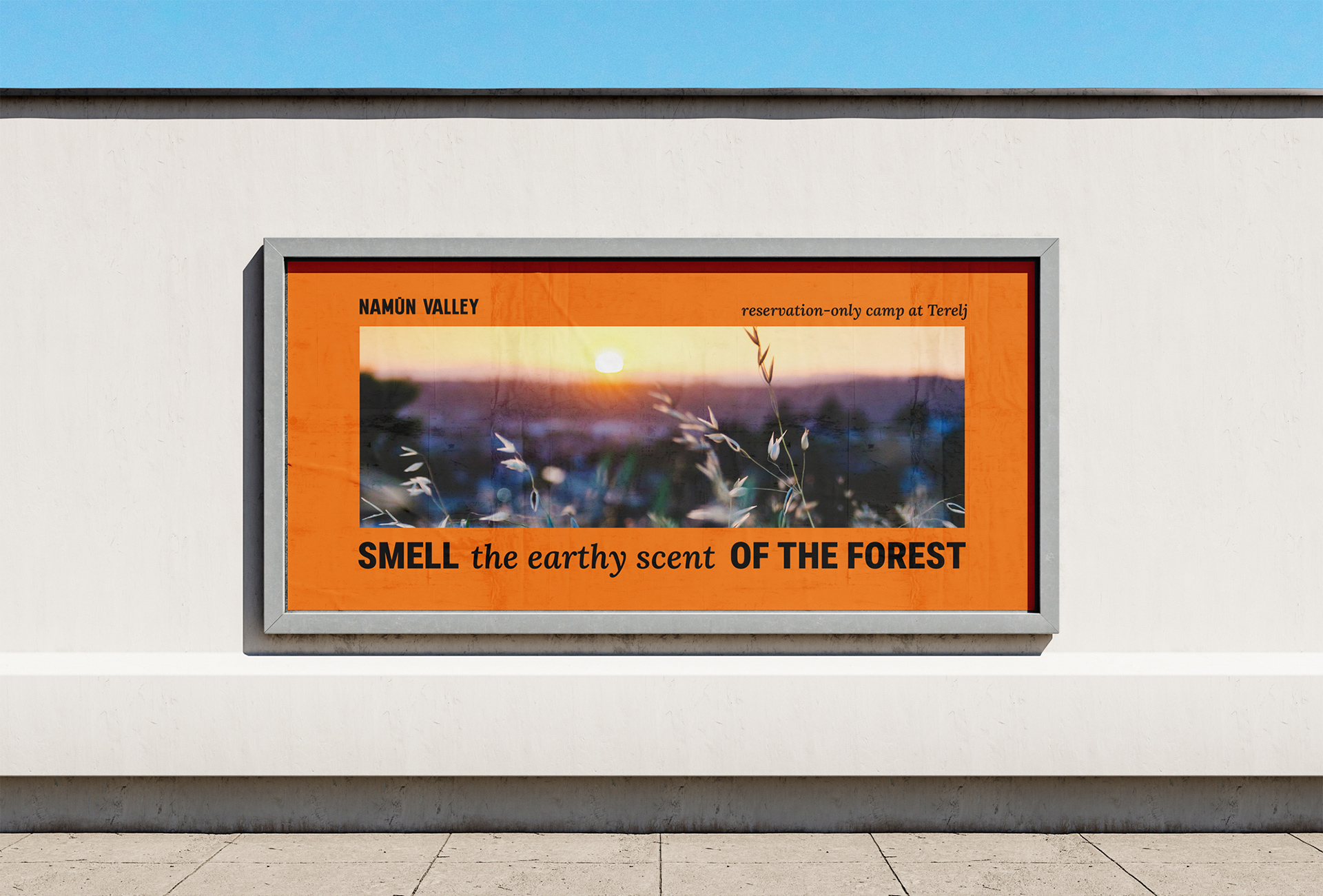
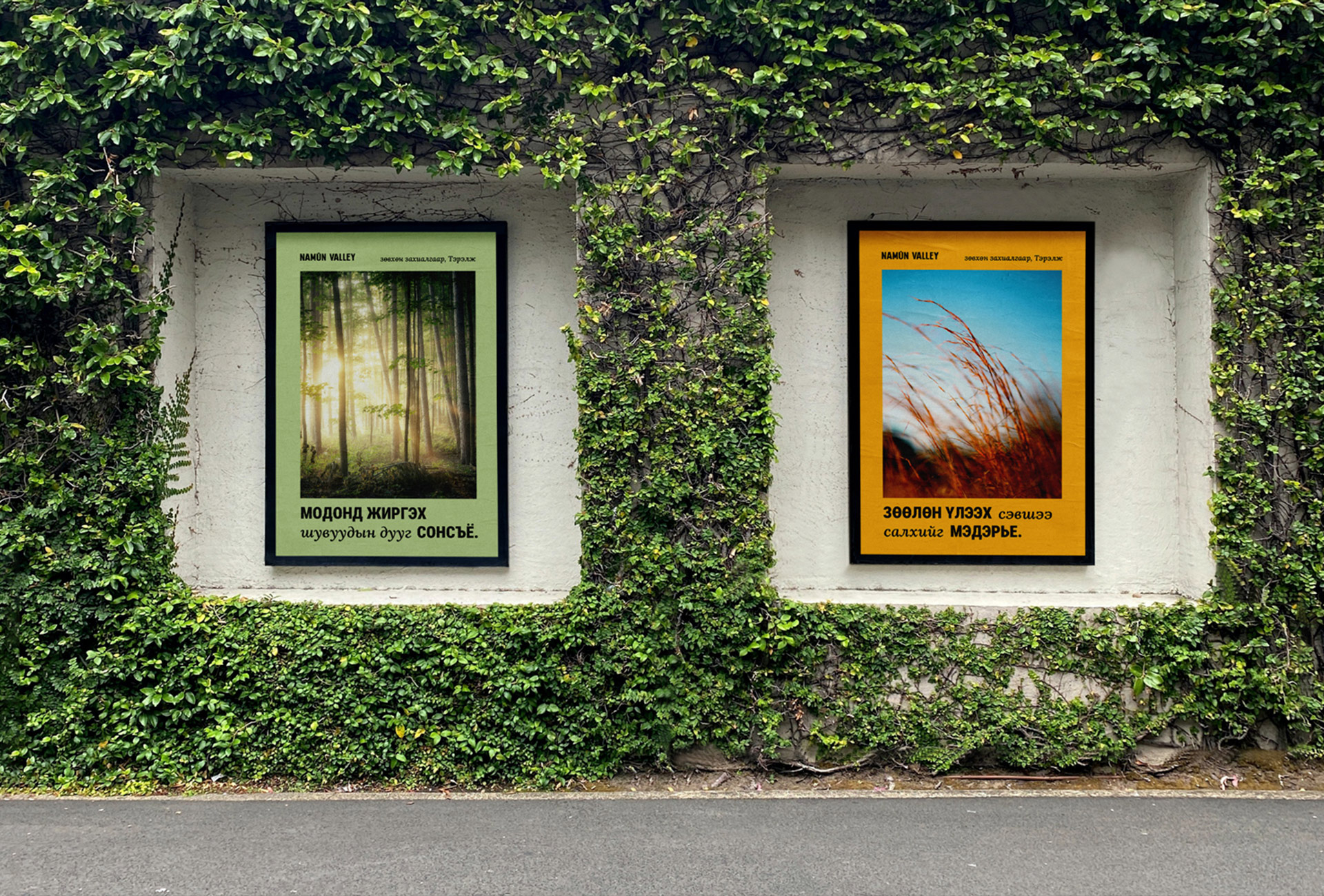
Brand touchpoints: From restaurant brand touchpoints to eye-catching OOH campaigns and cohesive collateral materials, we created Namuun Valley’s visual identity to shine across every format and application.
Colours: Colours are only used in the background, not in the text. They are versatile and can be combined effectively. The colour palette consists of six welcoming and friendly hues, each named after elements found in nature. The colours include: Phoenix Rose: A warm and inviting hue reminiscent of blooming roses. Succulent: A gentle combination of blue and green. Leaf: A deep, rich green reminiscent of lush foliage. Grass: A soft, pastel light green akin to fresh grass. Dandelion: A bright and cheerful yellow, evoking the warmth of sunshine and happiness. Honeysuckle: A vibrant orange hue reminiscent of the sweet scent of honeysuckle flowers in bloom. Handbell Flower: A pristine white colour, symbolising purity and tranquility. These colours contribute to a welcoming and harmonious visual language, drawing inspiration from the diverse elements of the natural world.

CREDIT
- Agency/Creative: Desember Design Studio
- Article Title: Vibrant Brand Identity for Namuun Valley Camping Resort Inspired by Nature
- Organisation/Entity: Agency
- Project Type: Identity
- Project Status: Published
- Agency/Creative Country: Mongolia
- Agency/Creative City: Ulaanbaatar
- Market Region: Asia
- Project Deliverables: Brand Design, Label Design, Logo Design
- Industry: Hospitality
- Keywords: WBDS Creative Design Awards 2024/25 , #playfulness #welcoming #resort #logodesigns #visualidentity #brandguidelines #brandcollaterals
-
Credits:
Designer: Anar Baasanbat


