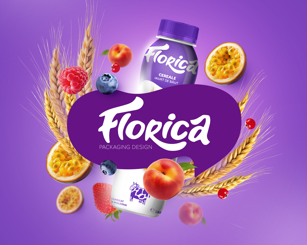
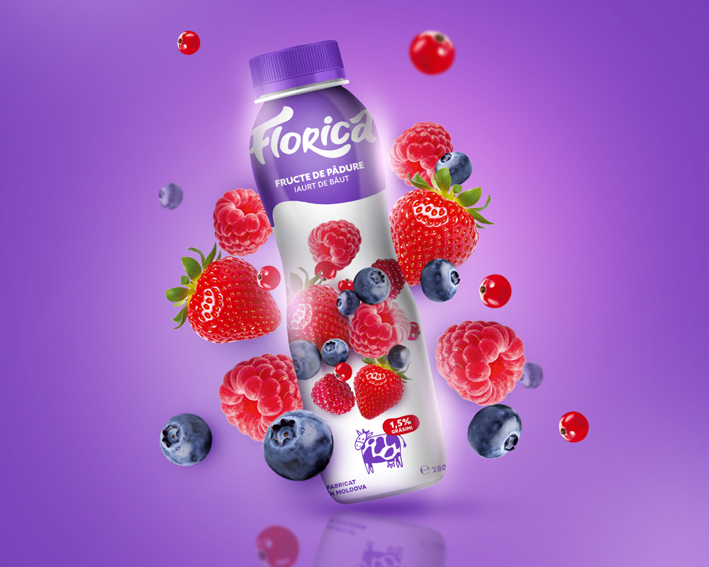
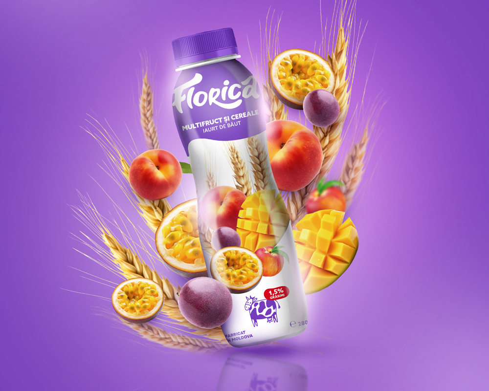
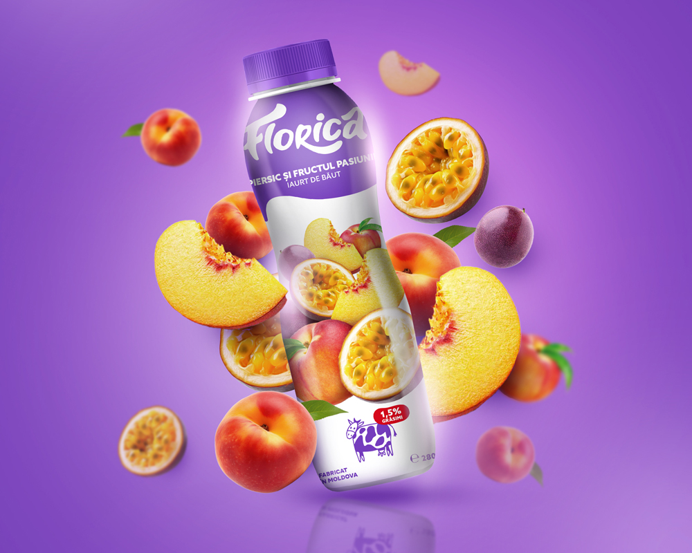
Creating packaging for drinking yoghurt is all about making it as fun and delightful as the product itself. Our mission is to design colourful, eye-catching packaging that grabs your attention and stands out on the shelf.
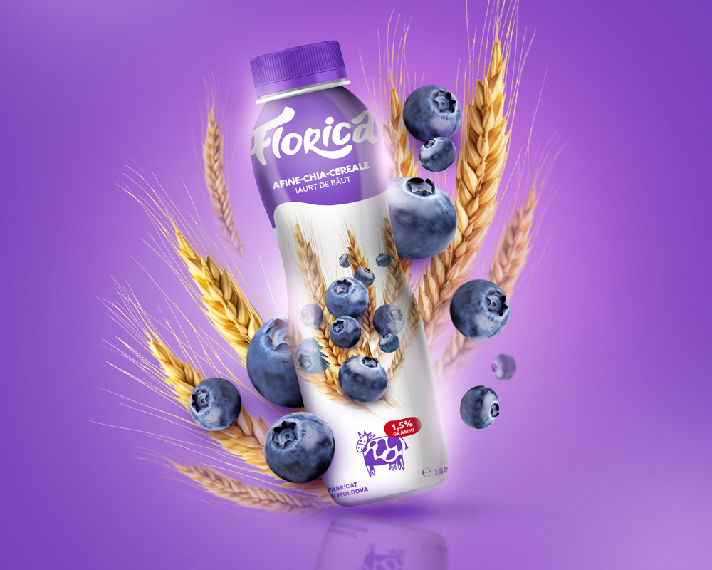
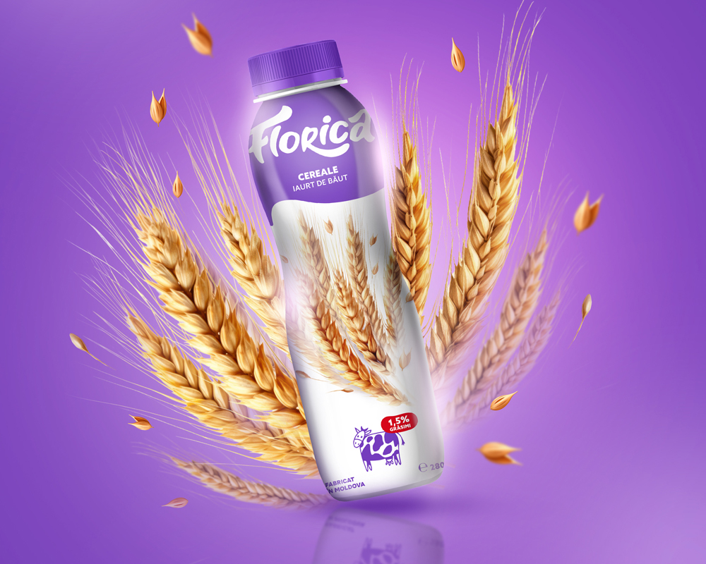
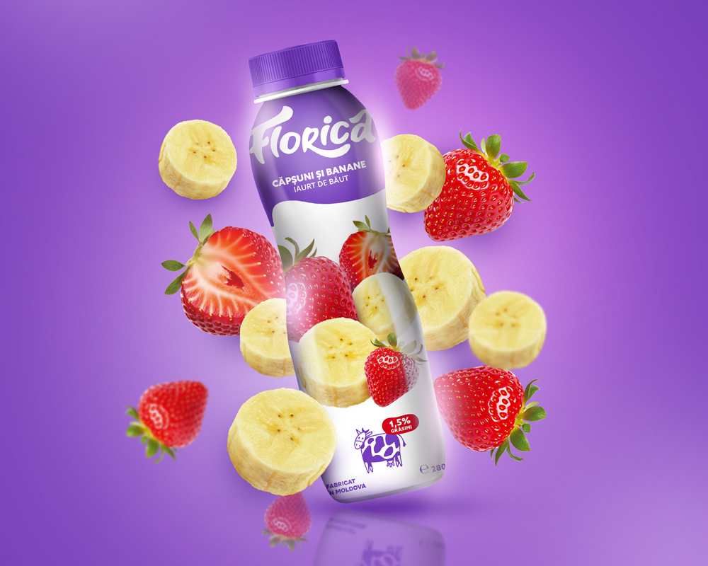
We start by diving into what our customers love. Bright, cheerful colours and playful patterns are a must, reflecting the fresh, fruity flavours of the yoghurt. Each flavour gets its own special color scheme, making it easy for you to spot your favourite at a glance. We use bold, easy-to-read fonts so you can see all the important details even from a distance.
We’re also thinking about the planet. Our packaging is made from eco-friendly materials that are both durable and recyclable. The resealable cap keeps your yoghurt fresh and makes it perfect for on-the-go snacking, fitting right into your busy lifestyle.
But it’s not just about looks. We want to tell the story of our yoghurt – from the high-quality ingredients to the delicious taste and nutritional benefits. Engaging illustrations and a modern design help convey this message, making you feel good about choosing our product.
In the end, it’s all about creating a connection. We want you to feel excited when you see our yoghurt on the shelf, knowing that it’s not only tasty but also thoughtfully packaged. With vibrant colors, fun graphics, and a commitment to sustainability, our drinking yoghurt packaging is designed to bring a smile to your face and keep you coming back for more.
CREDIT
- Agency/Creative: Mind Brand Design Studio
- Article Title: Vibrant and Inviting Design for Drinking Yoghurt Florica Designed by Mind Brand Design Studio
- Organisation/Entity: Agency
- Project Type: Packaging
- Project Status: Published
- Agency/Creative Country: Moldova
- Agency/Creative City: Chisinau
- Market Region: Europe
- Project Deliverables: Design, Food Styling, Graphic Design, Packaging Design
- Format: Bottle
- Industry: Food/Beverage
- Keywords: Yoghurt, design, packaging, fruits, drinking yoghurt
-
Credits:
Art Director: Tatiana Arnaut


