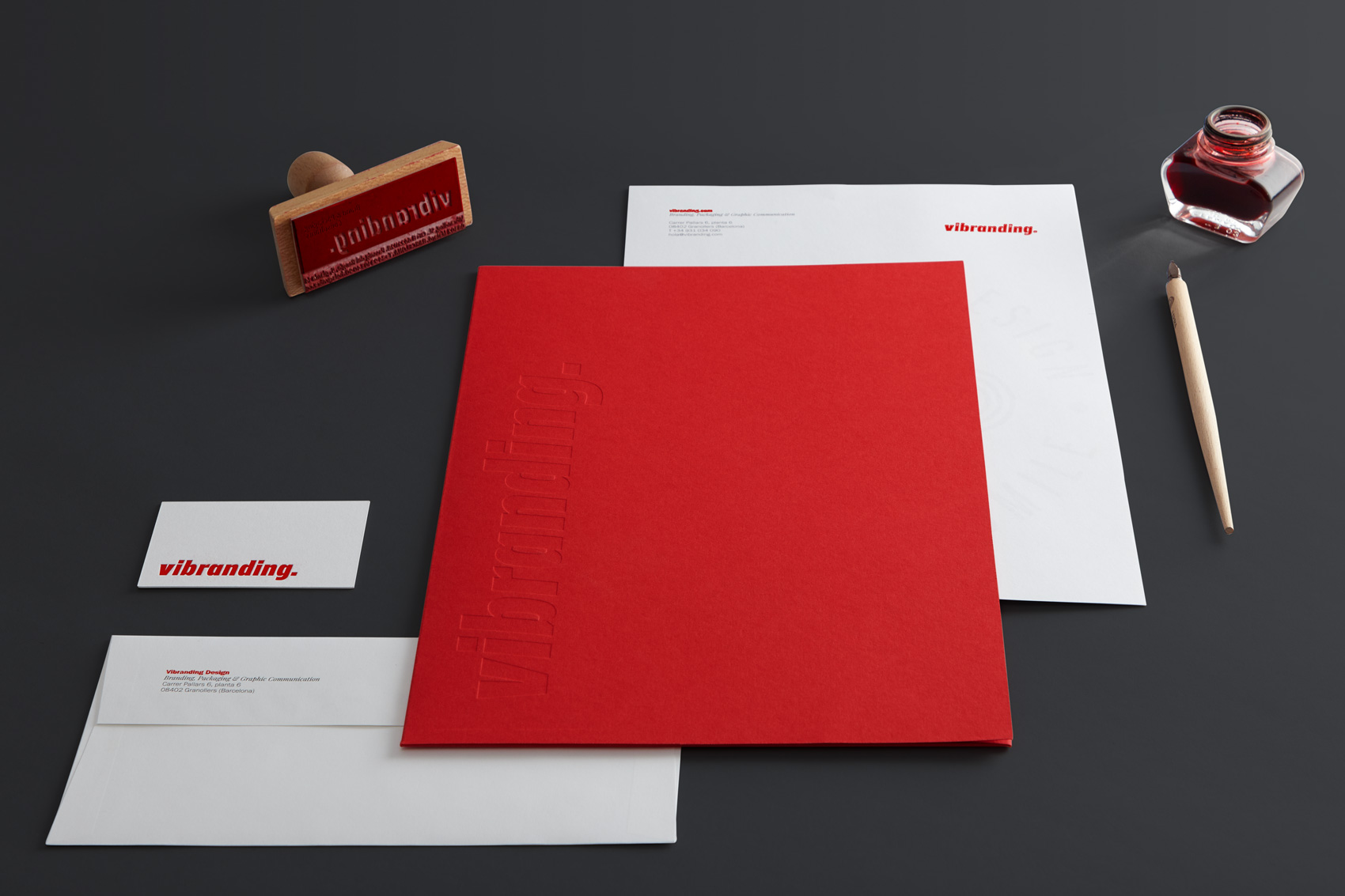
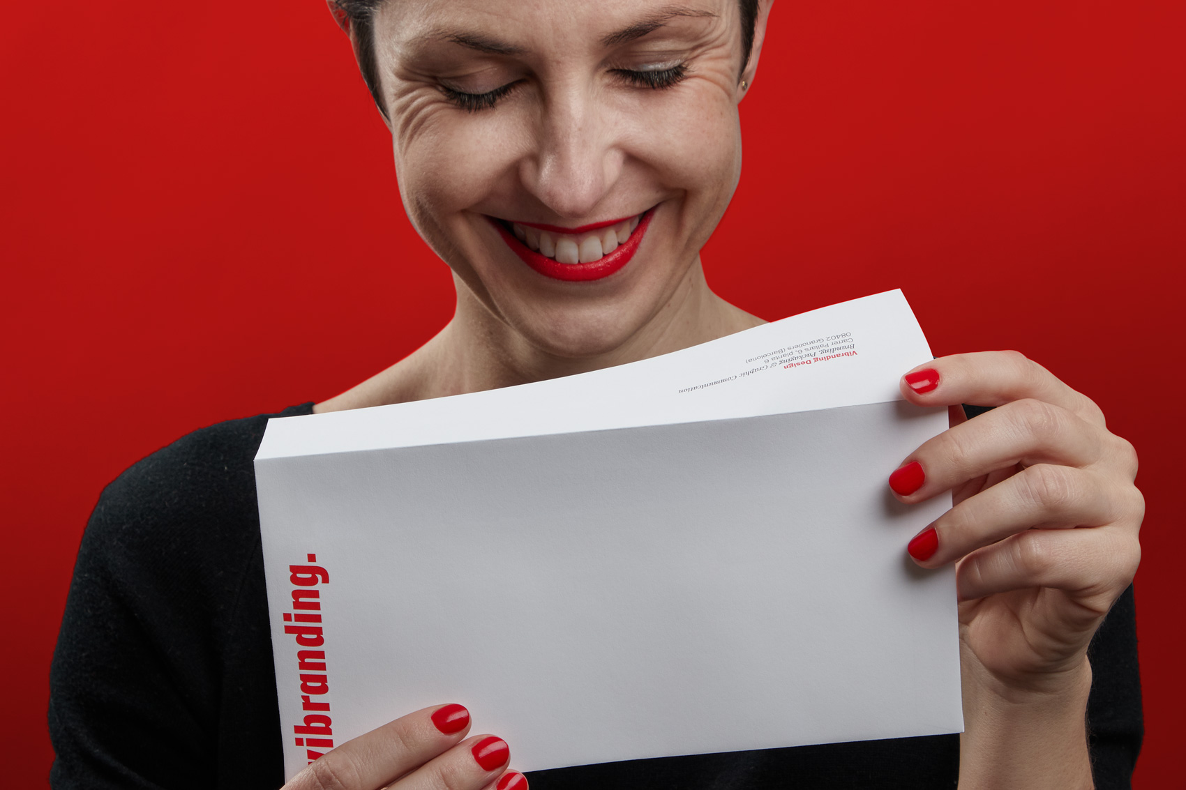
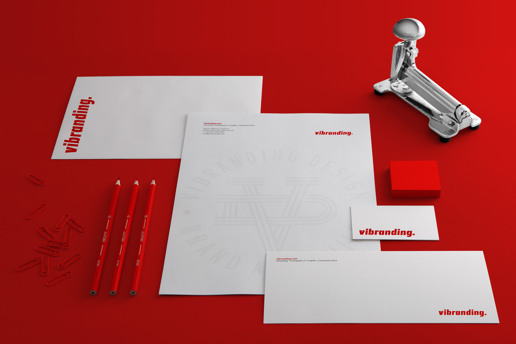
The cobbler’s children… — We are an agency that specialises in branding and corporate identity, but we had never our own comprehensive set of stationery. Not good… So we made the most of our new Design Director, Amador Garrell, a veteran in things graphic and asked him to “get us down on paper”. We needed something functional, simple, accessible and with quality.
Good stationery design is a branding classic. Perhaps not as much as yesteryear, but it still helps to afford brands consistency.
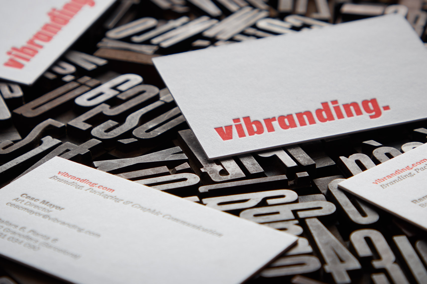
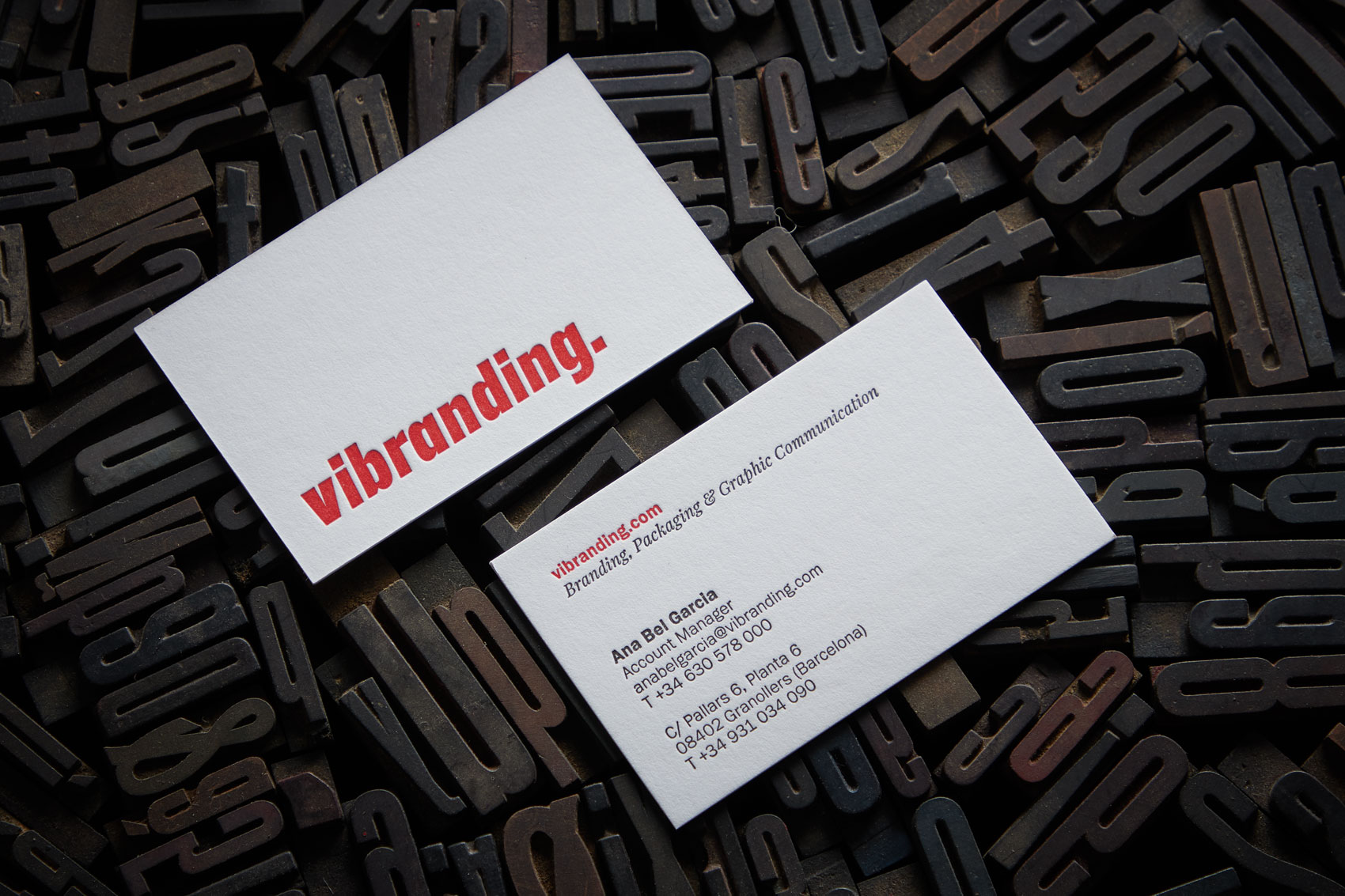
Letterpress — We wanted to make the most of the chance to print in typography. To this end, we decided to contact several workshops that specialise in letterpress in Barcelona. We ultimately chose L’Anacrònica. After a few tests on the paper chosen, a 600-gram Gmund Cotton, we agreed to design a couple of intermediate weights of our corporate typography, Franklin Gothic. Whichever way you look at it, this is a crazy undertaking for calling cards, but hey, sometimes we designers are a bit crazy and if no one steps in then our craziness runs riot.
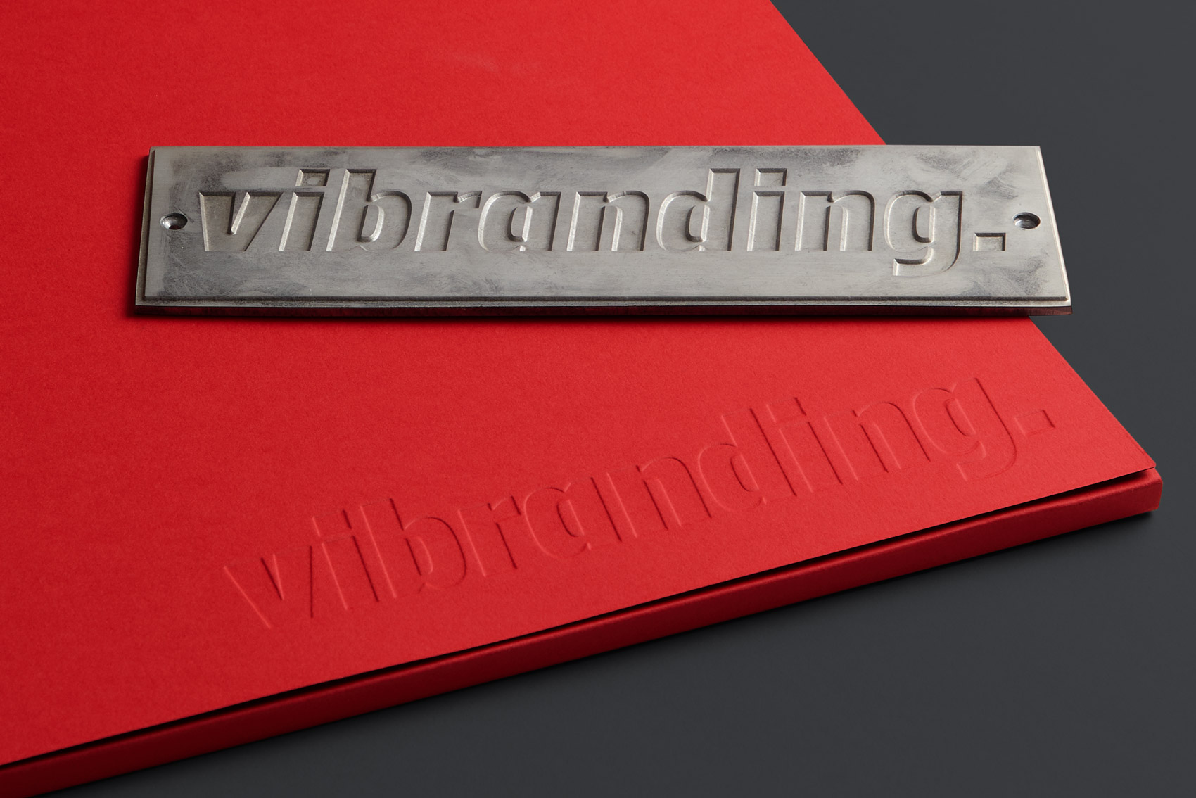
Packing paper — Another thing that gave us a major headache were the folders, particularly the A3-size ones. We like to do presentations in the traditional way. On paper. Always. Which is why we needed a functional and attractive corporate element, with presence. We designed the die-line to suit our needs, with a fair-sized spine. This time we went for a Colorplan Bright Red paper with a black inside, Ebony. This change of colour on the inside provided us with the ideal impact for certain occasions, but particularly with contrast. We decided not to use any ink and went for blind embossing on the inside, the same mould for the A3 and A4 formats. The truth is that delivering projects to our clients in these folders gives us immense pleasure.
More paper — For the remaining stationery applications we decided to plump for a classic, plain Conqueror. We really wanted to give our letter paper a special touch, so we designed a Vibranding monogram and printed it in black with a mirror effect on the other side. After a few tests at the printer’s we got just the intensity we wanted and achieved the watermark effect that come through on the front.
Parallel to the design and development of our stationery, we redesigned this brand-new web and applied the same criteria. As we always insist upon the need for brands to be consistent, we should practice what we preach. Now we are more consistent, we feel more comfortable and we are more Vibranding.
CREDIT
- Agency/Creative: Vibranding
- Article Title: Vibranding’s stationery
- Organisation/Entity: Agency, Published Commercial Design
- Project Type: Identity
- Agency/Creative Country: Spain
- Market Region: Europe
- Project Deliverables: Brand Identity, Branding, Graphic Design, Tone of Voice
- Industry: Information
- Keywords: stationery, printed, design, vibranding, branding


