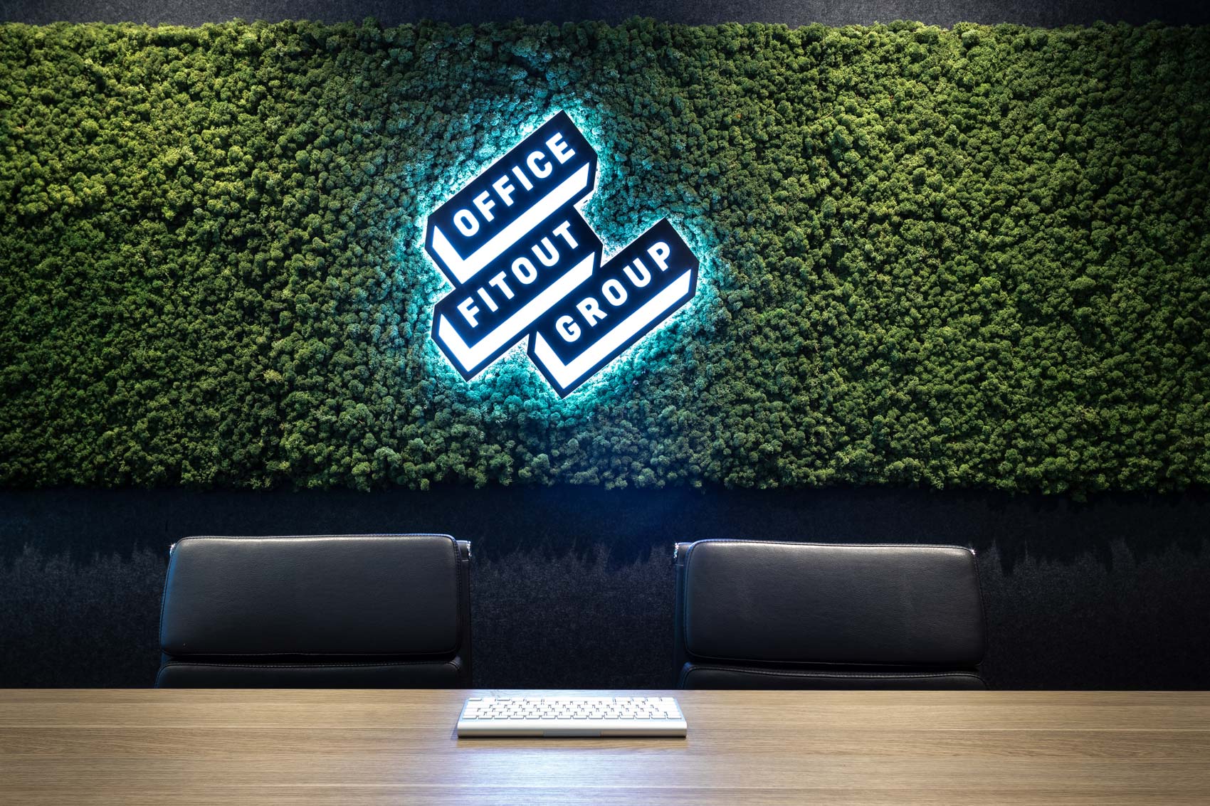
Monday’s here at last – In the centre of Sydney (Australia), there is a family business that specialises in intelligent interior design of offices and workspaces, a radically contemporary approach that promotes productivity and personal well-being through rational and humanistic design. The people who do this are Office Fitout Group. And they improve the workplace in different ways, using different tools: from ergonomic furniture to enhanced space distribution, involving serene decoration or the use of vegetation to create healthier settings.
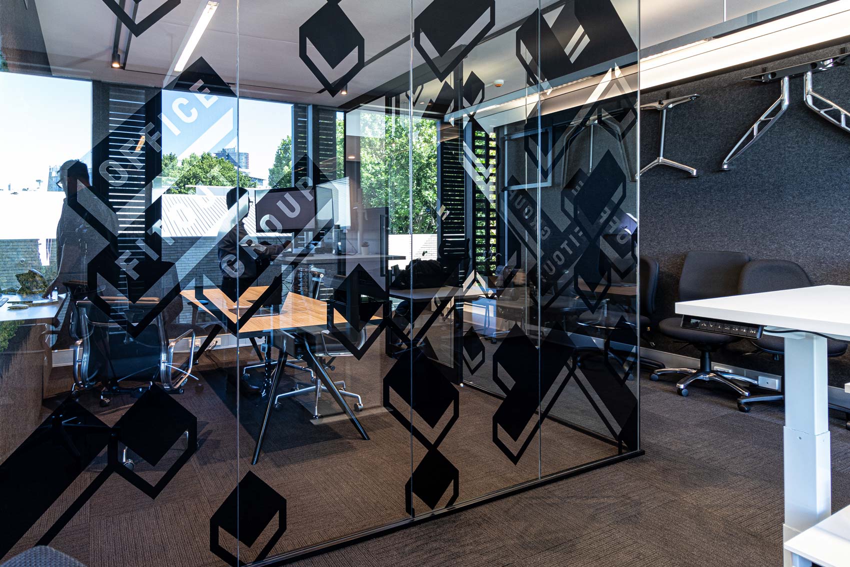
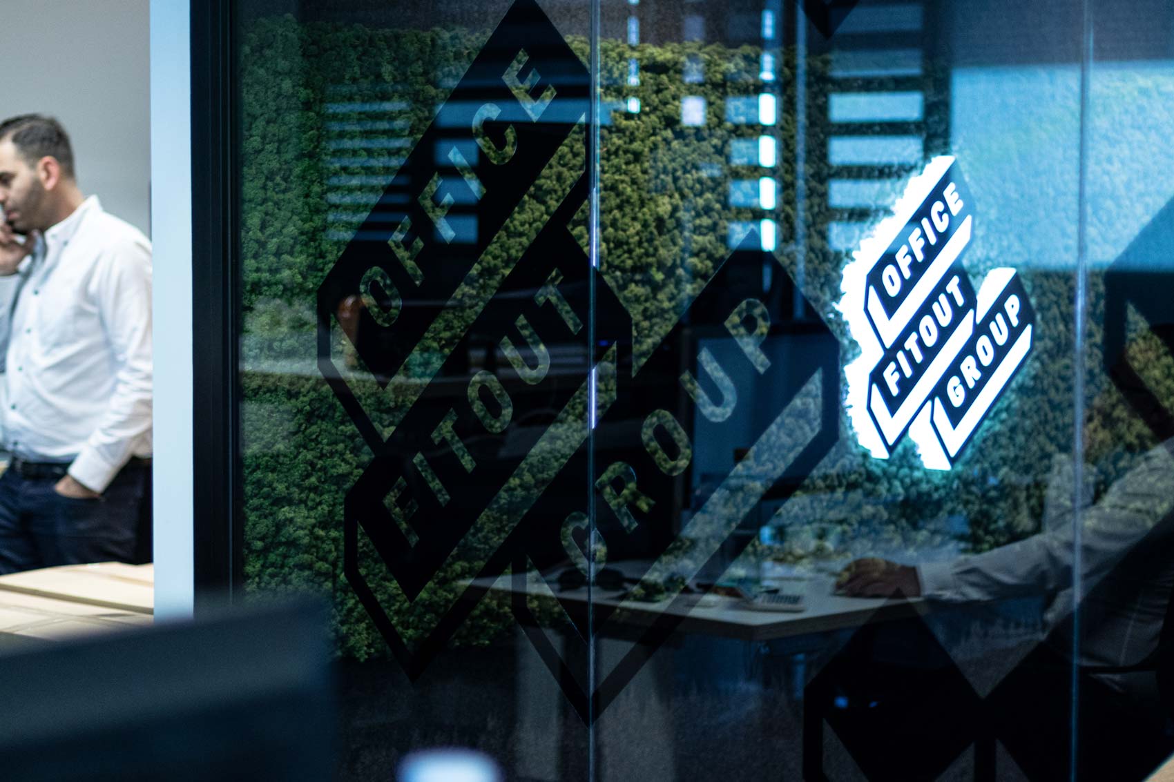
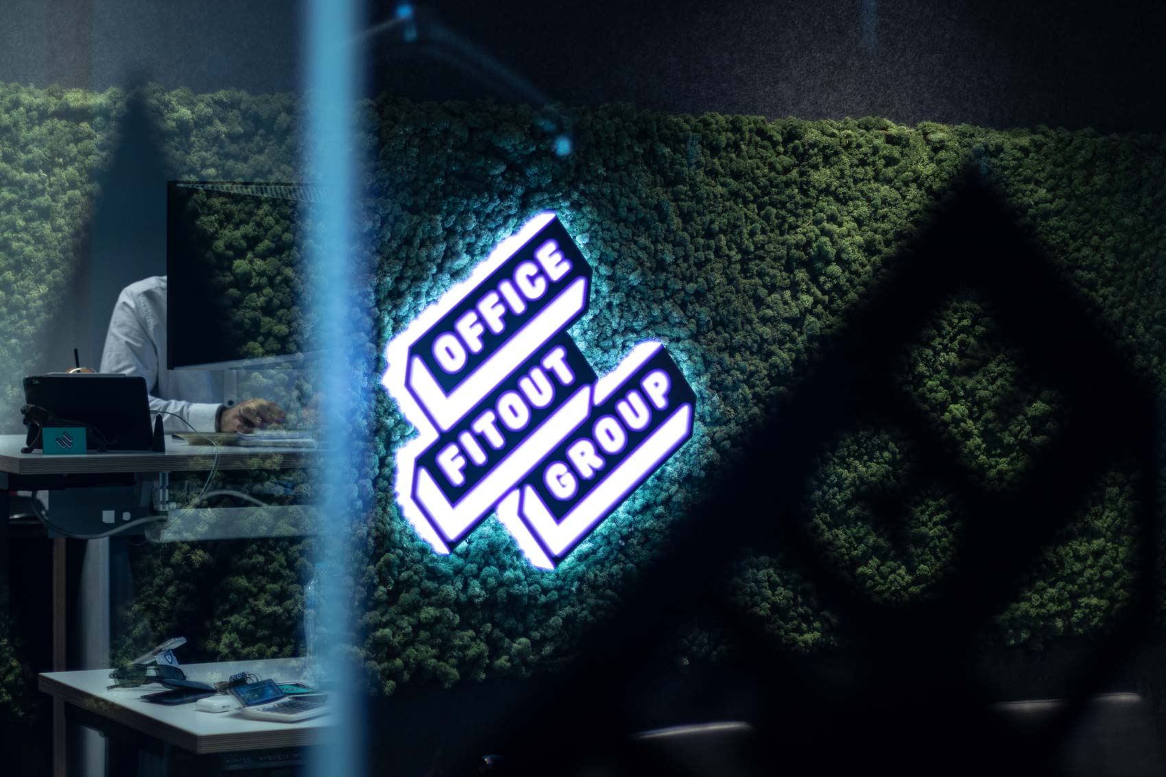
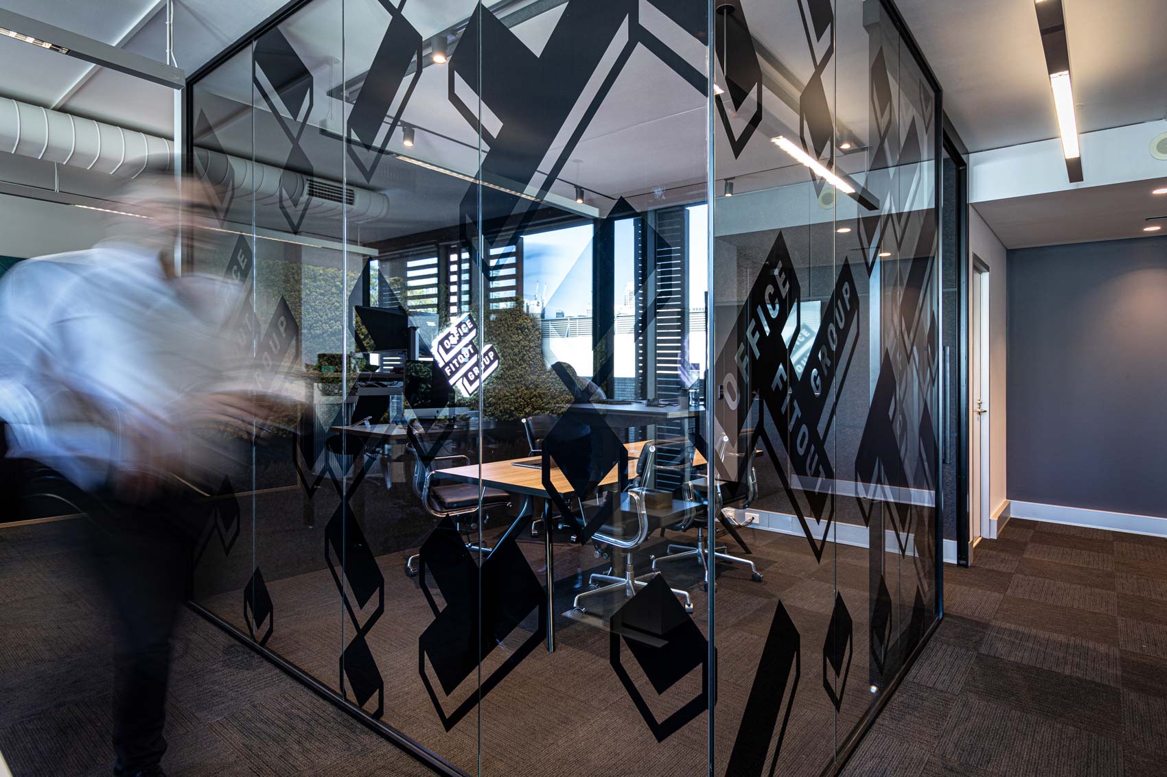
The signage and decoration of an office is branding too. Therefore, interior design companies should be acting as an example.
Big companies and enterprises are increasingly more concerned about their employees’ quality of life and happiness. Because motivation and comfort are closely linked to productivity. Creating healthy workplaces where workers feel comfortable is infinitely more profitable than shutting them in cubicles.
Office Fitout Group takes care of everything related to preparing an office: demolition, planning, engineering, design, manufacture or choice of furniture…
Office Fitout Group signage web design Vibranding brand branding corporate identity logotype
Beyond feng shui – They offer a highly technical service. Therefore, it was not a matter of creating a visual identity of mystical references, but quite the opposite, actually. They seek consolidation as a modern brand with refreshing ideas and a rational methodology. The position they pursue on the market is one of a company that delivers practical solutions for the 21st Century’s large offices.
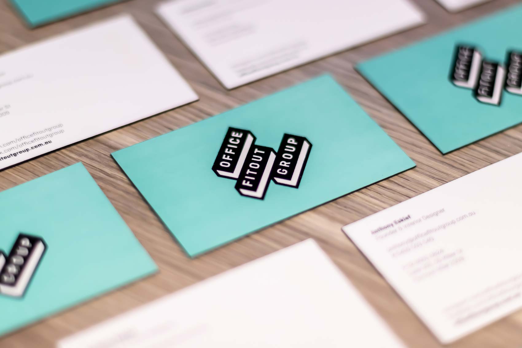
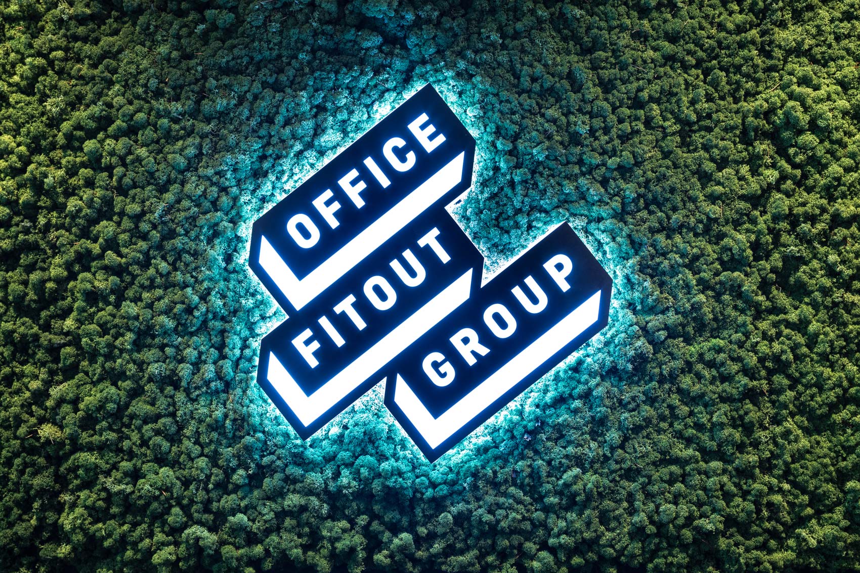
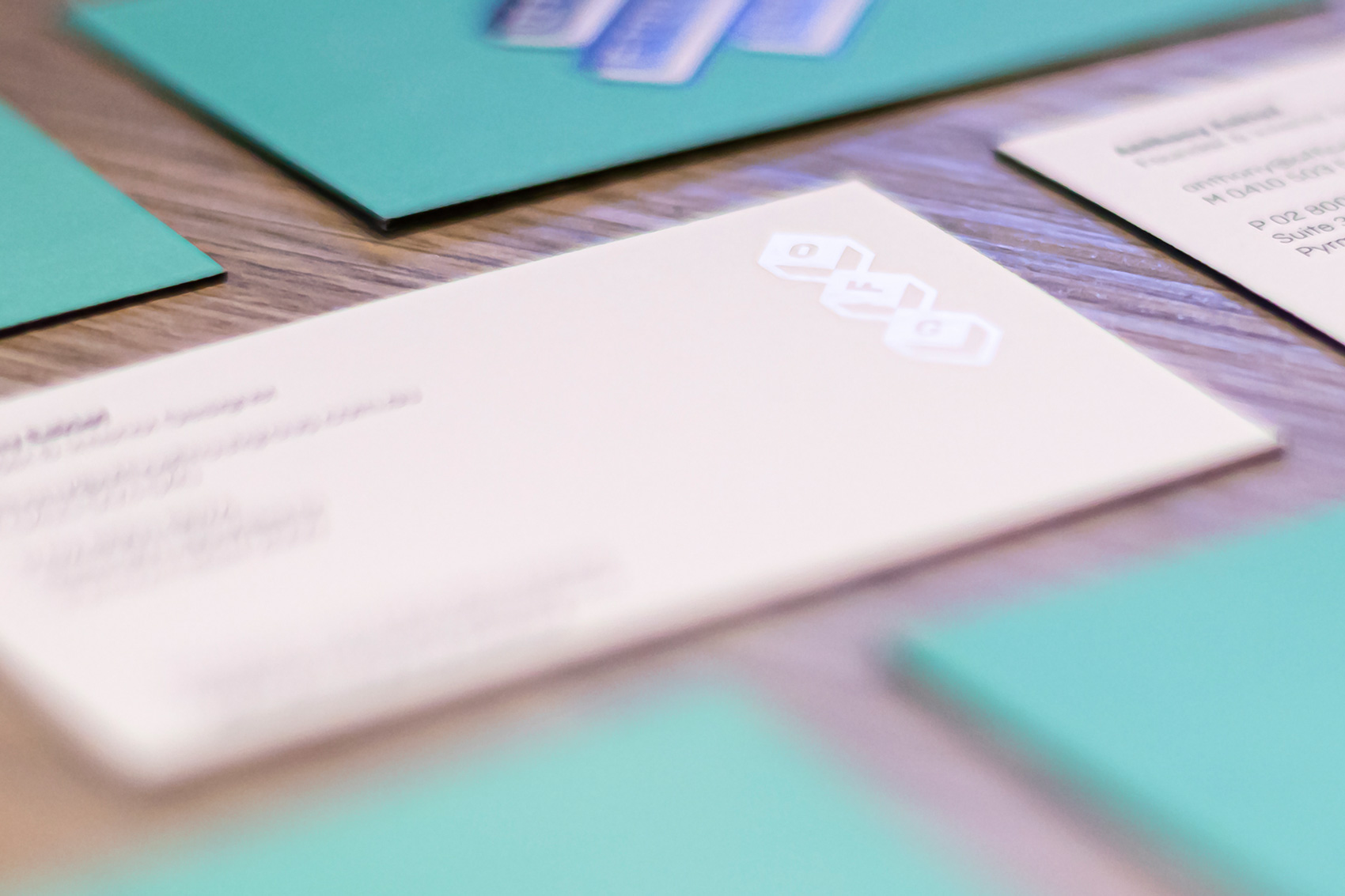
Our proposal begins with a logotype based on rectangular 3D structures that resemble desks. We chose a bare-bones and minimalist style for these forms. The blocks bear the logotype come in three pieces that can be combined to get rid of the sensation of stifling rigidity, something that many companies ask Office Fitout Group to do when they commission it to design their workspace. We love modular branding.
We are committed to simplicity and to the elimination of visual clutter to prevent the message from evaporating: sans serif typography and a whole lot of air in the composition of the elements.
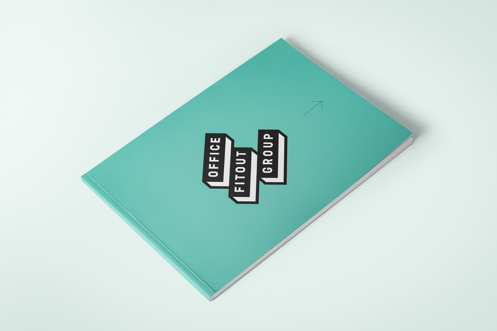
And to get away from the formal and staid blue colour they used to have, a very vivid turquoise hue that conveys entirely the opposite of boredom, but without being strident. Combined with black and white, it ultimately delivers the sobriety and the serenity needed for a company that is going to disembowel its offices.
The field of play – Office Fitout Group’s marketing strategy focuses mainly on the digital setting. For this purpose, its website has been designed with the same terms in mind, making sure not to overwhelm its users with content. The relaxing turquoise colour is conducive to this. Moreover, for the social media we created corporate identity elements that help to convey the brand values and ensure that they are a stand-out. Internet is a fast world. We want to convince our users quickly, make sure that they recall the brand and its attributes and realise that its identity is aligned with their concerns and lifestyle. And to make sure that all of this convinces them of the need to work in pleasurable and modern environments, this visual identity.

CREDIT
- Agency/Creative: Vibranding
- Article Title: Vibranding designs new logotype for Office Fitout Group
- Organisation/Entity: Agency, Published Commercial Design
- Project Type: Identity
- Agency/Creative Country: Spain
- Market Region: Oceania
- Project Deliverables: Brand Guidelines, Brand Identity, Brand World, Branding
- Industry: Construction
- Keywords: logotype, vibranding, australia, office fitout group, interior design, design


