


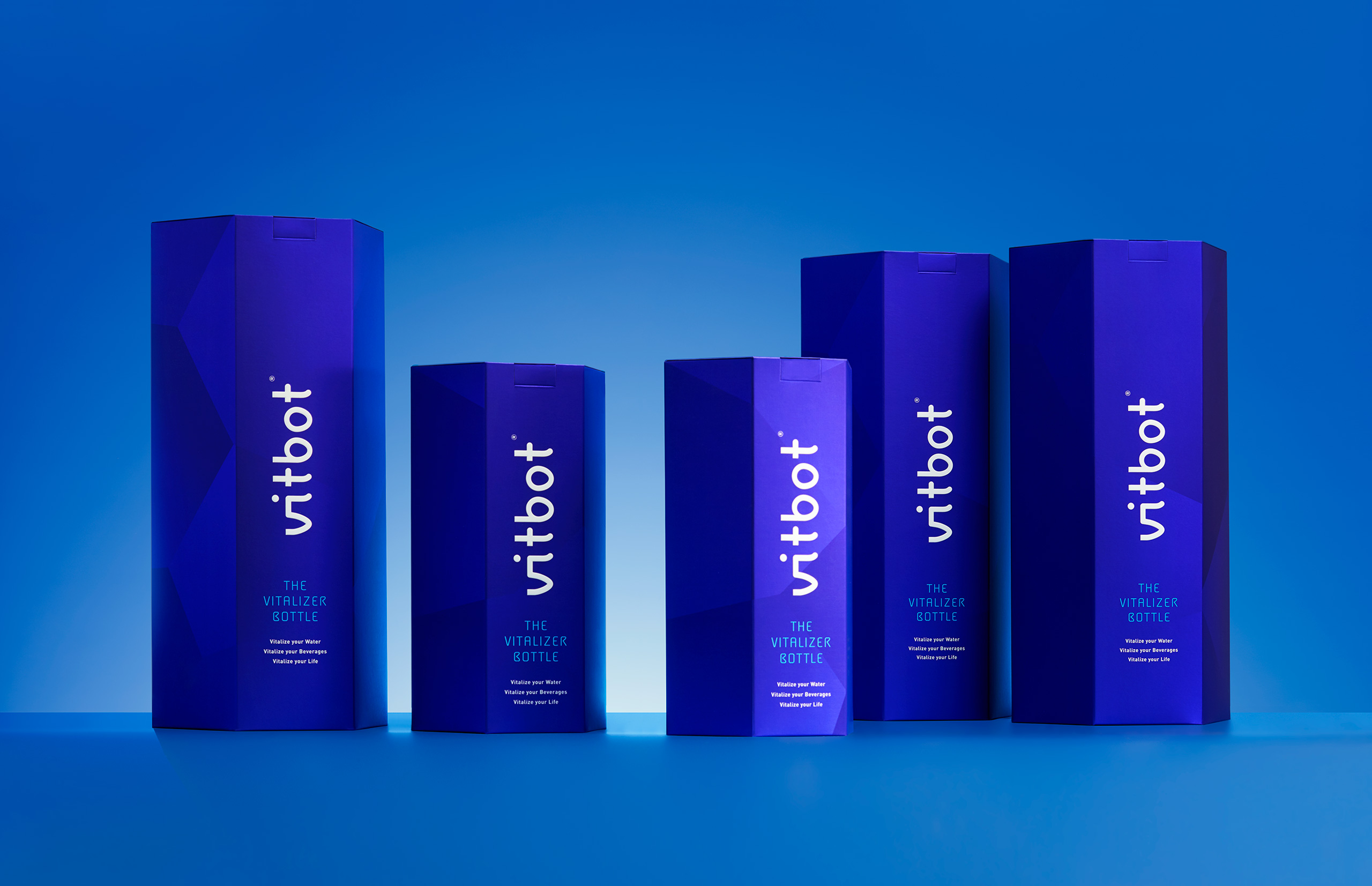
The essence of this product is its shape: an ovoid reusable bottle which vitalizes the liquids it contains. We made a comprehensive branding job to unify the brand’s form.
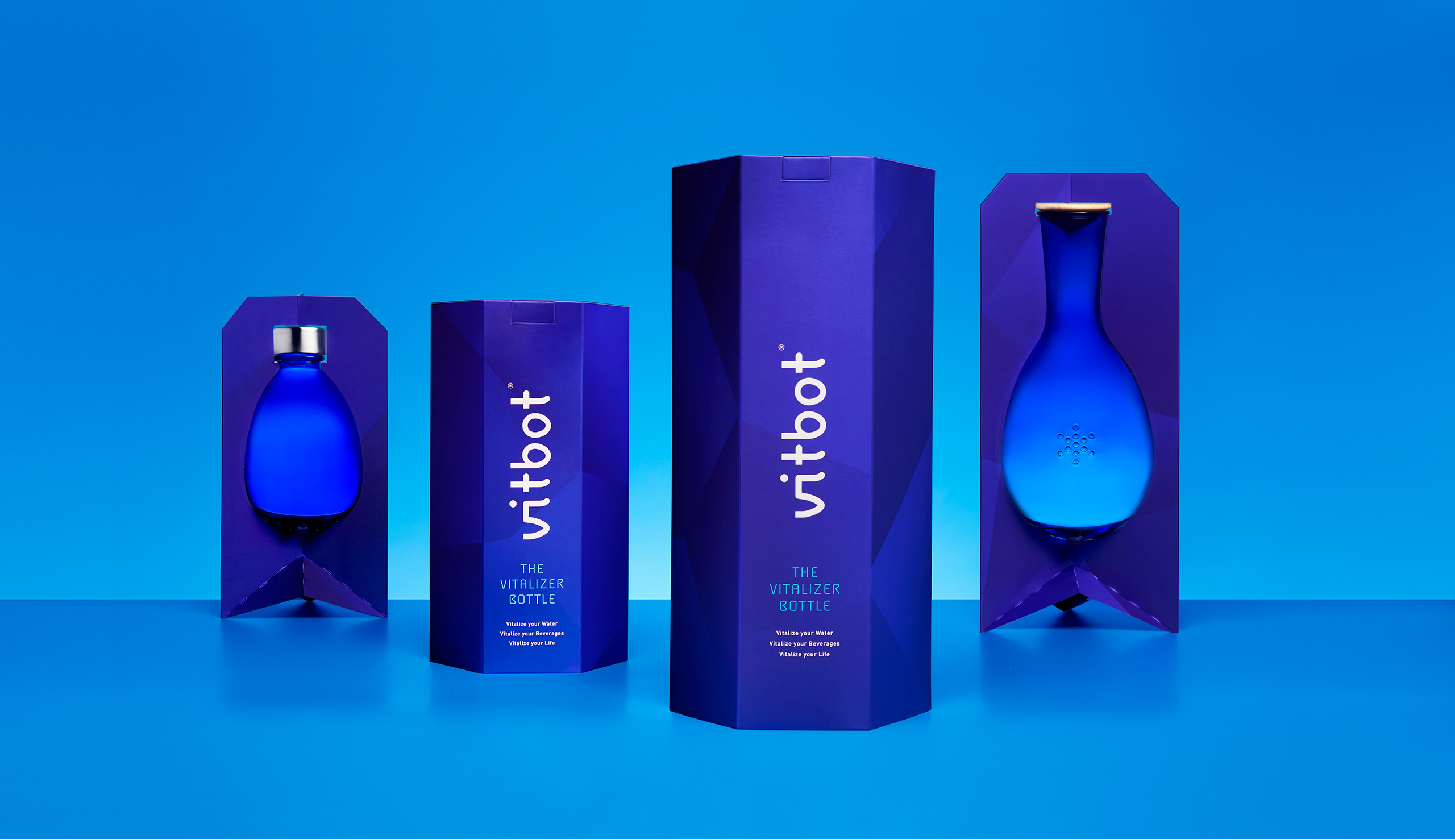
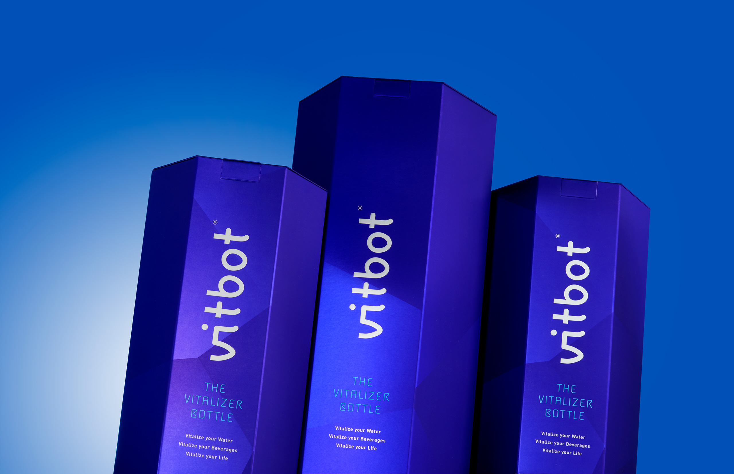
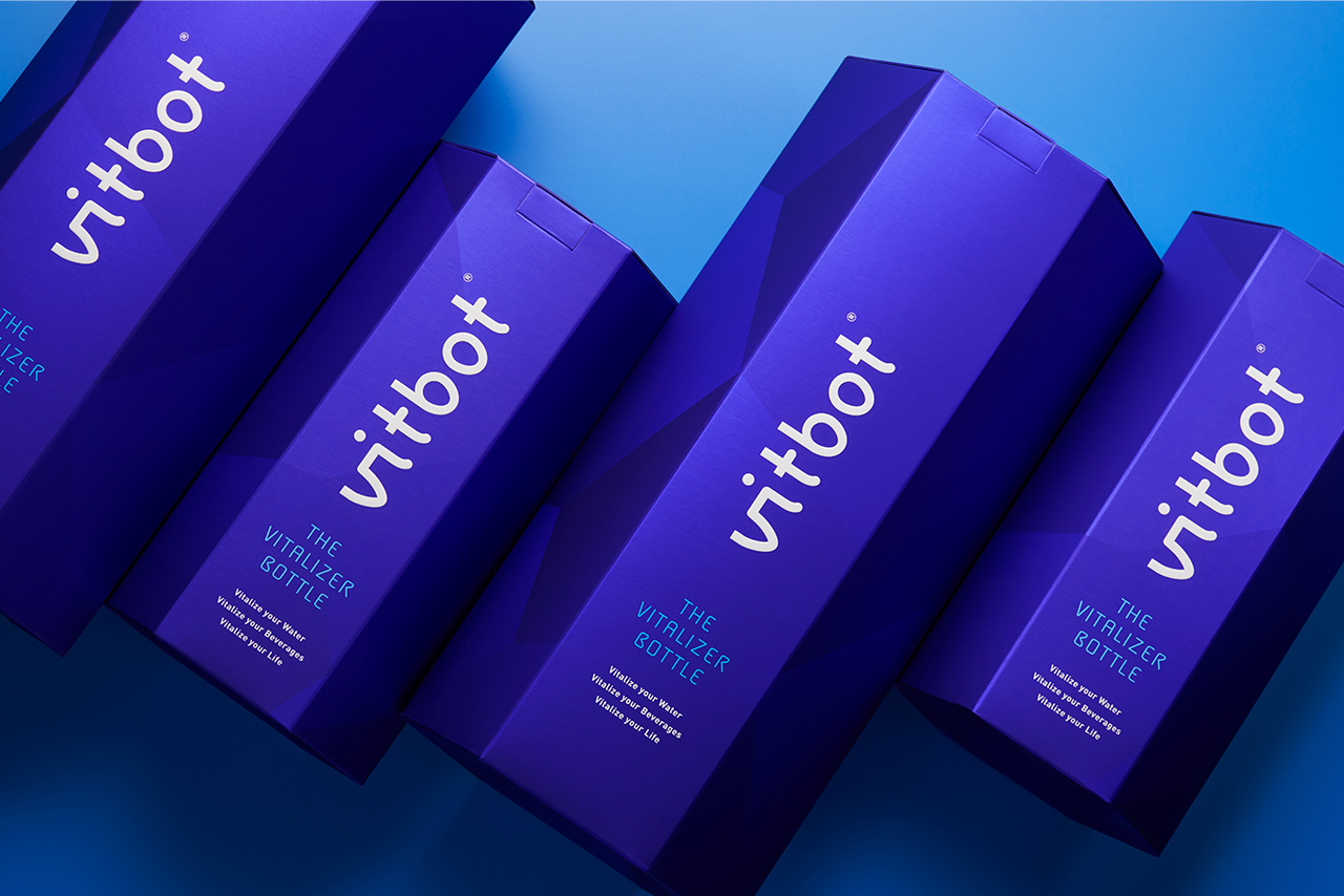
There is no brand that vitalizes water as well as looking good. Vitbot, with its design, the characteristics of its bottles and product variants, could indeed offer just that. Such uniqueness had to be conveyed in the packaging. We wanted the bottle to take centre stage. That’s why the bottle is held up on a base inside as well as outside the box. On a silver polyester we print a white ink gradient, a direct ink and a soft-touch effect. The finishes have a silky touch, the colours evoke the various tones of water at different depths and the overall result is that of an elegant and stylish product that also vitalizes water so that its molecules recover their original hexagonal structure. Form and function in perfect harmony.
CREDIT
- Agency/Creative: Vibranding
- Article Title: Vibranding designs a packaging for a reusable bottle
- Organisation/Entity: Agency, Published Commercial Design
- Project Type: Packaging
- Agency/Creative Country: Spain
- Market Region: Multiple Regions
- Project Deliverables: Brand Advertising, Brand Identity, Brand Refinement, Brand Strategy, Brand World, Branding, Graphic Design, Packaging Design, Photography, Product Architecture
- Format: Bottle
- Substrate: Glass Bottle


