


Setting — New South Wales, on the southern coast of Australia, has a long-standing aquaculture tradition. It is comprised mostly of oyster farms that are usually family concerns that produce a high-quality product that barely makes it beyond the confines of the local or tourist markets. Most of these bivalve farms do not have their own marketing department with the capacity to forge lasting relationships with major purchasers and therefore reach the entire Australian market. Or to put it another way: they need to publicise their quality products beyond their immediate environment.
Blue Harvest is an Australian marketing agency specialized in seafood that has taken on the role of introducing local producers to supermarket chains and mass consumption distributors. To do so, it creates clusters of aquafarmers with the same profile and thus be able to offer their products with a consistent and persuasive sales strategy.
You know that first impressions are lasting impressions. And when this is related to a brand it should convey, clearly and reliably, what the brand offers.
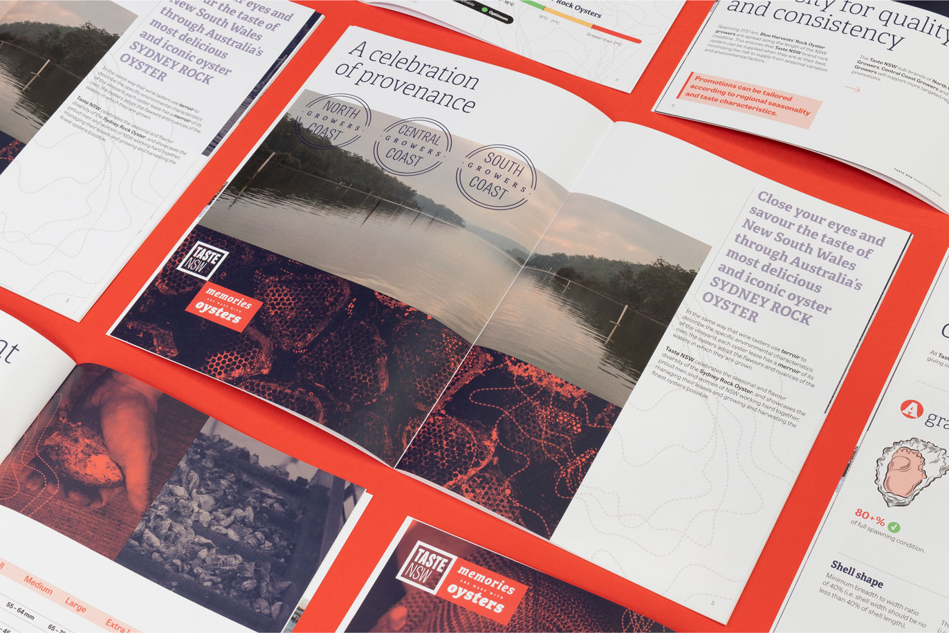
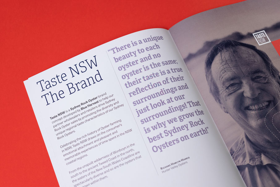
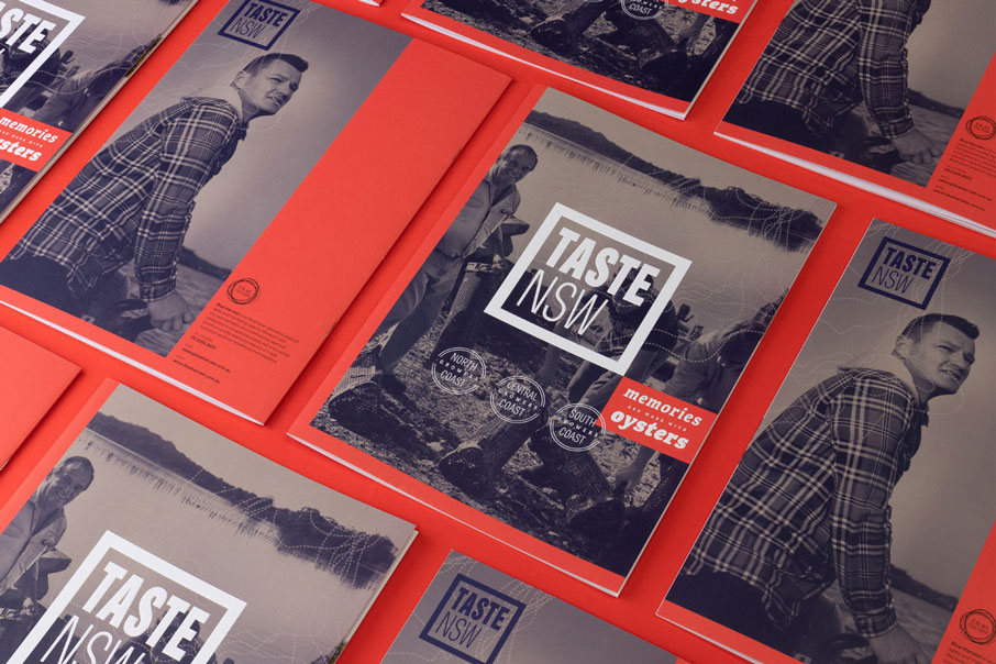
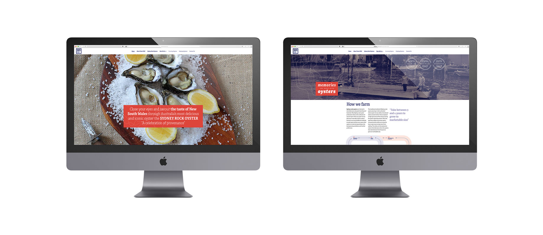
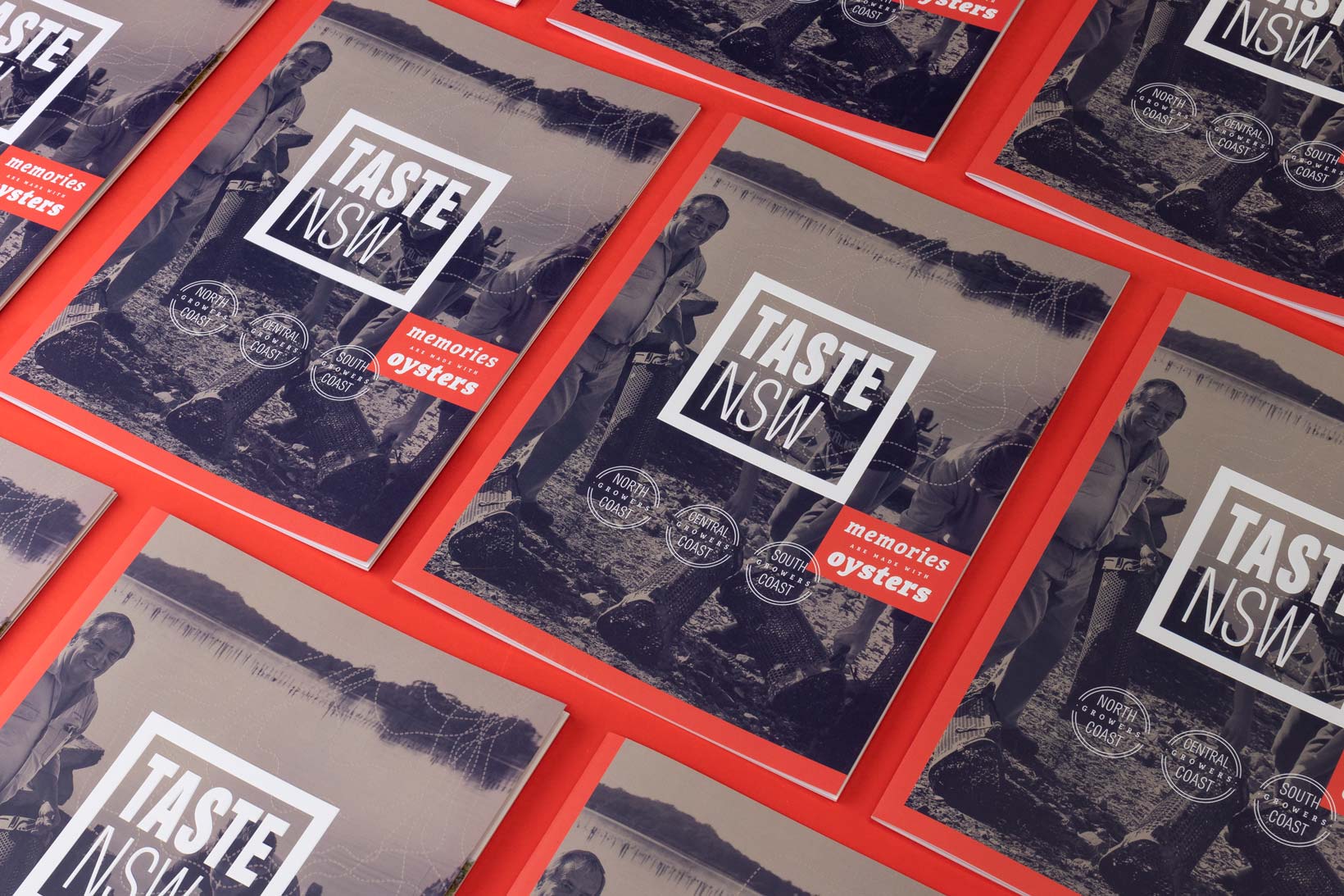
Oysters! — The star product of New South Wales is saccostrea glomerata, popularly known as the Sidney Rock Oyster, a genuine native Australian product also regarded by many as one of the world’s best oysters. In order to achieve this, Blue Harvest created an umbrella brand, Taste NSW, whose branding we take care of.
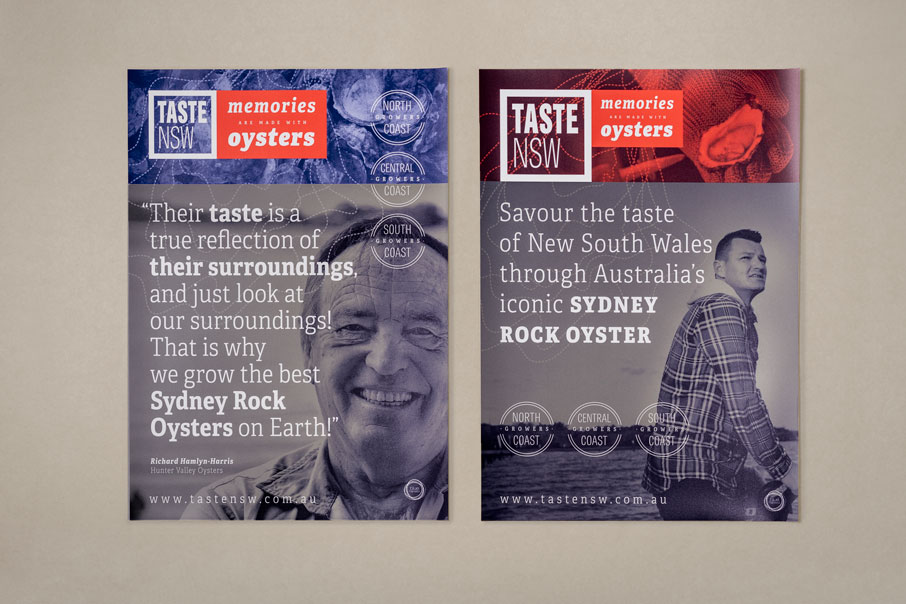
Attributes — The client proposed that we work with the tagline “Memories are made of oysters” (everyone recalls having visited New South Wales and eating oysters in the self-same farm that produces them). We used this to roll out a graphic identity based on concepts such as taste, territory, tradition, authenticity and premium nature.
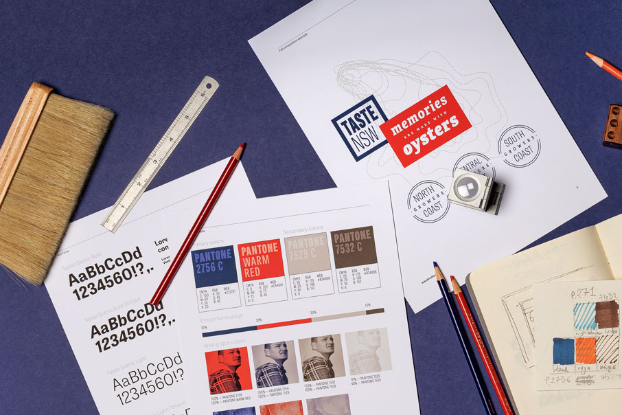
The logotype highlights the words “Taste”, and the imagotype that complements it consists of the drawing of an oyster whose broken lines also make it look like a map. Product and source are visually united. Both elements are combined in different ways, depending on what we want to emphasise in each communication or medium: the product or its attributes; the logo or the tagline.
The corporate colour palette combines a striking and modern-looking red, a deep navy blue and (for photos) tones between sepia and bistre reminiscent of the oyster shell. It is a combination of contrasts. On the one hand, bold and vivid colours; on the other, photos that seem to have been taken from old newspapers. Tradition and modernity. A branding work to share the reality of an unprocessed artisanal product produced in a natural setting with everyone.
Media — The graphic identity of Taste NSW is being applied to its product catalogue, the cluster’s visual website, posters for public communication, point of sale material (stoppers, stand displays, stickers…) and, in the not too distant future, we will also be seeing it in new communication media.

CREDIT
- Agency/Creative: Vibranding
- Article Title: Vibranding designs a logotype for oysters manufacturers Taste NSW
- Organisation/Entity: Agency, Published Commercial Design
- Project Type: Identity
- Agency/Creative Country: Spain
- Market Region: Oceania
- Project Deliverables: Brand Advertising, Brand Architecture, Brand Guidelines, Brand Identity, Branding, Graphic Design, Identity System, Research
- Industry: Food/Beverage
- Keywords: australia, oysters, melbourne, design, branding, brand identity, vibranding, taste nsw


