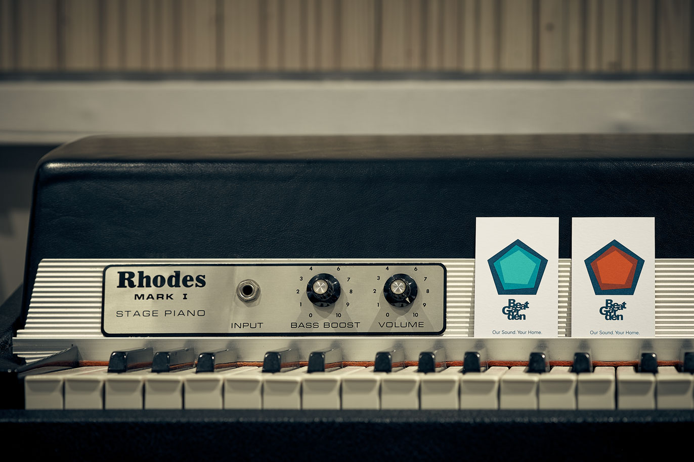
Once upon a time, there was a music producer who had the chance to expand his business and to buy a historic recording studio in Barcelona to take this major step. Up until then, Pau Romero had done all his production work in a small rented studio inside another studio. The growth opportunity also required him to develop his brand. He and his partner, Jordi Solans, did not hesitate. The first step was to improve their image to consolidate their identity.
There is not much difference between music and graphic design. It is a question of composing harmoniously to tell a story, albeit with different tools.
Support your local bands — For the creative development of Beat Garden’s logotype (the commission), we focused on two reference points: the Scandinavian design (what the customer wanted) and the typographic compositions of musicals from the nineteen-fifties (our contribution). All of it wrapped up in a pop culture aesthetic. Because besides musical production for bands, Beat Garden also provides post-production audio services for documentaries, films and advertising. The moodboard we came up with fused music, audiovisuals and design.
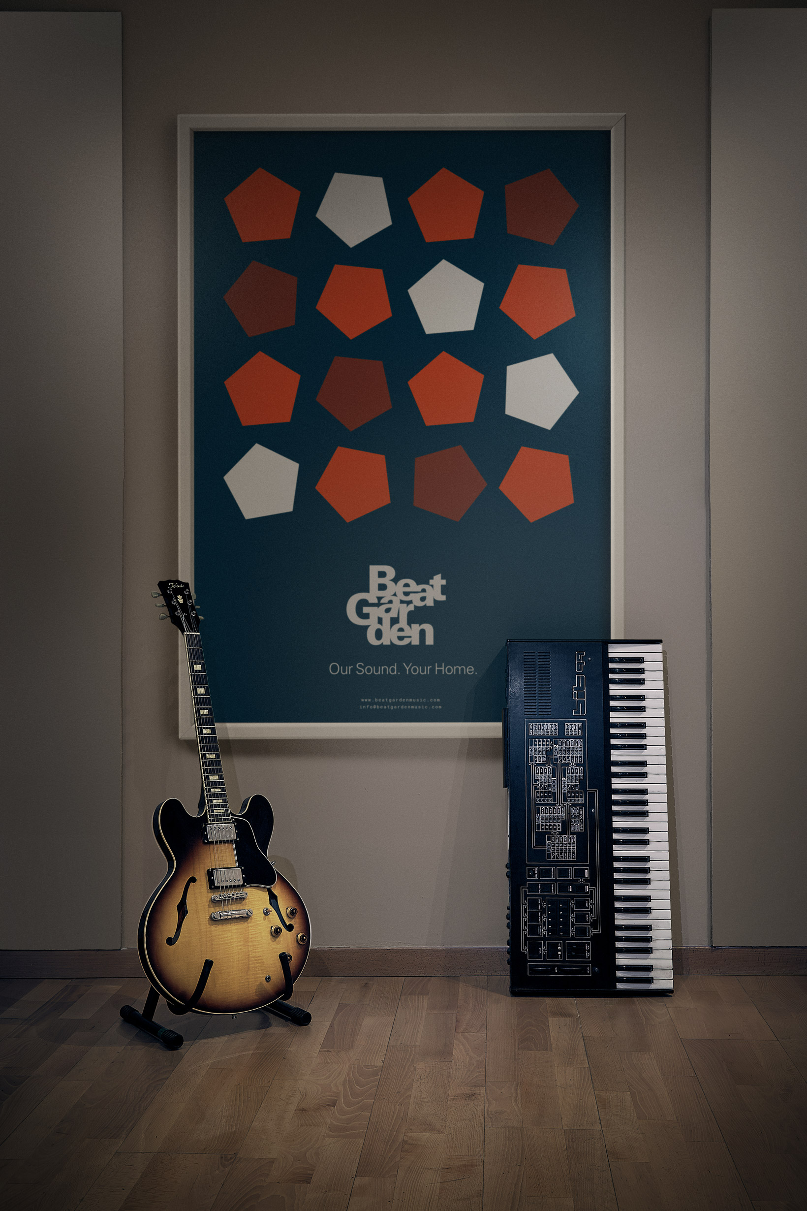
In the briefing, one of the key points to consider was Beat Garden’s familiar way of doing things. All projects are addressed in a very close and intense fashion. “We want our customers to feel at home”, they told us. As part of the creative process, we came up with a phrase that helped us to summarize this spirit and which also gave us a visual roadmap: Our Sound, Your Home. It was only intended as a guide, a creative point of support; but when we showed it to Pau and Jordi they liked it so much that it eventually became their tagline and a full part of the brand.
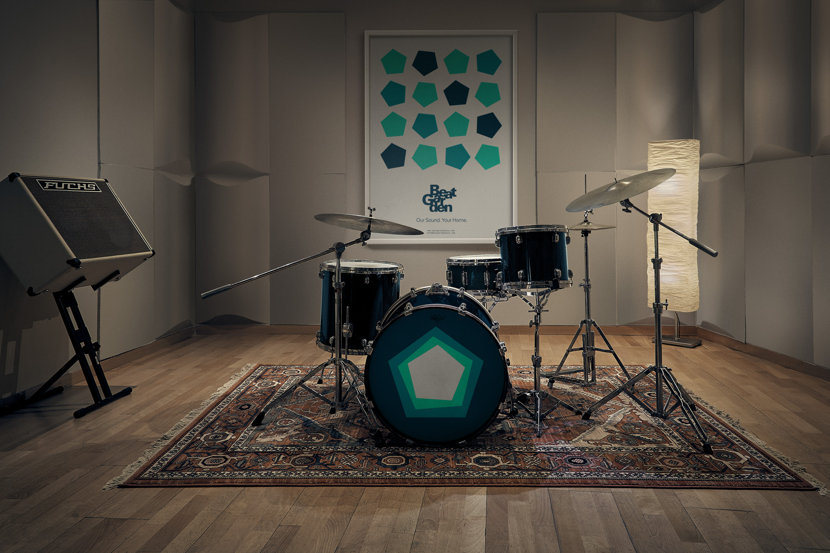
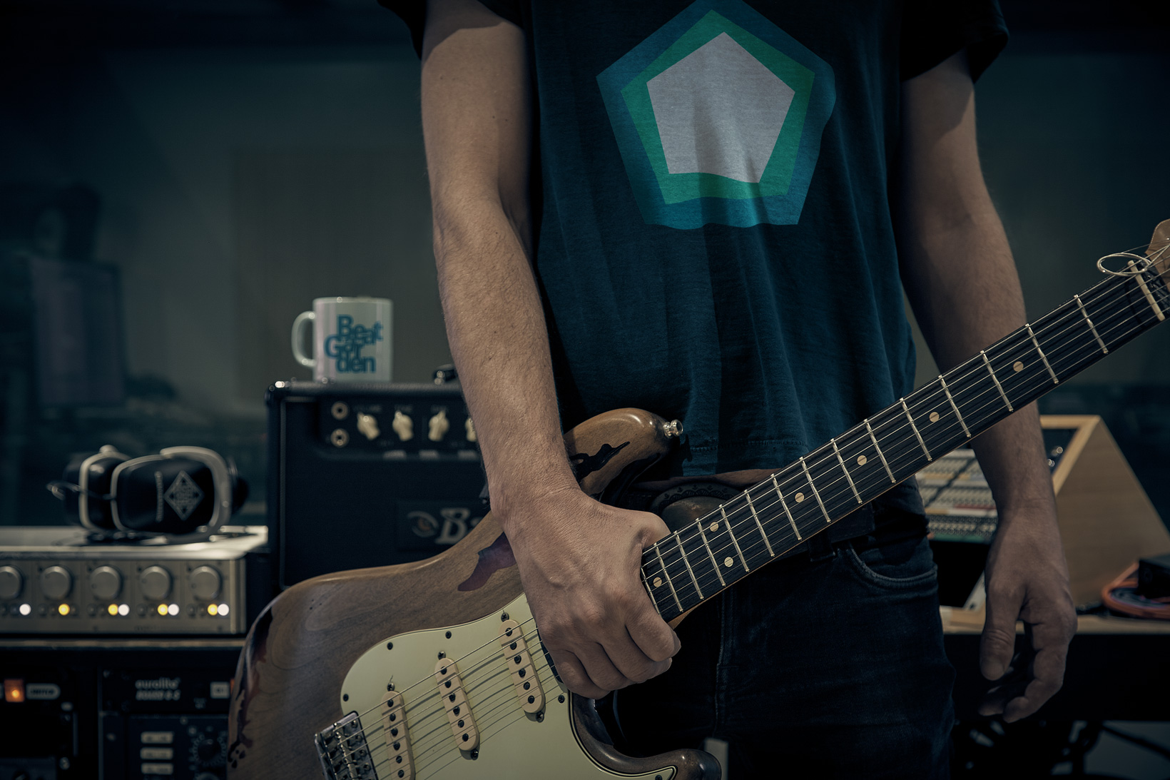
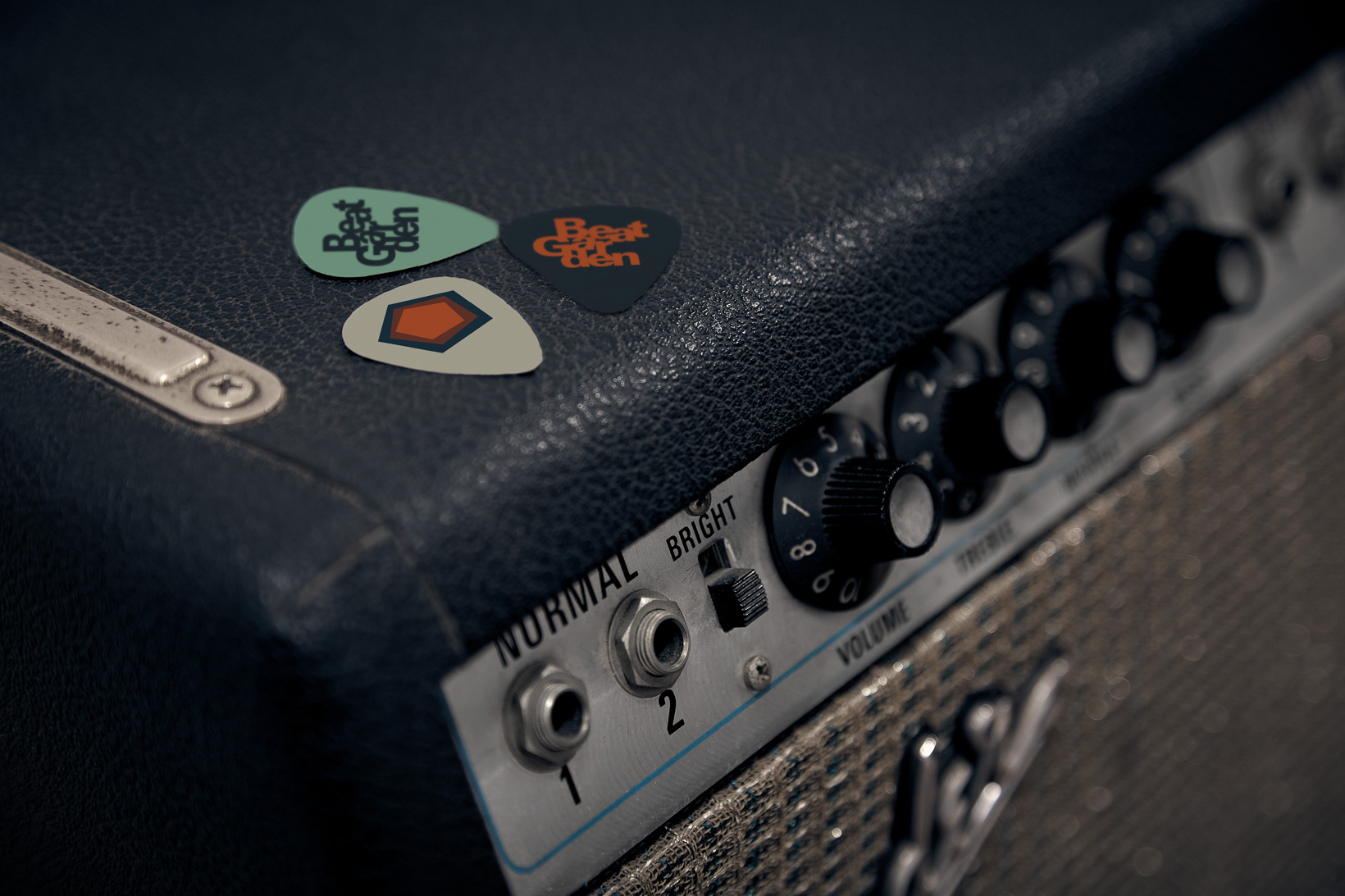
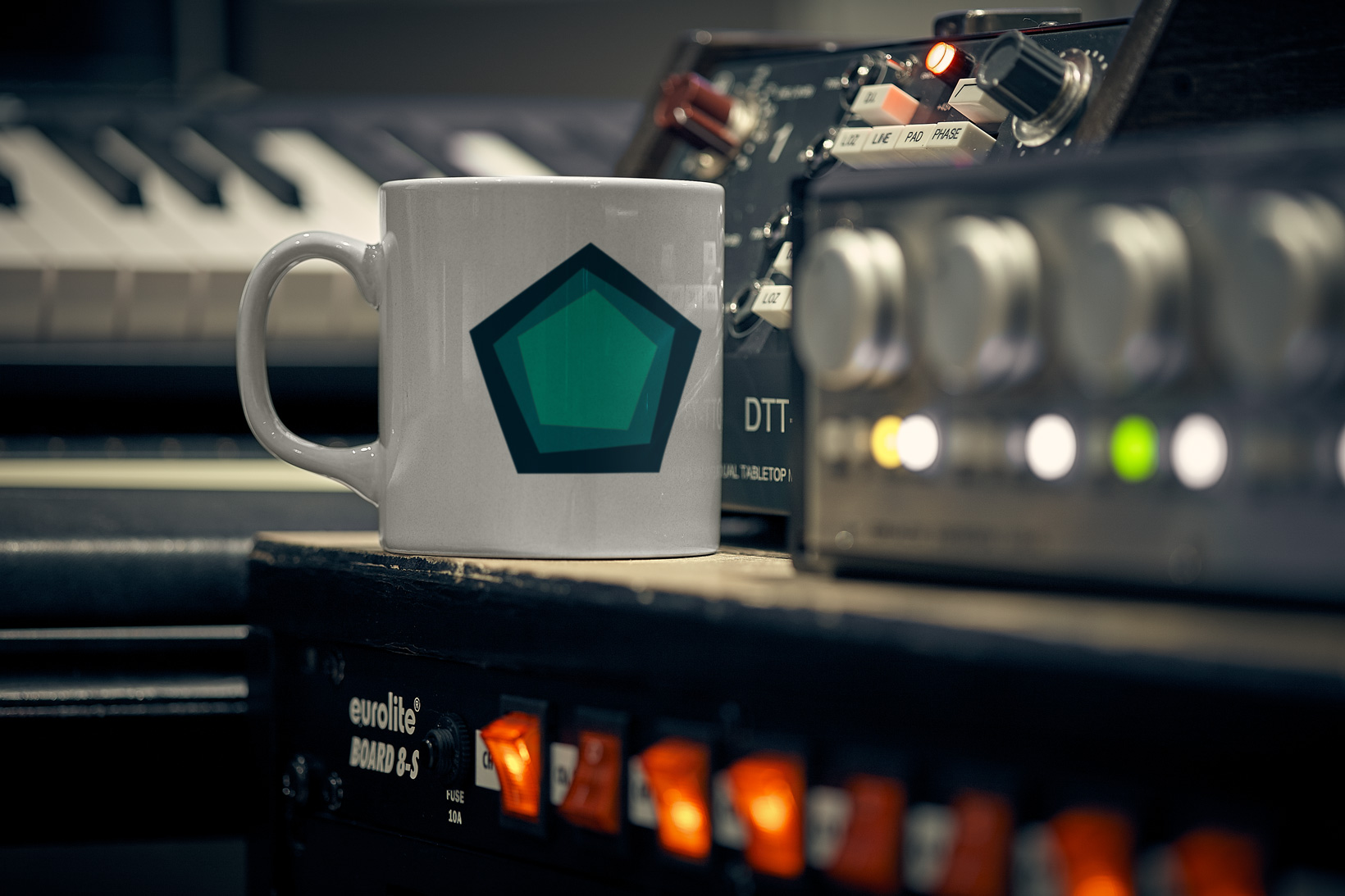
The pentagon — Almost from the outset (possibly driven by the need to be as Scandinavian as possible and for Alvar Aalto and Arne Jacobsen to deem us worthy of their Olympus), we were convinced that we had to work with a pentagon as an isotope. Its shape reminded us of a house. And music is written on a staff (five lines), so there was a connection there. The first pentagons of the early sketches were simple outlines.
We gradually honed the idea of plain-coloured concentric pentagons that broke away from the two-dimensionality of simple geometric forms, affording it rhythm and depth. The uneven layout of the different pentagons ultimately led the overall design to vibrate with great intensity. The colour combinations reinforced these “vibes”. This was cool.
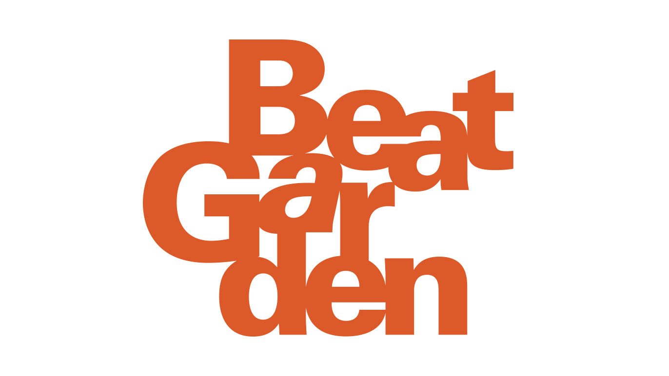
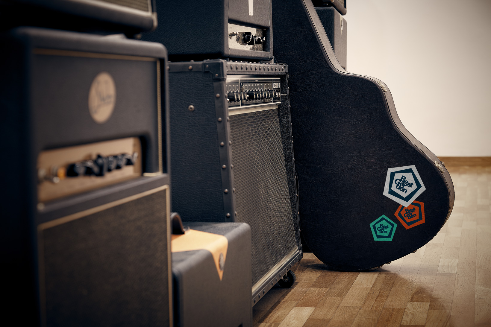
Morphology — Beat Garden’s logotype was a tough nut to crack. In the first place, Beat Garden is a long word. Yes, you heard right: a word. As far as Pau and Jordi are concerned, BeatGarden is a single word. However, in all the tests we did with one word, the logotype proved to be too horizontal. And if we put the two words on different lines we lost the single-word sensation. In some cases, it was even as if we were designing the logotype of a garden called Beat. In a word (or two), not cool. We were stuck.
The solution we eventually hit upon was the result of a simple idea: “What about splitting the syllables? Syllables are phonemes. Phonemes are the minimum units of vocal sound or meaning. Phonemes are the notes of linguistics”. Eureka! This allowed us to maintain the visual appearance of a single word (with an evident syllabic separation) which, moreover, was spelt correctly (because when all is said and done, Beat Garden is two words). Moreover, this gave us visually homogeneous graphic blocks, making the typographical composition a lot easier.
A couple of fonts — We chose a Univers Black for the logotype, a grotesque typography that provides rigour and objectivity. Although it is true that the question of closeness and familiarity was important, and that creativity is like an engine humming away like studio background noise, neither could we forget that the work done by Pau and Jordi at Beat Garden is very precise and that both of them are very methodical. Which explains the Univers.
Also because it afforded musicality to the logotype without losing a certain austerity. Stepping up the rhythm gave us a powerful contrast: dynamism and musicality in a highly stable composition. The large whites provided by the counter-forms make it easy to read and a lively typographic ensemble, while the italicised A on the inside roughs it all up a bit. Great.
Moreover, this family’s extensive variety of weights proved to be very useful for the tagline, constructed with a Univers Light with the same characteristics as its big sister, with added – and typically Nordic – refinement and tidiness. All of this, naturally, in a totally harmonious typographic system.
Finally, we chose a Roboto Mono for the remaining corporate texts (names, positions, addresses, telephone numbers, stationery, website…). This free font is easy to use and boasts retro-technological characteristics that enabled us to consolidate the idea that Beat Garden is your home, and a tidy one at that, where meticulous sound engineering rules.
CREDIT
- Agency/Creative: Vibranding
- Article Title: Vibranding designs a logotype for a recording studio in Barcelona
- Organisation/Entity: Agency, Published Commercial Design
- Project Type: Identity
- Agency/Creative Country: Spain
- Market Region: Europe
- Project Deliverables: Brand Architecture, Brand Creation, Brand Identity, Brand Strategy, Brand World, Branding, Graphic Design, Identity System
- Industry: Entertainment
- Keywords: recording studio, design, branding, brand identity, design, beat garden, vibranding, logotype, merchandising


