


Vero was brought to life in Belfast, Northern Ireland, as a build-your-own bowl restaurant with a mission to create feel-good food. Vero is a fast-casual concept with a difference: providing nourishing food without sacrificing flavour, with convenience in mind. Partnering with Crown Creative, a hospitality specialist design agency based in the heart of Belfast, Vero set out to change the lunch break game.
Built on a love for whole foods prepared with a verve for great taste, a range of grains, greens, proteins, roasted root veggies, and sauces allow for endless combinations to build your bowl. The scope of choice allows the individual’s taste to create a fresh experience with every visit or create a reliable go-to that is true to self.
Owner Andrew Maxwell’s experience as a professional rugby player gave way to enthusiasm for hearty, healthy food. Vero means ‘true’, and the ‘True Food’ tagline explains the inspiration behind the name while stating a commitment to everyone who eats at Vero. The mission behind Vero happens to redefine stereotypes; serving healthy food that isn’t a salad as a takeaway that doesn’t take you on a guilt trip. Vero holistically aligns with the ethos of their mission through the quality of the food they serve.
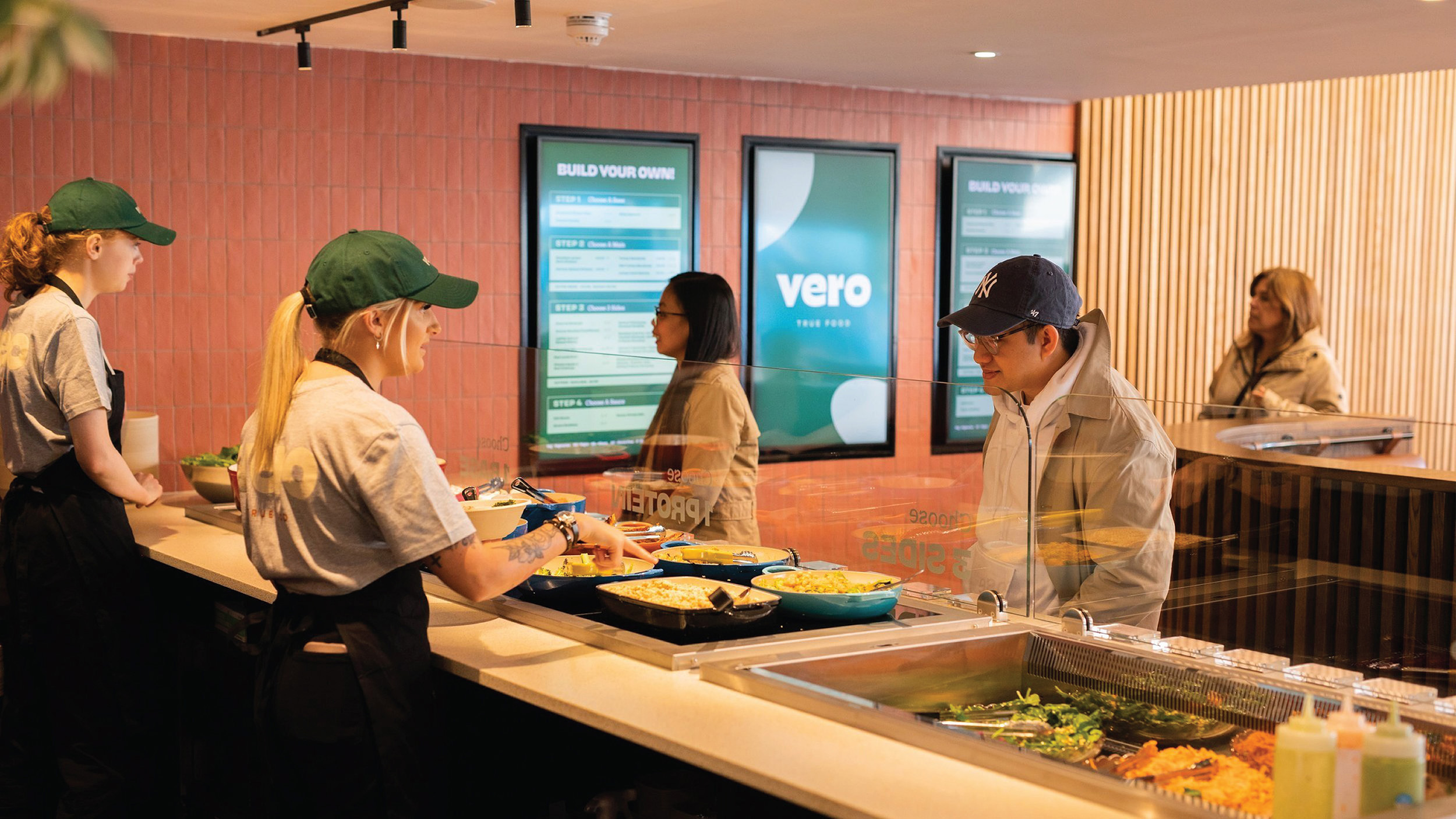
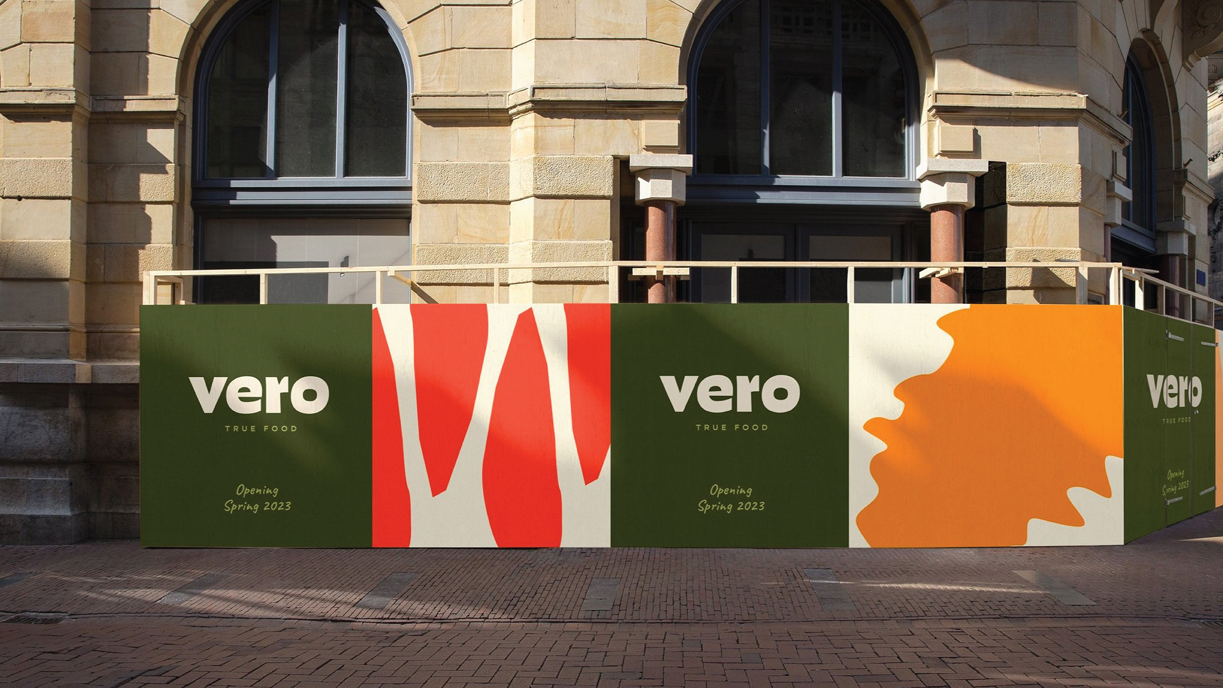
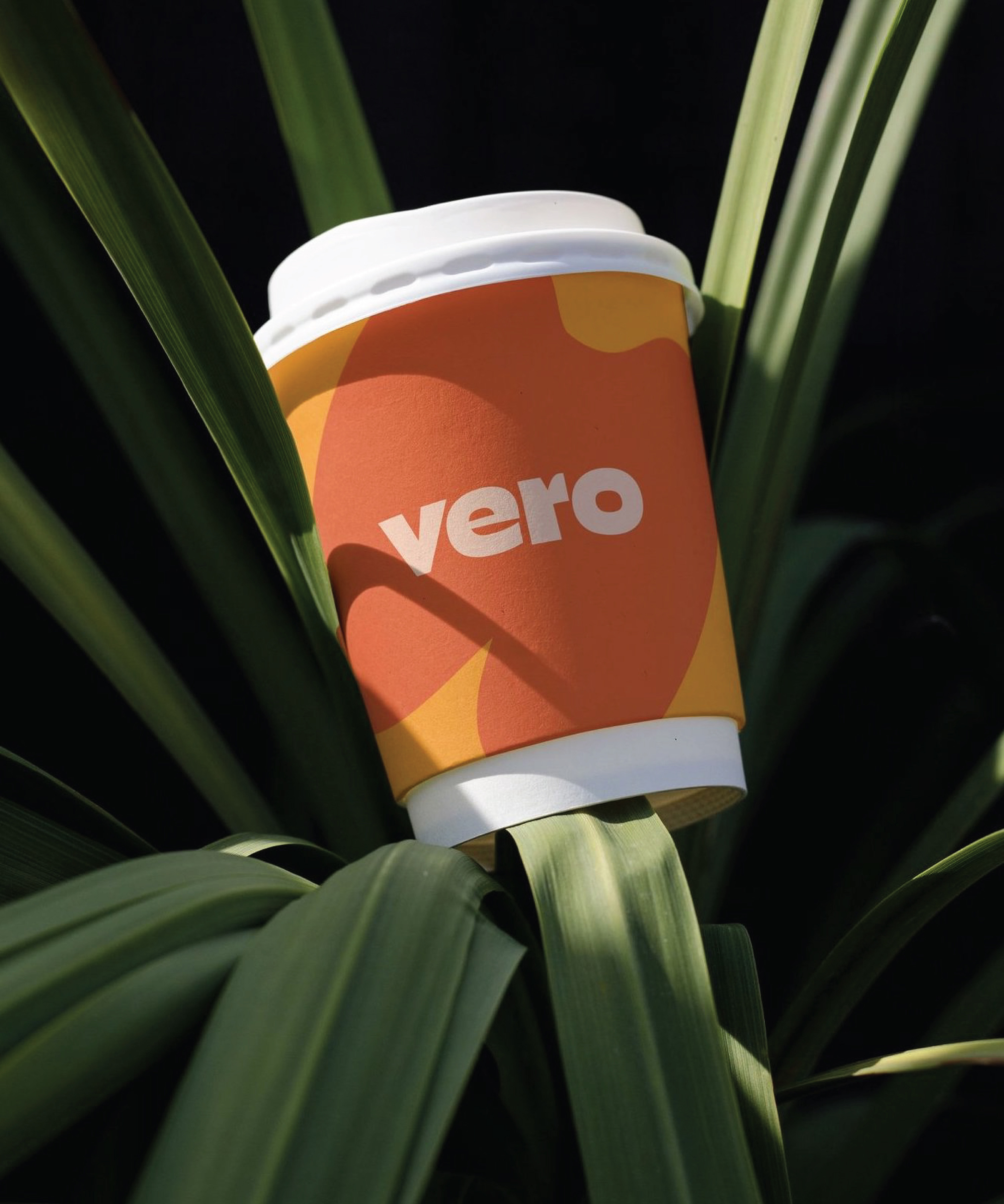
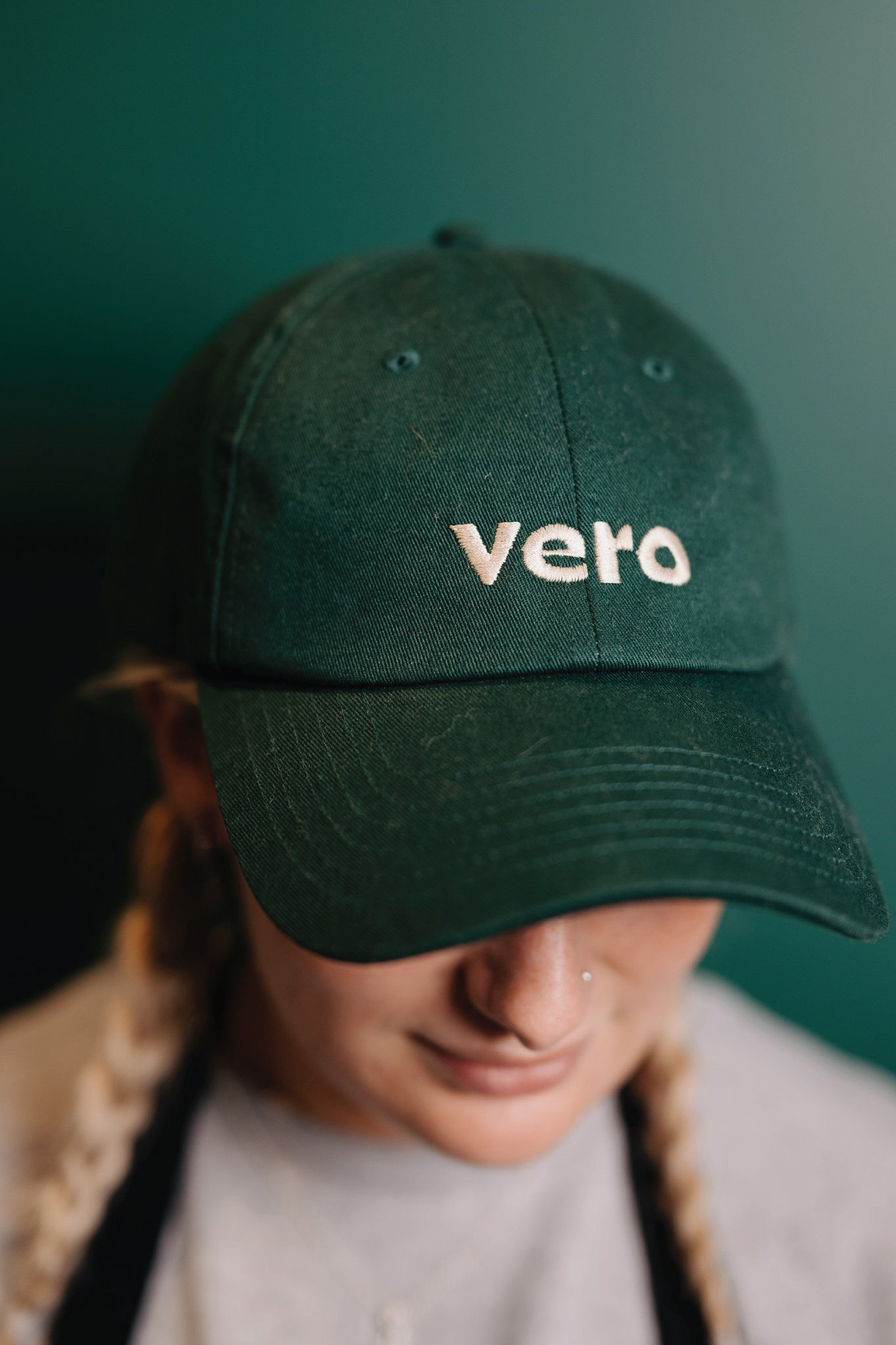
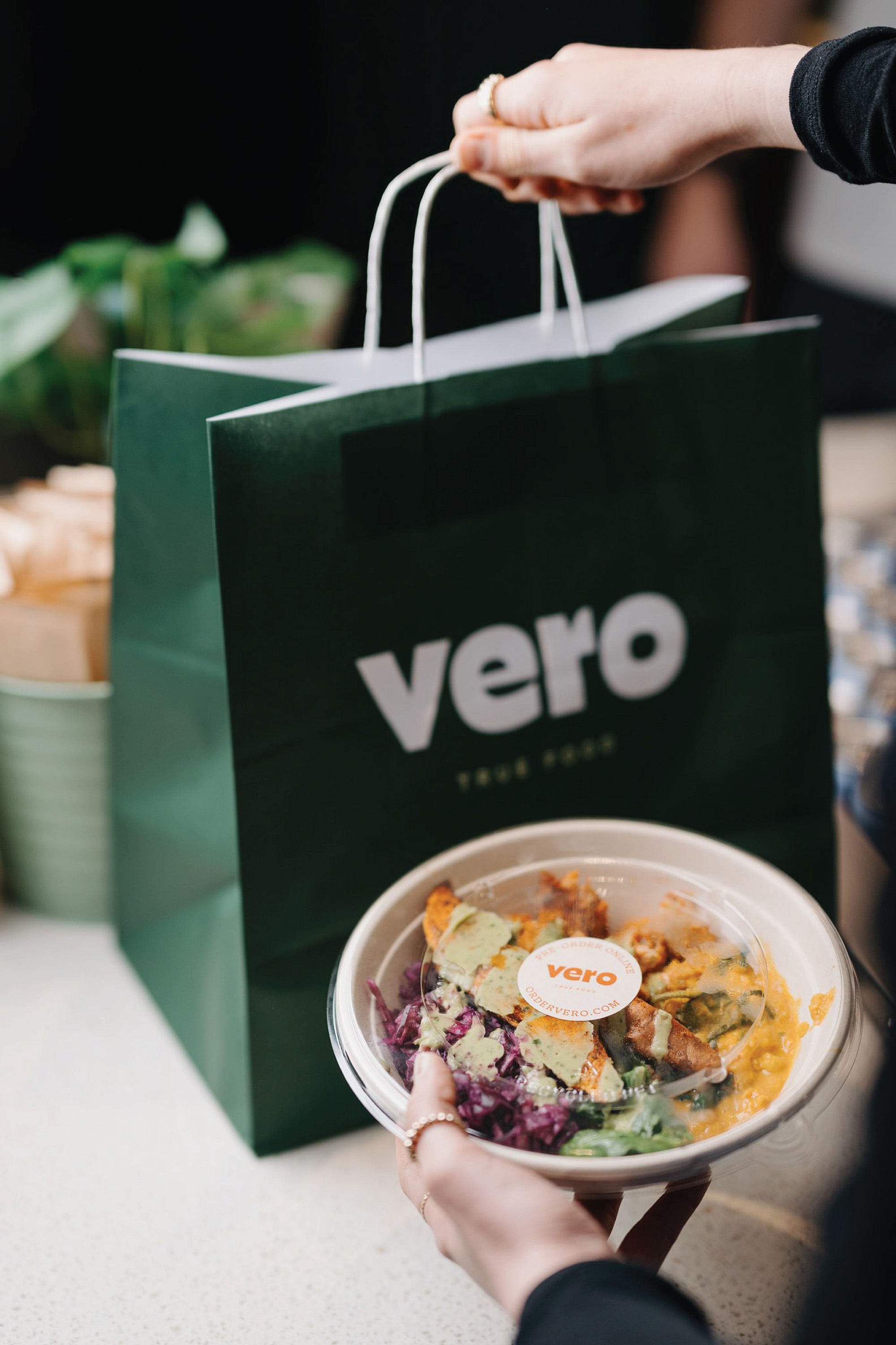
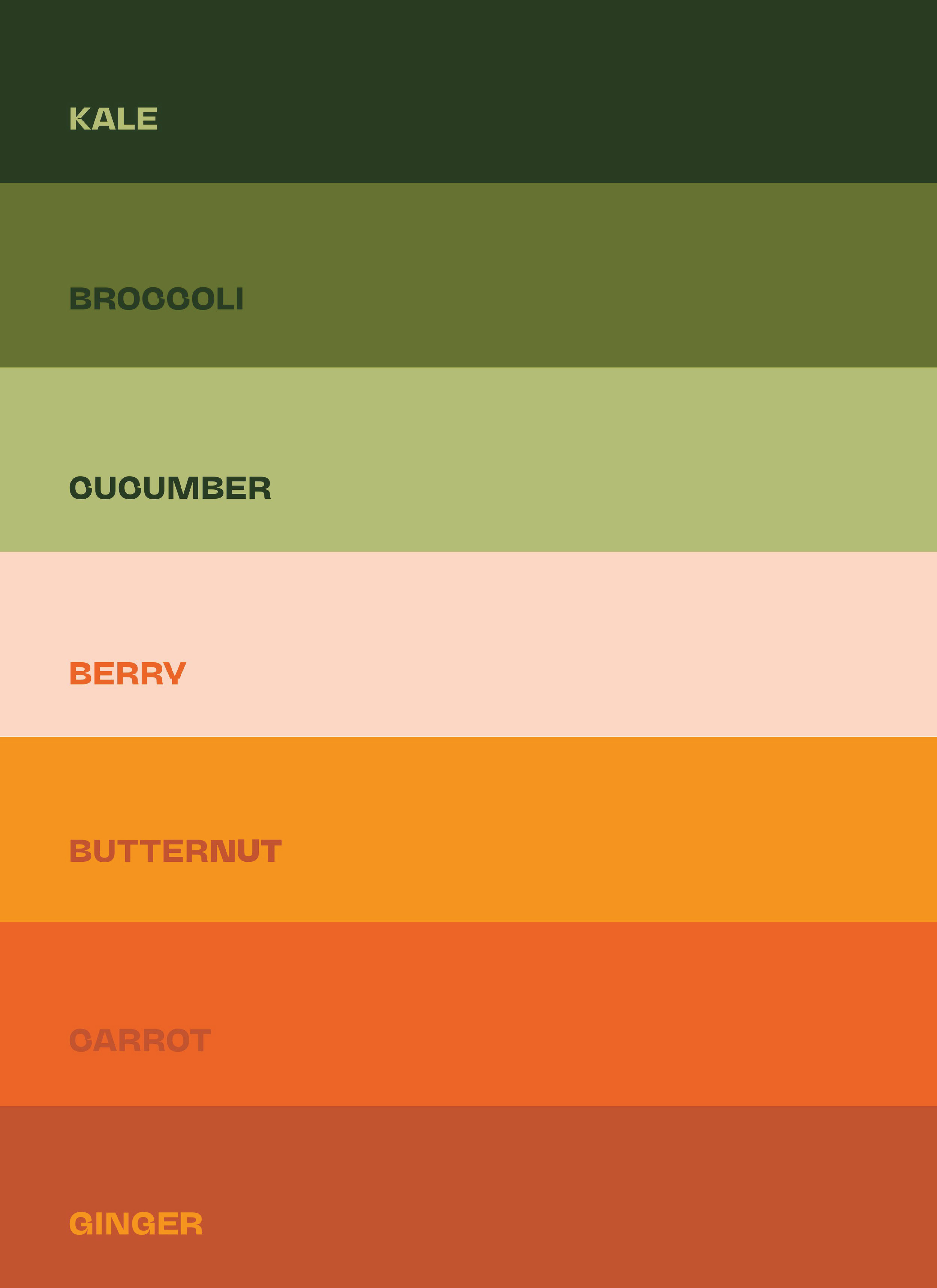
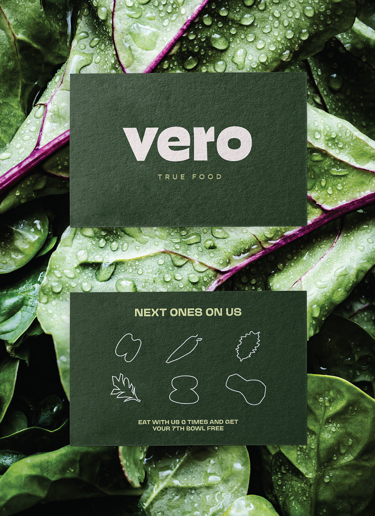
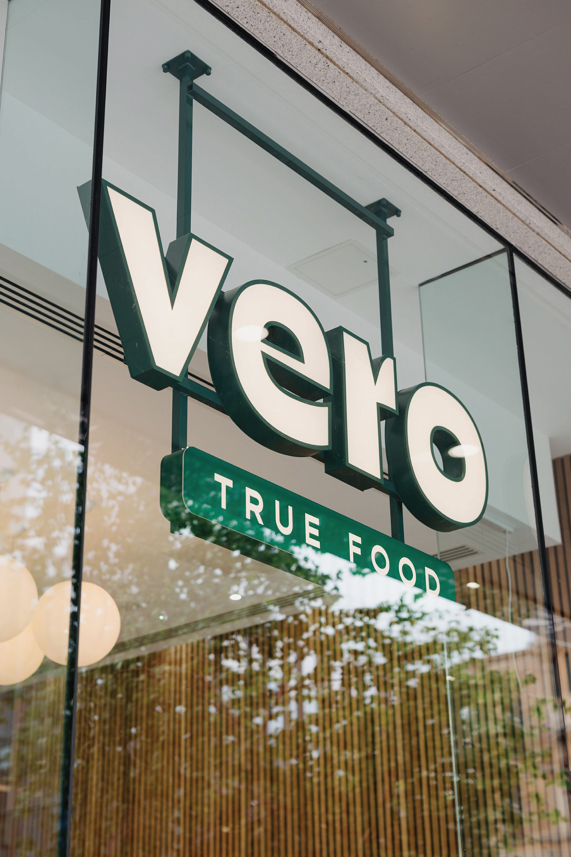
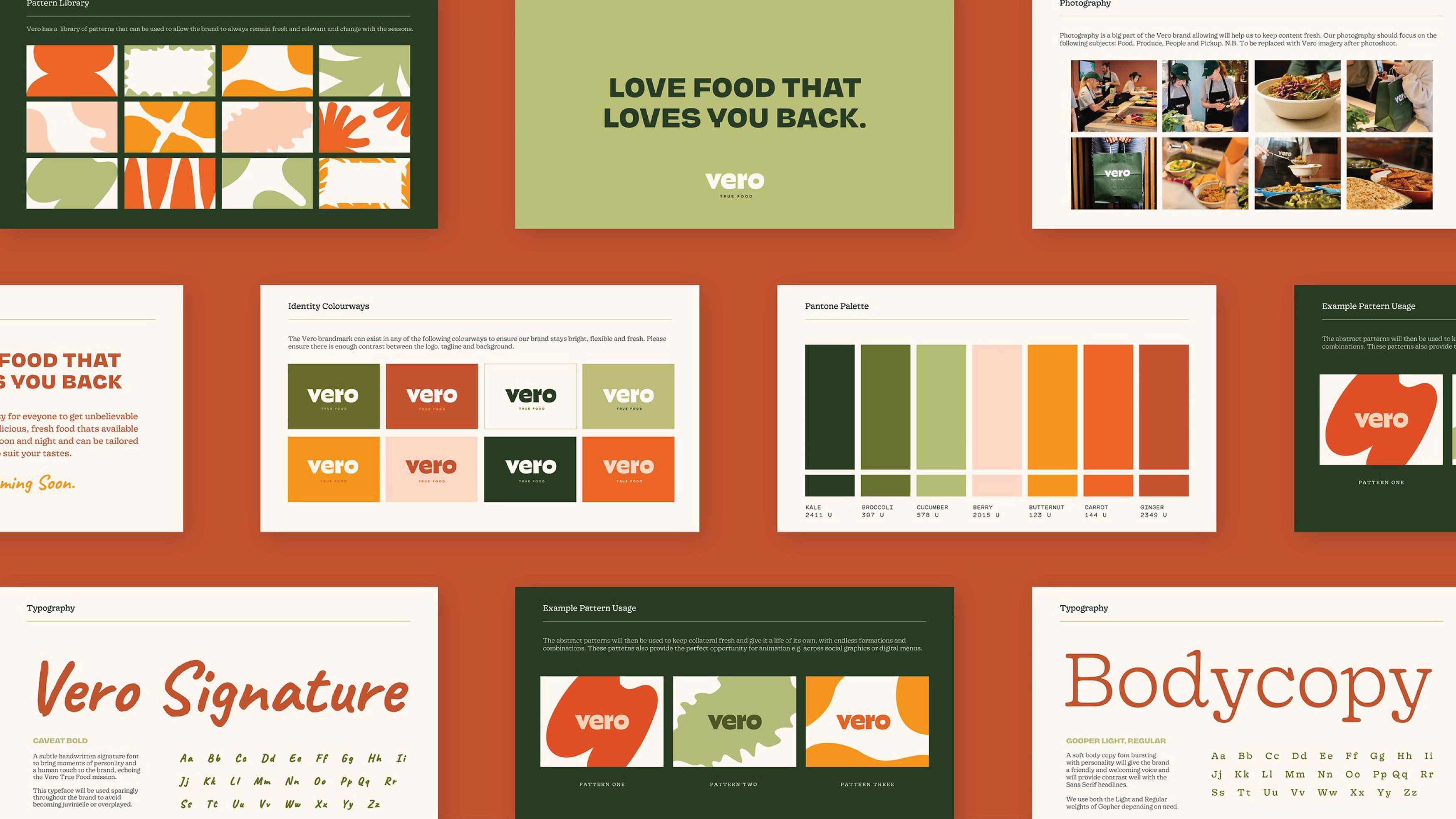
Crown Creative establishes a trustworthy brand, framing Vero with an identity which speaks to the brand promise. Vero is a vibrant brand environment which is ingredient-led with an optimistic attitude. Crown Creative’s approach carries a familiar and friendly feeling with a digital focus. Digital menu boards along the order line prepare the taste buds with bright animated illustrations. Vegetables are a classic motif throughout the brand but not at first glance. The colours of a ripe harvest clothe the identity in a range of deep to bright greens and warm, vibrant oranges. The custom wordmark looks like it was carved by a knife, with a bold weight and sharp, cut-out corners, giving character to an urban, minimal type.
Large-scale illustrations of abstract vegetable shapes splash colour throughout the brand and, when combined, create flexible patterns. Inspired by the range of Vero’s ingredients, the bold block colour shapes feature flowing lines of round ripe vegetables and contrasting chopped edges familiar to the forms found within the core logotype.
The identity uses photography throughout the brand to highlight Vero’s quality. Bright lighting accentuates the bright colours of the combinations of flavours, capturing a curated bowl similar to a still-life painting.
Vero’s character extends through the expressive type choices of the band. NaN Juane speaks a bold, urban playfulness into headings and key brand phrases. Contrasting body copy Gooper Light adds a friendly and approachable tone of voice, with rounded points and classic serif form. A handwritten signature font layers a gentle human touch, emphasising Vero’s personable authenticity.
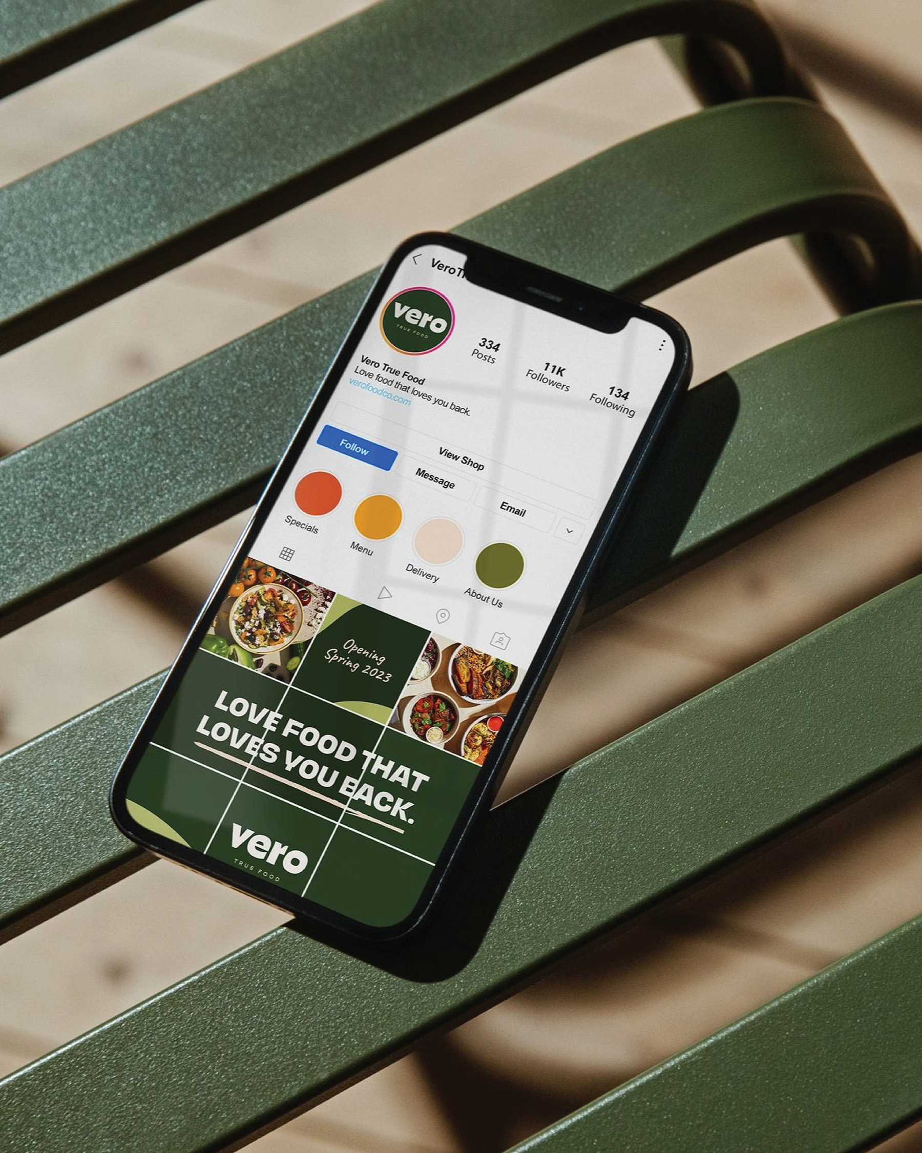
Vero is playfully spirited throughout its identity, bringing fresh energy to the industry. Bold and bright with a hint of warmth, the brand is honest and friendly, reflecting their authentic ingredients and sincere heart for quality. “Food That Loves You Back” encapsulates Vero, seen throughout the brand as a mantra and promise. Vero sets itself apart as a distinctive grab-n-go that serves honest good food. So, “Have It Your Way”, as Vero says. Build-your-own bowl, get it to-go or sit in and escape the bland with True Food.
CREDIT
- Agency/Creative: Crown Creative
- Article Title: Vero True Food Brand Identity by Crown Creative
- Organisation/Entity: Agency
- Project Type: Identity
- Project Status: Published
- Agency/Creative Country: United Kingdom
- Agency/Creative City: Belfast
- Market Region: Europe
- Project Deliverables: Art Direction, Brand Design, Brand Identity, Brand Mark, Identity System, Illustration
- Industry: Hospitality
- Keywords: healthy, colourful, colour, brand, modern, bright, urban, custom, type, typography
-
Credits:
Designer: Crown Creative


