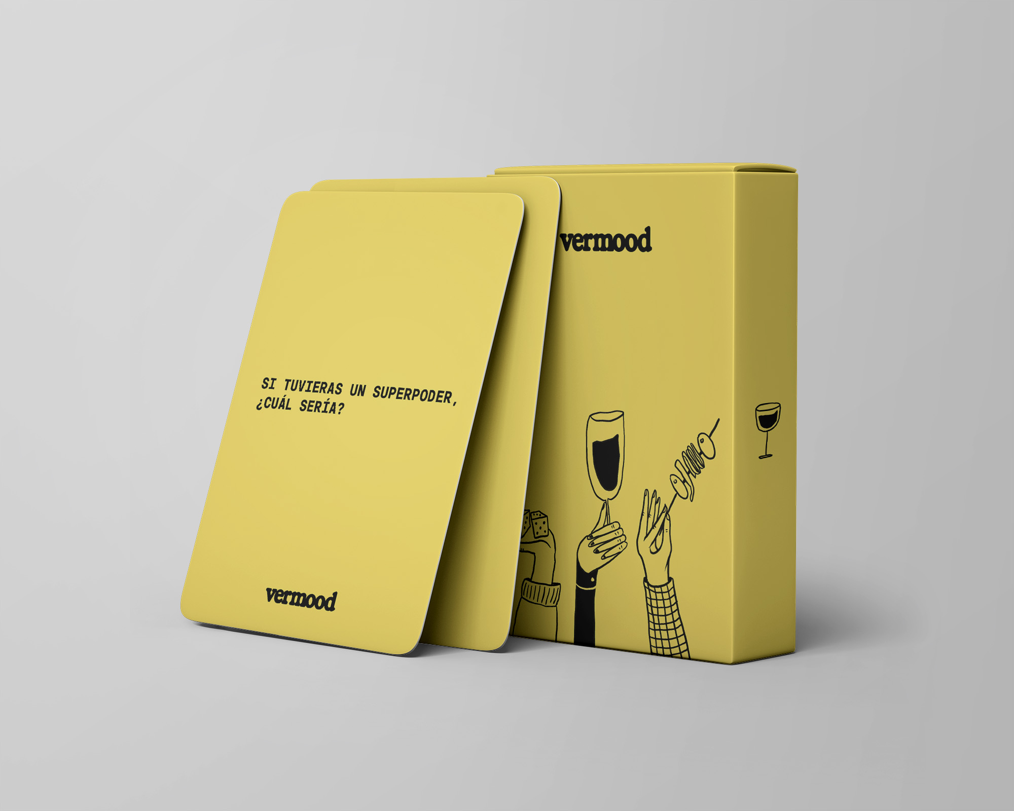
Vermood’s mission is to bring back and enhance the joy of spending quality time together, accompanied by the finest appetizers and Vermouth. Vermood is a blend of “Vermouth” and “Mood,” capturing the essence of both a state of mind and the traditional Catalan “Vermut” hour—a cherished custom of gathering with friends, family, and colleagues to enjoy appetizers and good conversation. It seeks to revive and elevate these shared moments by introducing a unique element: a series of games designed to foster deeper connections among participants.
The brand is set to expand into three distinct branches of services and products:
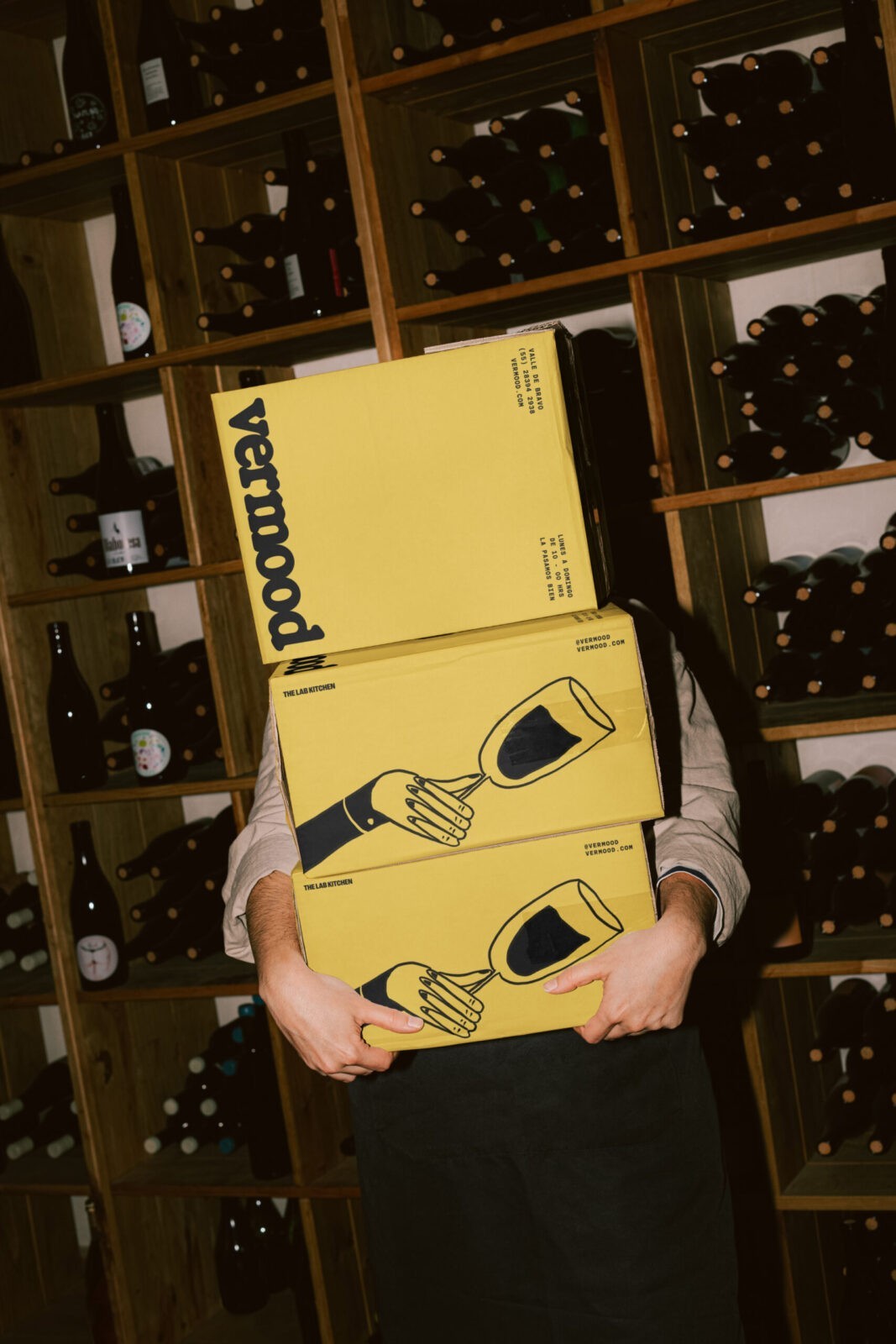
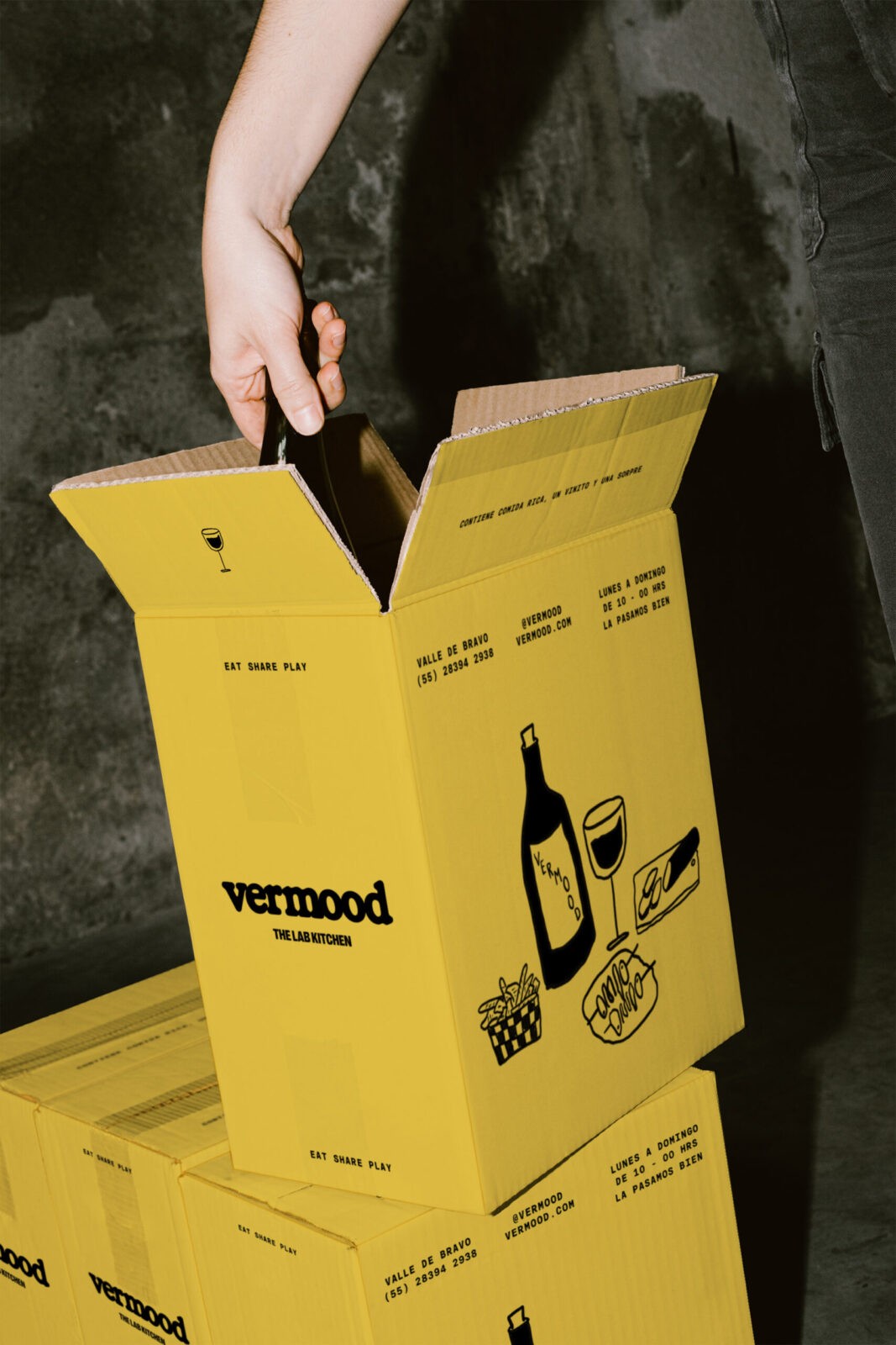
Vermood Delivery: Ready-to-take packs that include Vermouth, appetizers, and a game, delivered straight to your doorstep.
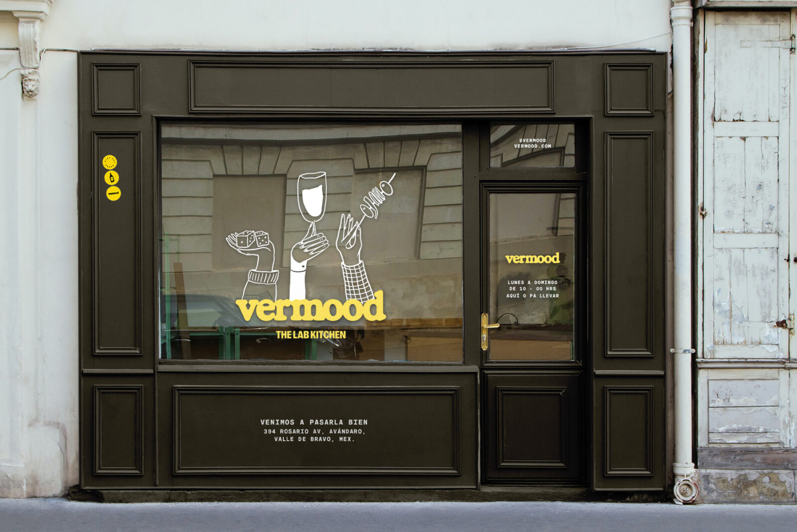
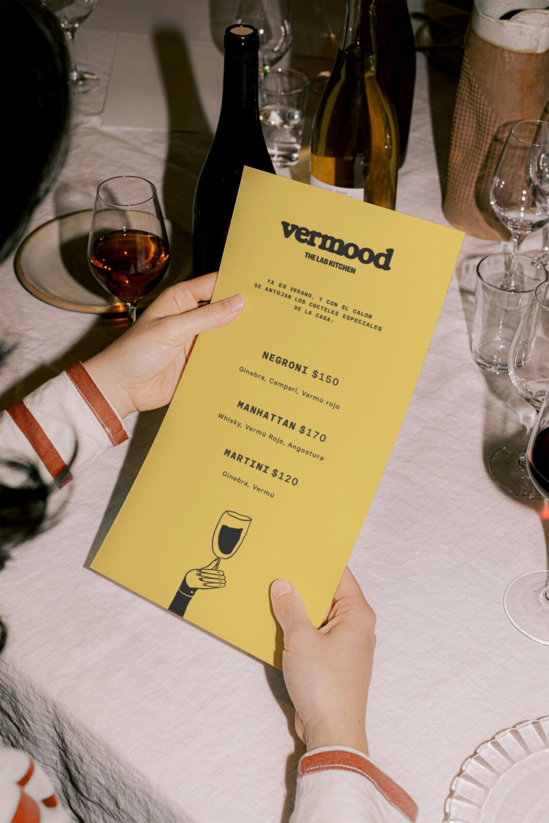
Vermood Bar: Physical spaces where patrons can enjoy house-made Vermouth, nibble on delicious tapas, and play our custom games in a warm, inviting atmosphere.
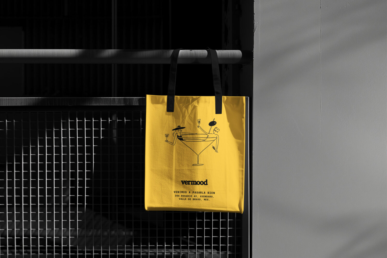
Vermood Products: A line of branded products available online, in physical locations, through The Lab Kitchen’s catering services, and in other restaurants and bars.
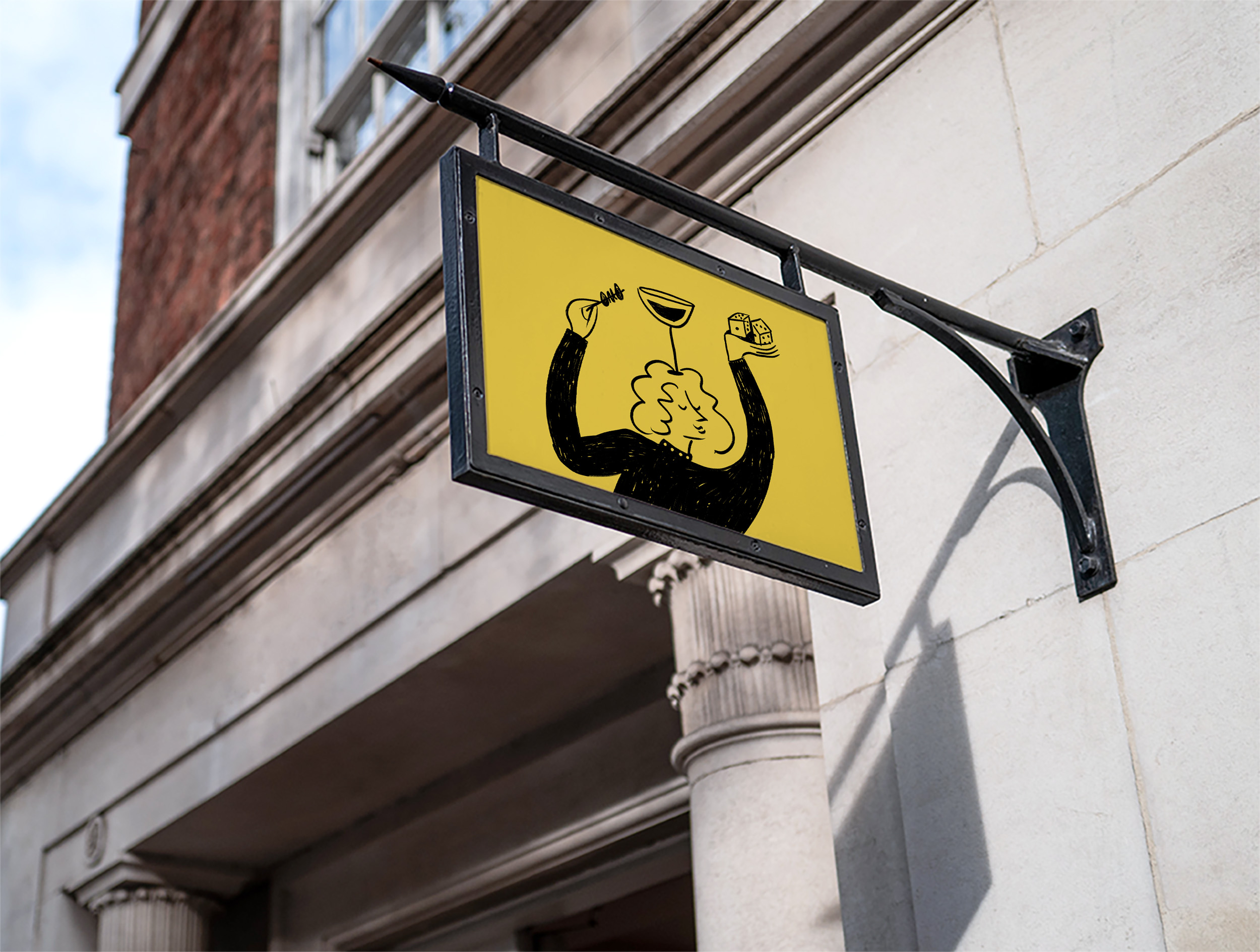
Food, appetizers, cocktails, and games all share a common thread—they are the essence of shared moments, where good company turns the ordinary into the unforgettable. Vermood opens its doors to moments yet to be created, offering a space where laughter resonates and extends beyond the walls. At Vermood, every experience becomes a celebration of life, where eating, sharing, and playing intertwine to create a warm, fun, and inviting atmosphere.
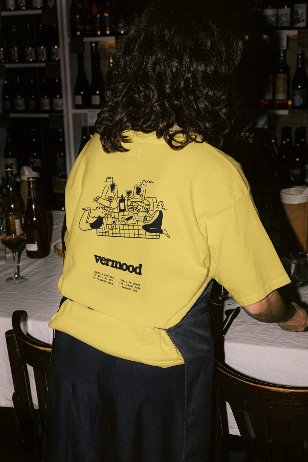
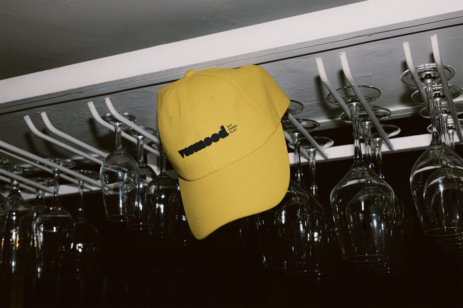
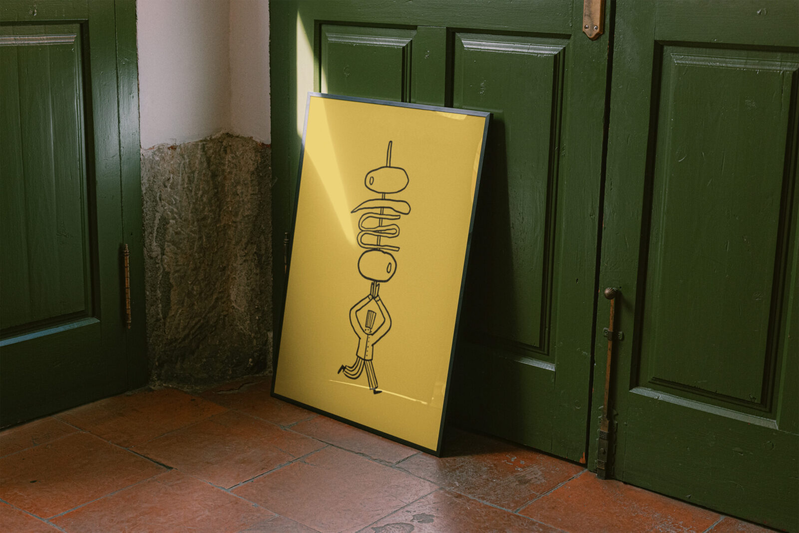
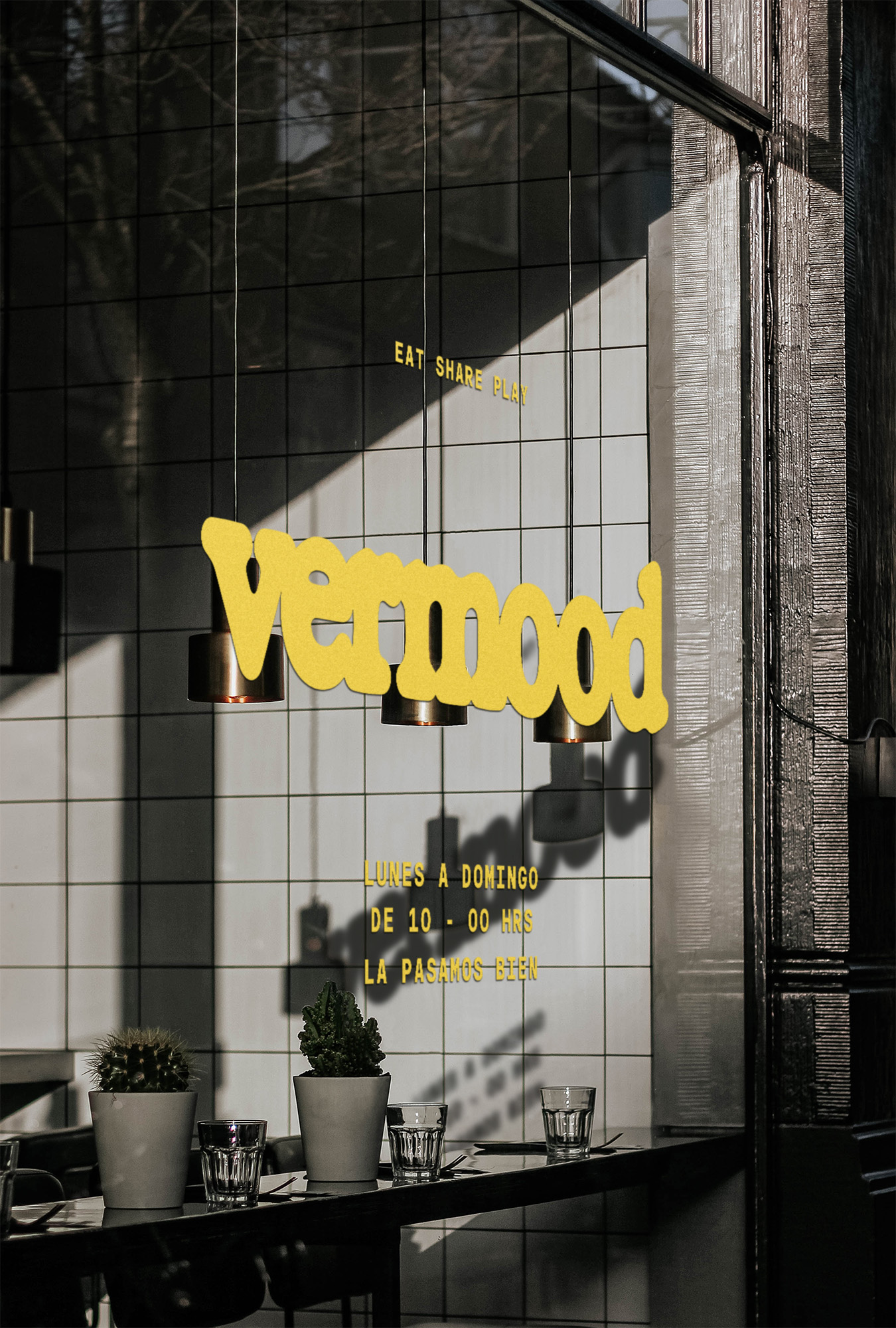
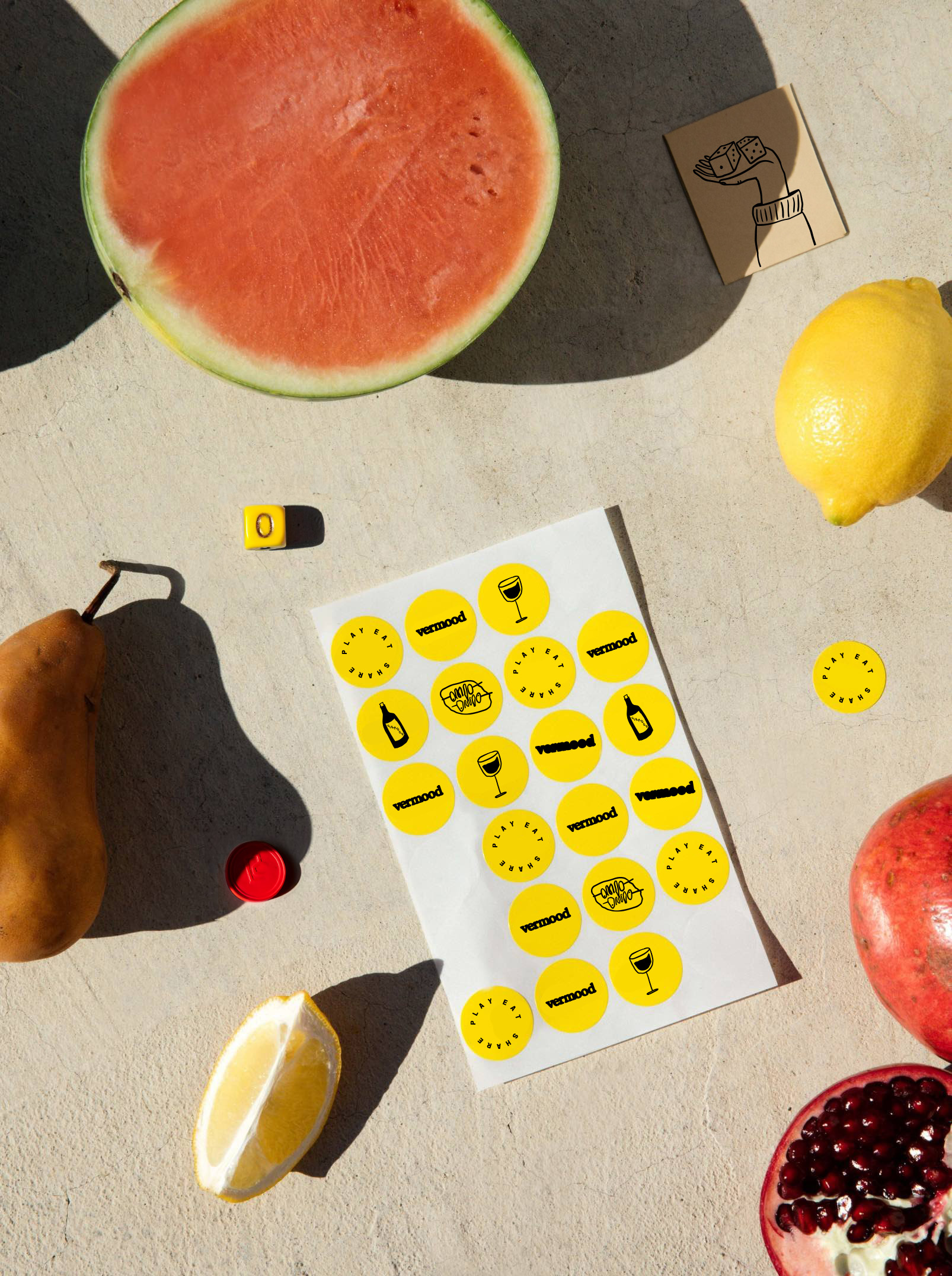
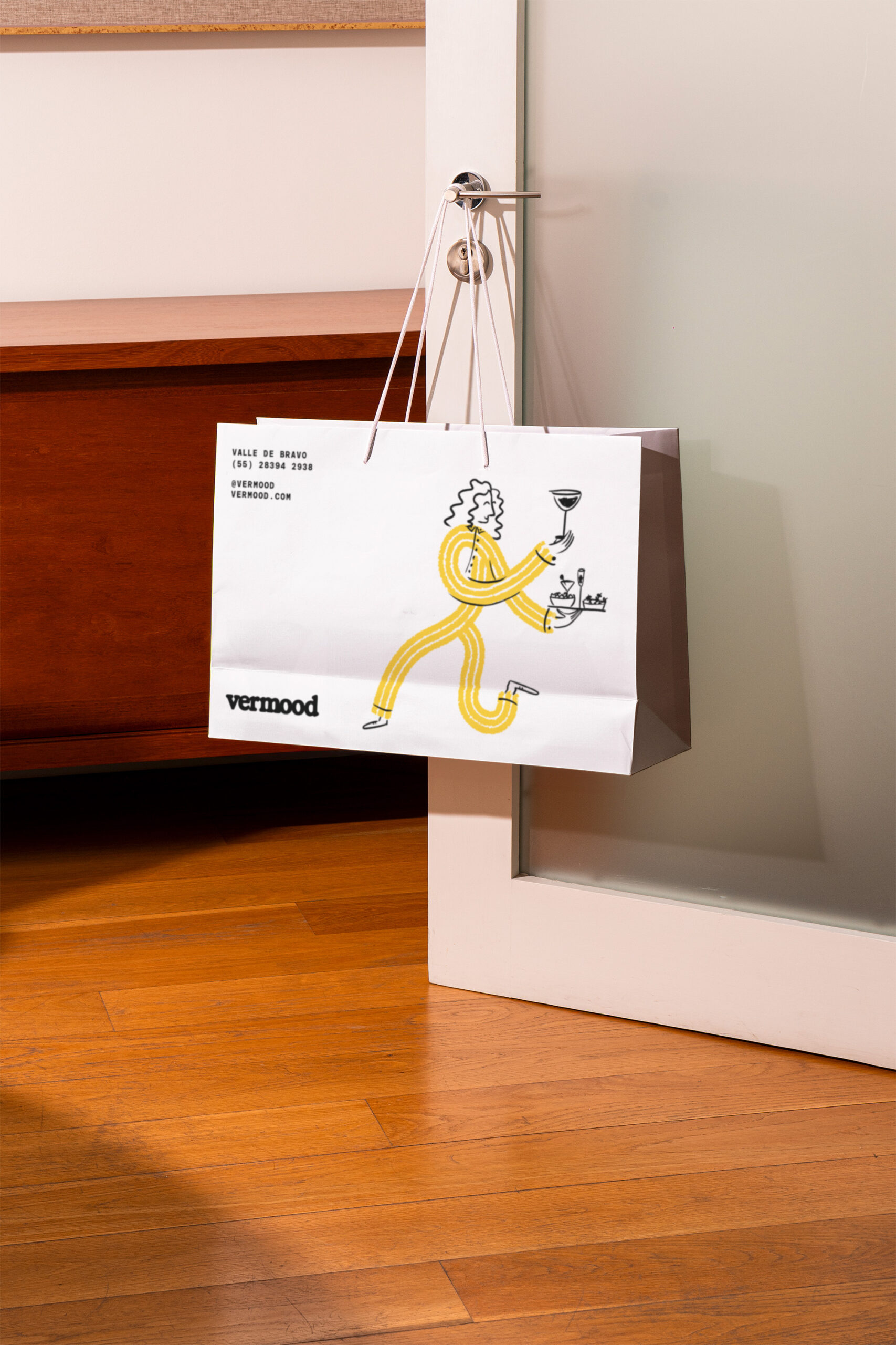
Branding Approach: Our branding approach focuses on creating a cool, aspirational brand that thrives in an urban context. The goal is for every interaction with the brand to be an experience in itself, one that is fun and engaging. The logo features an extra-bold, patina-style typeface, symbolizing the spilled liquid on a tablecloth—a lasting mark of a good time. The brand system includes illustrations that represent the various experiences Vermood offers, set against a solid, direct, and alternative color palette of yellow and black. Our objective is to quickly establish Vermood as a memorable and easily recognizable brand in the minds of consumers. Yellow is the color that best represents Vermood because it signifies the beginning of a “good mood,” disconnection, joy, and fun. It’s the color of optimism, sunshine, and summer—evoking the warmth of the Mediterranean.


CREDIT
- Agency/Creative: Cantera Estudio
- Article Title: Vermood’s Catalan-Inspired Brand Identity by Cantera Celebrates Social Connections and Urban Lifestyle
- Organisation/Entity: Agency
- Project Status: Published
- Agency/Creative Country: Mexico
- Agency/Creative City: MExico City
- Market Region: Mexico City and Barcelona
- Project Deliverables: Brand Creation, Brand Design
- Industry: Hospitality
- Keywords: WBDS Agency Design Awards 2024/25
- Keywords: WBDS Agency Design Awards 2024/25
-
Credits:
Head of Design: Karol Rosales
Designer: Isabel Acedo
Senior Designer: Isabel Caso
Partner: Samuel Alazraki
Partner: Eduardo Castro
Designer: Delia Albarrán
Designer: Jimena Prado
Designer: Delia Albarrán


