


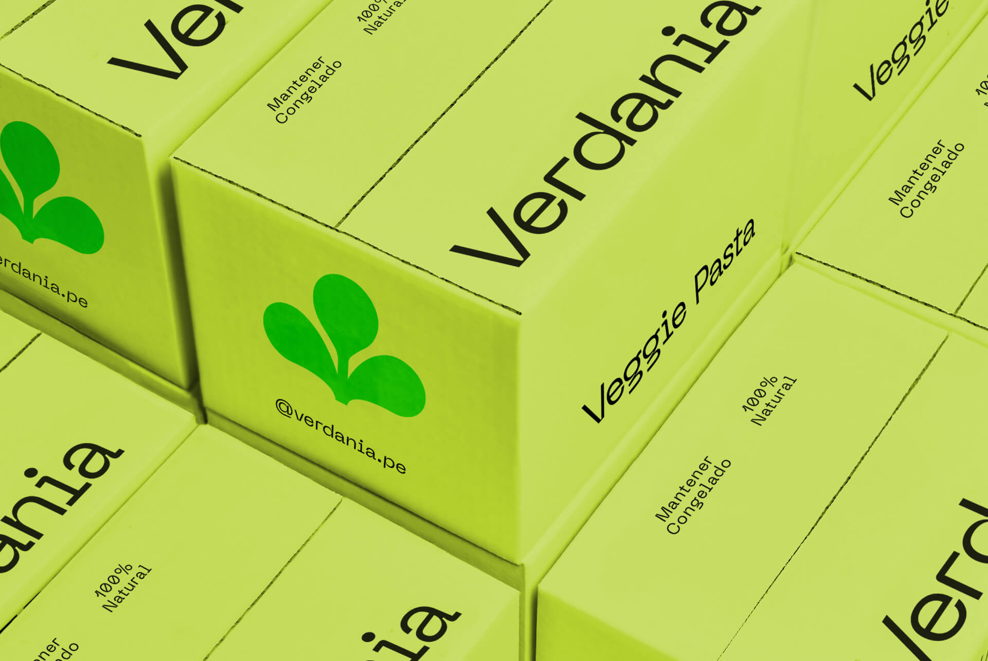
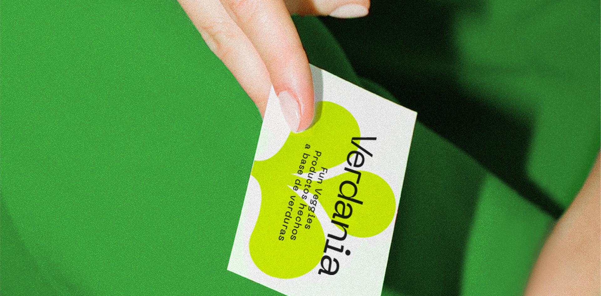
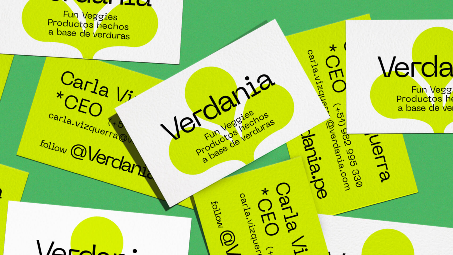
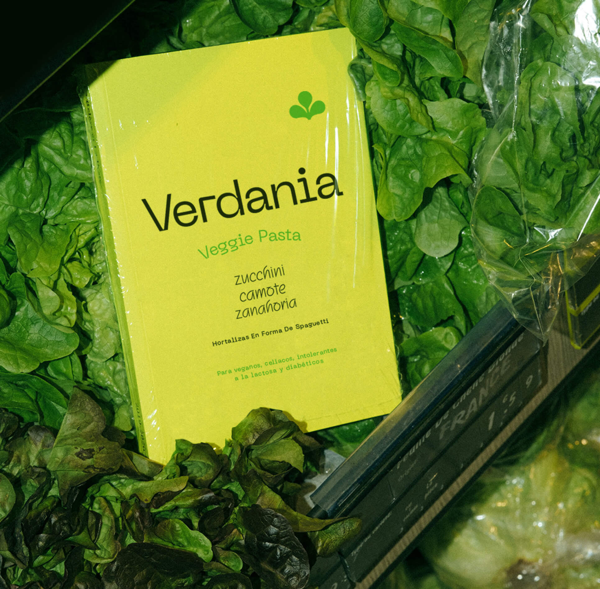
Verdania is a brand of noodles made 100% from vegetables and other healthy foods. Since they are super foods in the form of spaghetti, we want the branding to reflect that, a fun and different way of eating vegetables. The identity of the brand proposes Verdania as a green universe where eating healthy is really fun. This colour was chosen for the corporate palette in order to highlight its main quality which is natural and healthy. Vibrant and striking tones were proposed to give it that unique and disruptive touch that represents so much the product, this being so different within its market. The isotype was generated from a synthesis of the stems that we find in many fruits, vegetables and other superfoods, this being the green part of many of our inputs. It is finding the green in the universe of Verdania. The decision to make 3 leaves was based on the balance and equilibrium that having a healthy diet gives to our lives.
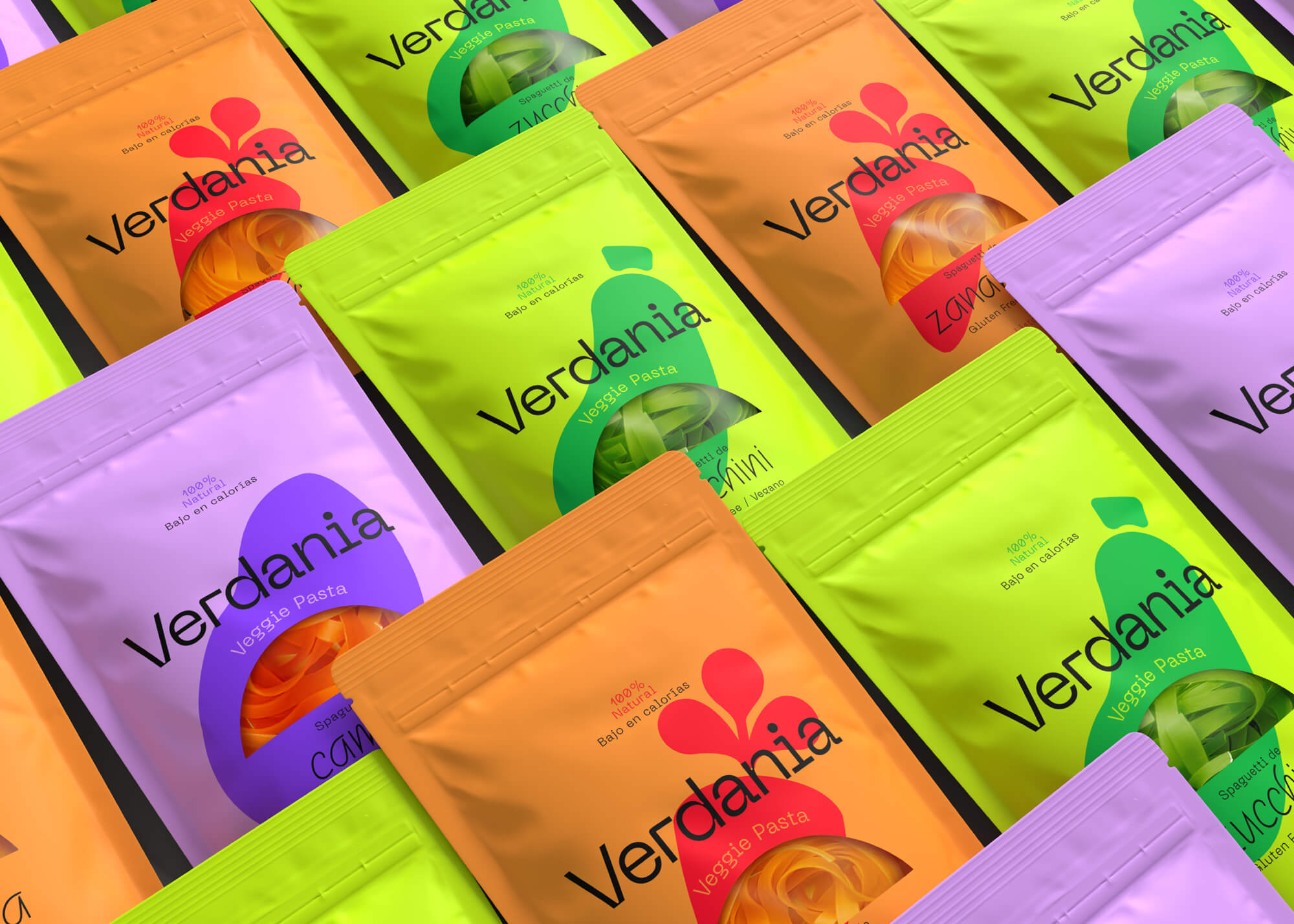
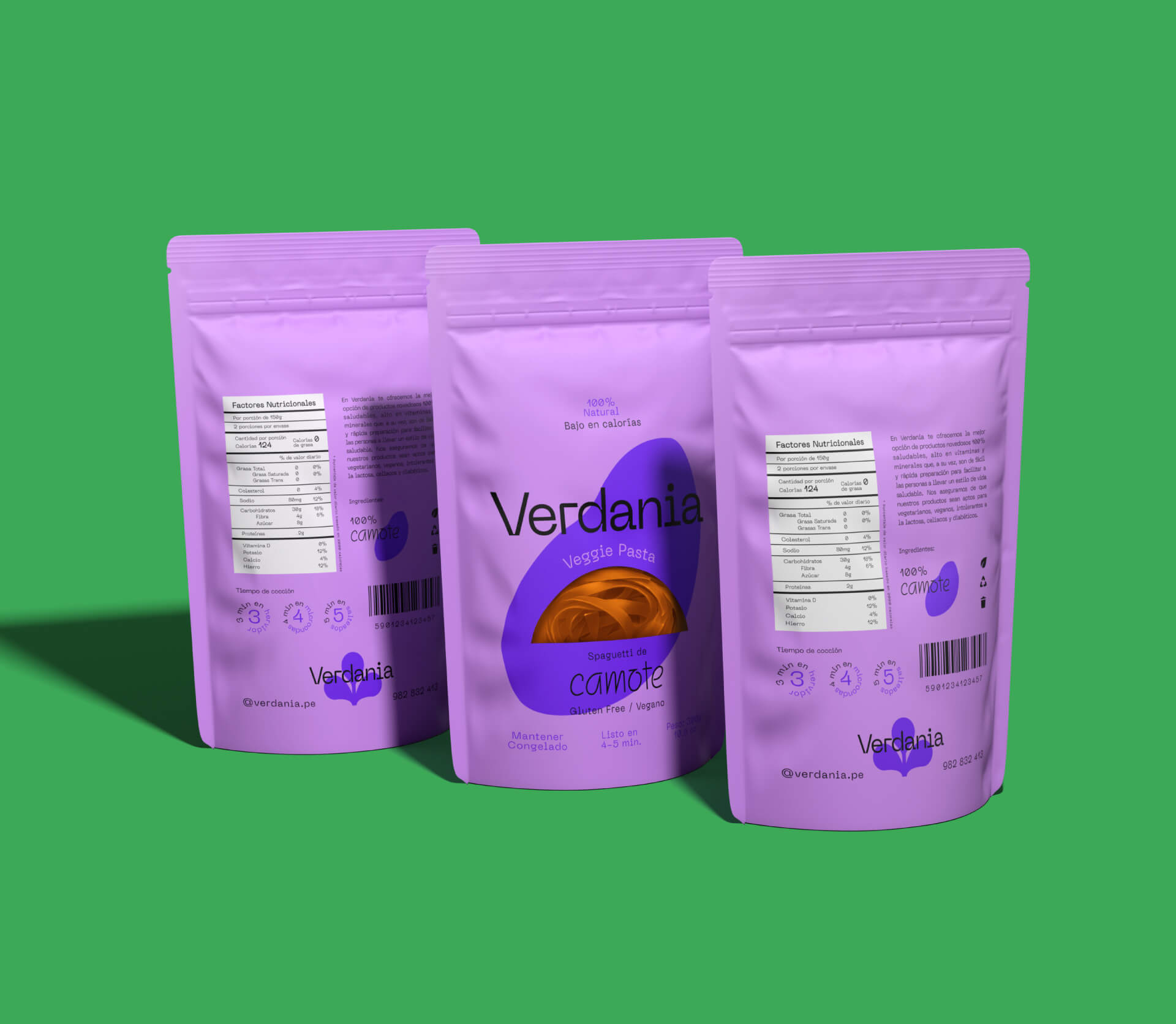
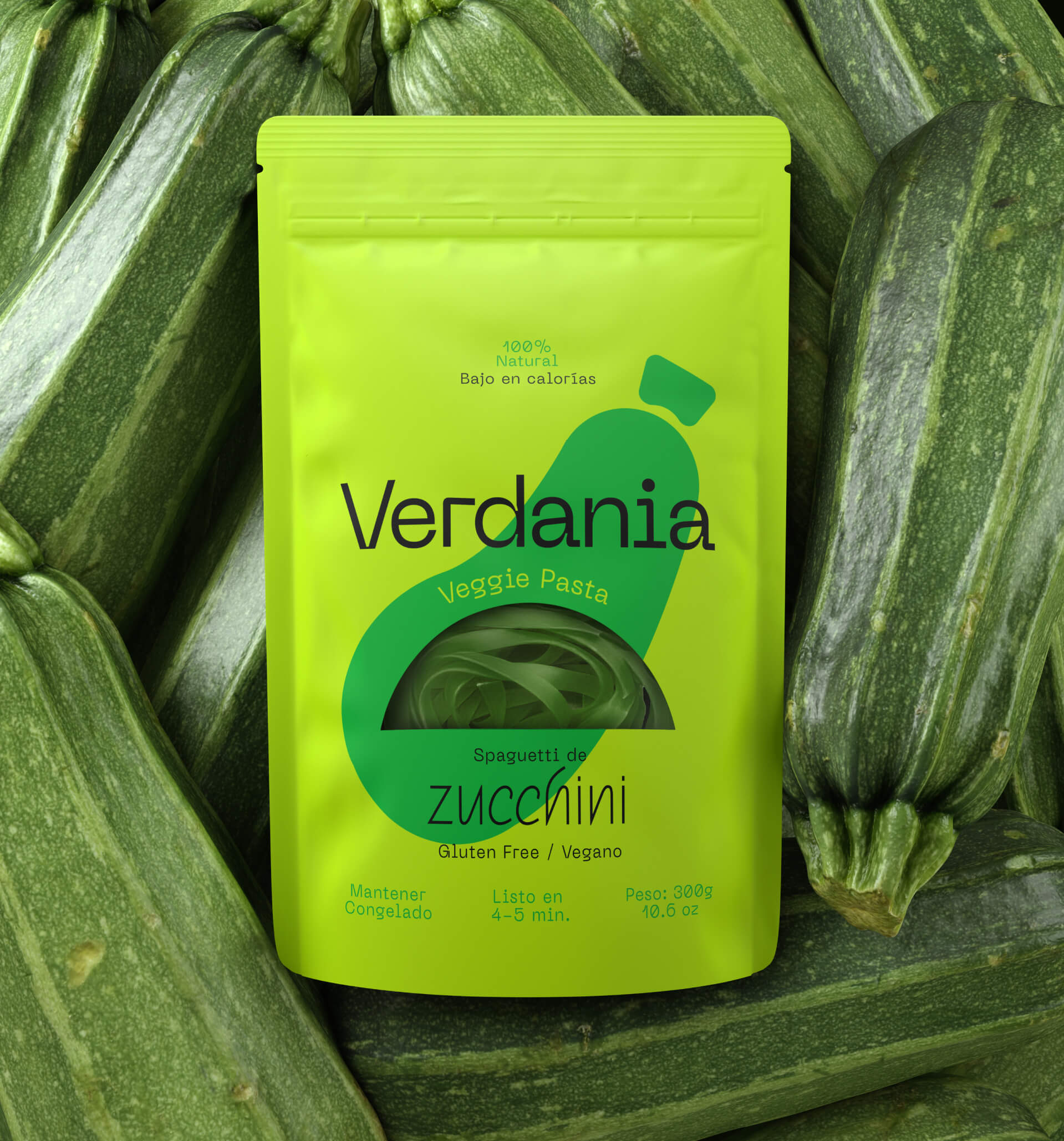
Being a brand that proposes such an unusual product in the Peruvian market, two unusual and very particular fonts were chosen that, together with the proposed layout, generates a very dynamic brand. Neue Machina, a monospaced and geometric typeface that gives the brand a certain formality but which, due to its unusual finishes, gives it a lot of personality and versatility. And Squirl, a playful and fun typeface to highlight and give prominence to the ingredients, which are the most important thing in the product proposal. Product packaging follows this same logic, where ingredients are the most important thing. For this reason the color is selected from the input from which the pasta is made. In the same way that the greens were chosen, each package has two vibrant hues of the same colours. These colours generate a very interesting color contrast with the shades of green in the main palette. The photographic style was proposed, as the packaging, with a lot of color in it. Using fun contrasts with greens in the background, putting the packages on the same vegetables and generating consumption scenes that look fun and provocative. Verdania’s identity invites us to eat vegetables in a different way, without thinking what they really are and enjoying every bite.
CREDIT
- Agency/Creative: Tais Kahatt
- Article Title: Verdania Fun Veggies Spagetthi Brand and Packaging Design by Tais Kahatt
- Organisation/Entity: Freelance, Published Commercial Design
- Project Type: Packaging
- Agency/Creative Country: Peru
- Market Region: South America
- Project Deliverables: Brand Identity, Brand World, Branding, Graphic Design, Identity System, Packaging Design, Retail Brand Design, Tone of Voice
- Format: Flow-Pack
- Substrate: Plastic


