The question, “How will we live together?” is at once ancient and urgent. The Babylonians asked it as they were building their tower. Aristotle asked it when he was writing about politics. His answer was “the city.” The French and American Revolutions asked it. Against the tumultuous backdrop of the early 1970s, Timmy Thomas passionately pleaded it in his song “Why Can’t We Live Together?”
It is indeed as much a social and political question as a spatial one. More recently, rapidly changing social norms, the political polarization between left and right, climate change, and the growing gap between labor and capital are making this question more urgently relevant and at different scales than before. In parallel, the weakness of the political models being proposed today compels us to put space first and, perhaps like Aristotle, look at the way architecture shapes inhabitation in order to imagine potential models for how we could live together.
Every generation feels compelled to ask this question and answer it in its own, unique way. Today, unlike with previous ideologically-driven generations, there seems to be a consensus that there is no single source from which such an answer can come. The plurality of sources and diversity of answers will only enrich our living together, not impede it.
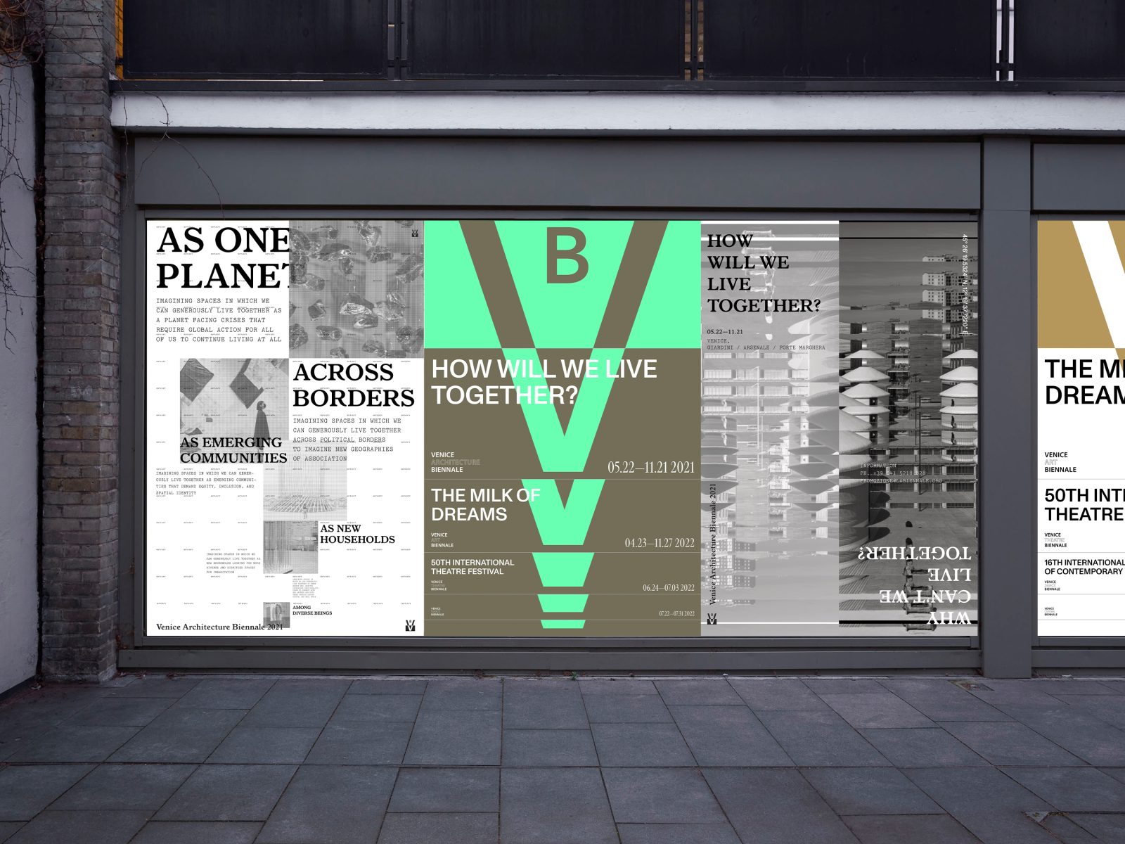
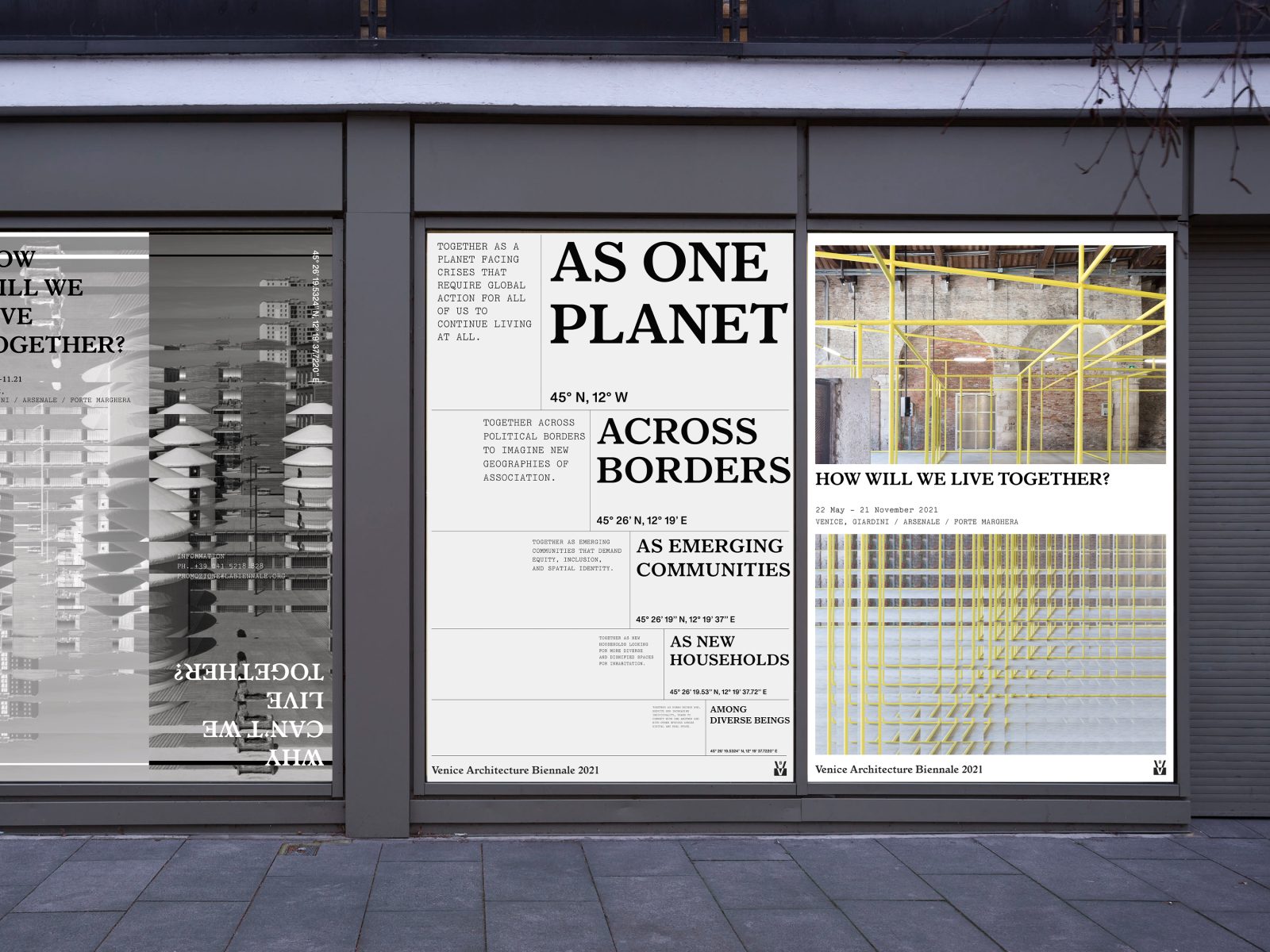
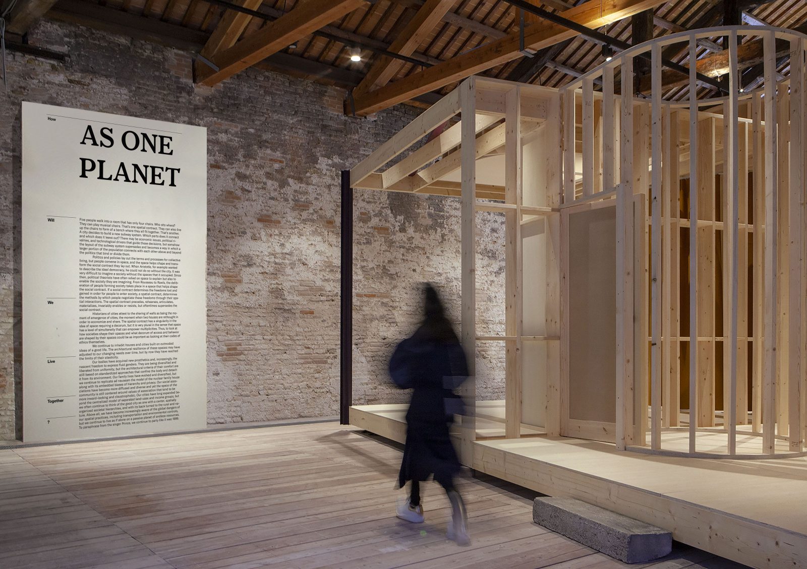
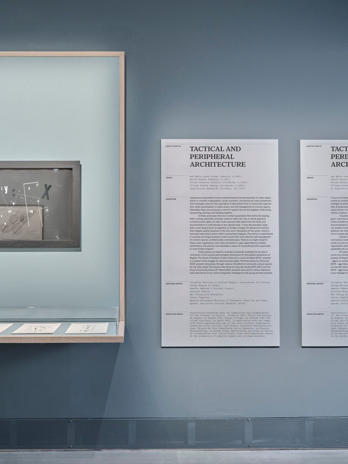
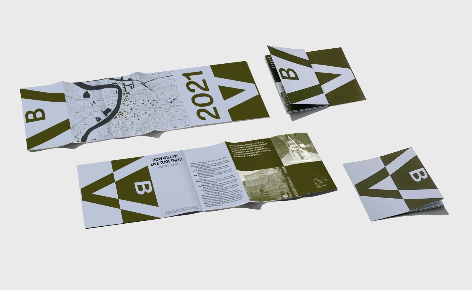
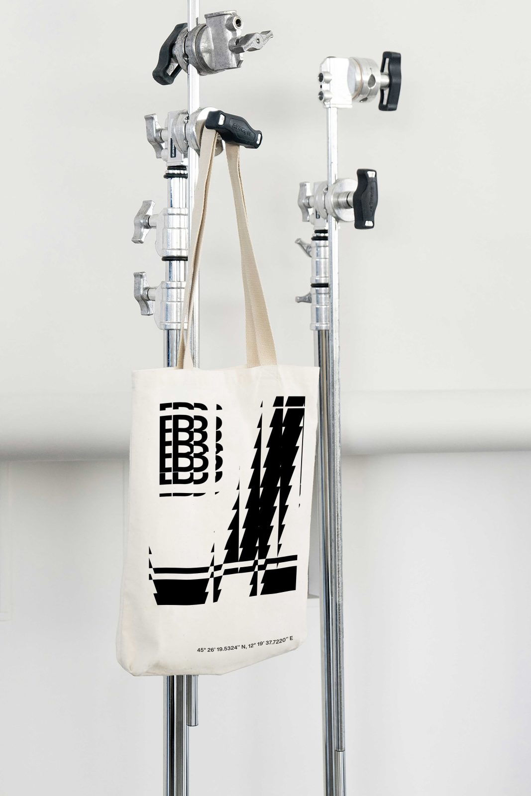
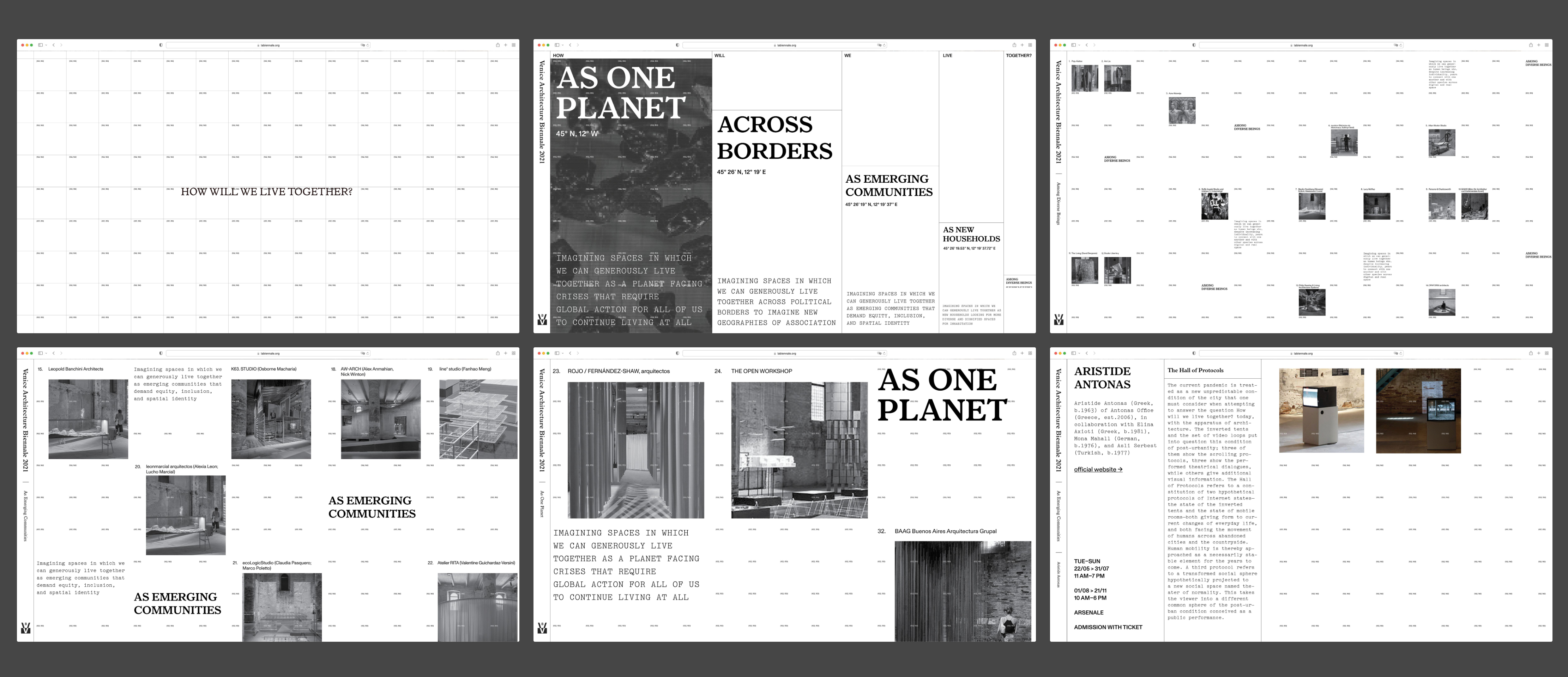
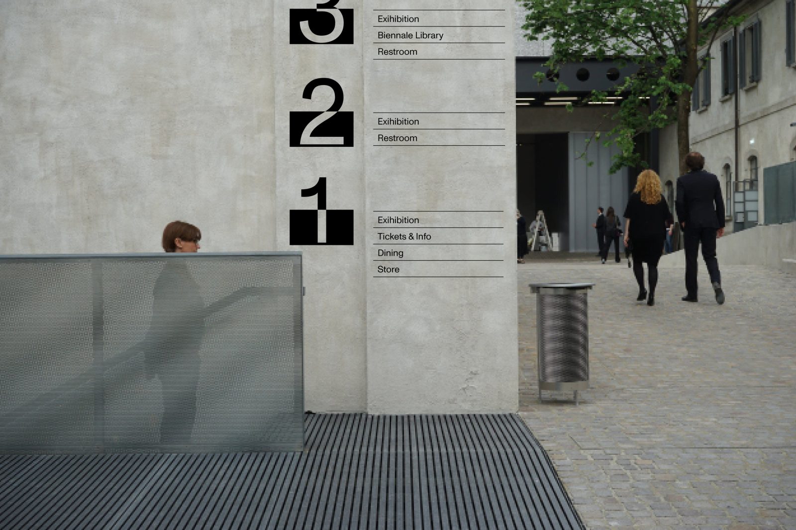
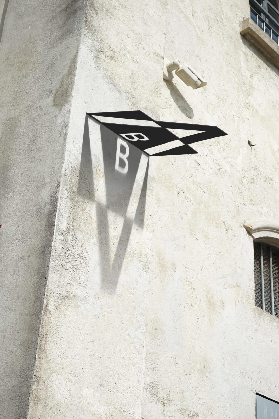
Design the identity, publications, exhibition graphics, and merchandise, as well as digital and print campaigns for the Venice Biennale and The 17th International Architecture Exhibition of Venice Biennale. Curated by Hashim Sarkis, “We need a new spatial contract. In the context of widening political divides and growing economic inequalities, we call on architects to imagine spaces in which we can generously live together”, Sarkis has commented. Drawing from themes within the exhibition, the graphic identity explores ideas of fluidity, identity, the human and the non-human, diversity and fragmentation. These disparate artworks are united in their representation of scales, which are symbolic of important ideas running through the exhibition: Among Diverse Beings, As New Households, As Emerging Communities, Across Borders, As One Planet.
CREDIT
- Agency/Creative: Yan Yan
- Article Title: Venice Biennale Brand Redesign
- Organisation/Entity: Student
- Project Type: Identity
- Project Status: Non Published
- Agency/Creative Country: United States of America
- Agency/Creative City: Oakland
- Industry: Construction
- Keywords: WBDS Student Design Awards 2022/23
-
Credits:
Educational Institution: ArtCenter College of Design - Graphic Design
Educator's Name: Brad Bartlett


