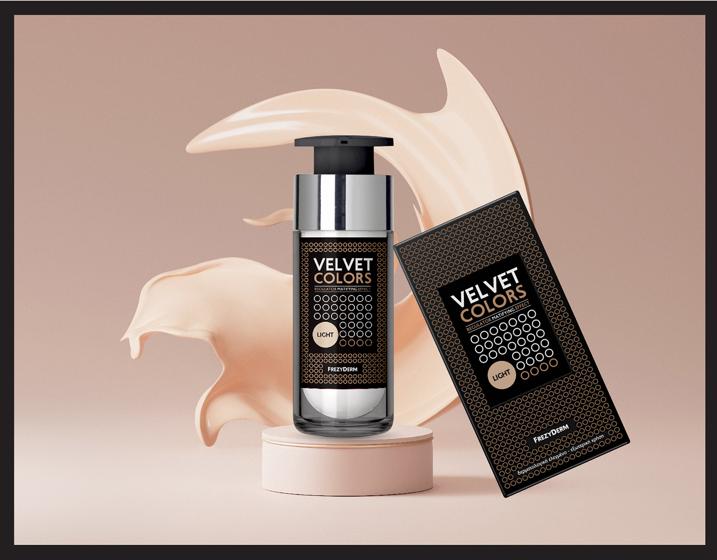
Frezyderm produced the Velvet Colors foundation series, with colored and rich, velvety texture to cover skin imperfections and protect the skin.
ABC Design wanted to depict and communicate the covering qualities of this innovative product. We were inspired by the laboratory image of the pores of human skin in microscope magnification and abstractly designed a circular pattern indicating the cellular level at which Velvet Colors can penetrate, leveling-out every imperfection in the skin and leaving behind a velvety feeling of blossoming freshness. This product has the capability both to penetrate and protect the skin.
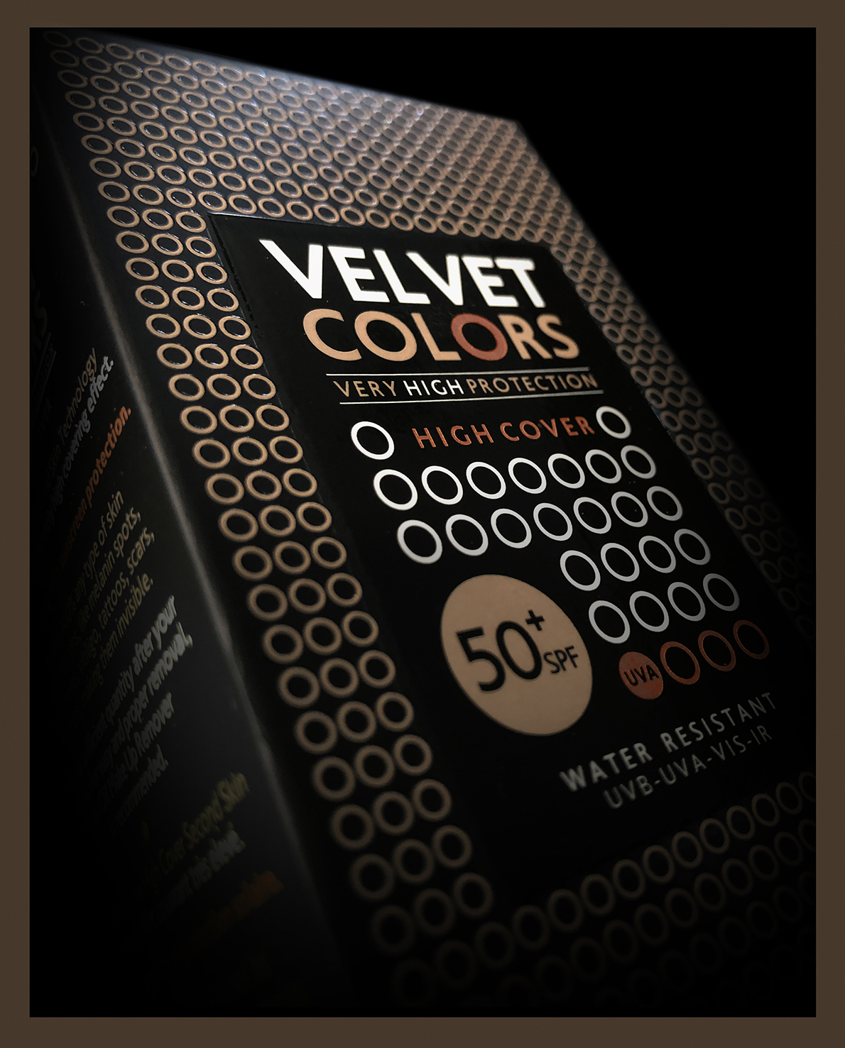
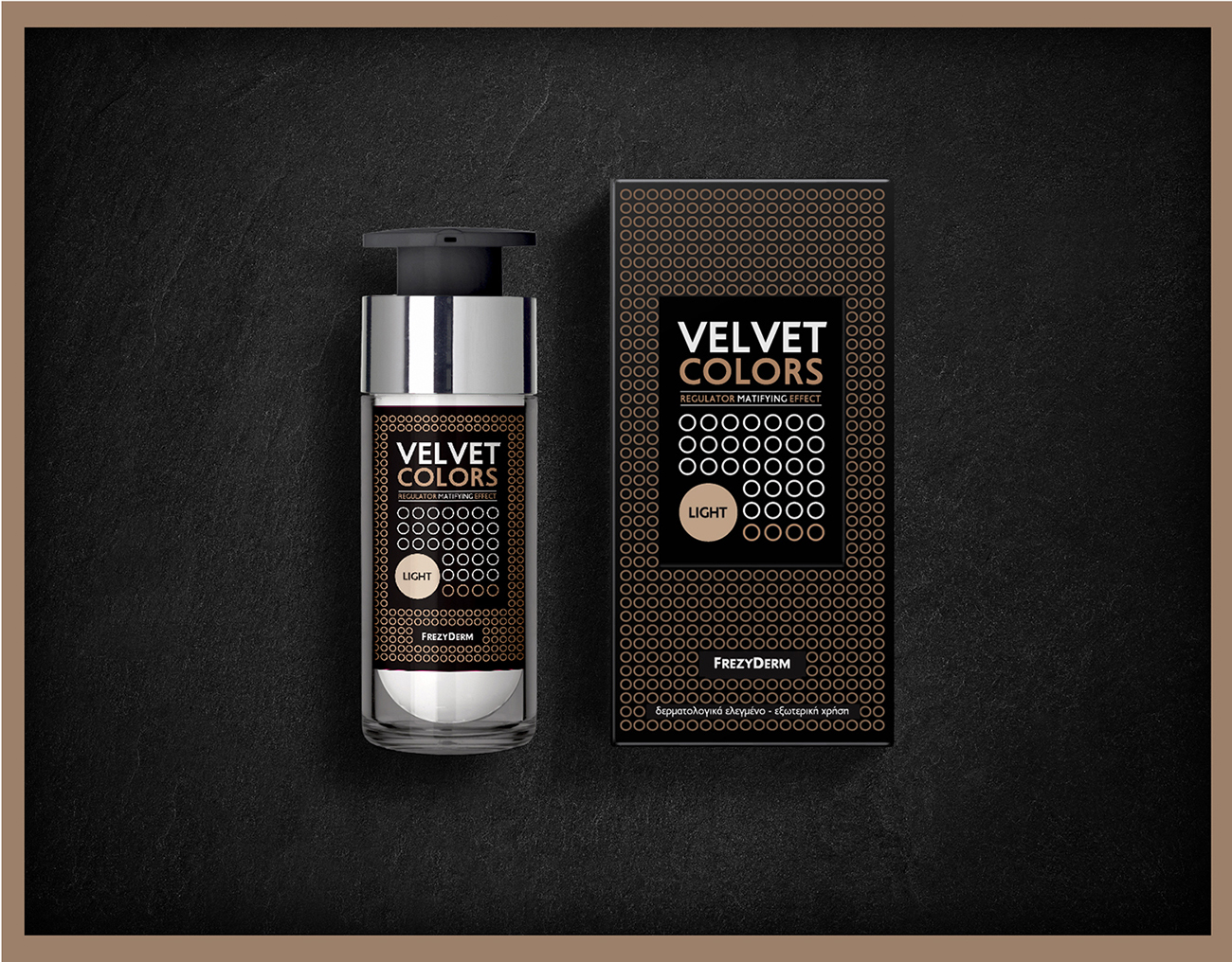
The graphic design of the logo as well as the block of text with the product details create a sense of bold labeling on the packaging that is attractive but also provides clear information.
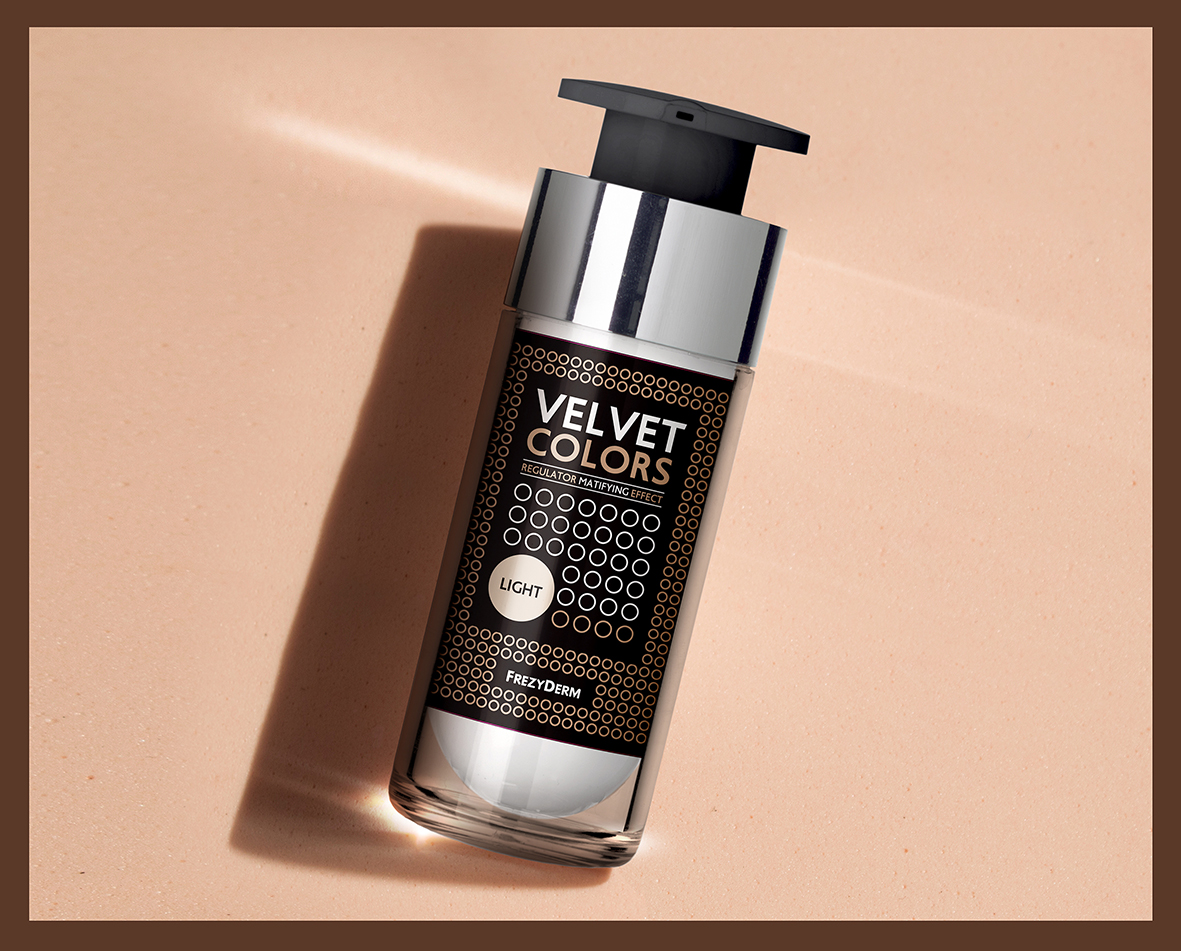
As the series consists of four different sub-products, with different color tones for each skin-type, it makes an eye-catching element on the shelf cosmetics stores and creates a strong group. The black background, combined with the extra printing processes offer a luxurious feel to the product and makes the different color tints more distinct with each other. Βlack also ties in with the bottle’s silver collar and it’s clear casing creating a luxurious item for the consumer to carry with or for the cosmetics cabinet. The varnish as well as the embossed surface of the circles on the packaging box makes a clear reference to the features of the product and its coating effect on the skin.


CREDIT
- Agency/Creative: ABC Design Communication
- Article Title: Velvet Colors Branding and Packaging Design
- Organisation/Entity: Agency
- Project Type: Packaging
- Project Status: Published
- Agency/Creative Country: Greece
- Agency/Creative City: Athens
- Market Region: Asia, Europe, South America
- Project Deliverables: Packaging Design
- Format: Bottle, Box
- Industry: Beauty/Cosmetics
- Keywords: make-up
-
Credits:
Senior Art Director: Kornilios Nikolaidis


