


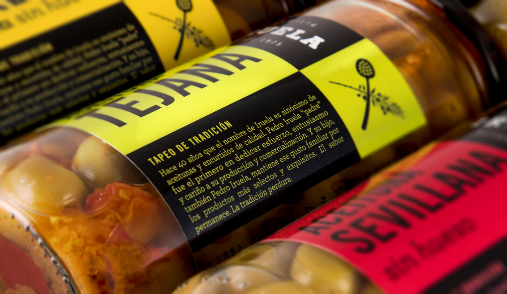
Family — In the mid-1970s, Pedro Iruela sowed the seeds of a company that manufactures olives which has grown and become a deep-rooted brand in two areas: exquisite taste and popular prices.
Both the packaging and the logo they had worked with for years were simple, crude and cheap solutions… A new image was called for, one as exquisite as its products, but underpinned by the same popular spirit.
The personality and differentiation of this packaging design were fundamental in helping Iruela to grow in terms of sales and brand image.
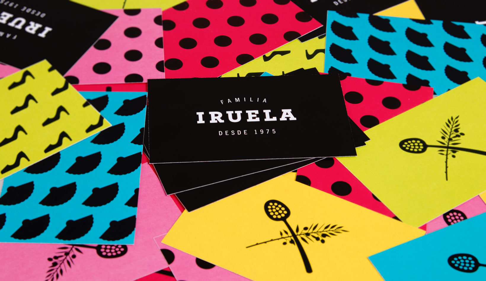
Logo — The first step in the process was to redesign the logotype in order to place it within the visual universe of the premium category (sobriety, monochrome, elegant typeface…) and provide it with a clean and elemental tag line (“Iruela Family – Since 1975”). In visual terms, we channelled the brand towards a certain sophistication; narratively, towards values of tradition, experience and closeness. Or in other words, we did not want to move too far away from Iruela’s two main areas. An exquisite logotype: a popular tag line.
We complemented the logotype with a symbol logo of an olive branch and an olive ladle crossed in an epic and distinguished fashion, but also with a cheeky sense of humour: a noble composition with good-natured objects.
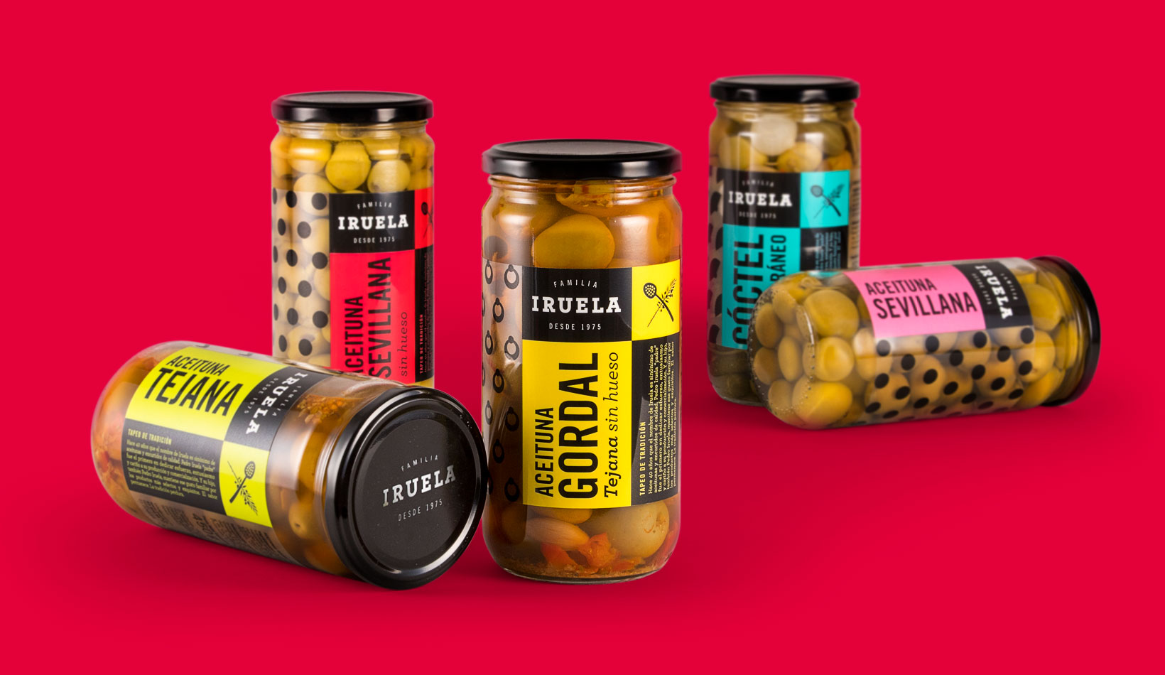
Label — We managed to get the packaging to maintain this brand duality thanks to visual patterns with folkloric overtones, albeit in a modern style. We used the aesthetic of polka dot dresses and inserted them into a digital pictogram aesthetic in order to create modern motifs. The traditional aesthetic of Andalusia, albeit with a contemporary approach.
Thus, the polka dot became an earring, a high-heel shoe or a fan. We drew a different icon for the different varieties of olive (keeping the polka dots for the Sevillian olive, naturally).
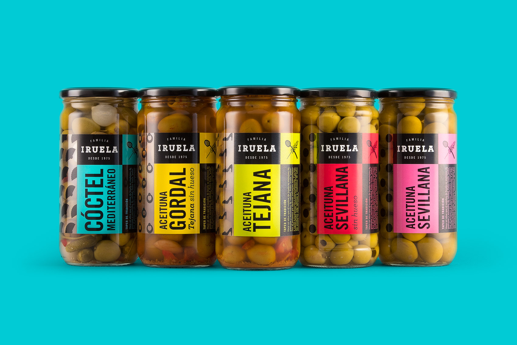
We placed the different graphic elements in order into independent areas to facilitate hierarchy and visibility: the logo and an intimate storytelling about the history of the brand occupy a sober space; the symbol logo and the descriptor stand out over an attention-grabbing coloured background. And the pattern elegantly surrounds the rest of the tin, without concealing the product from us.
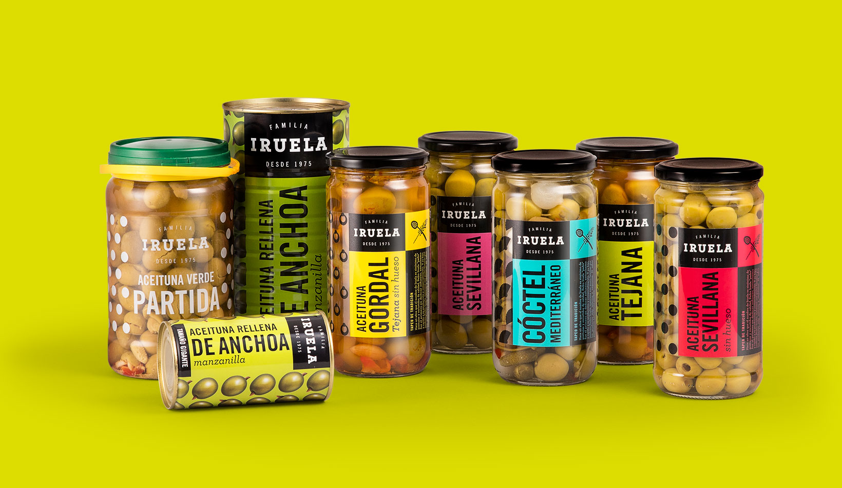
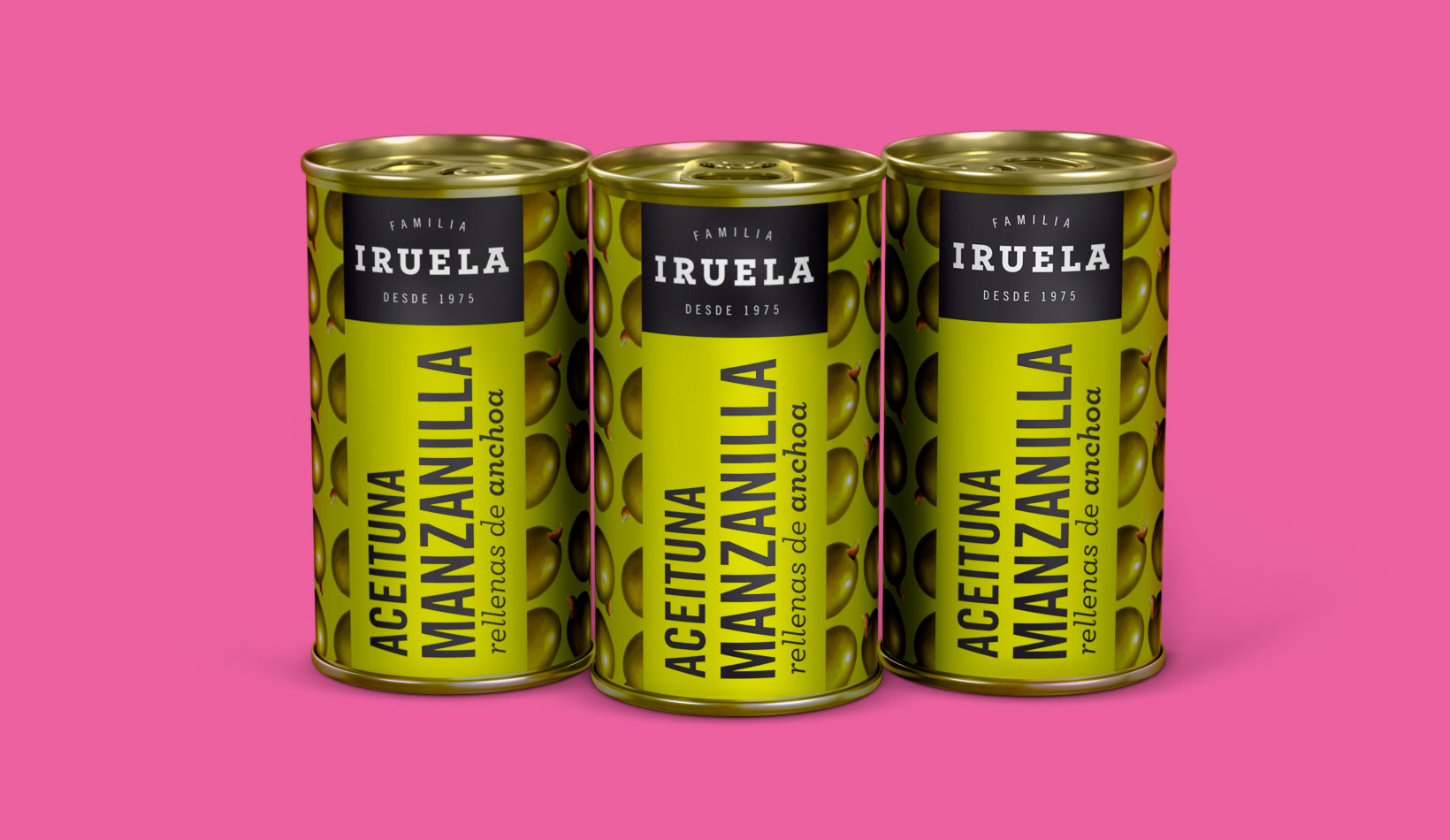
For all tastes — In applications of other containers, for cans and plastic jars, we applied these same codes, adapted to their characteristics. In cans, we cannot see the product, so we turned it into a pattern, in the plastic jars (used for bulk selling), multicolour printing would have pushed the price up, so we simplified the design to print in black and white, with a simpler and more synthetic graphic construction: brand, pattern and descriptor; nothing else.
Colorful — The colour palette that we used avoids the strident reds and greens typical of the folklore aesthetic, using, instead, unsaturated tones that are never actually pastel. In this way, the packaging attracts our attention right from the shelves, and each product is distinguished with one colour. There are few black or coloured areas on the label and the patterns are above transparencies because (and this is something that needs to be emphasised) a product that is as good as the Iruela olives needs to be seen, first and foremost.

CREDIT
- Agency/Creative: Vibranding
- Article Title: Vebranding designs the packaging for spanish olives Iruela
- Organisation/Entity: Agency, Published Commercial Design
- Project Type: Packaging
- Agency/Creative Country: Spain
- Market Region: Multiple Regions
- Project Deliverables: Brand Architecture, Brand Guidelines, Brand Strategy, Brand World, Graphic Design, Packaging Design, Product Architecture, Rebranding, Research, Tone of Voice
- Format: Can, Jar
- Substrate: Glass Jar, Metal


