Adega Zenaide is a special project of Zenaide Bar, a bar located in a countryside region in Brazil, which was very famous for its quality in all aspects for the way it receives its customers.
Thinking of offering a better experience for its customers, the company decided to build its own line of products, bringing wines straight from the best producing regions in South America, such as Mendoza – Argentina.
Our mission was to bring a sense of refinement and the cold winds from the mountains of the South American west coast (Argentina and Chile), but of course, without losing the existing identity of the Zenaide brand, which already has a defined brand and color palette.
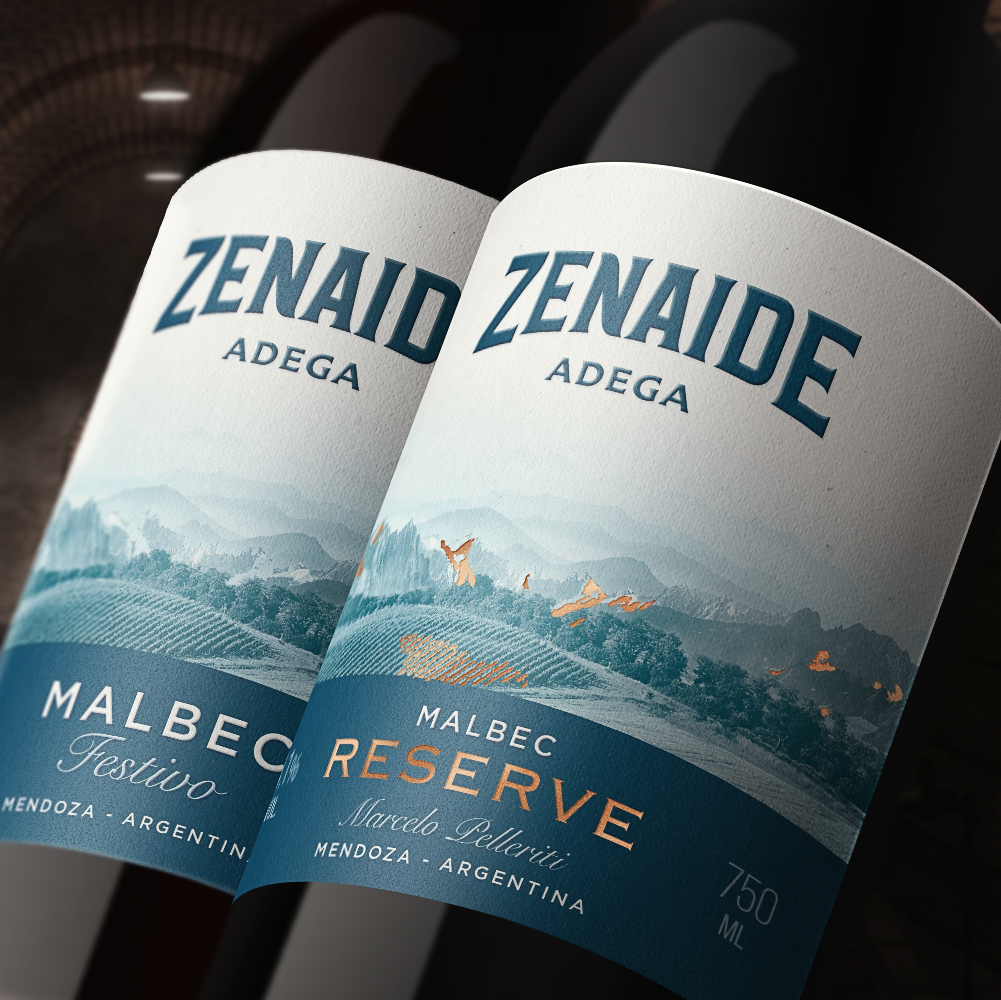
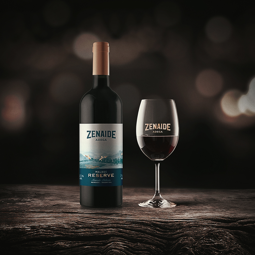
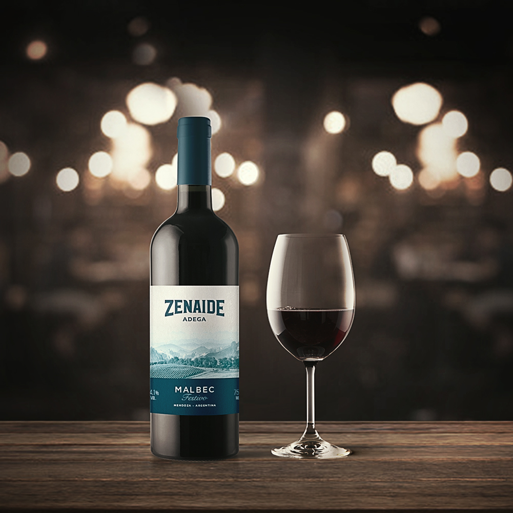
To convey this kind of sensation, we first work with real images of vineyards in the open field, surrounded by the mountains, with an image treatment that favors the contrast of the plantations and that makes the mountains gradually disappear along the sky. We use a dark blue and desaturated hue to refer to the cold winds of the region and, of course, to emphasize the identity of the Zenaide brand. In the case of the RESERVE edition (the most noble product in the portfolio), which deserves some different attention due to its extra quality and its higher cost, we work with small highlights in copper foil, symbolizing the snow over the mountains and part of the plantation, and also in the typography highlighted to facilitate visual differentiation in the choice of wines. In addition, the labels had a textured paper with relief in some information to be valued.
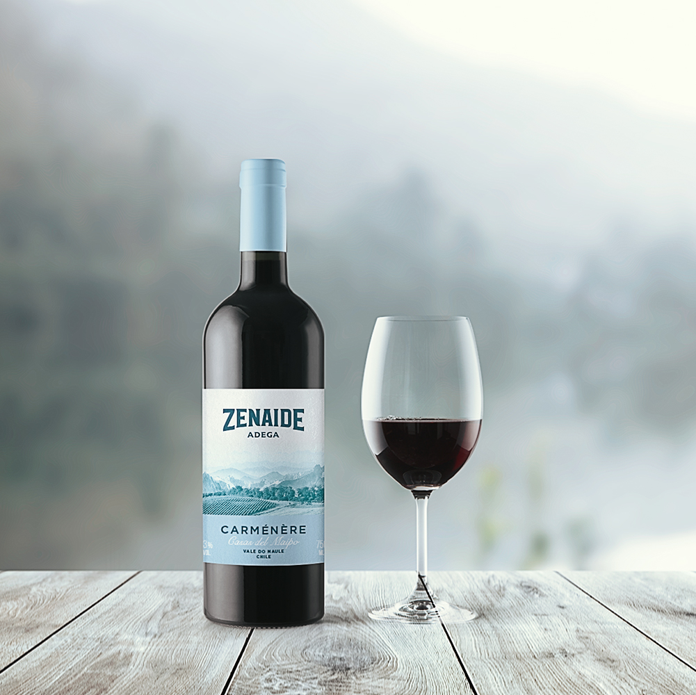
The customer loved the idea immediately and the launch of the products was a success among the public that appreciates a good wine and is faithful to the pub’s brand. A new Chilean wine was also launched to complement the two Argentines who were already part of the product family, where we work with a light blue and desaturated hue to differentiate the product.
With the success of the first launch and the good number reached in sales, the owner of the company is already preparing novelties for the market, such as a new dry gin inspired by the bar’s manifesto and different types of “cachaça” (traditional alcoholic drink and very beloved in the Brazil).
CREDIT
- Agency/Creative: vbiasi design
- Article Title: Vbiasi Design Creates Wine Bottles Inspired in Argentine Fields
- Organisation/Entity: Agency, Published Commercial Design
- Project Type: Packaging
- Agency/Creative Country: Brazil
- Market Region: South America
- Project Deliverables: Brand Architecture, Brand Identity, Branding, Graphic Design, Packaging Design, Product Architecture, Research, Retail Brand Design
- Format: Bottle
- Substrate: Glass


