


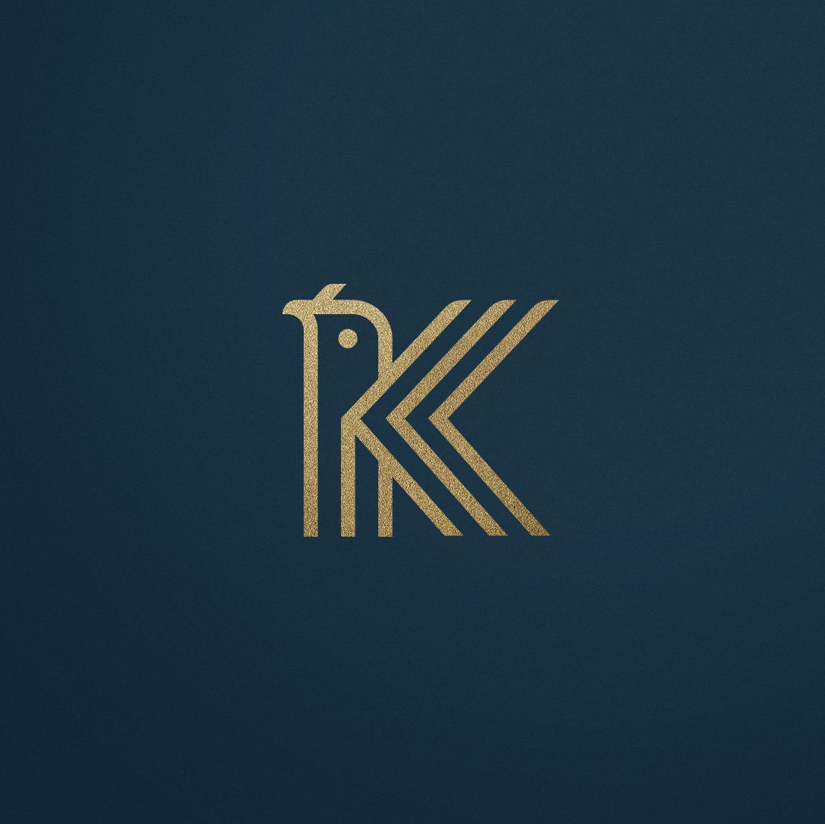
Kardinal is a Multi Family Office (financial consultant) specialised in asset management and asset consultancy. The fund invests mainly in shares of credit rights funds and credit instruments. The name created already brings with it two main concepts: (1) cardinal points, main points of reference on the earth’s surface, and also (2) the Cardinal bird, a smart animal with privileged vision. Concepts that already make Kardinal’s position clear: a company with a privileged view of the scenario and that manages, in a discreet and precise manner, to guide its customers with precision and security.
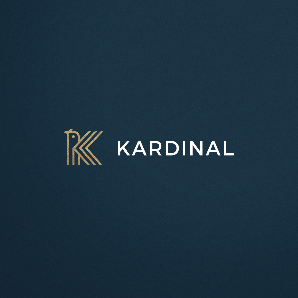
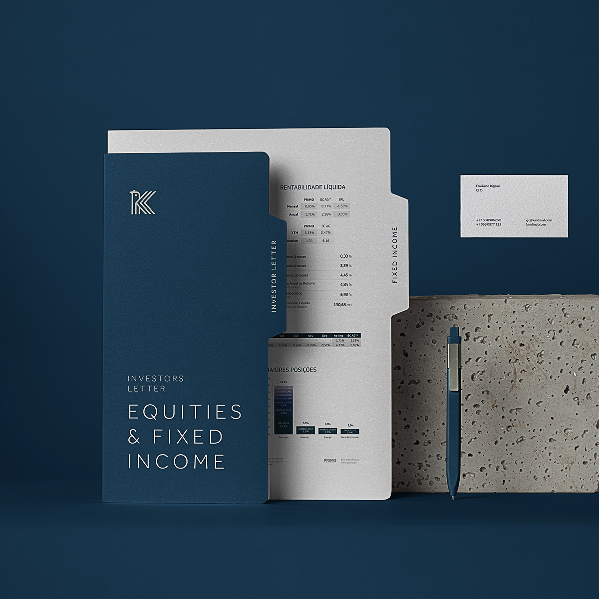
For the creation of the monogram, we created a combination of the concepts of the bird + the initial letter K + the direction arrows. Worked on top of a straighter grid with well-defined angles. For the typography, a sans serif was edited, adding curves on the upper parts bringing a sense of movement and modernity and, of course, following the symbol’s aesthetic. Although the symbol has sequential elements, concepts and lines, it still manages to be simple and accurately convey its meaning and, at the same time, the audience segmentation that the company wants to achieve.
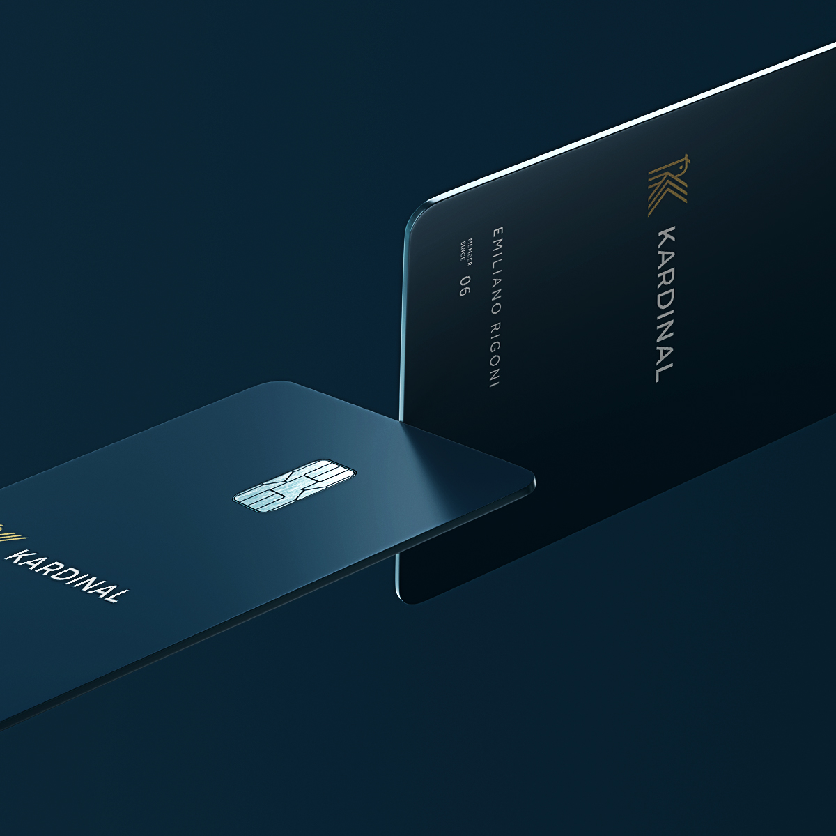
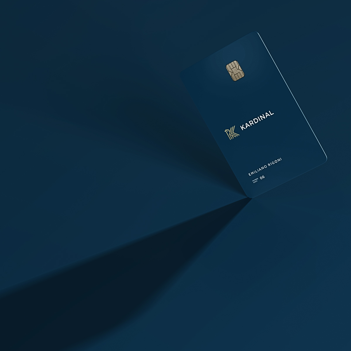
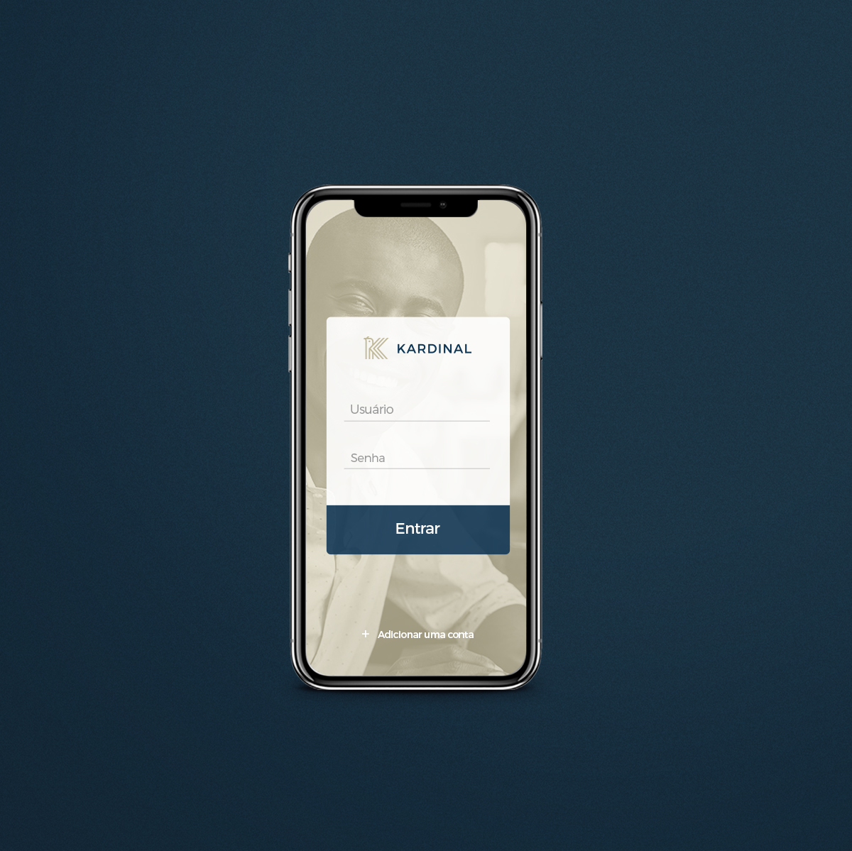
The identity created to support and give continuity to the brand was composed of more sober and direct elements. A classic color palette for the segment, with a dark and sober blue together with a less saturated and more discreet gold. White and lighter tones such as off-white complement and bring more harmony to the identity. Serif typographies were chosen and used in their lighter versions, giving a more serious and thin appearance to the materials. For the standard of photography, less posed and clichéd photos, ranging from successful people in everyday moments to moments of leisure or adventure, escaping from the daily routine and seeking new paths. For the treatment, a mixture of tones that lead to the sepia and gold side were used, always with a sunnier tone and high contrast and sharpness of the elements.


CREDIT
- Agency/Creative: vbiasi design
- Article Title: Vbiasi Design Creates New Identity for Financial Company
- Organisation/Entity: Agency
- Project Type: Identity
- Project Status: Published
- Agency/Creative Country: Brazil
- Agency/Creative City: Uberlandia
- Market Region: South America
- Project Deliverables: Advertising, Art Direction, Brand Design, Brand Naming, Branding
- Industry: Financial
- Keywords: kadinal, finance, financial, investment, capital, stock exchange, bird, cardinal
-
Credits:
Head Designer: Victor Biasi Silva


