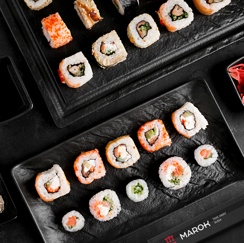
We were approached by an entrepreneur addicted to Japanese food to create a clean and straightforward concept for his new project: a sushi bar focused on delivery and take-away.
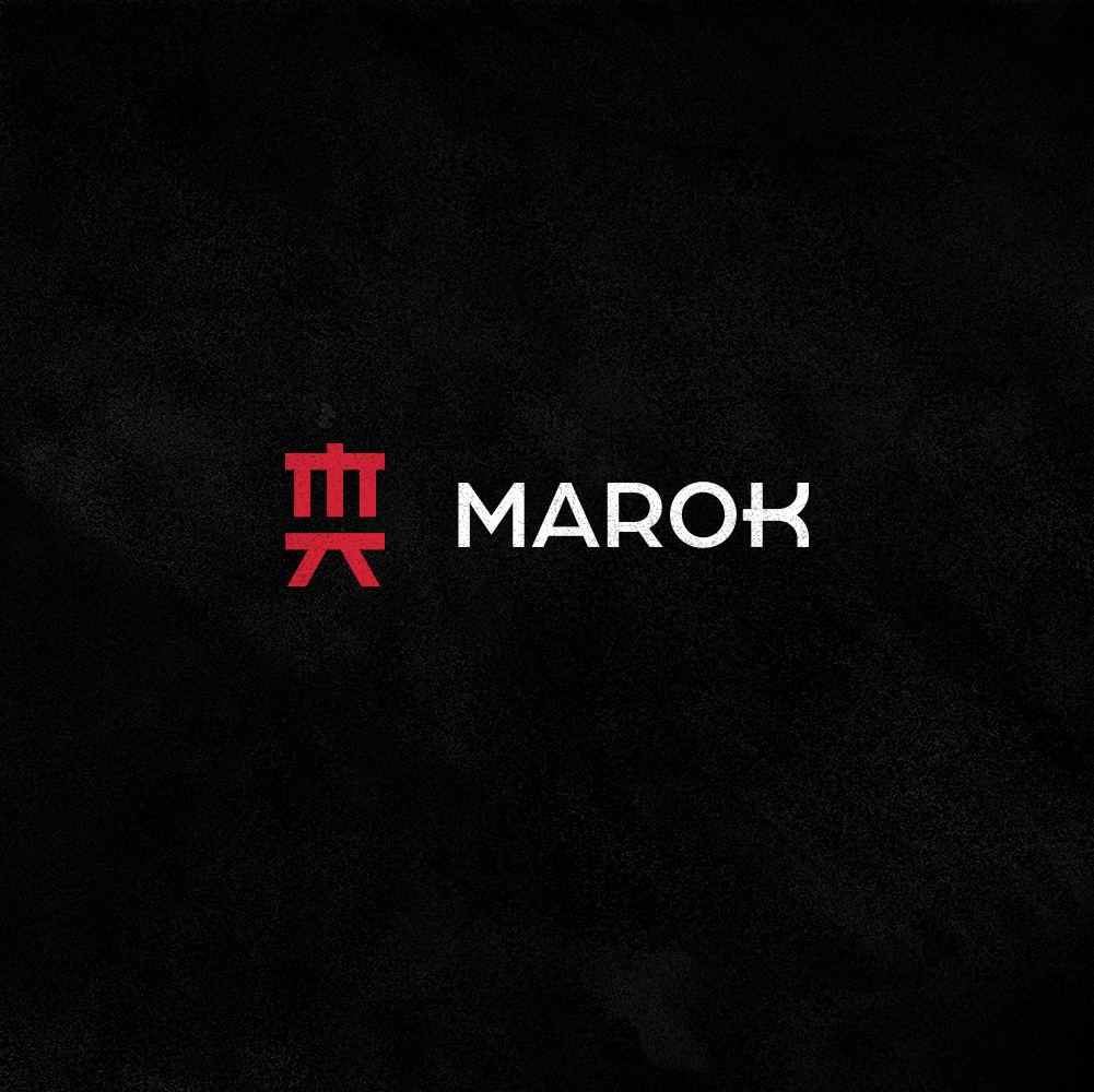
The name Marok is a neologism (invented name) that seeks to simulate the phonetics and way of writing of the oriental people, especially the Japanese. He is easy to speak, has an open pronunciation at the beginning and close and strong at the end, which brings personality and strength to the name.
With the name defined, we chose not to take very different paths from the traditional ones. Our idea was very clear: to make it simple. We work with colors and visual elements that are already part of the category’s universe and that facilitate identification with the public.
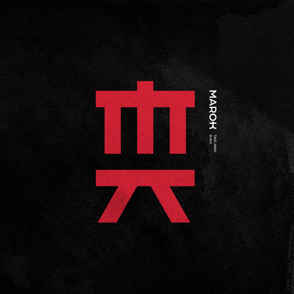
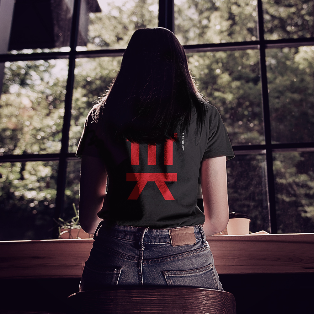
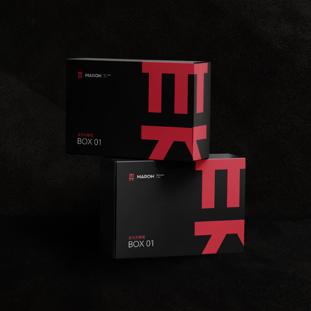
To create the logo, we were inspired by the visual aesthetics of Japanese letters to make our version of the letters M and K, referring to the beginning and end of the restaurant’s name, that is, something like starting and ending the meal, enjoy it fully. For a more assertive look, we were inspired by the traditional Japanese portals and also by the basic forms of benches and tables, which is where everything happens in the food segment.
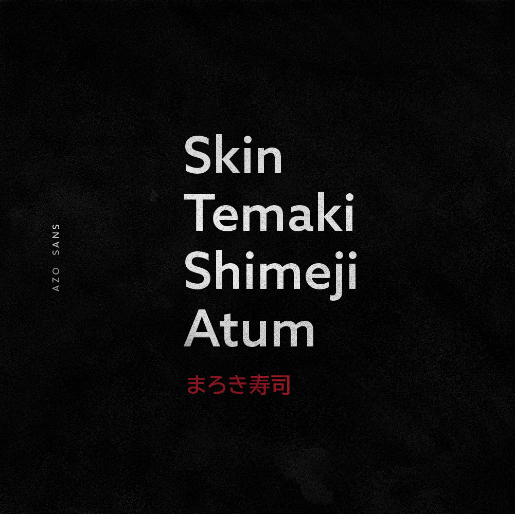
We use the common colors of the segment, always using black as a background, bringing feelings of something more refined, gourmet and well done, and with red as a highlight, bringing more life to the identity and, of course, alluding to the characteristic colors from Japan.
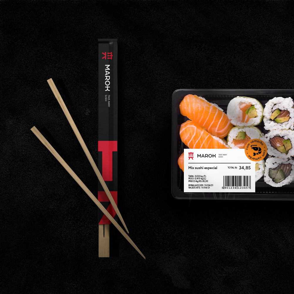
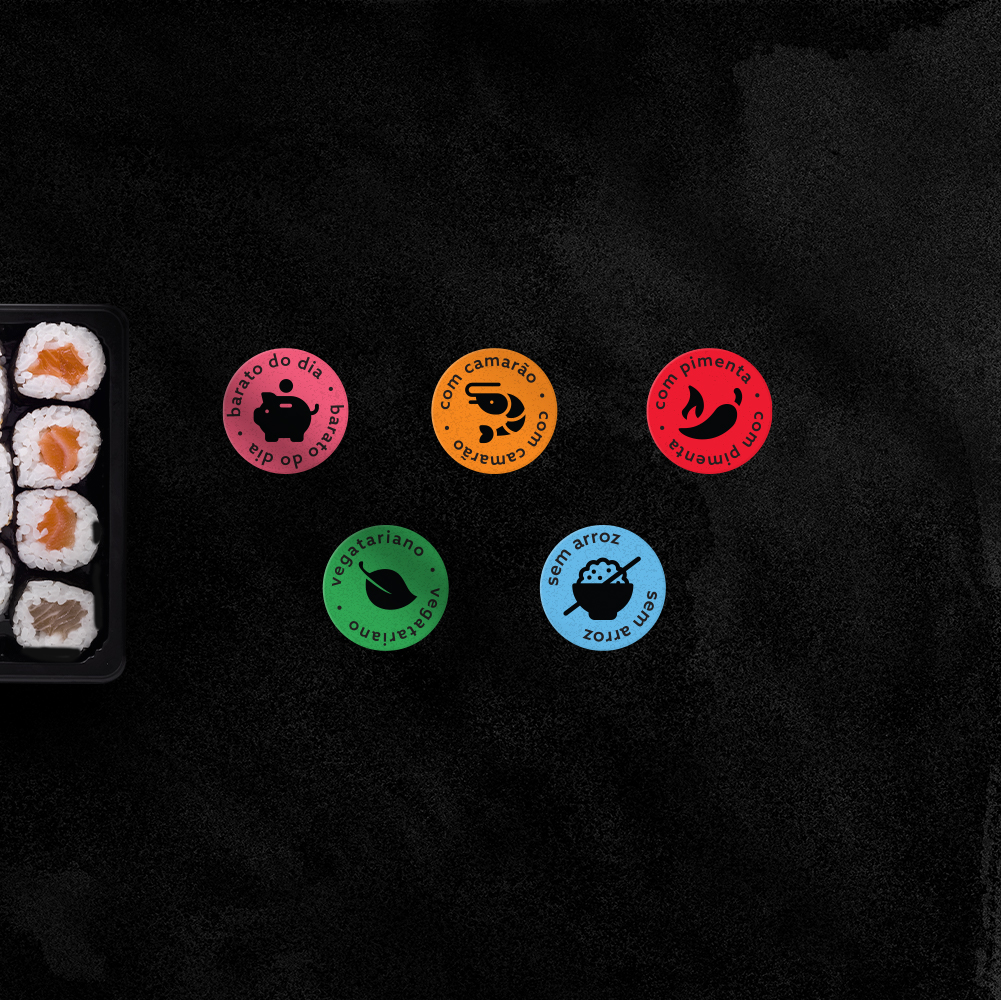
As the focus of the project is delivery and take-away, we create different styles of packaging, always focusing on practicality and, of course, thinking about making the customer experience easier and faster when choosing from the ready-made products window. Instructional stickers were also created to facilitate each type of product, such as “vegan”, “contains shrimp”, “contains pepper”, “without rice”, among others.
CREDIT
- Agency/Creative: vbiasi design
- Article Title: Vbiasi Design Creates a New Logo for Marok Sushi Bar
- Organisation/Entity: Agency
- Project Type: Identity
- Project Status: Published
- Agency/Creative Country: Brazil
- Agency/Creative City: Uberlândia
- Market Region: South America
- Project Deliverables: Art Direction, Brand Design, Brand Identity, Brand Naming, Icon Design, Packaging Design
- Industry: Food/Beverage
- Keywords: sushi, japanese, sushi bar, marok, brazil
-
Credits:
Designer: Victor Biasi


